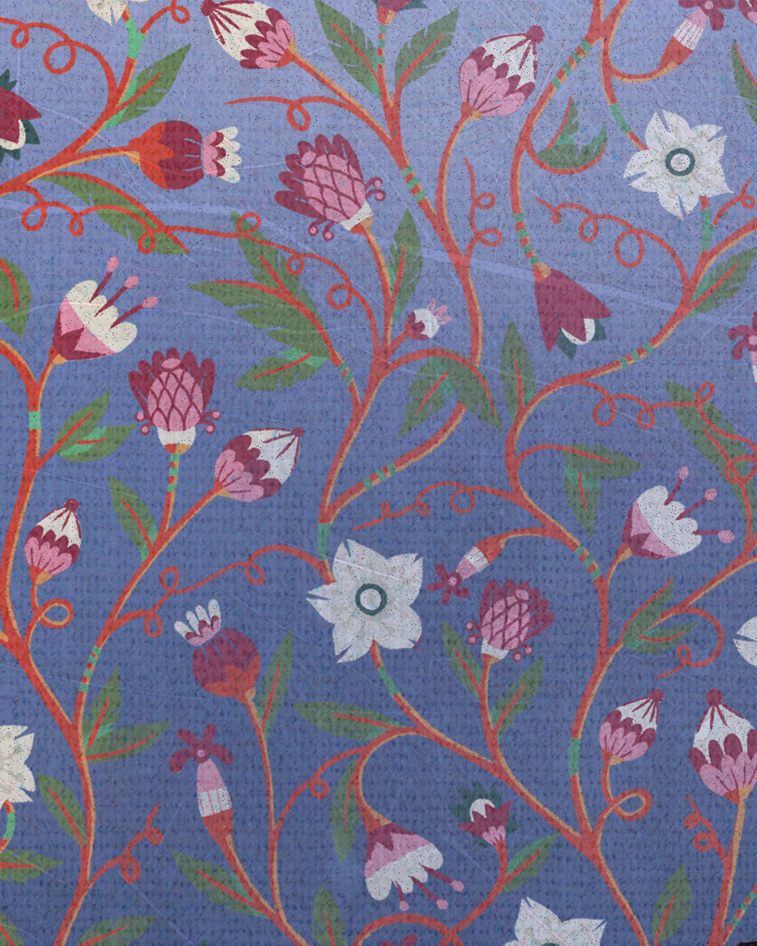
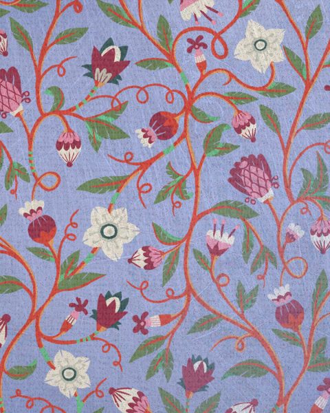
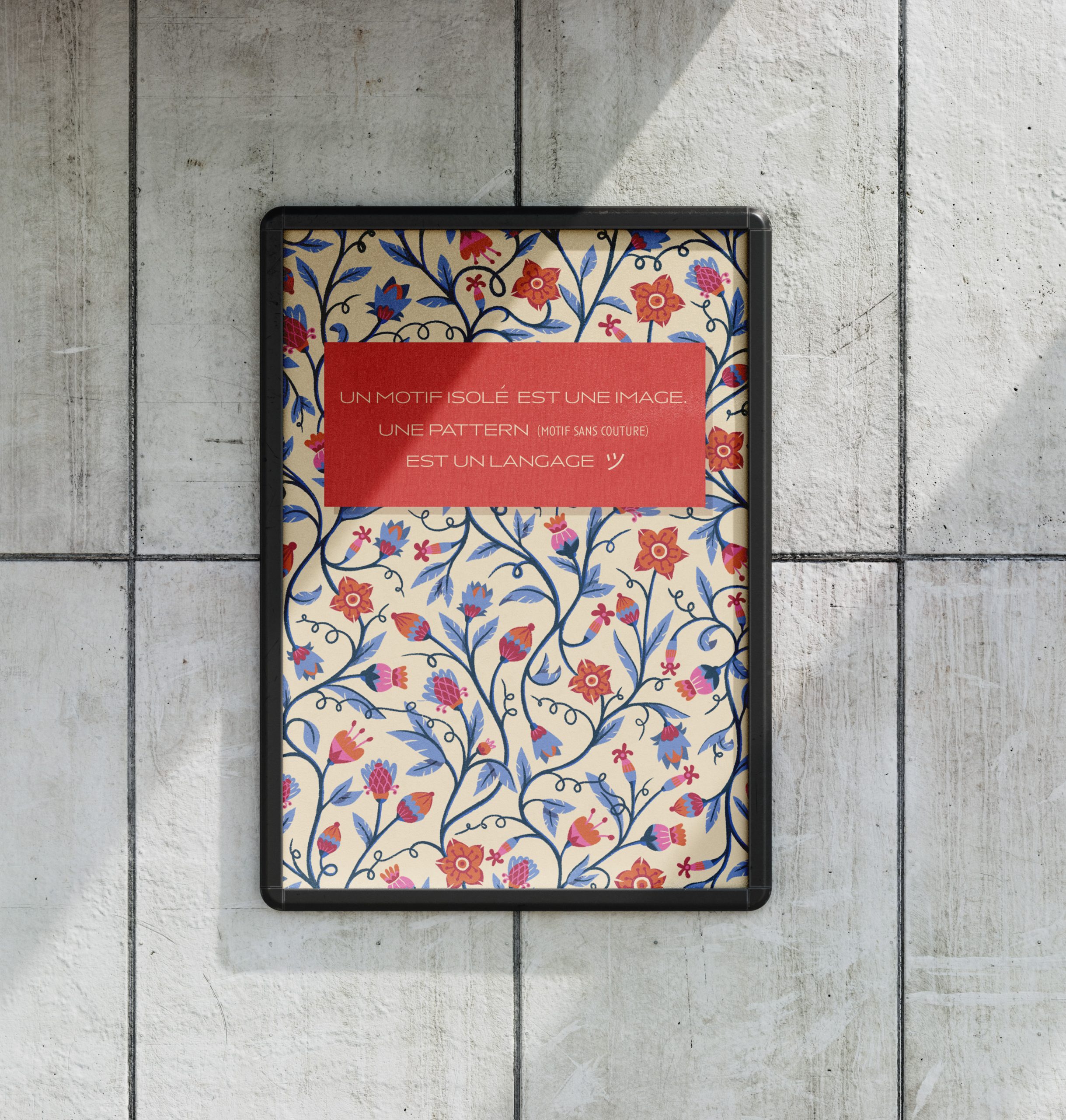
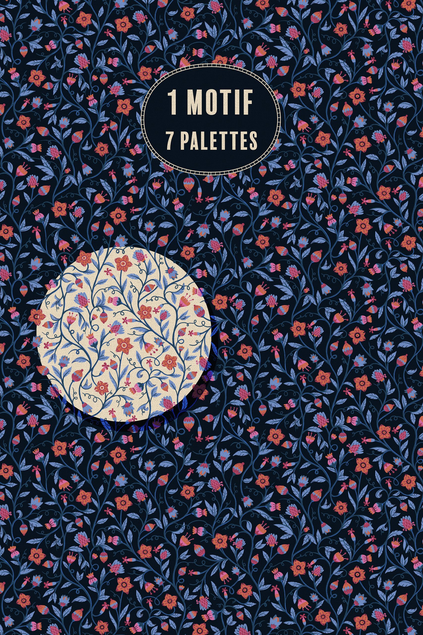
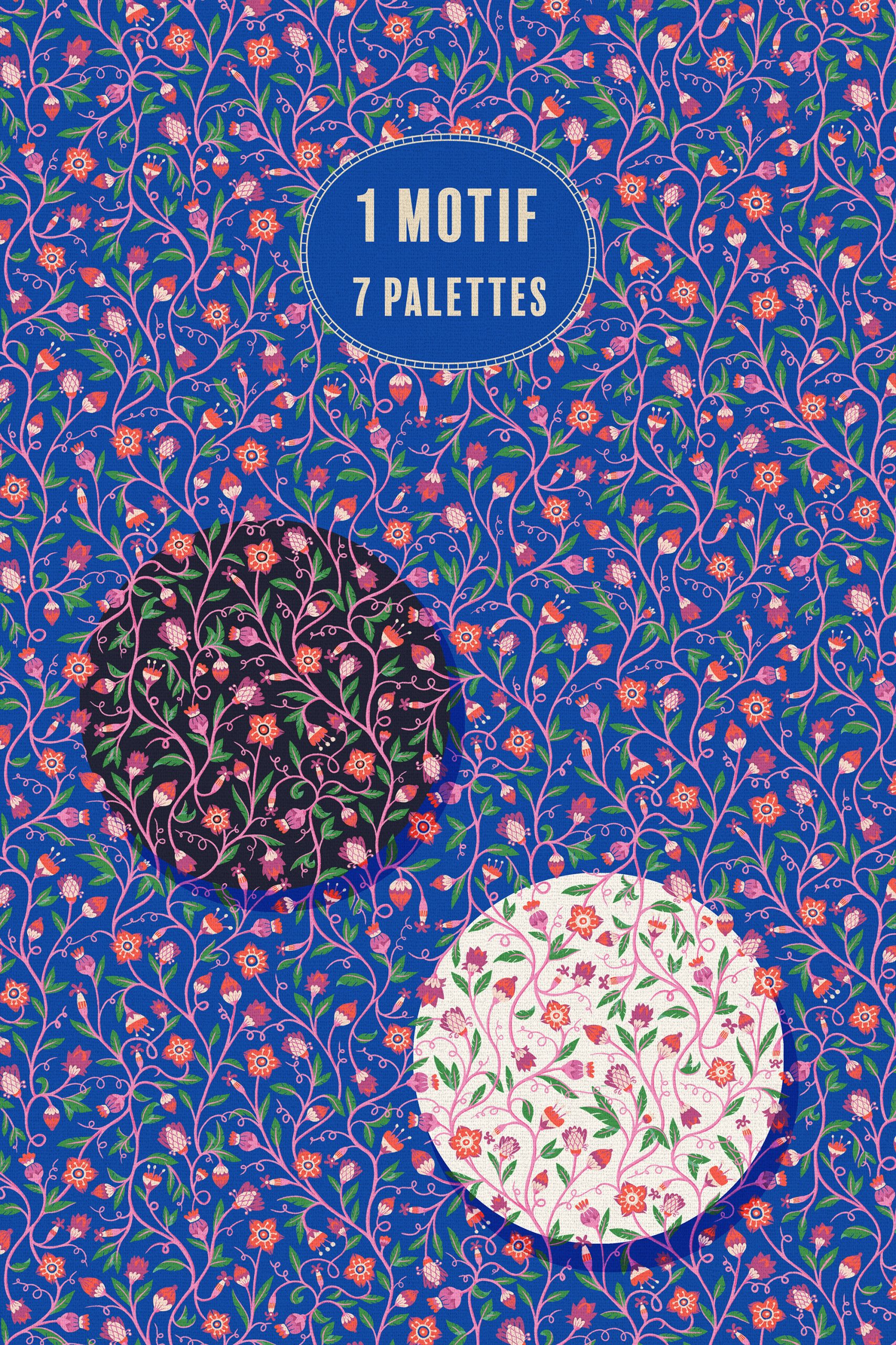
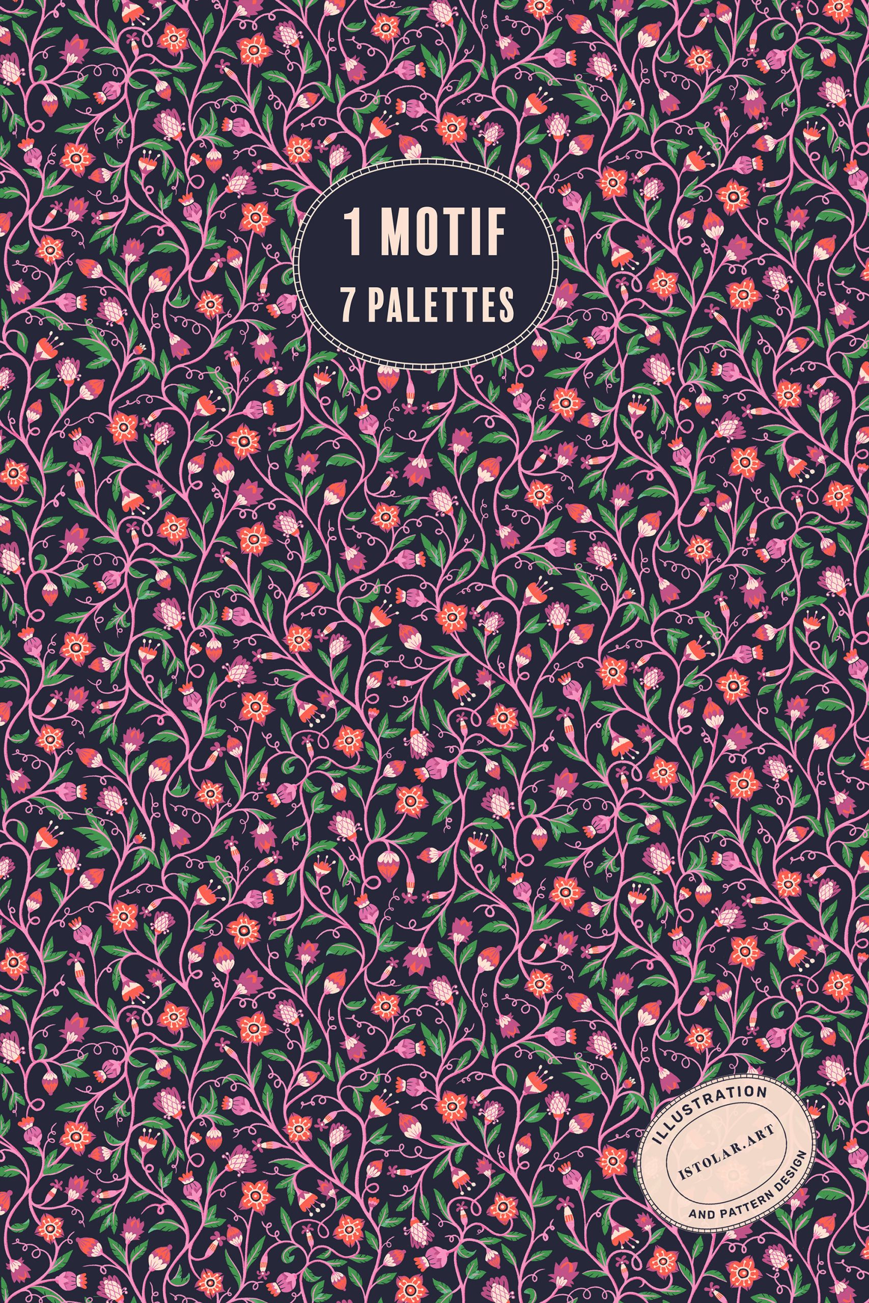
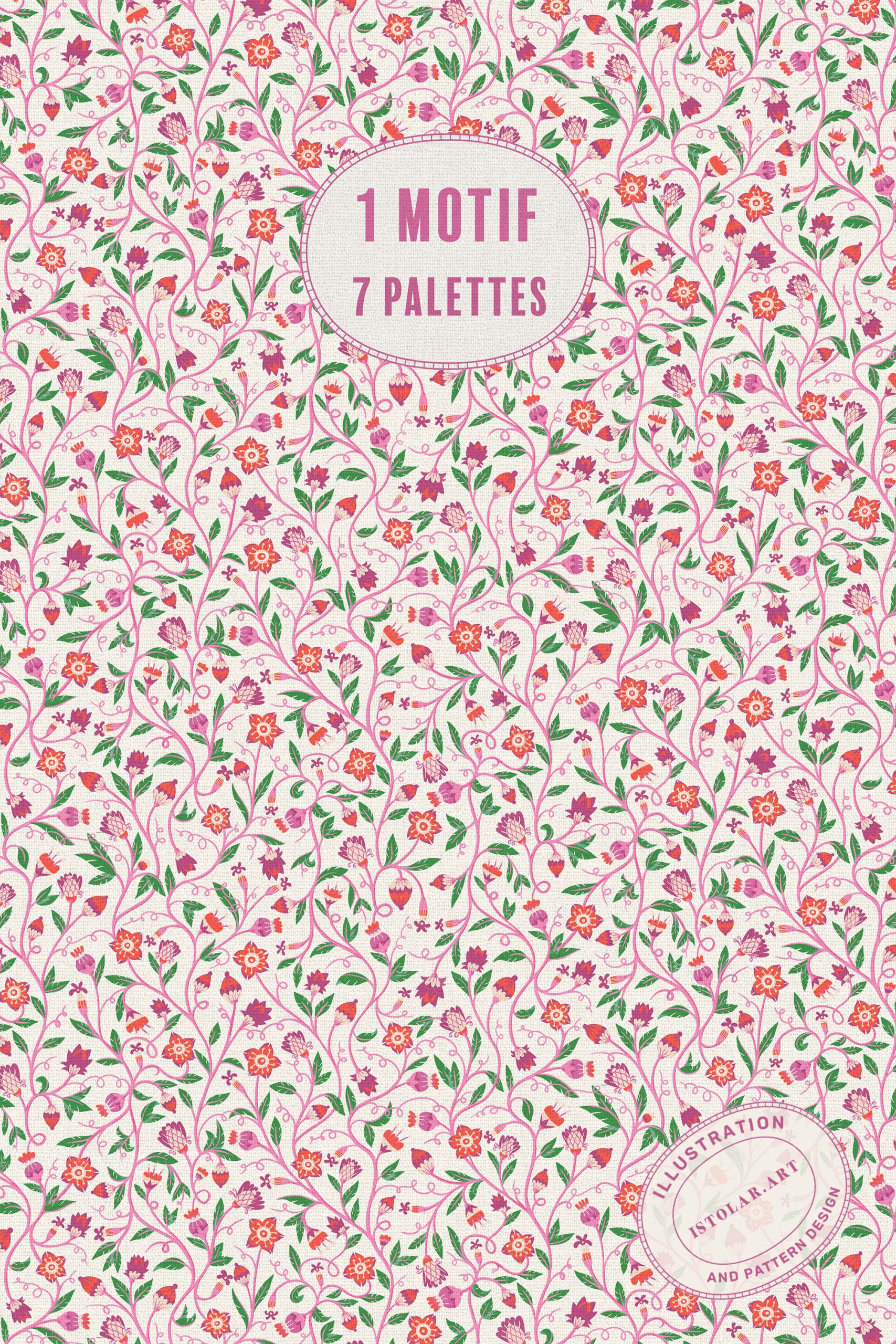
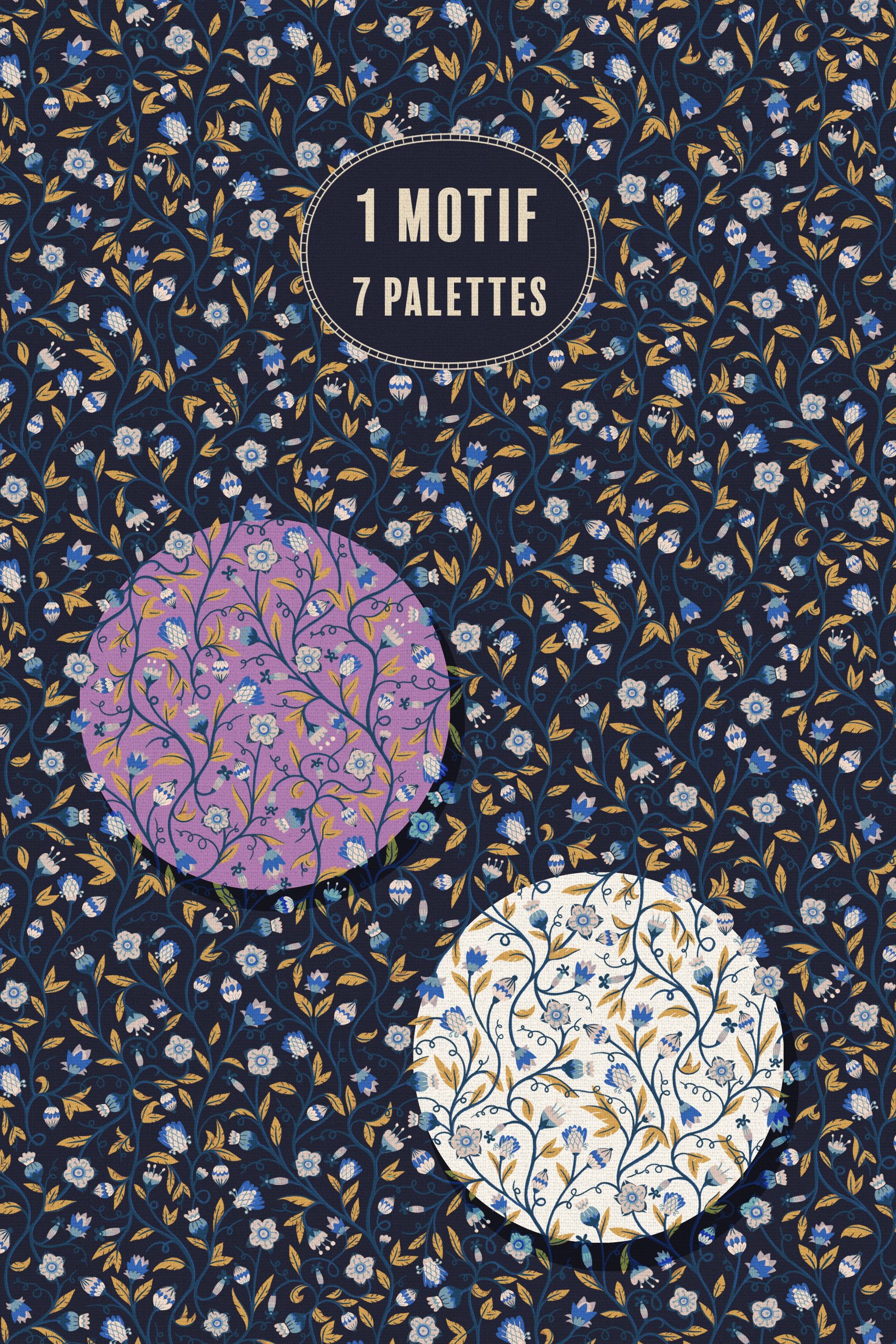
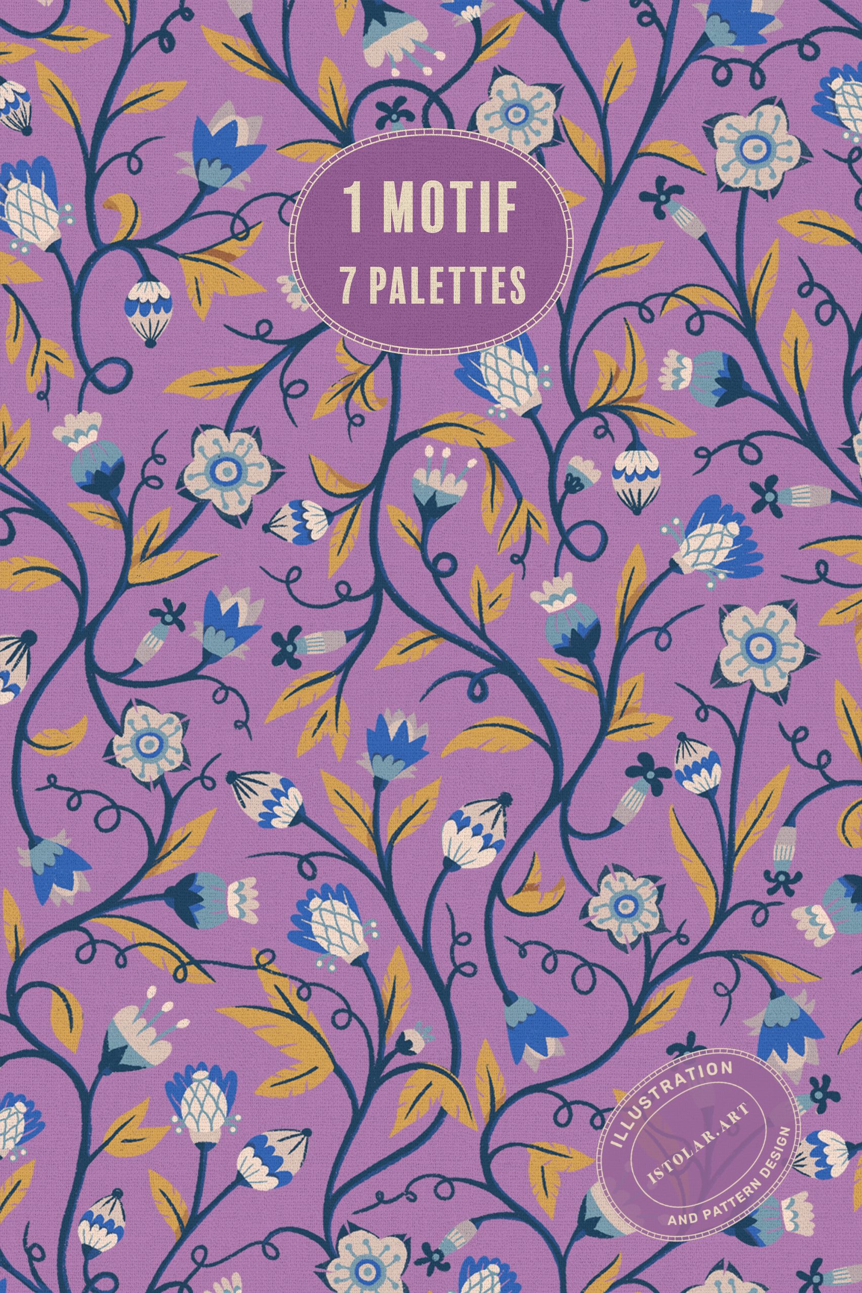
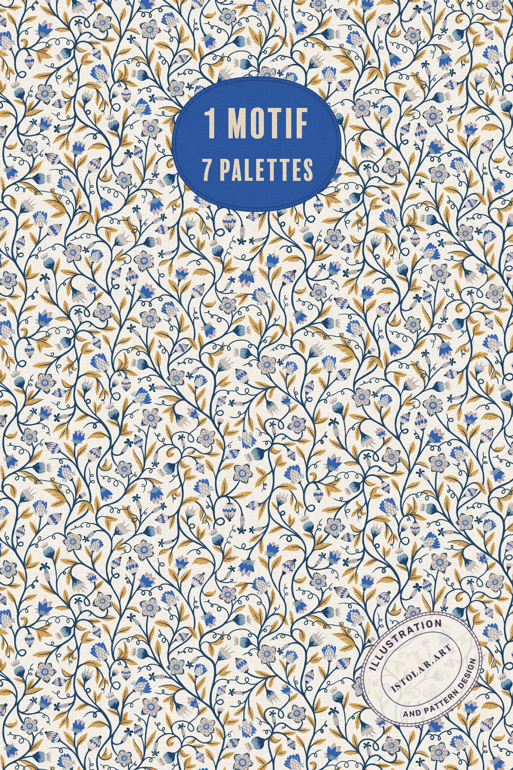
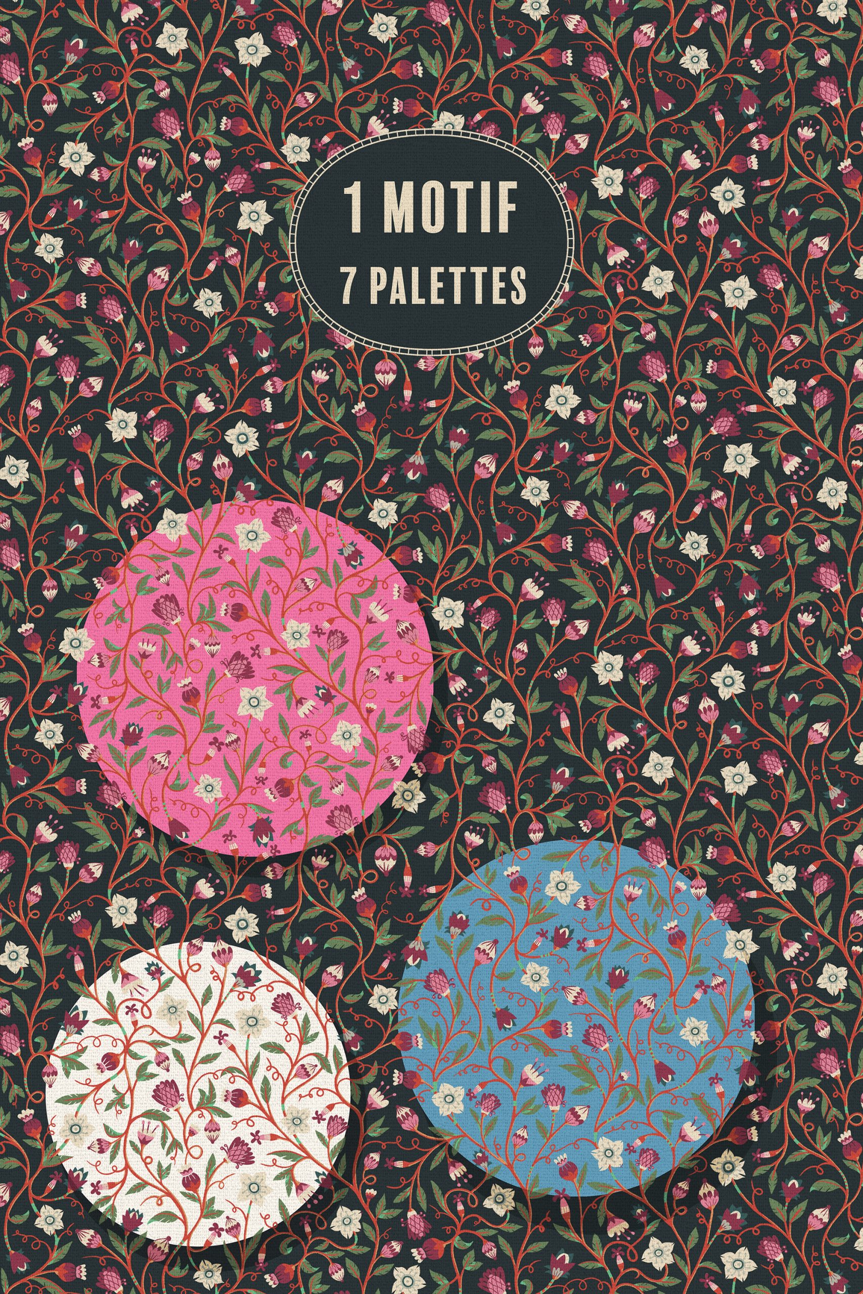
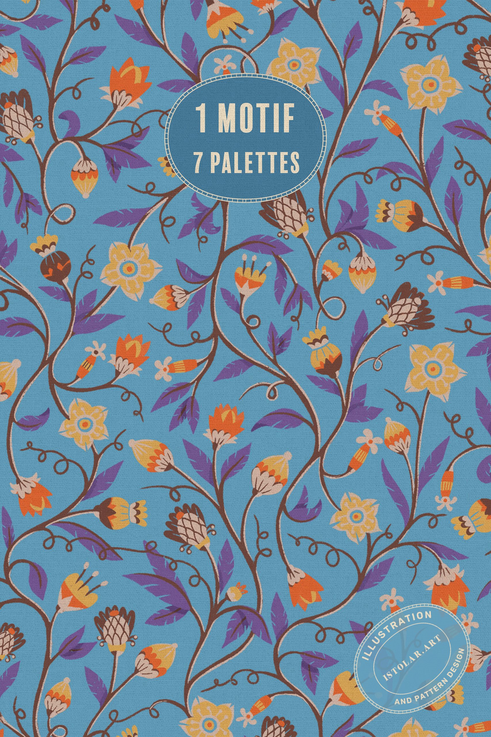
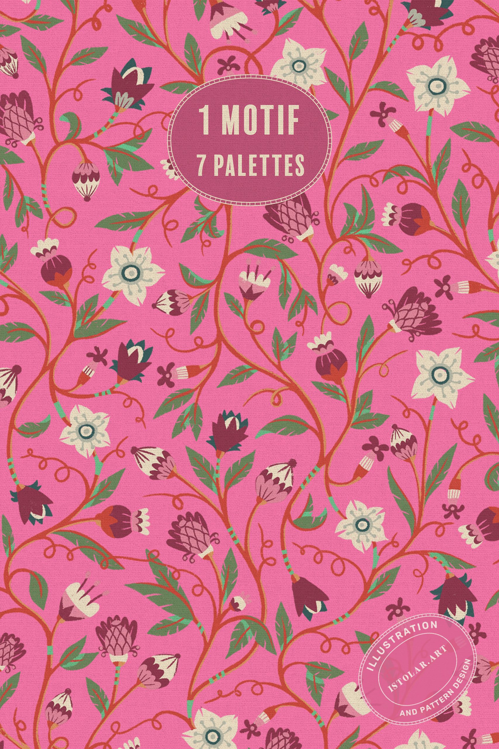
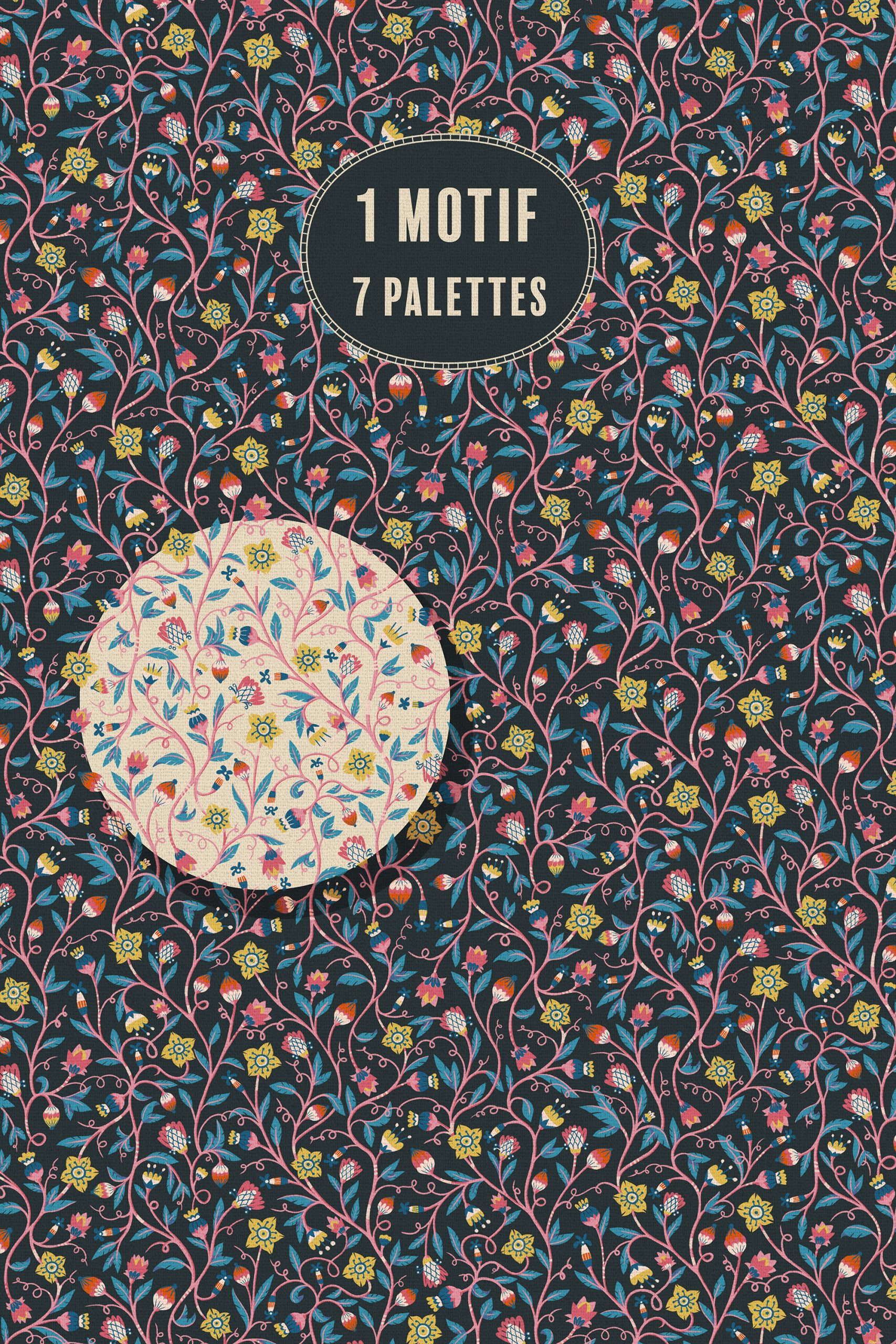
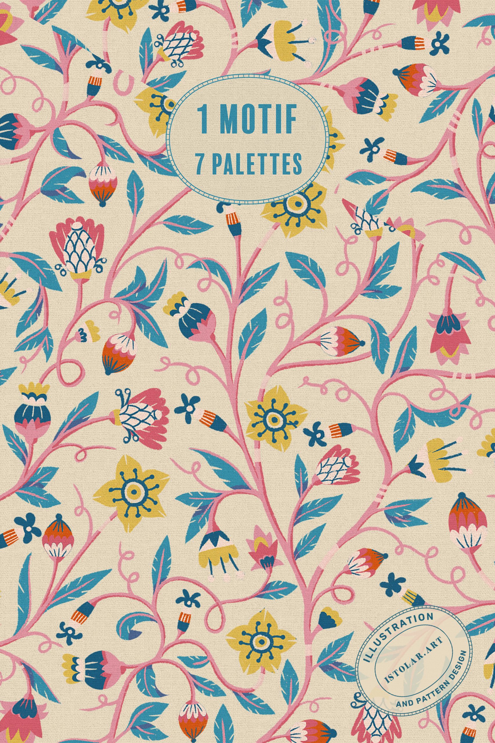
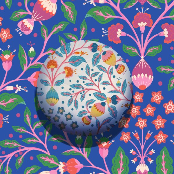
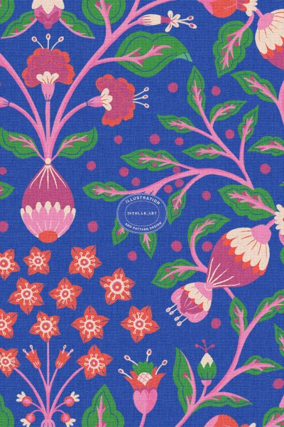
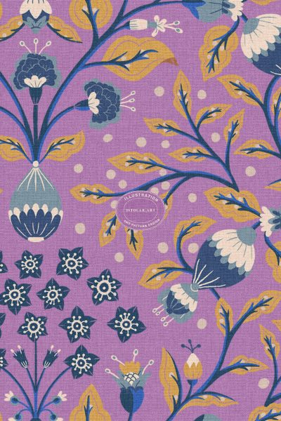
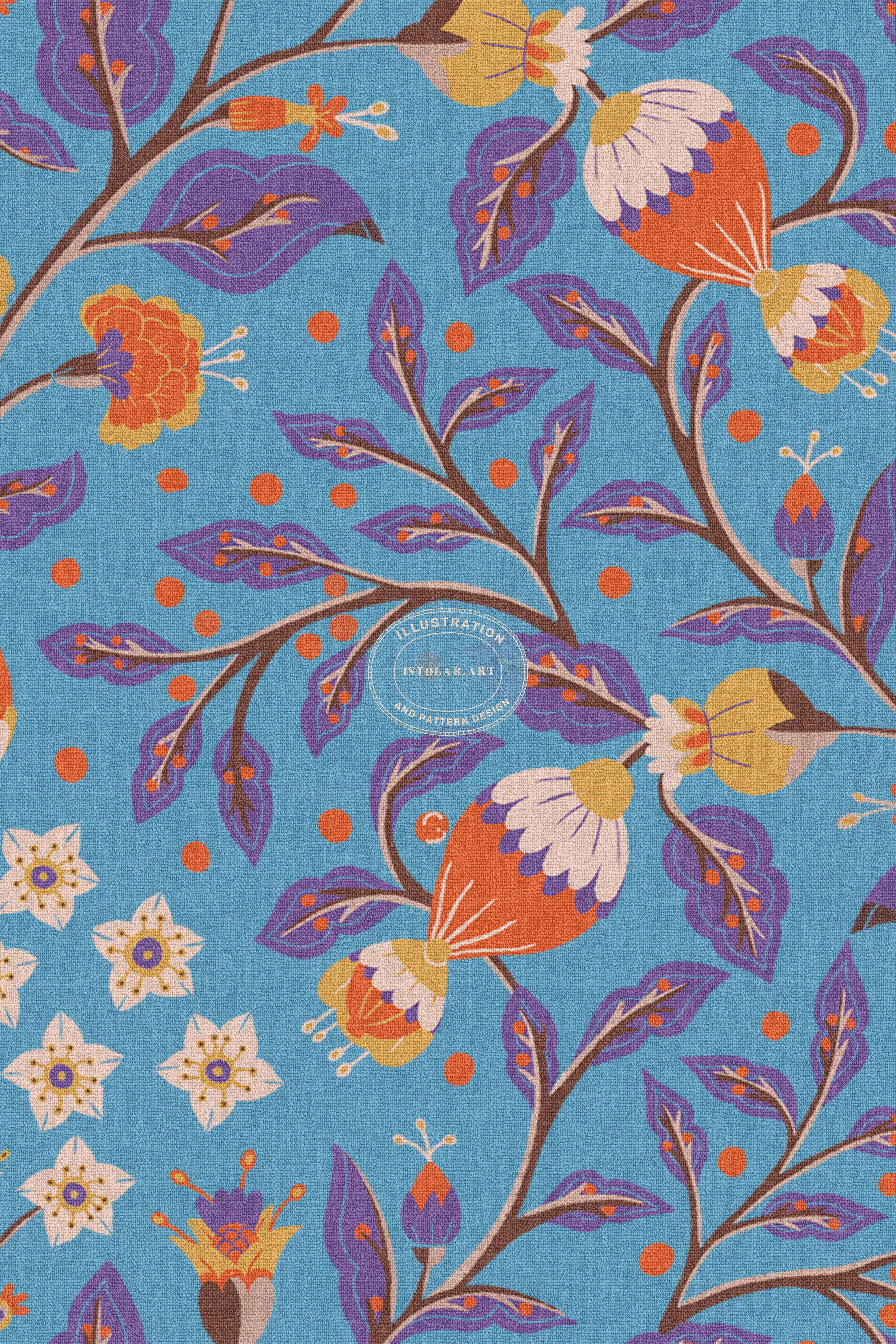
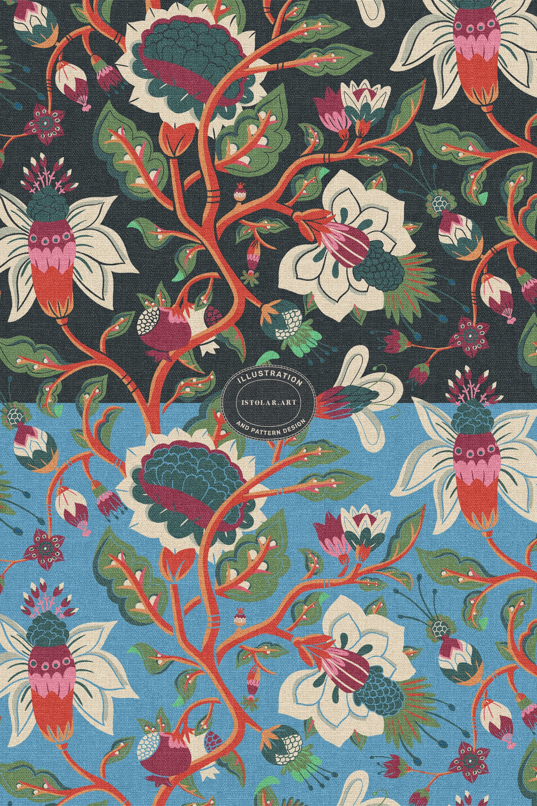
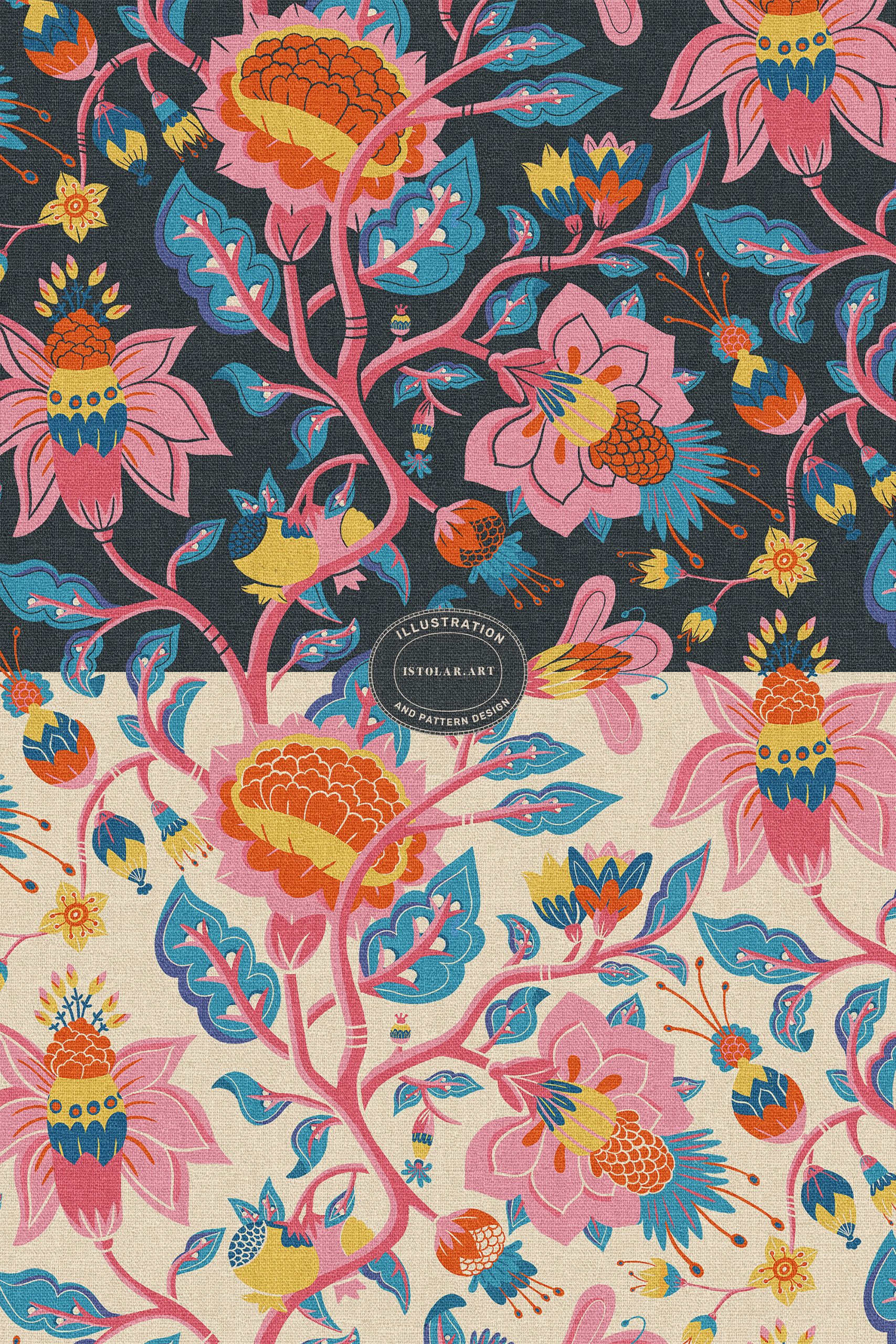
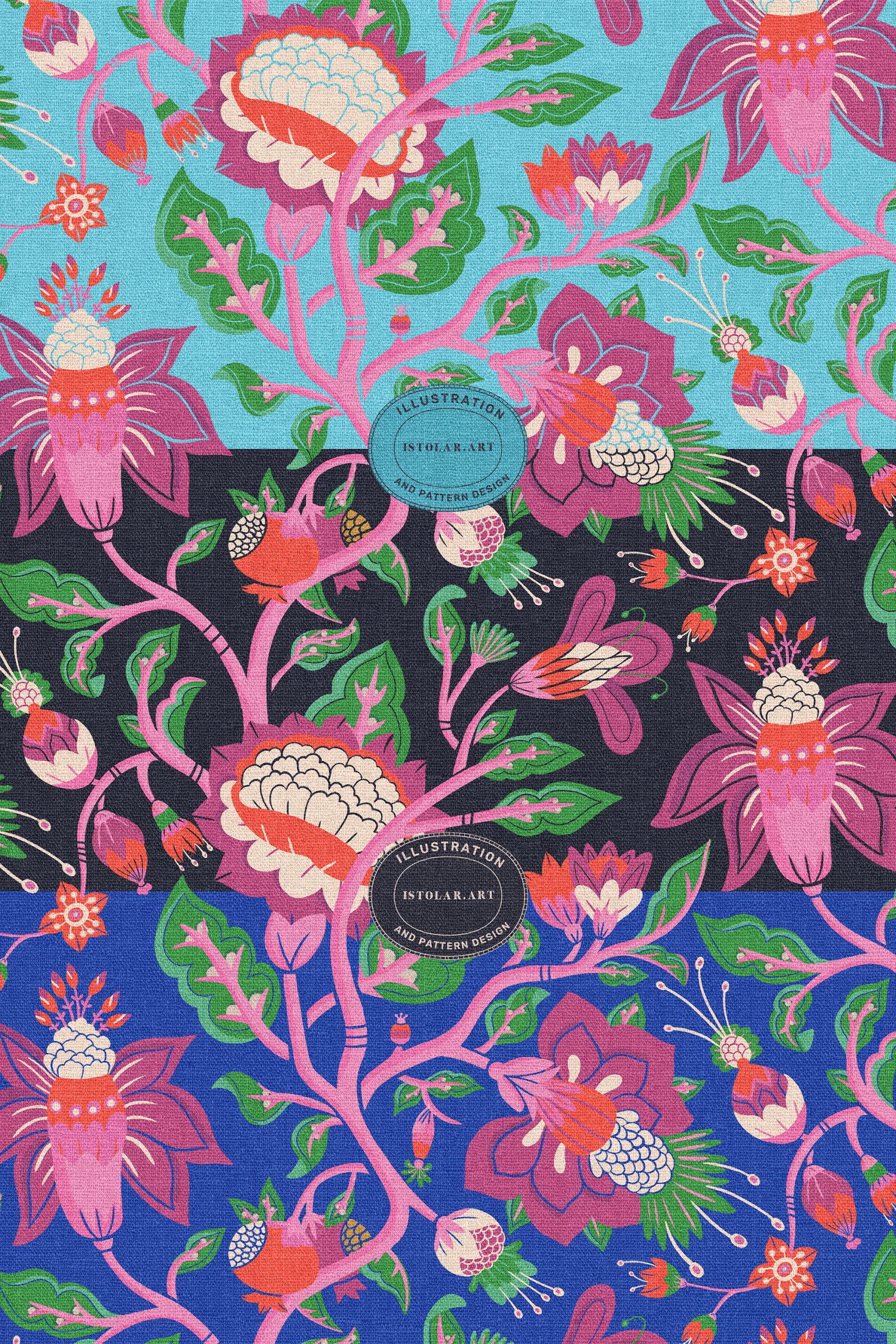
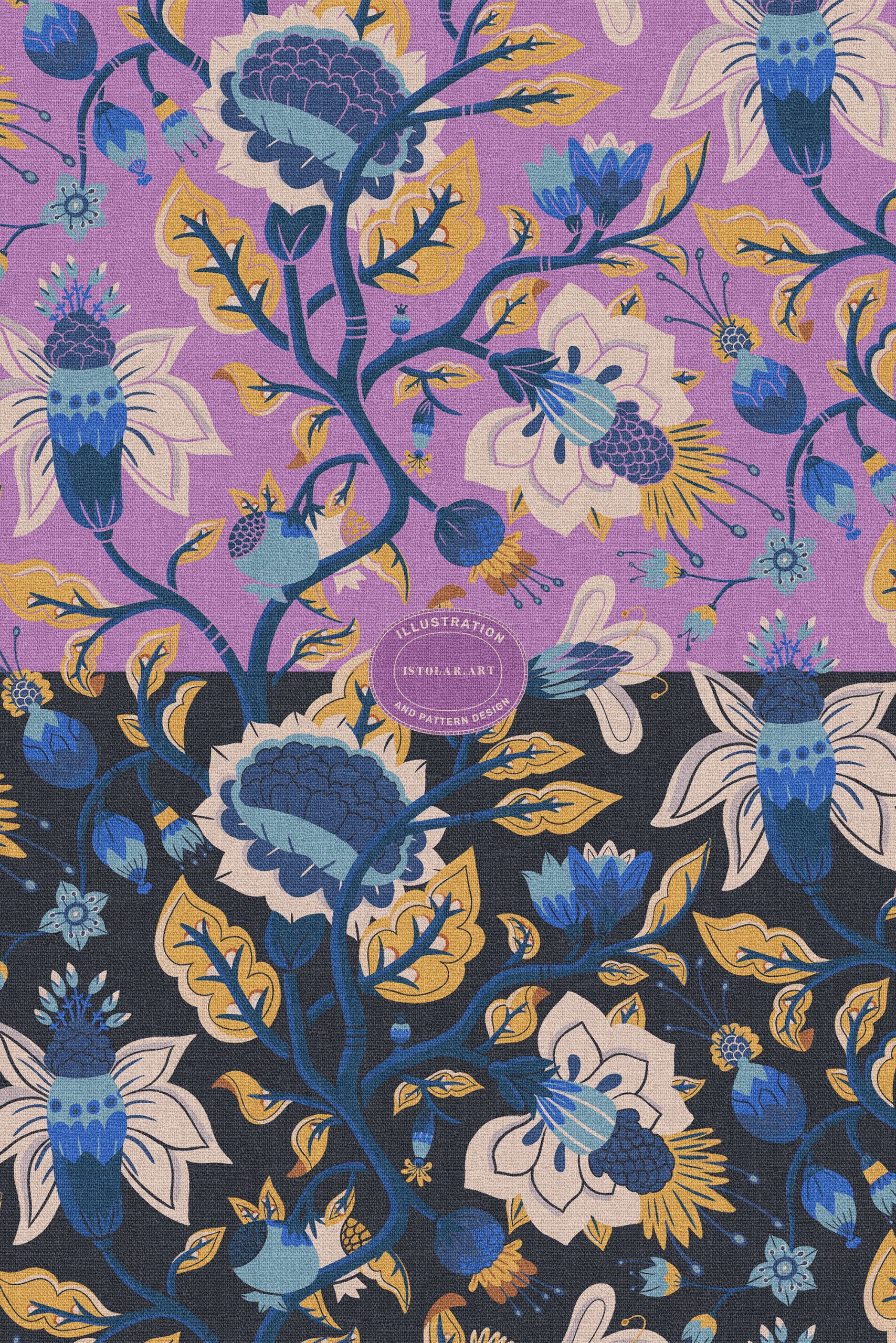
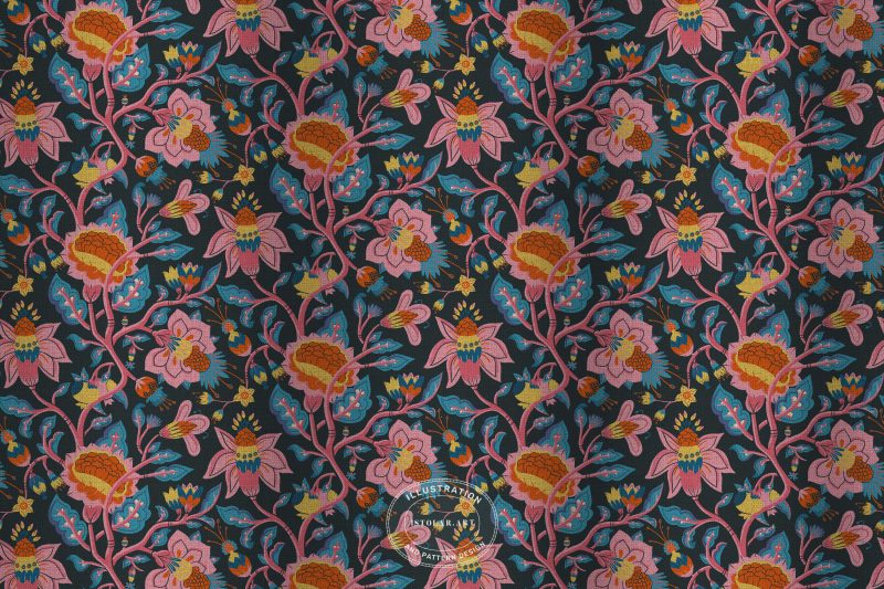
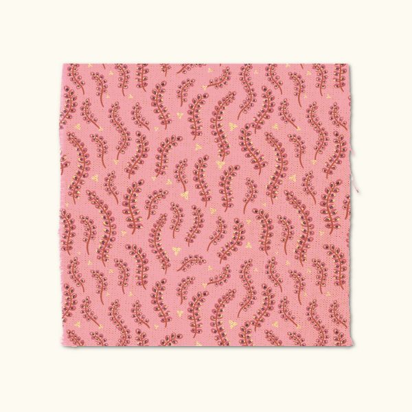
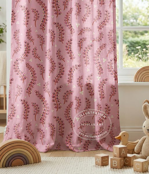
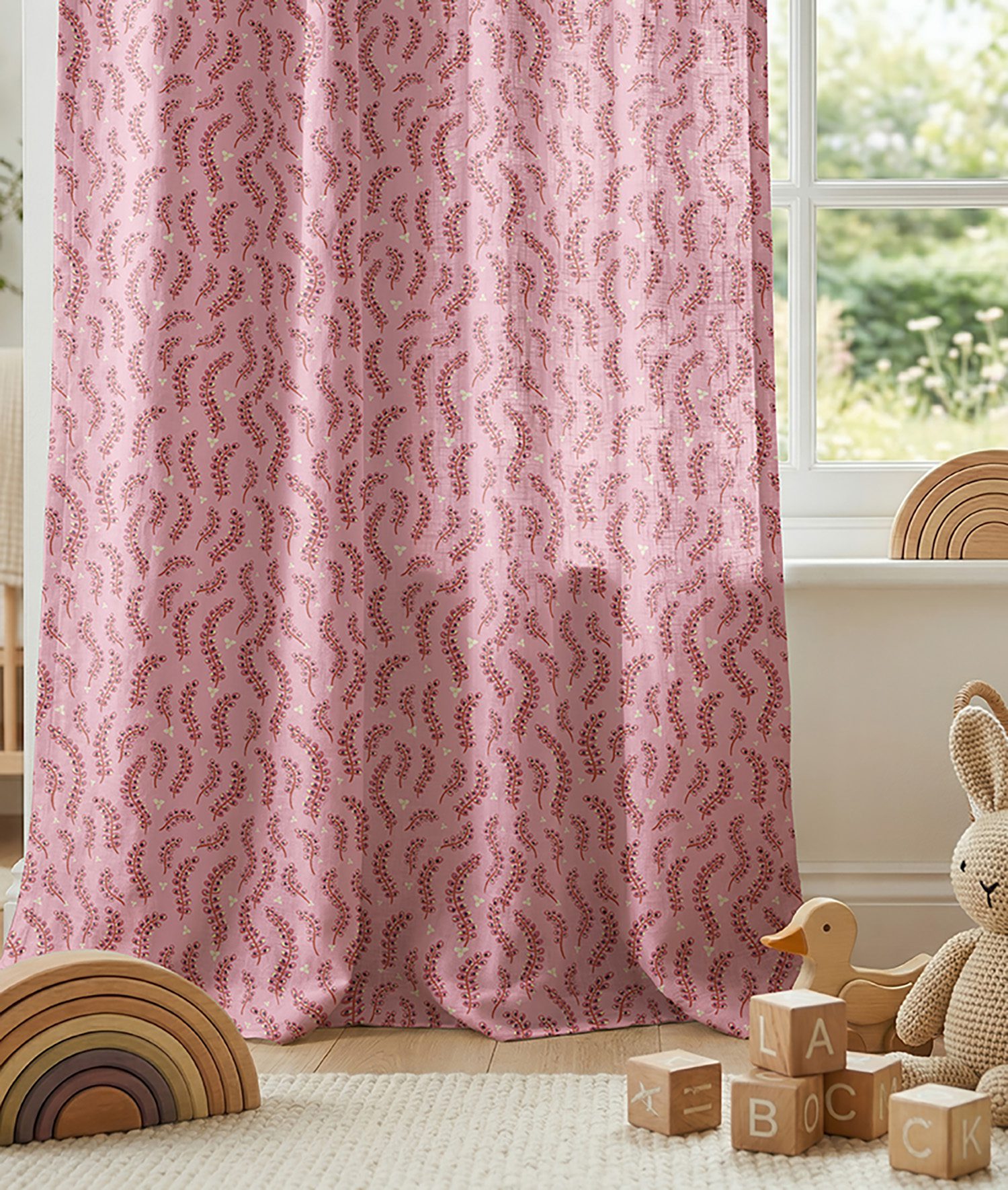
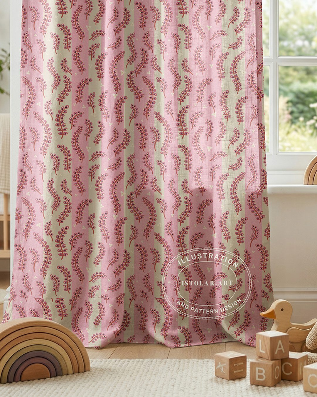
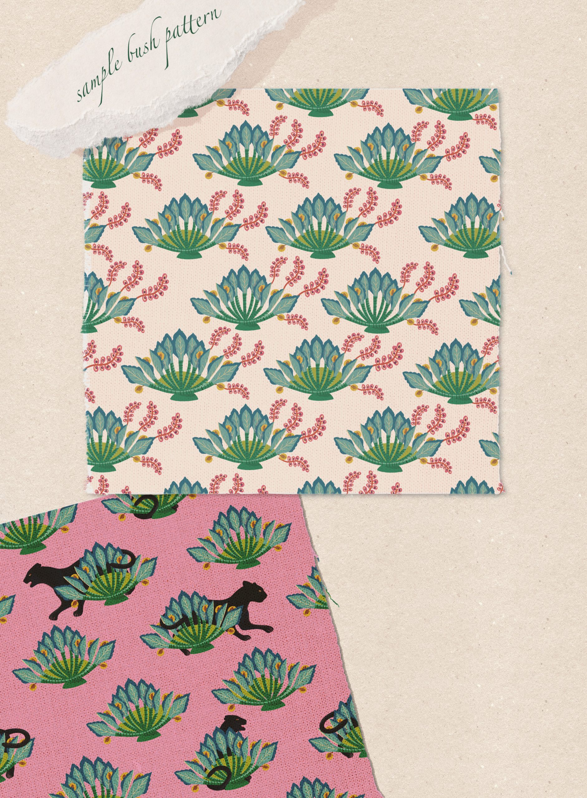
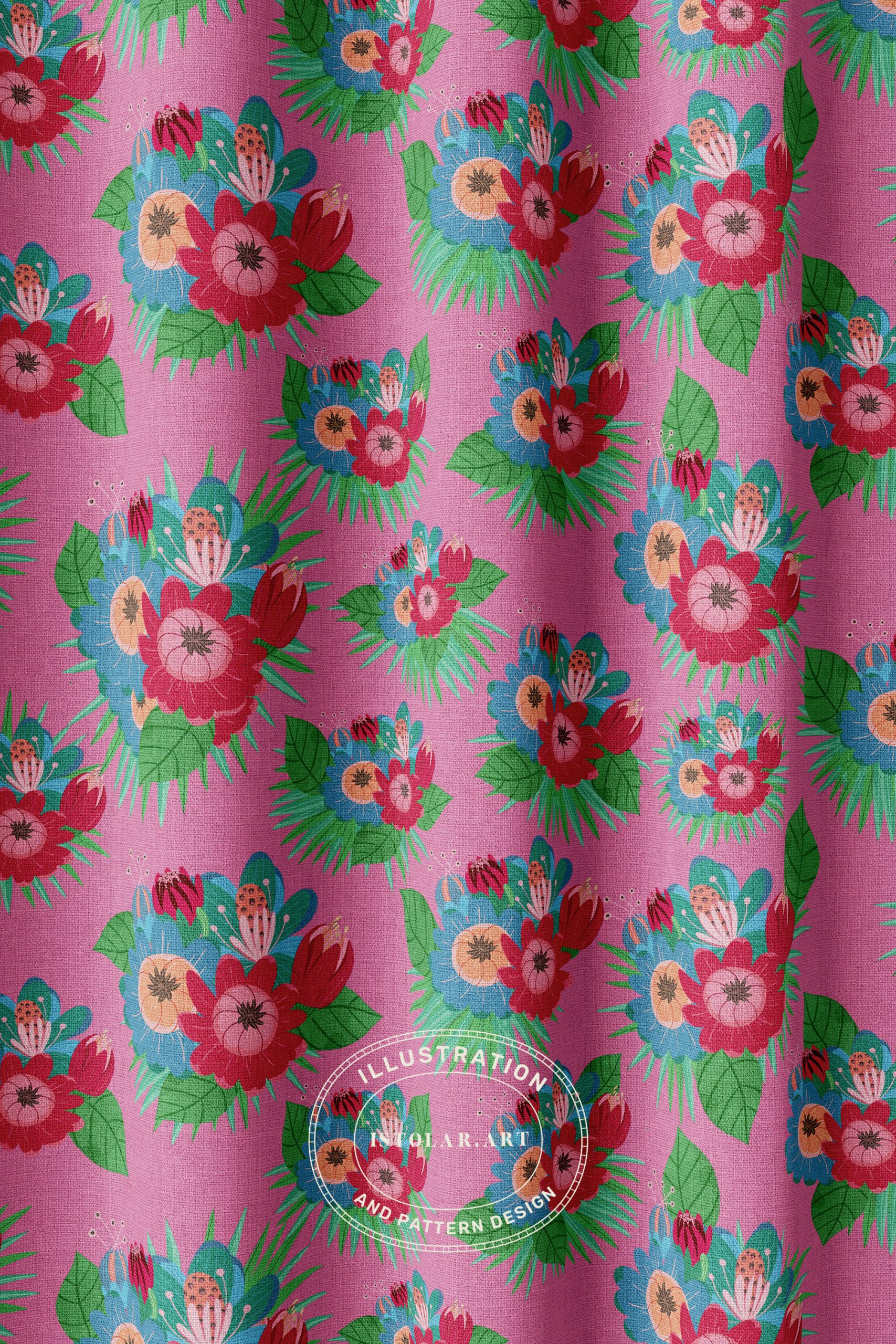
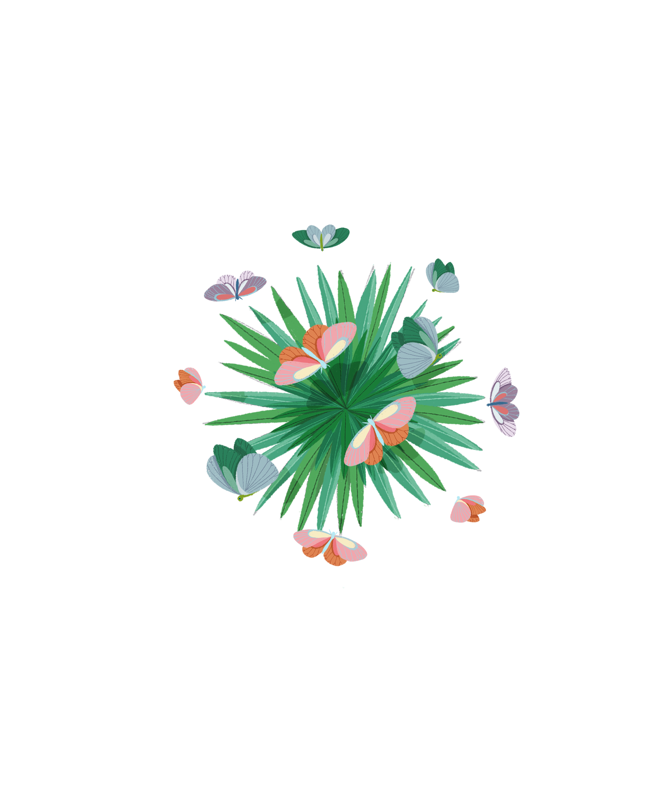
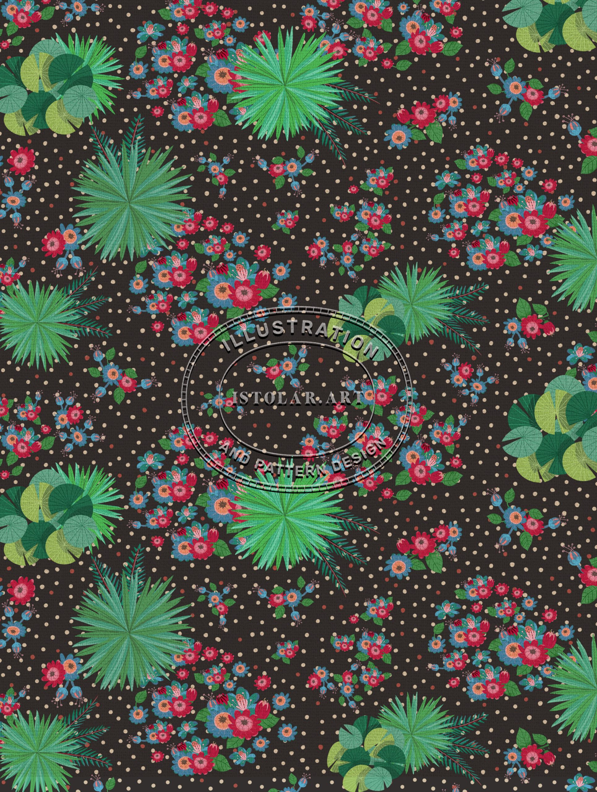
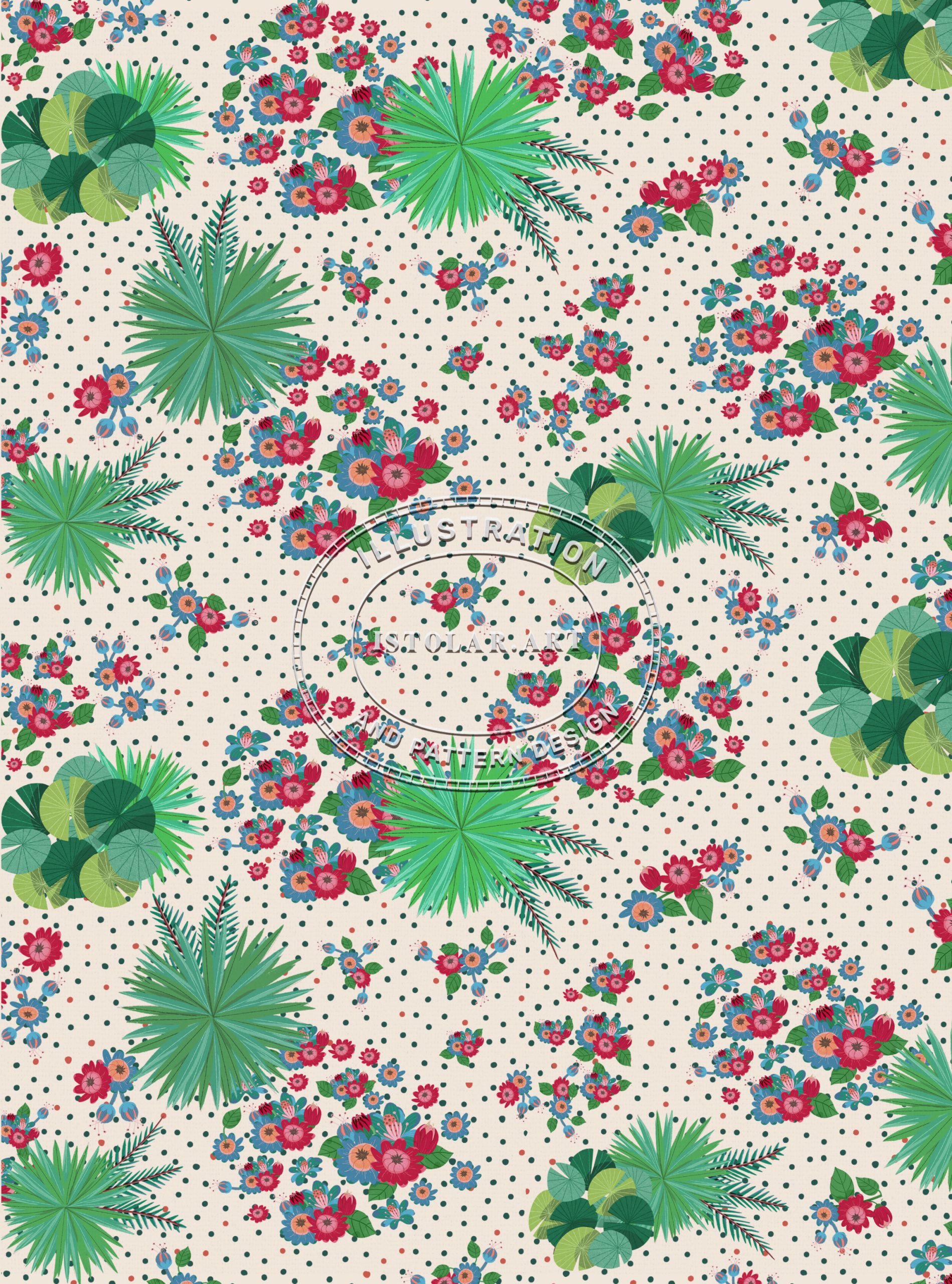
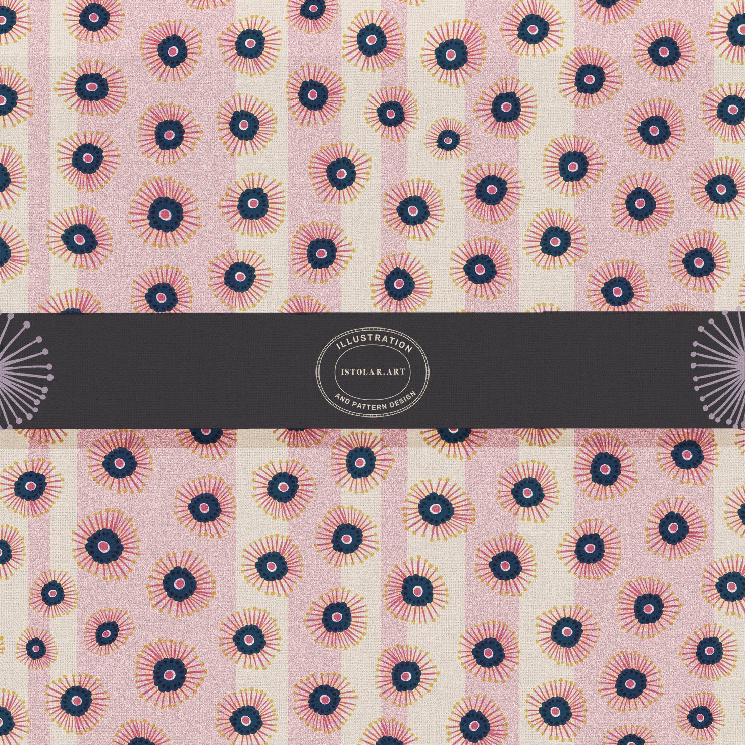
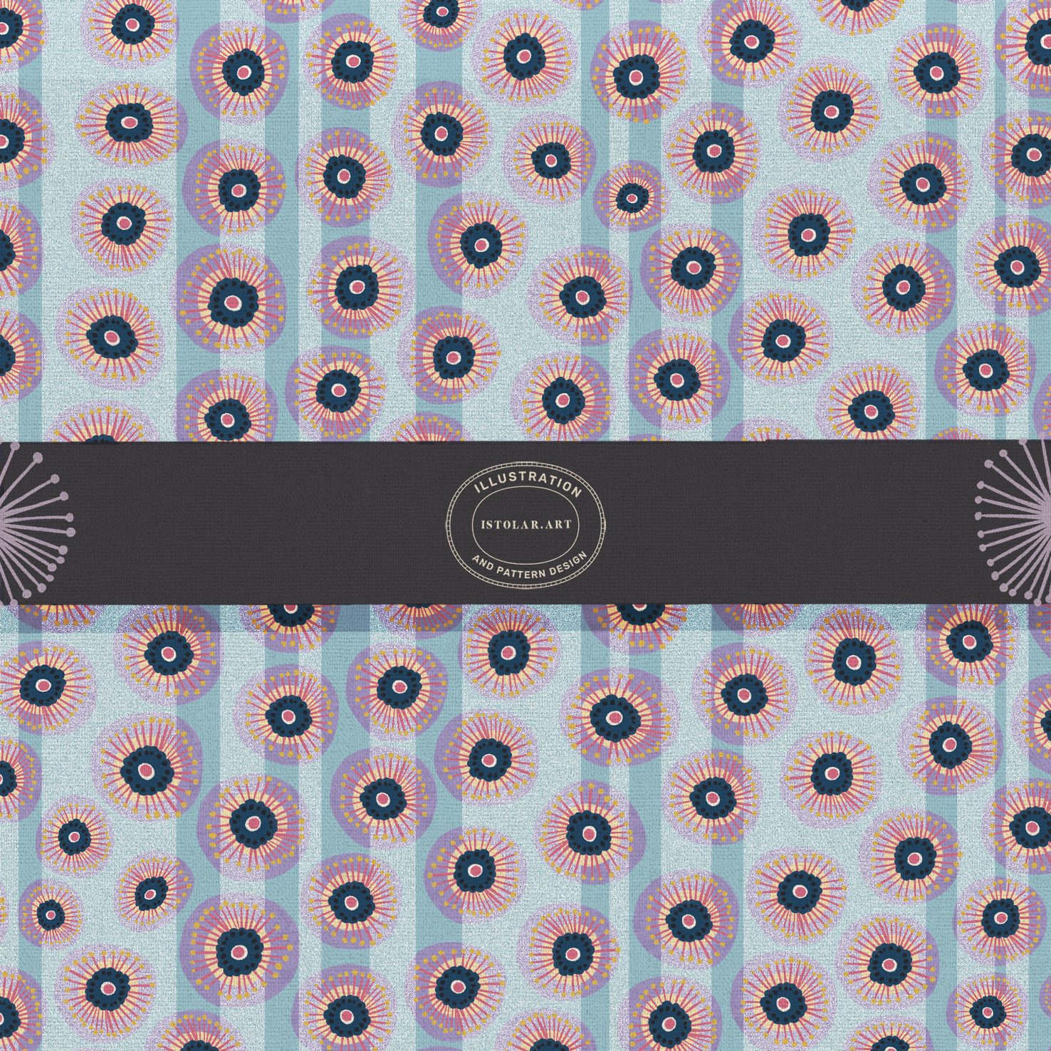
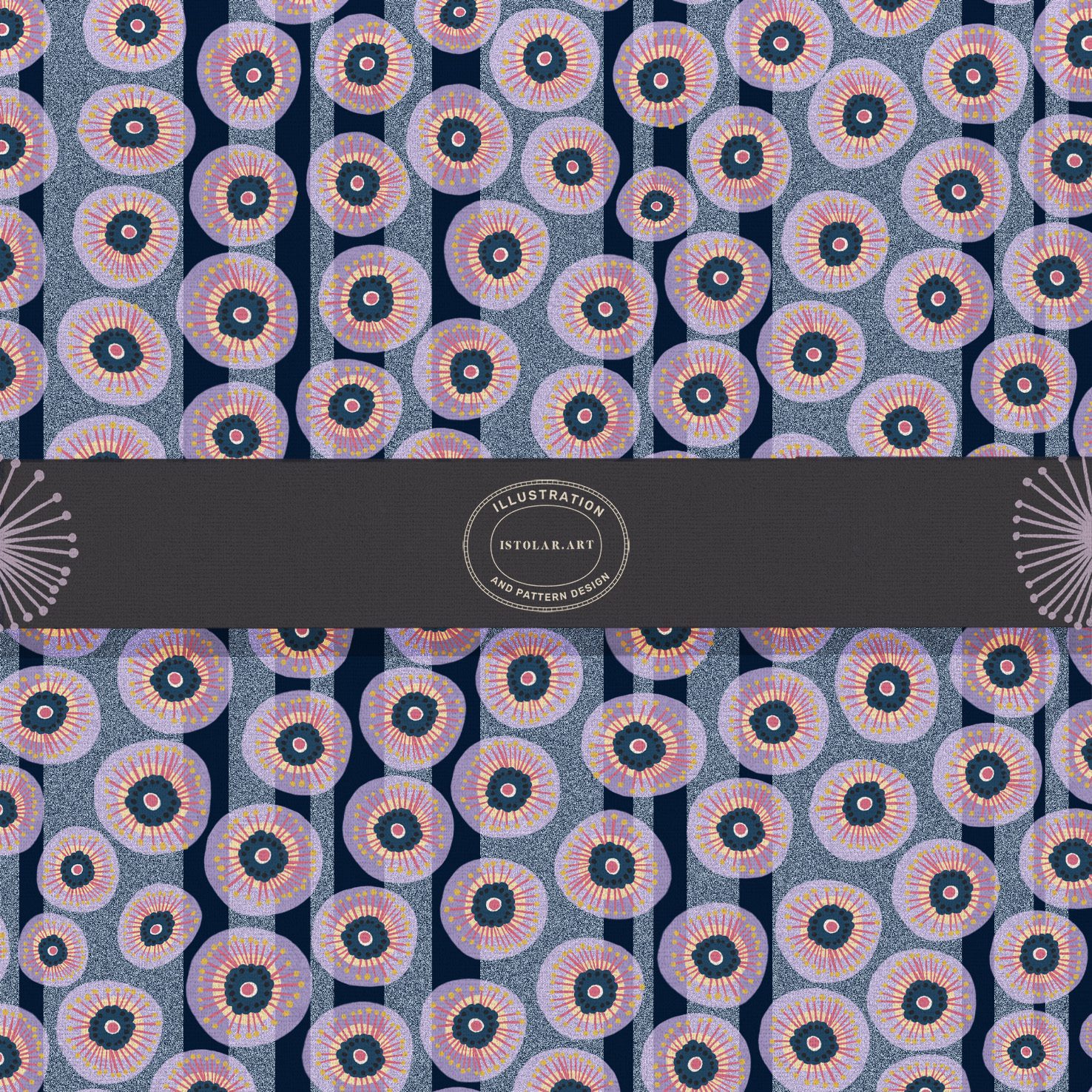
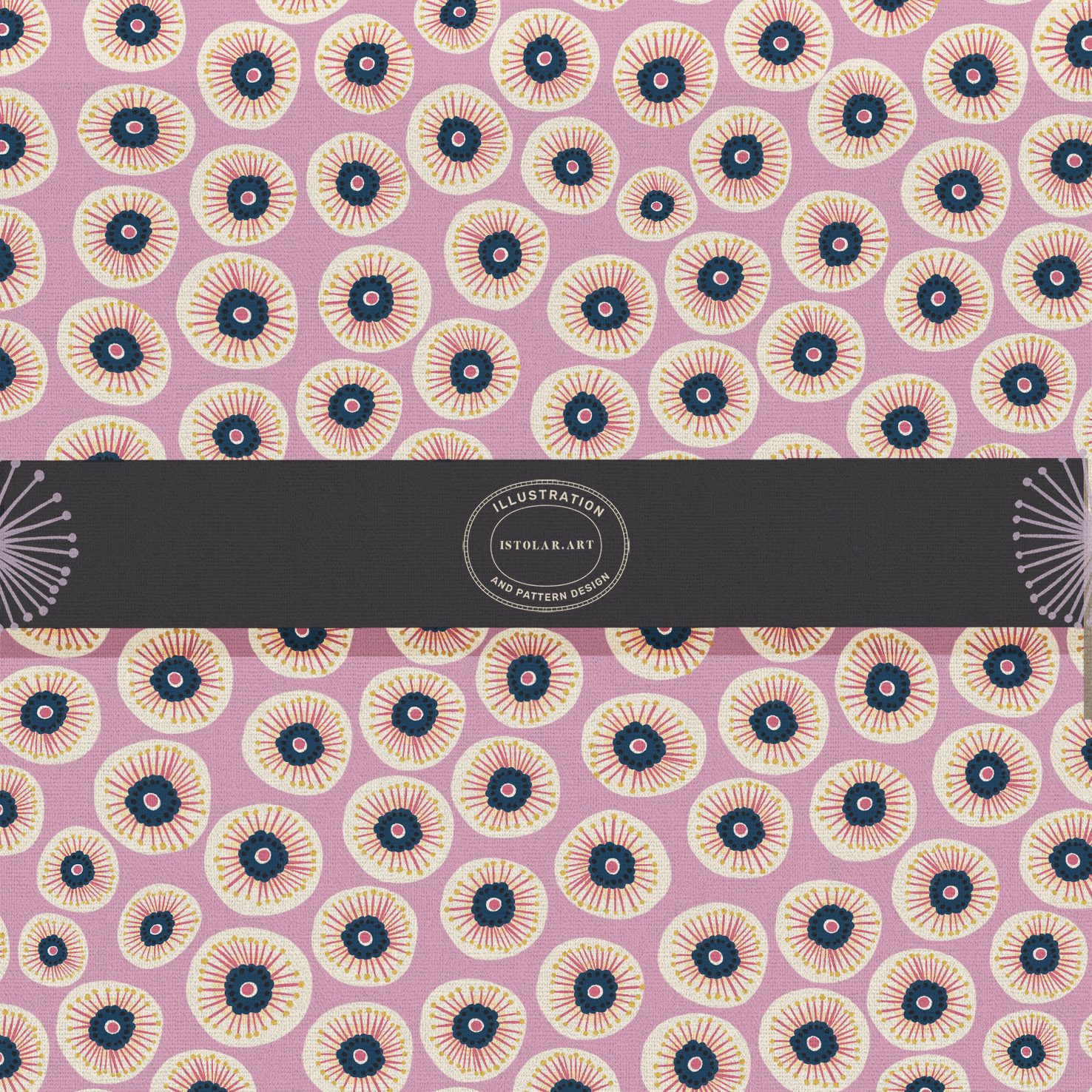
MOTIF FLORAL ” ALL OVER” INSPIRÉ DE STYLE “CHINOISERIES” (version “all over”) A PALETTES MULTIPLES
by istolar.art
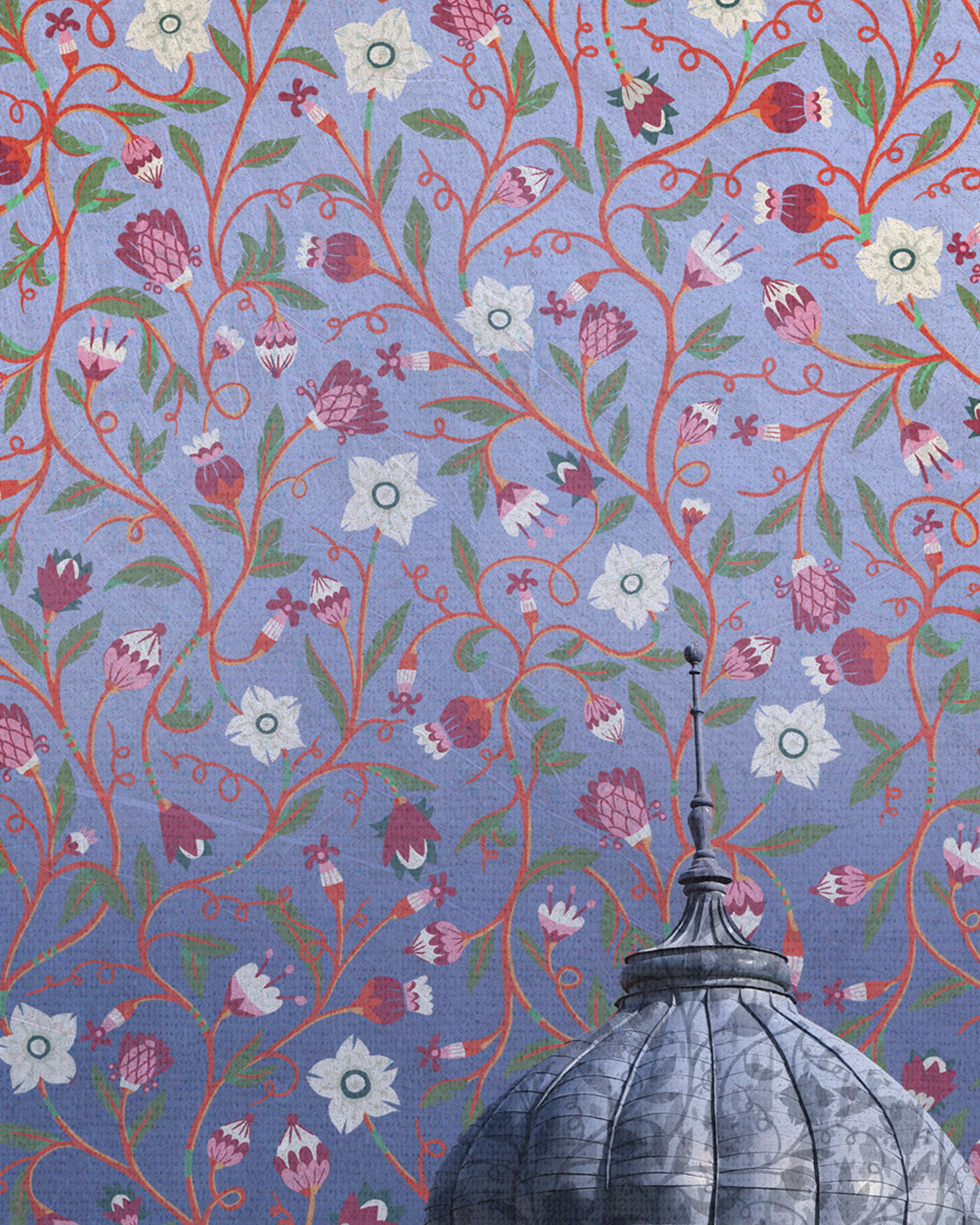
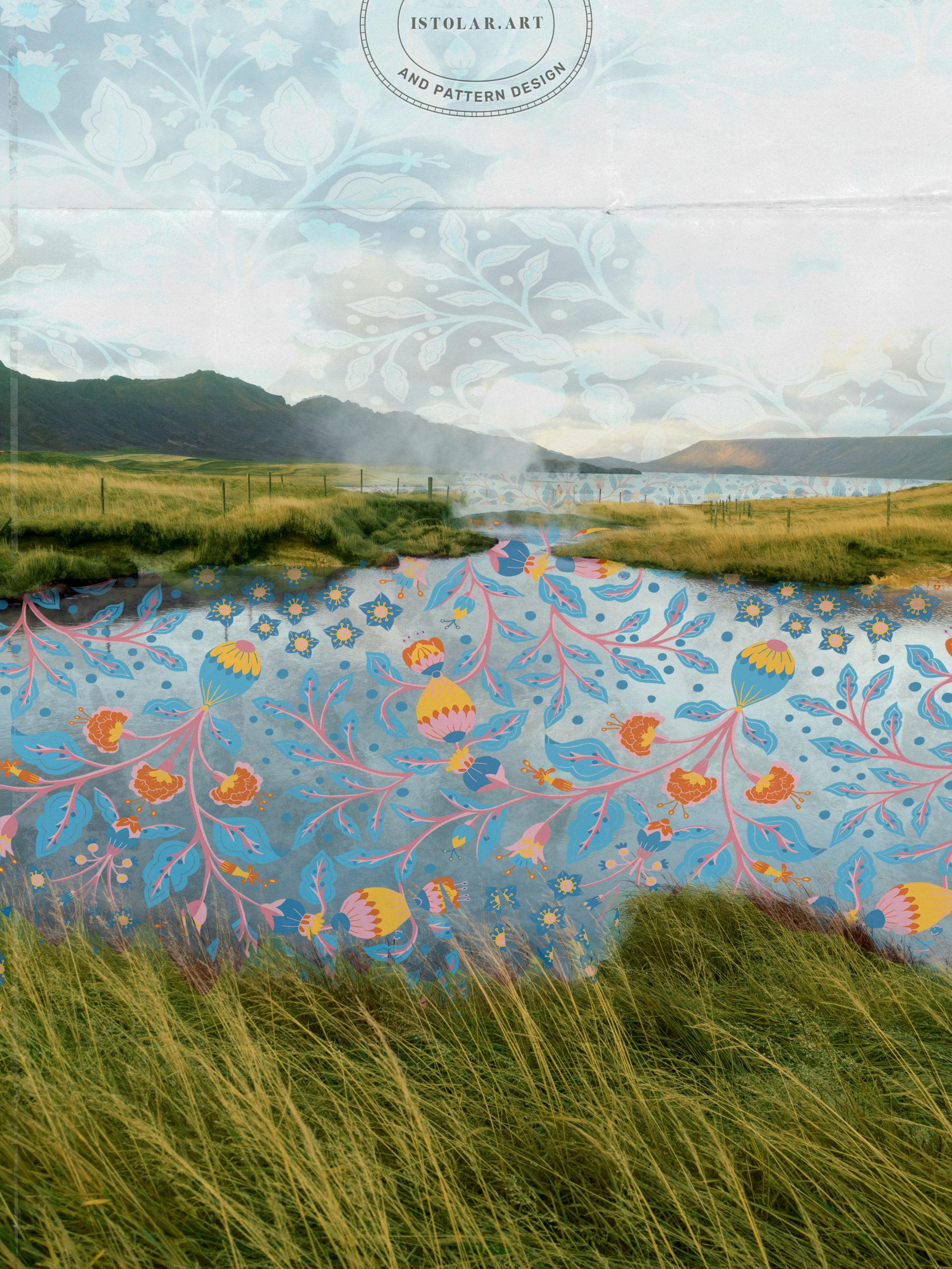
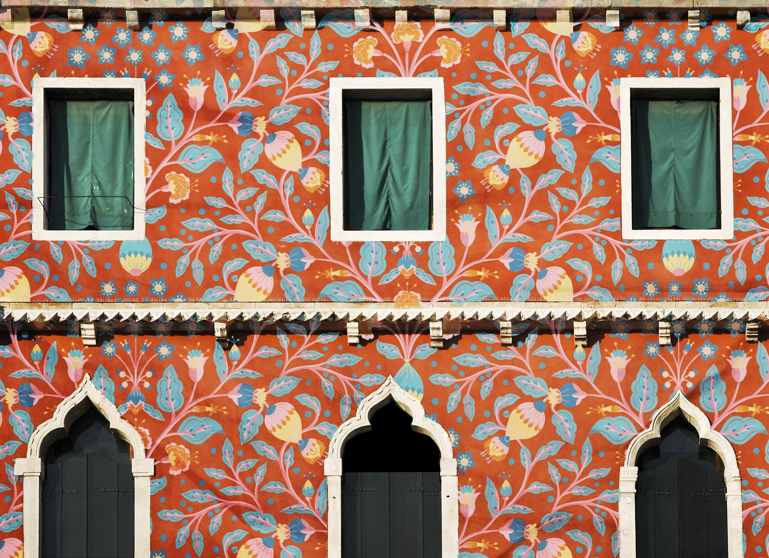
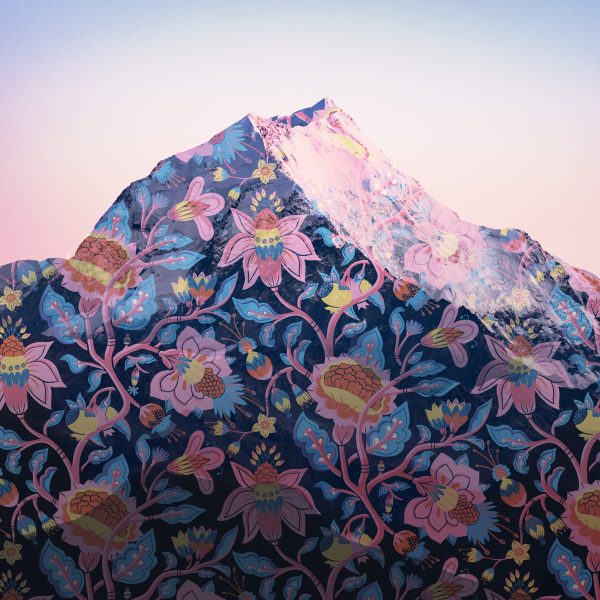
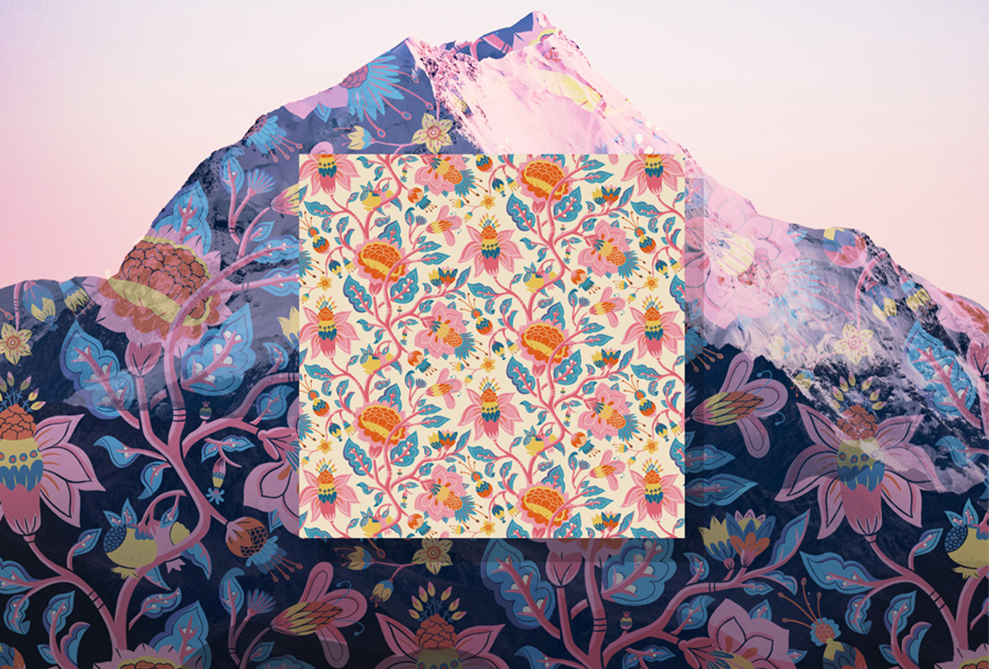
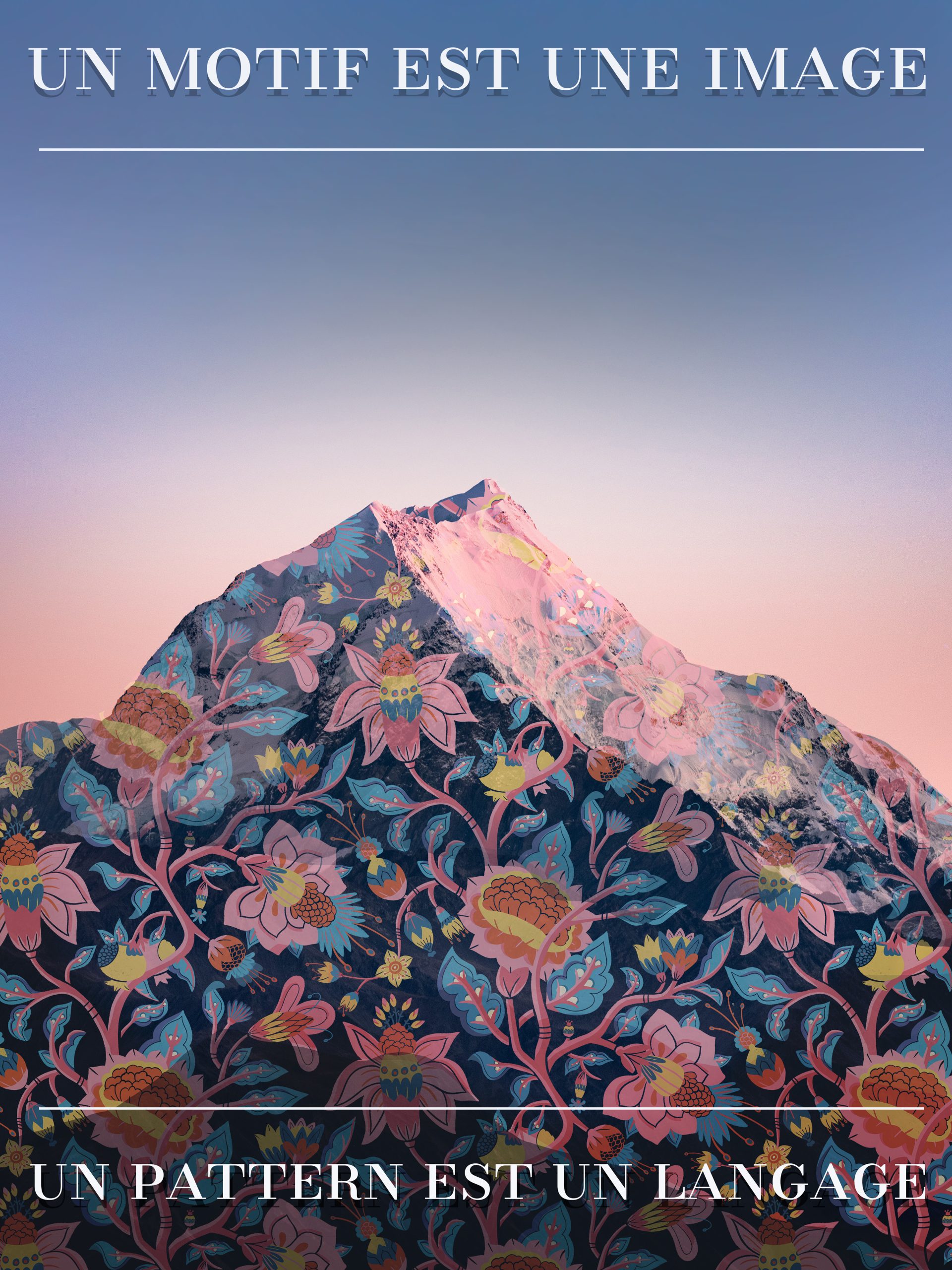
FR: Depuis quelque temps j’aime bien, en tour de piste final, lorsque un pattern est abouti, l’appliquer sur une image le texturer un peu et en un cliché voir ce qu’il peut raconter d’insolite. C’est la magie des motifs répétés qui vont de la tapisserie à ces ròles “cameo” dans une image/illustration 🙂
ENG: For a little while now, I’ve enjoyed making one final detour once a pattern is finished: applying it to an image, adding a little texture, and seeing, in a single shot, what unexpected story it might tell. That’s the magic of repeat pattern, how they can move from tapestry to these little “cameo” appearances within an image or illustration. 🙂
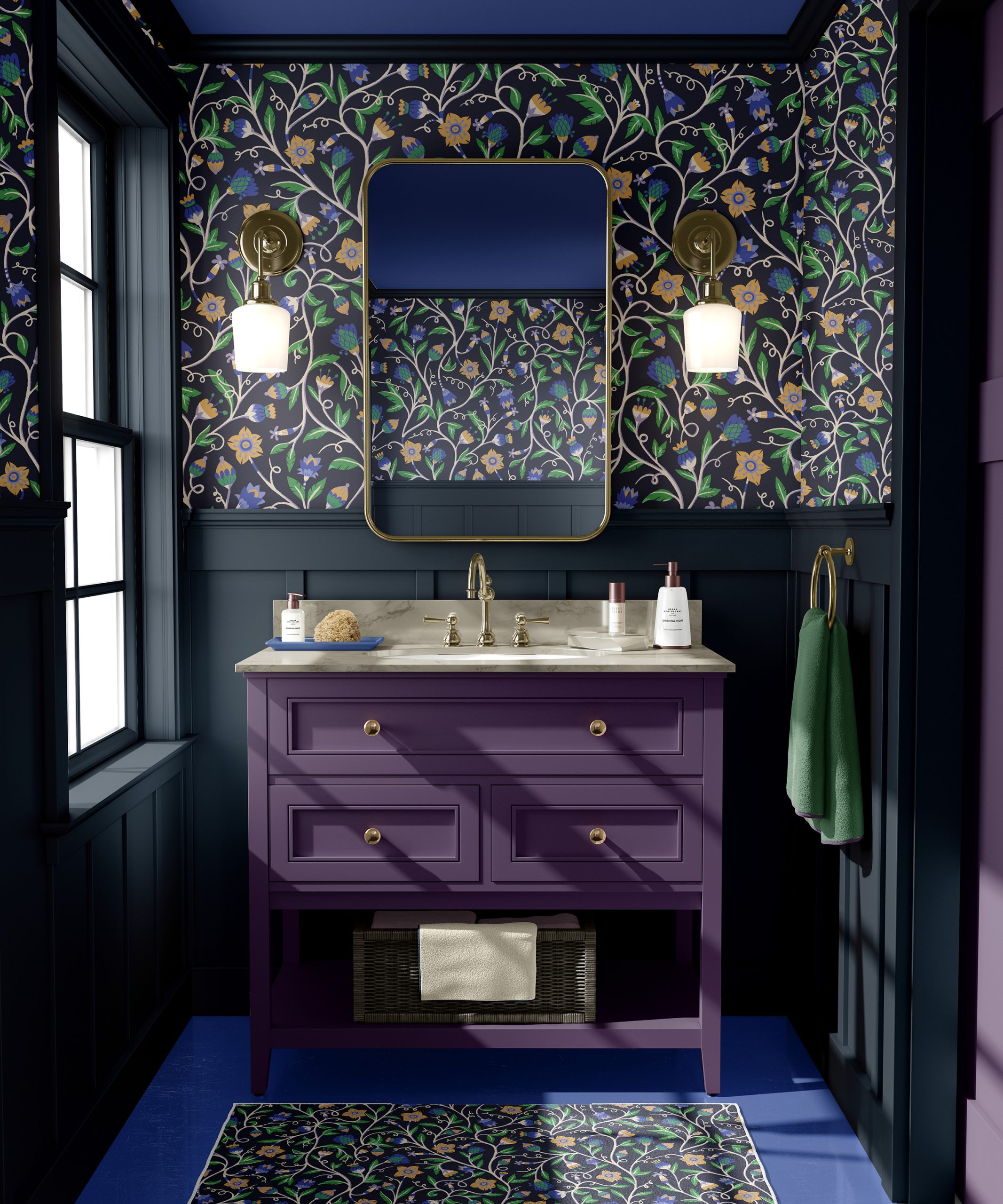
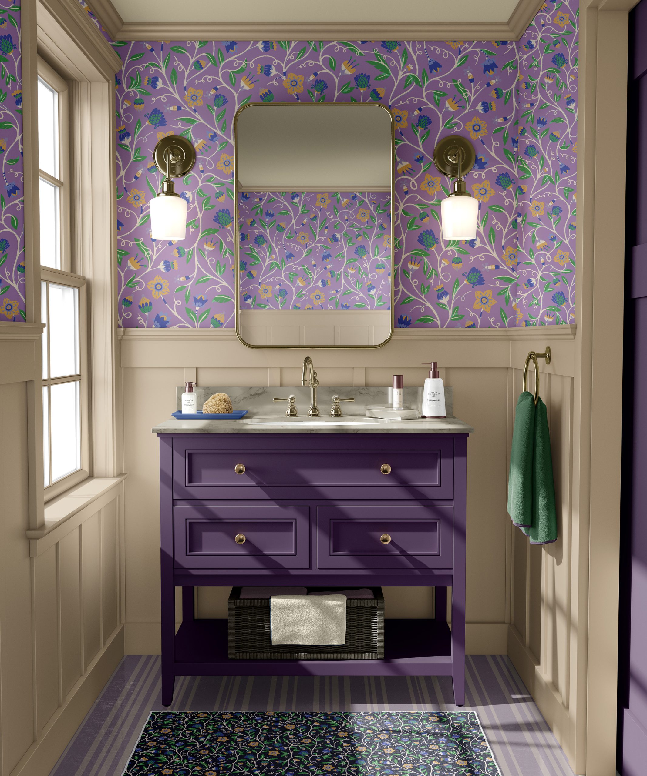
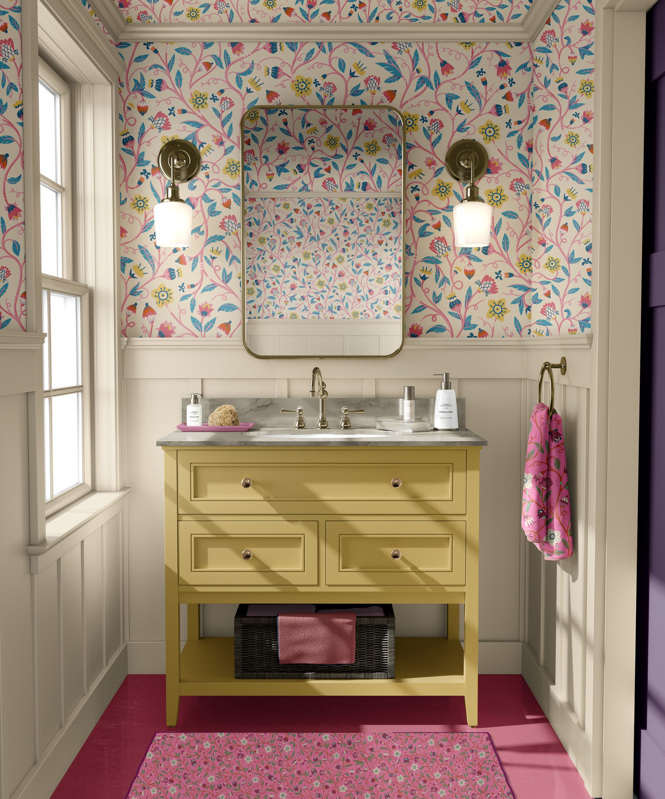
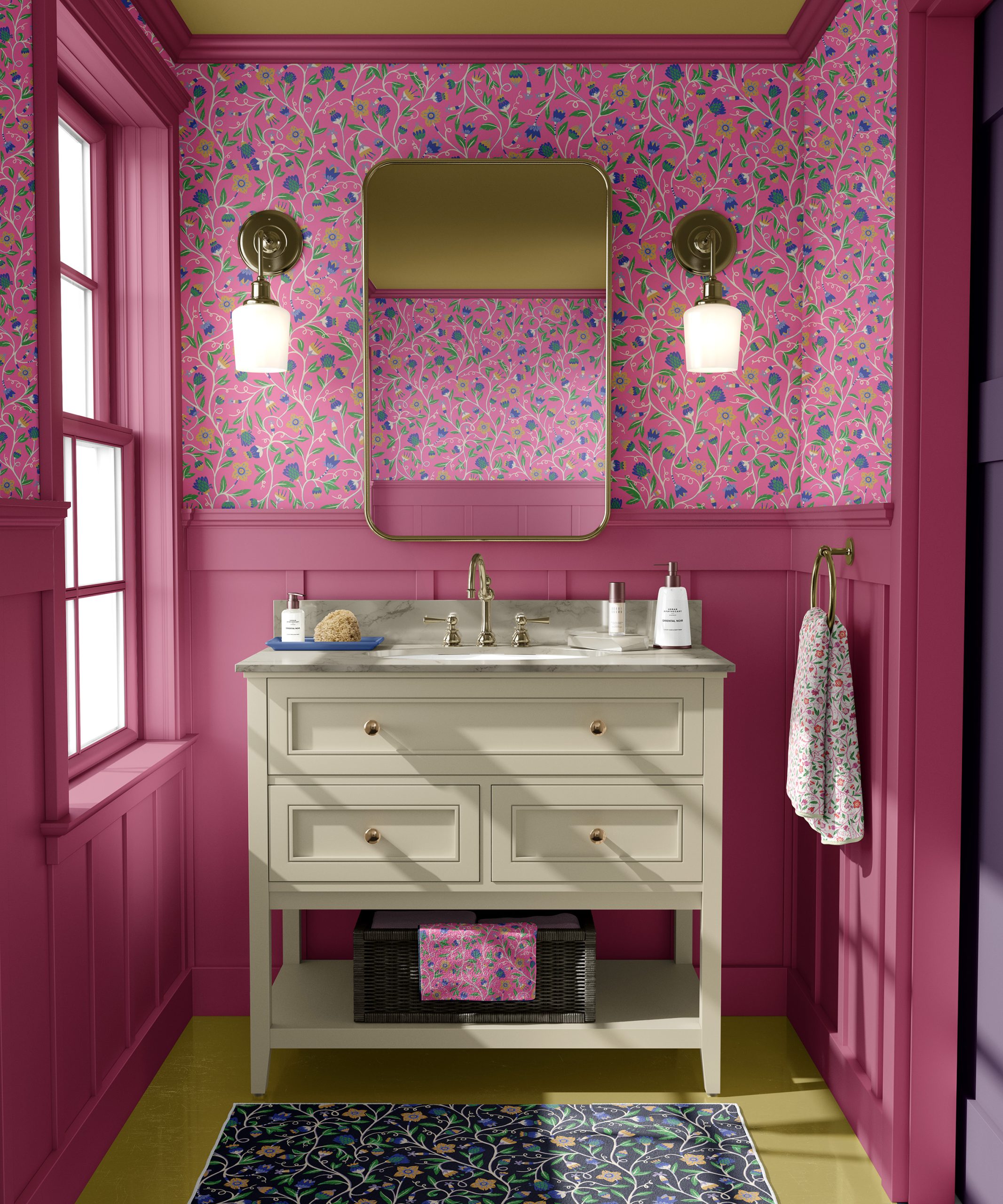
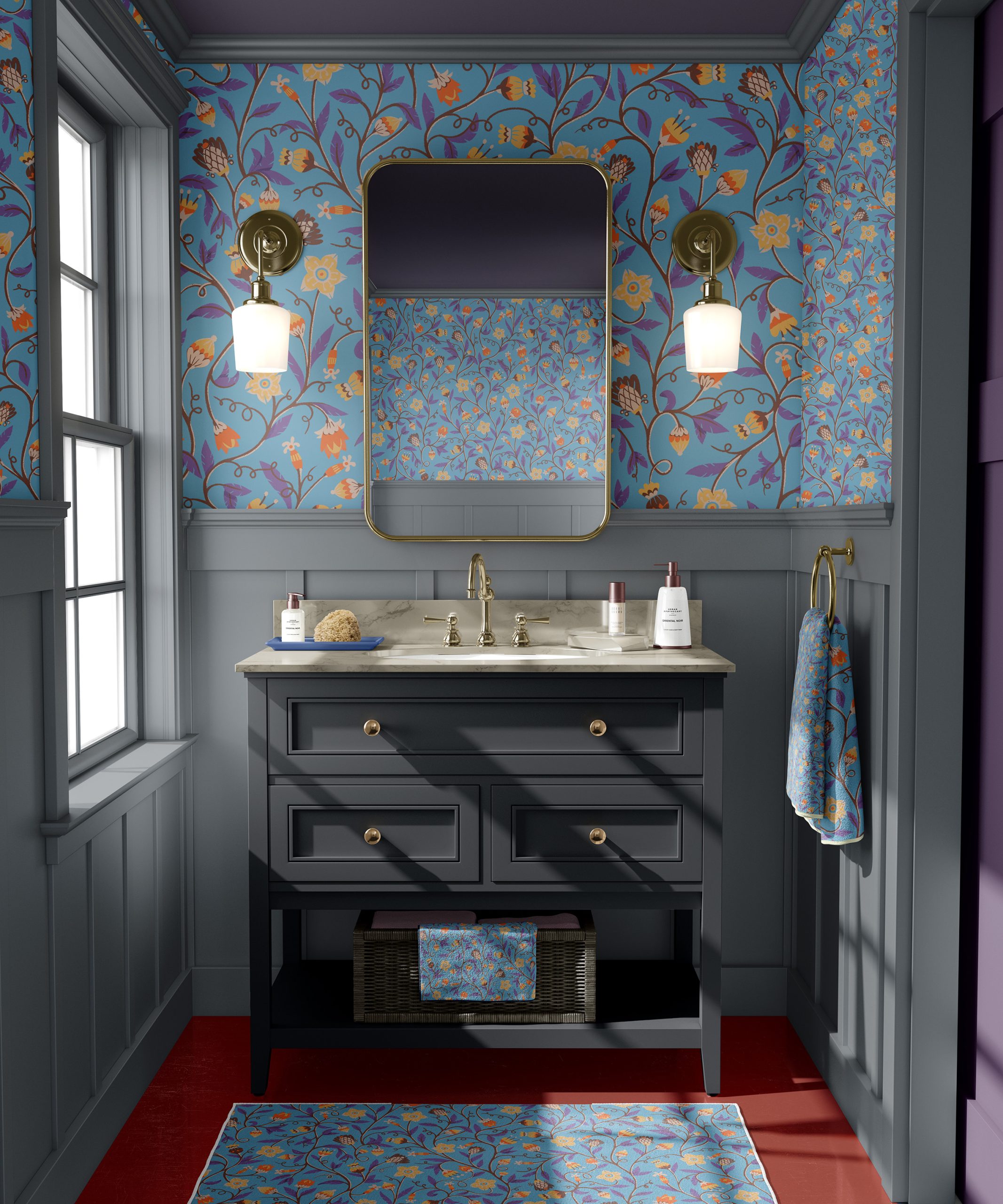
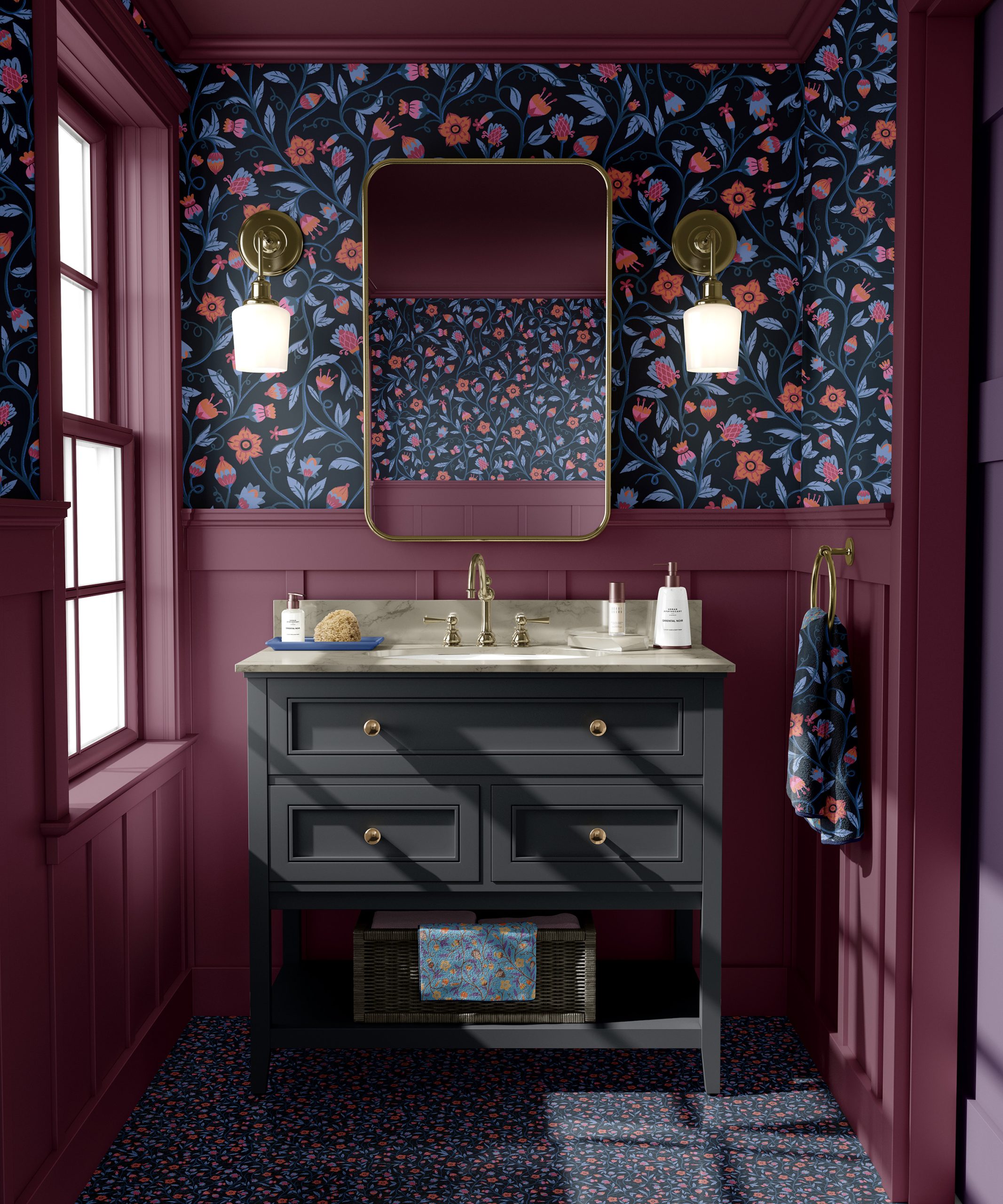
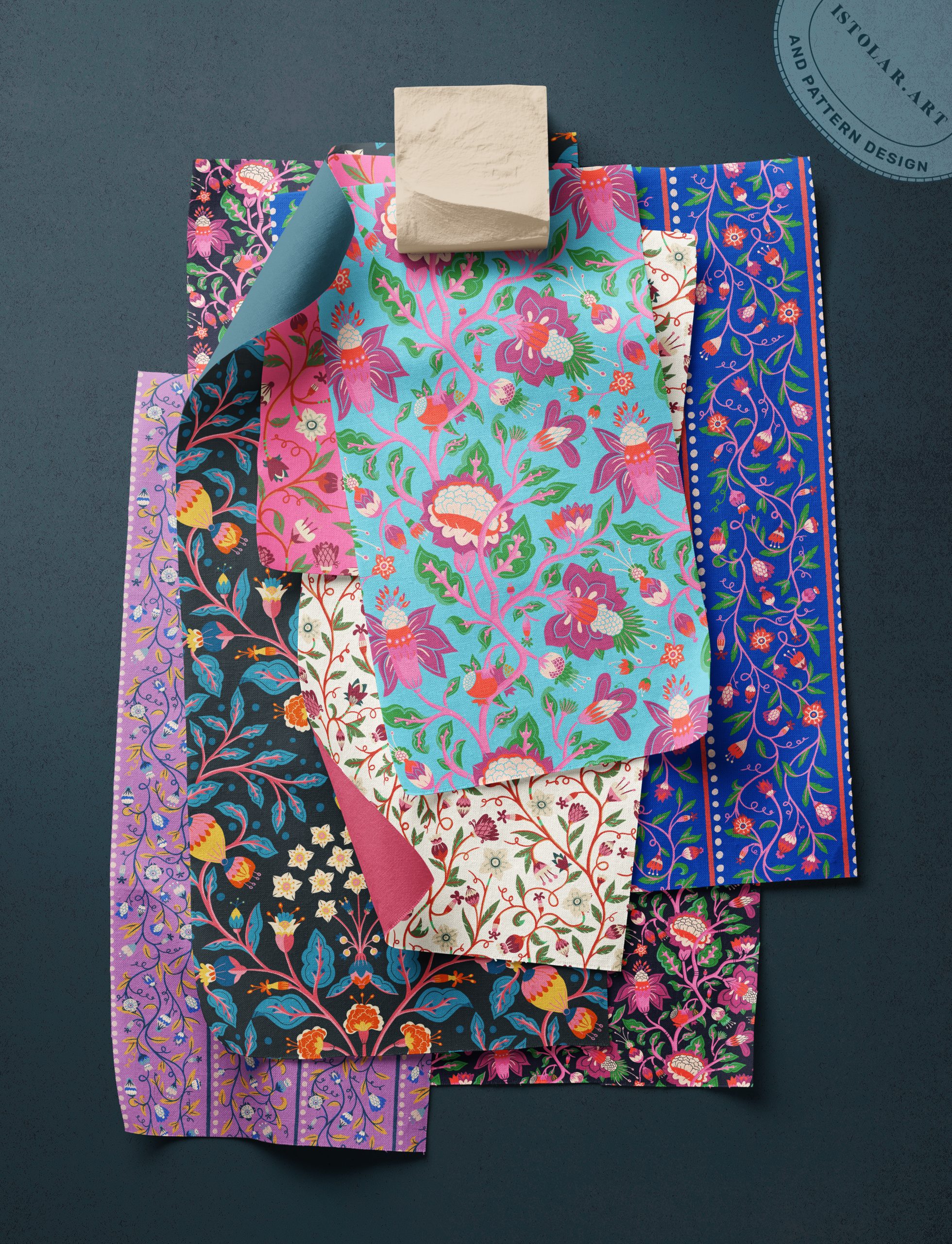
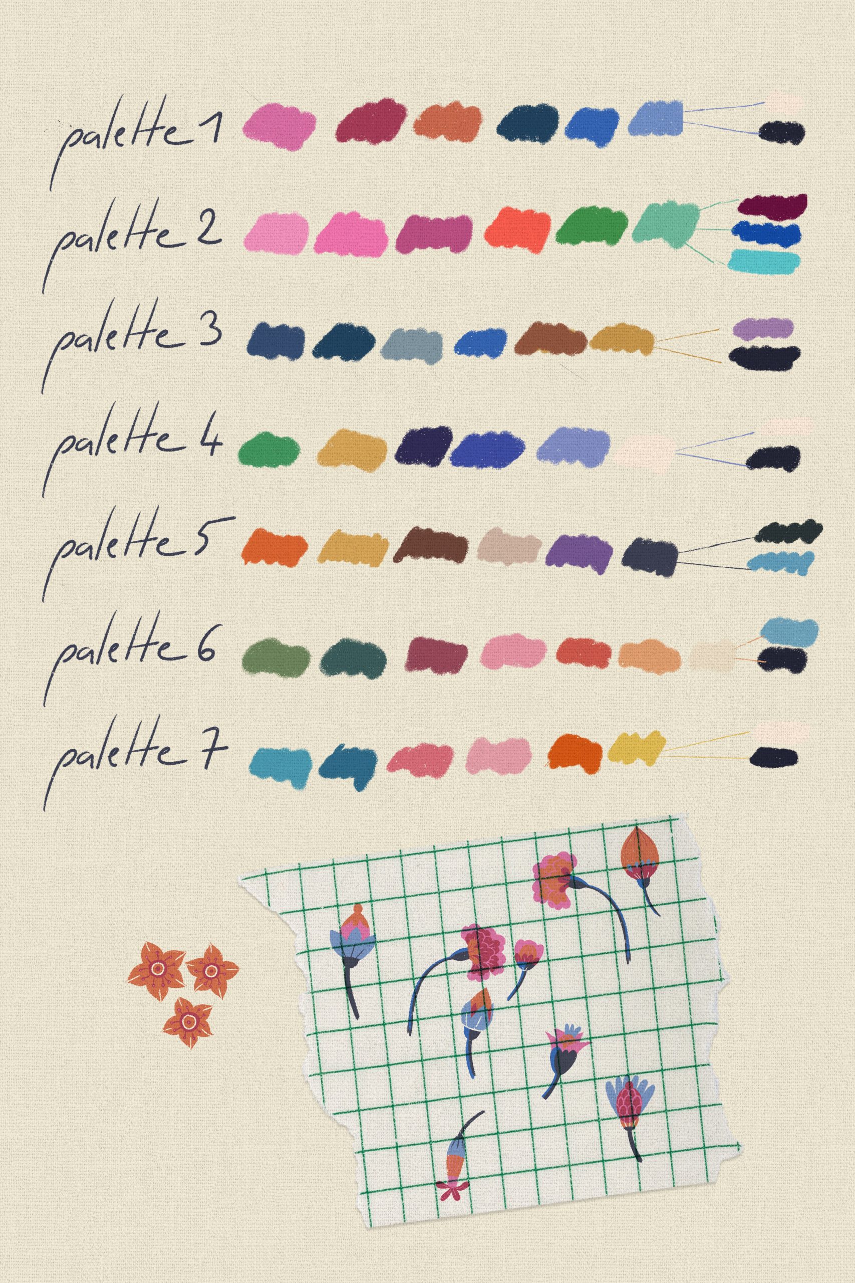
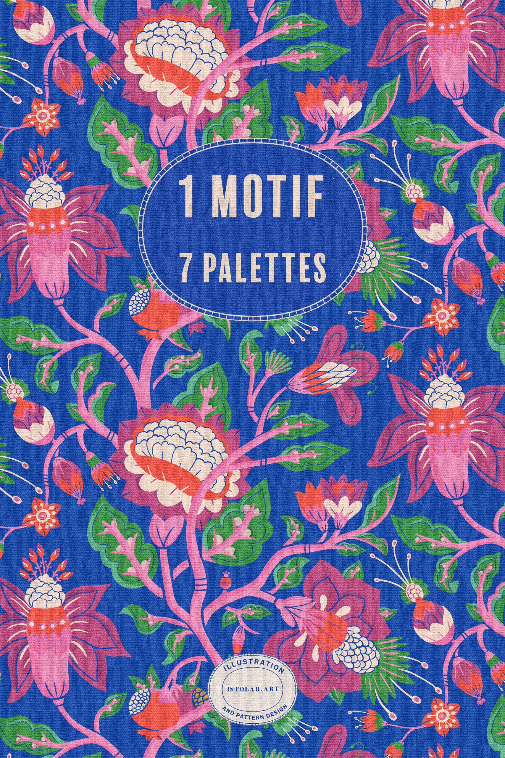
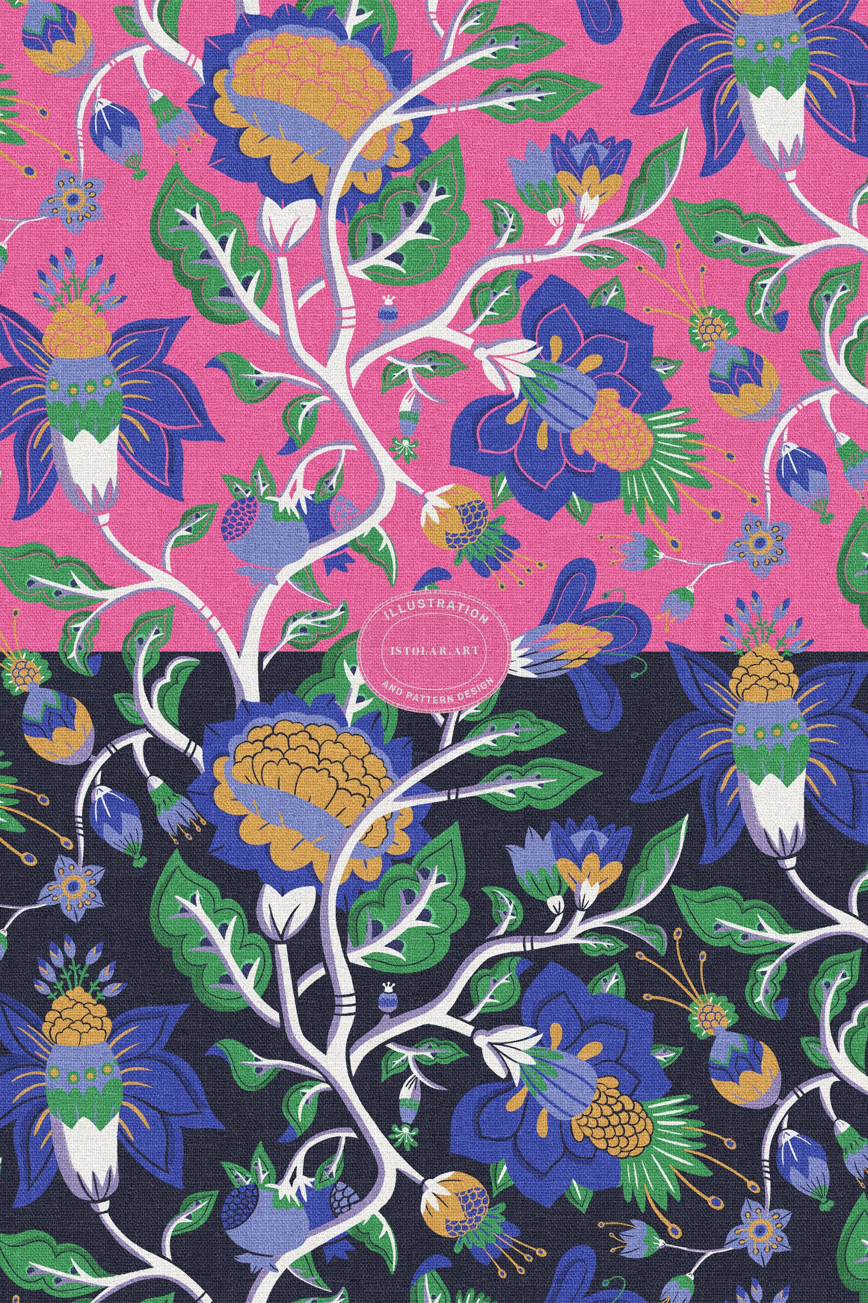
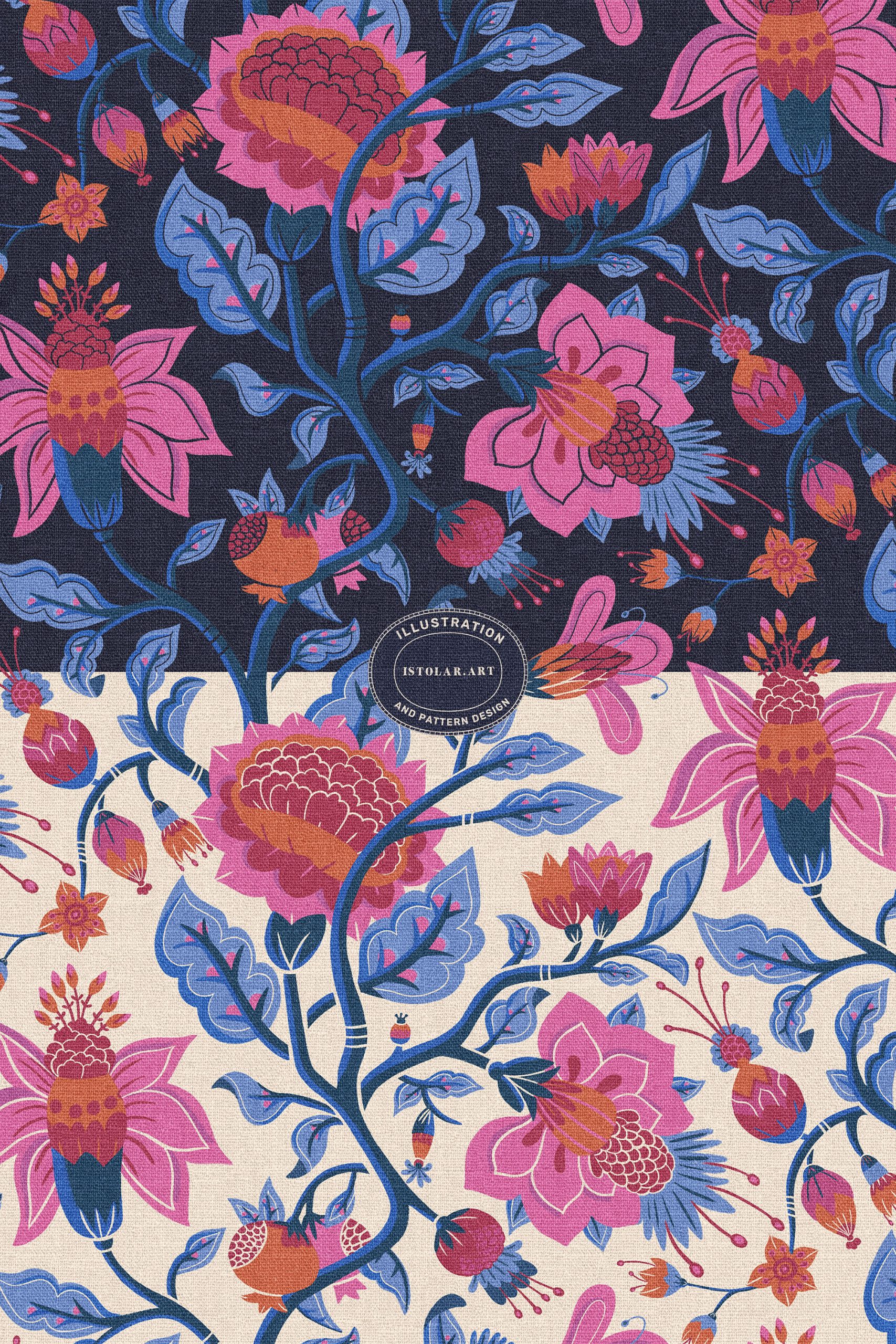
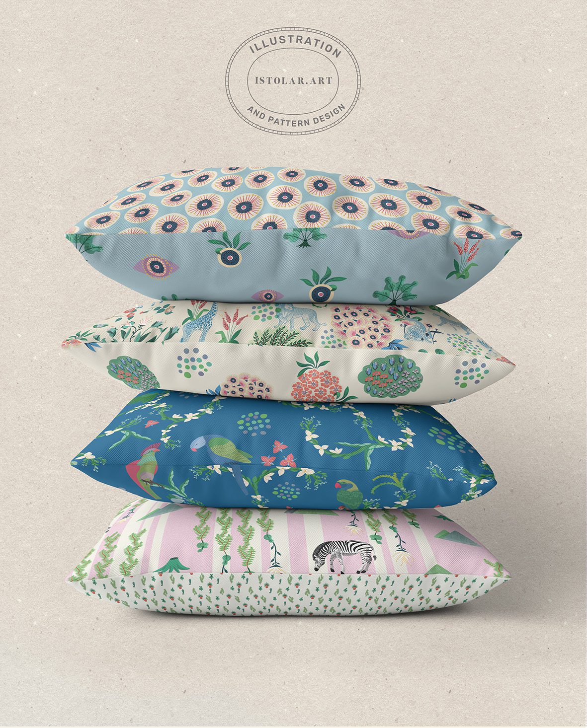
HERE ARE 7 PALETTES APPLIED TO ONE MOTIF
FR: La plupart de mes motifs sont entièrement éditables, chaque couleur étant placée sur son propre calque. Une fois le motif terminé, je trouve assez fascinant d’explorer différentes combinaisons de couleurs: elles peuvent donner au même dessin une amplitude de caractères qui permettent de les imaginer sur diverses surfaces, dans des univers et des atmosphères très différents.
Techniquement parlant, choisir quelle couleur associer à quel calque peut être un processus assez long voire laborieux, mais c’est aussi une étape importante pour découvrir tout ce que le motif peut devenir.
ENG: Most of my patterns are fully editable, with each colour placed on its own layer. Once the pattern is finished, I find it quite fascinating to explore different colour combinations: they can give the same design a whole range of different characters, making it possible to imagine it on various surfaces, in very different settings and atmospheres.
Technically speaking, choosing which colour to assign to each layer can be quite a long, sometimes even laborious process. But it’s also an important part of discovering all the different things the pattern can become.
FR: Ceux qui ont des passe-temps qui impliquent parfois des jeux de couleurs savent à quel point c’est fun… et parfois laborieux aussi… de faire varier les palettes. C’est souvent très time-consuming: tel pétale disparaît sur un autre, telle couleur mange tout le reste, tel contraste vient soudain casser l’atmosphère… Ahhhhh ! Et puis, soudain, ça tient. Tout trouve sa place. C’est un petit moment de paix intérieure. ^_^
ENG: Those of you who have hobbies that involve playing with colour will know how much fun it can be… (somehowlaborious too…) to keep changing and tweaking palettes. It can be very time-consuming, one petal disappears into another, one colour suddenly takes over everything, one contrast somehow ruins the whole atmosphere… Ahhhhh! And then, suddenly, it works. Everything falls into place. A little moment of inner peace. ^_^
Imagine le motif sur papier peint dans une salle de bain ! de charme anglais
Imagine the motif as a wall paper in a bathroom with a touch of english charm !
Bientôt sur spoonflower, sur tissus et papier pain
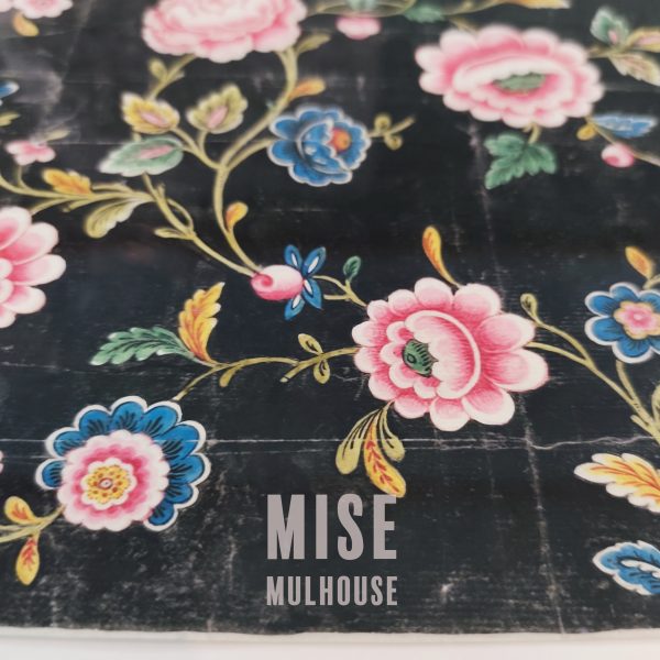
FR: Un peu sur un coup de tête, j ai demandé a ma fille de m’accompagner jusqu a Mulhouse depuis l Ardéche. La France est grande. Ce trajet en train fut long mais le musee est unique.
Le MISE mène actuellement un vaste chantier d’inventaire, de numérisation et de sauvegarde de ses collections, à la suite de la découverte de vols massifs dans ses réserves
Et quand on dit vol massif ( révélé en 2018) c est MASSIF! ! Un seul gars a dilapidé des trésors pour son compte perso pendant 20 ans. Crazy! .. je vais retrouver l’histoire et là rajouter ci dessous :
Donc, de fait si le musée reste très intéressant… quelque chose me dit qu’ il est un peu l’ombre de lui même pour le moment… Sauf pour ces magnifiques plaques… Pure poésie! Vous lisez bien!!! on parle de la disparition d’environ 400 carrés Hermès et de 3 000 livres d’échantillons textiles dérobés de l’intérieur par un système de pillage organisé.Petit bug de la conservation du patrimoine.WoW!
Quand il y a une ampoule dans l histoire on se méfie ou pas? (voir l’article)
”Le directeur du musée, Eric Bellargent, dépose plainte début avril 2018 mais deux semaines plus tard, alors qu’il change une ampoule au Mise, il tombe d’une échelle et se tue. Un accident, conclura l’enquête… Fin avril, son délégué à la conservation, Jean-François Keller, est interpellé et reconnaît le vol des vases ainsi que ceux d’une centaine de carrés Hermès. Mis en examen pour vols et escroquerie, il est incarcéré quelques mois, puis libéré sous contrôle judiciaire”
ANGL: On a spur of the moment decision. I asked my daughter to accompany me from the Ardèche all the way to Mulhouse. France is a big country. The train journey was long, but the museum is truly unique
Actually, even though I really loved the museum, the collection of fabric samples that can be seen in the Taschen bookThe Book of Printed Fabrics is not actually on display in the museum, the inventory is pending. The MISE is currently undertaking a major project to inventory, digitize, and preserve its collections, following the discovery of massive thefts from its storage facilities.
So, although the museum is still very interesting, something tells me that, for the moment, it is somewhat of a shadow of its former self… Except for these magnificent printing blocks. Pure poetry!
I learmed about the massive theft, I mean MASSIVE!! (It was uncovered in 2018.) One single guy systematically plundered and sold off treasures for his own personal gain for YEARS. Crazy! isn’t it? … and yes, you read that correctly!!! We’re talking about the disappearance of around 400 Hermès scarves and 3,000 books of textile samples, stolen from inside the museum as part of an organized looting operation. A little glitch in the preservation of our cultural heritage. Wow! At the end of April, the head of conservation, Jean-François Keller, was arrested and admitted to stealing the vases as well as around one hundred Hermès scarves. Charged with theft and fraud, he was imprisoned for several months before being released under judicial supervision.”
“The museum’s director, Eric Bellargent, filed a complaint in early April 2018, but two weeks later, while changing a light bulb at the MISE, he fell from a ladder and died. An accident, the investigation concluded…When there’s a light bulb involved in a story like this, do we get suspicious or not? (see the article)
At the end of April, his head of conservation, Jean-François Keller, was arrested and admitted to stealing the vases as well as around one hundred Hermès scarves. Charged with theft and fraud, he was imprisoned for several months before being released under judicial supervision.”
Du rêve en plaque ^_^
FR: Une culture du motif où le dessin, la couleur, la technique d’impression et la possibilité de réinterprétation sont indissociables.
À l’origine, le musée est presque une « bibliothèque de motifs » L’histoire commence bien avant la création officielle du MISE.
En 1833, les industriels de Mulhouse, réunis au sein de la Société industrielle de Mulhouse (SIM), commencent à conserver leurs propres productions textiles. Mais ils ont une idée beaucoup plus ambitieuse : rassembler également des textiles, dessins et échantillons provenant d’autres régions et d’autres époques.… et ceci pas seulement pour préserver le patrimoine. Leur objectif est très concret : donner aux dessinateurs et aux fabricants une immense source d’inspiration. C’est cette collection qui conduit à la création, en 1857, du Musée du Dessin industriel.
C’est assez extraordinaire quand on y pense : le musée est constitué, dès le départ, comme une sorte de bibliothèque visuelle professionnelle, où un dessinateur peut venir regarder comment les autres ont construit un motif. Il raconte donc à la fois l’histoire de l’industrie, l’histoire des techniques et l’histoire du goût et des motifs.
Puis vient le MISE Après la Seconde Guerre mondiale, les collections sont réorganisées et, en 1955, est créée l’association qui donne naissance au Musée de l’Impression sur Étoffes tel qu’on le connaît aujourd’hui. Le musée obtient ensuite l’appellation « Musée de France ».
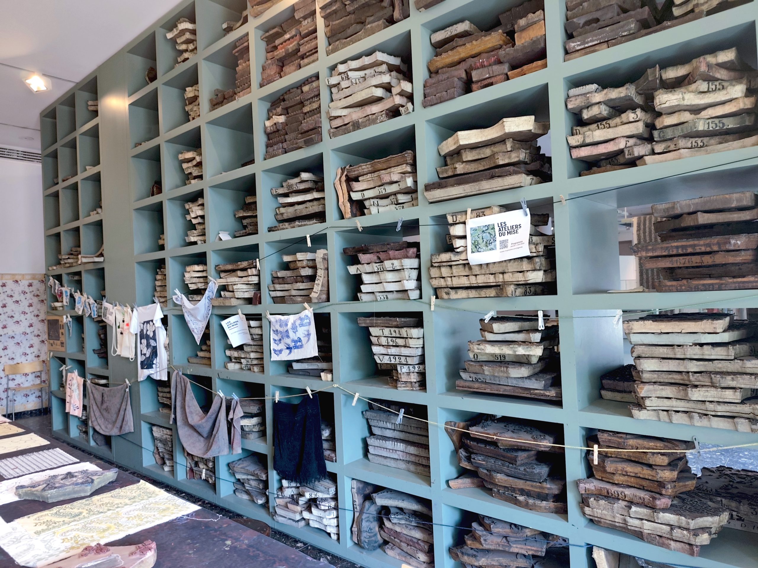
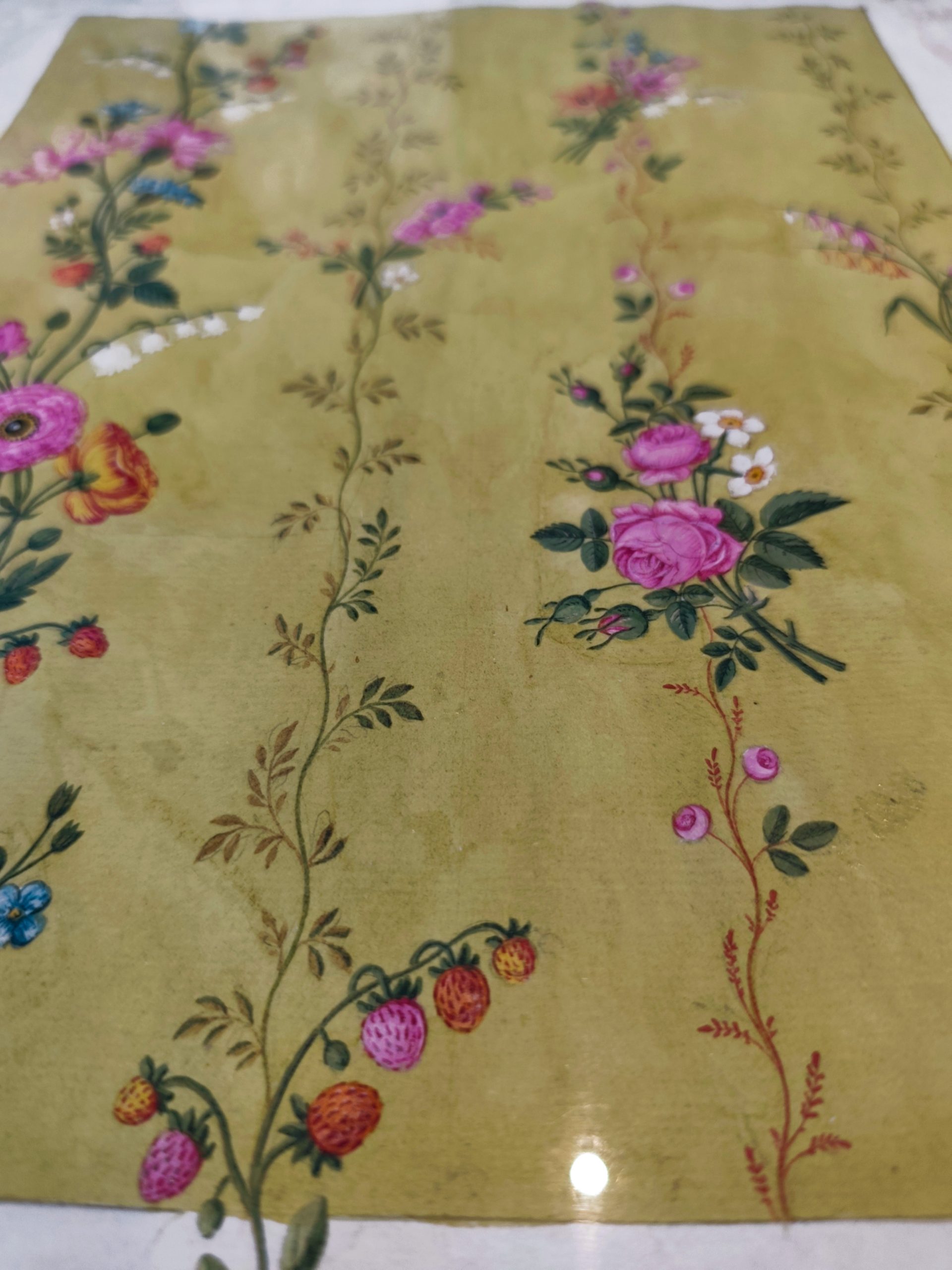
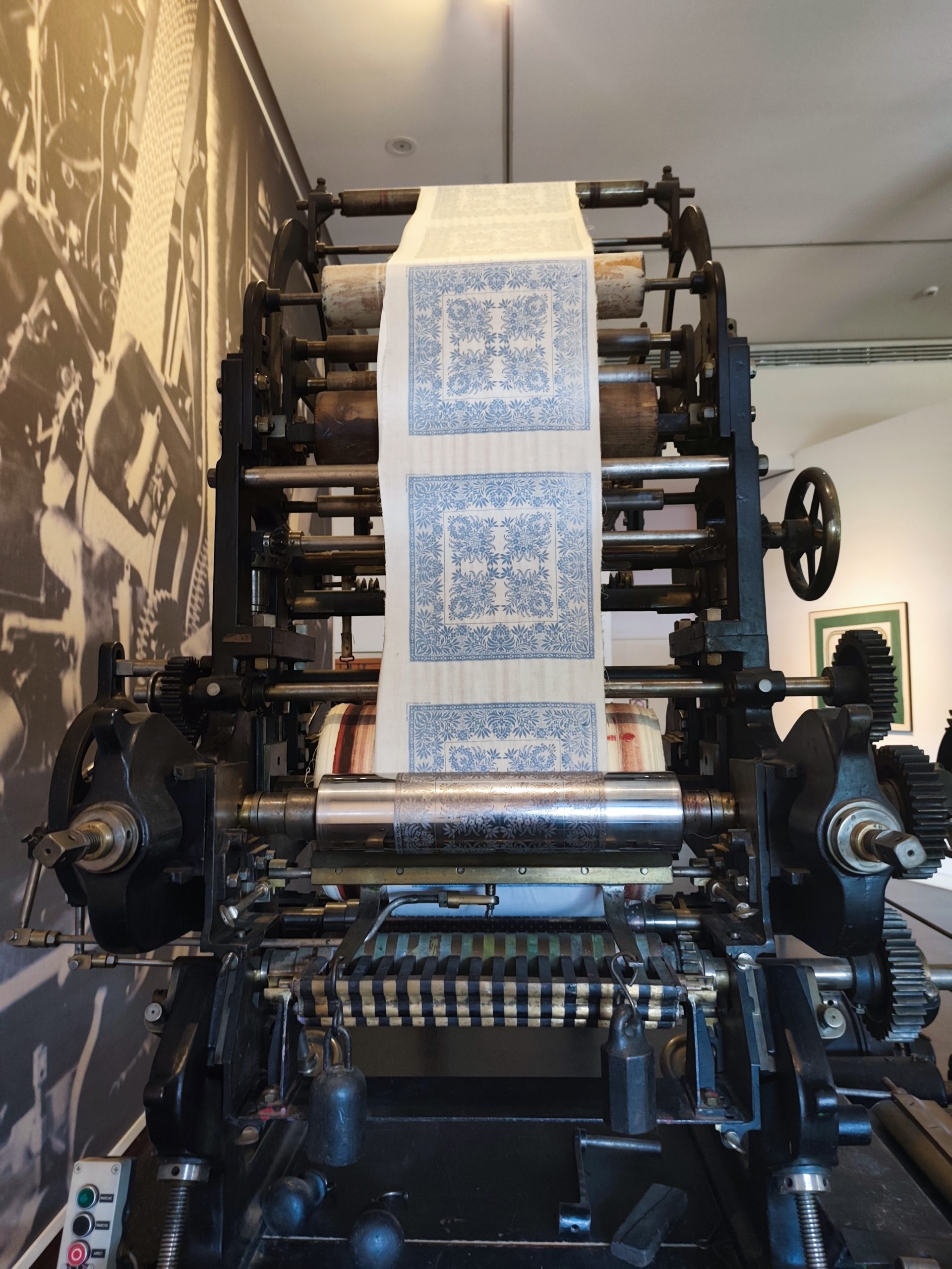
On y trouve des indiennes et tissus imprimés, des dessins préparatoires, des livres d’échantillons, des planches d’impression, des machines, des archives industrielles, des textiles du monde entier, des créations contemporaines.
ENGL: A culture of pattern-making in which drawing, colour, printing techniques and the possibility of reinterpretation are inseparable.
Originally, the museum was almost a “pattern library”. Its history begins well before the official creation of the MISE.
In 1833, the industrialists of Mulhouse, brought together within the Société Industrielle de Mulhouse (SIM), began preserving their own textile productions. But they had a much more ambitious idea: to also bring together textiles, drawings and samples from other regions and other periods.
And this was not simply about preserving heritage. Their aim was very practical: to provide designers and manufacturers with an immense source of inspiration. It was this collection that led to the creation, in 1857, of the Musée du Dessin Industriel (Museum of Industrial Design).
It is quite extraordinary when you think about it: from the very beginning, the museum was conceived as a kind of professional visual library, where a designer could come and study how others had constructed a pattern. It therefore tells the story not only of the textile industry and its techniques, but also of the evolution of taste and pattern design.
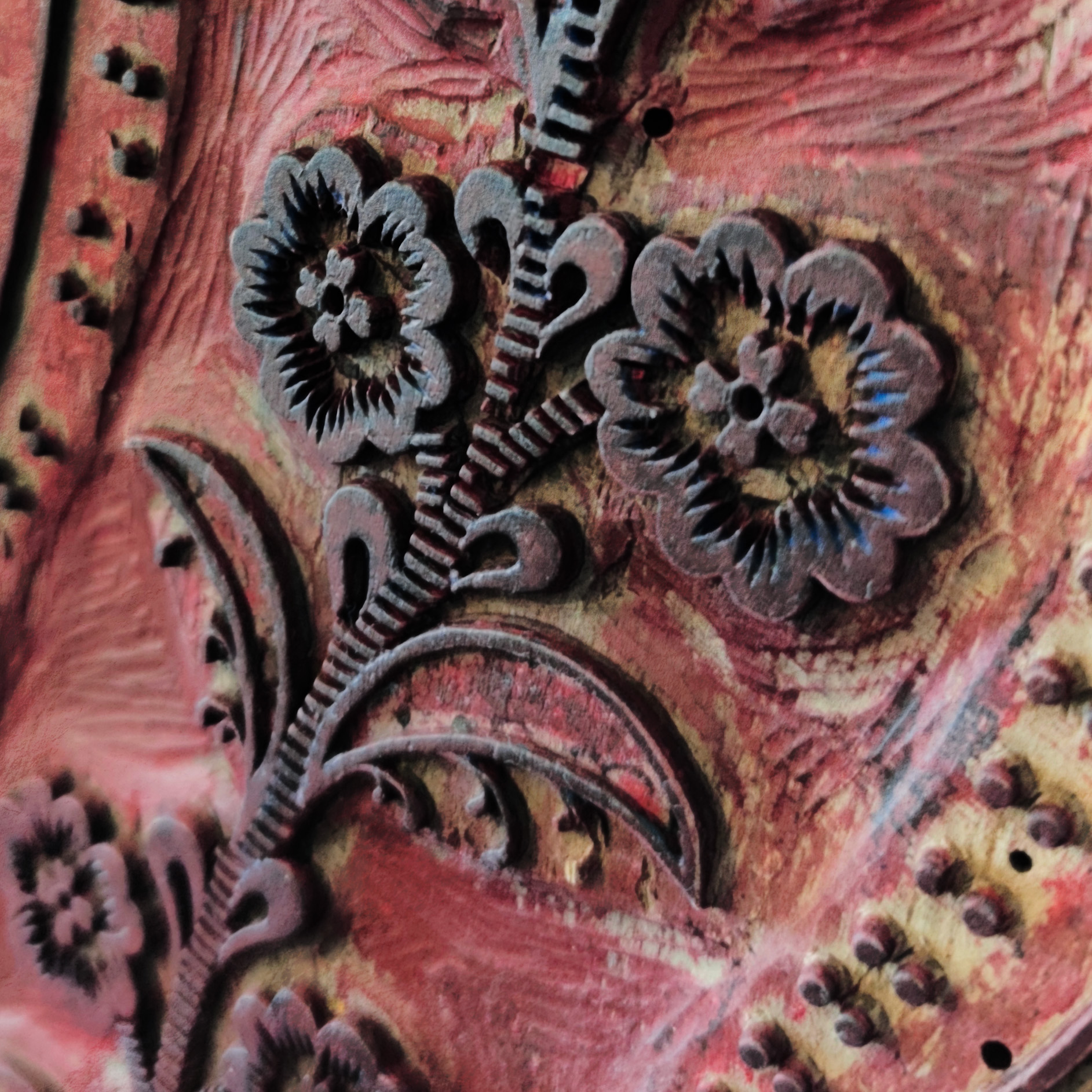
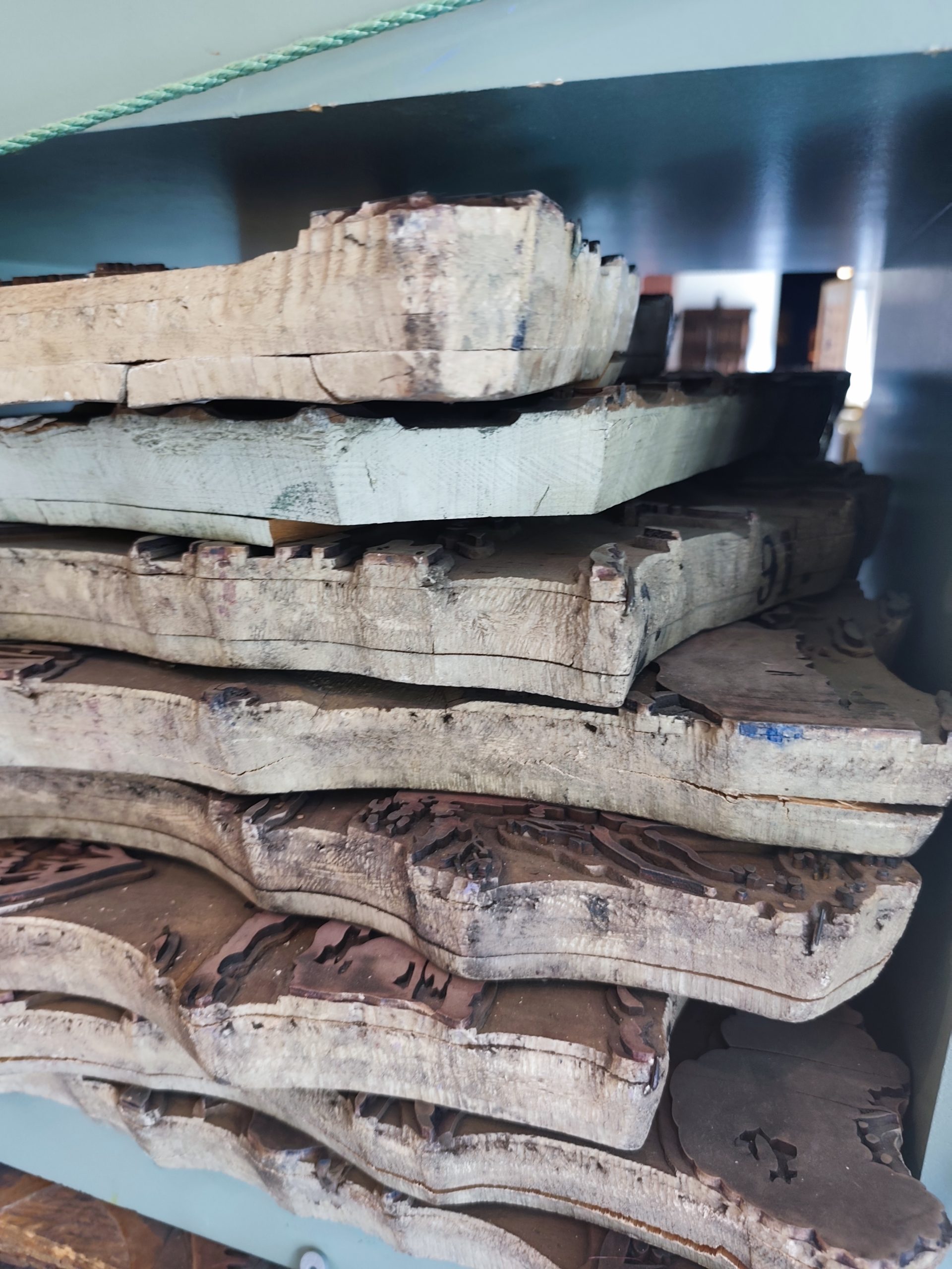
FR: Voici les matrices d’impression en bois, garnie d’éléments métalliques en relief ((laiton ou cuivre) enfoncés à la main, destinée à l’impression textile ou papier…. XIX iem
ENGL: Almost on a whim, I asked my daughter to come with me all the way from the Ardèche to Mulhouse. France is a big country. The train journey was long, but the museum made it entirely worthwhile.
Accompagnatrice de choix
Les carrés Hermes du MISE
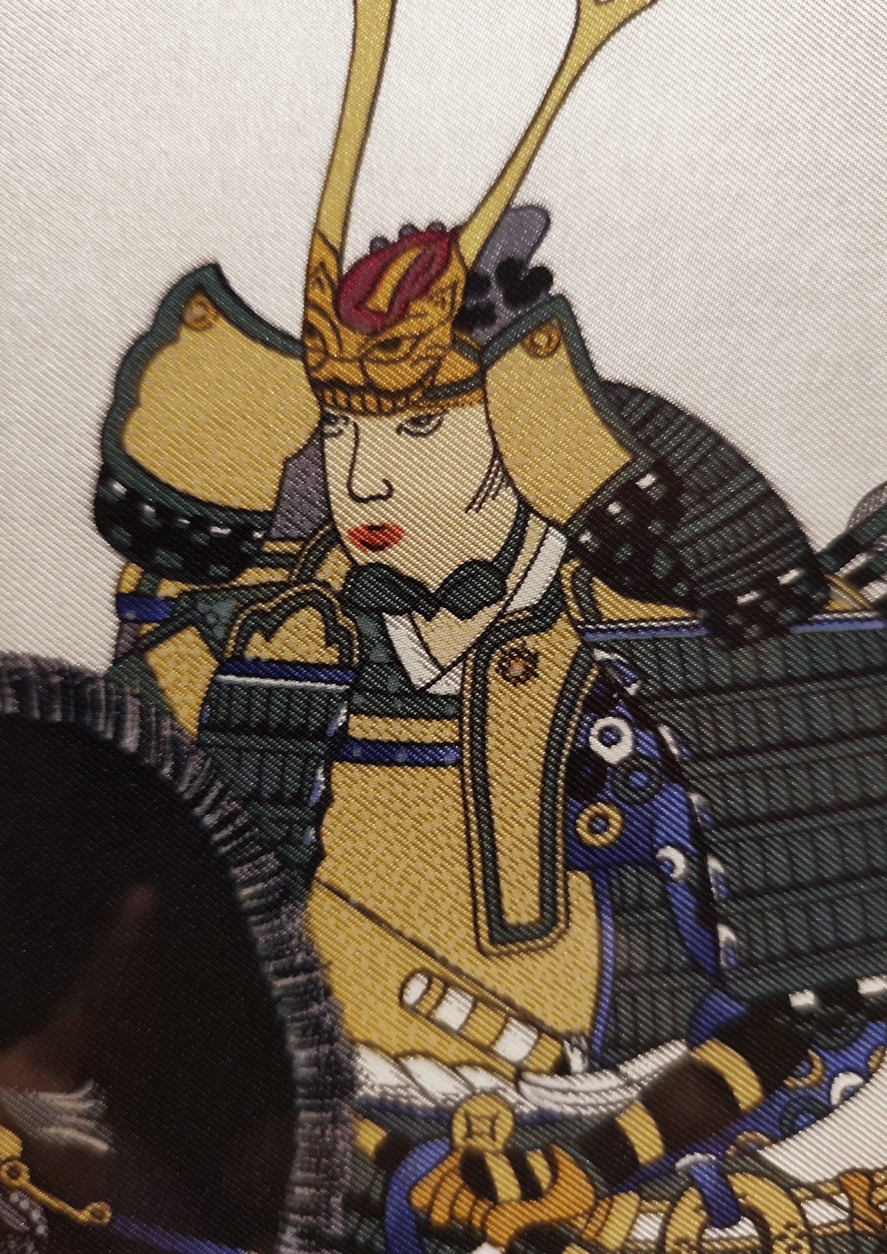
Print on a ” carré Hermes”
FR: Le MISE entretient avec Hermès une relation ancienne, qui commence en 1974. La maison commence alors à donner régulièrement des carrés au musée. Le premier don important est constitué de 24 carrés. Puis les dons se poursuivent au fil des années. La collection finit par dépasser 500 références, faisant du MISE le Musée de France qui possédait la collection de carrés Hermès la plus complète. Ce n’est donc pas simplement une exposition consacrée à Hermès. Les carrés sont entrés dans les collections du musée comme des documents permettant de raconter l’évolution du dessin textile et de la création contemporaine. Et c’est assez logique historiquement: le carré Hermès est lui-même l’héritier de cette longue histoire de l’imprimé, du dessin, de la gravure, de la couleur et de la répétition
Les carrés Hermès sont encore plus intéressants lorsqu’on les regarde non pas comme des accessoires de luxe, mais comme des objets de design graphique et textile.Ce n’est pas simplement une illustration imprimée sur un foulard. C’est une image construite couleur par couleur, presque comme une partition, puis recomposée par l’impression selon le principe de la sérigraphie. … pas celui d’une impression numérique où l’on peut demander à une imprimante de mélanger quatre encres pour reproduire des millions de couleurs. Dans la sérigraphie traditionnelle du carré, chaque couleur est déposée séparément…. même si Aujourd’hui, ces informations sont ensuite numérisées, mais le principe de séparation reste celui de l’impression traditionnelle. Chaque calque correspond à ce qu’on appelle une séparation de couleur. Et chaque séparation devient ensuite un écran de sérigraphie différent.
Hermès indique qu’un carré demande en moyenne 25 à 30 couleurs, mais que les modèles les plus complexes peuvent atteindre 48 nuances. Hermès possède une bibliothèque gigantesque de couleurs. La maison indique aujourd’hui travailler à partir de plus de 75 000 nuances
Du dessin au textile
Tout commence par un dessin pluotôt qu’un motif textile. Le point de départ est généralement une œuvre originale réalisée par un artiste ou dessinateur. Le premier carré, Jeu des Omnibus et Dames blanches, date de 1937. Depuis, plus de 2 000 dessins de carrés ont été créés. Hermès travaille avec des artistes très différents, certains venant du monde de l’illustration, de la peinture, du graphisme ou du dessin. Le dessin doit cependant être pensé pour devenir un objet textile. Cela signifie qu’il faut anticiper: la composition dans un carré les contours, les zones de couleur , les superpositions, les ombres, les dégradés, les détails extrêmement fins et surtout la manière dont chaque élément pourra être imprimé.
C’est là que commence le véritable travail de transformation du dessin en textile, là que commence le véritable travail de transformation du dessin en textile.
Une fois le dessin accepté, il arrive entre les mains du graveur textile. Son rôle est de prendre l’image finale et de la déconstruire. Hermès explique que le dessin original est repris à taille réelle et que le graveur le trace manuellement sur des films transparents. Le travail du graveur est donc beaucoup plus complexe que du simple décalquage Le graveur doit notamment restituer les contours, les différentes profondeurs, les ombres, les lumières, les dégradés, les détails les relations entre les couleurs.
Hermès réédite régulièrement certains dessins historiques dans de nouvelles colorations. La maison présente par exemple ses “Carrés de toujours”: comme des dessins patrimoniaux réédités dans des colorations différentes. Le dessin et la palette sont deux niveaux différents de création.
ANGL: The Musée de l’Impression sur Étoffes (MISE) in Mulhouse has maintained a long-standing relationship with Hermès, dating back to 1974. The house began donating Carrés to the museum on a regular basis, with the first major donation consisting of 24 scarves. The donations continued over the years, and the collection eventually grew to more than 500 references, making the MISE the Musée de France with the most extensive collection of Hermès Carrés.
This is therefore not simply an exhibition devoted to Hermès. The Carrés entered the museum’s collections as documents that help tell the story of the evolution of textile design and contemporary creation. And this makes perfect historical sense: the Hermès Carré is itself the heir to a long tradition of textile printing, drawing, engraving, colour and repetition.
The Hermès Carrés become even more fascinating when viewed not simply as luxury accessories, but as works of graphic and textile design. A Carré is not merely an illustration printed onto a scarf. It is an image constructed colour by colour, almost like a musical score, and then recomposed through the printing process using the principles of screen printing.
This is quite different from digital printing, where a printer can combine a limited number of inks to reproduce millions of colours. In traditional Carré screen printing, each colour is applied separately. Although the process has now been partly digitised, the principle of colour separation remains rooted in traditional printing methods.
Each layer corresponds to what is known as a colour separation, and each separation is then used to create a separate screen for the printing process.
Hermès states that a Carré requires an average of 25 to 30 colours, while the most complex designs can reach as many as 48 shades. The house has an enormous library of colours and currently works with more than 75,000 different shades.
From drawing to textile
It all begins with a drawing rather than a textile pattern.The starting point is usually an original artwork created by an artist or designer. The first Hermès Carré, Jeu des Omnibus et Dames Blanches, dates from 1937. Since then, more than 2,000 Carré designs have been created. Hermès has collaborated with artists from many different backgrounds, including illustration, painting, graphic design and fine art.
The drawing must nevertheless be conceived with its transformation into a textile object in mind. This means anticipating the composition within the square, the contours, areas of colour, overlaps, shadows, gradients, extremely fine details, and above all, the way in which each element can actually be printed.
This is where the true transformation of a drawing into a textile begins: once the design has been approved, it is passed on to the textile engraver. Their role is to take the finished image and deconstruct it.
Hermès explains that the original drawing is reproduced at full scale and that the engraver manually traces it onto transparent films. The engraver’s work is therefore far more complex than simply tracing an image. They must reconstruct the contours, different levels of depth, shadows, highlights, gradients, details, and the relationships between colours.
Hermès also regularly reissues historic designs in new colourways. The house’s Carrés de toujours, for example, bring heritage designs back to life in different colour combinations. The drawing and the colour palette are therefore two distinct levels of creation
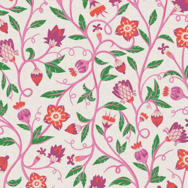
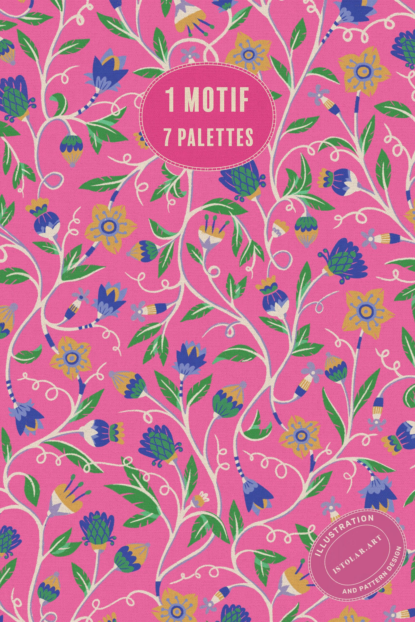
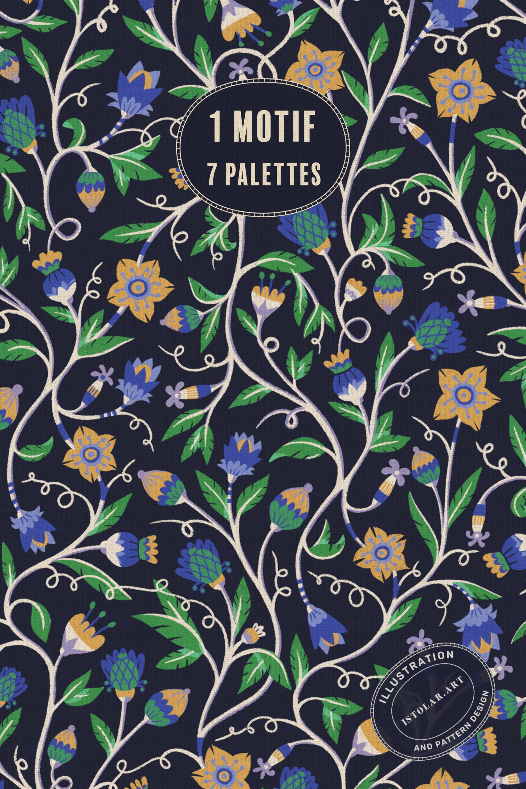
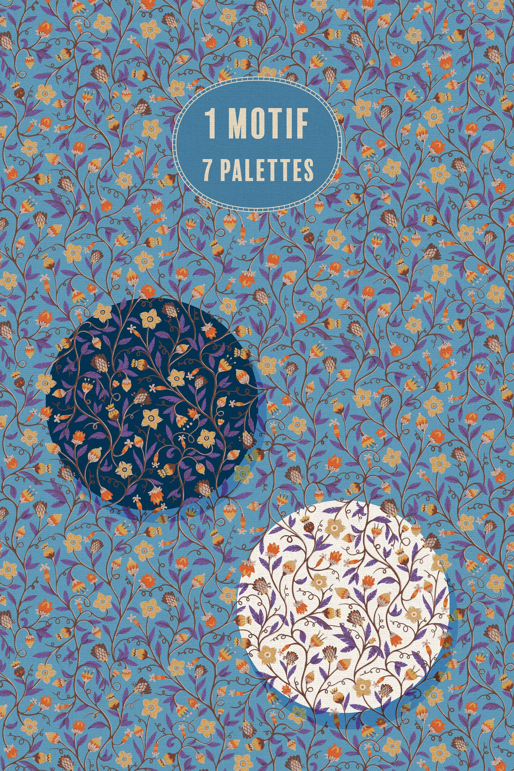
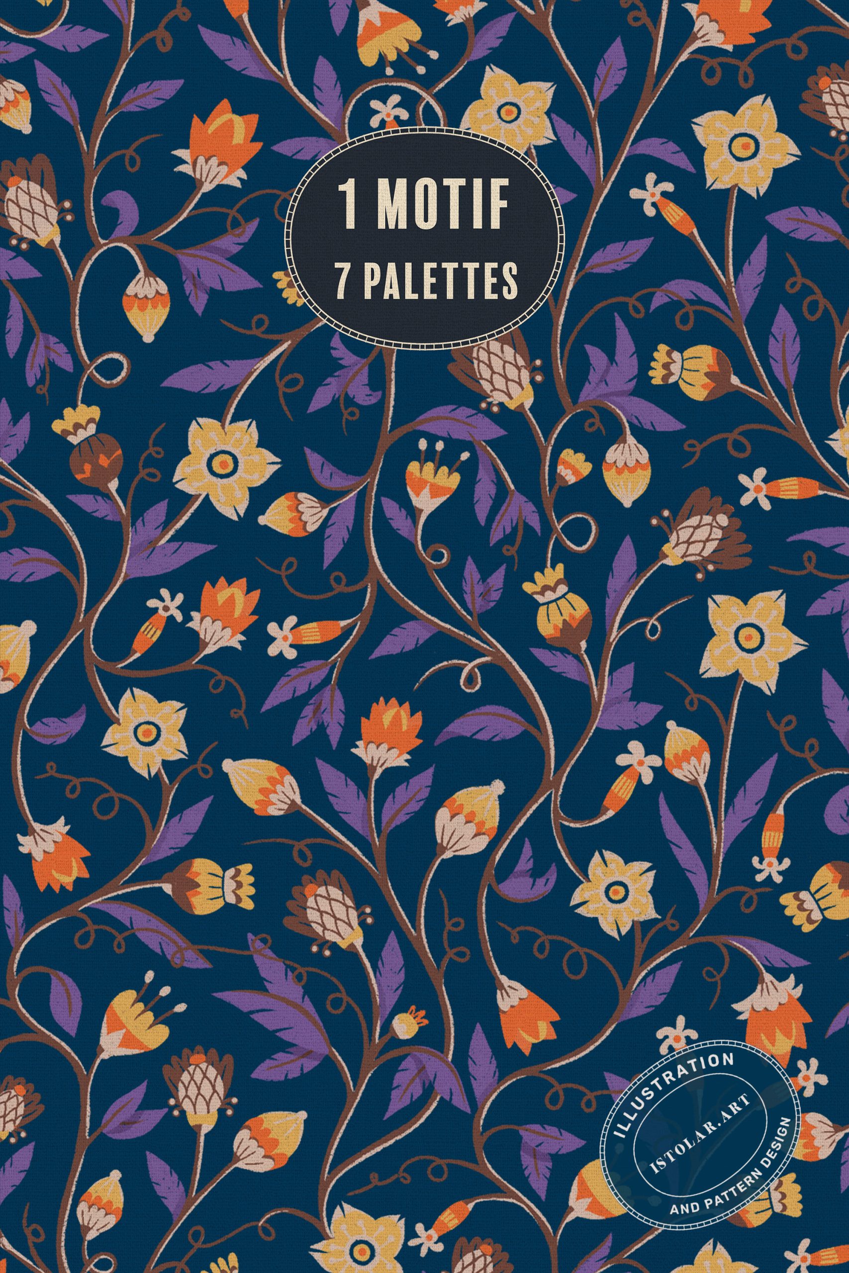
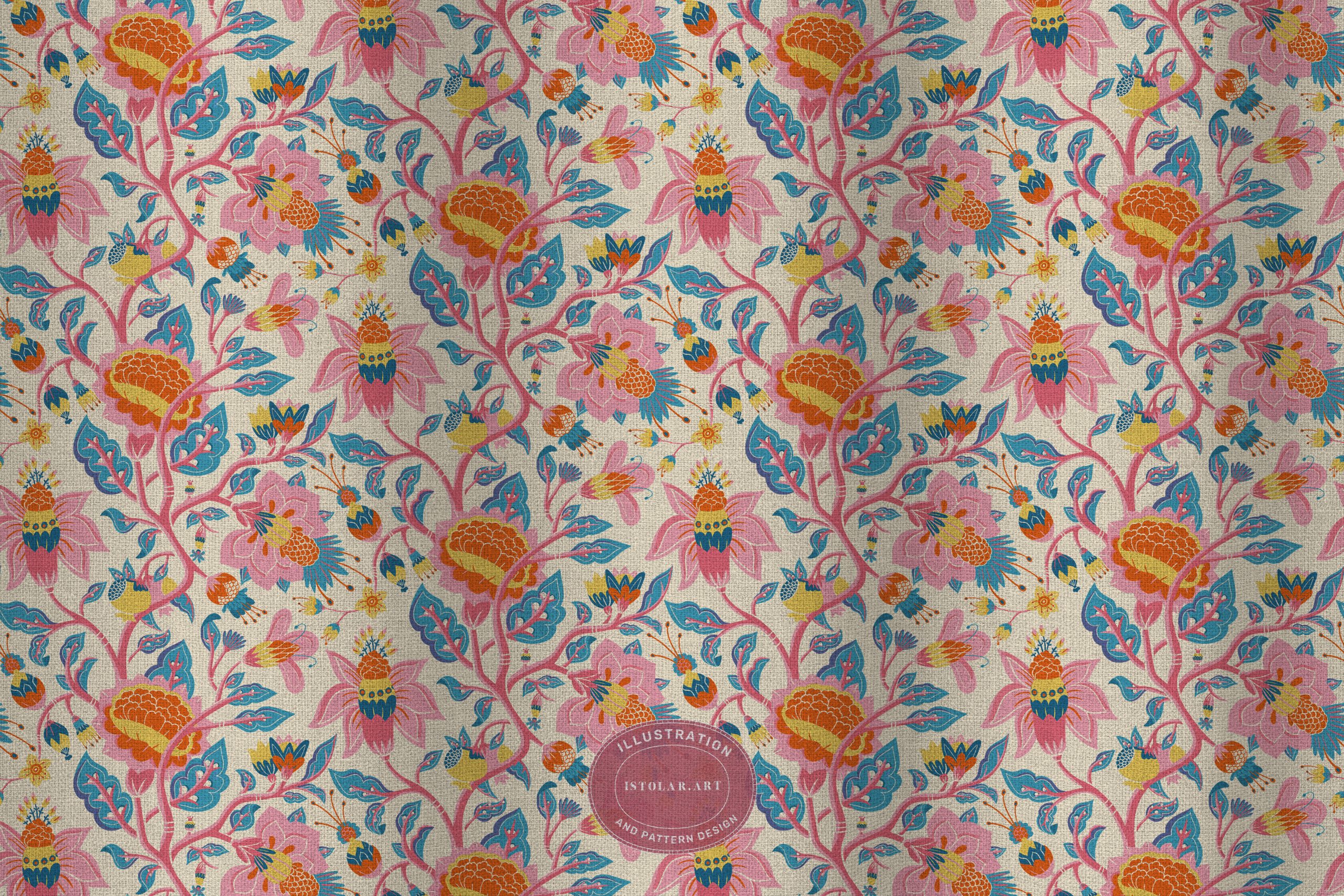
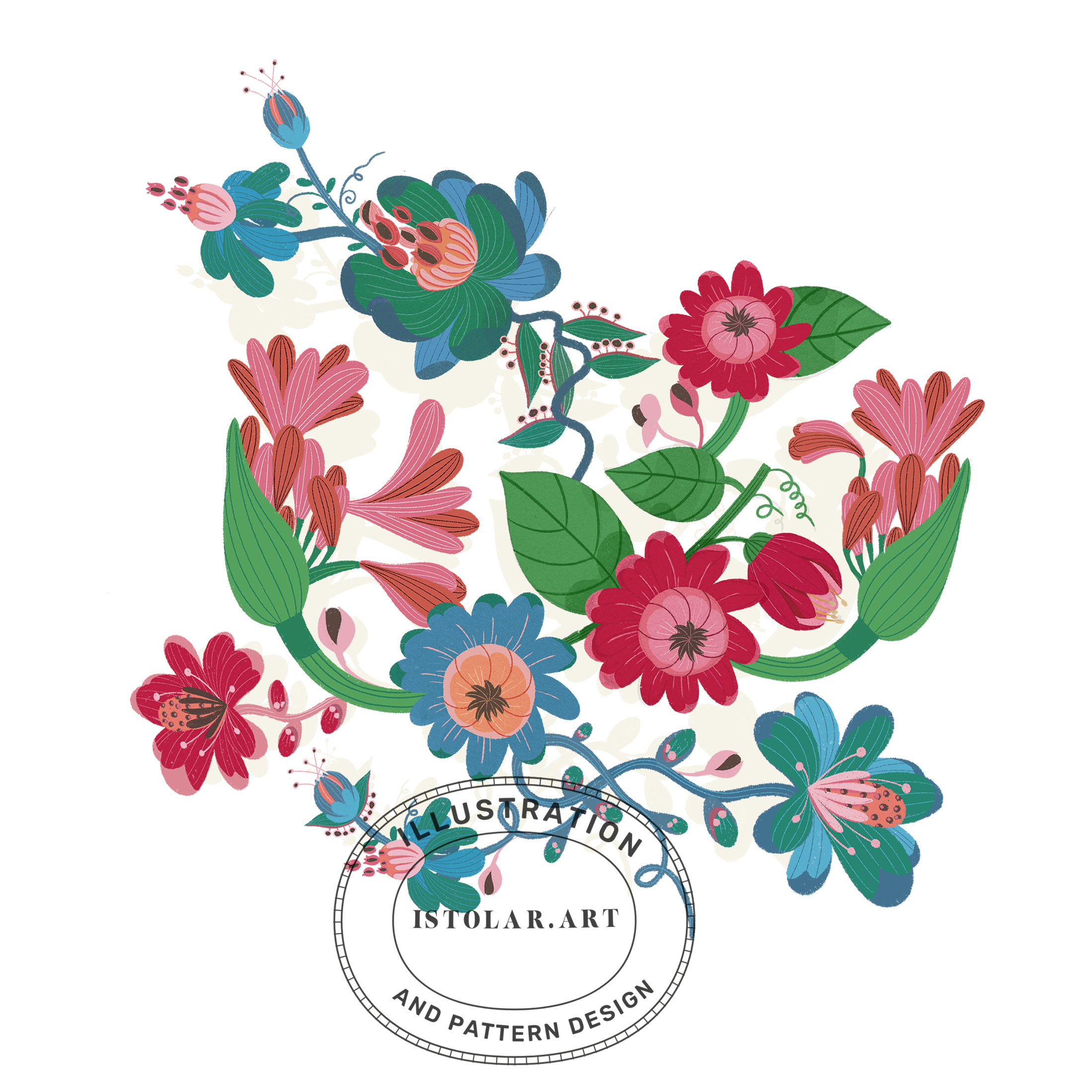
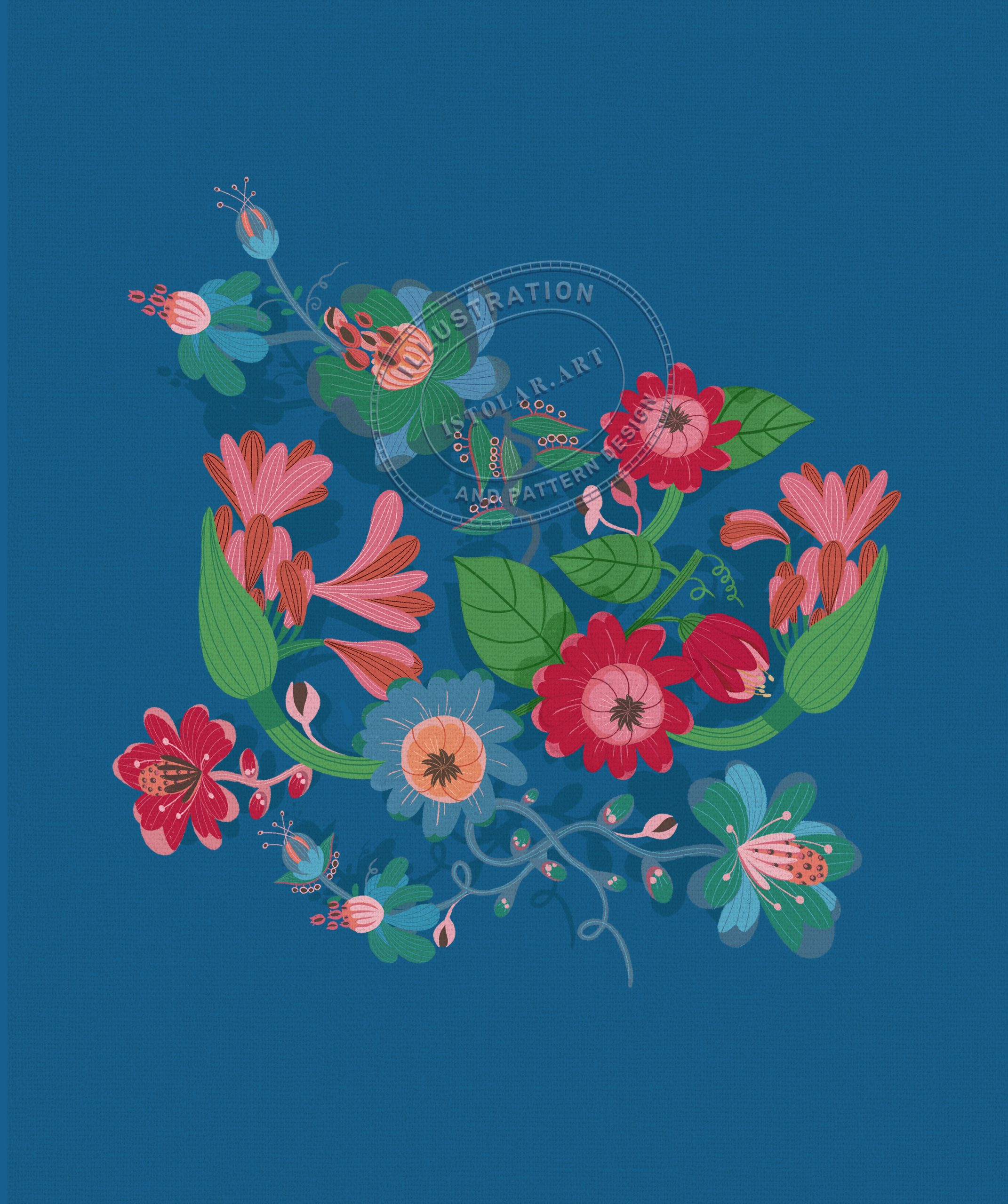
MOTIF COMTENPORAIN INSPIRÉ DU STYLE “CHINOISERIES”
(large flower: hero / principal motif )
(Hero pattern of the collection)
FR: Un aperçu d’une nouvelle minie série de motifs “éditables” (à chaque couleur son calque) en cours d’élaboration … d’inspiration chinoise contemporaine. Encore quelques réglages de palette à apporter avant de les présenter.
C’est la magie de la conception de motifs: un motif isolé se définit par lui-même et un motif répété se défini par ses relations … de fait, en répétant un motif, on ne le banalise pas nécessairement, on peut au contraire le révéler.
***
ENGL: An early glimpse of a new mini series of editable patterns in progress (each color on its own layer), inspired by contemporary “chinoiserie” design. I have a few more palette adjustments to make before presenting them.”
That’s the magic of pattern design: an isolated motif defines itself, while a repeated motif is defined by its relationships… In fact, repeating a motif doesn’t necessarily make it ordinary; on the contrary, it can reveal it.”
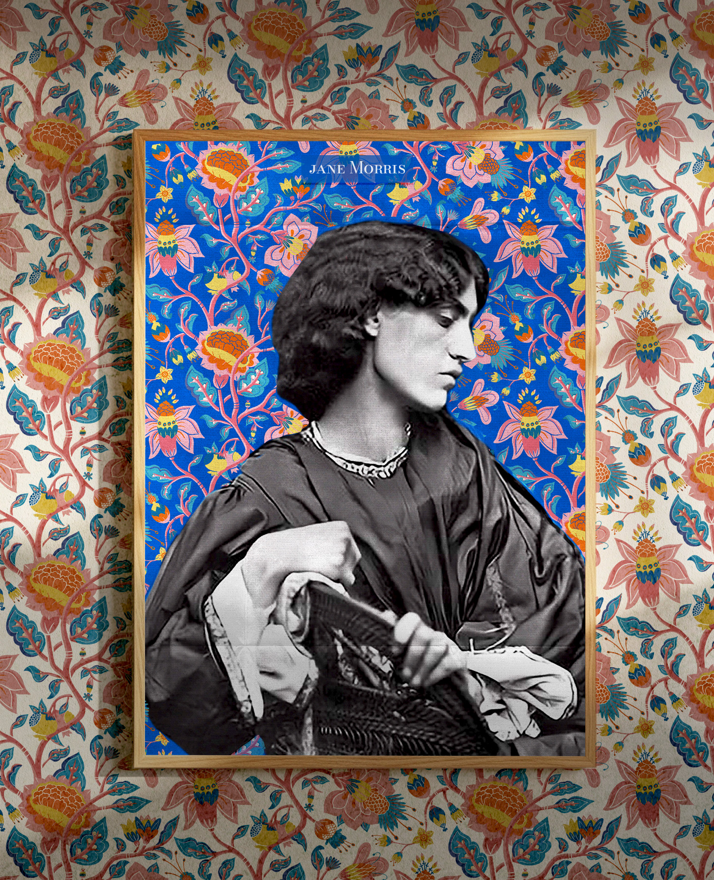
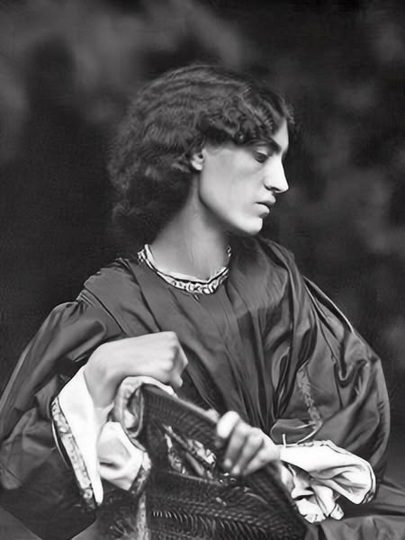
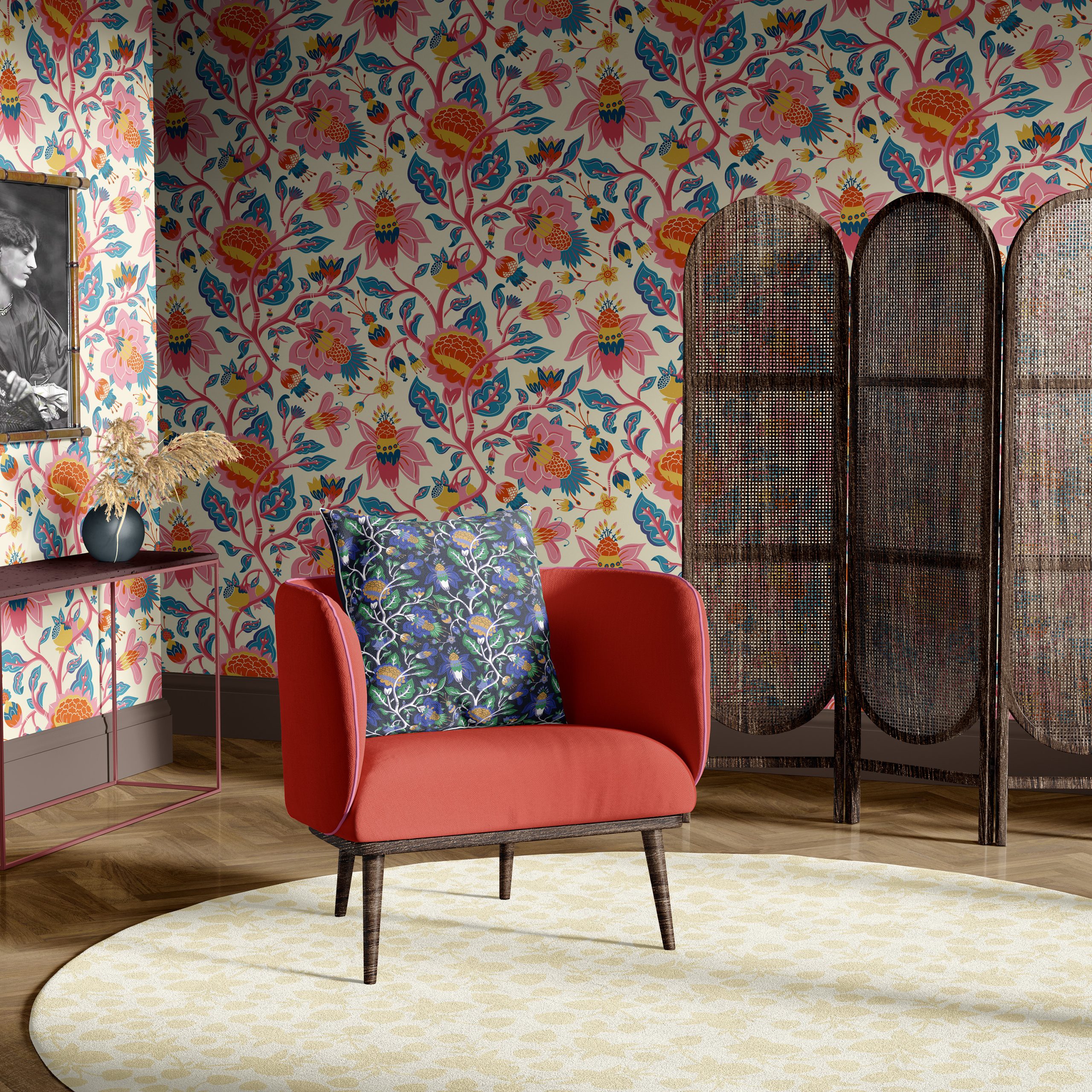
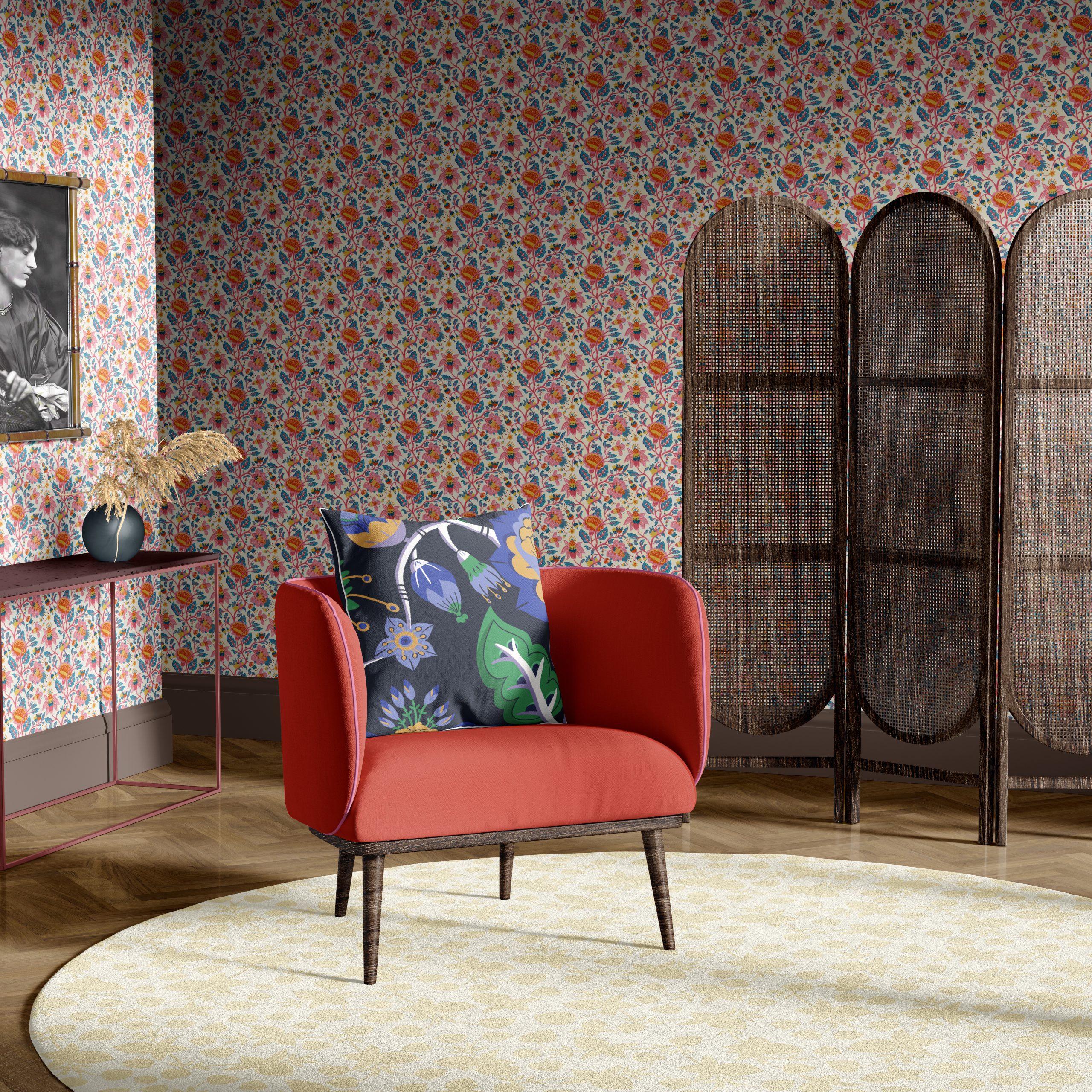
FR: Mon dernier motif appliqué à un portrait photographique de Jane Morris (née Burden) pris en juin 1865 par John Robert Parsons et mis en scène par le peintre préraphaélite Dante Gabriel Rossetti.
EN: My latest pattern applied to a photographic portrait of Jane Morris (née Burden), taken in June 1865 by John Robert Parsons and staged by the Pre-Raphaelite painter Dante Gabriel Rossetti.
FR: Les sources historiques ne la présentent pas comme une créatrice régulière des motifs au même titre que William Morris, May Morris ou John Henry Dearle. L’influence de Jane Morris est plutôt une influence de goût, de savoir-faire et de culture textile. Brodeuse, couturière, elle a participé aux premières productions. Elle fut aussi muse de William Morris et Dante Gabriel Rossetti: une idée de la beauté féminine préraphaélite, visage allongé, cheveux très foncés, regard grave, silhouette élancée, vêtements médiévaux… Elle est devenue progressivement une sorte de modèle vivant de l’univers esthétique de Morris.Morris. Si elle n’est pas la designer cachée de Morris & Co, elle est l’une des figures qui ont contribué à l’univers esthétique des design de W.Morris.
En revanche, May, fille de Jane et William Morris est une véritable designer chez Morris & Co.À seulement 23 ans, en 1885, May prend la direction du département de broderie de Morris & Co. Elle est responsable des nouveaux dessins, des commandes et de la production, et elle crée elle même des motifs pour textiles, broderies et papiers peints tels que “Honeysuckle”, “Horn Poppy”, “Arcadia”et “Horn Poppy”
Il reste que certaines productions réalisées par Jane, sa sœur Bessie et leurs filles ont été commercialement associées au nom de William Morris. surprise :-/ grrr
***
ENG: Historical sources do not present her as a regular pattern designer in the same way as William Morris, May Morris, or John Henry Dearle. Jane Morris’s influence was rather one of taste, craftsmanship, and textile culture. An embroiderer and dressmaker, she took part in some of the firm’s early productions. She was also the muse of both William Morris and Dante Gabriel Rossetti: an embodiment of the Pre-Raphaelite ideal of feminine beauty — elongated face, very dark hair, a serious gaze, slender figure, medieval-inspired clothing… She gradually became a kind of living model for Morris’s aesthetic world. If she was not the hidden designer behind Morris & Co., she was certainly one of the figures who helped shape the aesthetic universe of William Morris’s designs.
By contrast, May, the daughter of Jane and William Morris, was a true designer at Morris & Co. At just 23, in 1885, May took over the firm’s embroidery department. She was responsible for new designs, commissions, and production, and created her own patterns for textiles, embroidery, and wallpapers, including Honeysuckle, Horn Poppy, and Arcadia.
It is worth noting, however, that some of the pieces made by Jane, her sister Bessie, and their daughters were commercially associated with the name of William Morris. Surprise :-/ Grrr.
***
FR: Mes motifs sont souvent très fournis. J’en dessine des plus aérés parfois mais je dois le reconnaitre mon univers metal est peuplé d’une ref imposante.
ENG: My patterns are often very dense and richly populated. I do draw more pared-back ones sometimes, but I have to admit that my own pattern universe is inhabited by one rather imposing reference
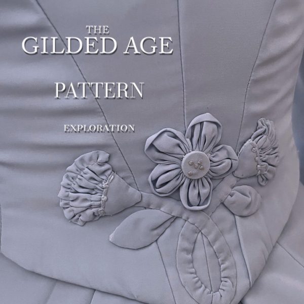
FR: J’ai vula série”the gilded age”. Des motif botaniques raffinés d’inspiration victorienne, associant des feuillages sinueux, des fleurs stylisées et un ornement évoquant le damas, dans un élégant motif en répétition continue.
***
ENGL: I saw the “gilded age” serie. Refined botanical motifs inspired by the Victorian era, combining sinuous foliage, stylized flowers, and damask-inspired ornamentation in an elegant seamless repeat.
illustration de circonstance ( not from “the gilded age”)
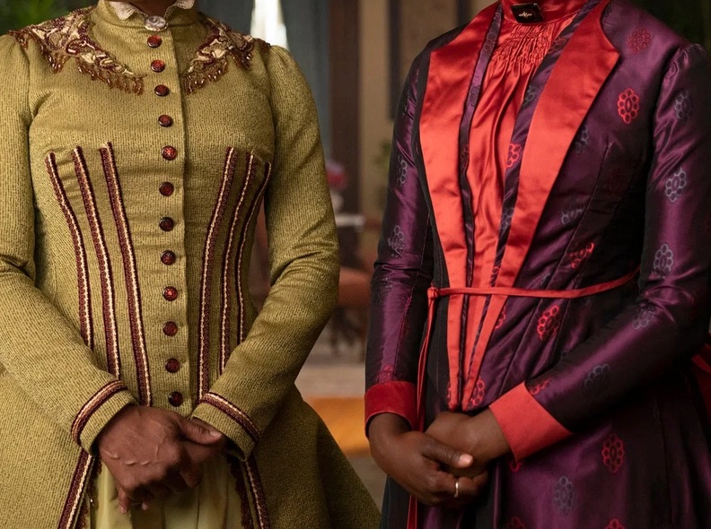
FR: Quoi qu’ il en soit on fera une distinction entre « Gilded Age » historique et « The Gilded Age » série HBO. Pour le moment je suis sous le charme esthétique du “the gilded age” de la série. J’aime ce vocabulaire historique réinterprété avec une opulence théâtrale et une sensibilité chromatique plus contemporaine. La série re-visite l’époque plutôt qu’elle ne la reproduit de manière strictement documentaire. La costumière explique, d’ailleurs elle-même, avoir pris des libertés créatives pour produire des costumes plus spectaculaires à l’écran.
J’ai regroupé quelques uns des magnifiques motifs de la série
ENGL: In any case, we should distinguish between the historical Gilded Age and The Gilded Age, the HBO series. For now, I’m completely captivated by the series’ aesthetic interpretation of the Gilded Age. I love this historical vocabulary reinterpreted through theatrical opulence and a more contemporary color sensibility. The series interprets the period rather than reproducing it in a strictly documentary way. The costume designer herself has explained that she took creative liberties in order to create costumes that would appear more spectacular on screen.
I’ve gathered together some of the beautiful patterns and motifs featured in the series.
FR: Les robes, papiers peints, rideaux, tapis, tissus d’ameublement et décors intérieurs dialoguent constamment!
En arrière plan, des rideaux damassés. Au moyen plan des fauteuils à motif floraux et tapis à motifs parfois géométriques. Au premier plan, des robes florales..creant une impression de maximalisme controlé.
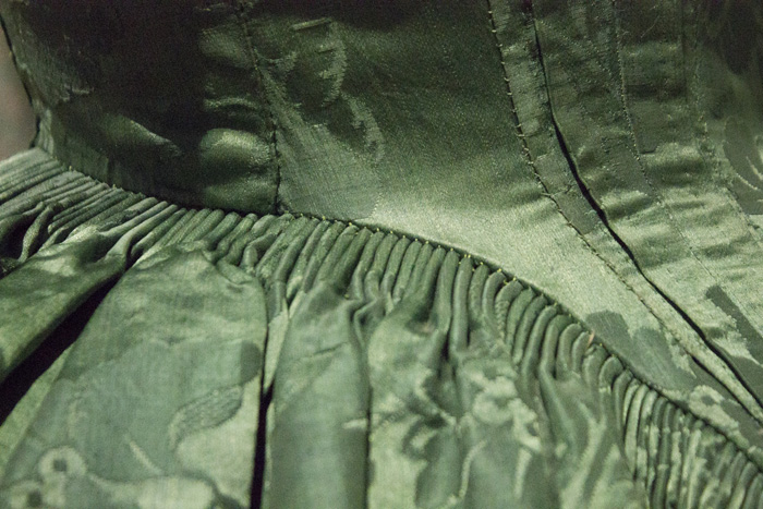
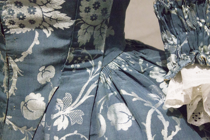
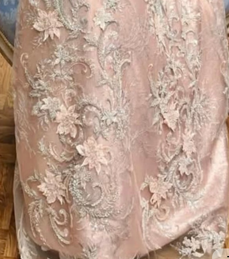
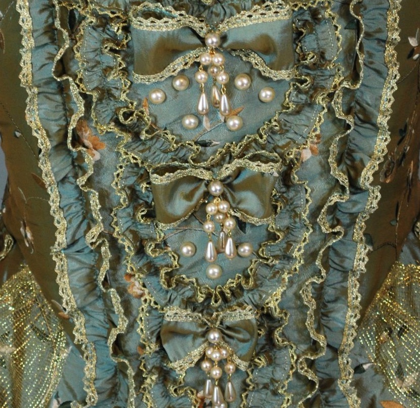
Partout, il a des motifs somptueux, tactiles et décoratifs, avec une prédilection pour les velours dense, profond, absorbant la lumière, des soies et satin brillants, fluides, parfois irisés, des taffetas plus rigides, avec beaucoup de tenue et de volume, des brocarts et jacquards en motifs intégrés dans le tissage plutôt qu’imprimés, les damas floraux ou arabesques souvent ton sur ton, des dentelles et tulles utilisés en géniales superpositions, des tissus moirés, donnant un effet ondulant … bref des design floraux a l infini!
La costumière Kasia Walicka-Maimone explique notamment avoir fait fabriquer certains velours pour obtenir deux dimensions de couleurs, et avoir utilisé des taffetas irisés dont la couleur change avec la lumière below the line
Dans The Gilded Age, le décor fonctionne beaucoup par stratification: des grands motifs, des motifs secondaires, des textures, galons, frange, surface unie
***
The dresses, wallpapers, curtains, carpets, upholstery fabrics, and interior settings are in constant dialogue with one another.
In the background, damask curtains. In the middle ground, floral-patterned armchairs and carpets featuring sometimes geometric motifs. In the foreground, floral dresses — creating an impression of controlled maximalism.
Everywhere, there are sumptuous, tactile, and highly decorative textiles, with a particular predilection for dense, deep velvets that absorb the light; glossy, fluid silks and satins, sometimes with an iridescent quality; more structured taffetas with plenty of body and volume; brocades and jacquards, where the patterns are woven into the fabric rather than printed; floral or arabesque damasks, often in tonal combinations; lace and tulle used in beautiful layers; and moiré fabrics, creating a rippling, shifting effect… In short, an endless array of floral designs!
The costume designer, Kasia Walicka-Maimone, explains that she had some of the velvets specially made to achieve a two-dimensional color effect, and also used iridescent taffetas whose colors shift with the light.
In The Gilded Age, the interiors rely heavily on layering: large-scale patterns, secondary motifs, textures, trims, fringe, and areas of solid color.
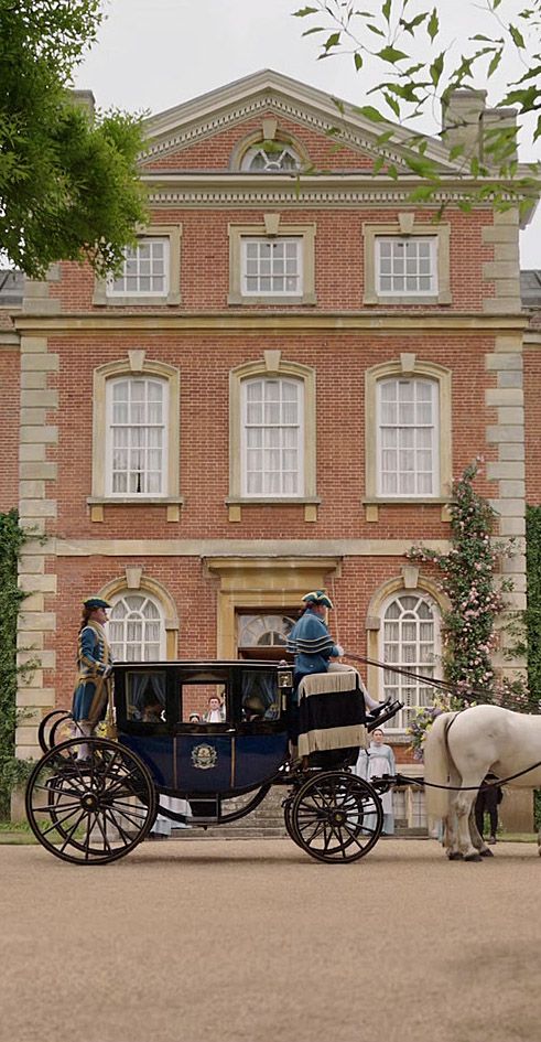
Comme Bridgerton ?
FR: Esthétiquement, on pense assez vite à comparer The gilded age à l’univers de Bridgerton … pourtant malgré la part d’interprétation des décors, dans “the gilded age”, on pressent moins d’anachronismes des couleurs … disons … de bonbonnières ou plus exactement cette palette « pastel sophistiquée »car il ne s’agit pas simplement de « couleurs pastel », la palette possède souvent une base légèrement grisée ou blanchie, ce qui lui donne cette impression de douceur et de raffinement (bleu poudré bleu gris vert sauge vert amande rose poudré rose blush lavande lilas jaune beurre crème, vieux rose). A noter que dans cette palette, le blanc est extrêmement important (ivoire, crème, blanc cassé, champagne). Ces neutres servent de respiration entre les couleurs.
bref une palette a la fois historiquement encrée et volontairement idealisée. D’autant que dans le cas de bridgerton chaque famille possède son propre « branding » chromatique dont la série utilise beaucoup cette opposition: Bridgerton (bleus, verts, blancs, argentés) et Featherington (jaunes, oranges, roses, verts chauds)
Le code couleur de Bridgerton est presque aussi important que les motifs : il participe directement à la construction des personnages, des familles et de l’atmosphère. Il est surtout beaucoup plus pastel, lumineux et poudré que celui de The Gilded Age.
Les deux séries puisent dans un vocabulaire historique très ornemental, mais elles le traitent de manière assez différente. Gilded Age est plus riche, dense, structuré et textile. Bridgerton est plus léger, romantique, floral et fantaisiste.
Dans Gilded Age, le motif semble souvent construit comme une architecture décorative. il a une certaine gravité. Il donne l’impression d’avoir été tissé, brodé ou imprimé sur un textile ancien. Il est a la fois ornamental, dense, superposé et structuré. Il remplit tout l’espace.
les couleurs dominantes somt les bordeaux, vert profond, bleu, or. La palette est faite de tons riches de “jewel tones” et terre. les valeurs sont moyenne à sombre. Les neutres sont des beige, brun, crème, bois sombre … on a une impression d opuplence
Dans Bridgerton, au contraire, le motif romantique aéré et délicat paraît davantage illustratif et narratif. Il laisse davantage respirer le fond. On retrouve beaucoup de fleurs isolées , de bouquets, de petites branches, d’oiseaux, de papillons, de paysages ou scènes de jardin, de motifs inspirés des chinoiseries. Le motif peut donner l’impression d’un jardin qui aurait été peint sur le tissu ou le papier peint.
La palette est, nous l’avons vu, pastelle poudrée, de valeurs claires et saturation moyenne avec des temperatures plutot froides aux quelques accents chauds. Les couleurs dominantes somt le bleu, rose et vert.
***
ENGL: Aesthetically, it is quite natural to draw a comparison between The Gilded Age and the world of Bridgerton. Yet, despite the degree of creative interpretation in the sets of The Gilded Age, we sense far fewer color anachronisms — or, to put it another way, far less of that confectionery-like quality found in Bridgerton’s sophisticated pastel palette.
It is important to note that this is not simply a matter of “pastel colors.” The palette often has a slightly greyed or whitened base, which gives it that characteristic sense of softness and refinement: powder blue, blue-grey, sage green, almond green, dusty pink, blush pink, lavender, lilac, butter yellow, cream, and old rose.
White is also extremely important within this palette — ivory, cream, off-white, champagne. These neutrals provide breathing space between the colors.
In short, it is a palette that is both historically grounded and deliberately idealized. In Bridgerton, each family even has its own chromatic “branding,” and the series makes extensive use of this opposition: the Bridgertons are associated with blues, greens, whites, and silvery tones, while the Featheringtons are associated with yellows, oranges, pinks, and warmer greens.
The color coding in Bridgerton is almost as important as the patterns themselves: it directly contributes to the construction of the characters, the families, and the overall atmosphere. Above all, it is much more pastel, luminous, and powdery than the palette of The Gilded Age.
Both series draw from a highly ornamental historical vocabulary, but they treat it in quite different ways. The Gilded Age is richer, denser, more structured, and more textile-driven, while Bridgerton is lighter, more romantic, floral, and whimsical.
In The Gilded Age, the pattern often seems to be constructed like decorative architecture. It has a certain gravity. It gives the impression of having been woven, embroidered, or printed onto an antique textile. It is simultaneously ornamental, dense, layered, and structured. It fills the entire space.
The dominant colors are burgundy, deep green, blue, and gold. The palette is built around rich jewel tones and earthy hues, with medium to dark values. The neutrals include beige, brown, cream, and dark wood tones. The overall impression is one of opulence.
In Bridgerton, by contrast, the romantic, airy, and delicate pattern feels more illustrative and narrative. It allows the background to breathe. We see many isolated flowers, bouquets, delicate branches, birds, butterflies, landscapes or garden scenes, as well as chinoiserie-inspired motifs. The pattern can give the impression of a garden painted directly onto fabric or wallpaper.
As we have seen, the palette is soft and powdery, with light values and medium saturation, generally leaning toward cooler temperatures with a few warm accents. The dominant colors are blue, pink, and green.
FR: Les deux univers sont infiniment inspirant pour “une faiseuse de motifs”.
De Gilded age on pourrait garder la richesse des damas, les rinceaux*, la densité.
De Bridgerton on pourrait garder la délicatesse florale, les jardins , les oiseaux et papillons, la chinoiserie, la légèreté narrative.
* motif ornemental en forme de branche végétale qui s’enroule en spirale ou en volute, le plus souvent garni de feuilles, de fleurs ou de fruits.
***
ENGL: Both worlds are endlessly inspiring for a pattern designer.
From The Gilded Age, we could retain the richness of damasks, the scrolling foliage, and the density.
From Bridgerton, we could retain the floral delicacy, the gardens, the birds and butterflies, the chinoiserie, and the narrative lightness.
* A decorative botanical motif in the form of a branch that curls into a spiral or scroll, usually adorned with leaves, flowers, or fruit.
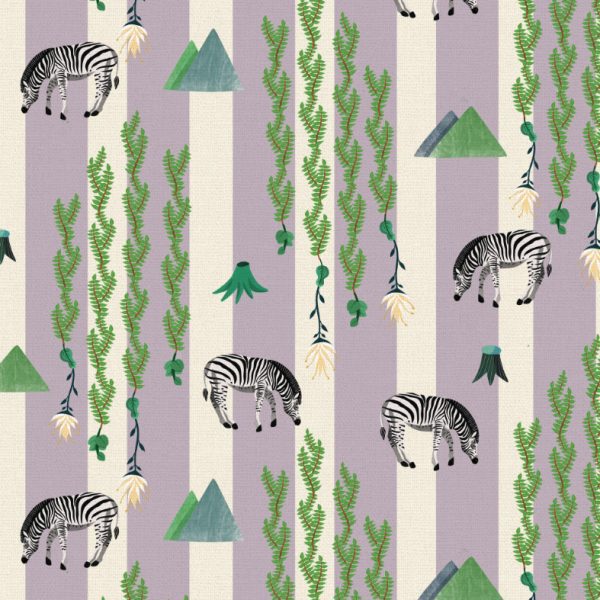
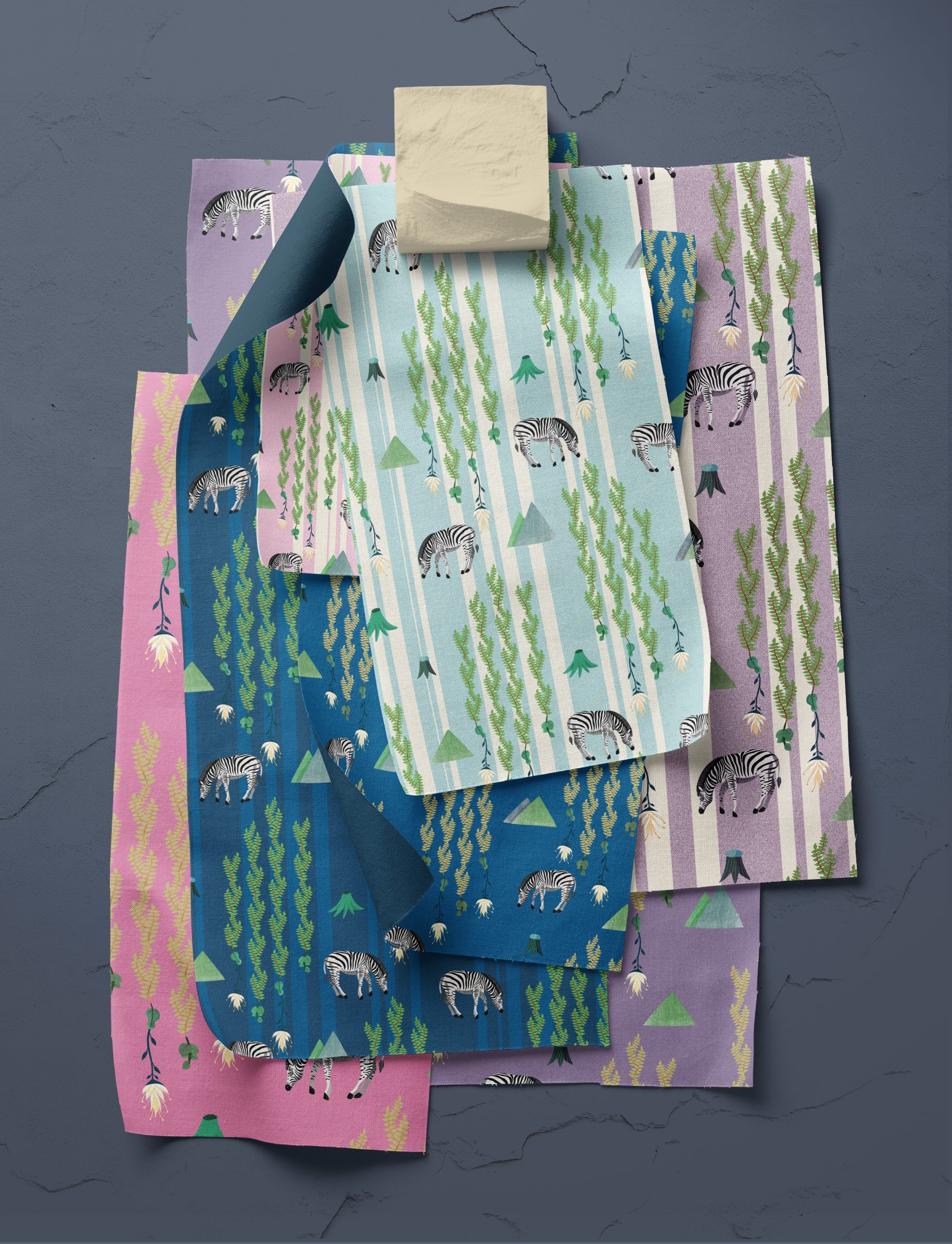
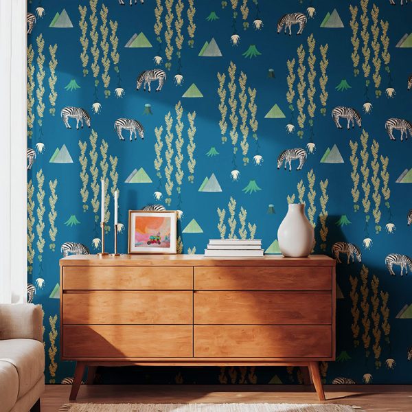
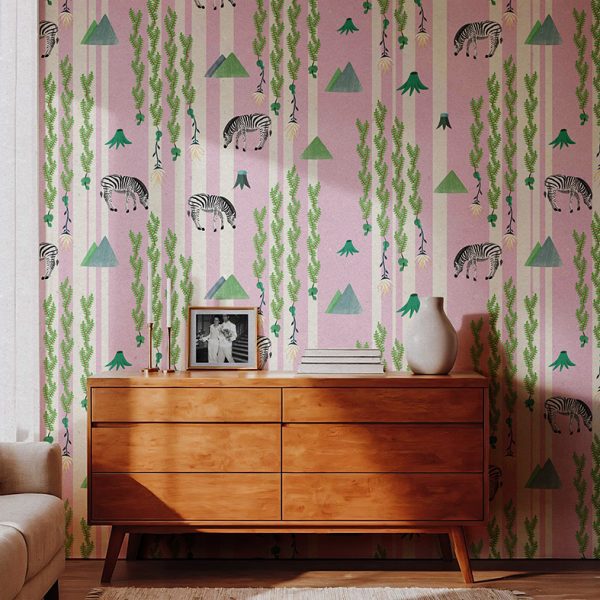
French: J’ai pensé ce motif à répétition sans raccord, comme une interprétation du thème de la savane à travers le prisme d’un design contemporain stylisé en douceur.
Ce paysage rythmique, conçu pour envelopper l’espace, présente une alternance de colonnes lavande (mauve ou bleu) et crème qui agissent comme une structure de fond pour un flux descendant de frondes de fougères suspendues et de lianes retombantes. Entre ces « rideaux » végétaux, des zèbres en train de paître apparaissent comme des points d’ancrage graphiques. Leurs rayures ponctuent la verdure et dynamisent visuellement la composition. Des formes de montagnes douces et géométriques ainsi que des fleurs stylisées s’intègrent au système de rayures, ajoutant je l’espère, de la profondeur sans pour autant rompre la continuité du motif.
Les textures dessinées à la main et la palette atténuée en font un choix idéal pour un papier peint haut de gamme pour chambre d’enfant, des rideaux statement ou un revêtement textile de boutique. Grâce à son mouvement vertical équilibré et à sa continuité sans rupture, ce motif transforme toute surface en un paysage botanique immersif et apaisant
ENG: With this seamless repeat design intended to reimagine the Savannah theme through a lens of contemporary design softly styled.
This rhythmic, room-wrapping landscape design displays alternating lavender (purple or blue)and cream columns that act like a structured backdrop for a downward flow of hanging fern fronds and trailing vines. Between the botanical “curtains,” grazing zebras appear as graphic anchors. The stripes punctuate the greenery and keep the composition visually energized. Soft, geometric mountain forms and stylized blooms tuck into the stripe system, adding depth and a sense of place without breaking the pattern’s continuity.
The hand feeling illustrated textures and muted palette make it an ideal choice for high-end nursery wallpaper, statement drapery, or boutique upholstery. With its balanced vertical movement this pattern transforms any surface into an immersive and calming botanical landscape.
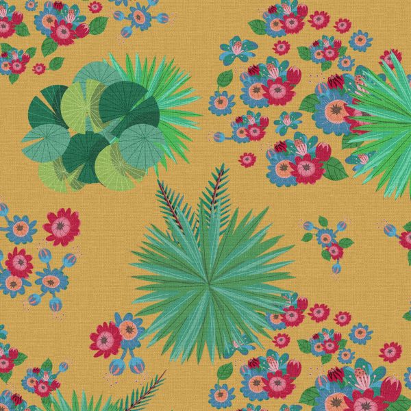
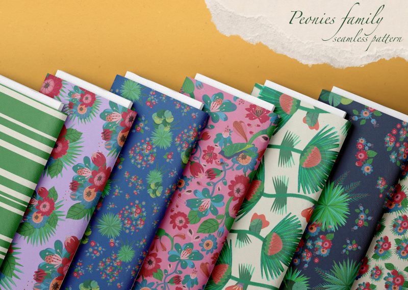
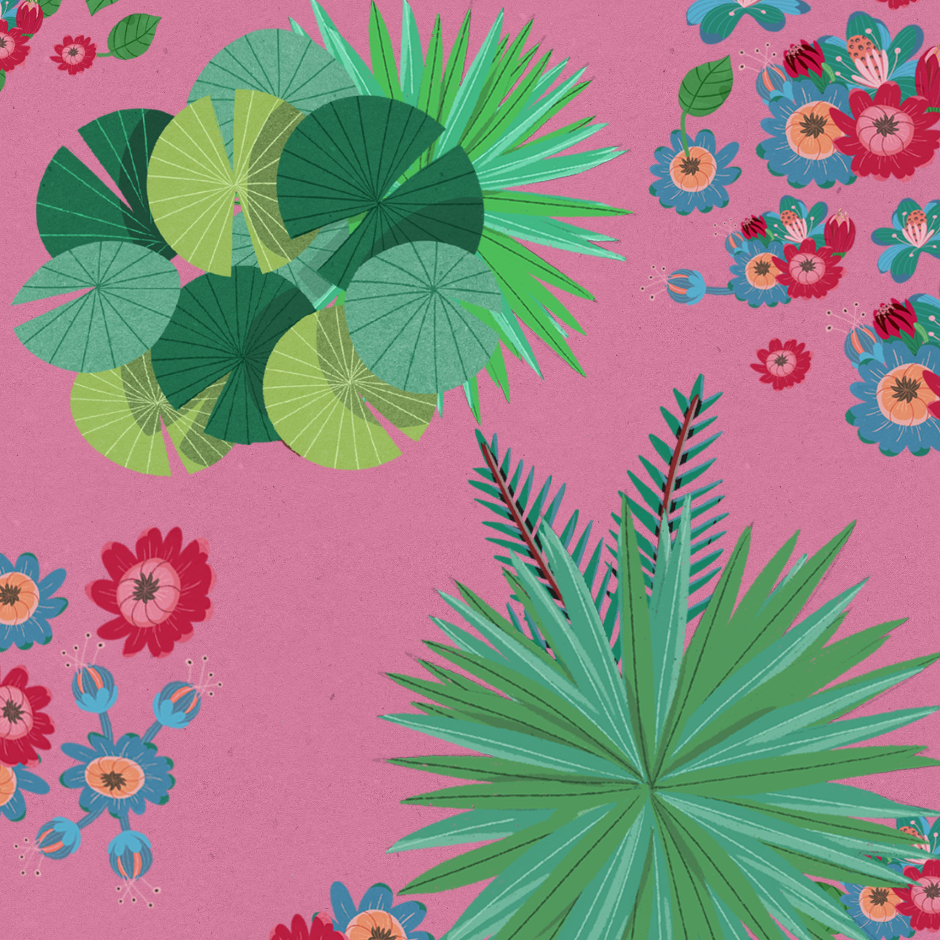
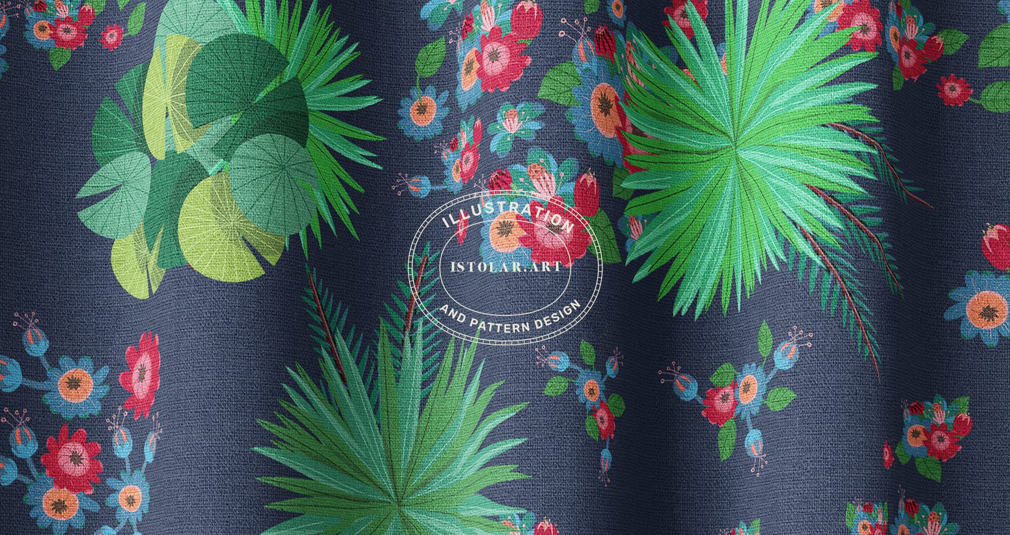
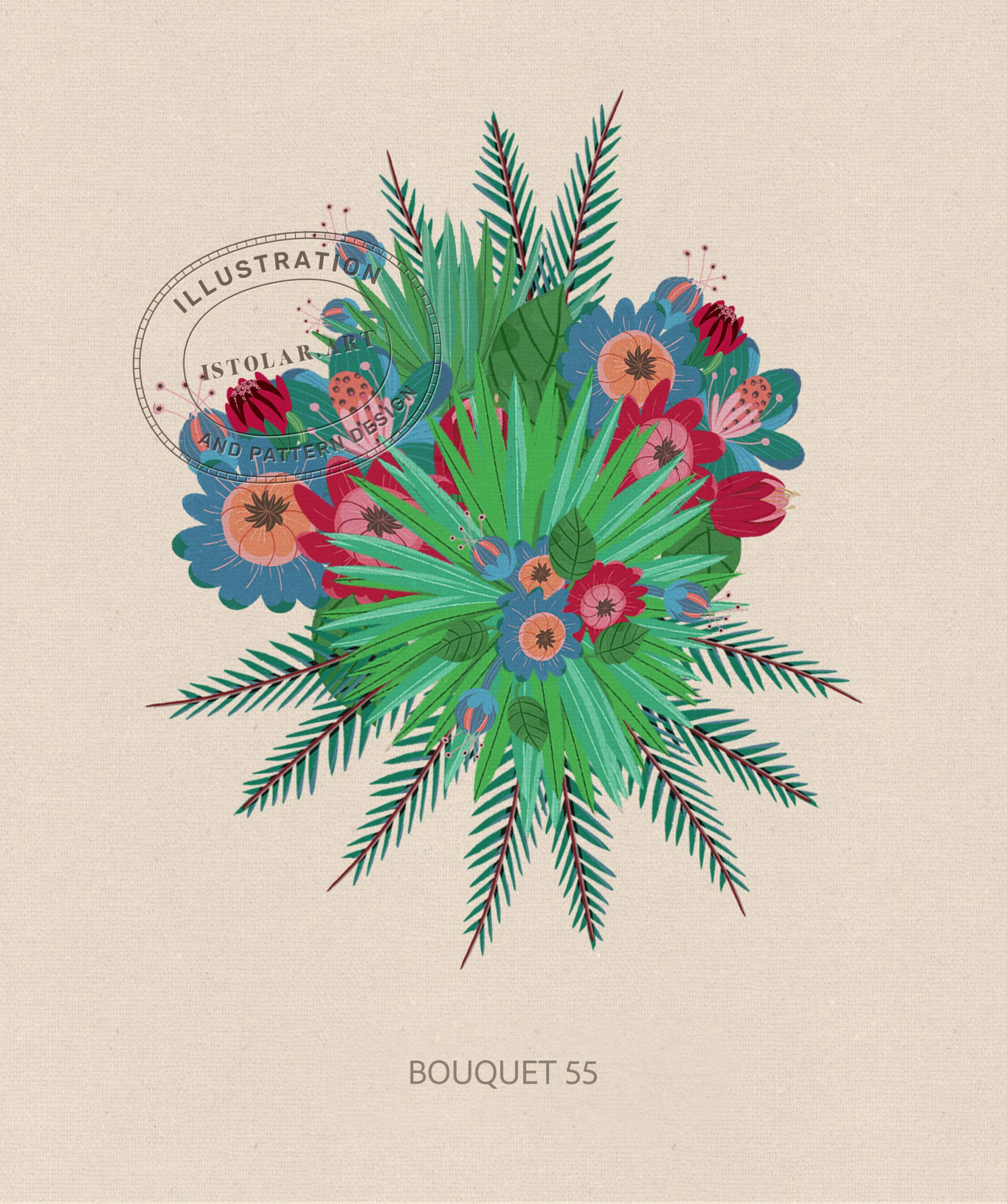
FR:Le motif est une répétition multidirectionnelle, de taille moyenne, un équilibre d’îlots fleuris dispersés avec des zones de respiration plus ouvertes.
c’est une vue aérienne d’un jardin tropical, où les palmes en étoile aux lignes graphiques rencontrent la des pivoines d’inspiration folklorique. Overall, the pattern conveys a sense of optimism and escape. It feels a little like stepping into a garden bursting with colour at midday.
J’ai réorganisé des motifs pour que celui des bouquets de pivoines s’intègre dans la “green cathédrale” collection. J’ai rajouté des superpositions de formes de feuilles plates, arrondies et effilées et piquantes qui structurent la profondeur, donnant au motif une composition proche d’une carte de jardin. Il crée ainsi la sensation visuelle de pénétrer dans une canopée végétale vue à vol d’oiseau, où des pivoines exotiques s’épanouissent dans des rouges saturés, des bleus corail entremêlés à des feuillages en forme de frondes de palmiers rayonnantes.
FR: The pattern is a tossed repeat with a multi-directional layout using a medium, balancing high-density “islands” of botanical clusters with open breathing room.
Ir’s an aerial view of a tropical garden, where sharp palm starbursts meet soft folk-style peonies. Dans son ensemble, le motif évoque l’optimisme ainsi qu’un sentiment d’évasion. C’est un peu comme entrer dans un jardin aux couleurs éclatantes, à midi.
I rearranged some of the motifs so that the peony bouquet design could be integrated into the Green Cathedral collection. I added layers of flat, rounded, tapered and pointed leaves to structure the depth, giving the pattern a composition reminiscent of a garden map. The result creates the visual sensation of entering a leafy canopy seen from above, where peonies bloom in saturated intertwined with radiant, palm-frond-like foliage.
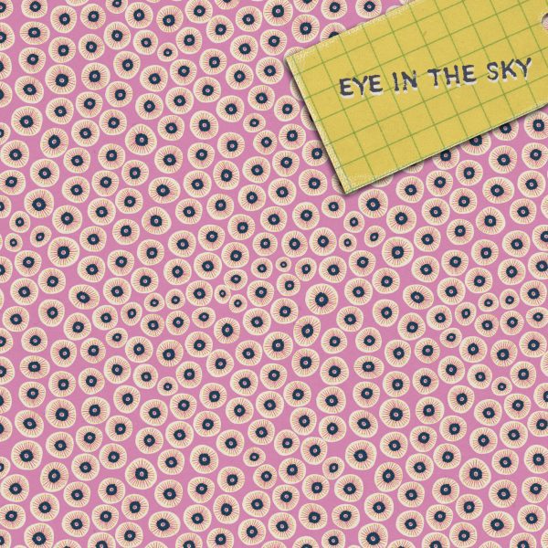
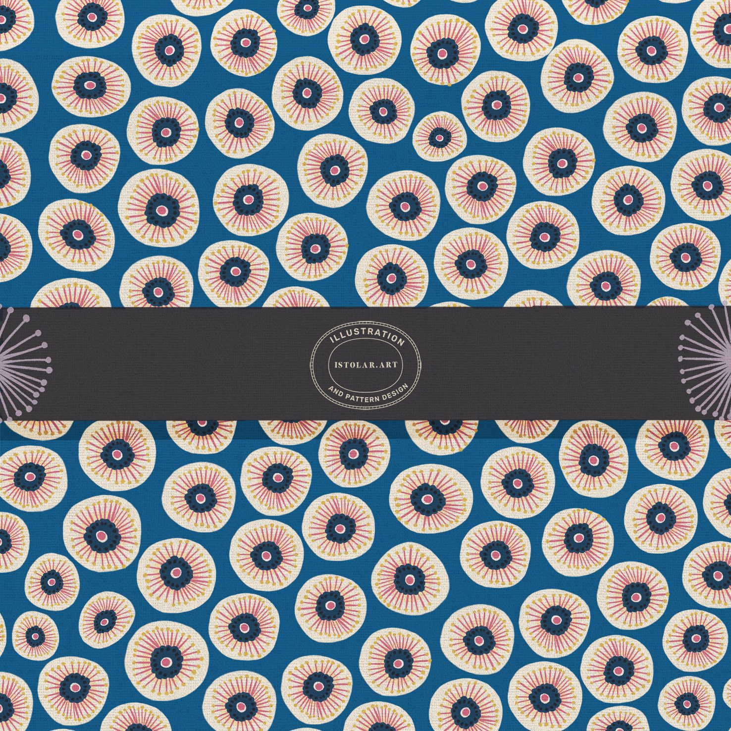
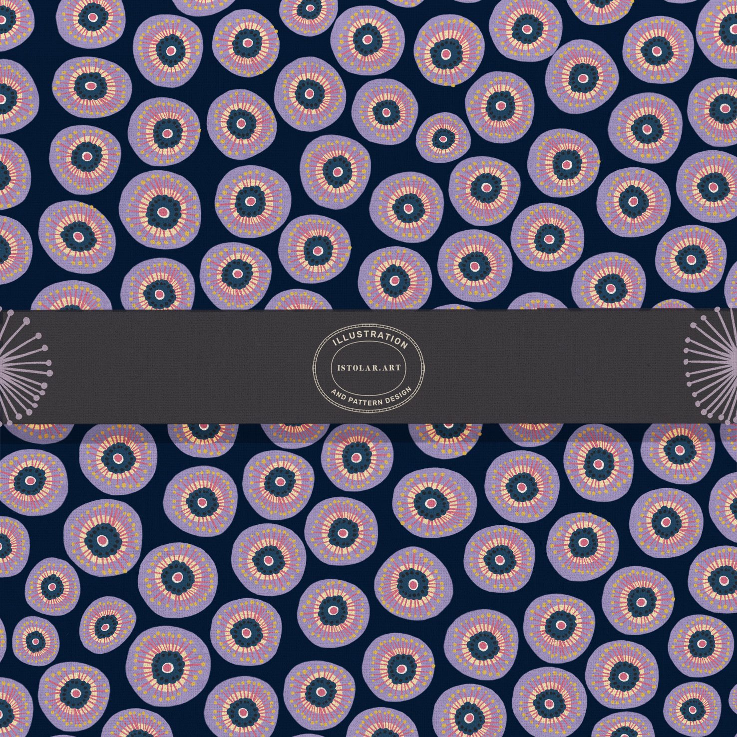
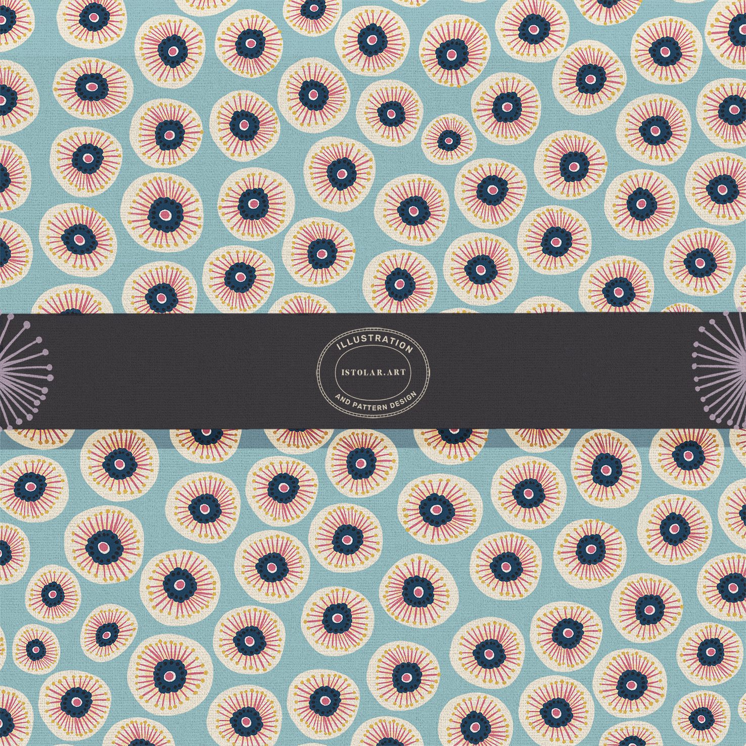
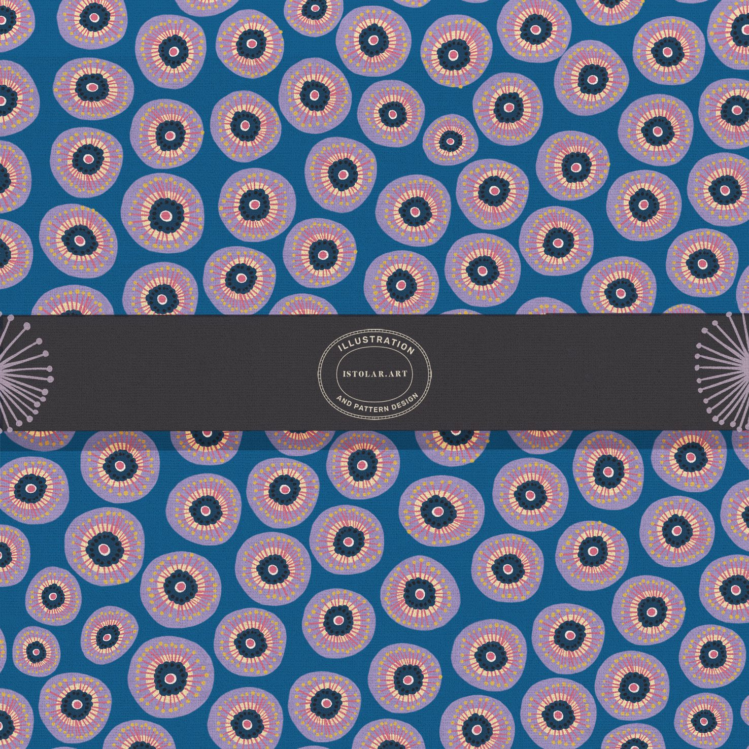
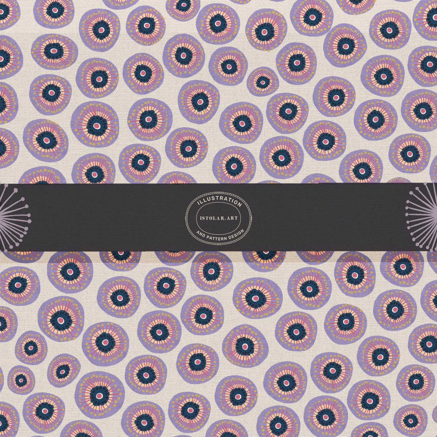
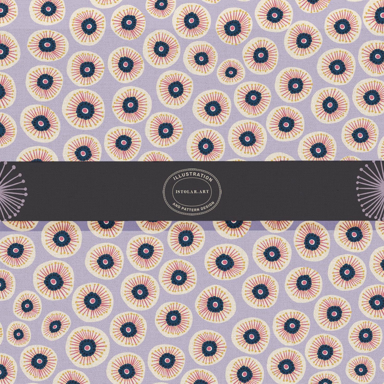
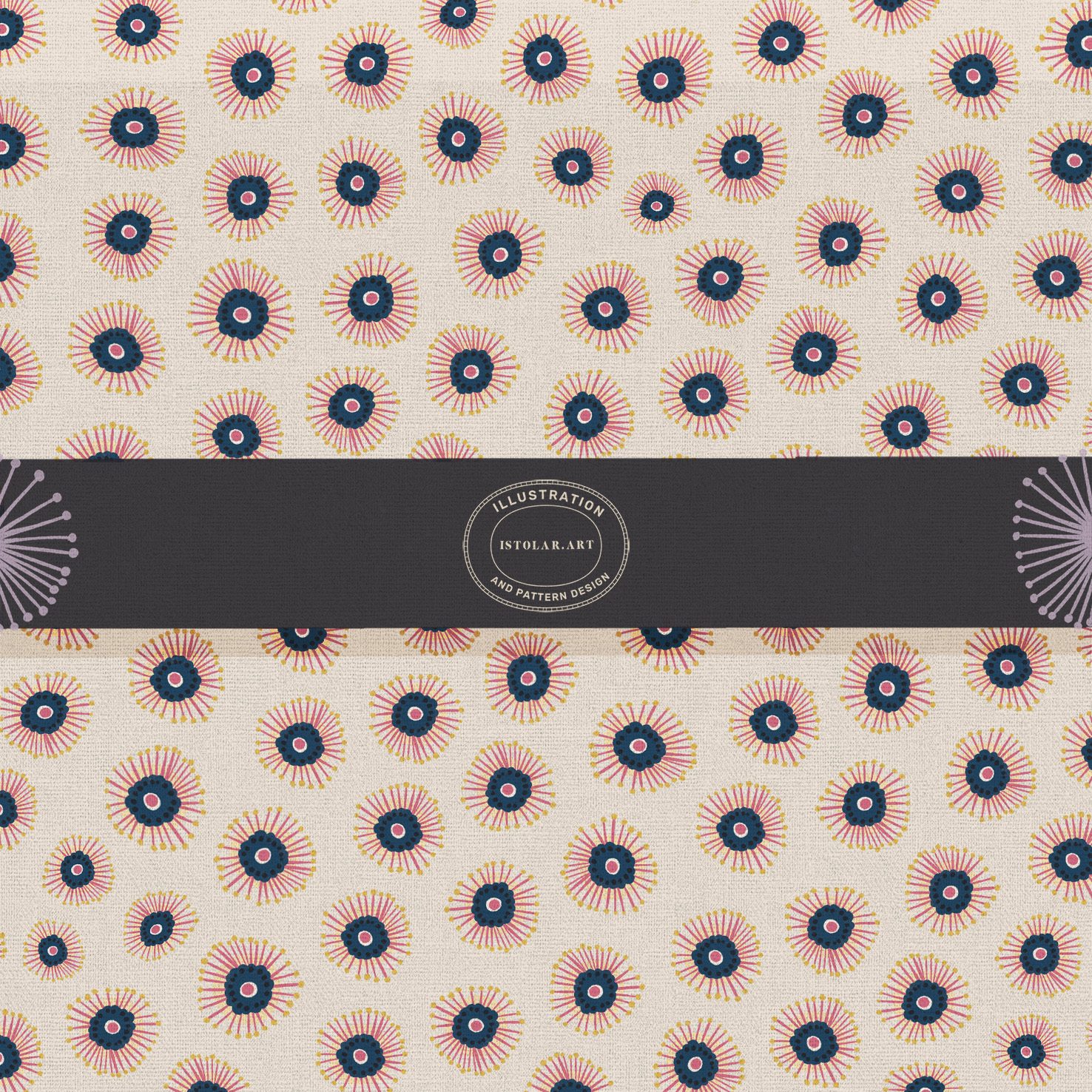
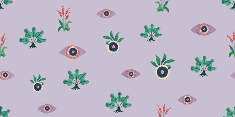
FR: Un motif en semis de rosettes stylisées, de cercles et d’iris, sur fond lavande, crème ou bleu marine.
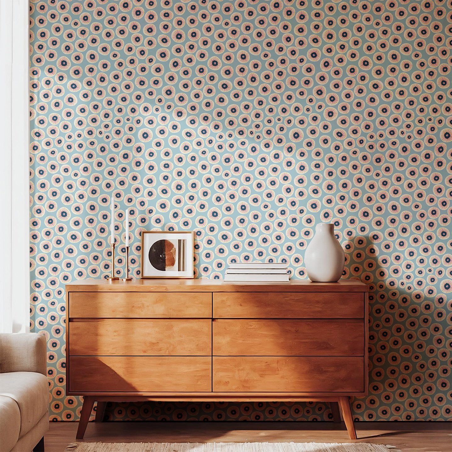
Polyvalent, ce motif secondaire offre un rythme graphique et est conçu pour s’associer à des motifs principaux plus imposants dans des collections de décoration intérieure et de textile. Il peut également se suffire à lui-même, comme le montre l’exemple en papier peint.
En papier peint, cette déclinaison de couleurs transforme une pièce en un écrin enveloppant et sur tissu, elle se prête particulièrement bien à la tapisserie d’ameublement, aux rideaux, aux coussins, aux courtepointes et aux accents décoratifs audacieux, où la densité du motif apporte instantanément structure et énergie.
Je n’y avais pas particulièrement pensé lors de la création de ce motif, mais je perçois aujourd’hui un mélange d’influences japonaises et africaines.
Dans ses éléments d’inspiration japonaise, les rosettes centrées sur un bleu marine peuvent évoquer des kiku stylisés que sont les chrysanthèmes emblématiques vénérées pour leur floraison automnale et autrefois cultivées.
Dans ses éléments à rapprocher d une inspiration africaine, on retrouve une esthétique proche de celle des impromés wax.
Pris dans son ensemble et observé à distance, le motif devient une texture ornementale et atmosphérique, un champ rythmé et maximaliste de médaillons d’iris , comme une fusion symbolique entre des soleils rayonnants et des yeux attentifs.
Cette répétition déploie une riche palette d’indigo et de lavande pour créer une surface contemporaine à l’allure presque talismanique.
ENG : A tossed repeat of stylized rosettes/ circles/ iris on lavender, cream or navy background.
It is a versatile secondary pattern offers a rhythmic, designed to coordinate with larger hero motifs in home decor and textile collections. It can stand alone as well (see wall paper picture)
As wallpaper, this colorway transforms a room into an atmospheric envelope
On fabric, it’s especially strong for upholstery, drapery, cushions, quilts, and bold home décor accents where dense patterning brings instant structure and energy.
I didn’t think much about it when designing this pattern, but now I can see a mix of Japanese and African influences.
In its Japanese-inspired elements, the navy-centered rosettes recall stylized “”kiku (chrysanthemums), iconic flowers revered for their autumn blooms and historically cultivated with great care and secrecy.
In its African-inspired elements it is a wax-print aesthetics.
As a whole and from a distance, it becomes an atmospheric, ornamental texture, a rhythmic, maximalist field of “Iris Medallions, a symbolic fusion of radiant sunbursts and watchful eyes. This repeat uses a rich palette of indigo and lavender to create a modern, talismanic surface design.
FR: Une esthétique décorative intemporelle, entre le charme nostalgique des chambres d’enfant traditionnelles et l’élégance raffinée des intérieurs haut de gamme.
ENG: A timeless decorative aesthetic, balancing the nostalgic charm of a traditional nursery with the refined sophistication of high-end interiors.
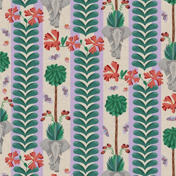
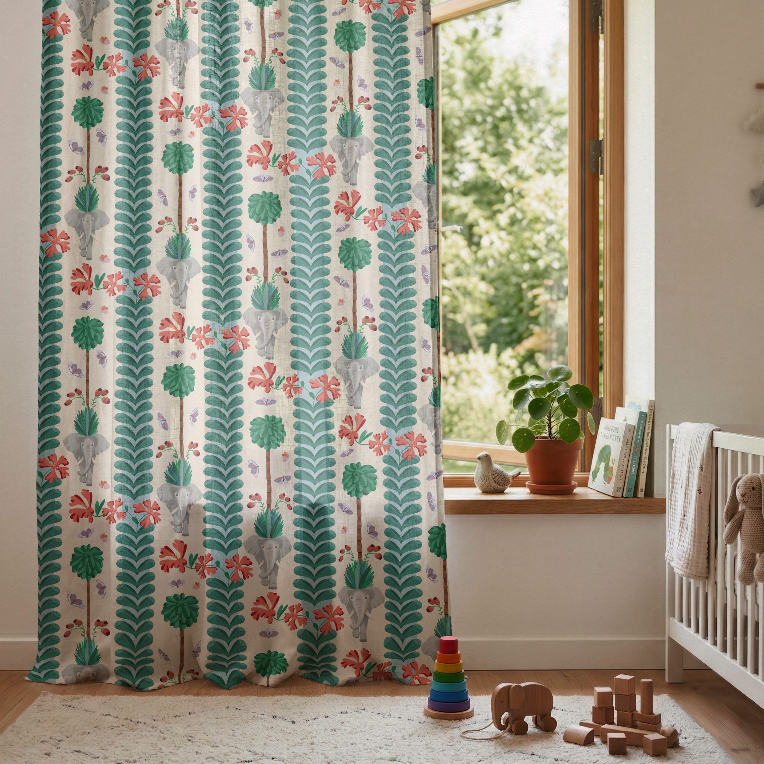
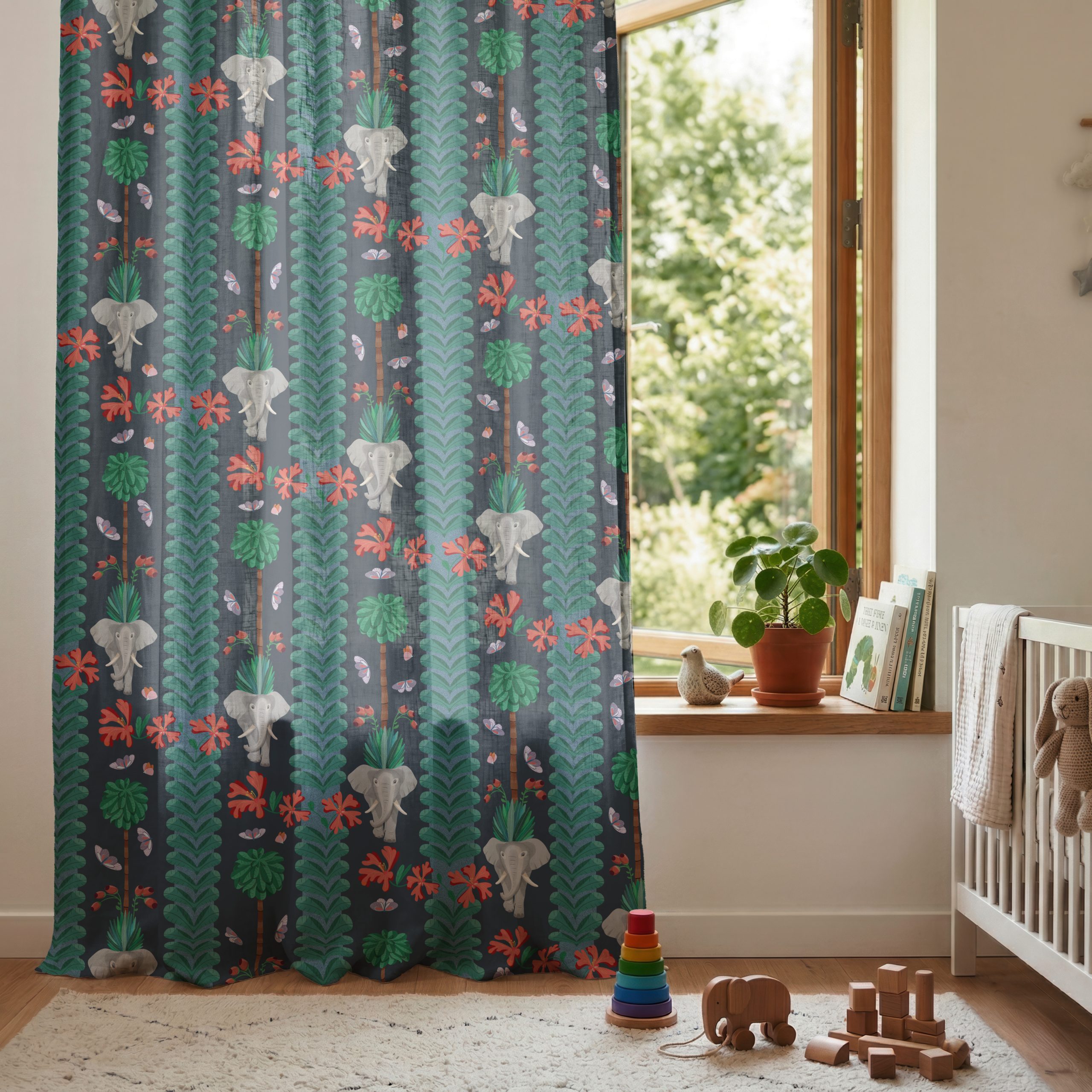
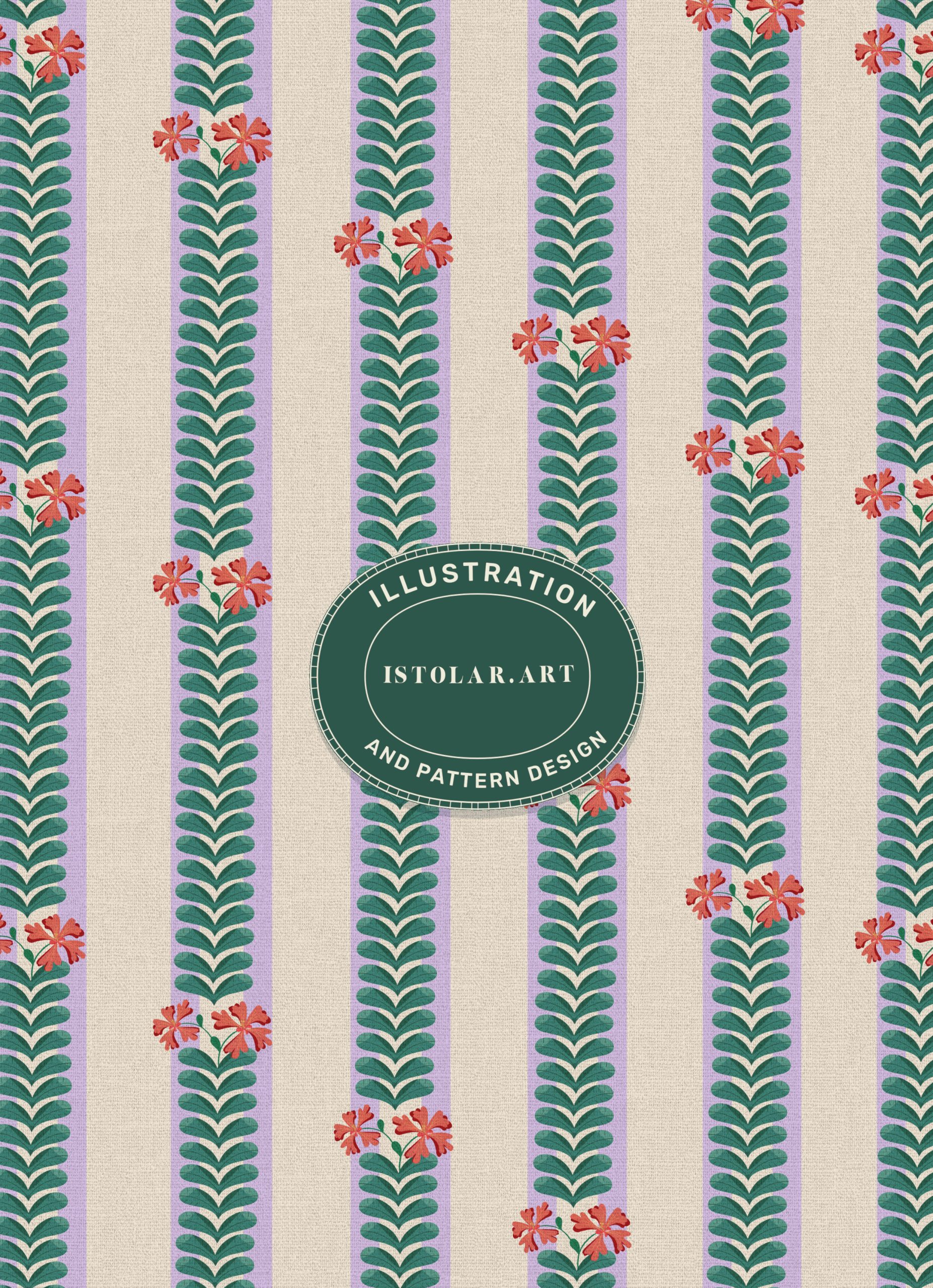
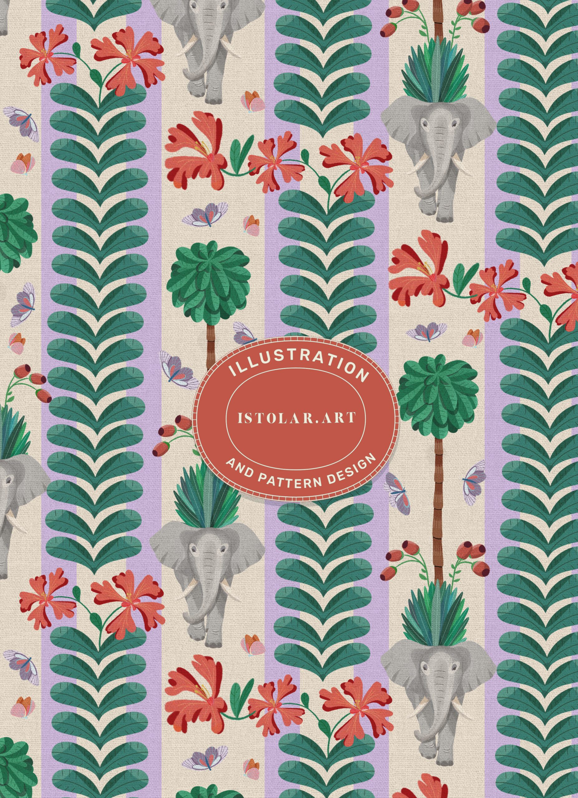
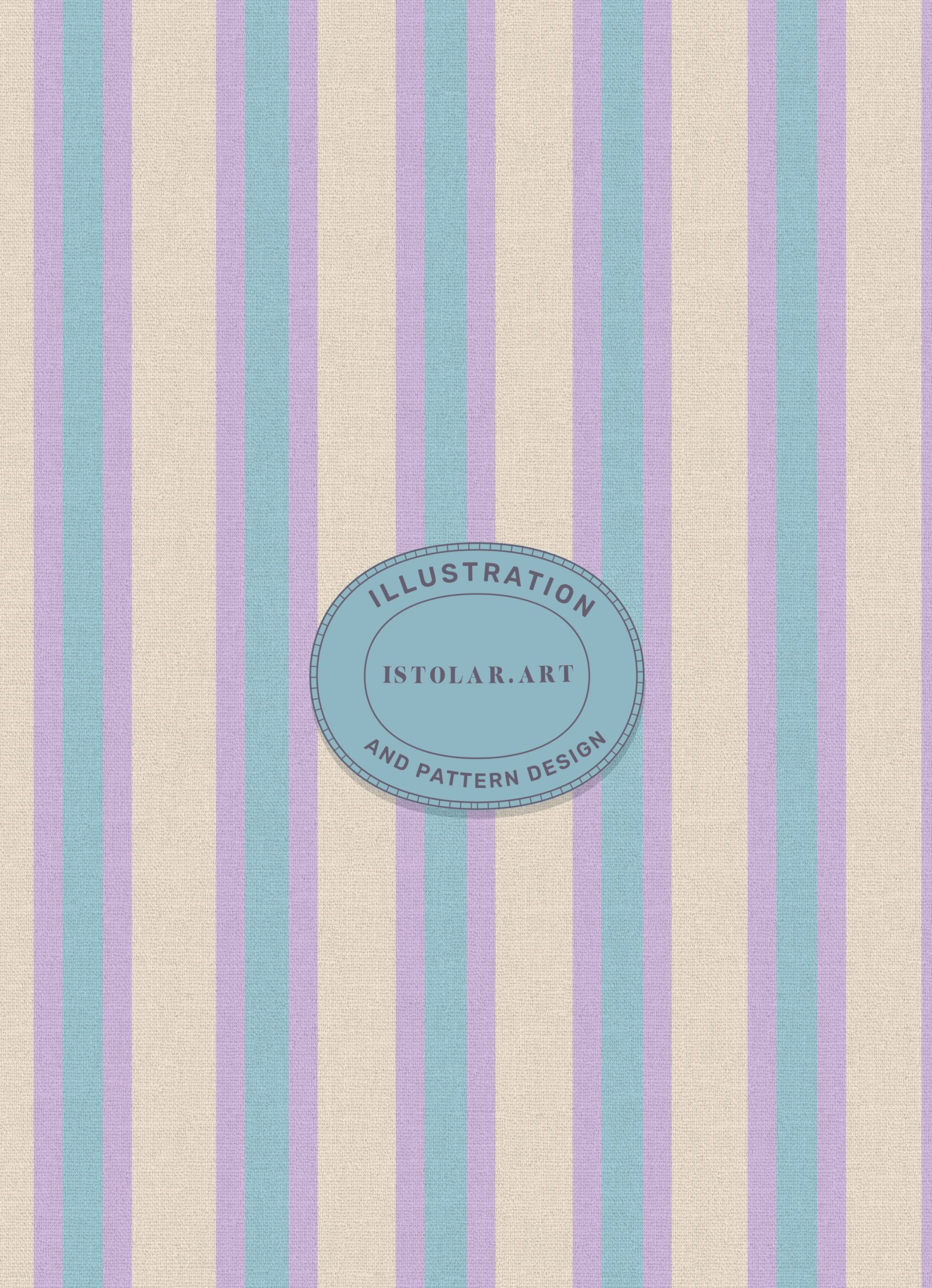
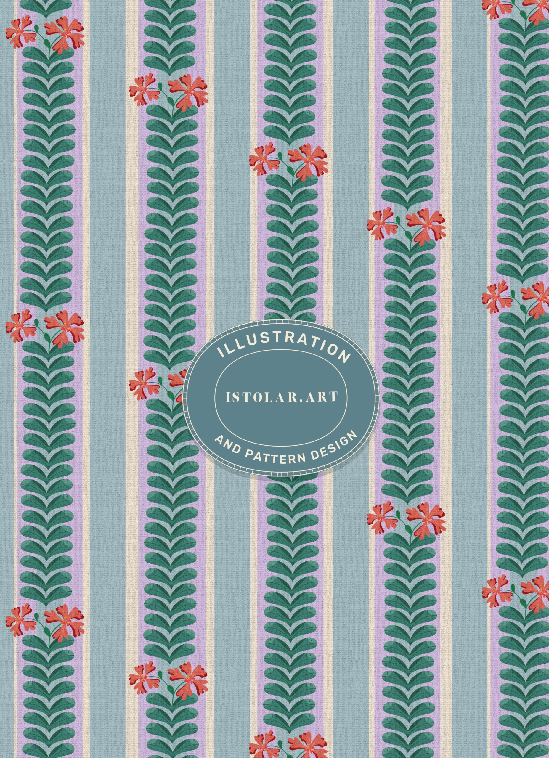
FR: Ce motif ornemental est conçue comme une frise décorative inspirée de la jungle. Sa composition en rayures verticales évoque le rythme de colonnes architecturales, avec des piliers de feuillage encadrés de papillons épars et d’hibiscus en fleur. le vert vegetal et les fleurs corail chaleureuses se détachent sur un fond lavande, créant ainsi de la profondeur.
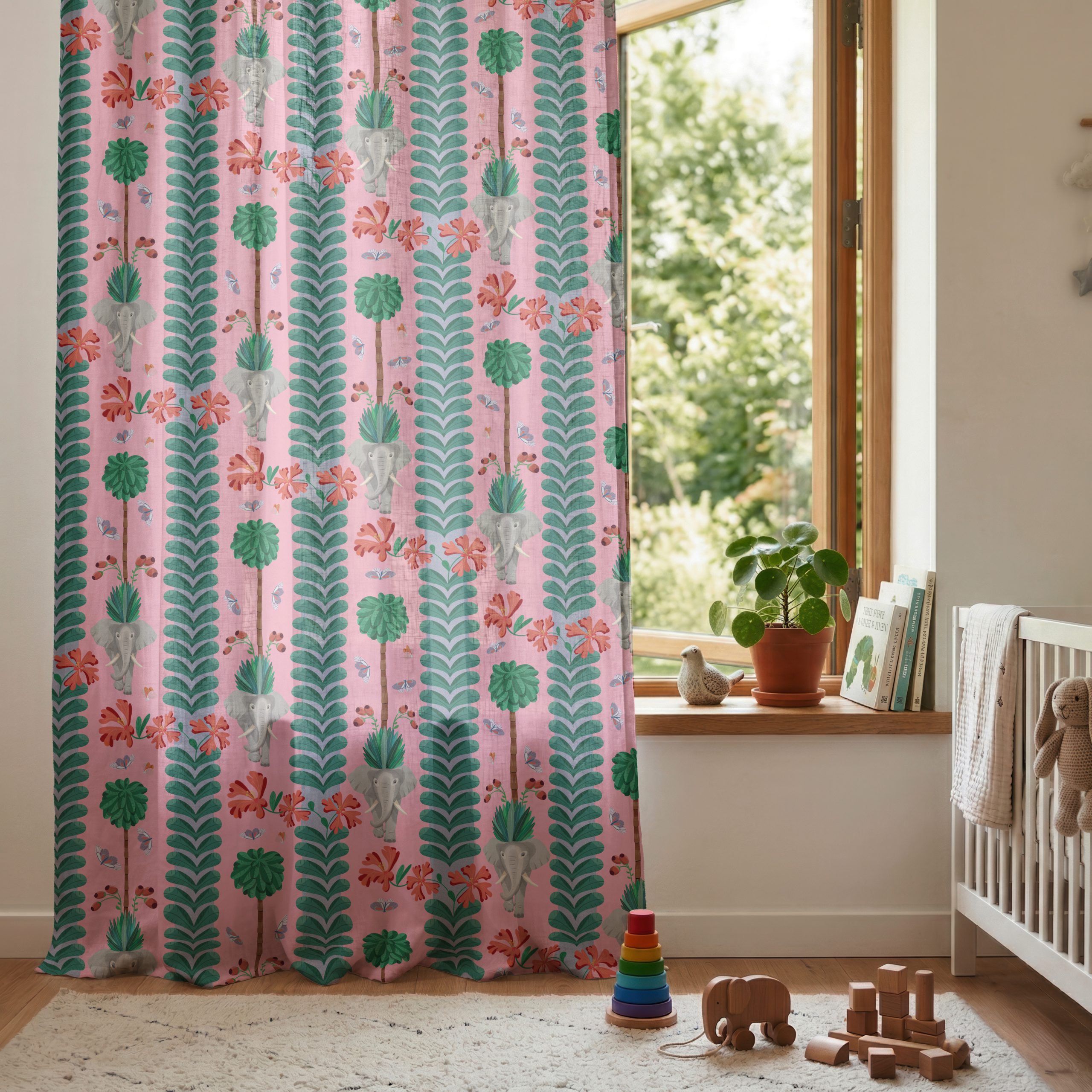
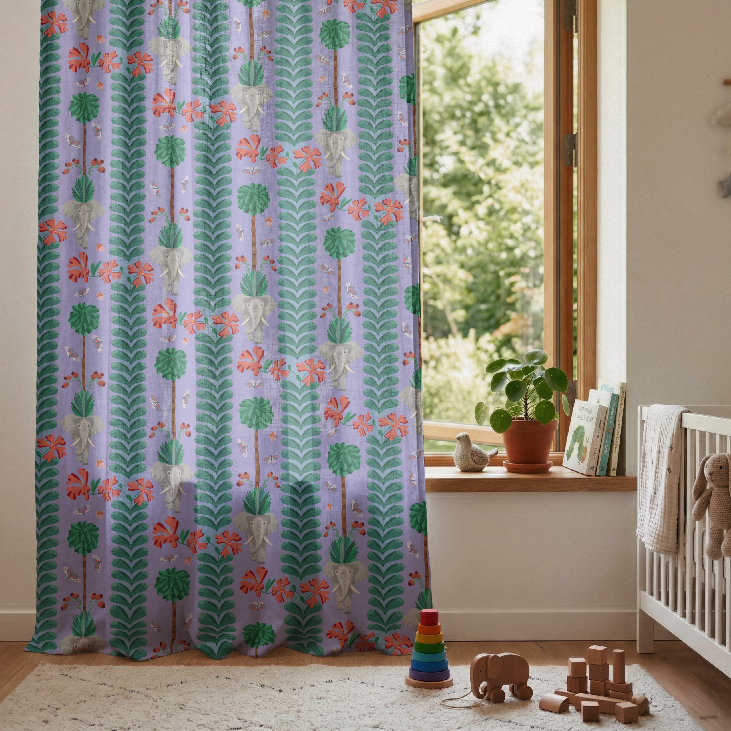
Le motif mêle une composition intemporelle à une approche plus moderne de la décoration intérieure. Son alignement rythmé assurent une continuité visuelle sur de grandes surfaces. Il convient particulièrement aux “murs d’accent”, aux tissus d’ameublement et aux rideaux remarquables.
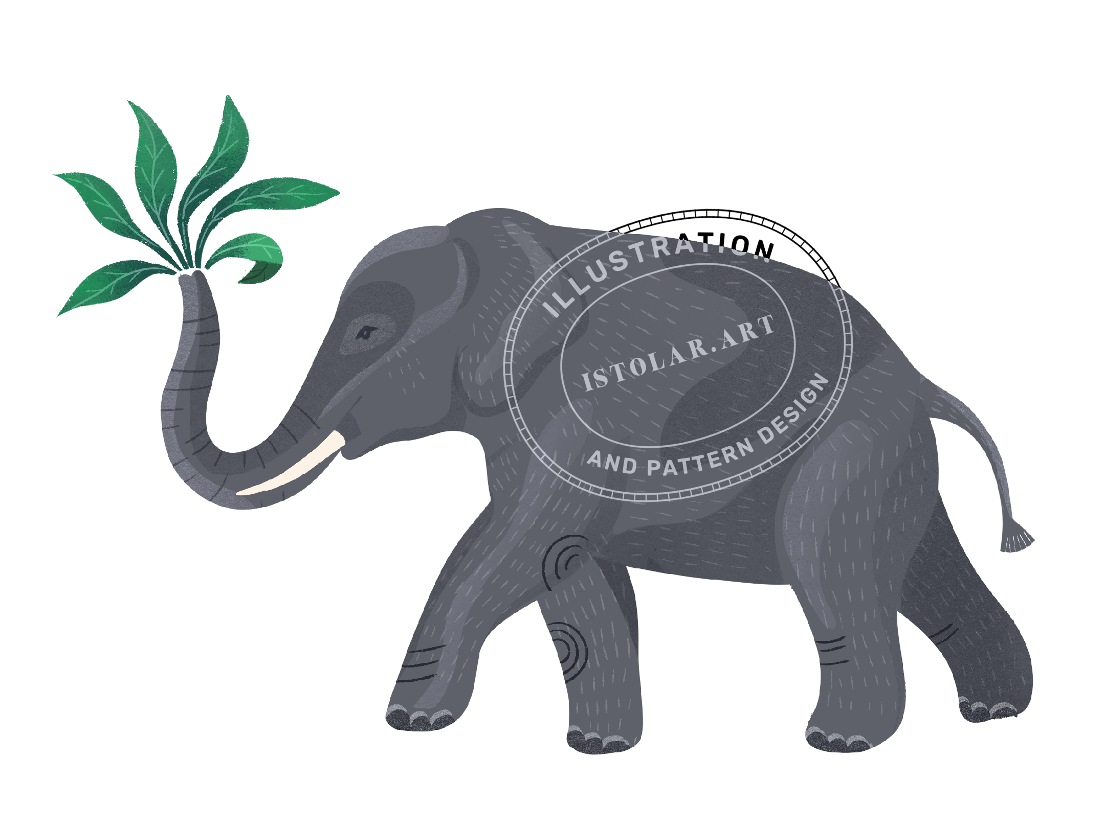
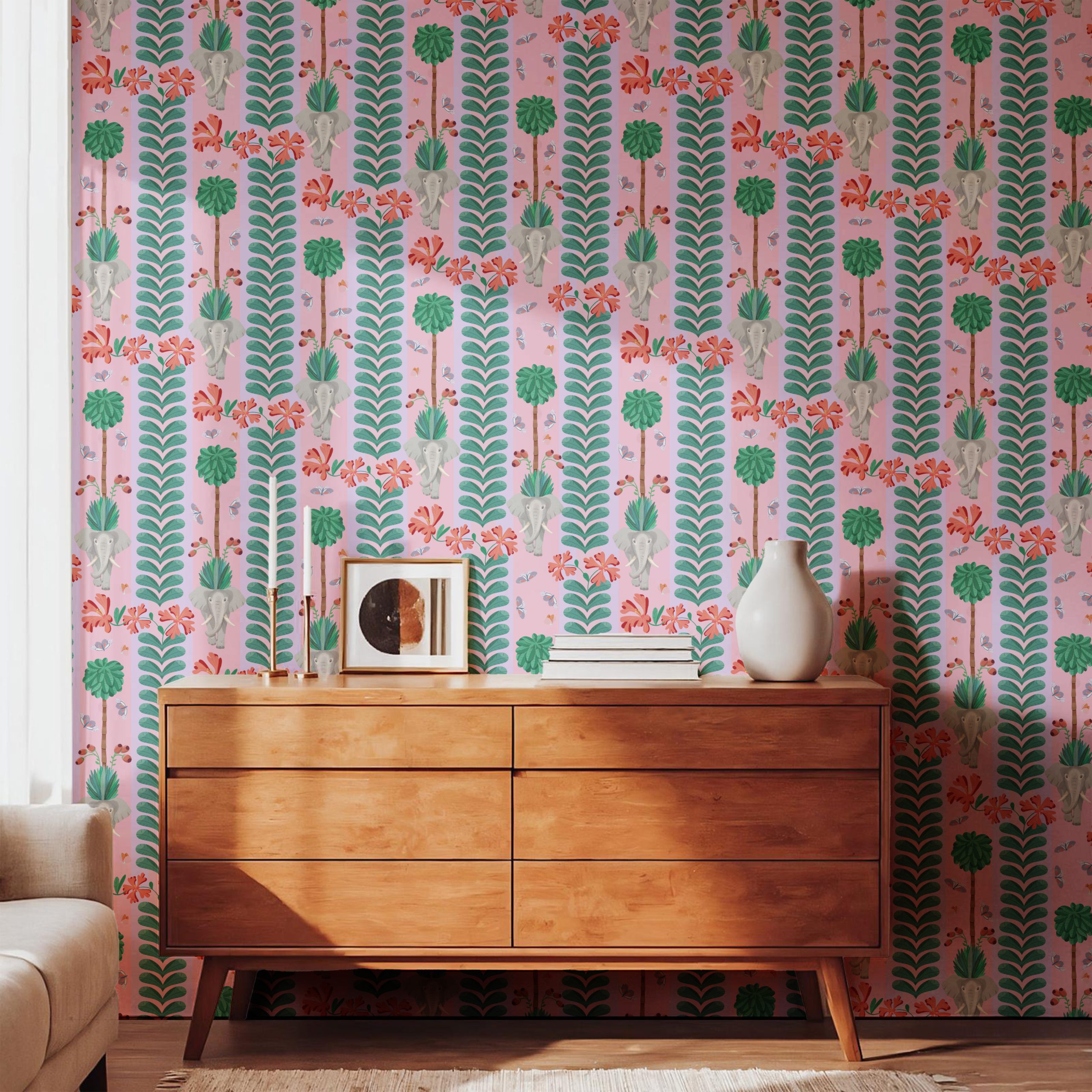
Utilisé en papier peint, ce dessin transforme une pièce en une fresque tropicale immersive. Éléphants, fleurs évoquant l’hibiscus, rameaux de baies et papillons virevoltants s’entrelacent dans une cadence de rayures , formant une grille décorative qui laisse deviner un potentiel d’une dimension narrative.
EN: The Ornamental Repeat is designed as a decorative jungle frieze. Its vertical striped layout echoes the rhythm of architectural columns, with leafy pillars framed by scattered butterflies and blooming hibiscus. Layers of green foliage and warm coral florals stand out against a soft lavender ground, creating depth.
Blending a timeless composition with a contemporary approach to interior décor, the pattern provide visual continuity across large surfaces. It is particularly suited to feature walls and upholstered furniture.
As wallpaper, the design transforms a room into a tropical safari mural. Elephants, hibiscus-like blooms, berry sprigs, and fluttering butterflies are woven into a rhythmic striped cadence, forming a decorative grid that suggest a lively storytelling.
 isa
isa