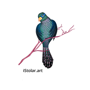
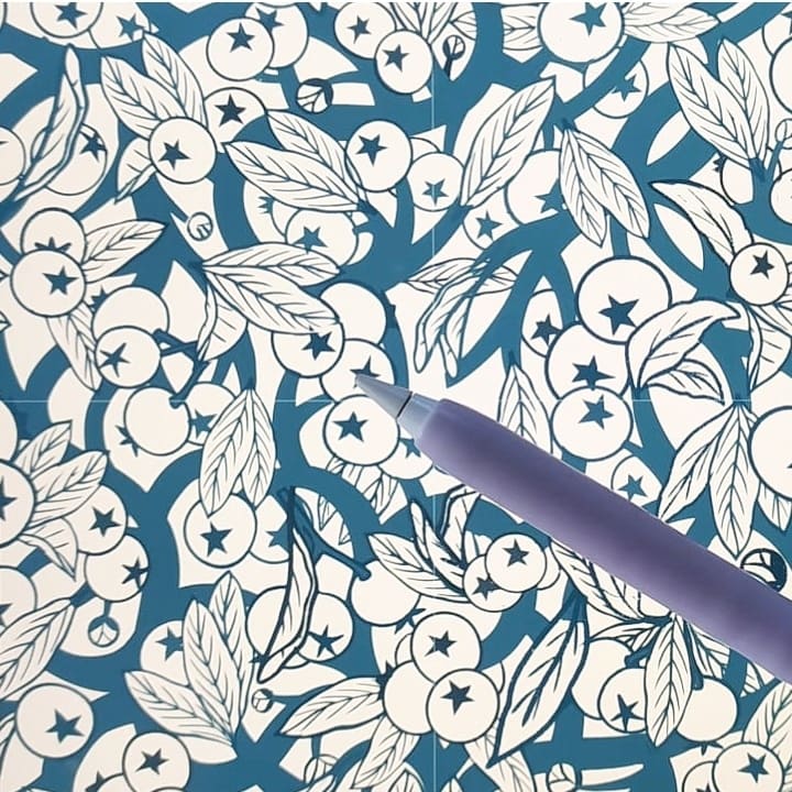
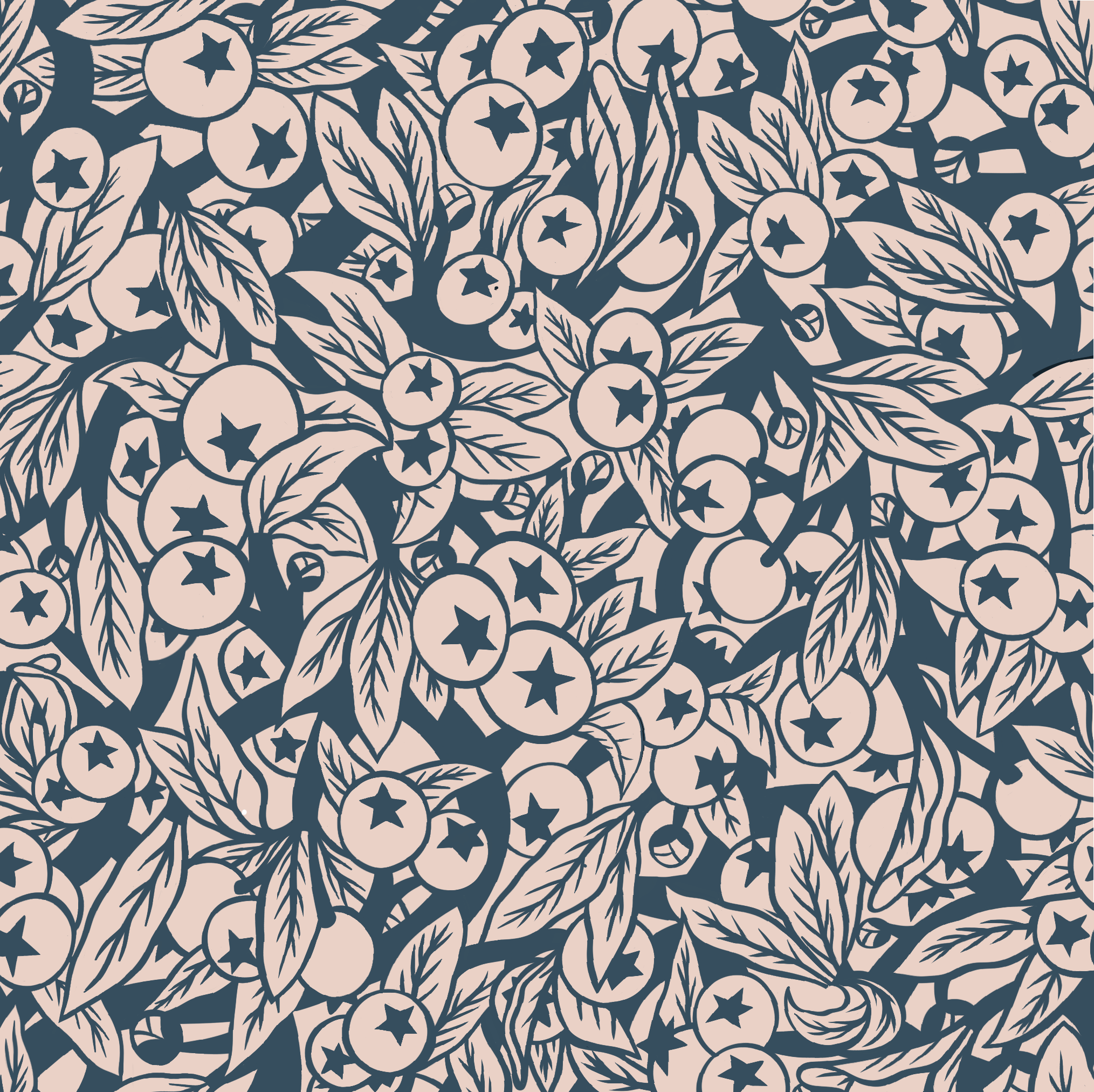
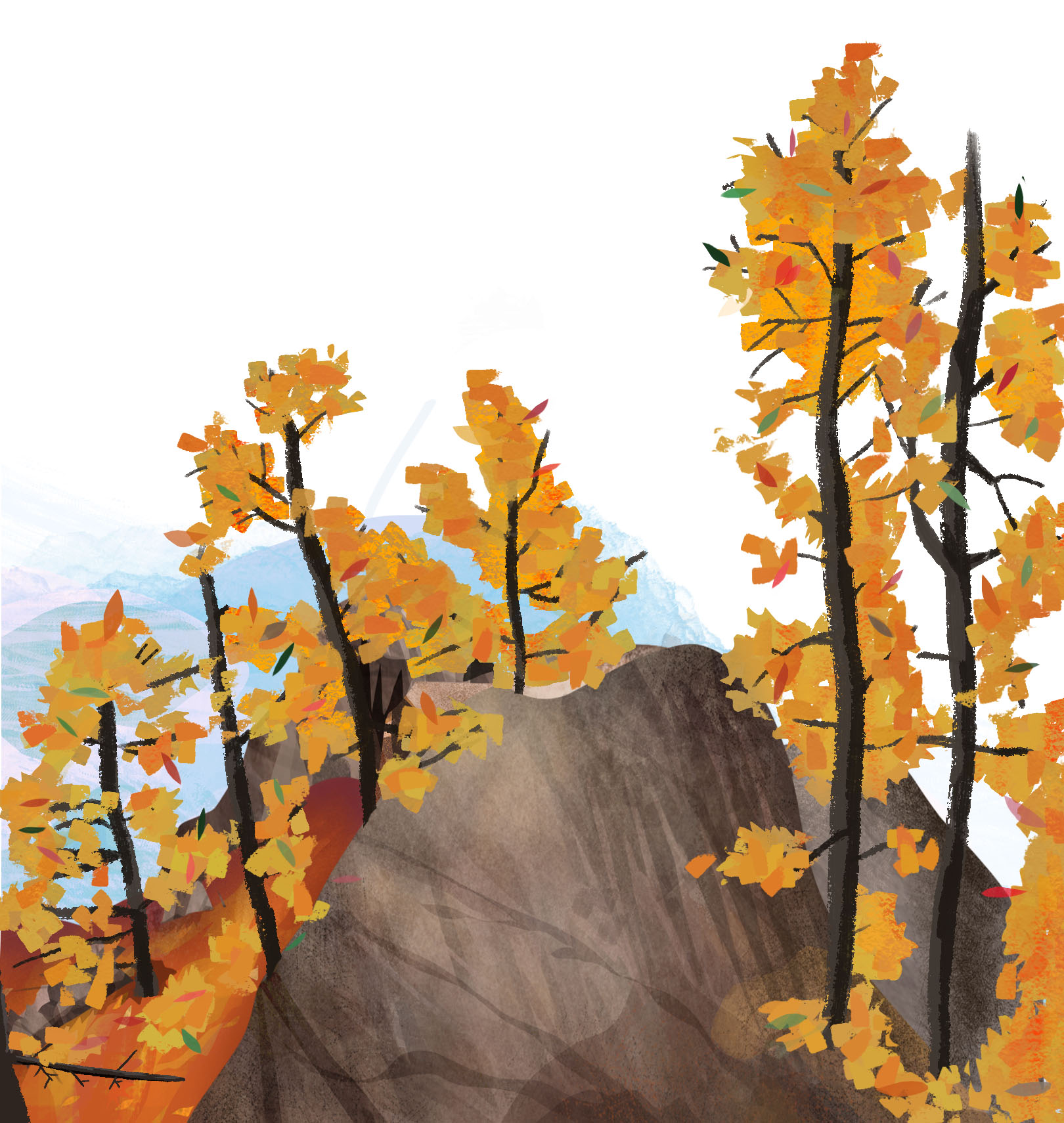
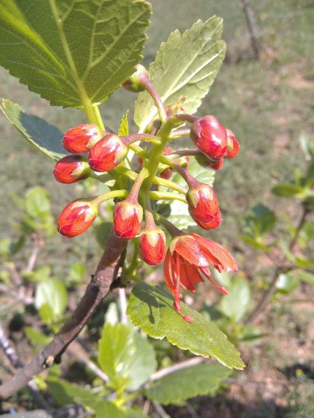
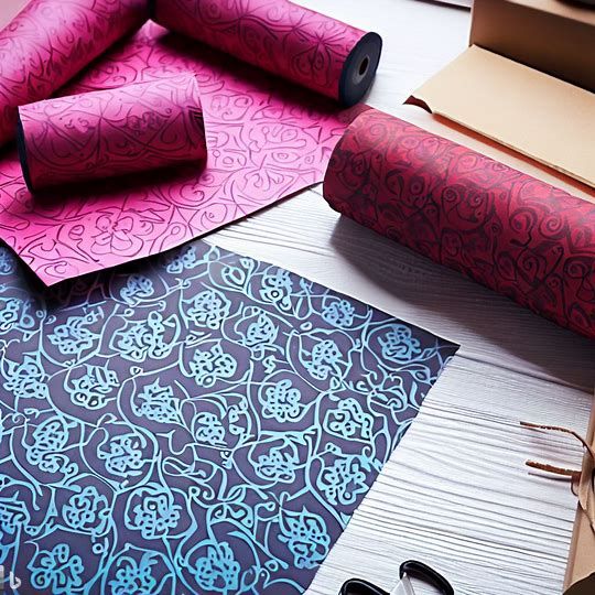
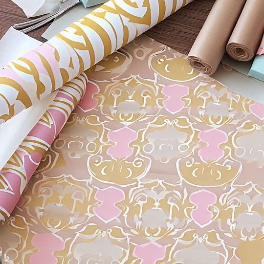
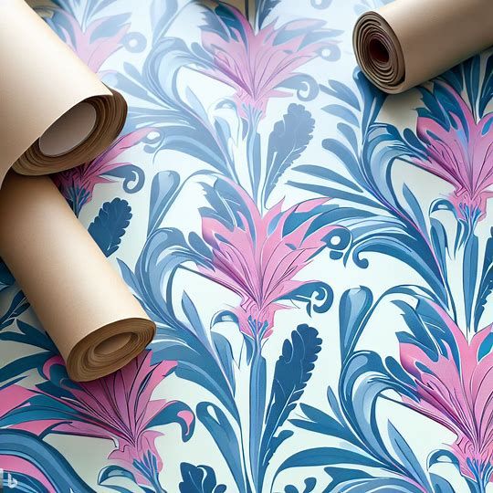
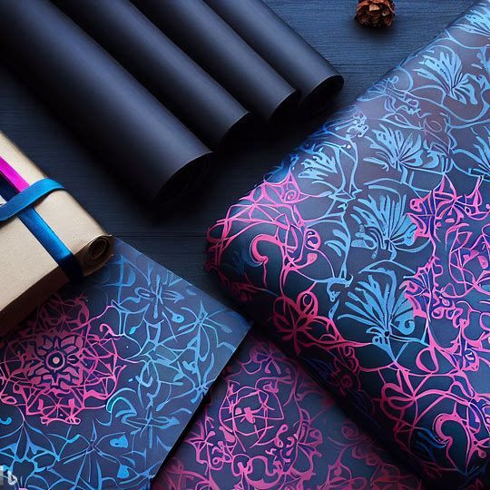
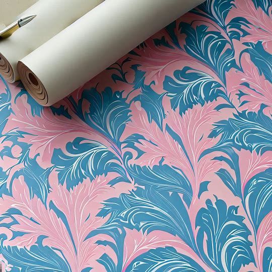
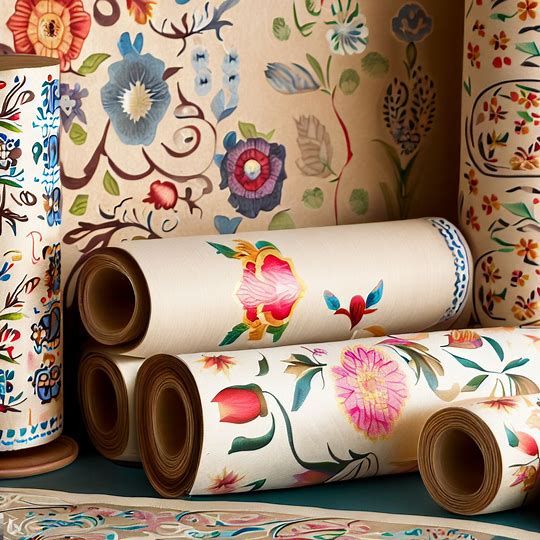
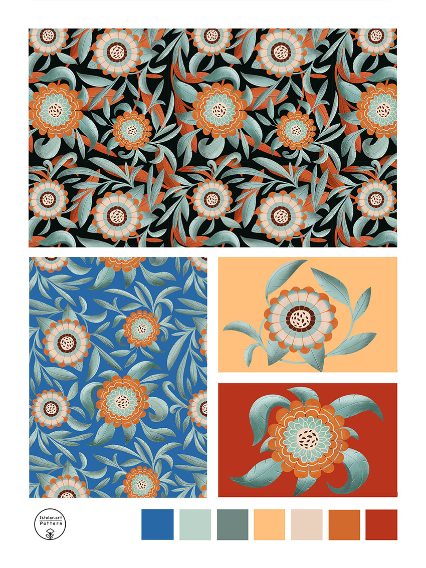
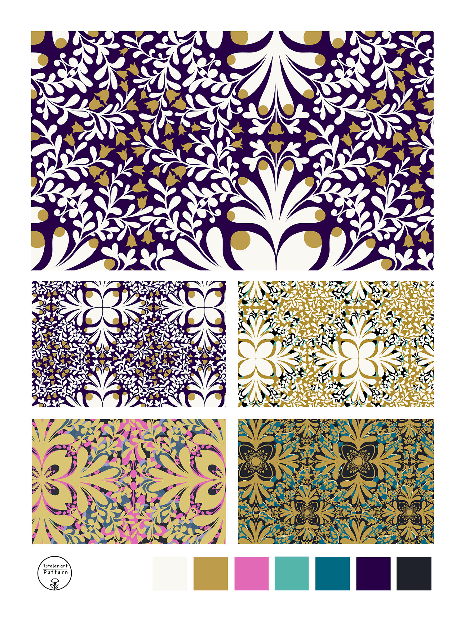
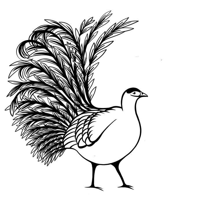
At the very begining I transformed a “tree of life” tile design non repeat pattern) into a full drop repeat pattern
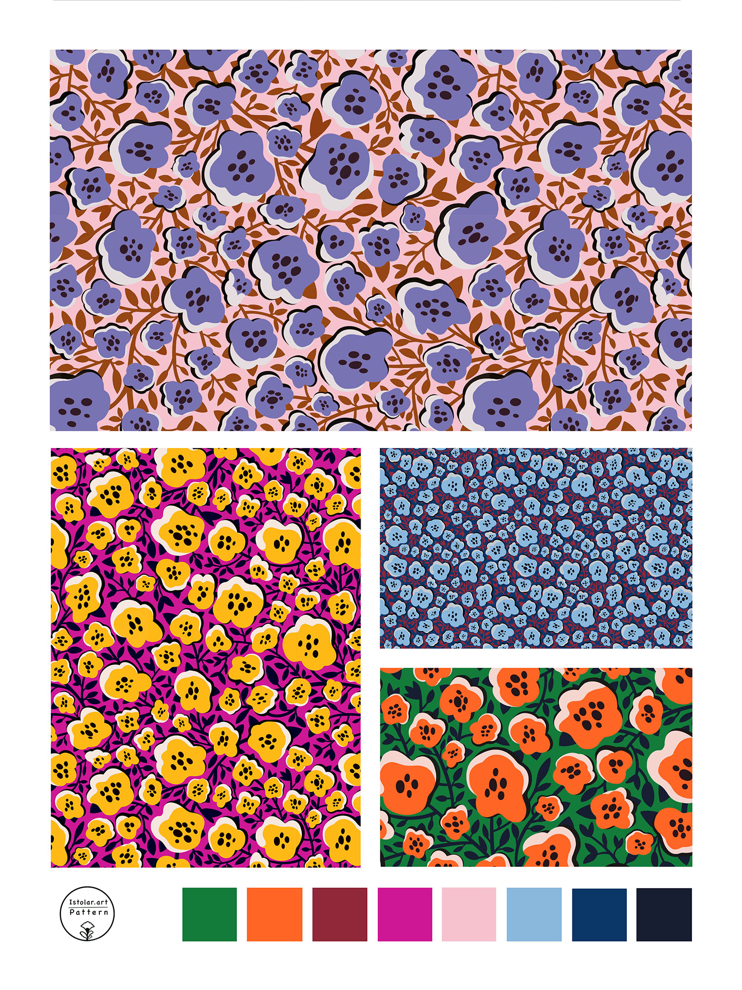
Then I intended to use the same pattern swatch structure to create an other pattern design. I wanted to create one more bushy motif with branches rather than thin flowers. I thought it would be a way to make an other pattern following the same tracks of a previous one. As a matter of fact I encountered lots of unexpected difficulties on the way: It was not that easy to make it even with the imbricated leaves and fruits. I might as well have started it from scratch. Eventually it worked out so all is well ! 🙂 .
I guess i learned a lesson : the structure of the repeat is one thing but the style of the flowers and leave make the identity and fluidity of the pattern even more strongly. It was not a short cut at all
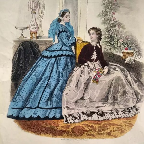
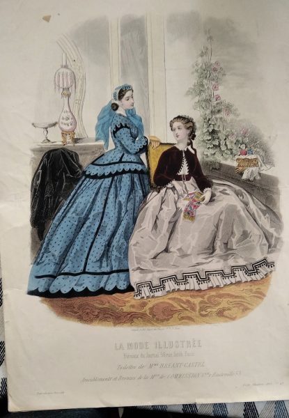
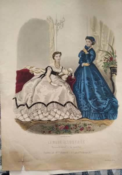
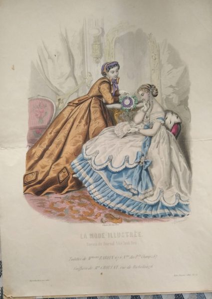
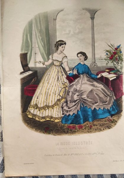
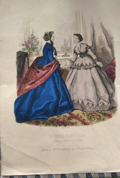
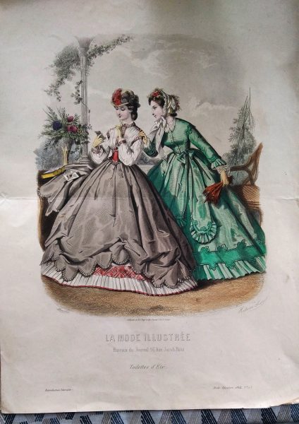
Des gravures de mode du XIXe siècle (datées de 1866 😳) . À l’oeil nu on devine une gravure reproduite (très bien reproduite, belles ombres en hachures) et des couleurs qui semblent ajoutées .
J’ai lu que la production de gravures pour une revue nécessitait souvent le travail – d’un artiste pour le dessin et – d’un graveur pour l’impression. Les revues populaires étaient en mesure d’embaucher les meilleurs illustrateurs du moment. Certaines gravures sont en noir et blanc tandis que d’autres, de grande qualité, ont été coloriées à la main après leur impression.
J’ai aussi lu que jusque en 1898 le coloriage des gravures se faisaient à la main et que par la suite, c”est une machine qui apposait la couleur selon la technique picturale du pochoir: la peinture était appliquée couleur par couleur, à travers des plaques métalliques découpées (c’est peut être le cas pour celles-ci.)
Le truc un peu foufou c’est que le monsieur me les a vendues pour 50 centimes pièce. n’est-ce pas? 😳
Quand je les ai vues sur place, je me suis dit que j allais les scanner et faire papoter les dames de féminisme… un jour
Une amie artiste, pleine de ressource a commenté mon post instagram et m’a permis d’apprendre des trucs – Vive instagram 🙂 !
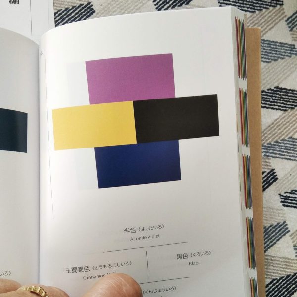
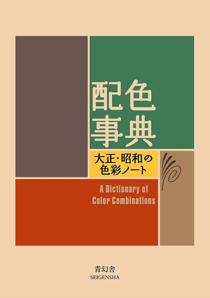
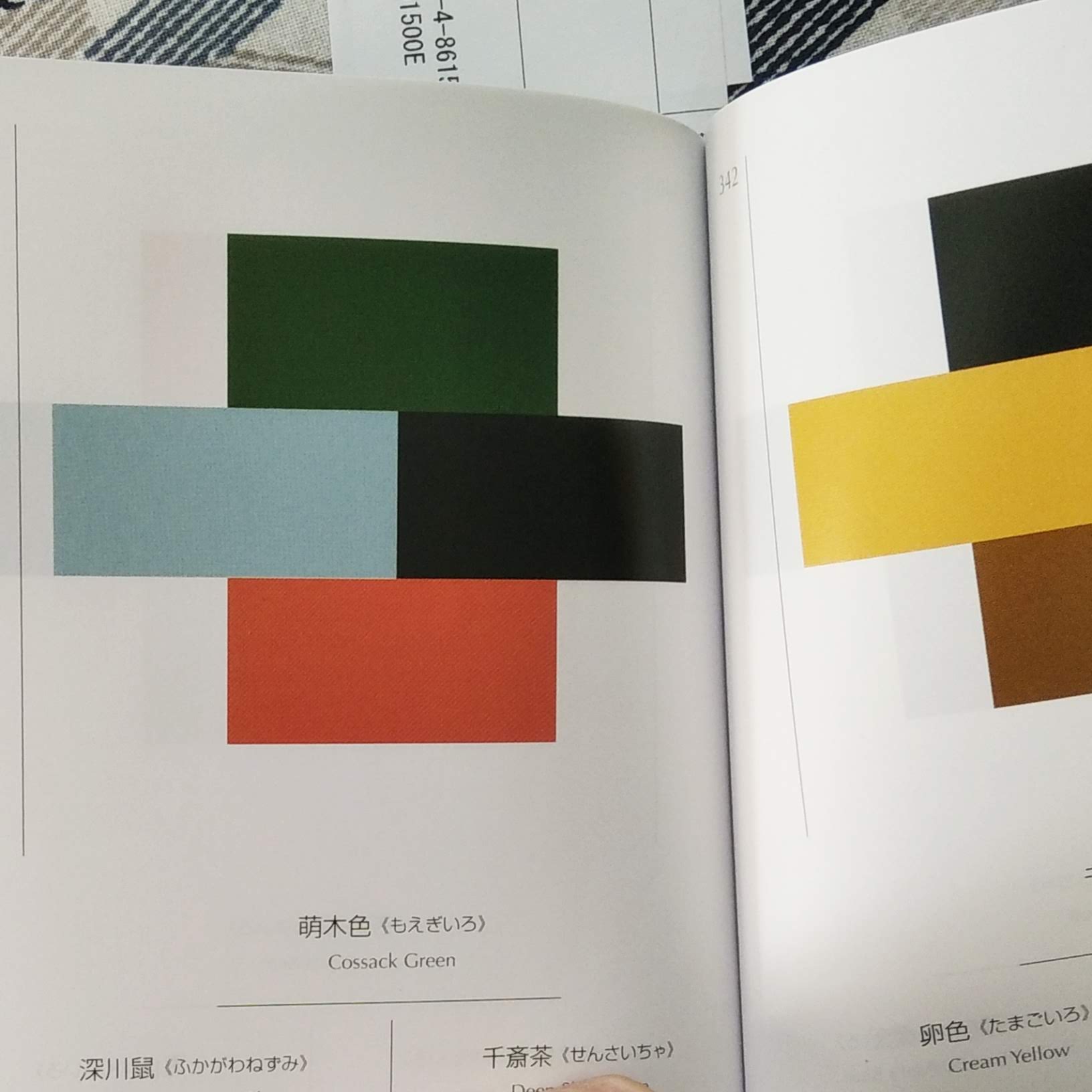
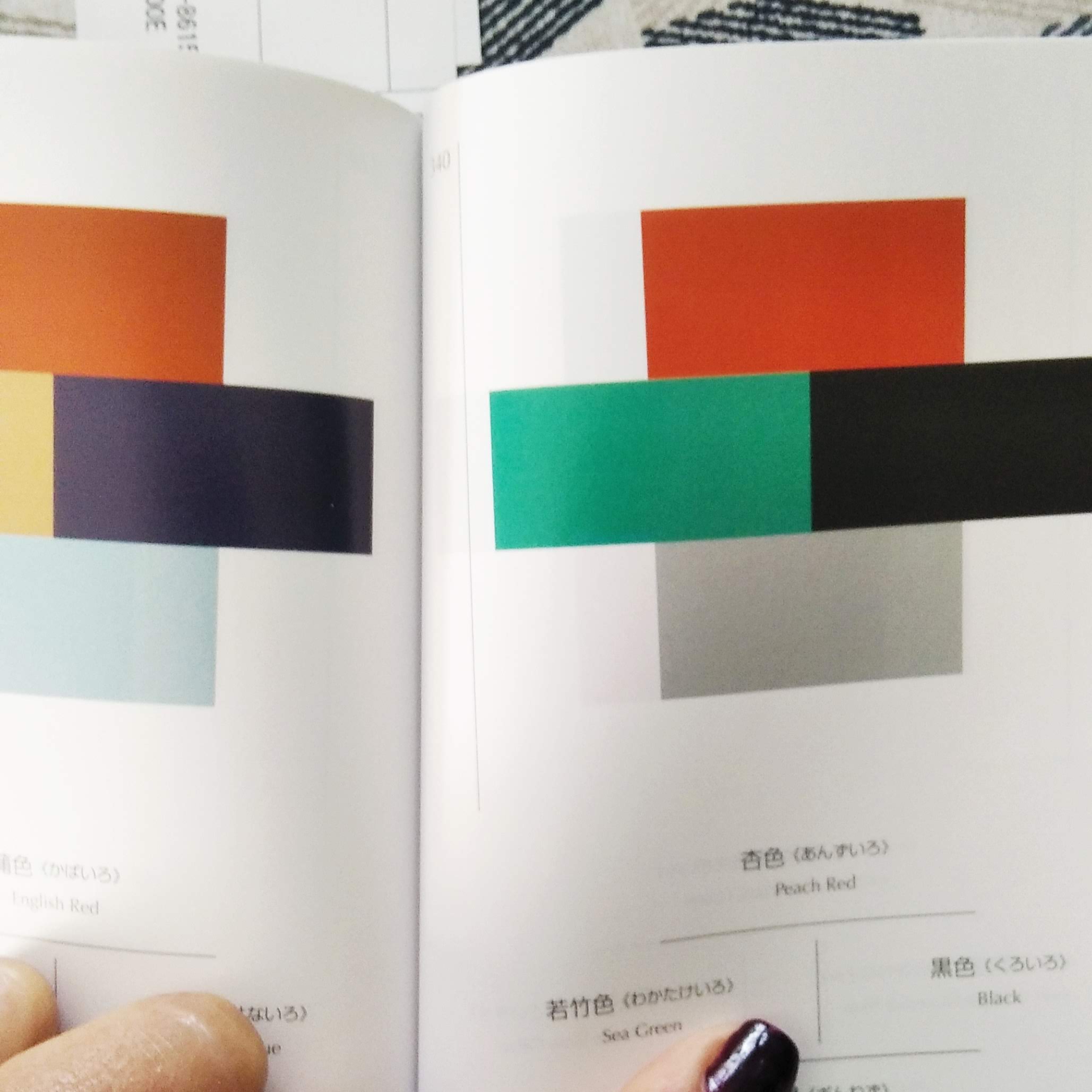
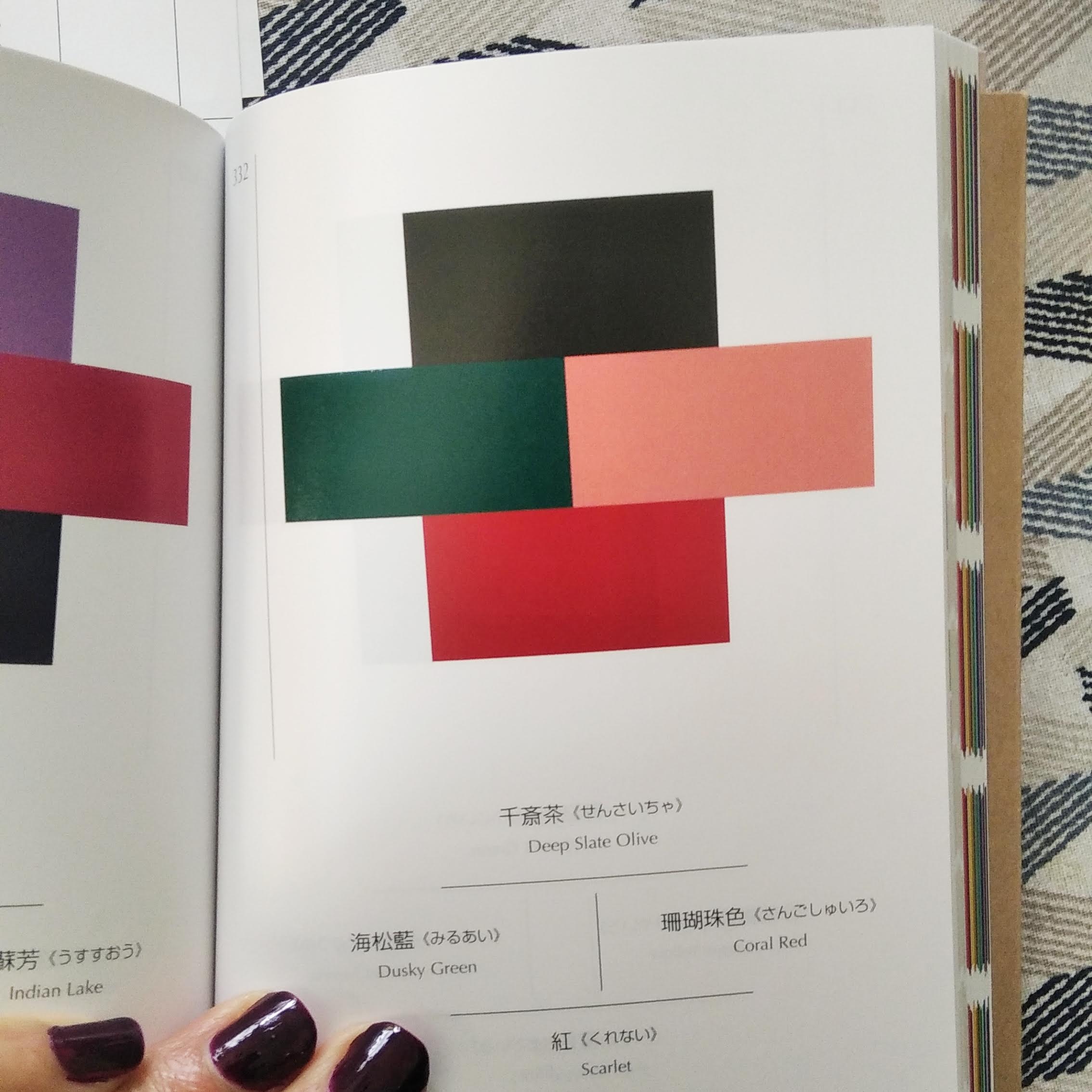
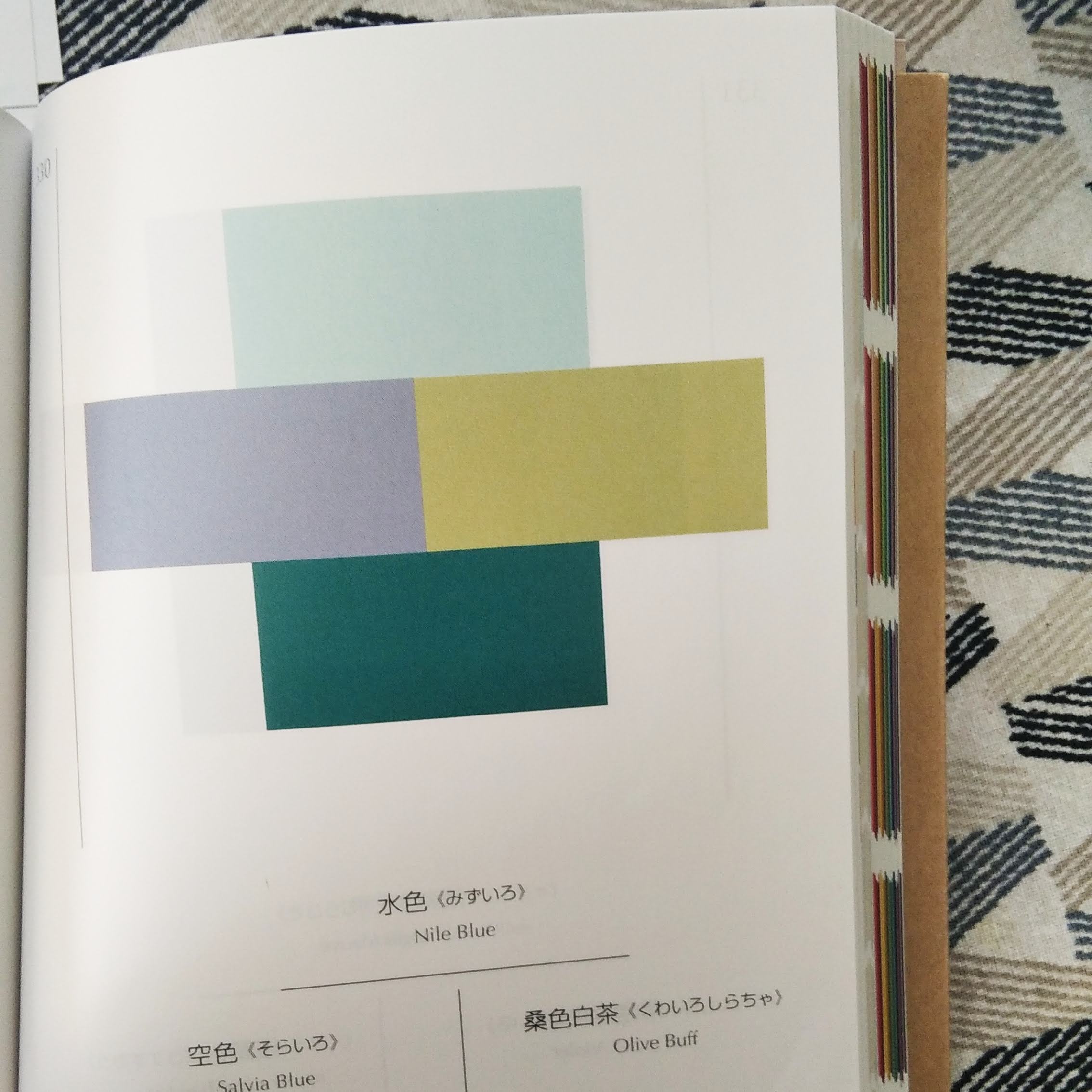
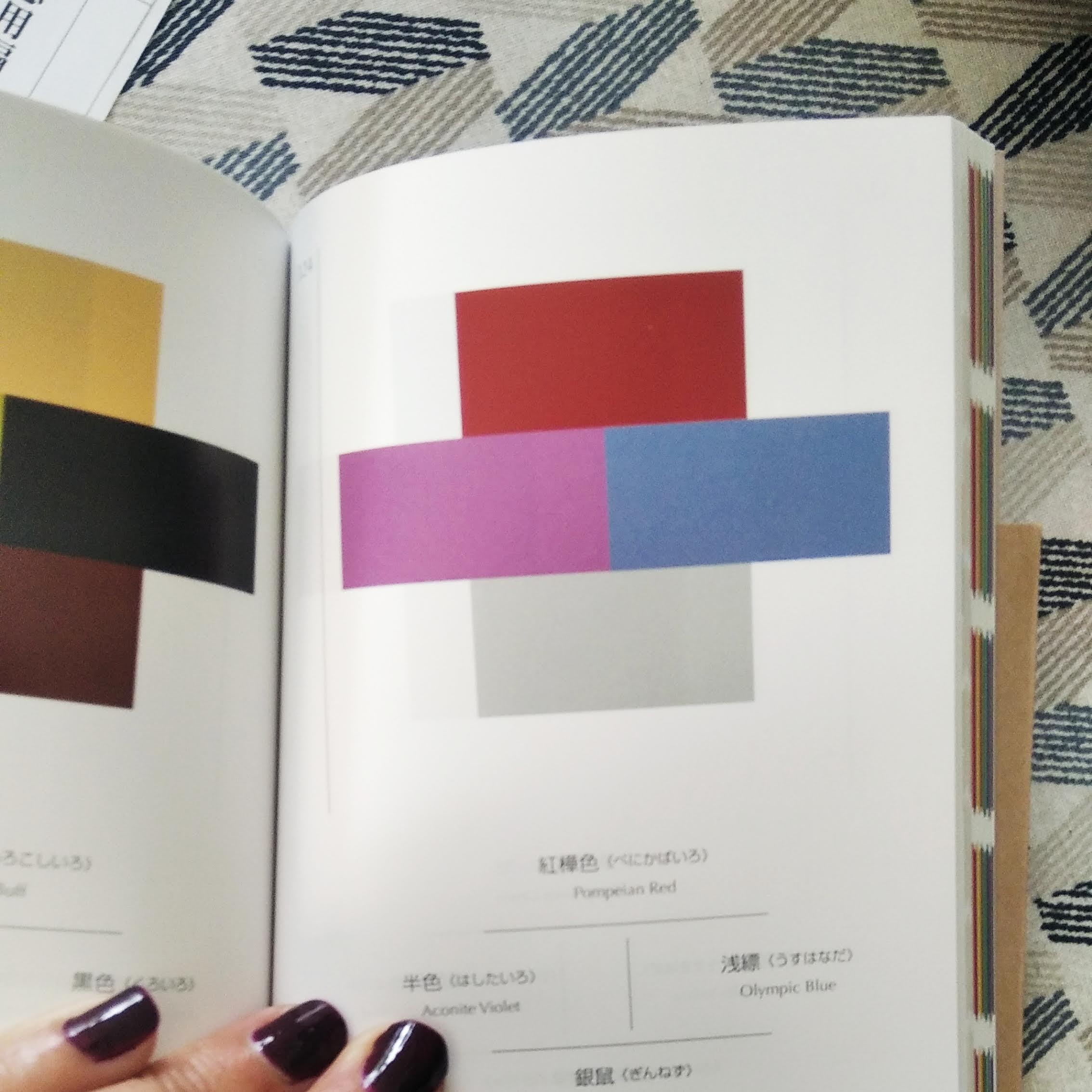
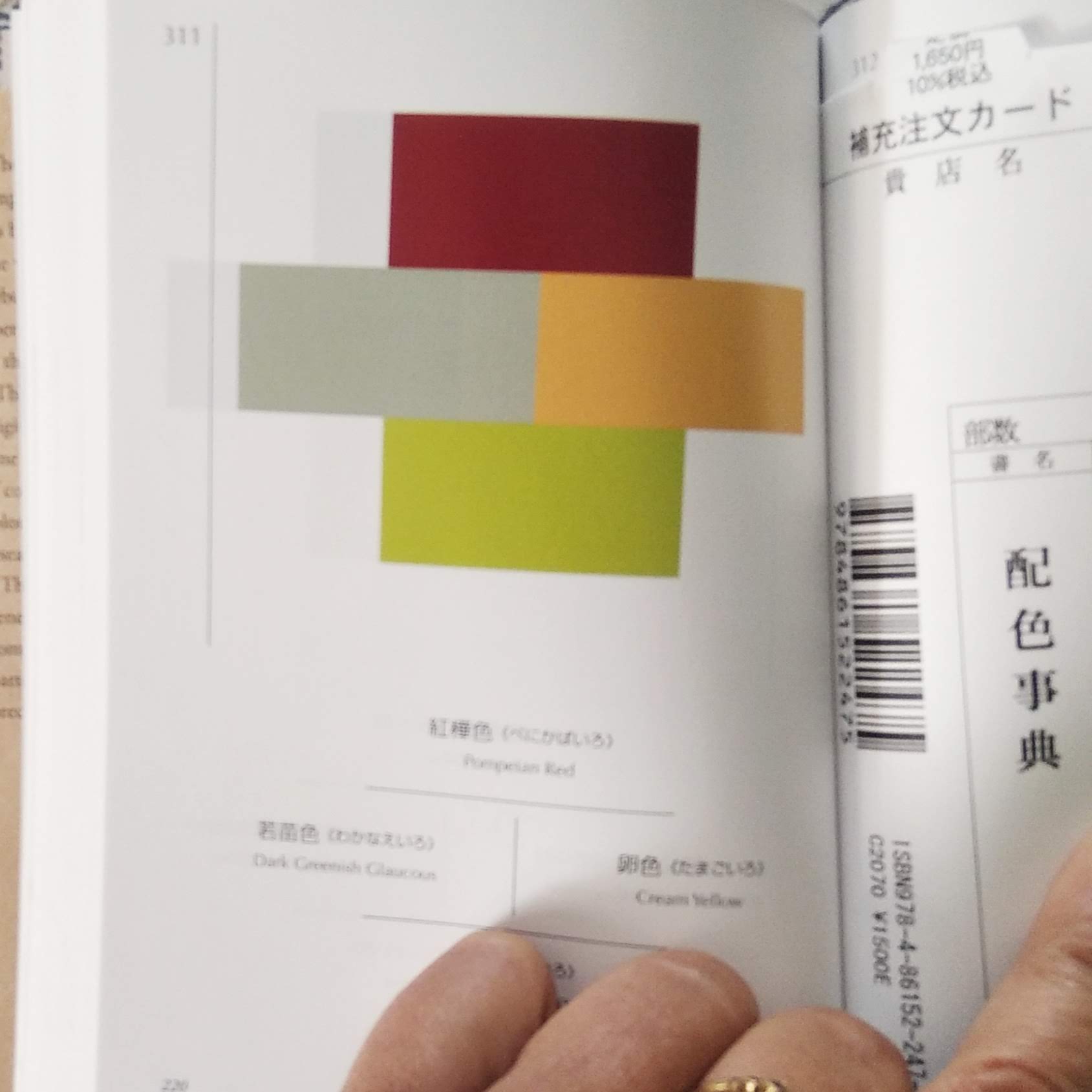
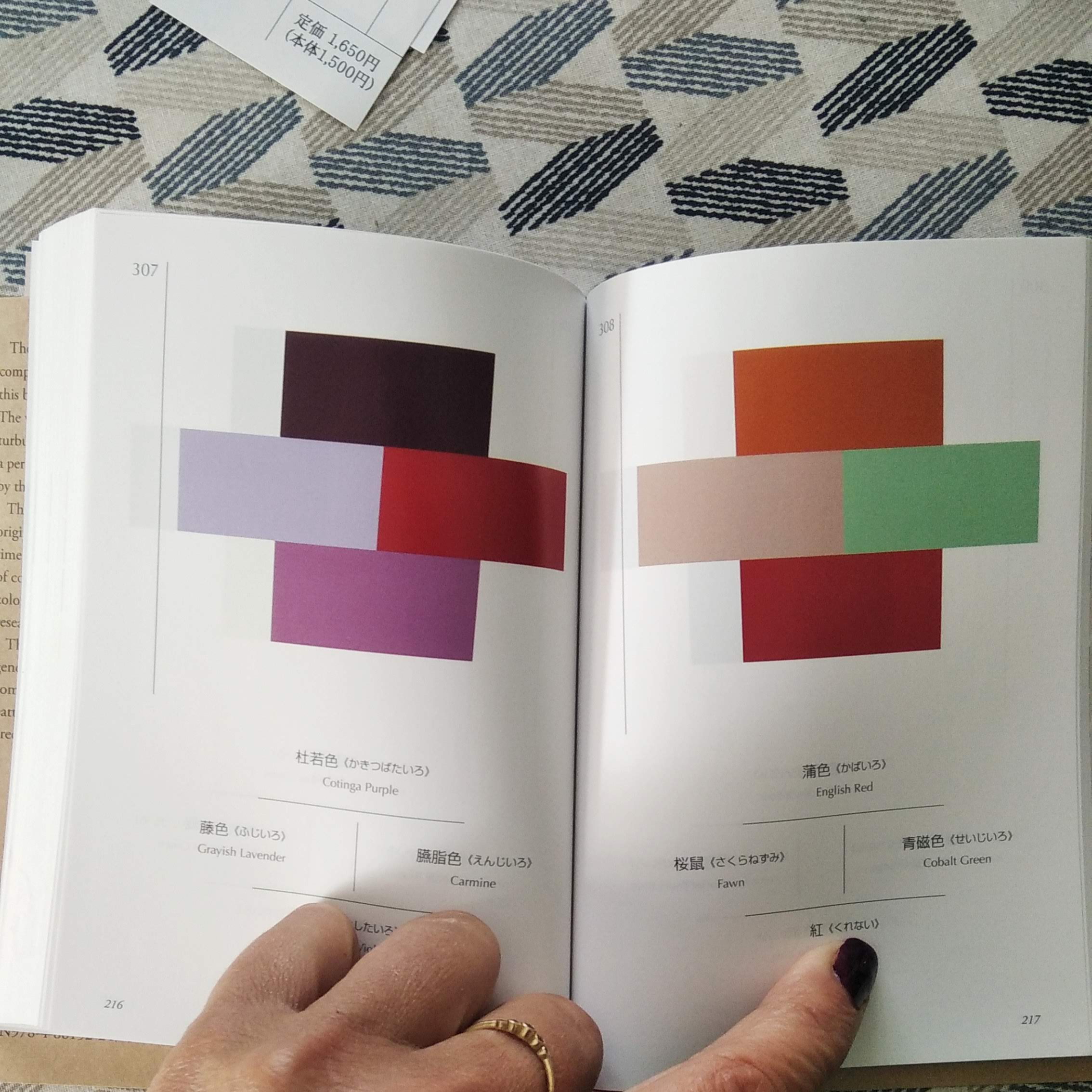
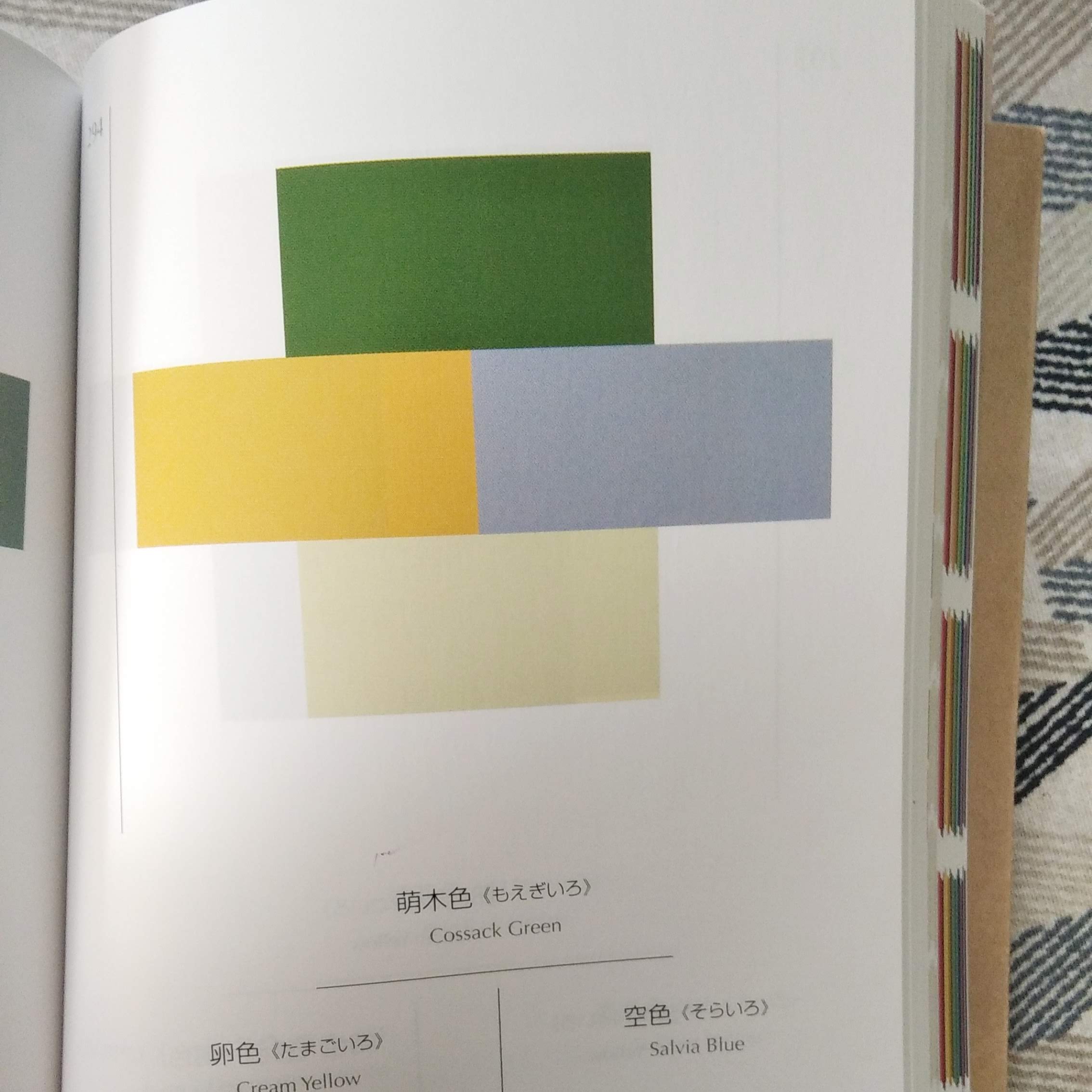
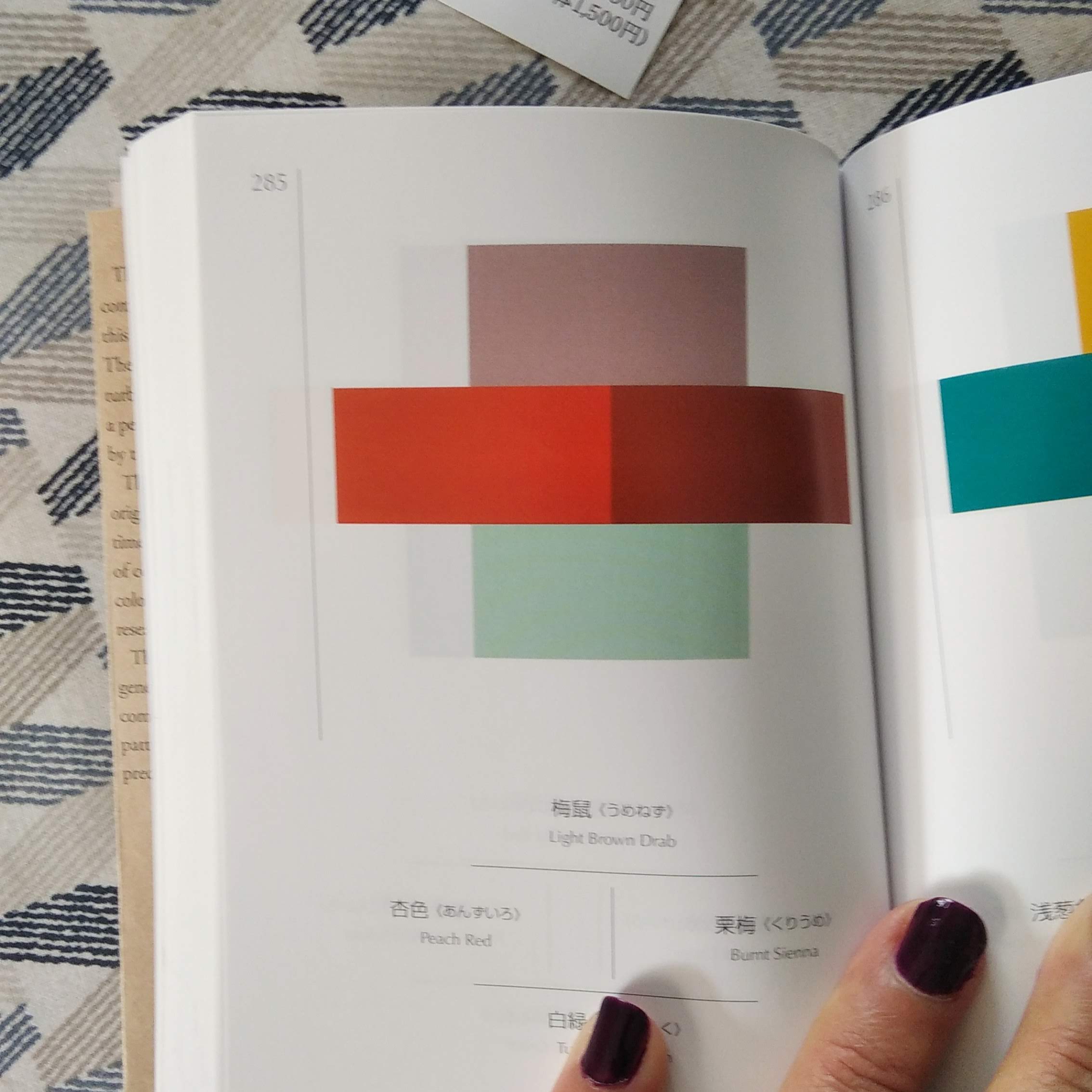
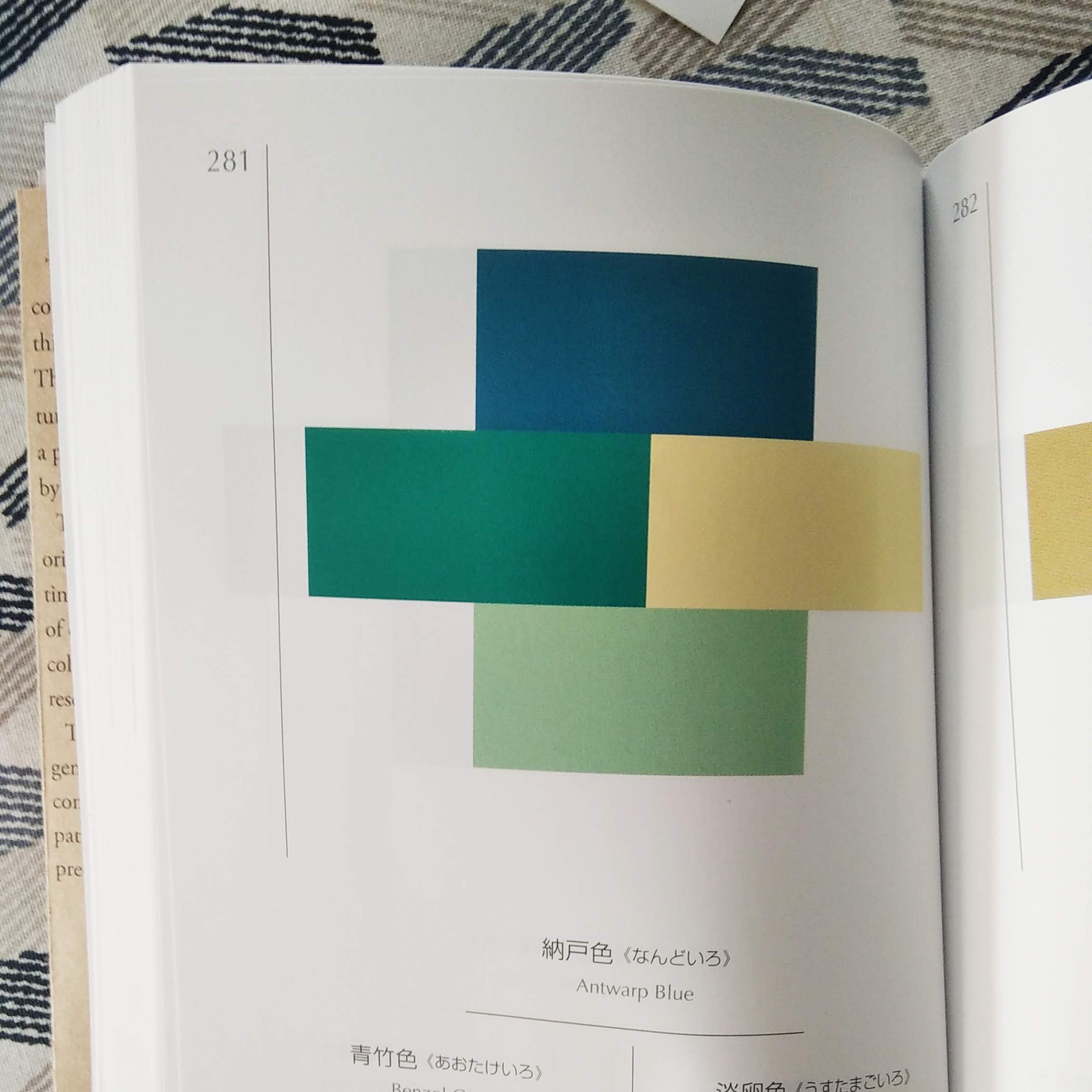
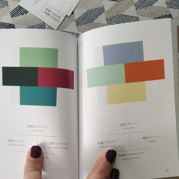
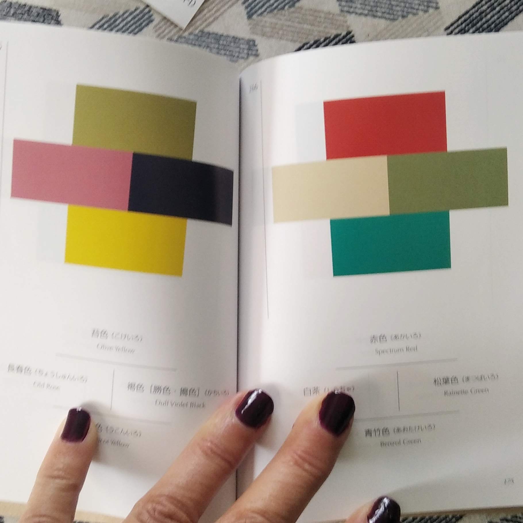
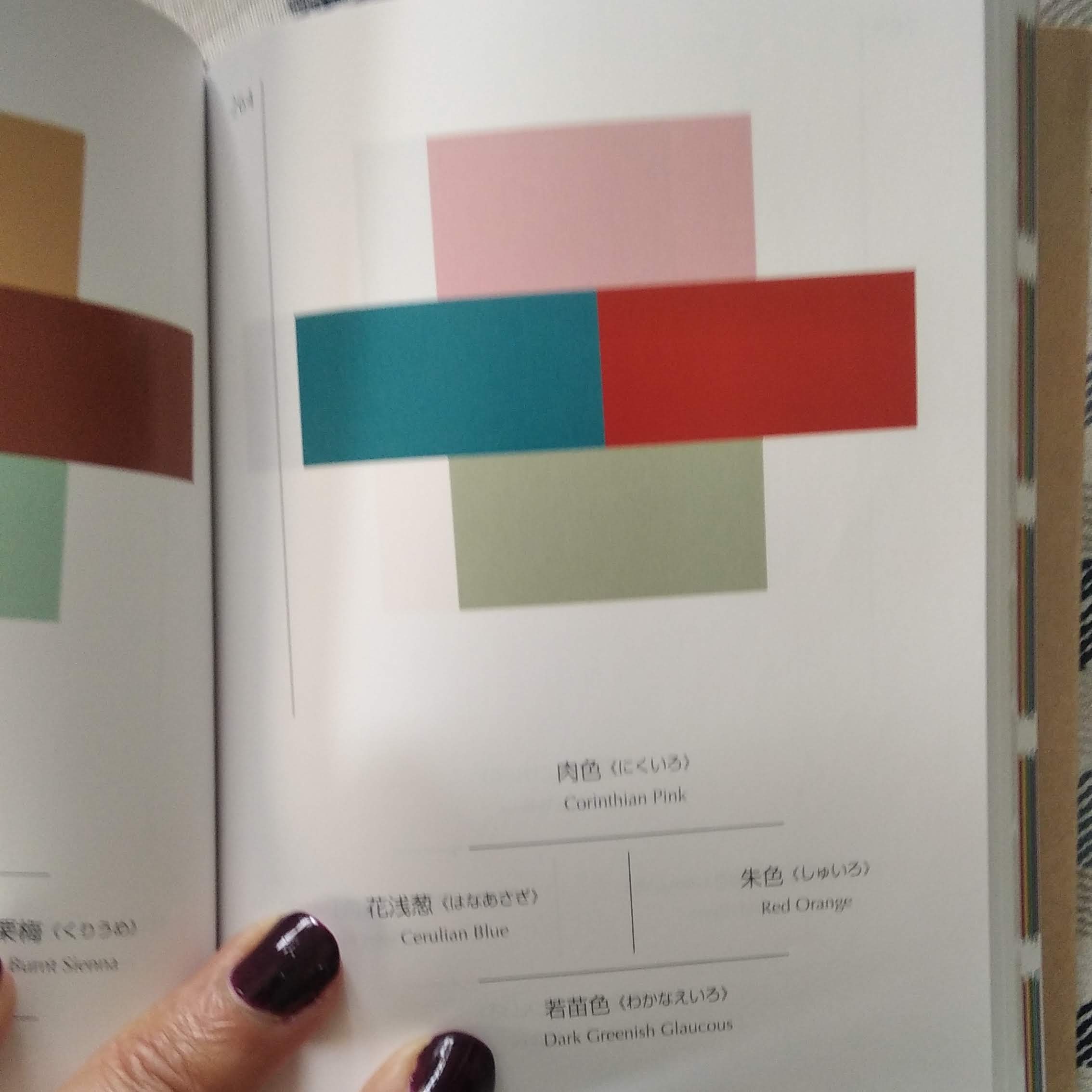
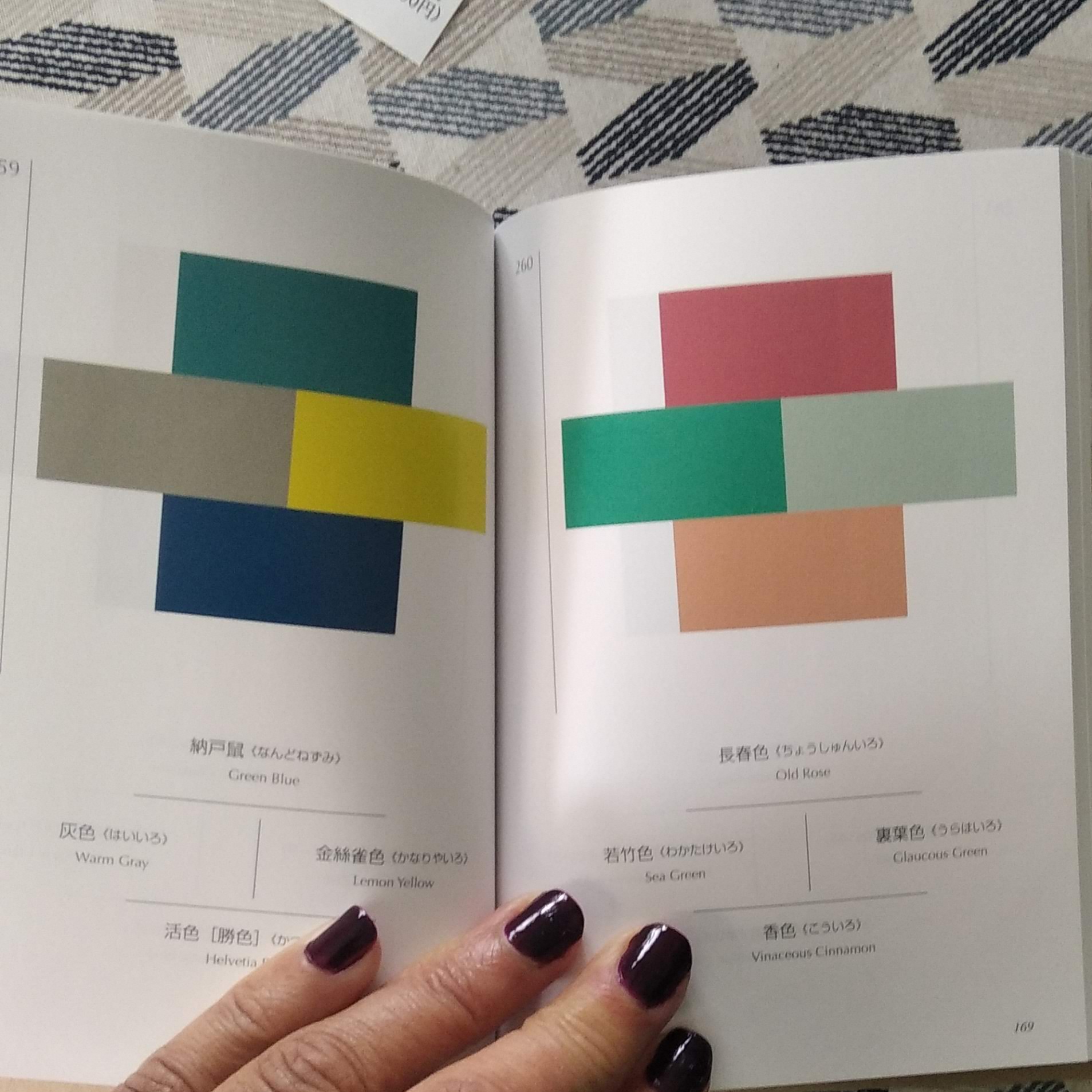
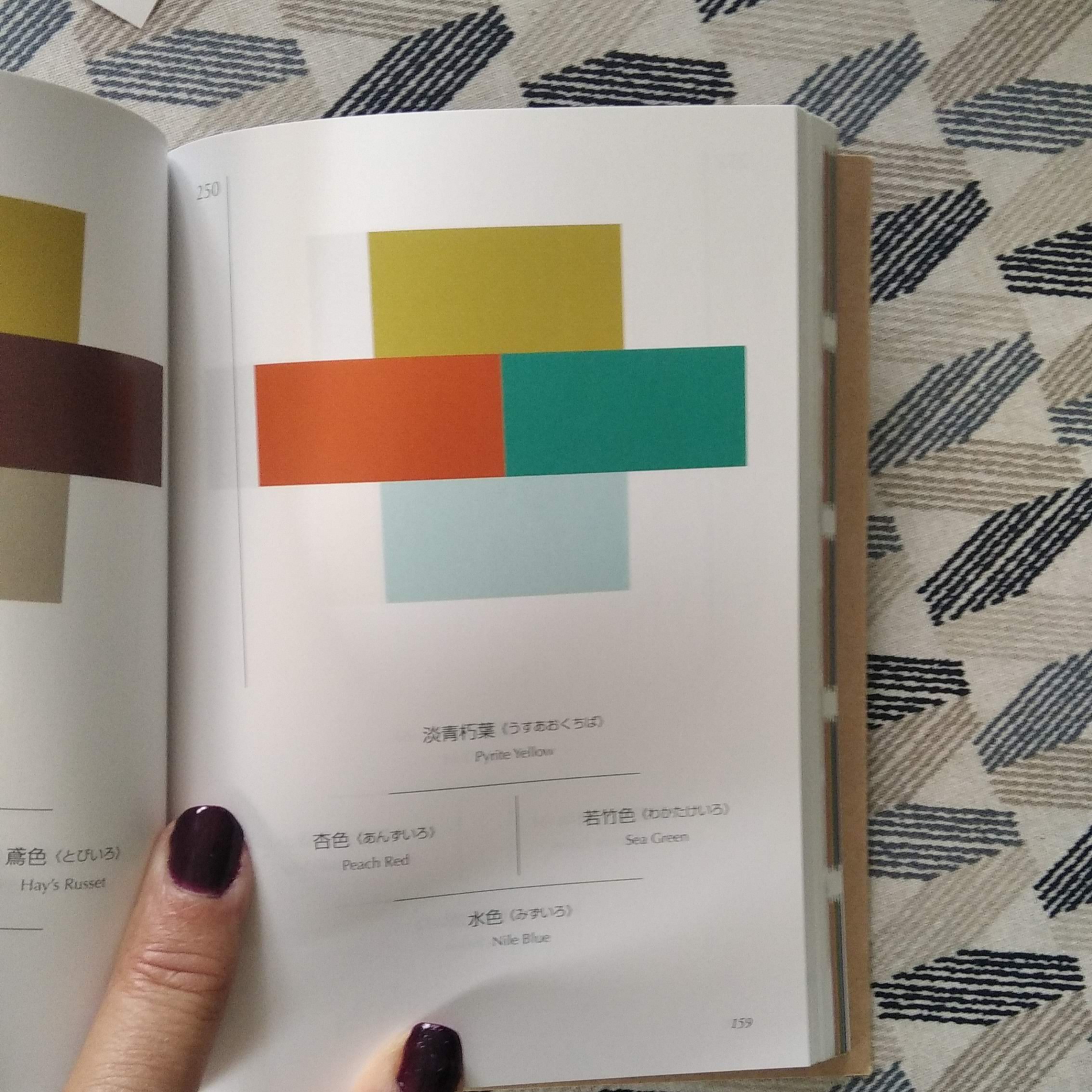
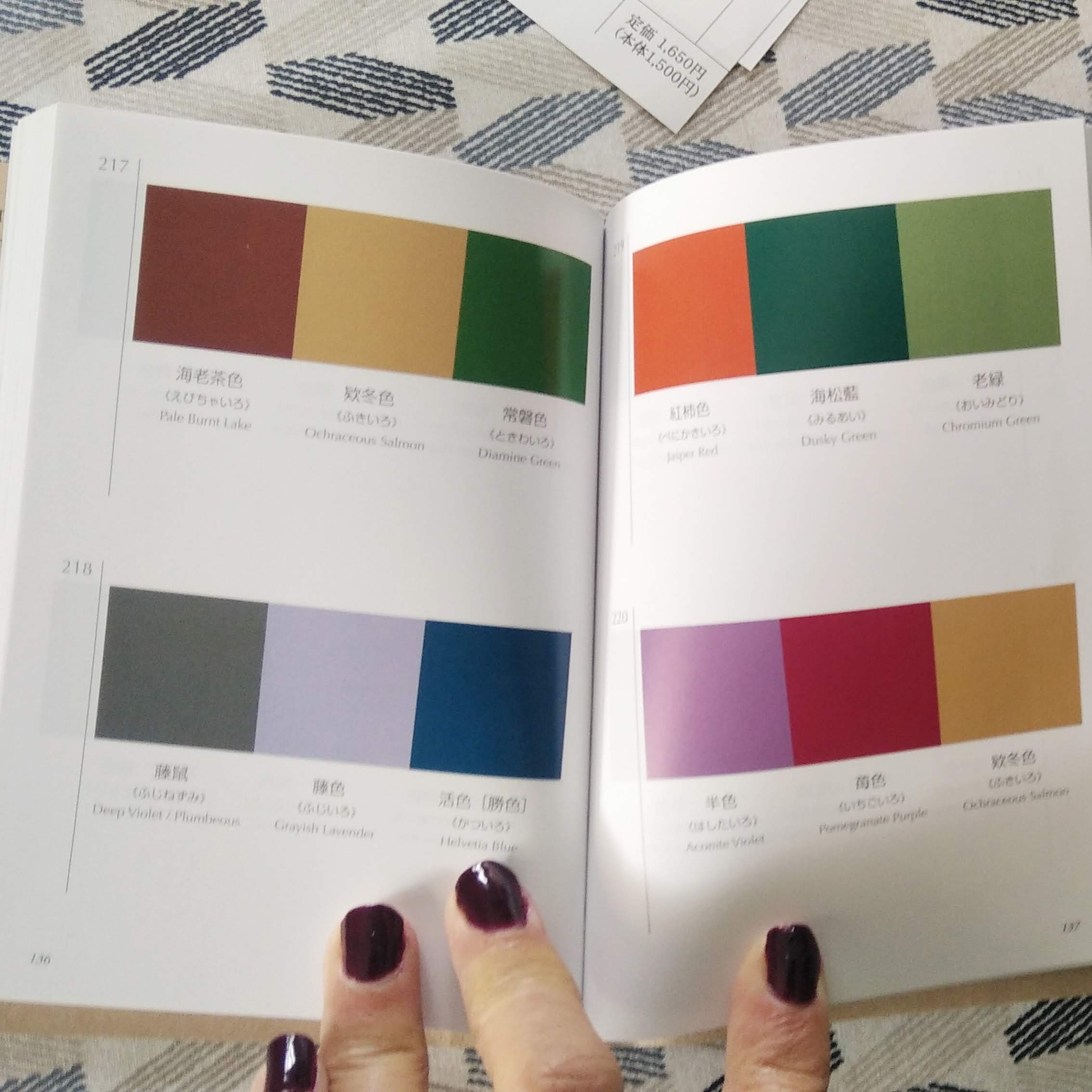
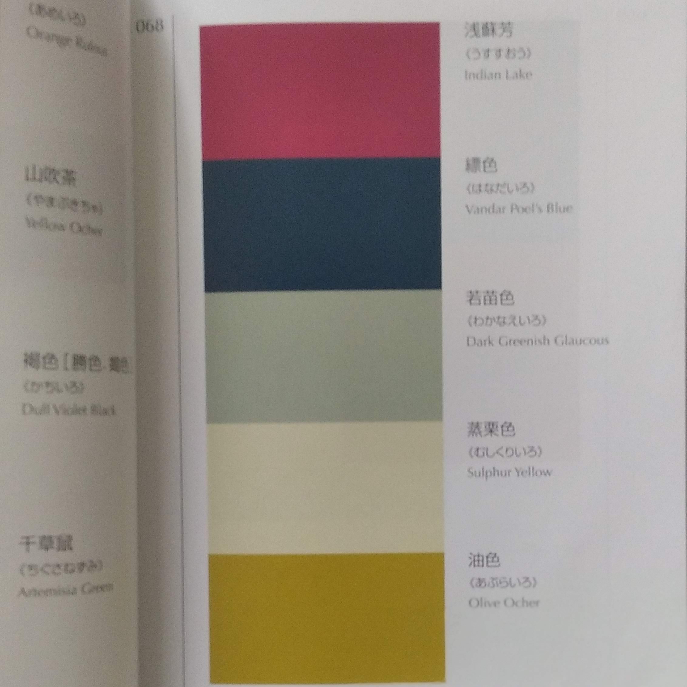
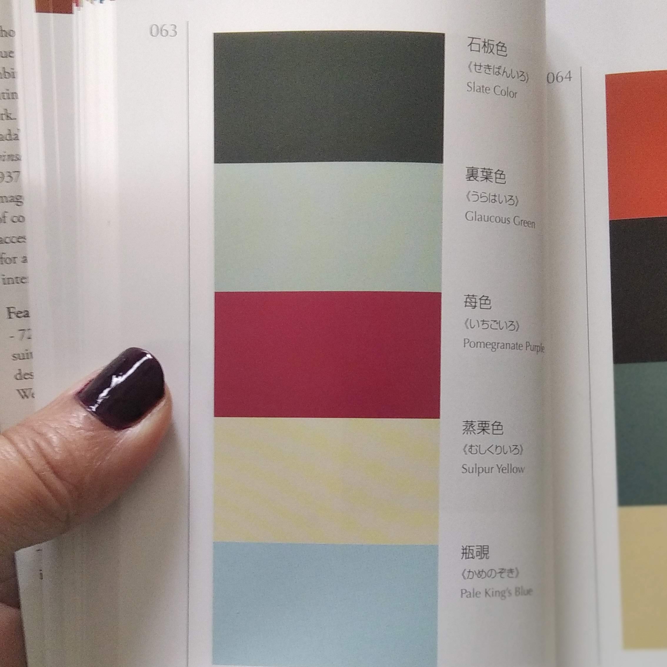
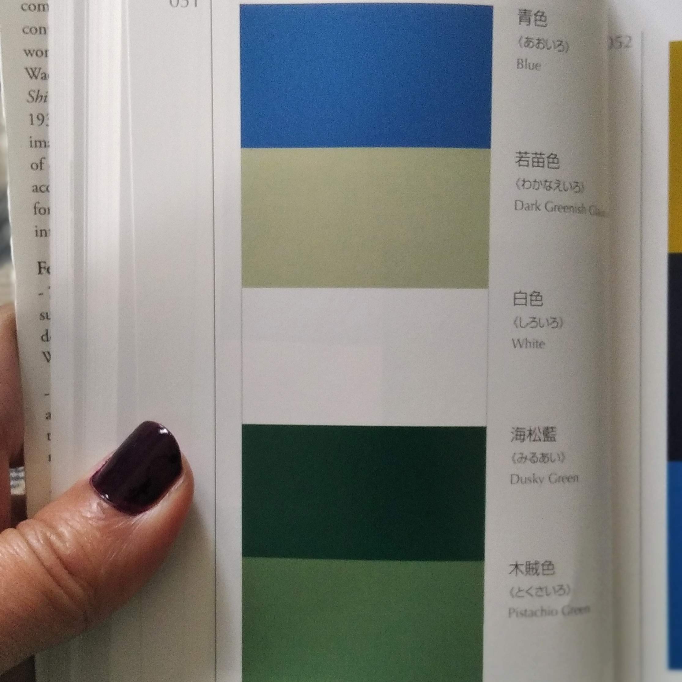
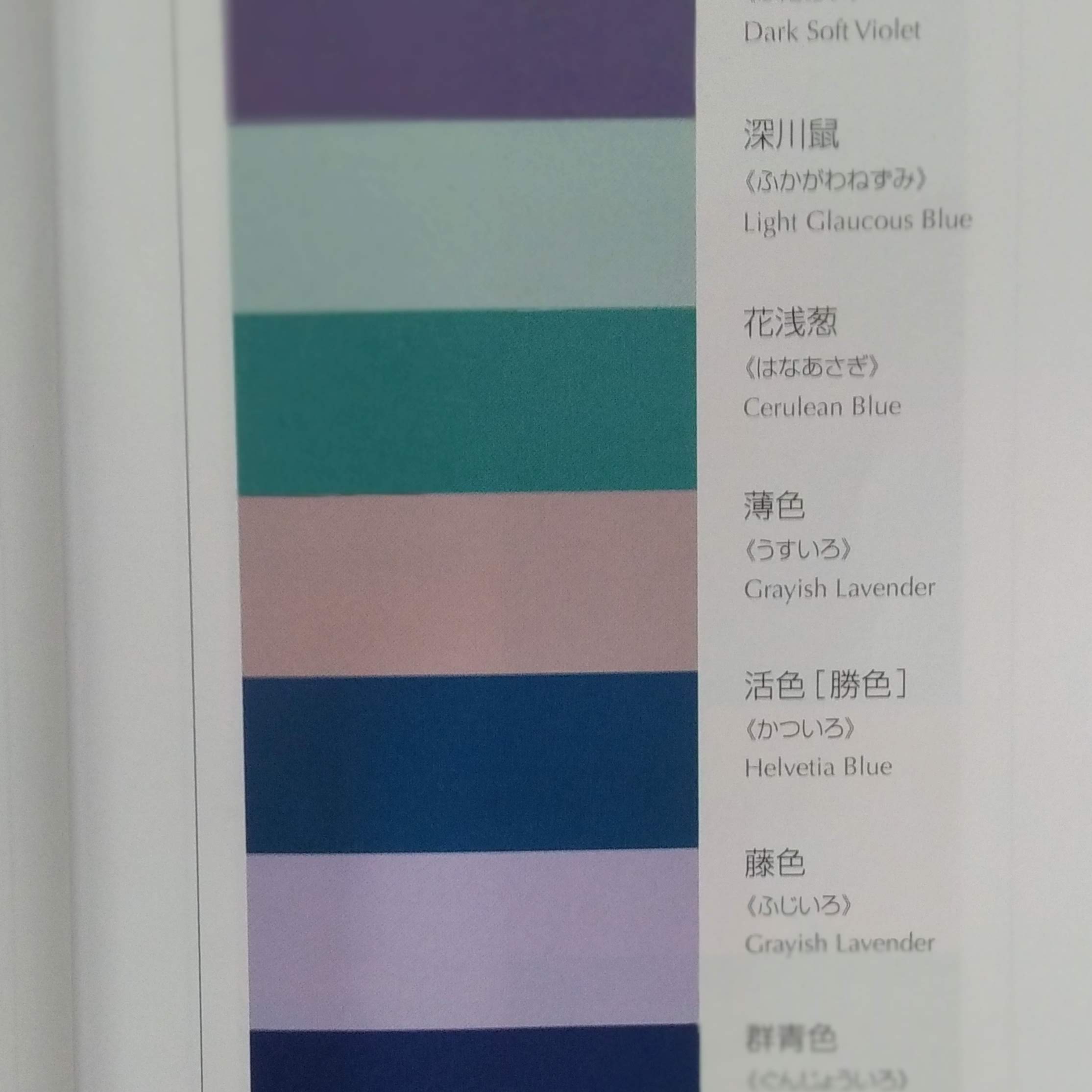
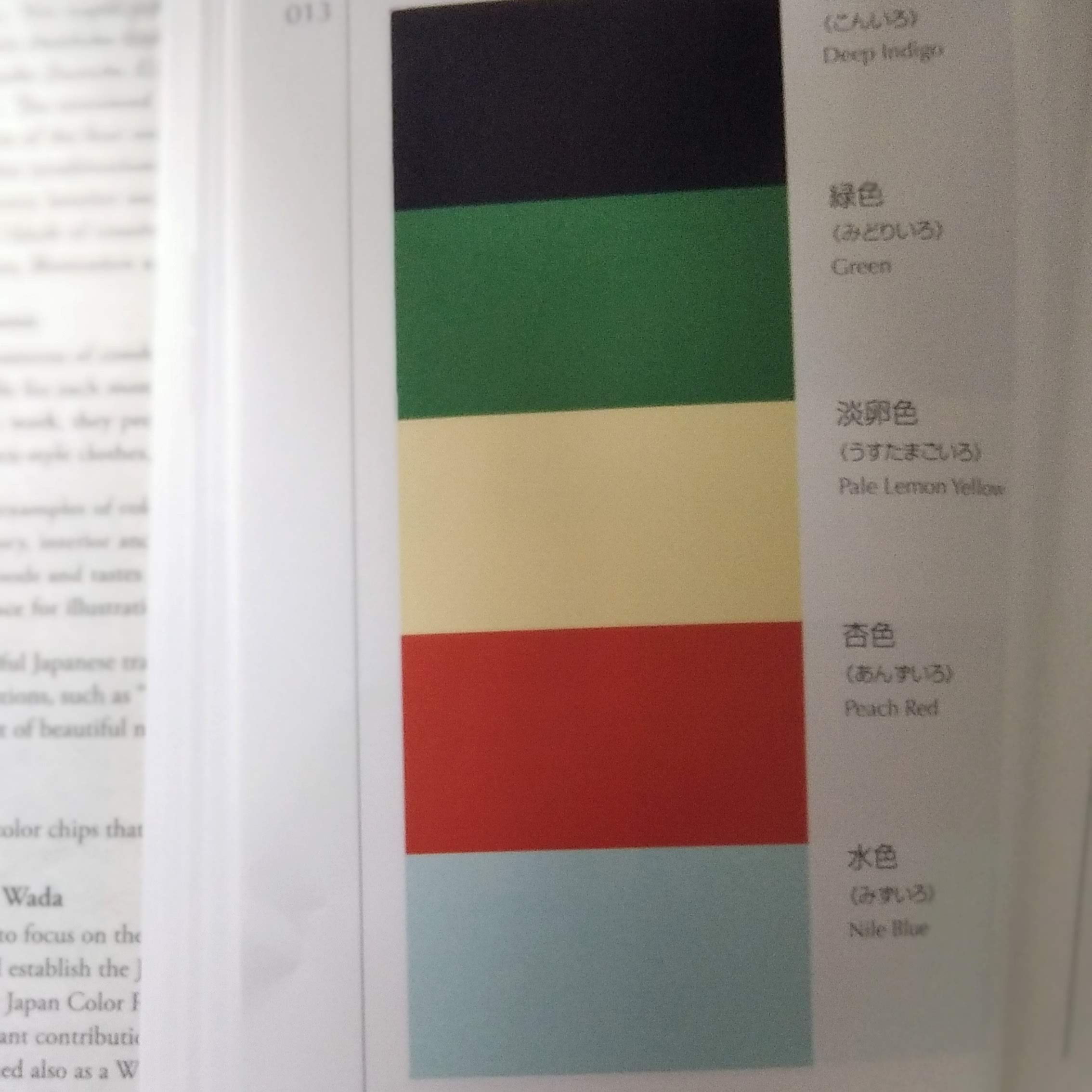
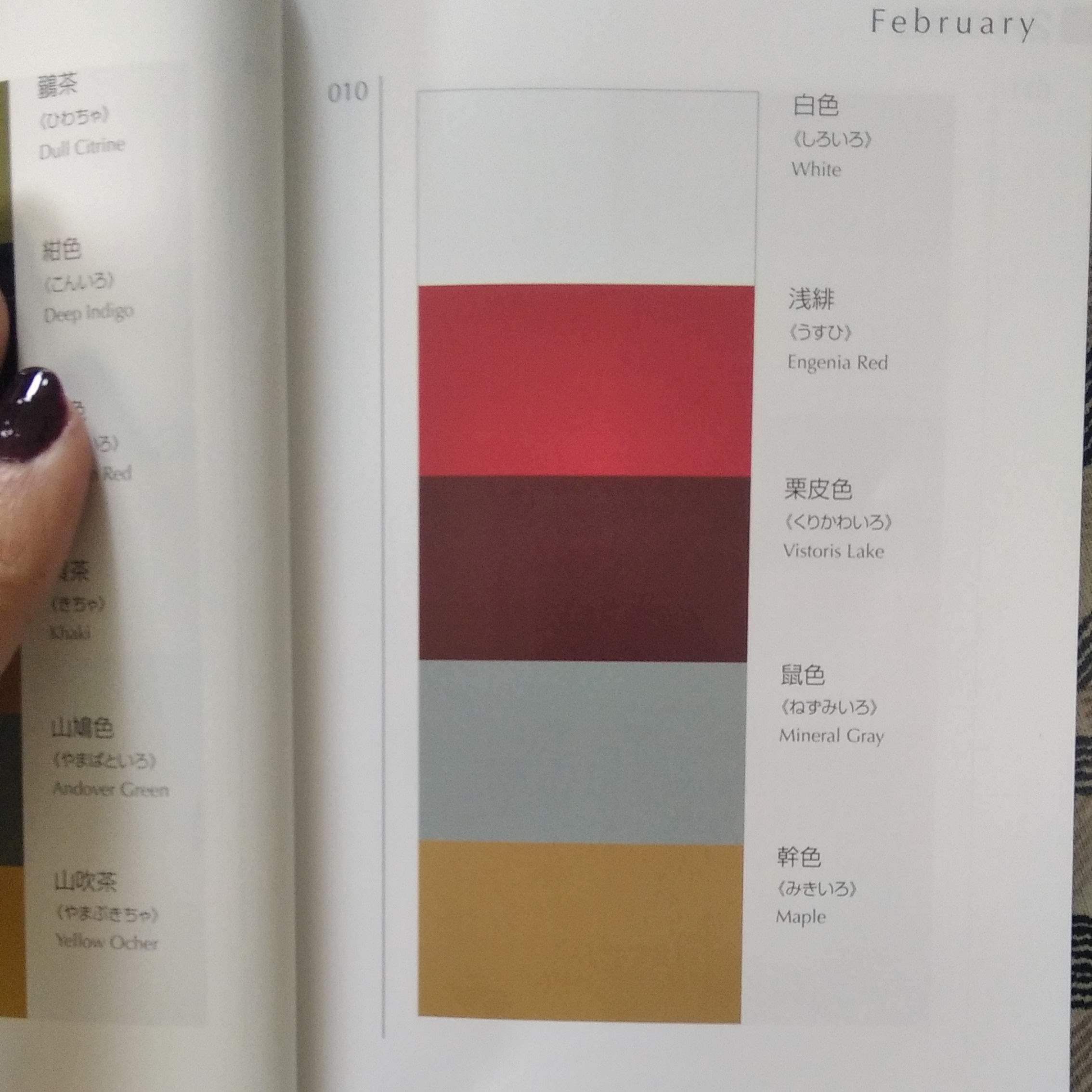
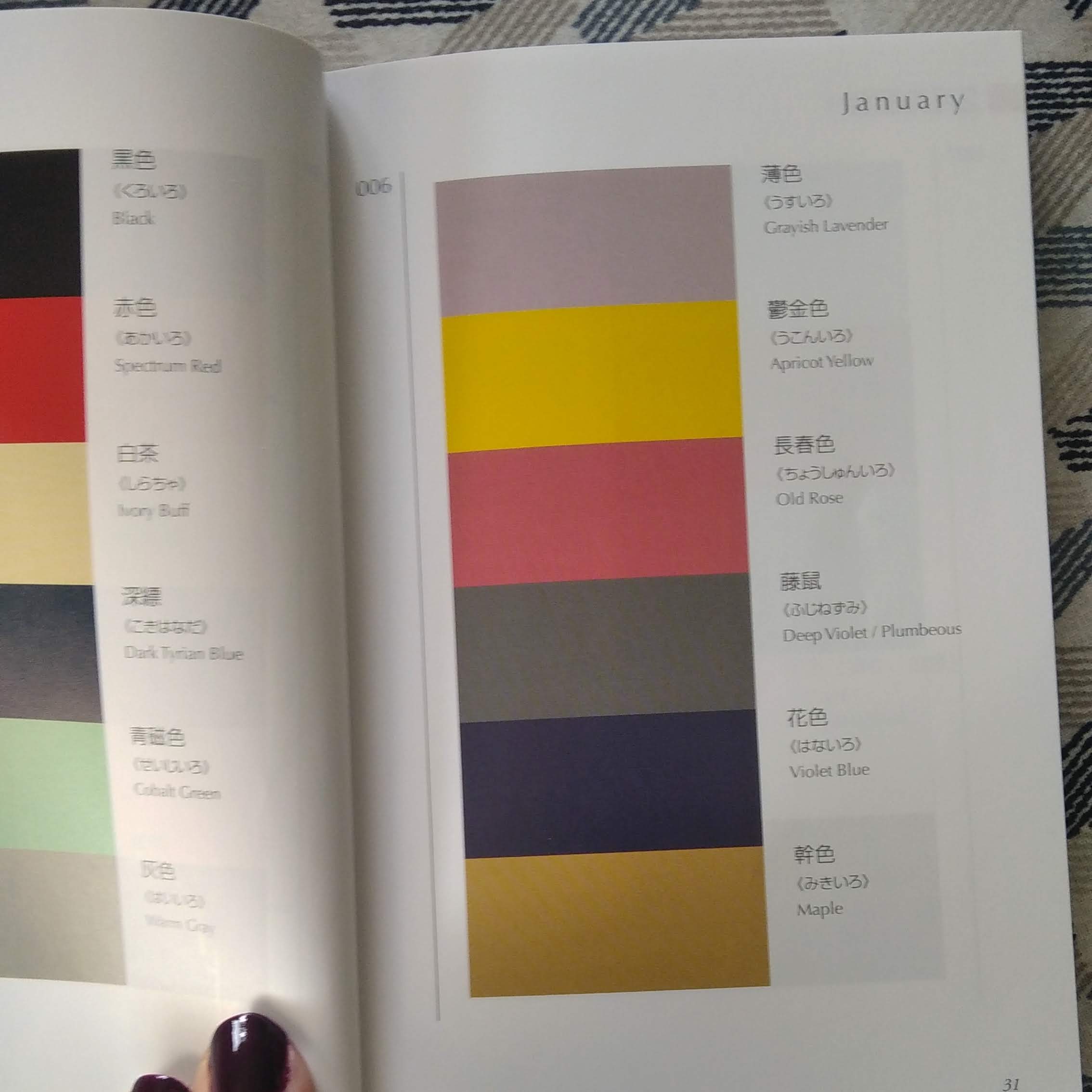
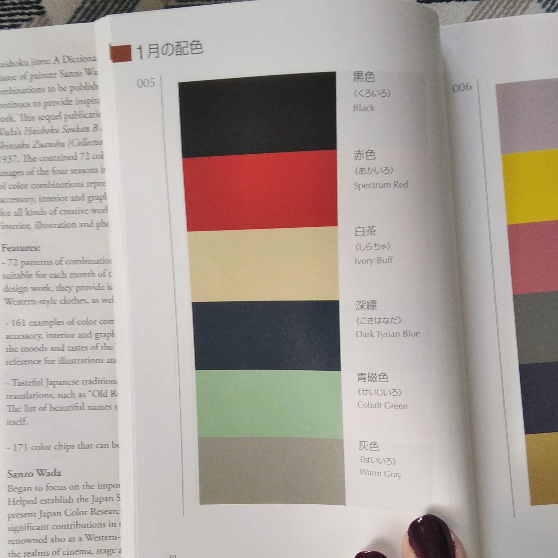
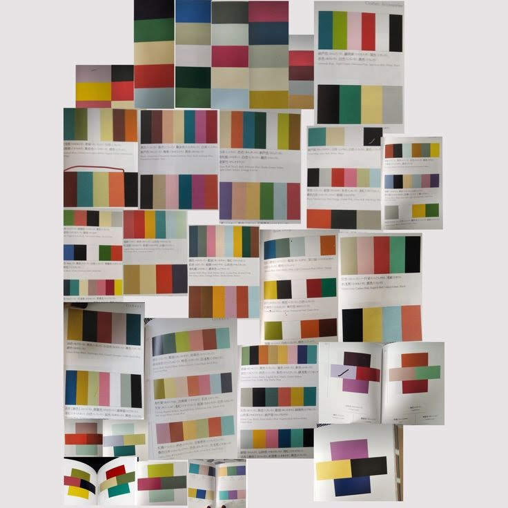
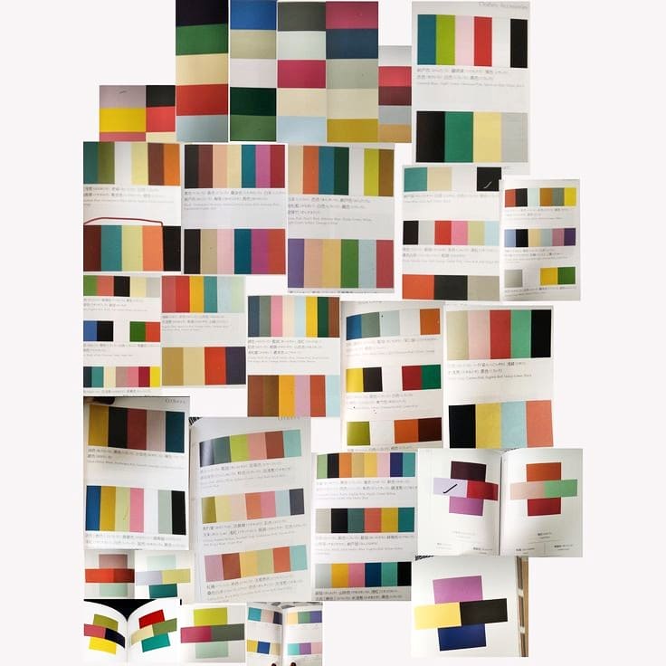
Dans la bibliothèque du MAD, j ai “trouvé” ces deux petits livres bijoux.
Le format, le papier, la présentation des combinaisons de couleurs tout est juste parfait
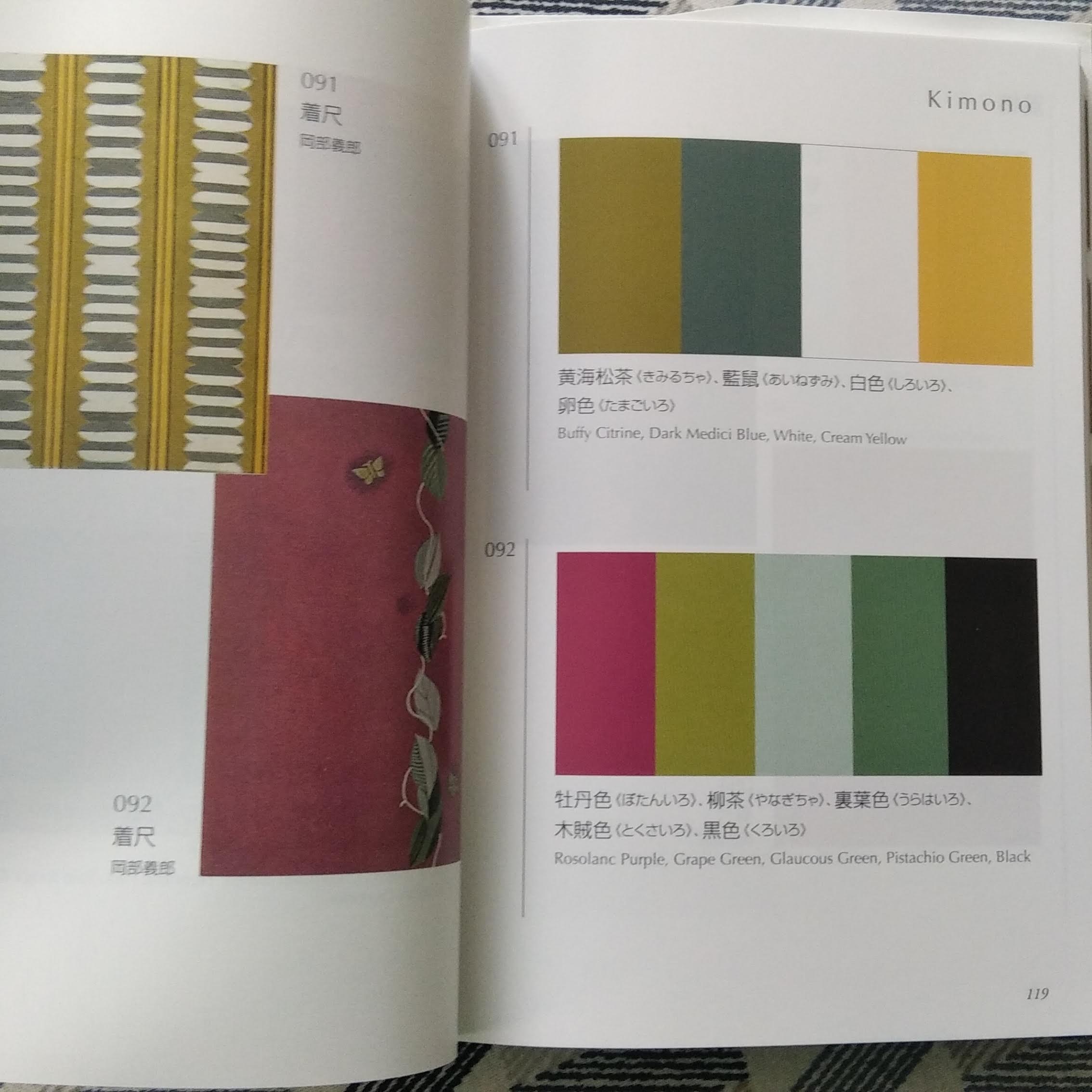
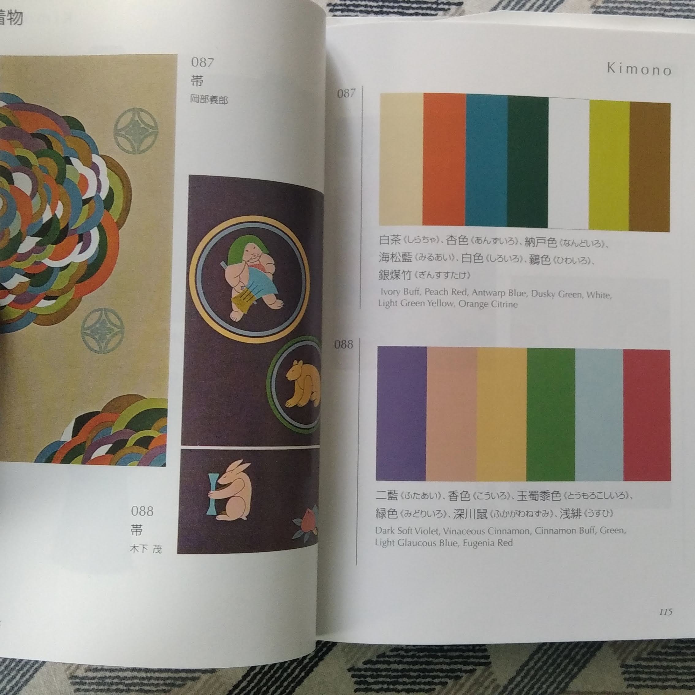
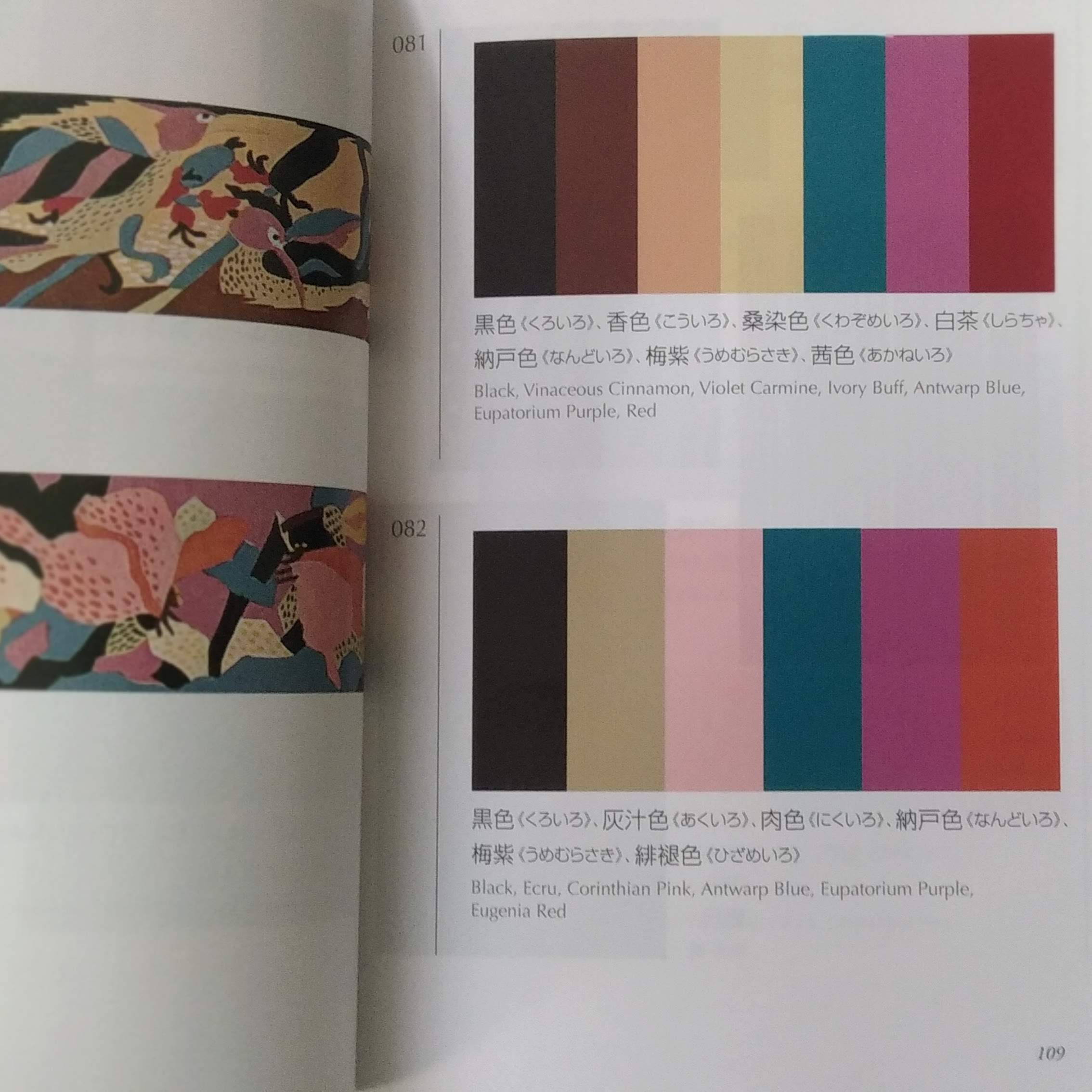
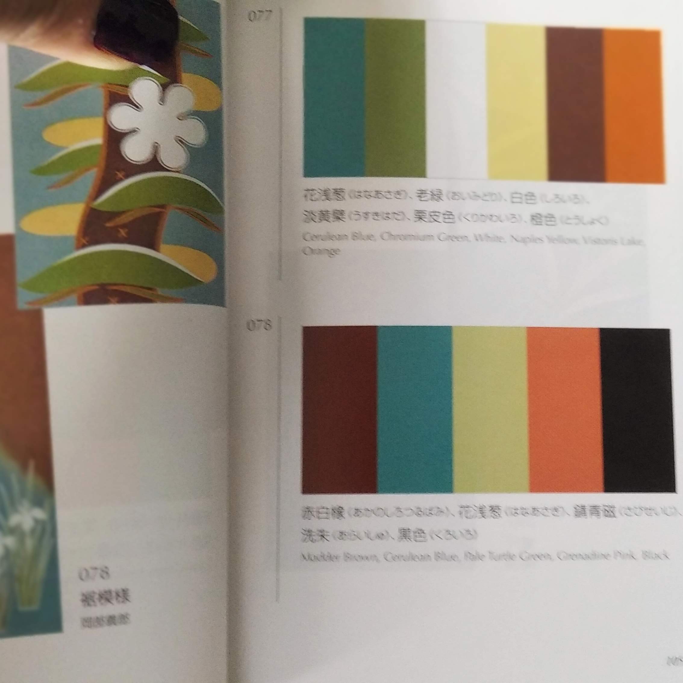
Adaptés de volumes publiés initialement entre 1933 et 1937, ces dictionnaires de combinaisons de couleurs ont été mis au point à l’époque par le peintre japonais SANZO Wada [1883-1967], lequel contribua notamment à créer la Japan Standard Color Association (devenue Color Research Institute).
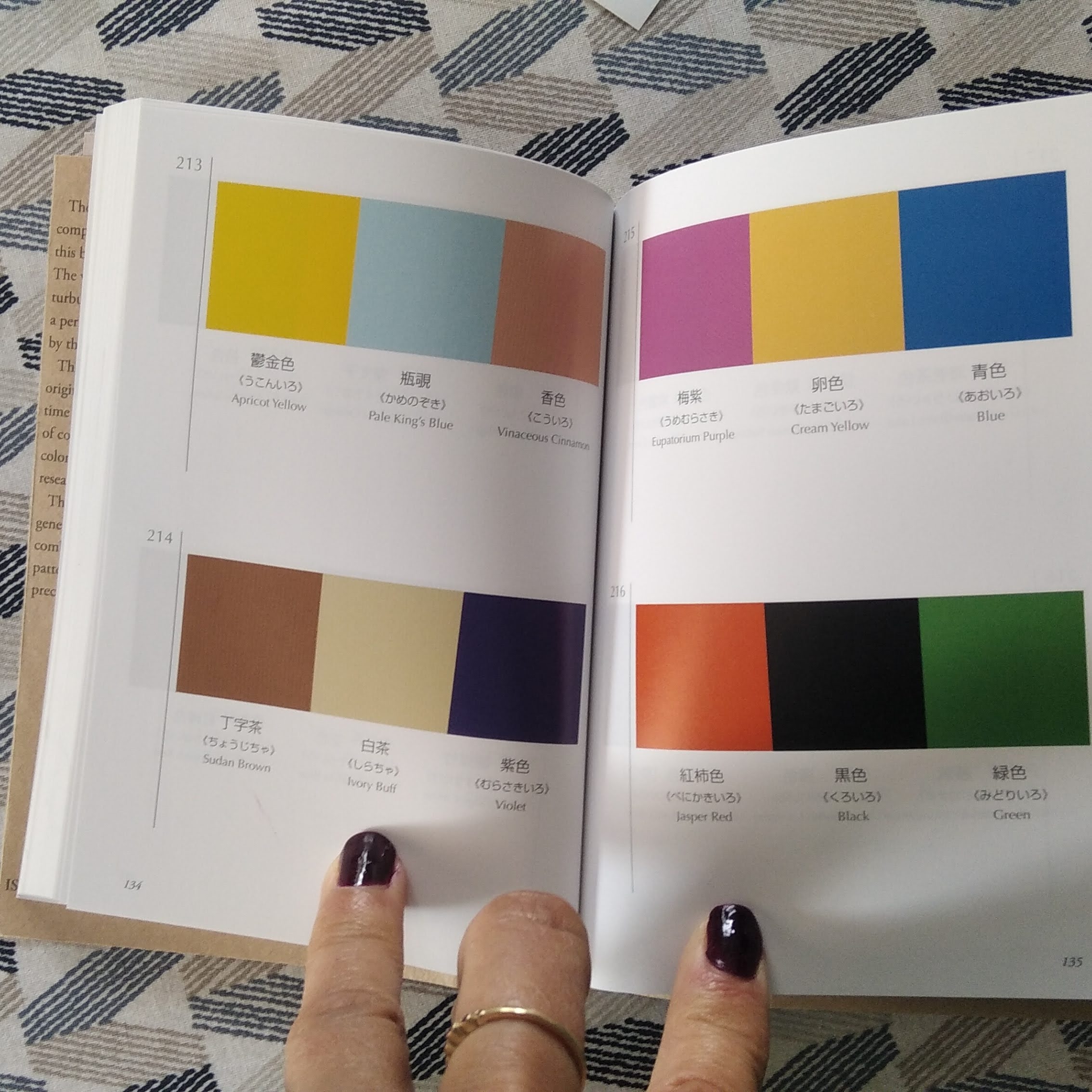
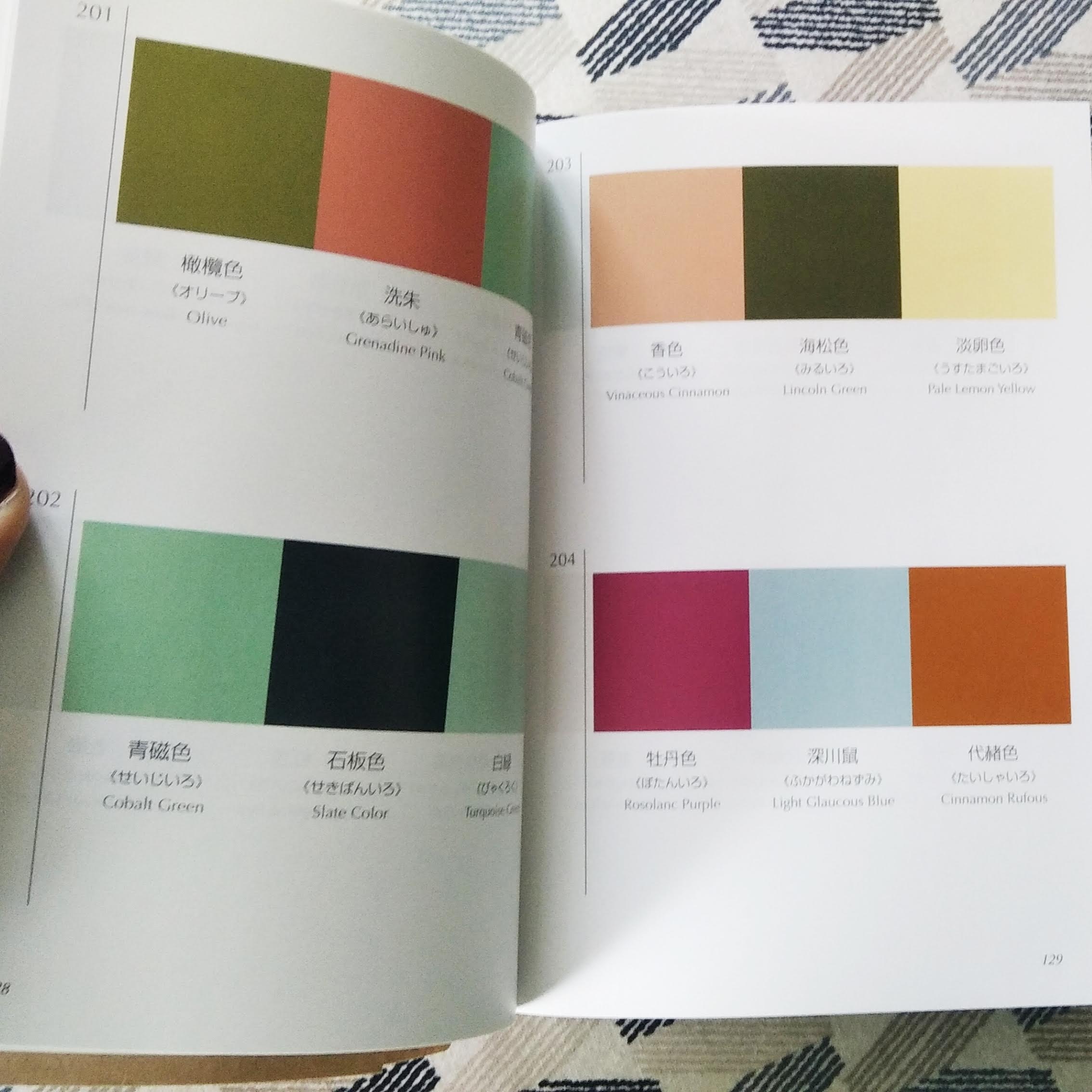
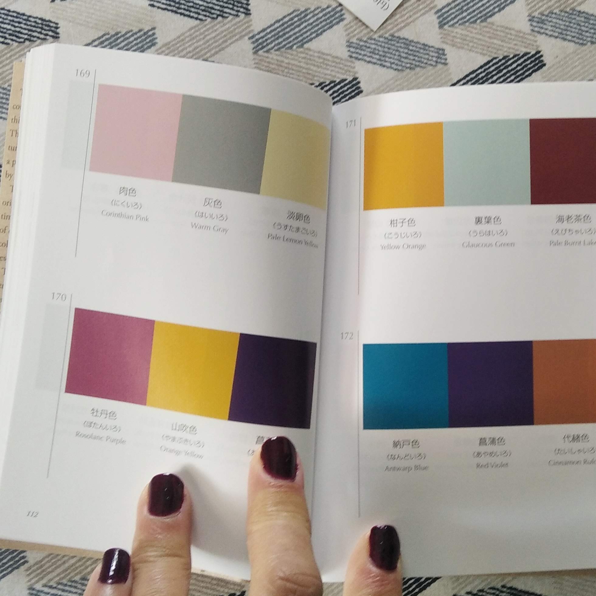
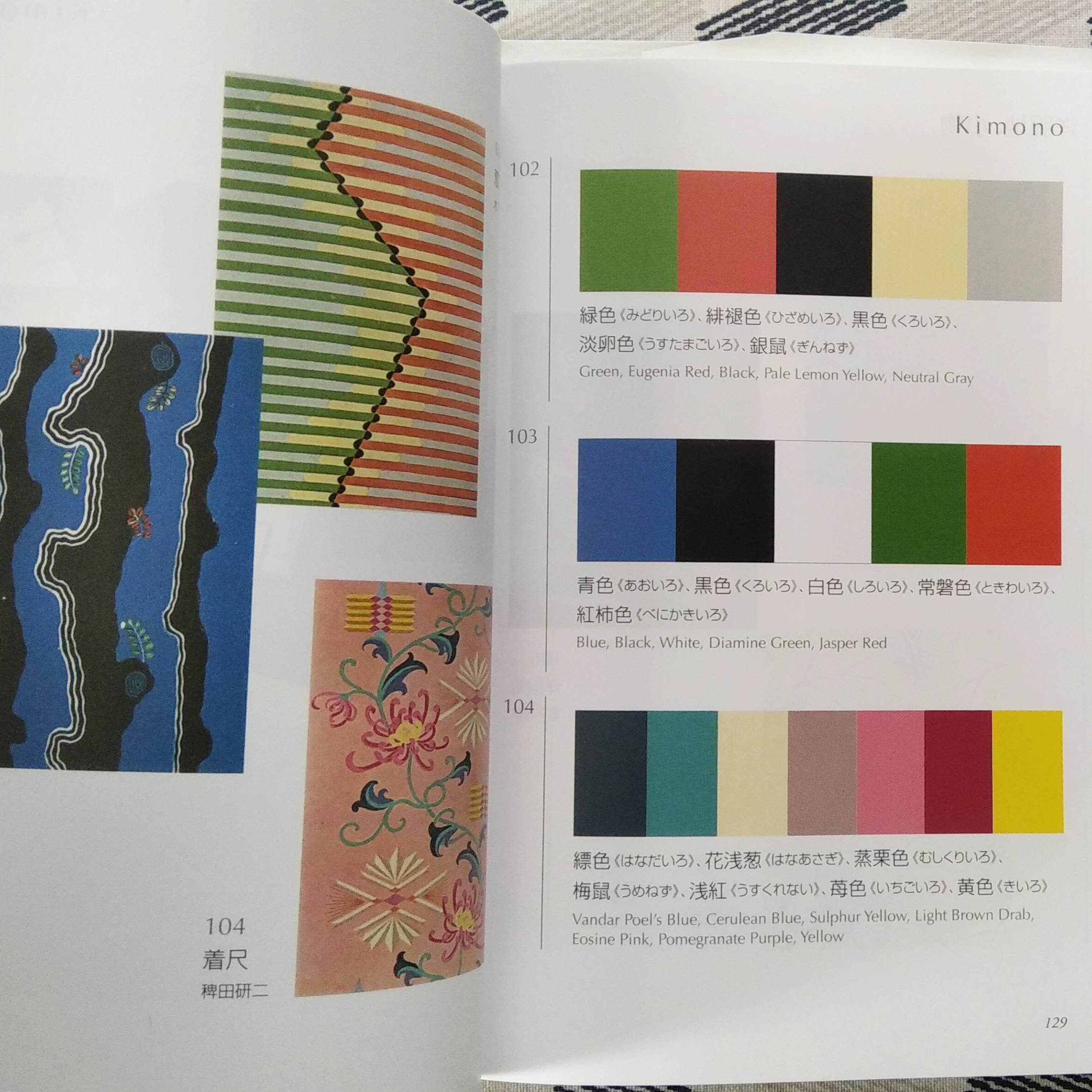
“DICTIONARY OF COLOR COMBINATIONS” vol. 1 et 2
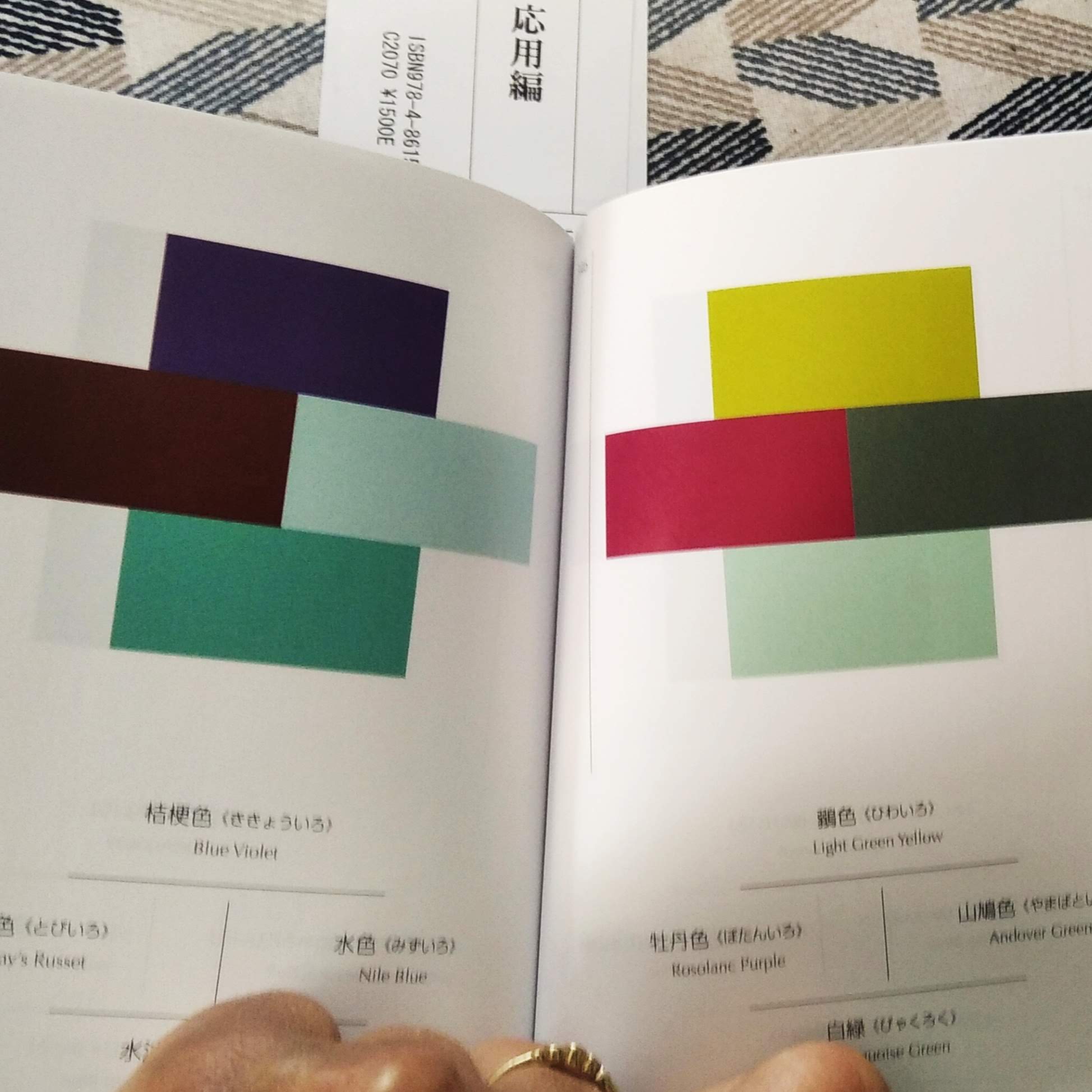
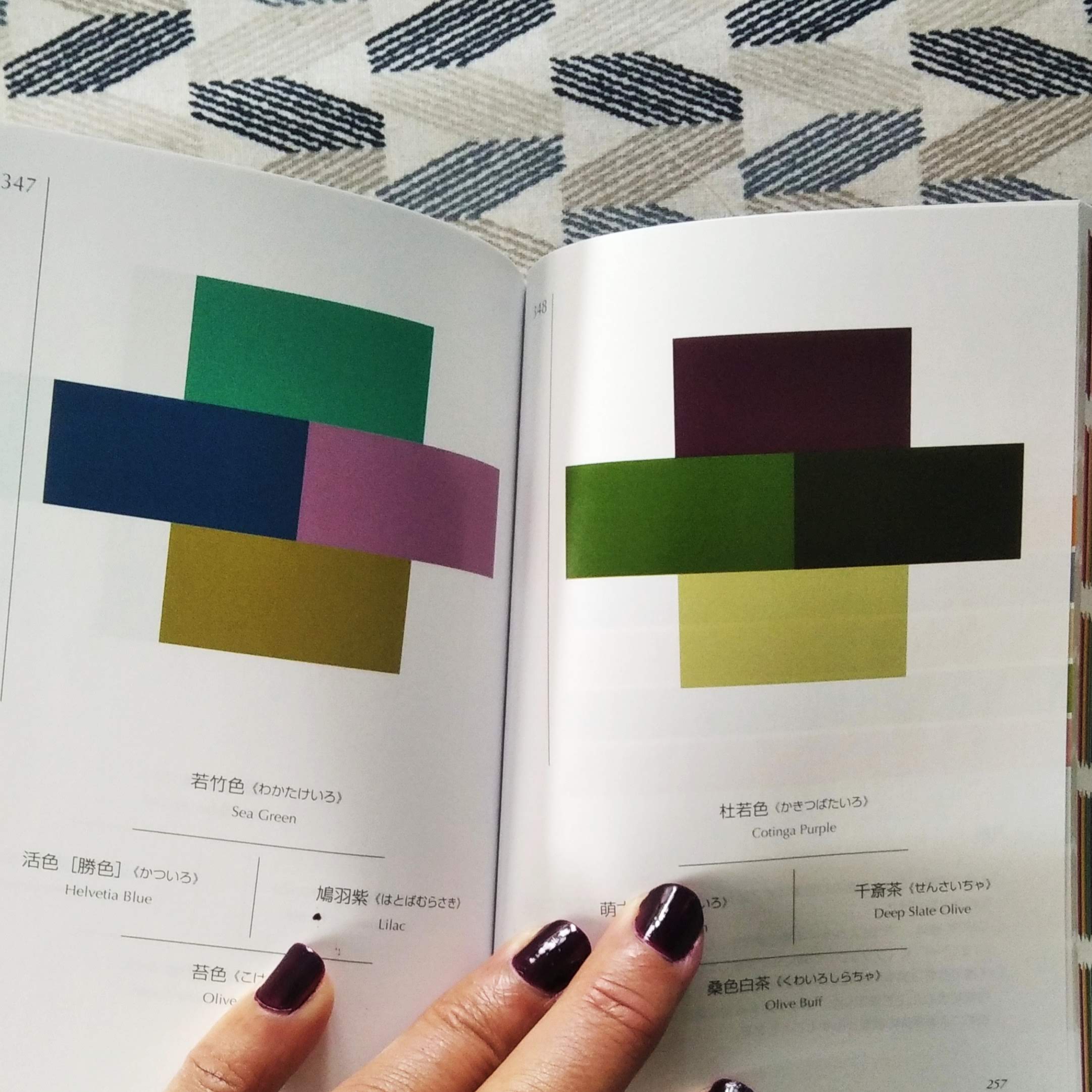
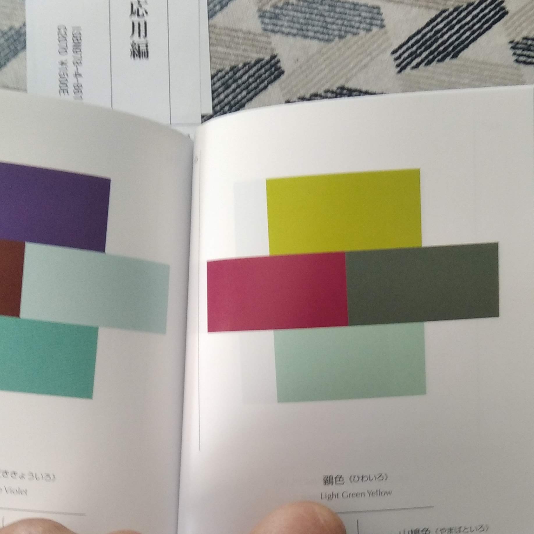
Le premier volume présente 348 associations de couleurs différentes, comme autant de propositions et de réflexions sur les possibilités offertes. Divisé en 3 sections qui réparties selon le nombre de couleurs associées – 2 puis 3 et enfin 4 – le livre dispose en dernière partie d’un index colorimétrique qui permette de l’utiliser comme un véritable outil. Ainsi l’on peut se laisser aller à feuilleter les pages en guise d’inspiration, ou bien décider de repérer et travailler à partir d’une couleur précise dont on consultera ensuite les différentes planches où elle figure.
Le deuxième volume reprend la même formule mais en multipliant encore davantage les combinaisons (jusqu’à 7 couleurs associées ensemble), et en divisant l’ouvrage par domaines de travail : kimono, accessoires, tapis, book design, poterie etc.
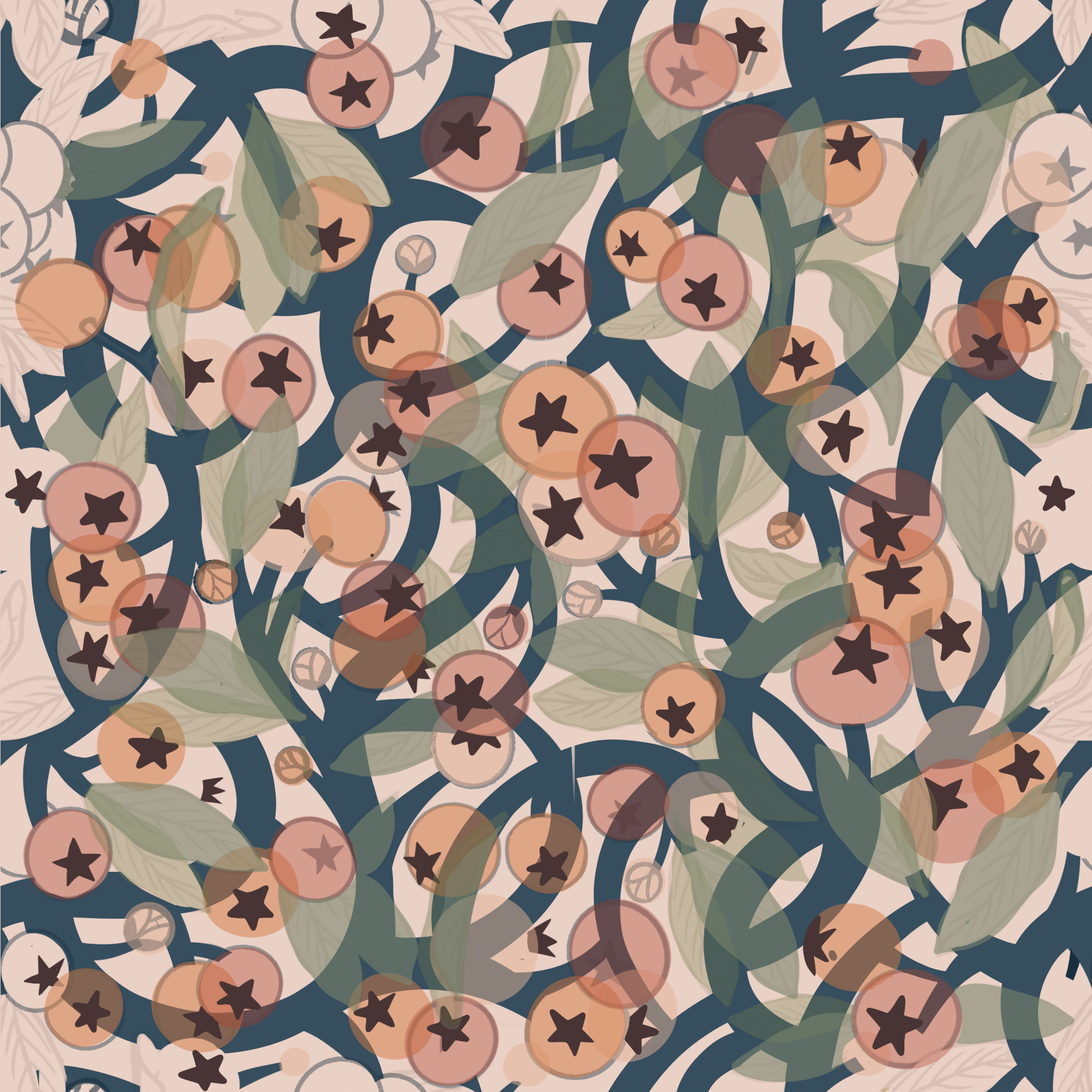
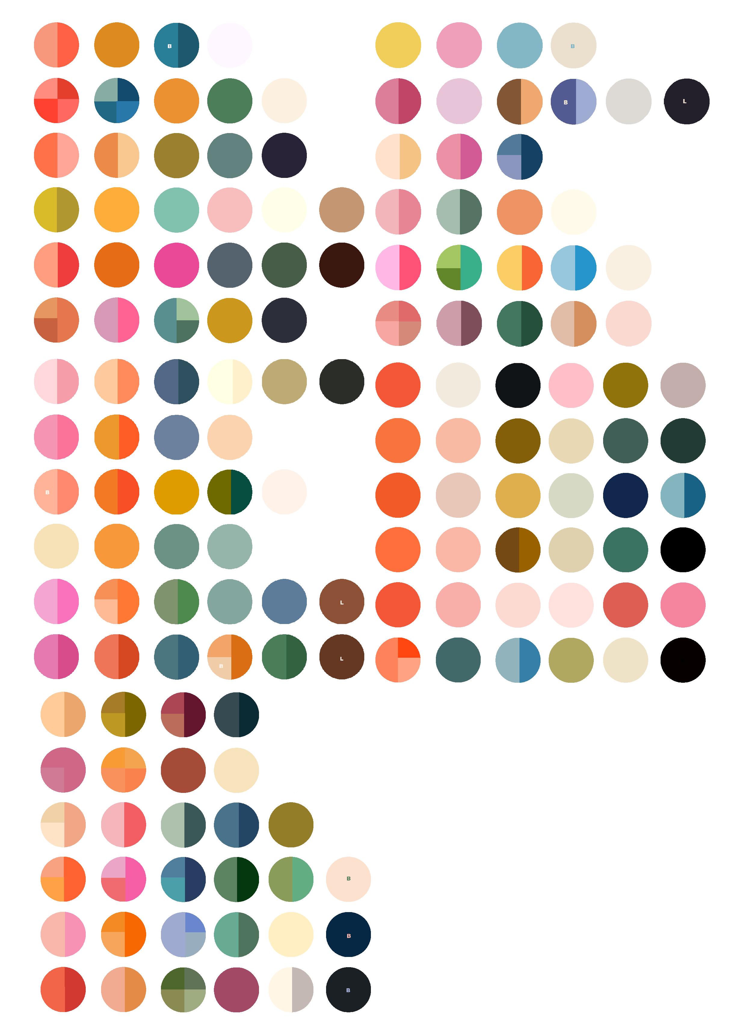
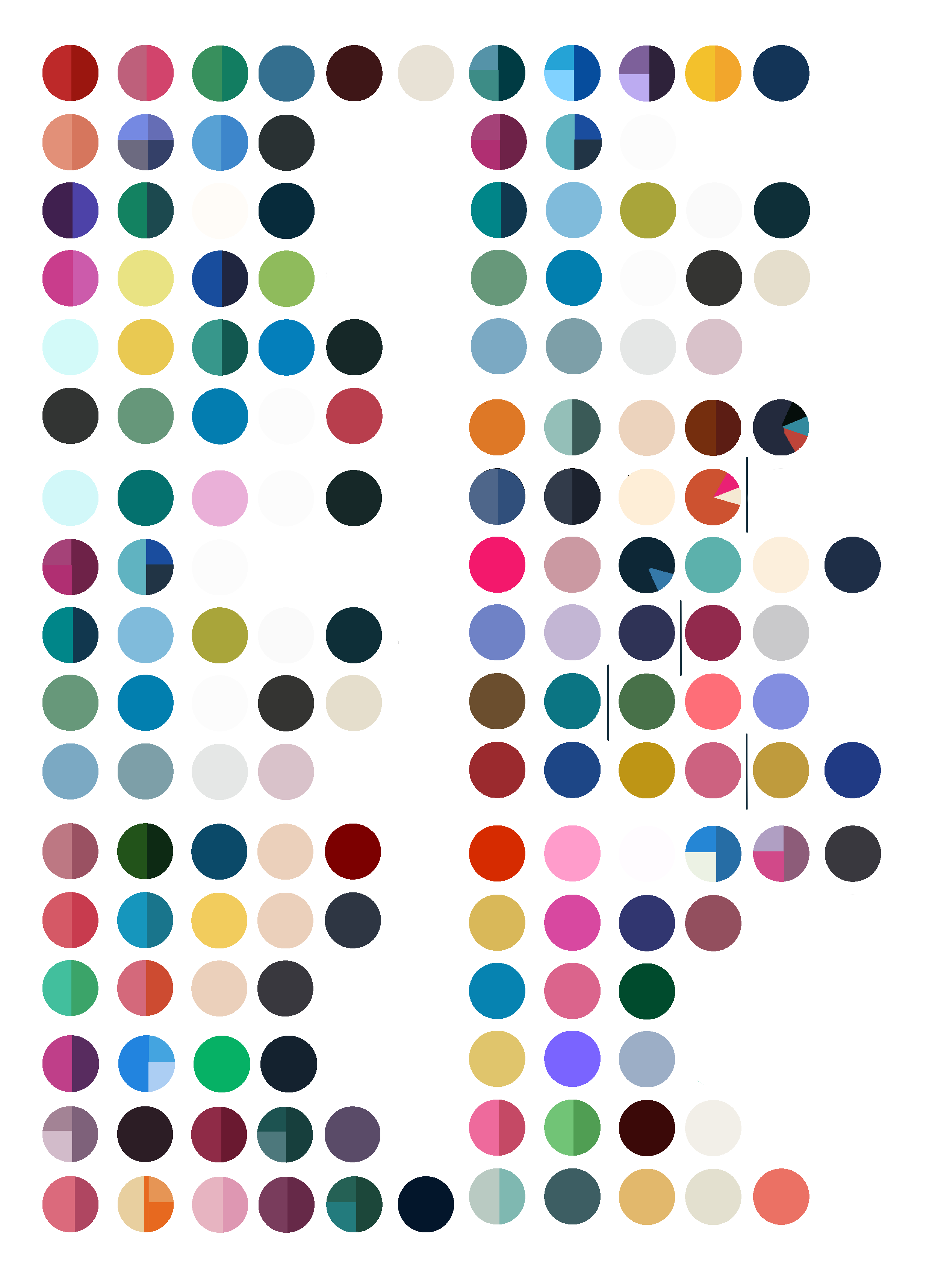
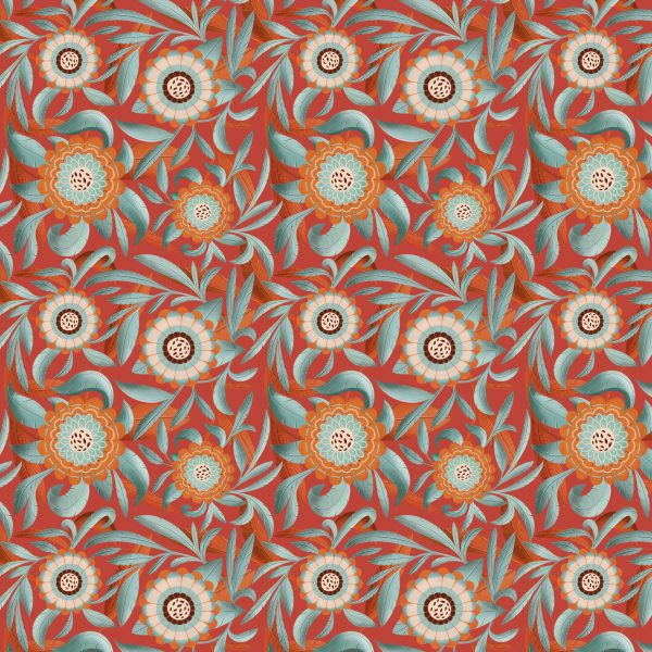
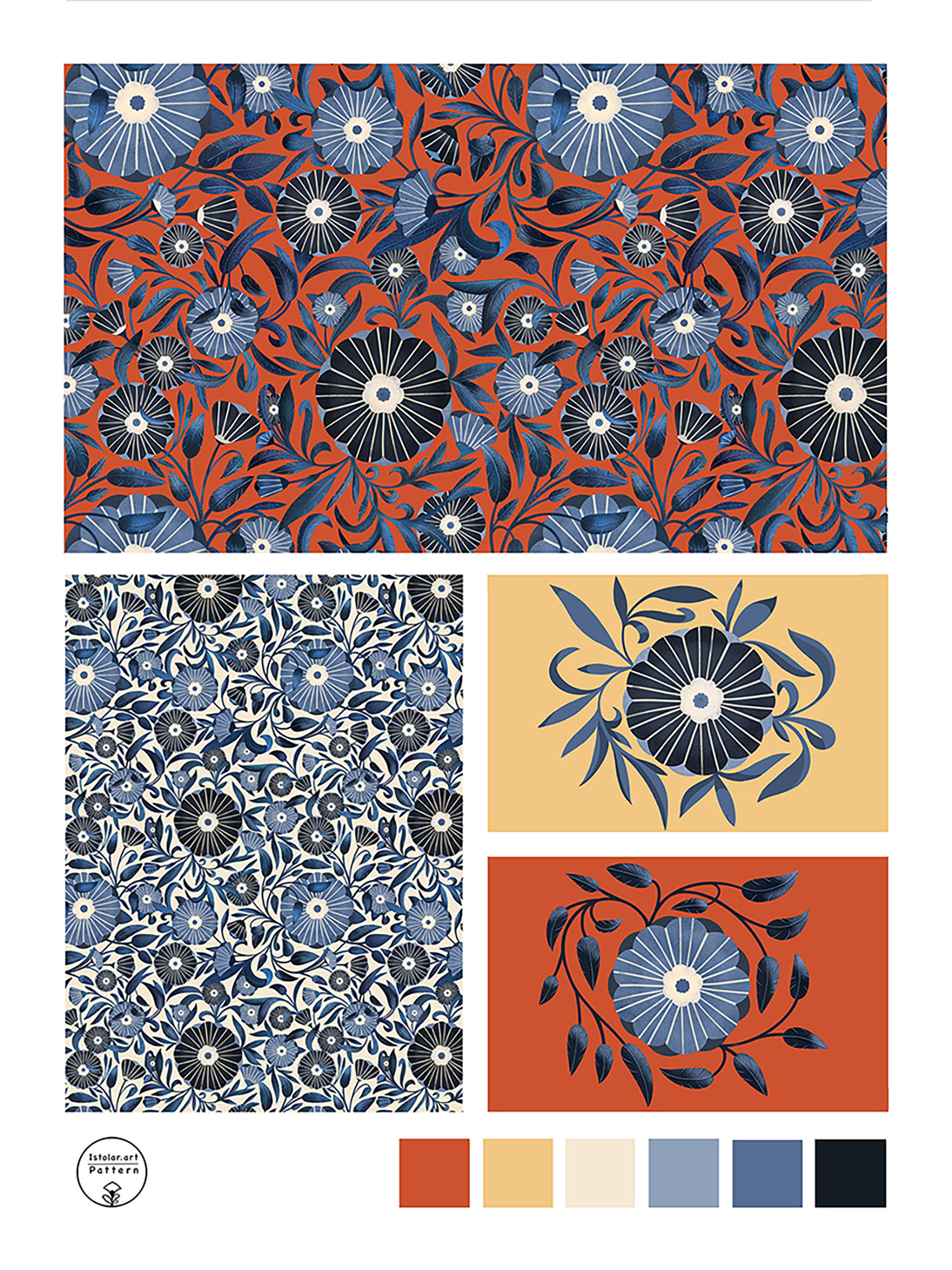
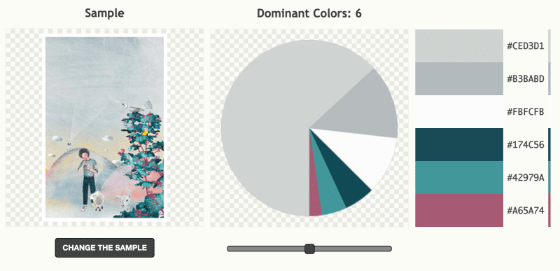
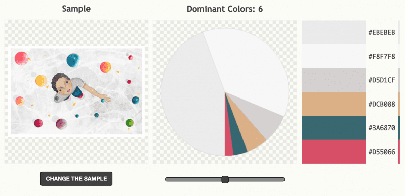
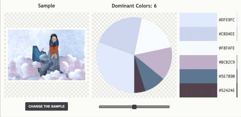
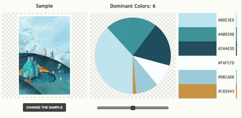
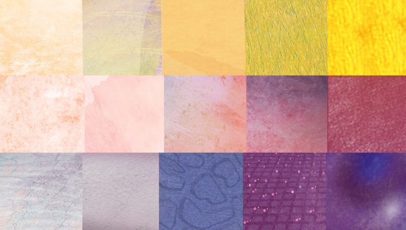
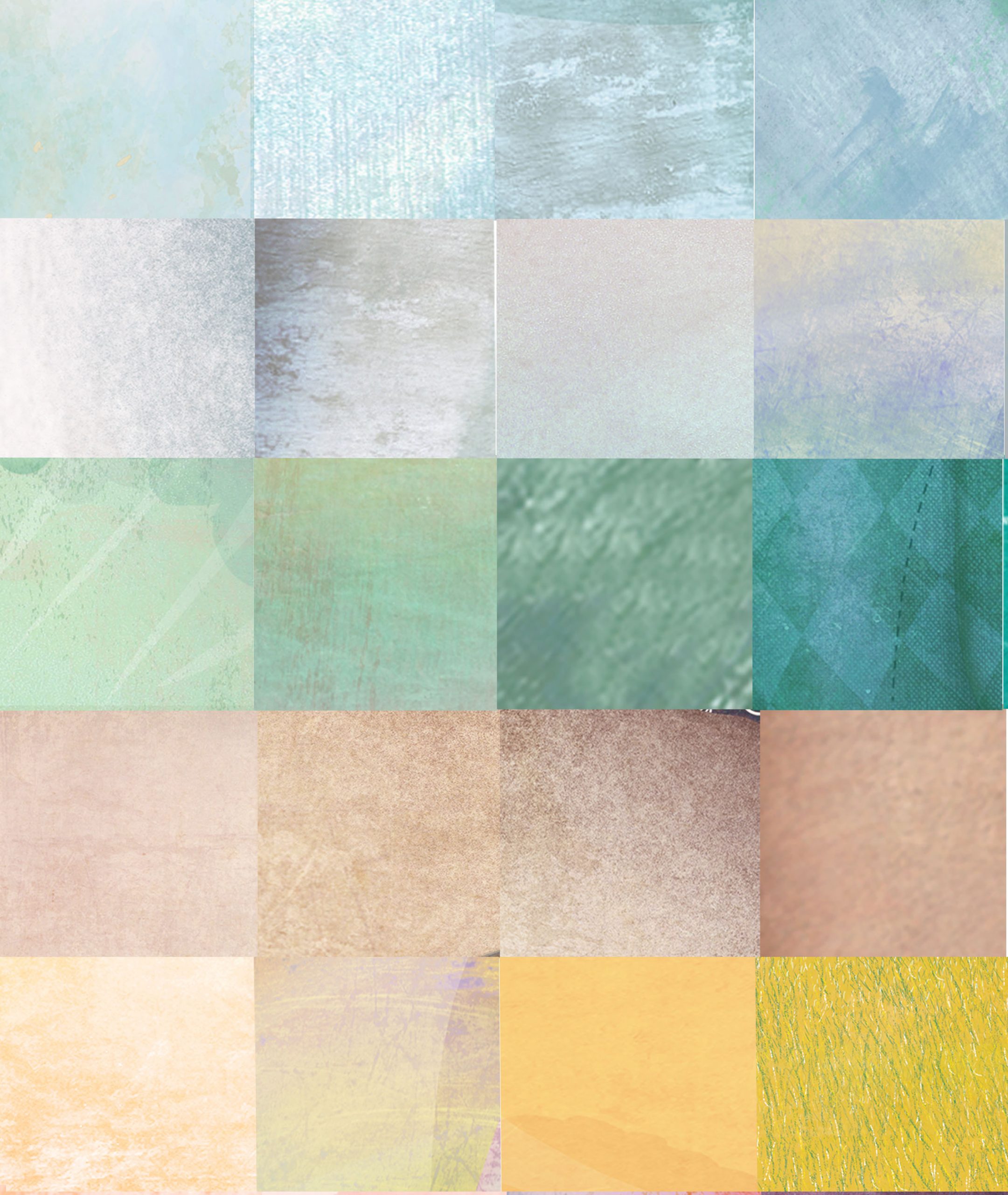
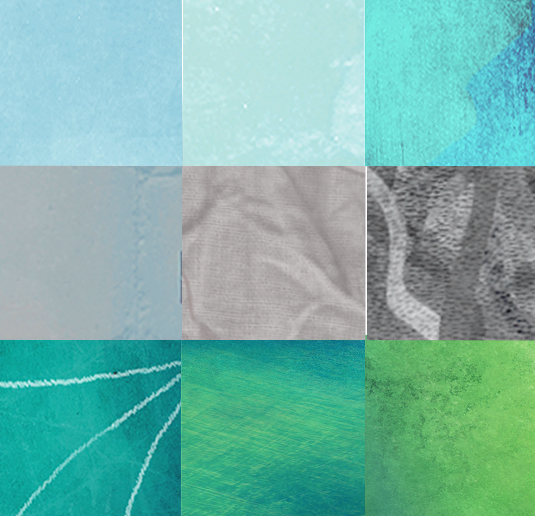
I had tried to diversify pattern color palette. It appears that taking the decision to change colors spectrum is not enough for it to happen. Habits are hard to break. I tend to naturally and unconsciously come back to the same set of colors… over saturated so I want to bring more muted colors. Therefore I looked into some of my favorite pattern designers palette that i mixed with mine to get a steady and different stock of colors. I never worked that way … Iam usually very intuitive in my process but I feel like trying that method. Let’s see how it goes.
Color palette gathered from pattern designer’s work I love
Mix of colors between my patterns palette and designer palette I like the work
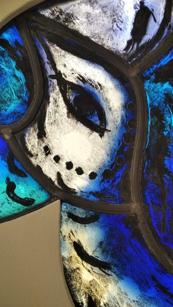
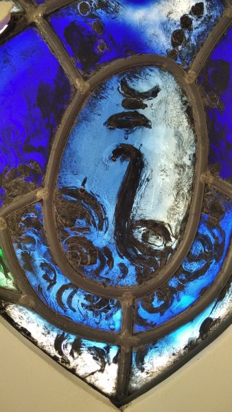
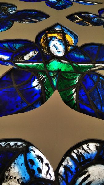
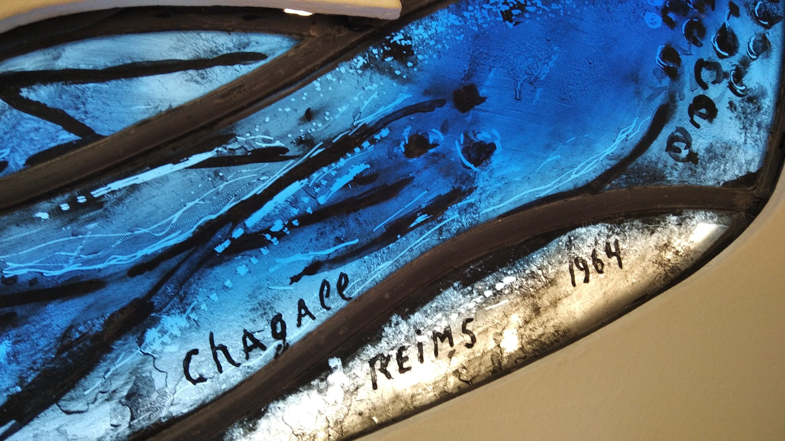
Ce verre épais transpercé de lumière donnent des envies de recueillement même laïque! ..
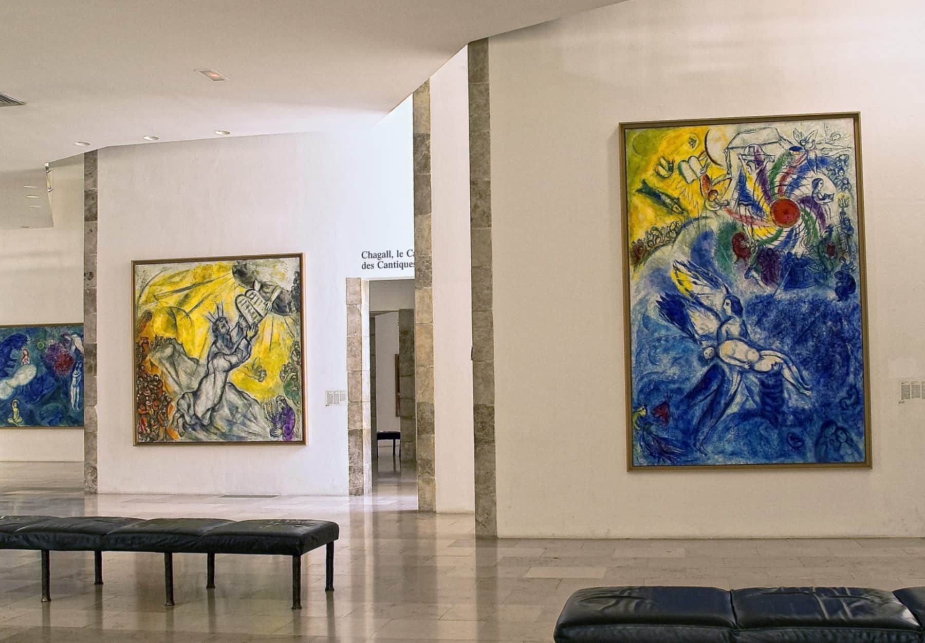
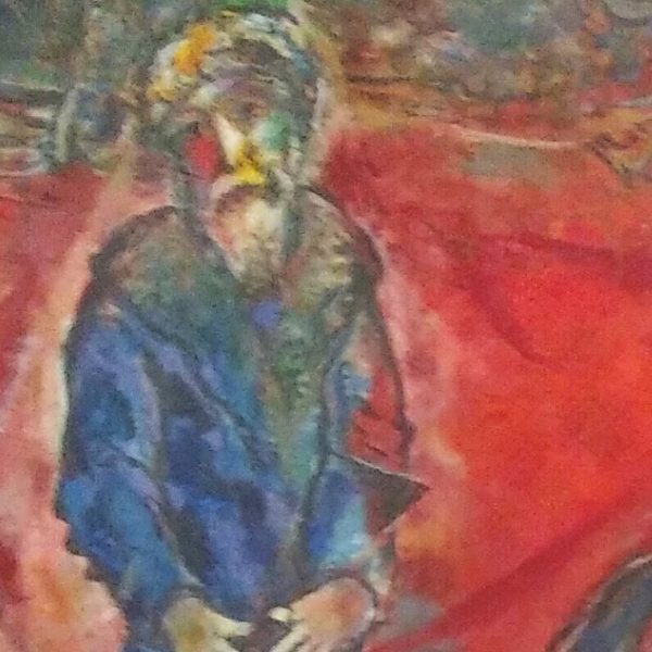
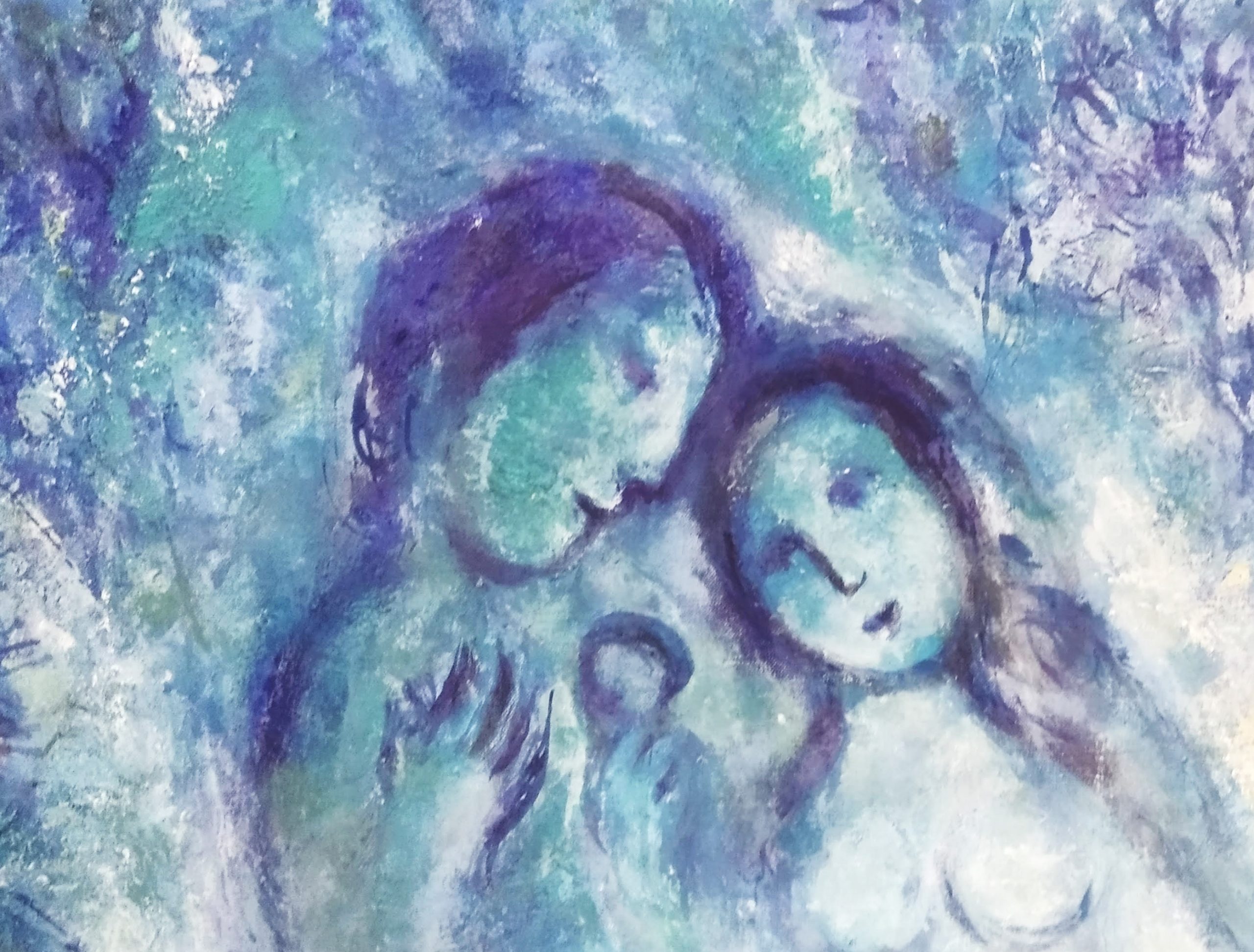
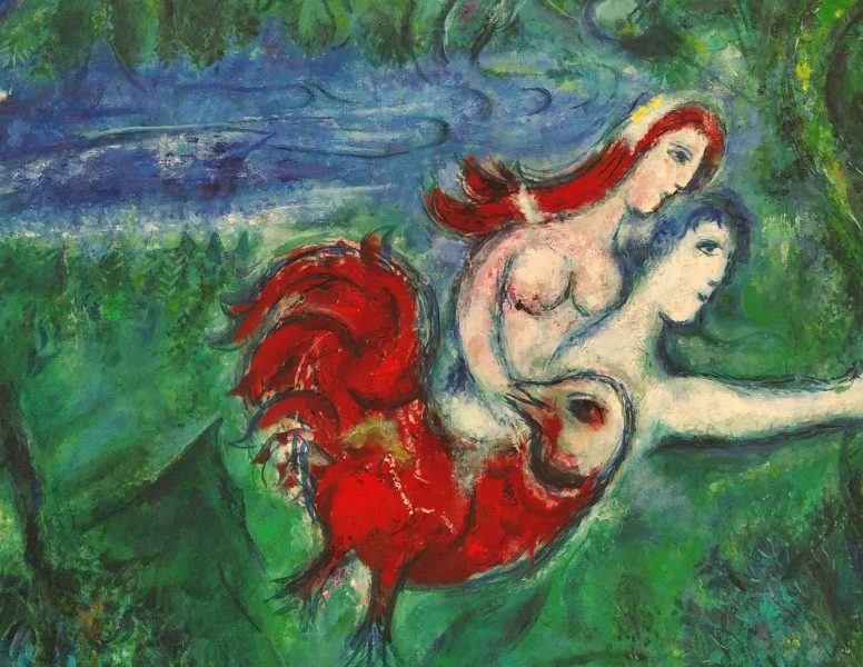
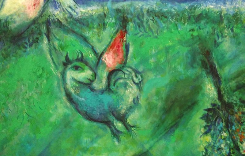
Des bouts de surréalismes et de tradition juive, ses bestiaires et ses personnages qui volent dans les airs … célèbres et célèbrent
Chagall disait : “je suis bleu”
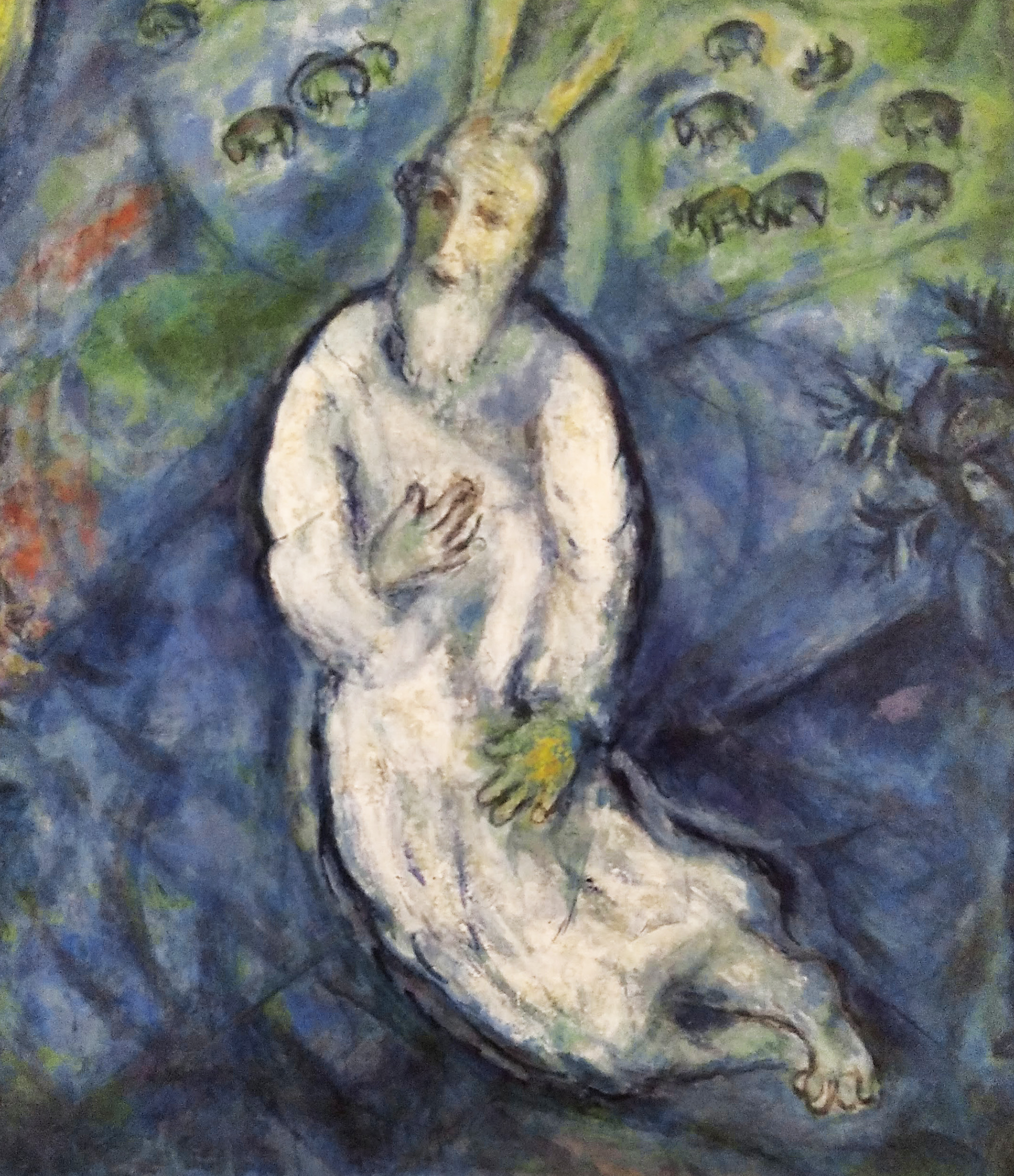
“Chagall commence à travailler sur le Message Biblique au début des années cinquante, d’abord pour rendre vie à la chapelle du Calvaire, à Vence, où il vit entre 1949 et 1966. Avec l’avancement du travail, il préfère détacher l’ensemble d’une religion particulière et décide finalement de l’offrir à l’Etat français en 1966. Le cycle comprend les douze tableaux illustrant la Genèse et l’Exode, les deux premiers livres de la Bible, et un ensemble de cinq peintures évoquant Le Cantique des Cantiques“
” Pour moi, un vitrail représente la cloison transparente entre mon cœur et le cœur du monde. Le vitrail est exaltant, il lui faut de la gravité, de la passion. Il doit vivre à travers la lumière perçue.” Marc Chagall
M. Chagall a collaboré avec un maitre verrier de Reims…A partir de commandes. Il réinvente des scenes bibliques en y re-intégrant des éléments de tradition juive:
Interview -Chagall et le vitrail – Hope Radio – Musées nationaux du XXe siècle des Alpes-Maritimes
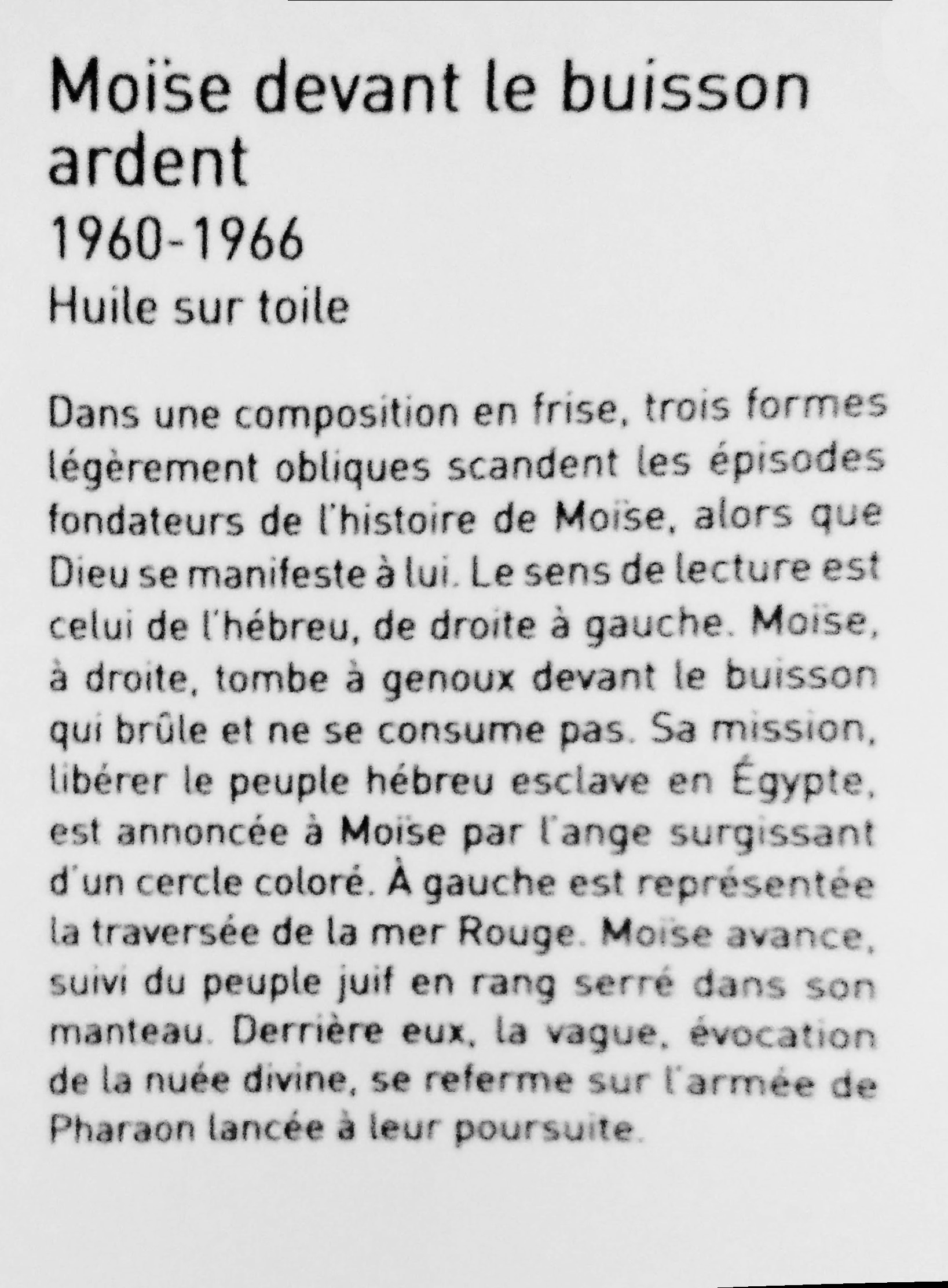
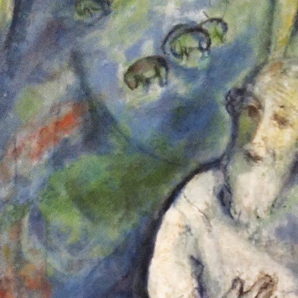
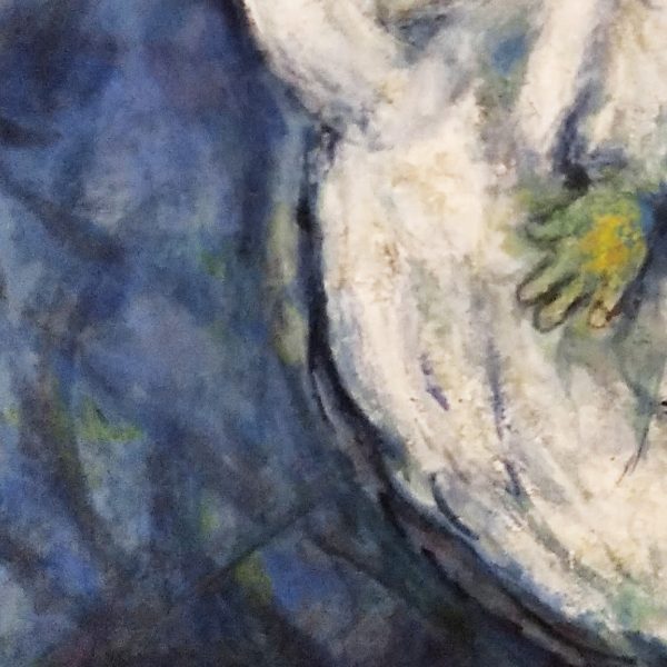
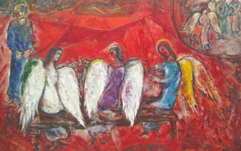
ET LES HUILES, SI BELLES ET SI GRANDES
17 grands tableaux intitulée Message biblique, plus grande collection publique d’œuvres de Chagall + collection temporaire
Mes photos sont de qualité tres tres moyenne mais l’idée et le souvenir y sont …
LA CRATION DE L’HOMME 1956- 1958 – HUILE SUR TOILE
ADAM ET EVE CHASSÉS DU PARADIS 1961 HUILE SUR TOILE
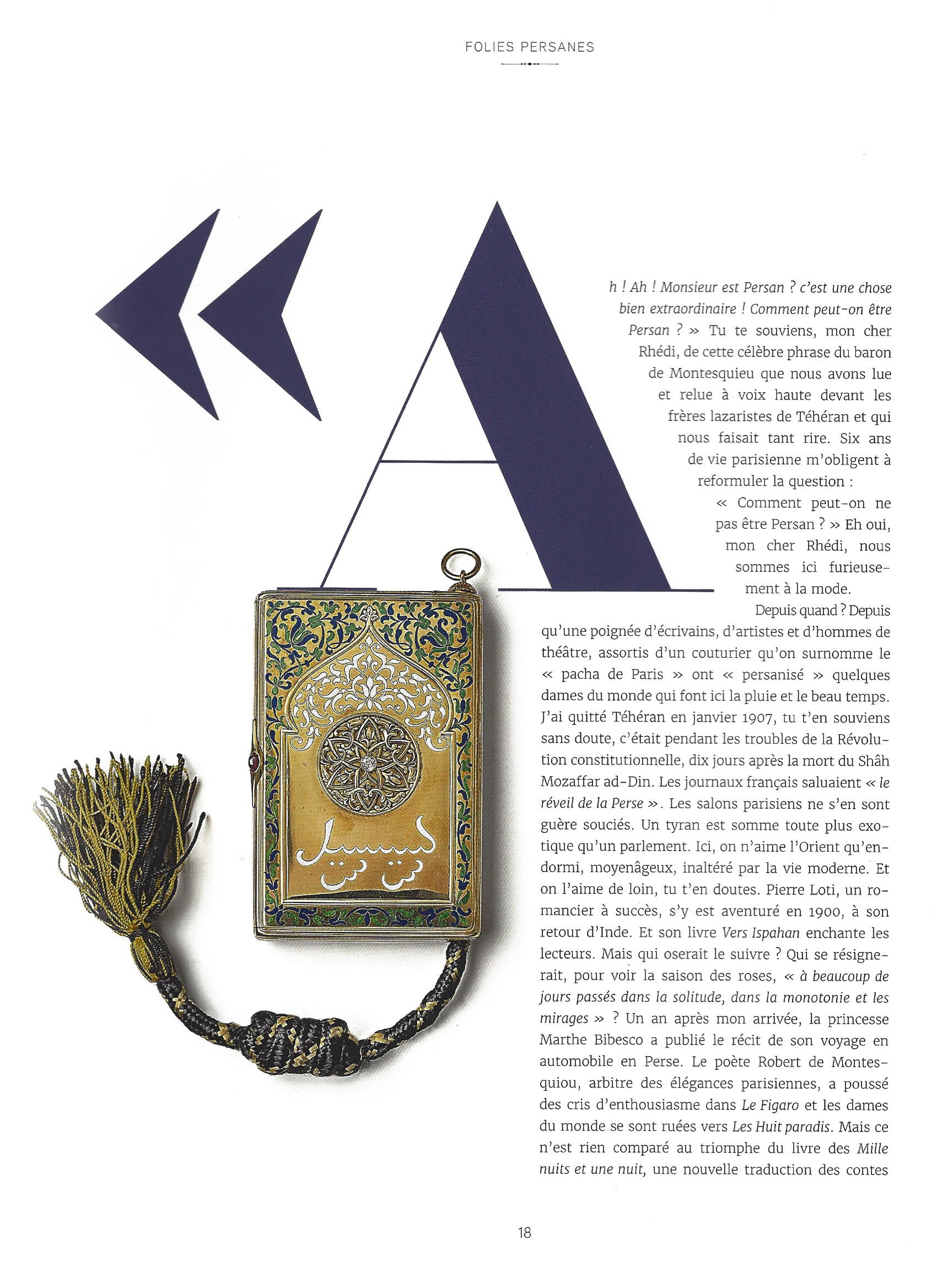
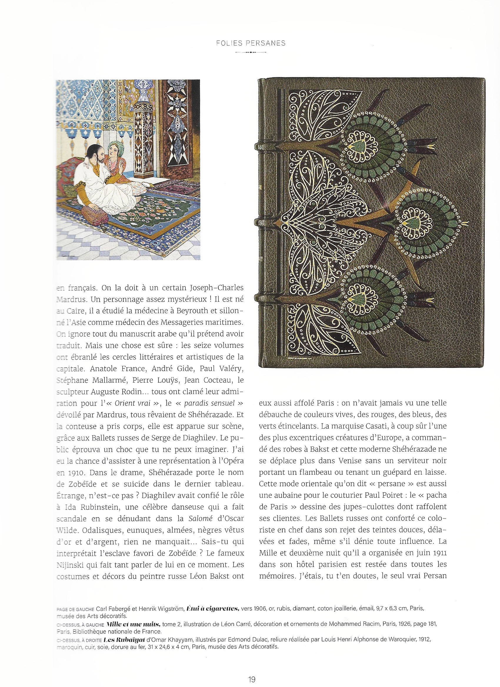
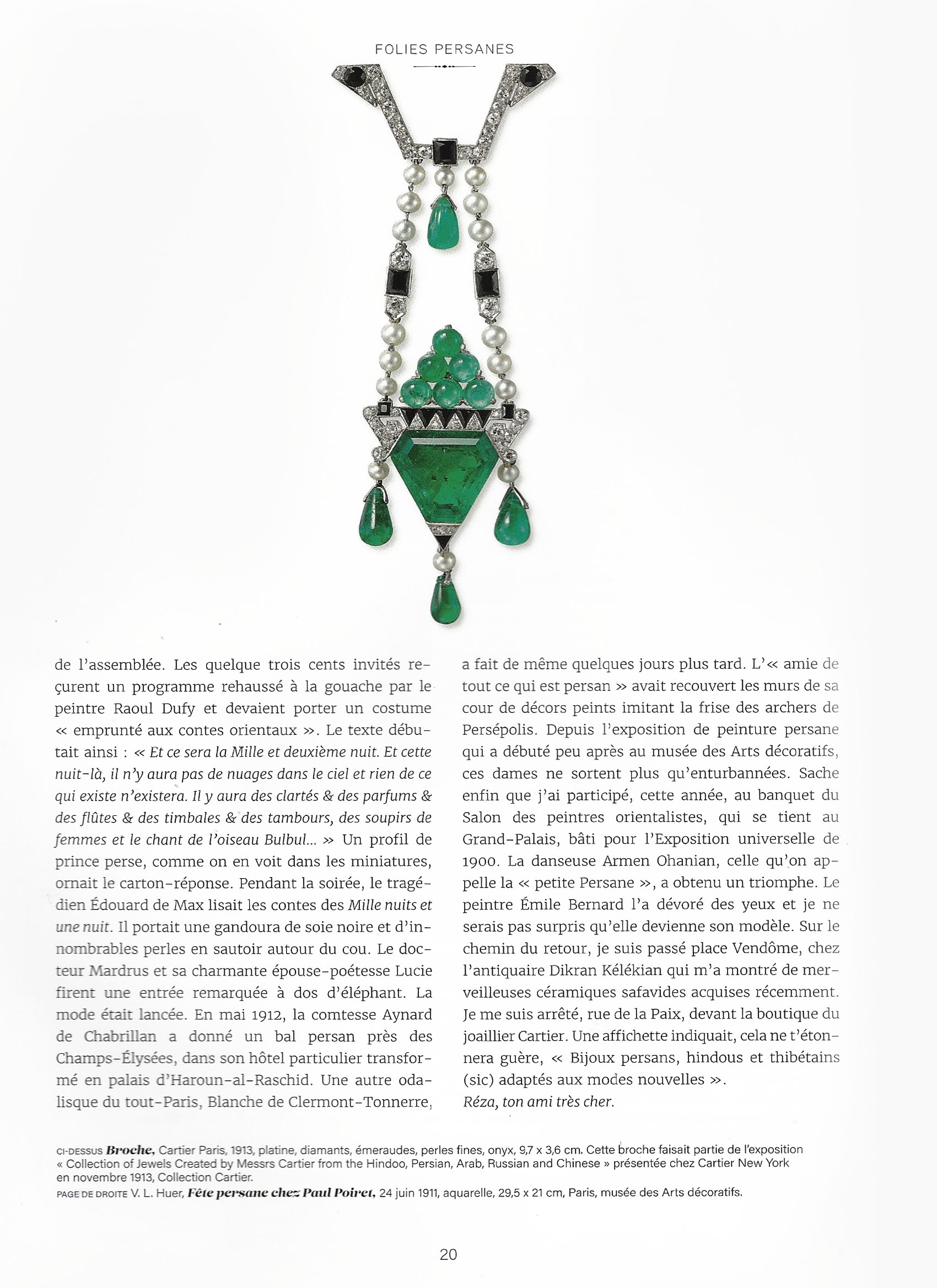
Ce hors-série, publiée à l’occasion de l’exposition présentée au musée des arts décoratifs à Paris, revient sur les influences des arts de l’Islam sur les productions de bijoux et d’objets précieux de la grande maison de joaillerie Cartier, du début du XXe siècle à nos jours.
Les dessins préparatoires de bijoux exposés à côté de leur réalisation précieuse étaient émouvants de par leurs lignes, leur matières et la convocation perceptible des savoir-faire d’artisans/artistes.
A la sortie du MAD, je me suis dit intérieurement, que que j’avais eu devant moi, le temps de cette visite, la définition, et la mise en forme brute, de l’Inspiration, au meilleur de son processus. Loin, très loin de la copie exacte ou la reproduction approximative. On percevait que ces lignes avaient été observées, admirées, habillées de subjectivités pour être mieux transformés, re-modelées sans jamais que l’hommage à la beauté née d’esprits nourris par la culture persane, ne soit oublié:
Plus tard, en lisant cette édition de “connaissance des arts”, j’ai compris comment un tel résultat a été rendu possible.
Pierre Cartier parcourait le monde avec la curiosité méthodologique d’un anthropologue observant les objets ainsi que les hommes qui les animent et les fabriquent. Il revenait vers ses ateliers parisiens, chargé d’images et d’ objets qu’il confiait librement à ses équipes, soit une sorte de “mood board” avant l’heure. Les artisans/artistes s’en inspiraient et rendaient, anonymement, les croquis de leur nouvelle créations, court circuitant la courses à aux égos pour, sans doute, et filtrant ainsi la quintessence du processus créatif inspiré de cette partie du monde, la Perse, dont le dessin et la réalisation de joaillerie avait/a tant à apprendre.
Ce parcours créatif est perceptible à la visite de l’exposition #cartieretlesartsdelislam.
Bijou en elle même
\
Depuis cette exposition, il y a des patterns dans ma tête:
The Bacchante, 1853 is a painting by Jean-Léon Gérôme ( French painter and sculptor in the style now known as academicism. The range of his oeuvre included historical painting, Greek mythology, Orientalism, portraits, and other subjects, bringing the academic painting tradition to an artistic climax.)
A Bacchante in Roman mythology is a female follower of Bacchus, god of wine and intoxication. In Greek mythology, they are called Maenads. … Bacchantes are depicted as mad or wild women, running through the forest, tearing animals to pieces, and engaging in other acts of frenzied intoxication.
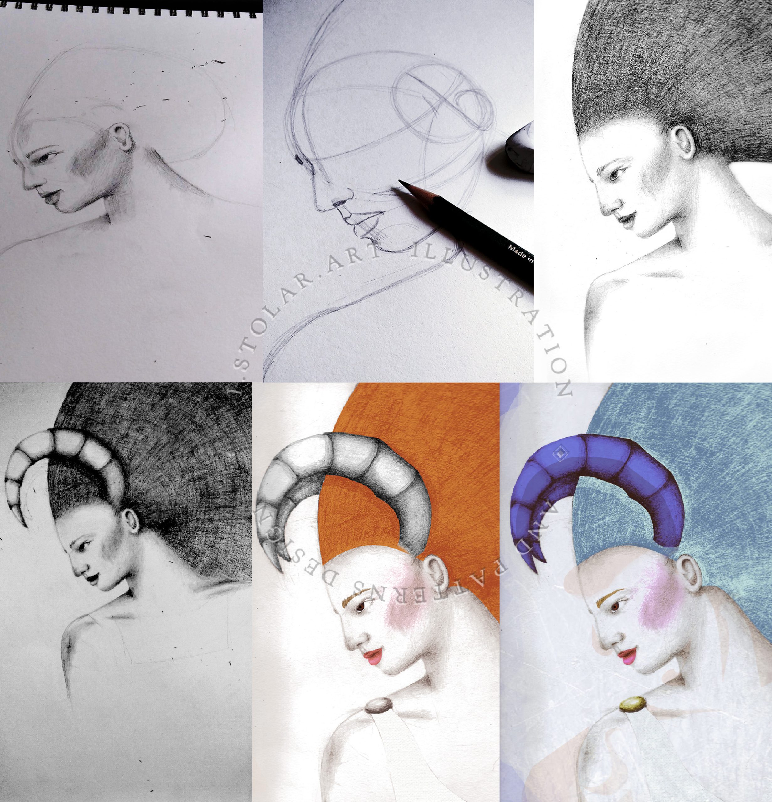
This painting or the bacchantes were not really my inspiration for the underneath portrait … some mental imagery are overlapping…
I thought there would be more paintings representing woman with rams’s horns other that this one from Jean Leon Gerome ( biography in French here)
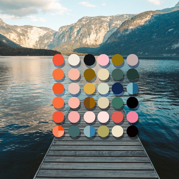
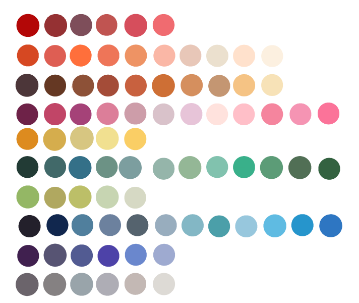
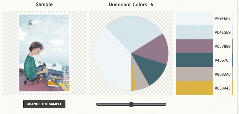
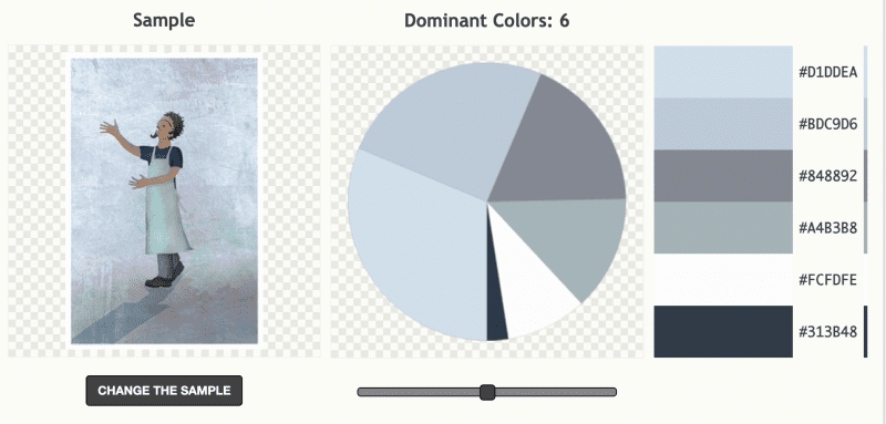
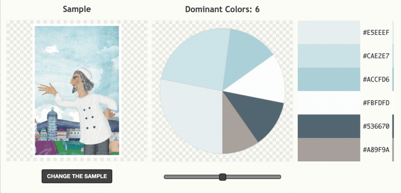
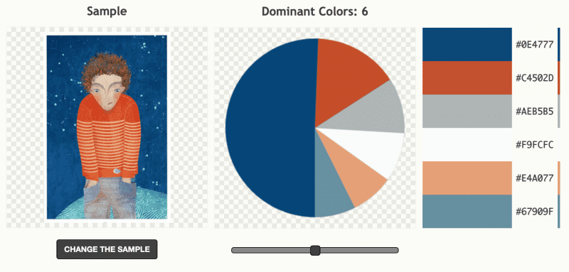
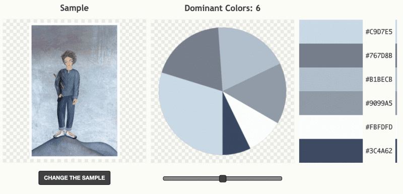
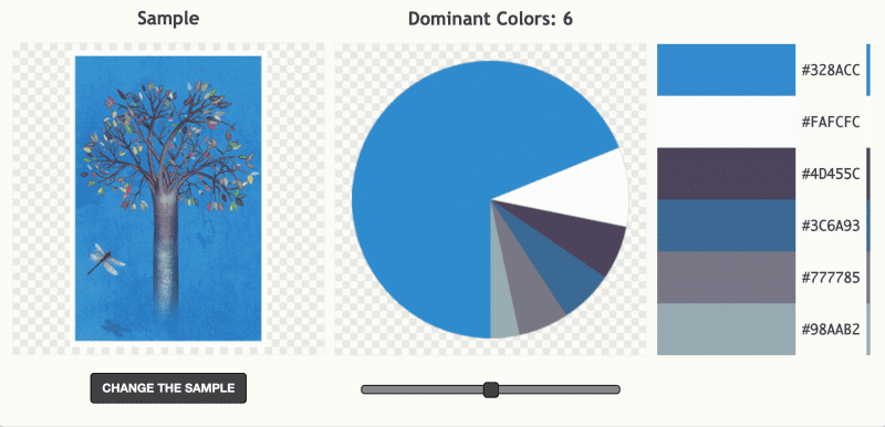
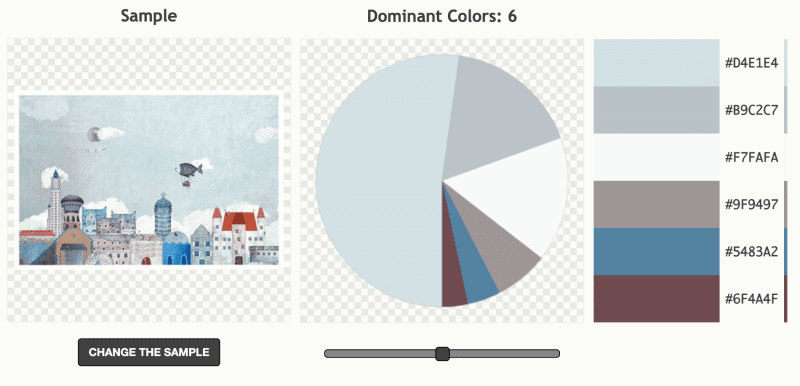
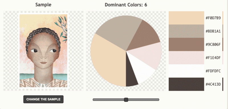
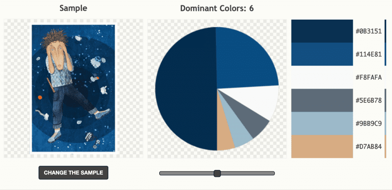
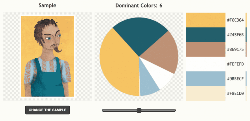
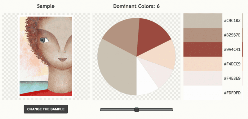
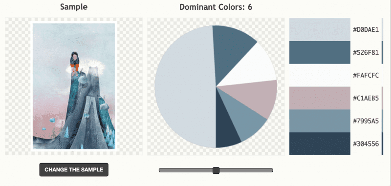
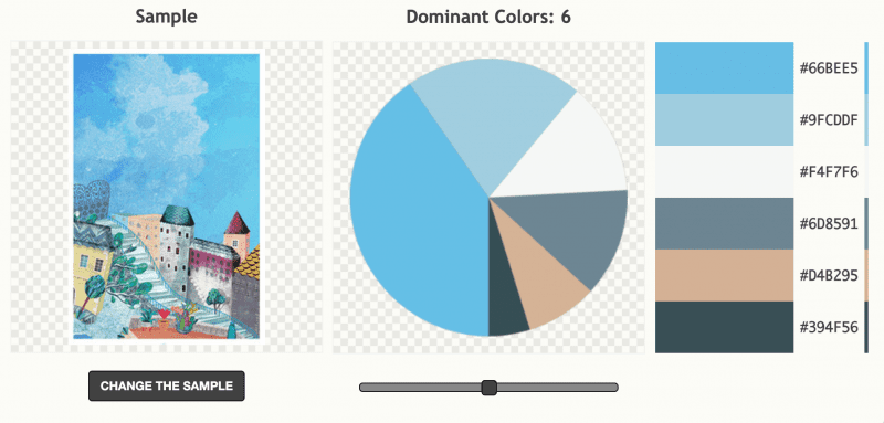
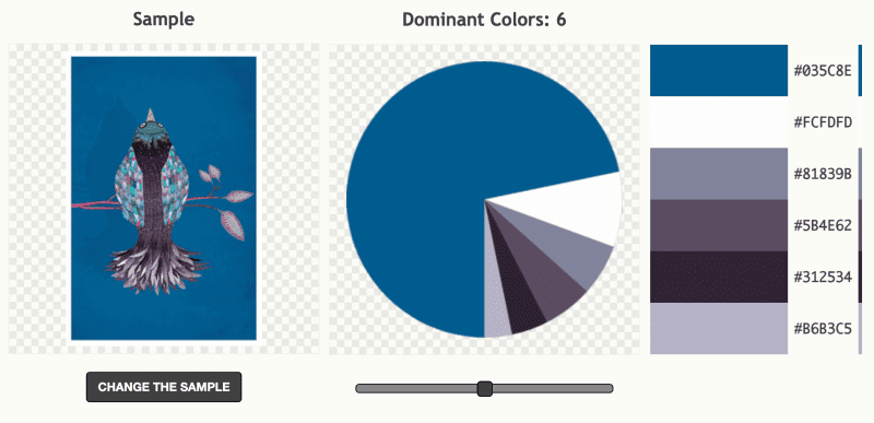
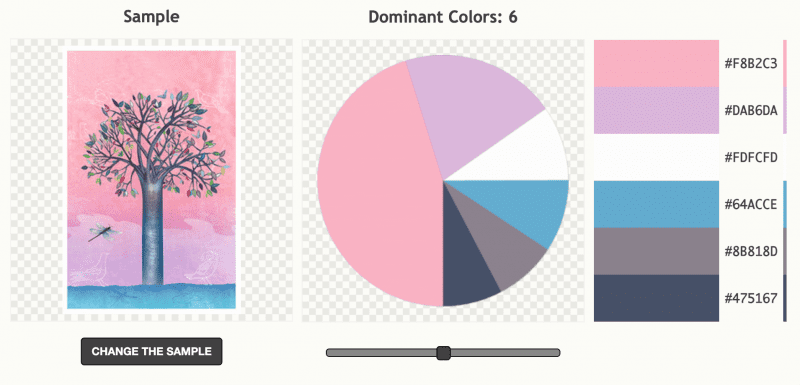
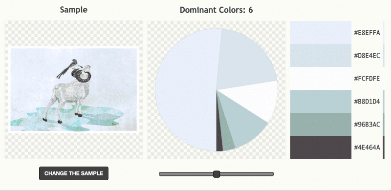
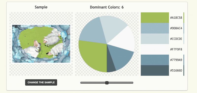
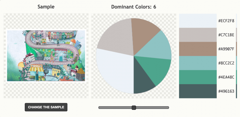
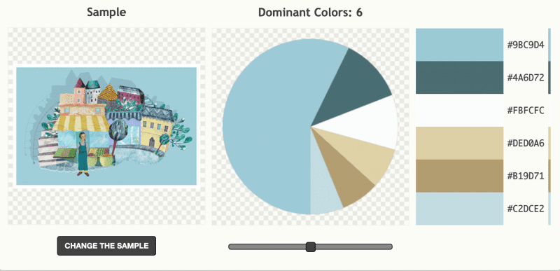
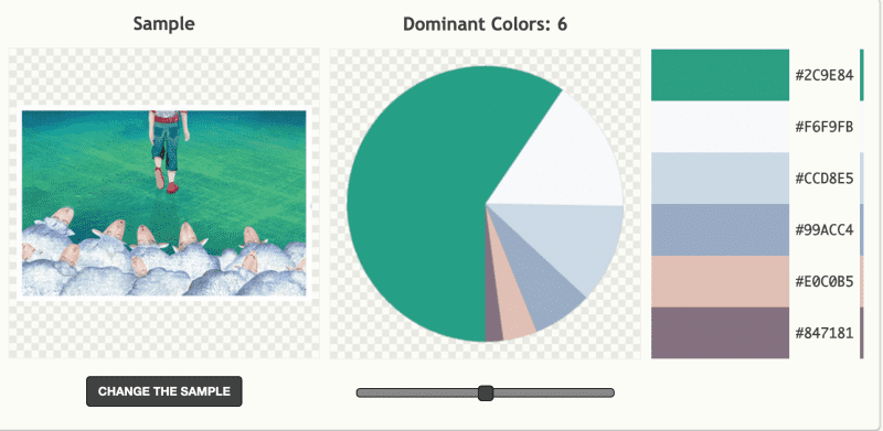
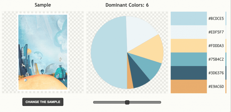
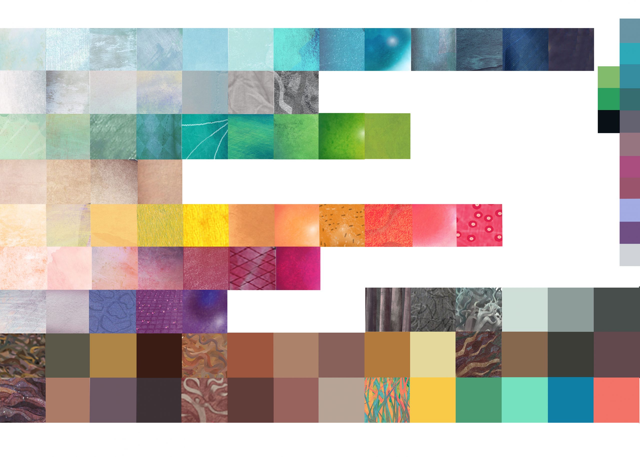
FR / J’ai essayé (sur mes cartes postales #Luno) un générateur de couleurs au hasard mais il y en a beaucoup à explorer sur le web, ici et là, un peu partout, à explorer… Je pensai que le bleu dominait plus le projet.
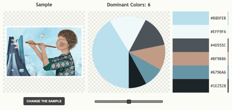
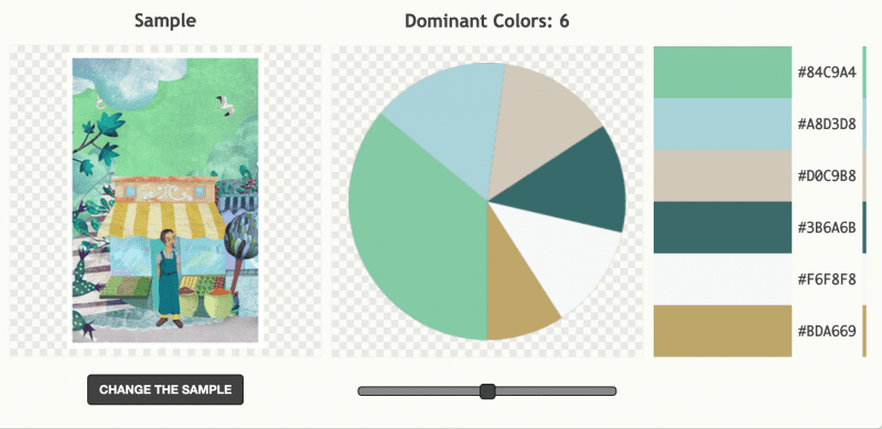
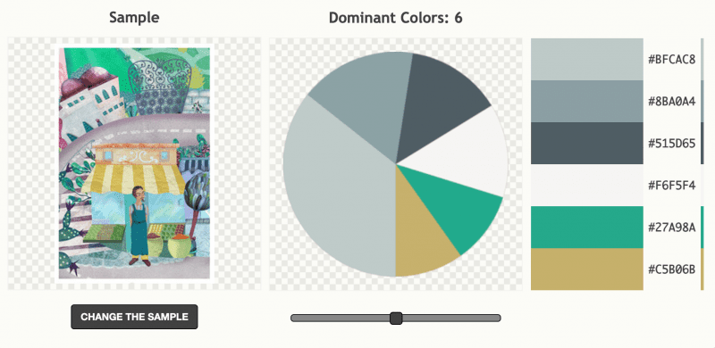
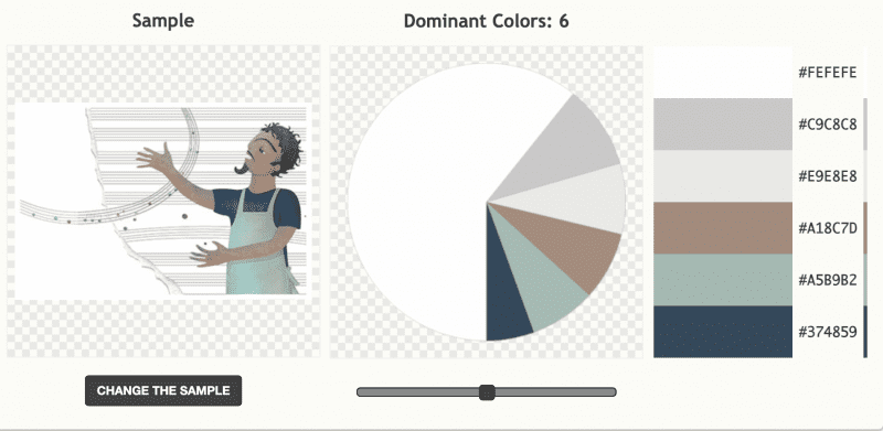
ENGL / I tried color palette on my Luno postcards. It is based on the predominant colors in image – 4 art projects, web design or home decor. I only try one generator, there is plenty on the net to explore
I though blue was dominant. It is … but there is plenty of green too !
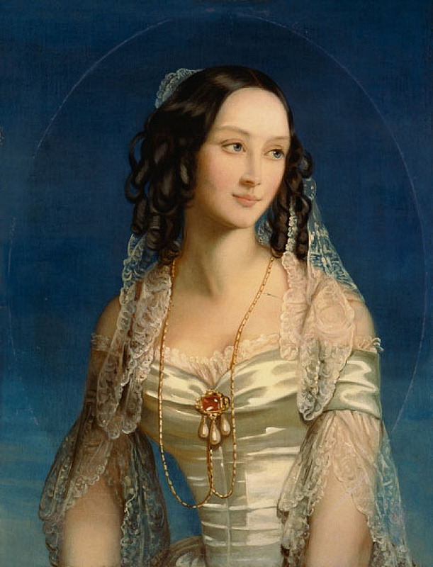
La duchesse Zinaida Yusupova était une noble russe née le 23 septembre 1861 et décédée le 24 novembre 1939. Elle était membre de la famille aristocratique Yusupov, l’une des familles les plus riches et influentes de la Russie impériale. Zinaida était la fille du prince Boris Yusupov et de la princesse Tatiana Alexandrovna.
La famille Yusupov était connue pour ses vastes richesses et sa participation à la vie sociale et culturelle de la Russie. Zinaida Yusupova s’est mariée avec le prince Felix Yusupov en 1889. Felix Yusupov est devenu célèbre pour sa participation à l’assassinat de Raspoutine, conseiller mystique de la famille impériale russe, en 1916.
La vie de Zinaida Yusupova a été marquée par la Révolution russe de 1917, qui a entraîné la chute de la monarchie et la disparition de la noblesse russe. Après la révolution, elle a vécu en exil en France avec son mari. La duchesse Zinaida Yusupova a survécu à de nombreux changements politiques en Russie et a vécu une vie tumultueuse jusqu’à sa mort en 1939.
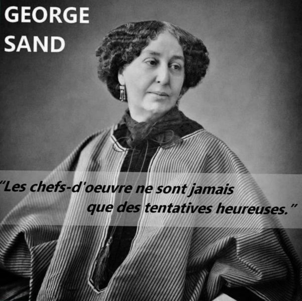
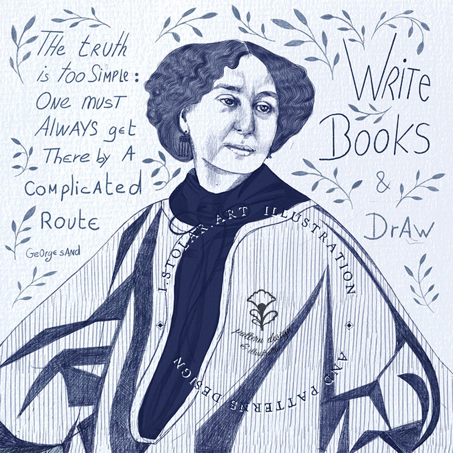
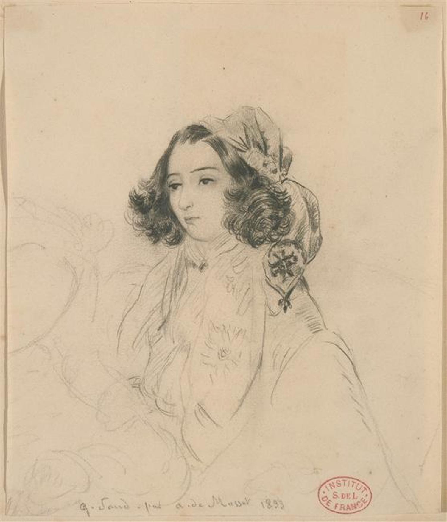
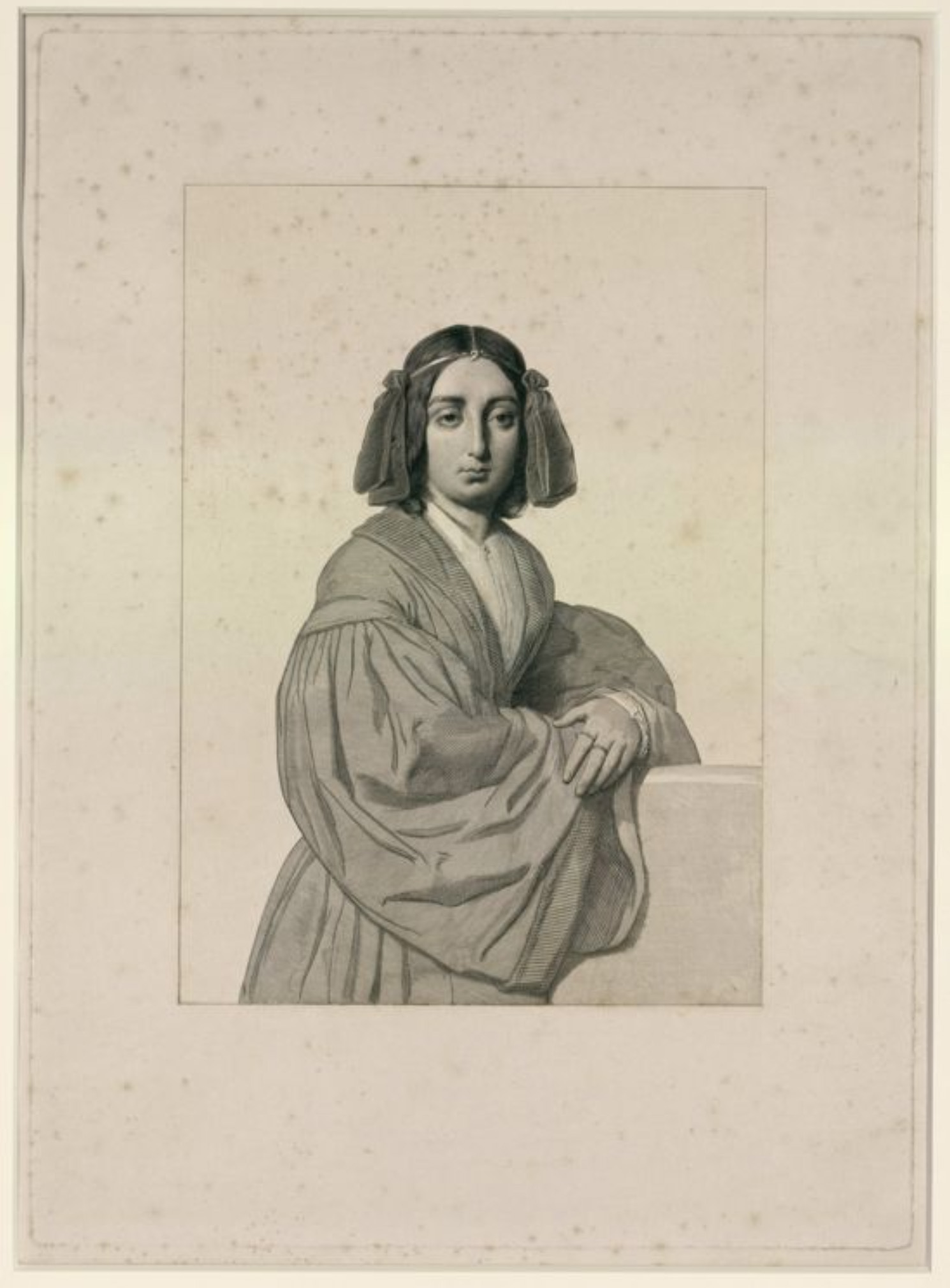
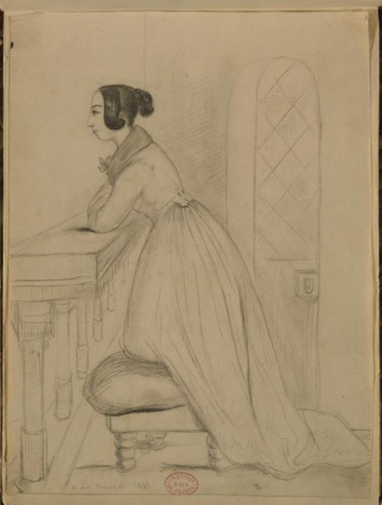
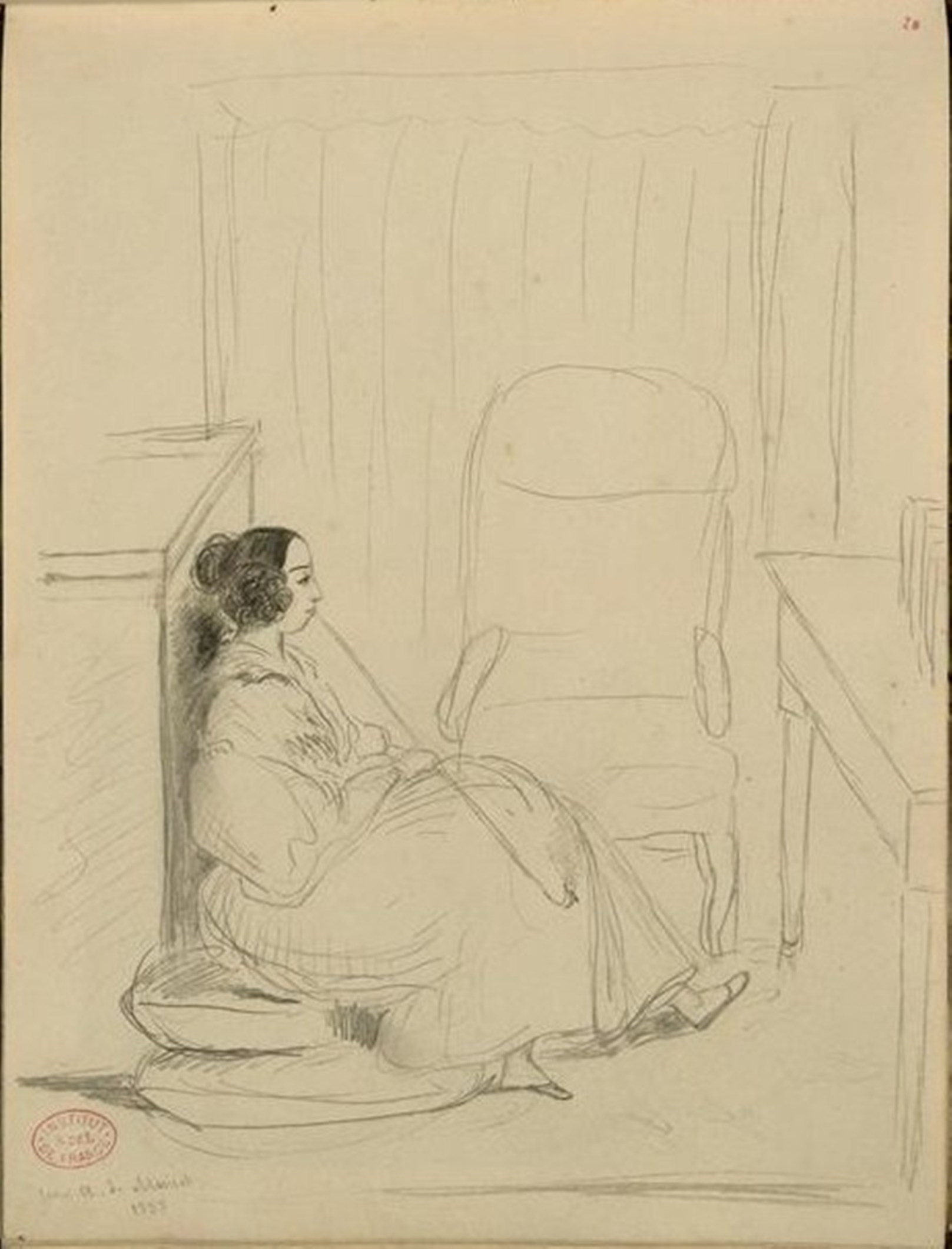
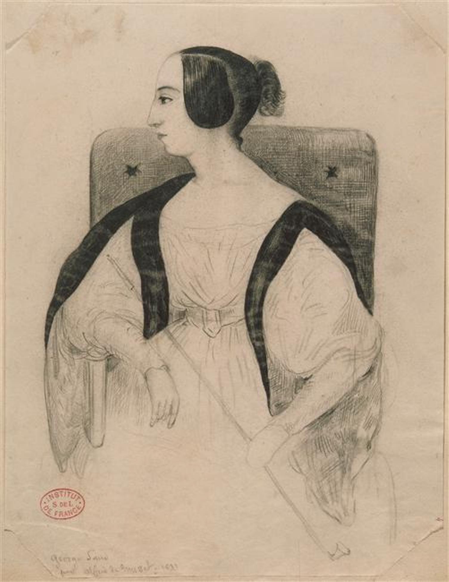
George Sand est le pseudonyme d’Amantine Aurore Lucile Dupin de Francueil, baronne Dudevant, romancière, auteur dramatique, critique littéraire française et journaliste.
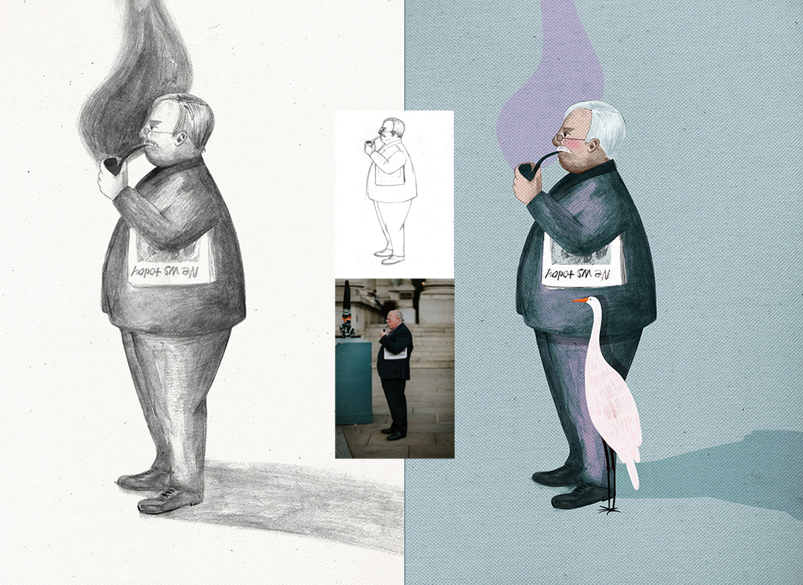
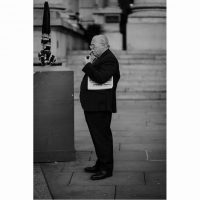
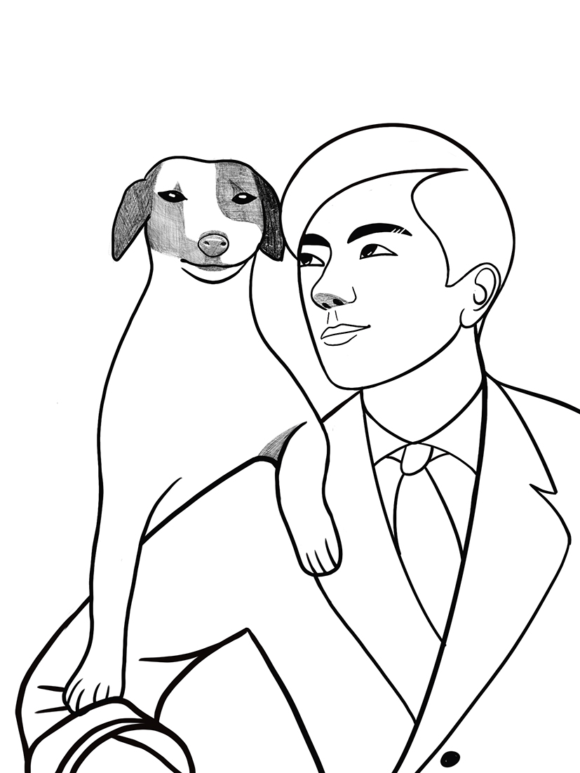
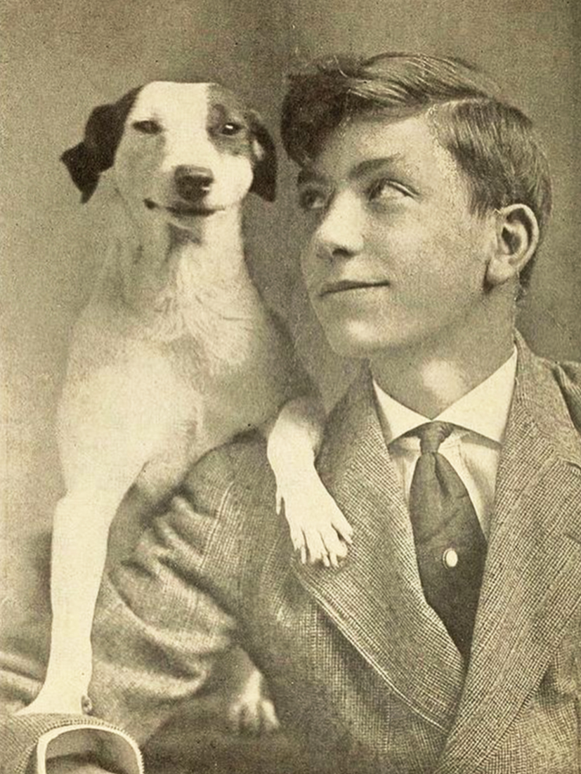
J’ai trouvé cette photos sur pinterest avec pour seul ‘credit’: “two pals, 1920”. C Tout!
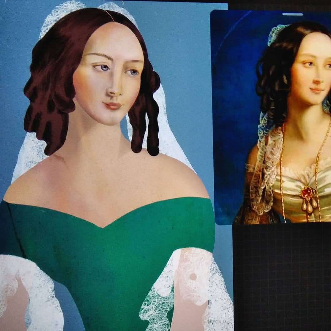
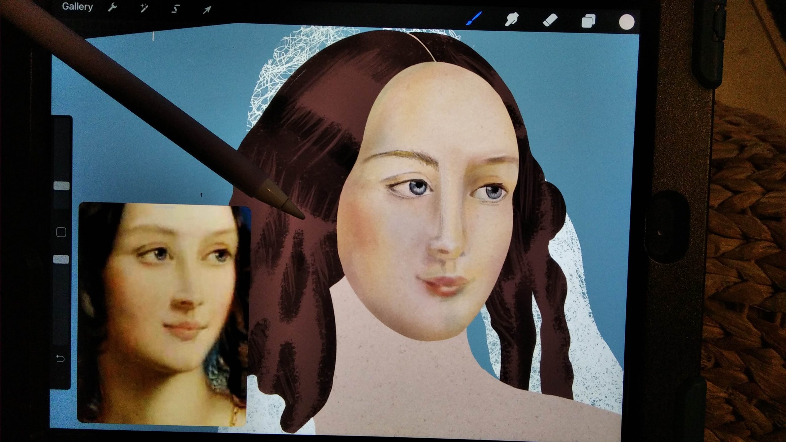
L’idée de travailler a partir de photos est de reprendre les lignes de l’image, l’énergie de la composition et progressivement au fil du dessin, se l’approprier sans trop y penser.
ici C’était un peu comme ‘croquer’ la connivence entre ces deux ‘guys’
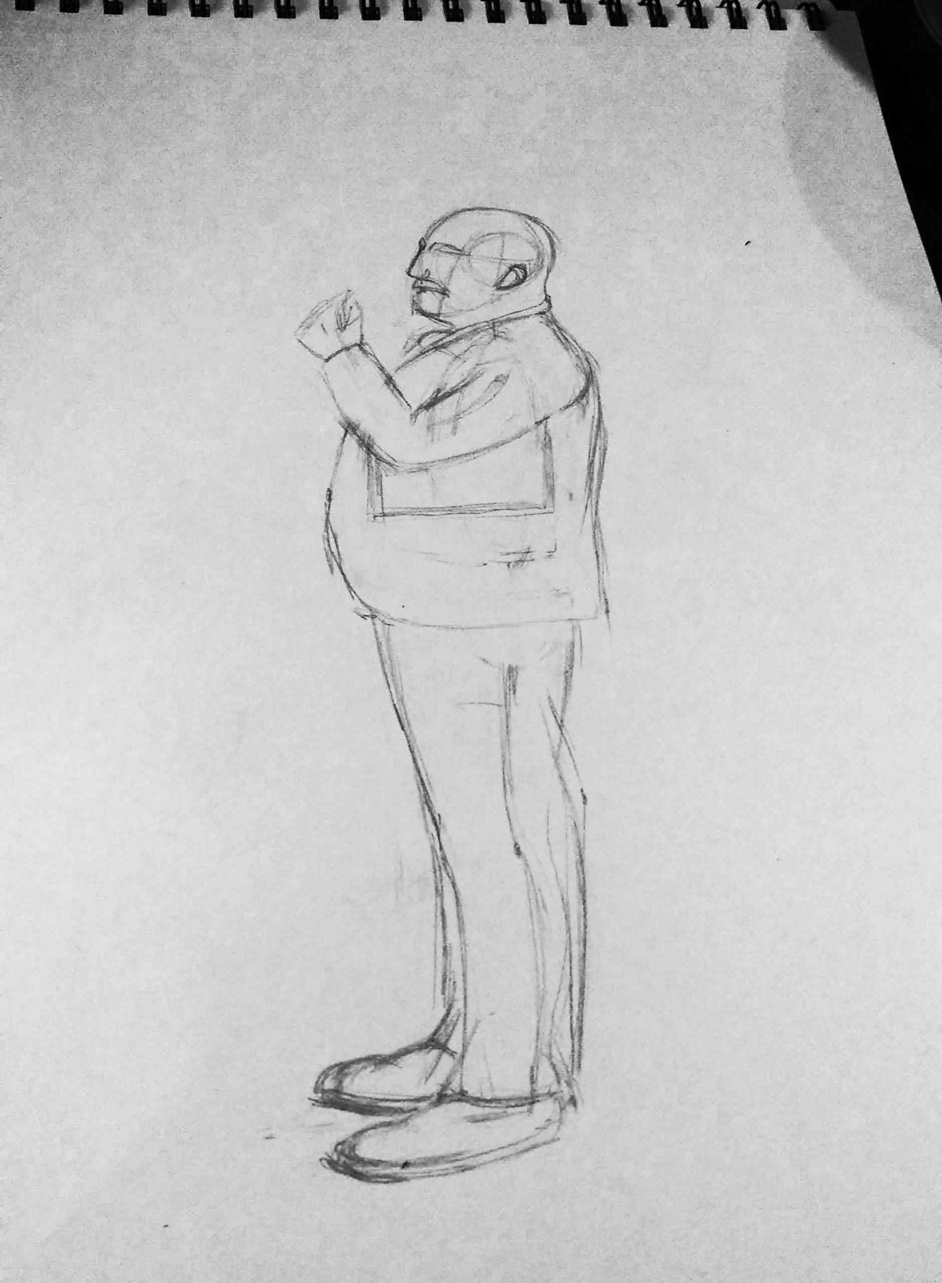
image finale faite avec procreate en utilisant le pinceau : sketching – HB pencil