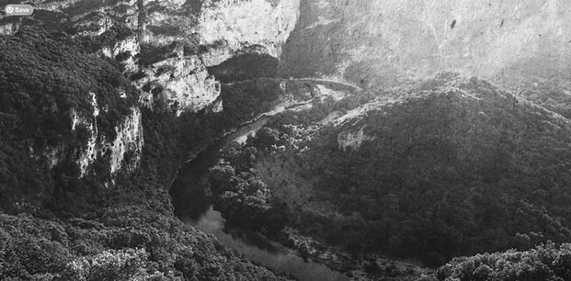
Il y aura des routes et des maison … en répétition
Parfois je me sers de ce blog comme lieu d enregistrement, une fonction de pense bête …
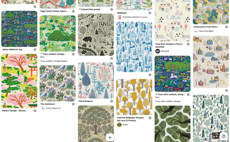
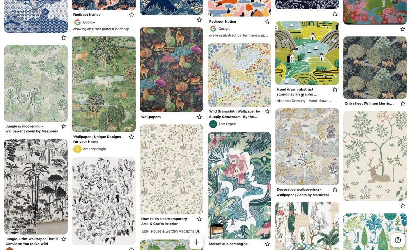
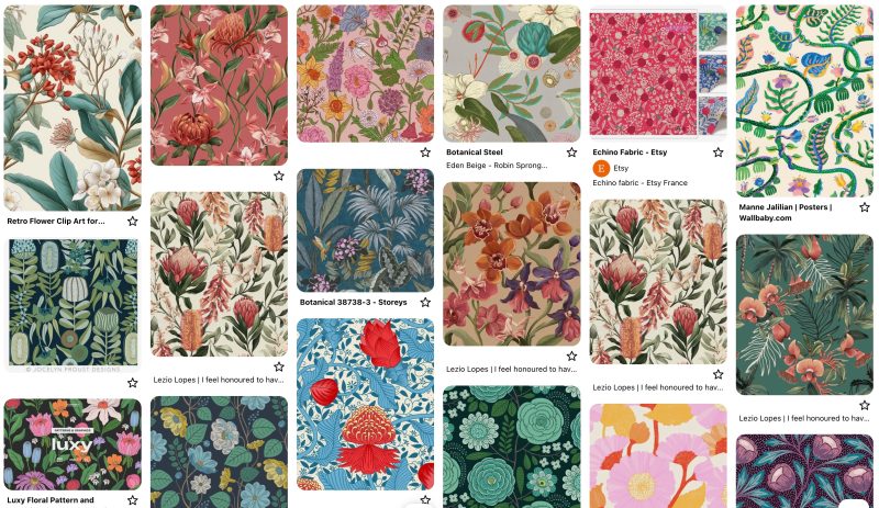
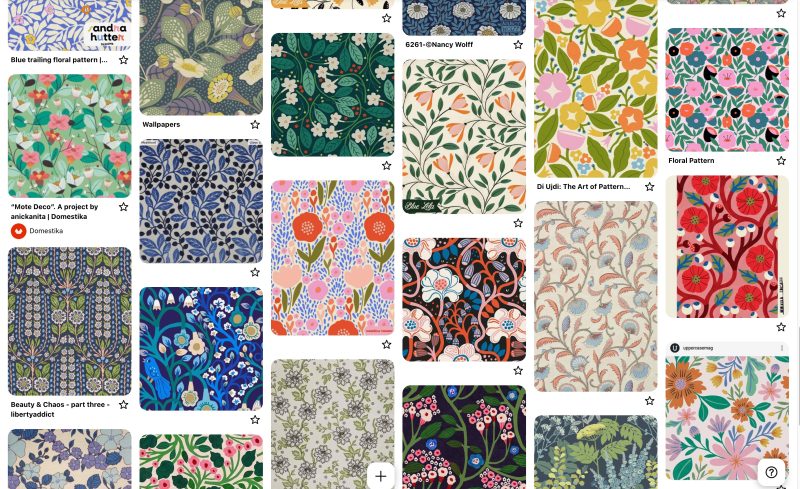
pinterest boards inspiration / all lay out for landscape patterns
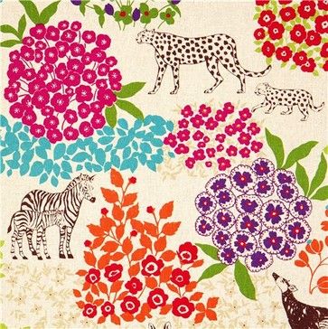
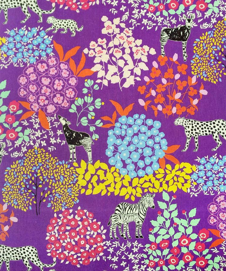
Mention special d’inspiration pour les motifs ECHINO, créés parle designer Etsuko Furuya,la célèbre marque de motifs textiles inspirés de l’esthétique graphiques colorée japonaise . essentiellement pouy les motifs ” scattered with cluste”
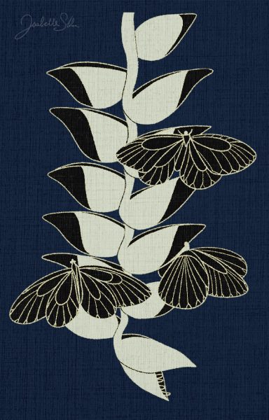
Je ne sais pas encore comment je vais m en approcher mais j aime beaucoup les motifs avec des groupe de fleurs + animaux , effet gravure et fleurs minimalistes.
Parfois je me sers de ce blog comme lieu d enregistrement, une fonction de pense bête …
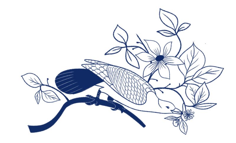
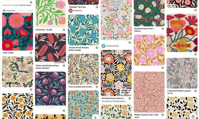
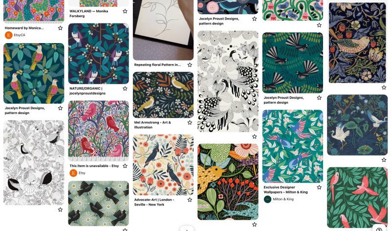
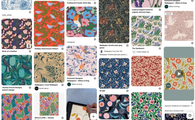
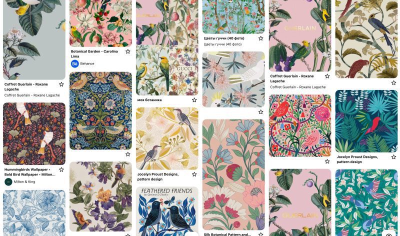
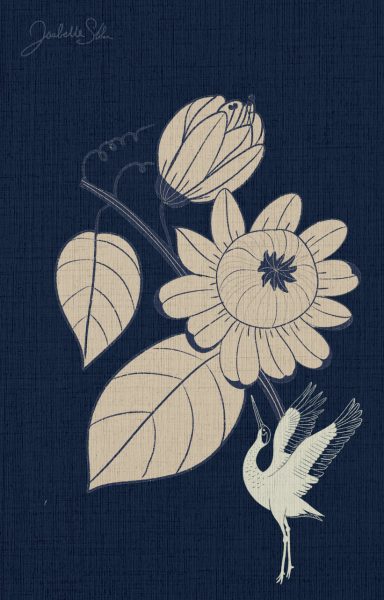
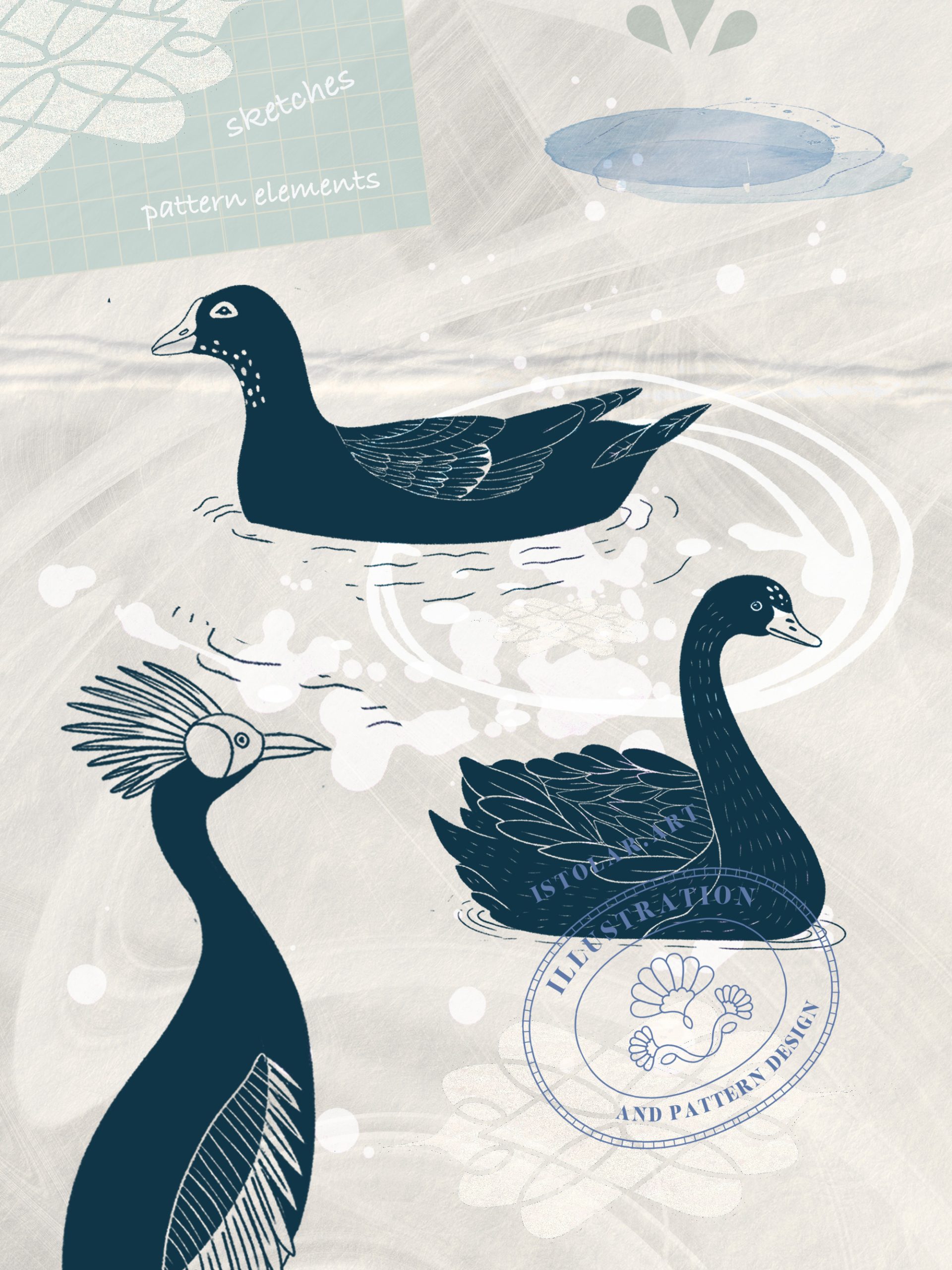
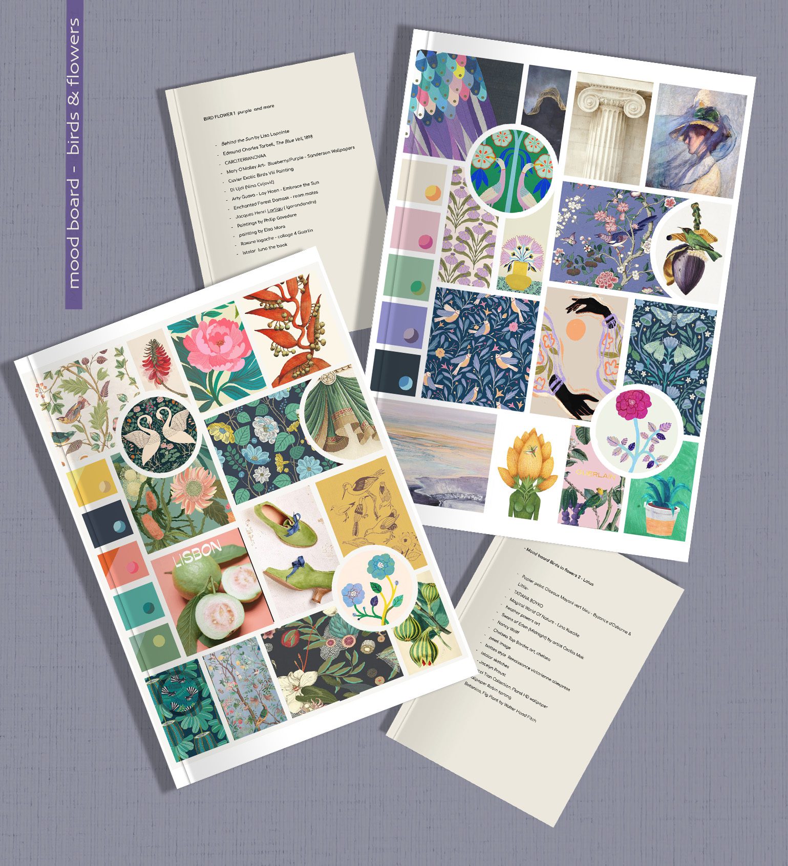
Pinterest board flower/bird – inspiration / lay out
Réécriture de motifs aux inspirations classiques. Revisiter des references, y insulfler de l’air du temps.
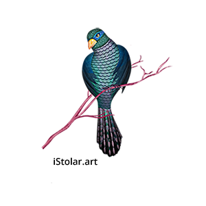
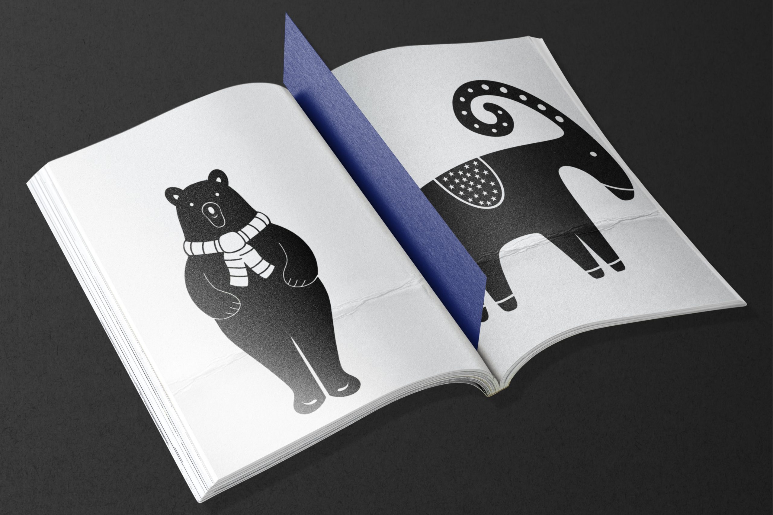
Jouer avec les symbolique des oiseaux(?): puissance, royauté , prestige , prospérité , beauté, rafinement, noblesse
Dans l’Égypte ancienne, les oiseaux étaient associés aux dieux et à l’au-delà. Par exemple, le faucon représentait le dieu Horus, et des motifs d’oiseaux apparaissent sur des tissus funéraires.
En Grèce et Rome antiques : Les textiles grecs et romains comportaient des oiseaux comme des paons (symbole d’immortalité), des colombes (paix et amour), et des aigles (pouvoir et divinité).
En Asie ancienne : En Chine et en Perse, des motifs d’oiseaux tels que le phénix (symbole de renouveau) et la grue (longévité) étaient courants dans les soieries et tapisseries.
Dans les Tapisseries médiévales européennes : Les oiseaux, souvent représentés dans des jardins d’Éden ou dans des scènes de chasse, symbolisent la nature et le divin.
Sur les broderies gothiques, les motifs de paons, d’oiseaux chanteurs et de colombes ornaient les textiles religieux et nobles.
A l’époque de la Renaissance l’influence de l’Orient et des découvertes artistiques redonne aux oiseaux une place importante dans les motifs textiles de la noblesse.
Dans l’Art ottoman et perse, les textiles brodés et les tapis persans comportaient des oiseaux stylisés dans des compositions florales Arts décoratifs européens (XVIIe-XVIIIe siècles) : Avec la mode des chinoiseries,
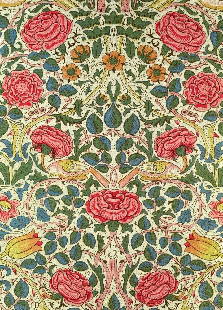
Au XIXe, siècle ,l’Art Nouveau et le mouvement Arts & Crafts remettent à l’honneur les oiseaux, inspirés par la nature et les estampes japonaises (notamment les motifs d’oiseaux et de fleurs). Et au XXe siècle les designers modernistes comme William Morris ont revisité les motifs d’oiseaux en les stylisant.
Aujourd’hui : Les oiseaux restent un motif central dans le textile (mode, décoration intérieure), évoquant la liberté, la nature et la poésie.
Brain storming
poétique
harmony, balance
Jardin Eden
joyful stylisé
classic art & craft revisité
happy / naif
Heritage oriental (arabesque imbriqué et symmetric)
ornemental
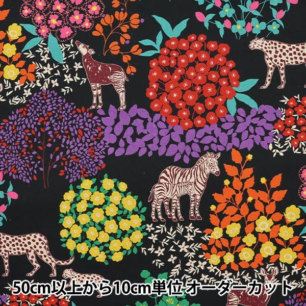
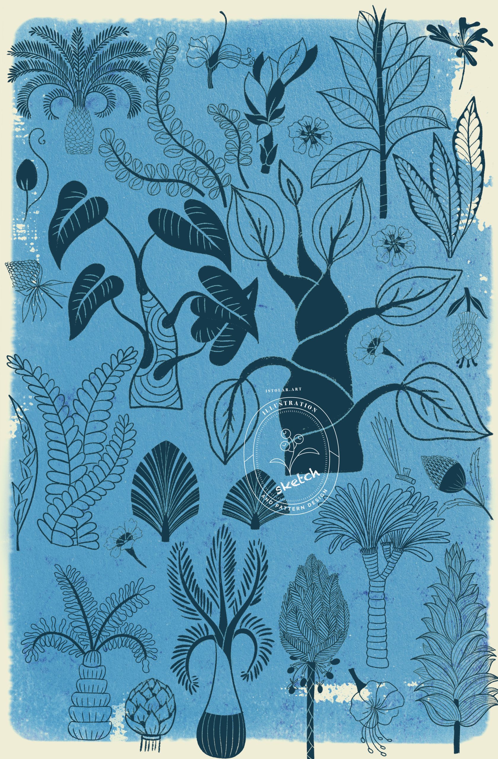
utiliser des elements floraux des thèmes ” jungle” et “foret”
2 collections directions:
Equilibre classique des motifs art & craft + ou – stylisé, + ou – modernisé – texture multicolor
William Morris Cross Stitch Pattern, Bird and Rose
Ses motifs floraux et organiques se marient bien avec différents styles déco, du classique au moderne. Ils apportent une touche sophistiquée et chaleureuse à tout type d’intérieur.
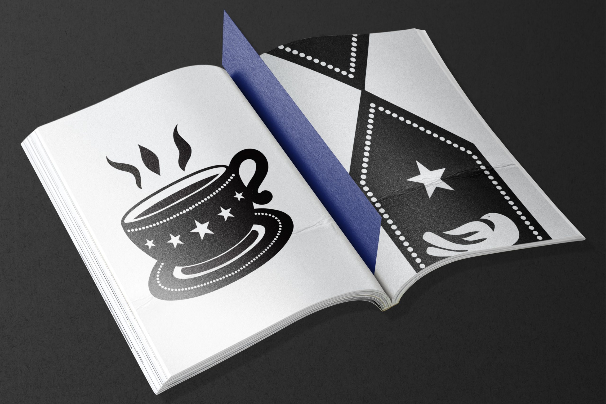
ZOOM SUR LES OTTOMANS …
… qui ont influencé par la Perse, la Chine et les traditions byzantines, a diffusé ses motifs vers l’Europe et le monde islamique. Aujourd’hui, on retrouve ces dessins dans des textiles contemporains inspirés des arts ottomans.
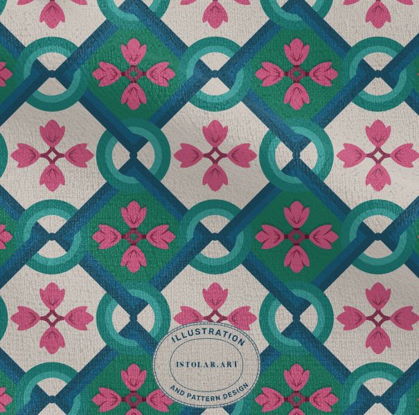
Les oiseaux dans les motifs ottomans ne sont pas simplement décoratifs ; ils transmettent des messages culturels et spirituels :Paon : Symbole de beauté, d’immortalité et du paradis. Il est souvent représenté dans des jardins fleuris, rappelant le jardin d’Eden. Colombe : Associée à la paix et à la pureté, elle apparaît souvent dans des compositions florales raffinées. Faucon et aigle : Symboles de puissance, de royauté et de protection. Ils sont parfois représentés stylisés dans des tapis ou des textiles destinés aux élites. Rossignol : Incarnation de l’amour mystique et de la poésie soufie, souvent montré dans des scènes bucoliques avec des roses.
L’art ottoman est marqué par des compositions très équilibrées, où les oiseaux sont harmonieusement insérés parmi des fleurs et des feuillages stylisés. Les principales fleurs accompagnant ces motifs sont :
Roses : Représentant l’amour divin et la beauté.Tulipes : Symboles de prospérité et de divinité.Œillets et jacinthes : Souvent présents dans les motifs textiles pour leur élégance et leur richesse symbolique.
Les oiseaux sont souvent dessinés avec un style stylisé et symétrique, intégrés dans des compositions florales inspirées du style “Saz” (arabesques végétales avec des tiges courbes) ou du style “Hatayi” (motifs floraux inspirés des fleurs chinoises).
Le décor de style saz est un décor foisonnant, où prédominent de grandes feuilles dentelées (souvent appelées feuilles saz), associées à des fleurs réelles (tulipes, œillets, jacinthes, violettes…) ou imaginaires, épanouies ou en bouton. Peuvent s’y ajouter des motifs chinois : rochers, vagues, nuages tchi.
Parfois je me sers de ce blog comme lieu d enregistrement, une fonction de pense bête …
La jungle incarne à la fois a beauté sauvage, l’inconnu et l’aventure, tout en portant des symboliques profondes et variées selon les contextes
En littérature la jungle peut être mystérieuse, oppressante, dangereuse, enchanteresse ou même spirituelle. Elle est souvent un miroir des émotions et de l’état intérieur des personnages, tout en restant un décor puissant et évocateur.
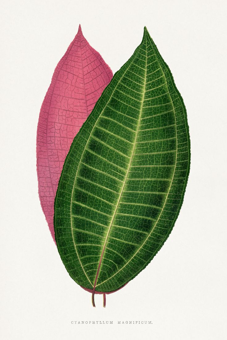
Calophyllum inophyllum leaf illustration. Digitally enhanced from our own original 1865 edition of Les Plantes a Feuillage Colore by Alexander Francis Lydon & Benjamin Fawsett.
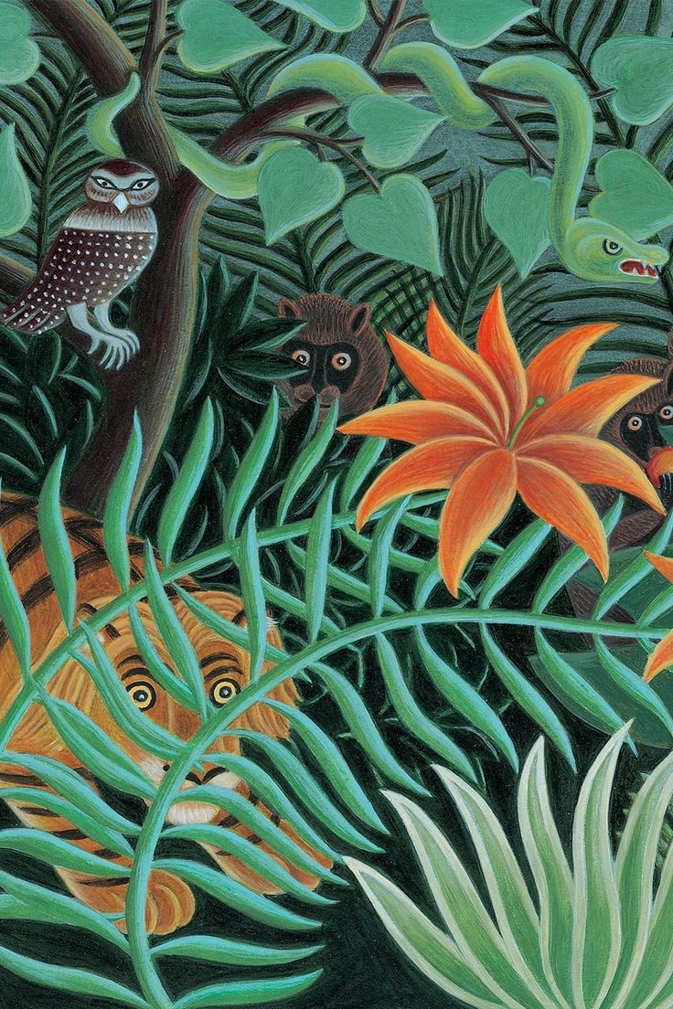
Henry Rousseau the jungle
La jungle dans les contes:
un personage qui transforme les héros
Dans les contes africains, la jungle est souvent un lieu mystérieux et sacré, peuplé de créatures fantastiques et d’esprits anciens. Elle incarne à la fois la beauté et le danger, un terrain d’aventure et de transformation. C’est un espace où les lois de la nature et celles de l’imaginaire se rencontrent, où les éléments vivants, qu’ils soient humains, animaux ou végétaux, sont interconnectés par des forces invisibles.
La jungle est aussi un lieu de passage, un endroit où les héros doivent faire face à des épreuves pour prouver leur courage, leur sagesse ou leur détermination. Les animaux qui y résident ne sont pas simplement des êtres sauvages ; ils possèdent souvent une dimension symbolique ou magique. Par exemple, un lion peut incarner la royauté et la justice, un serpent peut symboliser la ruse et la sagesse ancienne, tandis qu’un éléphant pourrait être un guide spirituel.
Dans ces contes, l’entrée dans la jungle est souvent un acte symbolique de transition, marquant un passage vers un autre monde, plus profond et plus mystérieux. C’est là que l’on affronte des défis pour découvrir des vérités cachées, apprendre des leçons de vie ou gagner une récompense spirituel.
C’est aussi un lieu où la force brute seule ne suffit pas ; il faut aussi intelligence, patience et respect des forces invisibles pour survivre et en sortir transformé.
la jungle dans les contes africains est bien plus qu’un simple décor c’est un acteur essentiel de l’histoire, qui défie et transforme les héros des récits.
ou clair pour une ambiance tropicale lumineuse (beige sable, bleu lagon).
VRAC/ storming
lieu de passage et d’épreuve / espace de transformation
luxuriance
interconnection
animaux magiques et symboliques
autre monde
intelligence de survie
REFERENCES
Douanier Rousseau (style naif)
Frida khalo ( symbolisme/inconscient)
Gaughin (Tahiti polynesie)
Kippling (jungle)
joseph conrad (Congo)
M Tournier ( pacifique/ R cruzoé
J. Vernes
Alejo Carpentier (Amerique du sud)
Les œuvres du DOUANIER ROUSSEAU illustrent la diversité des représentations de la jungle en peinture, allant du réalisme naïf à l’expression symbolique et exotique. La jungle est souvent perçue comme un lieu inconnu, presque magique, regorgeant de secrets et de créatures fascinantes. Dans la peinture, Henri Rousseau a magnifié cet aspect onirique avec des scènes luxuriantes et des animaux presque surnaturels. En littérature et en cinéma, des œuvres comme Le Livre de la Jungle de Rudyard Kipling ou Apocalypse Now (inspiré de Au cœur des ténèbres de Joseph Conrad) exploitent cet aspect mystérieux.
Des artistes comme FRIDA KHALO ont intégré des éléments de jungle dans leurs œuvres pour symboliser un lien profond avec la nature et l’inconscient.
Pour RUDYARD KIPLING a jungle y est un univers fascinant, régi par ses propres lois et habité par des animaux anthropomorphiques comme Bagheera (la panthère), Baloo (l’ours) et Shere Khan (le tigre). Kipling mêle aventure, fable et symbolisme pour explorer la relation entre l’homme et la nature.
JOSEPH CONRAD dans au coeur de ténèbres, à travers la jungle congolaise à la recherche d’un mystérieux trafiquant d’ivoire, a jungle est oppressante, obscure et métaphorique, représentant l’inconnu, la sauvagerie et la descente aux enfers psychologique.
Avec MARIO VARGAS LLOSA (maison verte) c’est une jungle sensuelle et mystique, sensuelle et hypnotique, presque envoûtante où “Les arbres gigantesques tendent leurs bras couverts de mousse, formant un toit impénétrable sous lequel la lumière se changeait en une lueur verte, diffuse. Des senteurs épaisses, lourdes, exhalent des fleurs cachées, et le bourdonnement des insectes remplissent l’air, comme une mélodie ininterrompue.”
La jungle de Jules Verne (La Jangada) est majestueuse et luxuriante, foisonnante, elle évoque un paradis naturel. “L’Amazonie s’étalait devant eux, gigantesque et souveraine. Les palmiers s’alignaient en colonnes naturelles, les orchidées suspendaient leurs grappes parfumées, et les eaux lentes du fleuve reflétaient les innombrables teintes du ciel et des feuillages.”
Alejo Carpentier (Les Pas perdus)Une jungle magique et initiatique, spirituelle, lieu de transformation et d’éveil. “La jungle semblait s’étirer à l’infini, un océan de feuillages où se mêlaient l’ombre et la lumière, le silence et le tumulte. Chaque bruissement de feuille était une parole ancienne, chaque cri d’animal un écho du passé. Dans cette cathédrale verte, j’avais l’impression d’être revenu aux origines du monde.”
QUEL MOTIF?
HERO POSSIBILITIES
Tight overlapping (packed) / college / pattern-maker
Airy jungle landscape ( all over or toile de jouy)
Intricated: art & craft ( jungle + object + animals)
SECONDARIES POSSIBILITIES
Loosely scattered ( animal tree plant) colored or monochrome
landscape smaller elements ( all over)
semi tight or scattered upward
few elements collage ( simplified more airy)
few elements collage (zoom or isolated elements : leaves, animals tree only)
Parfois je me sers de ce blog comme lieu d enregistrement, une fonction de pense bête …
QUEL MOTIF?
Forêt, Kokama et poètique écologique
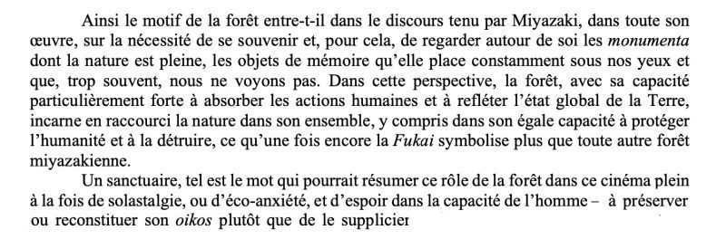
Si on explore La forêt “nature animée, impossible de ne pas ‘approcher du travail d’Hayao Miyazaki et de cette étude d’Helene Vial. Un trésor d’atmosphère un de concentré de forêt … pour trouver l esprit de notre collection.
En lisant son travail j ai découverts le mot SOSTALGIE !
Le cinema de Miyazaki est plein de Sostalgie, d’espoir dans la capacité de l’homme (ou certain humains à preserver son OIKOS plutôt que de le supplicier
Helene VIAL
Personnages à part entière, les forêts sont souvent présentées comme des lieux enchantés où les animaux parlent, où des créatures fantastiques résident et où des aventures inattendues se produisent. La forêt devient un personnage à part entière, avec ses propres règles et ses mystères.
La forêt est souvent vue comme un lieu intérieur, un reflet de l’âme, un labyrinthe mental. Elle représente l’inconnu en soi, les peurs, les désirs enfouis, la quête identitaire.
Dans les contes de fées (Le Petit Poucet, Hansel et Gretel), les héros se perdent dans la forêt… pour mieux se trouver.
Dans les contes
Dans l’ensemble, dans les contes pour enfants, la forêt est une métaphore de l’inconnu, où l’enfant est amené à faire preuve de courage, à surmonter ses peurs, et à découvrir un monde parallèle riche en aventures. – Une nature vivante et animée : Les plantes bougent doucement avec le vent, les animaux ont une présence forte et expressive. – Une symbolique forte : La nature est souvent liée à la sagesse, aux esprits ou à des forces mystérieuses qui influencent les héros. – Une esthétique stylisée : Inspiré des arts traditionnels africains, il représente la végétation de manière graphique et colorée.
Chez Charles Perrault, au XVIIe siècle, dans La Belle au bois dormant, repris plus tard par les frères Grimm où, lorsque la princesse s’endort, une haie d’épine se met à pousser autour du château qui devient une forêt quasi impénétrable.
C’est le cas aussi dans Le petit Poucet encore plus inquiétant puisque l’ogre y réside : « Tu vois bien que nous ne pouvons plus nourrir nos enfants…je suis résolu de les mener perdre demain au bois »
“BRAIN STORMING”: ELEMENTS
VRAC
lumière filtrée
silence
féerie
chants d’oiseaux
brume
ombre protectrice
parfum de terre
fougère
canopée feuillue
champignons luisants
plantes grimpantes
COULEURS
vert profond / deep green
Brun doré
pointe de rouge / orange
bleu pale / misty blue
jaune léger
METAPHORE
“…aussi tranquille qu’un lac d hiver”
“le poumon vert du monde”
“des colonnes de lumière”
“La mémoire vivante de la Terre”
“la conscience verte”
forces indomptées de la nature
ANIMAUX
cerf
chevreuil
loup
écureuil
ours
oiseaux
insects
serpents
papillons
…
MYSTHIQUE
fées
fantômes et esprits de la forêt
Dragon?
cerf blanc
chouette magique
loup garou
vouivre
animaux totem
MIYAZAKI…”nature animée” / Repos
espace de transformation
equilibre
coexistence
lieu d’enregistrement (creuset des passions des hommes)
enchanté, fantastique
refuge
repos
vestige
harmonie fragile entre homme/nature
peuple de creature fantastiques
non pas un décors / mais / personnage à part entière (avec conscience et secrets)
zone refuge / connection à soi même (Chihiro)
coexistence plants / animals – zone de conflit où nature reprend ses droits sur l homme (Nausicaa)
luxuriance
carrefour vie / mort – passé / futur – humain / divin
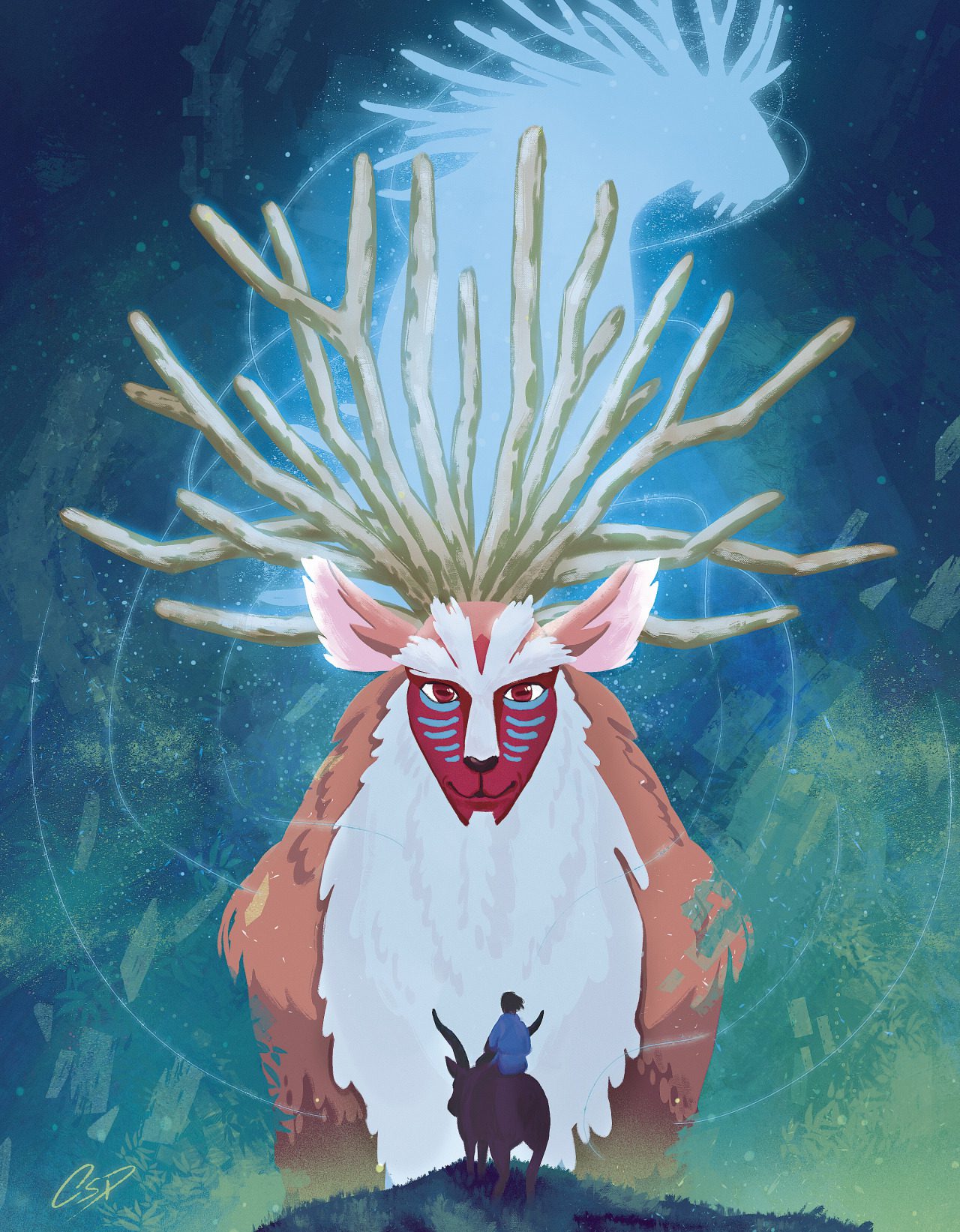
YOKAI (êtres surnaturels issus du folklore japonais . présence mystérieuse à la x inquiétantes et rassurantes ( cf princesse Mononoké… Dieu cerf avec sa forme hybride animal / humain : protège la forêt et ceux qui y vivent
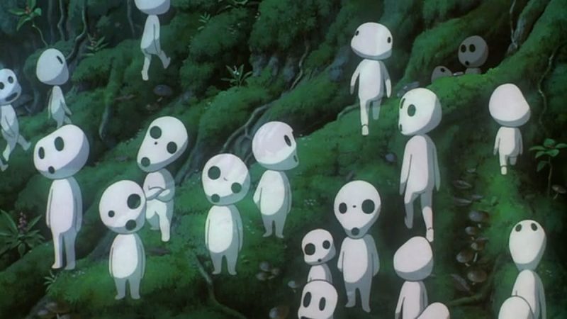
KODAMA ( echo des arbres ) * ou sylvains qui accompagnent les visiteurs – silhouette entre lutin squelette et fantomes – bienveillance, douceur, Totori roi de la foret
caisse de raisonances passionnelles – receptacle – terrain d’évolution
sanctuaire, objet de me2moire
raccourci sa nature, son essence (condensé)
animaux dotés de paroles ( vestige des temps anciens)
inspiration toujours:
Explorons un peu
LES KODAMA ET AUTRES ESPRITS DE LA FORET
chez Hayao Miyazaki
KODAMA
(Sylvains en francais ?)
Un lieu entre le monde des vivants et celui des esprits, des fées, ou des dieux. On y franchit des seuils, on y rencontre l’invisible.
Les Celtes voyaient la forêt comme un sanctuaire naturel où résidaient les dieux, et les arbres avaient une âme, une sagesse ancienne.
Ces petites créatures blanches, aux têtes rondes et mobiles, symbolisent la vitalité et l’harmonie de la forêt. Leur présence indique que la nature est en bonne santé. Ils émettent un cliquetis caractéristique et apparaissent souvent en groupe dans les scènes forestières du film.
* Un Kodama (木霊 ou 木魂) est une créature surnaturelle du folklore japonais, souvent décrite comme un esprit de la forêt ou un esprit des arbres.
Le mot “kodama” signifie littéralement “écho dans les arbres” ou “esprit/arbre résonnant” :木 (ko) = arbre霊 / 魂 (dama) = esprit, âme
Dans les croyances shintoïstes et les légendes japonaises, les kodama habitent certains arbres anciens, sacrés ou mystérieux. Couper un arbre habité par un kodama peut apporter malheur ou malédiction.
On retrouve ce genre de croyance dans l’idée que la nature est vivante et habitée — un thème central dans la spiritualité japonaise.
Dans les légendes, ils sont souvent invisibles ou apparaissent sous une forme humaine, spectrale ou petite créature étrange.
Leur représentation la plus populaire aujourd’hui vient de Hayao Miyazaki, dans son film Princesse Mononoké (1997).
Dans les légendes, ils sont souvent invisibles ou apparaissent sous une forme humaine, spectrale ou petite créature étrange.
Leur représentation la plus populaire aujourd’hui vient de Hayao Miyazaki, dans son film Princesse Mononoké (1997).
Symbolique: – Respect de la nature : couper un arbre, c’est aussi toucher à un esprit – Équilibre et harmonie : la présence des kodama montre que tout va bien dans l’écosystème. – Sagesse ancienne : ils sont liés à des lieux reculés, purs et oubliés des humains modernes.
Kodma = sylvains en français
Le terme “sylvain” est une traduction poétique utilisée dans certaines versions françaises pour désigner les Kodama — notamment dans le doublage du film Princesse Mononoké. Voyons pourquoi :“Sylvain” vient du latin silva, qui signifie forêt. Un esprit des bois ou créature de la forêt (dans la mythologie romaine ou dans la fantasy), Quelque chose de lié à la forêt (comme “paysage sylvestre”).
Le mot japonais qui n’a de traduction littérale parfaite en français, les traducteurs ont choisi “les Sylvains” pour – Rendre l’idée de petits esprits forestiers – Évoquer quelque chose de mystique et ancien – Et s’adresser à un public francophone en utilisant un mot poétique et évocateur.
c’est une adaptation culturelle pour donner aux Kodama une présence familière tout en gardant leur aura magiqueShishigami / Dieu cerf
Shishigami : “Dieu Cerf”
Dans Princesse Mononoké, l’Esprit de la Forêt (en japonais : Shishigami / シシ神) est une entité centrale et mystérieuse, représentant la vie, la mort et la nature elle-même.
Apparence : – Le jour : une créature majestueuse avec un corps de cerf, un visage humain, des ramures d’arbres. – La nuit : il se transforme en un être gigantesque appelé le “Marcheur nocturne” (Daidarabotchi), une silhouette translucide qui brille dans le noir.
Pouvoirs : – Il donne la vie (plantes qui poussent sous ses pas) – Il peut aussi retirer la vie par un simple souffle – Il incarne l’équilibre entre création et destruction.
Pour Miyazaki, les activités humaines s’impriment au coeur de la nature qui en est le miroir – le motif de la forêt est une nécessité de se souvenir – La nature place des monuments des objets de mémoires sous nos yeux ( svt nous ne les voyons pas) – La forêt a une forte capacité à absorber les actions humaines. Elle reflète l’état global de la terre. elle a une égale capacité à protéger et détruire l’humanité (symbole : la FUKAÏ) – La mature a ses habitants qui rencontrent pour le meilleur et pour le pire ceux qui y entrent… plus largement , un lieu où on se croise … un lieu où la vérité se cache et se révèle
L’Esprit de la Forêt est une figure ambivalente : ni bienveillant, ni malveillant, mais essentiel à l’équilibre du monde.
Il reflète la philosophie shinto où les kami (esprits) vivent dans les montagnes, les arbres, les rivières – et où la nature mérite respect et humilité.
ON PARLE DE FORET
” La forêt est un lieu étrange où le vent qui se glisse dans les branches semble murmurer des secrets anciens où les ombres dansent à la lueur pâle de la lune et où les bruits faibles et inarticulés semblent venir d’ une autre époque … les arbres avec leurs troncs tordus et leur racines noueuses semblent veiller sur ce royaume silencieux sans fin”
le ROMANTISME promeut le sentiment, le merveilleux et la nostalgie. Ces états d’âme s’expriment en des lieux tels que vallées embrumées, ruines abbatiales ou forêts sombres. les romantiques cherchent leur inspiration dans les contes du Moyen Âge, les chansons populaires et les légendes.
« La nature est un temple où de vivants piliers laissent parfois sortir de confuses paroles, l’homme y passe à travers des forêts de symboles qui l’observent… ».
Baudelaire – Les Fleurs du Mal.
La forêt y est le lieu de l’émotion, du souvenir
( les cèdres du Liban) :” Ces « reliques des siècles de la Nature », éternels, « verront les derniers comme les premiers jours ”
Lamartine
« Arbres de la forêt, vous connaissez mon âme… Quand je suis parmi vous, arbres de grands bois, dans tout ce qui m’entoure et me cache à la fois, dans votre solitude où je rentre en moi-même, je sens quelqu’un de grand, qui m’écoute et qui m’aime ».
V Hugo
Au XX iem (Proust ovide )La forêt reste source de poésie, lieu de promenade et relief du temps qui passe …
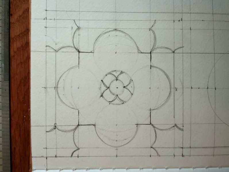
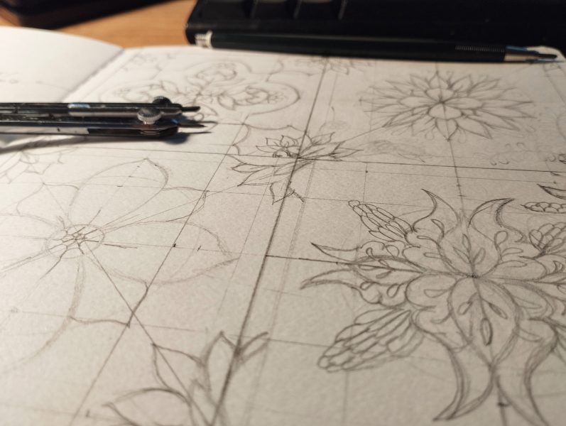
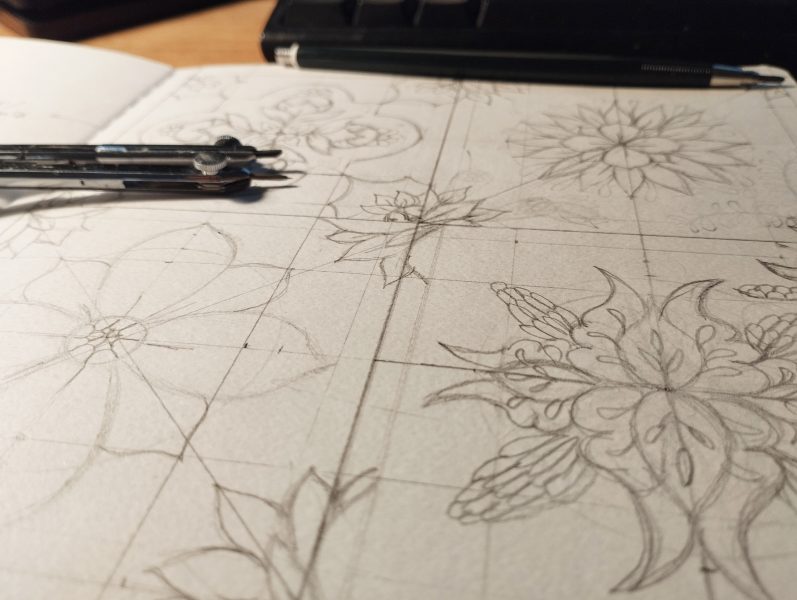
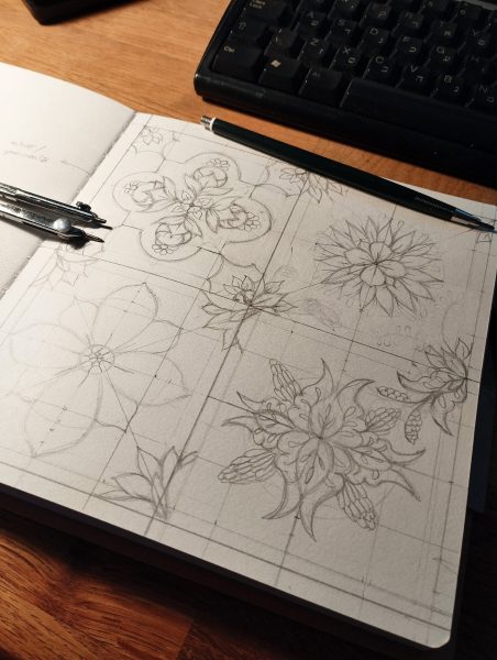
Ça y est ! Je me lance dans les collections. jusque là je créais des motifs à re-coloriser dans les détails (chaque petit élément pouvant être modifié indépendamment les uns des autres – utilisant différentes “layers” et / ou “smart object”). C’était déjà pas mal mais voilà venu le temps de l’étape supérieure vers la professionnalisation de l’ activité.
J’aurai pu y aller à l’intuition (c’est bien moi) mais j’ai choisi, cette fois, d’approcher l’étape avec méthode – wow! A force de voir mes collègues pattern designer d’internet(sur Skillshare et Domestika) créer de jolis cours et podcast sur l art de confectionner des collections, je me suis laissée naturellement impressionner par leur approche et surtout ce qui me plaît avant tout c’est d’injecter de l’intention dans la réalisation des motifs. Non pas juste une idée qui se construit au fil des répétitions et des sketches mais bien une histoire, des symboles, des références historiques et littéraires, creuser les émotions en jeu. Ceci nous rapproche d’un travail d’ illustration.
Lorsque je faisais uniquement de l’illustration, il me manquait ce mouvement de fermeture, soit, le CLIC TECHNIQUE. Cette seconde qui fait que lorsqu’on a réalisé le croquis, organisé son échantillon de référence de manière à ce qu’ il se répète invisiblement, le pattern fonctionne (ou pas).
Cela n’existe pas en illustration pure. Il reste toujours ce sentiment (aussi intéressant soit-il) du jamais fini, du tout subjectif… à l’ infini.
Corrélativement, ce qui peut faire défaut lorsqu’on dessine des motifs sans coutures, c’est toute la réflexion, le va et vient entre texte et image, ce processus inter-textuel qui fait émerger du nouveau, de l’auto l’émulation créative.
Préparer une collection en réfléchissant en amont sur les intentions et les usages des motifs, ajoute au processus de création cette dimension abstraite, que l’on connaît en illustration. autrement dit: du sens, de la cohérence qui fait que les motifs tiennent ensemble, forment un tout, se complètent.
Au-delà de poser des mots sur l’ambiance, les vibrations, les couleurs, Il s’agit aussi de planifier chaque collection en décidant à l’avance des modes de répétition qui vont le mieux au thème et à l’ intention esthétique qui les constitue.
ici
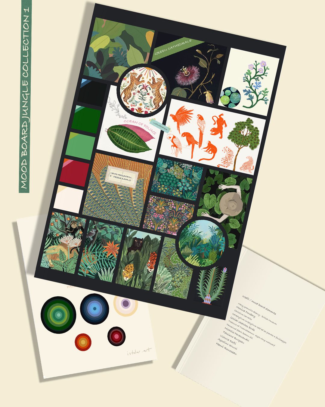
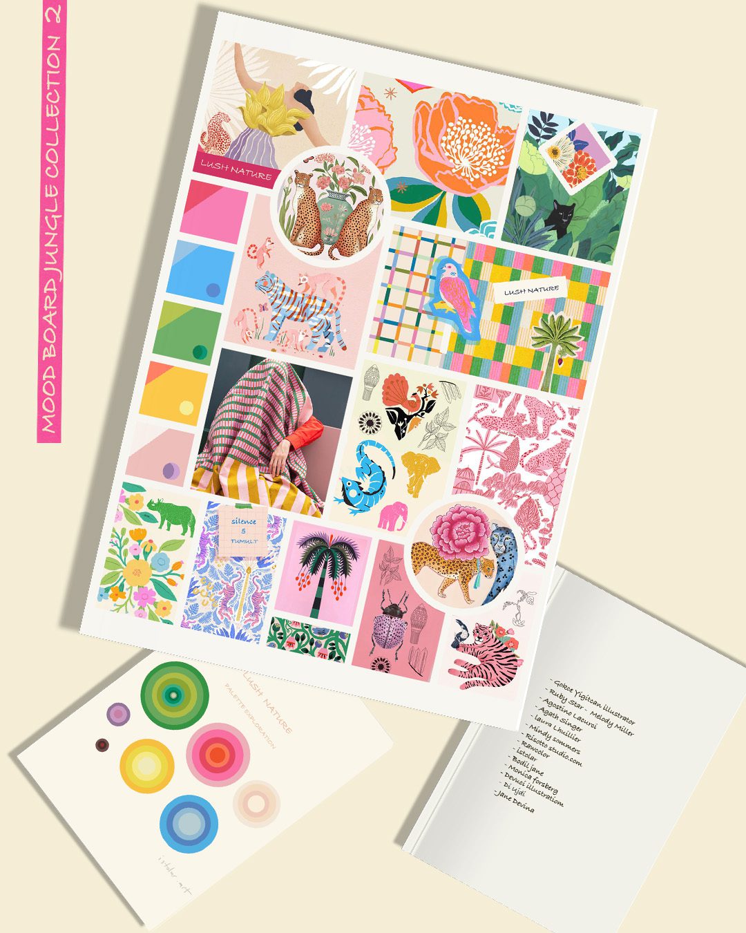
je creuses 4 thèmes
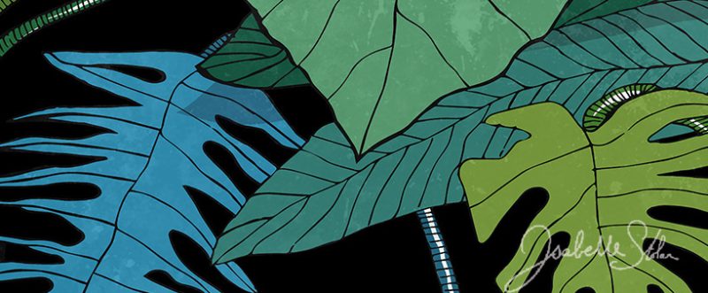
1/ JUNGLE/ TROPIQUES
2/ FORÊT (pas pareil !)
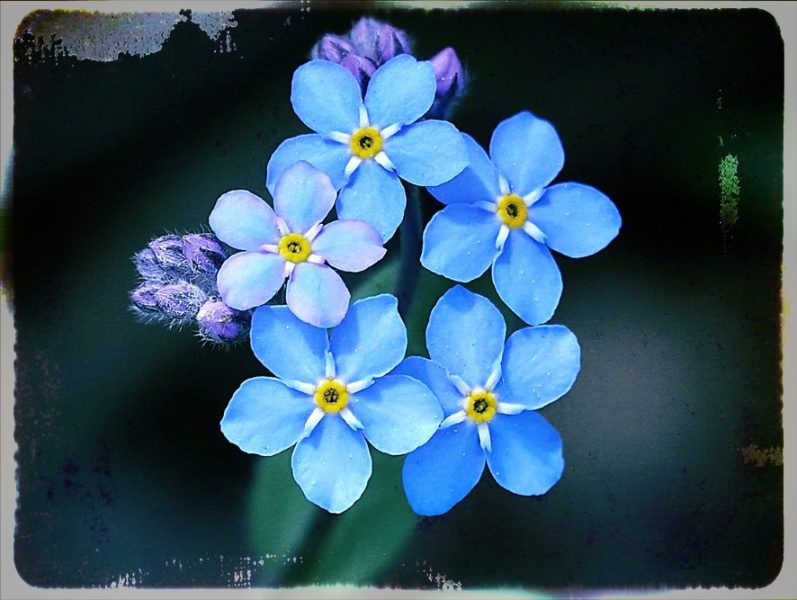
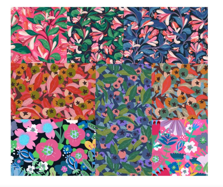
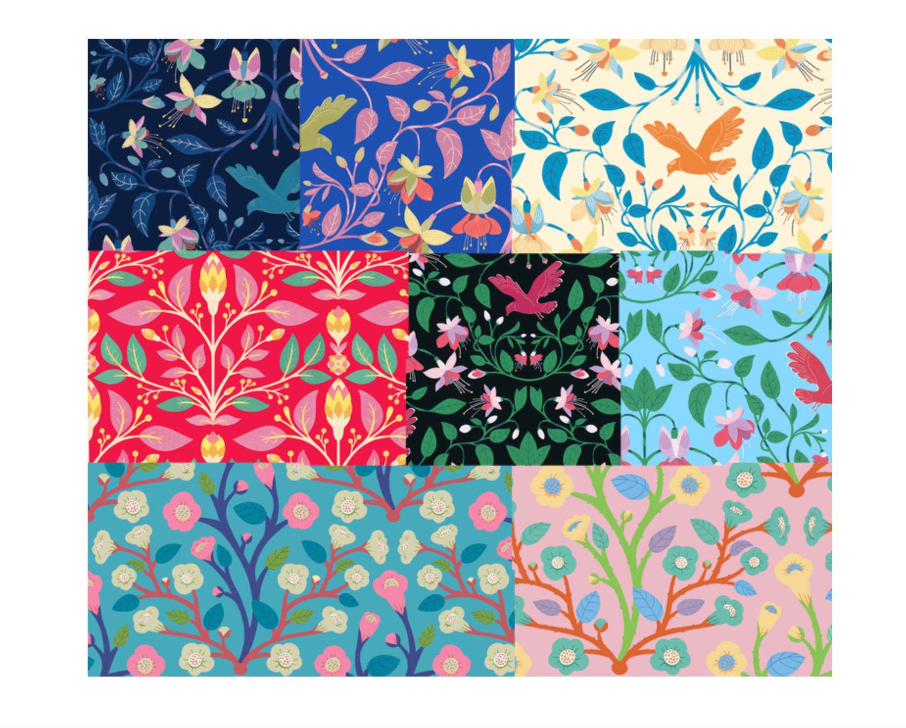
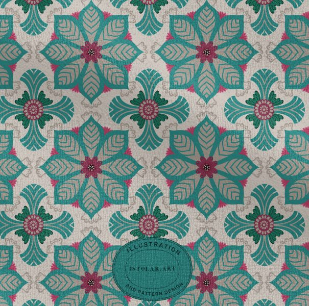
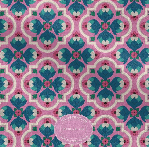
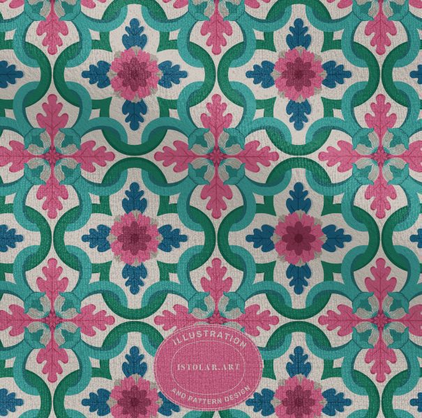
3/ FLEURS & OISEAUX SEULEMENT
4/ PAYSAGES ( avec maisons, chemins, rivières….)
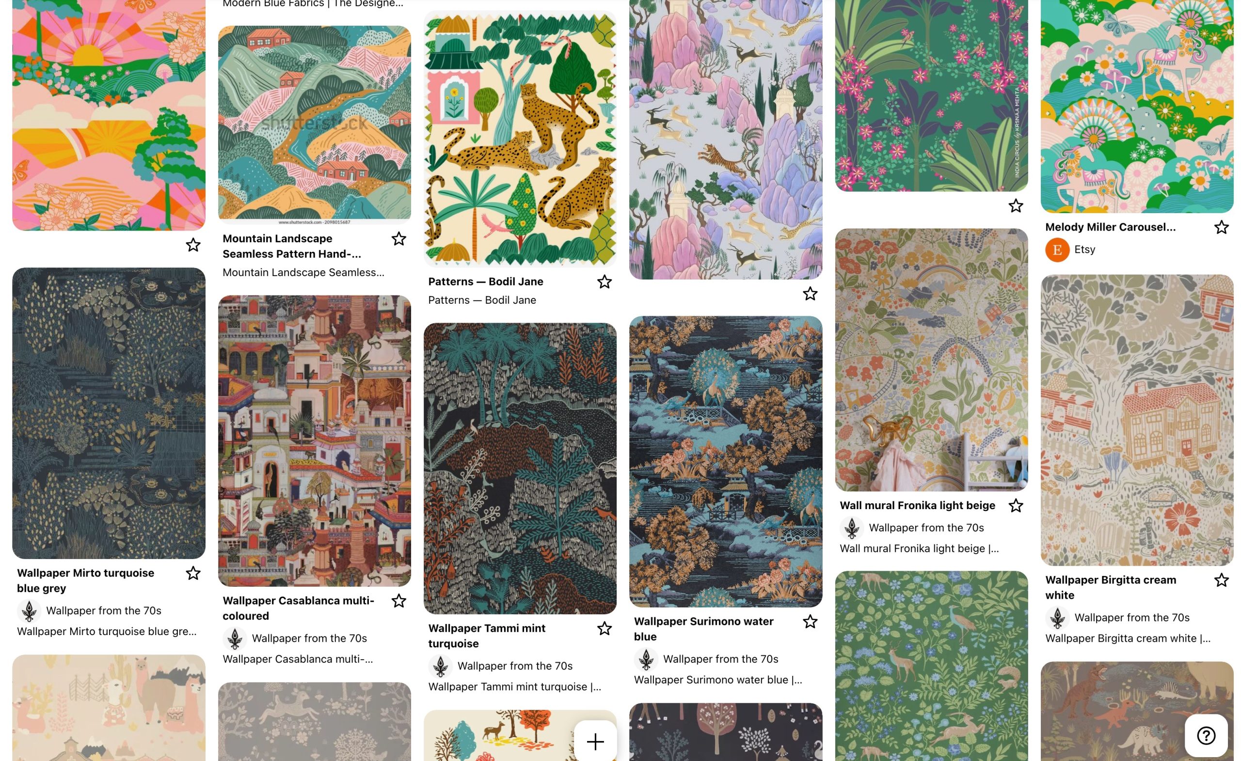
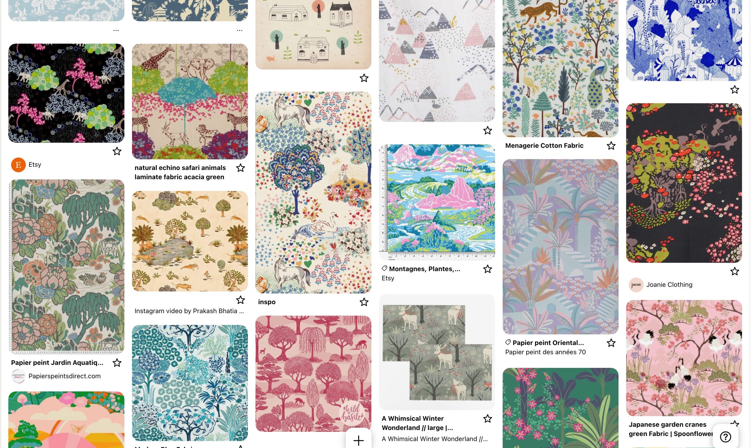
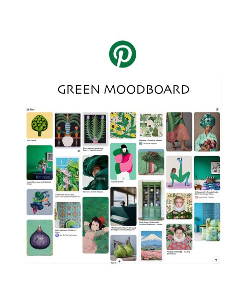
Voici les moodboards 1 et 3 (en deux versions codes couleurs chacun) qui vont me guider:
Cette étape consomme beaucoup de temps .A l’avenir il me faudra la réaliser plus rapidement (réduire l’exploration Pinterest sans fin). Je crois que par tâtonnement je me suis constituée une méthode.
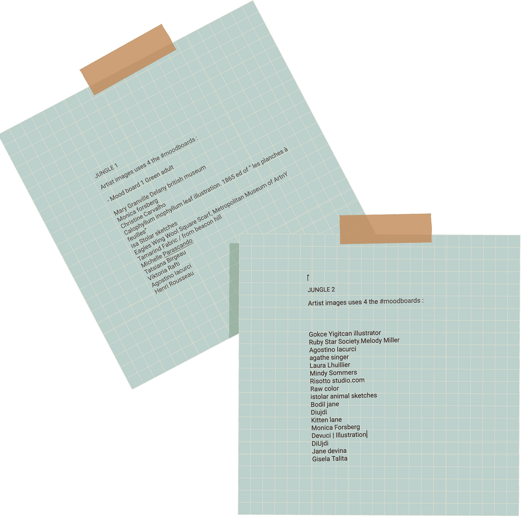
j’ai publié la liste des artistes dont les images constituent ces moodboards.
Alejo Carpentier – Les Pas perdus (1953)
Une jungle magique et initiatique, “La jungle semblait s’étirer à l’infini, un océan de feuillages où se mêlaient l’ombre et la lumière, le silence et le tumulte. Chaque bruissement de feuille était une parole ancienne, chaque cri d’animal un écho du passé. Dans cette cathédrale verte, j’avais l’impression d’être revenu aux origines du monde.”
Jules Verne – La Jangada (1881)
Une jungle majestueuse et luxuriante, “L’Amazonie s’étalait devant eux, gigantesque et souveraine. Les palmiers s’alignaient en colonnes naturelles, les orchidées suspendaient leurs grappes parfumées, et les eaux lentes du fleuve reflétaient les innombrables teintes du ciel et des feuillages.”
Mario Vargas Llosa – La Maison verte (1966),
Une jungle sensuelle et mystique, Les arbres gigantesques tendaient leurs bras couverts de mousse, formant un toit impénétrable sous lequel la lumière se changeait en une lueur verte, diffuse. Des senteurs épaisses, lourdes, exhalaient des fleurs cachées, et le bourdonnement des insectes remplissait l’air, comme une mélodie ininterrompue.”
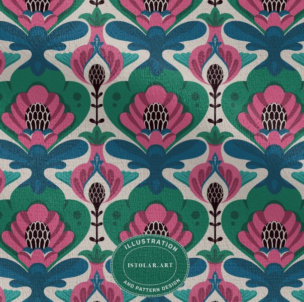
Les oiseaux dans l’art textile :
Dans l’Égypte ancienne, les oiseaux étaient associés aux dieux et à l’au-delà. Par exemple, le faucon représentait le dieu Horus, et des motifs d’oiseaux apparaissent sur des tissus funéraires.
En Grèce et Rome antiques : Les textiles grecs et romains comportaient des oiseaux comme des paons (symbole d’immortalité), des colombes (paix et amour), et des aigles (pouvoir et divinité).
En Asie ancienne : En Chine et en Perse, des motifs d’oiseaux tels que le phénix (symbole de renouveau) et la grue (longévité) étaient courants dans les soieries et tapisseries.
Dans les Tapisseries médiévales européennes : Les oiseaux, souvent représentés dans des jardins d’Éden ou dans des scènes de chasse, symbolisent la nature et le divin.
Sur les broderies gothiques, les motifs de paons, d’oiseaux chanteurs et de colombes ornaient les textiles religieux et nobles.
A l’époque de la Renaissance l’influence de l’Orient et des découvertes artistiques redonne aux oiseaux une place importante dans les motifs textiles de la noblesse.
Dans l’Art ottoman et perse, les textiles brodés et les tapis persans comportaient des oiseaux stylisés dans des compositions florales Arts décoratifs européens (XVIIe-XVIIIe siècles) : Avec la mode des chinoiseries,
Au XIXe, siècle ,l’Art Nouveau et le mouvement Arts & Crafts remettent à l’honneur les oiseaux, inspirés par la nature et les estampes japonaises (notamment les motifs d’oiseaux et de fleurs). Et au XXe siècle les designers modernistes comme William Morris ont revisité les motifs d’oiseaux en les stylisant.
Aujourd’hui : Les oiseaux restent un motif central dans le textile (mode, décoration intérieure), évoquant la liberté, la nature et la poésie.
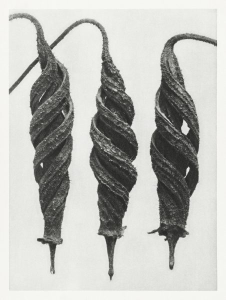
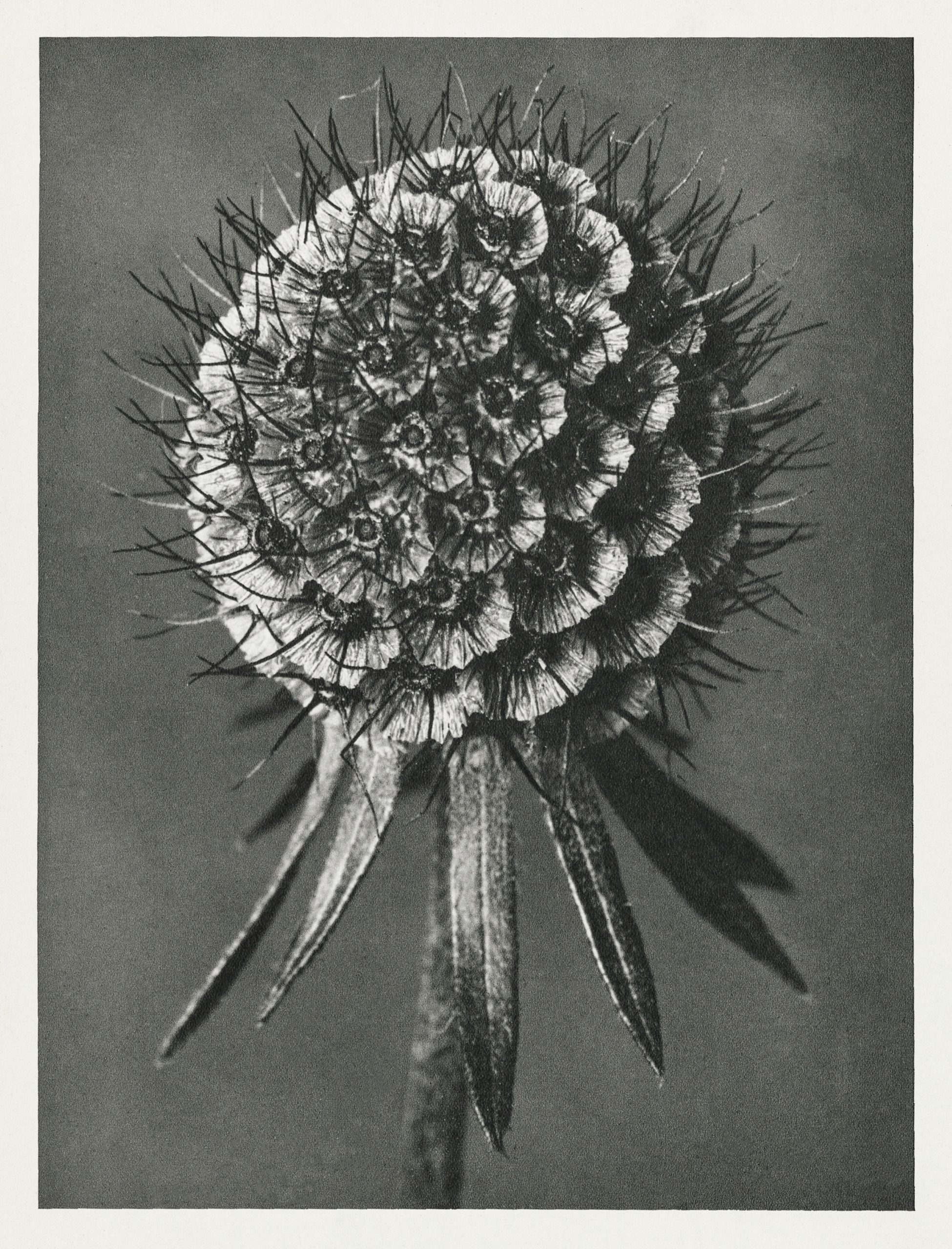
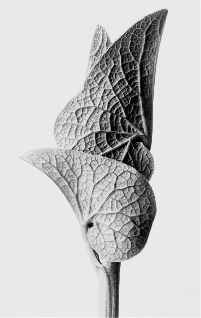
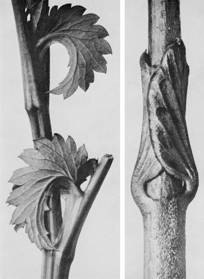
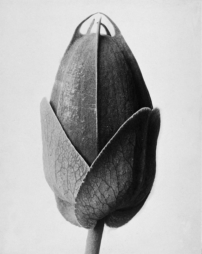
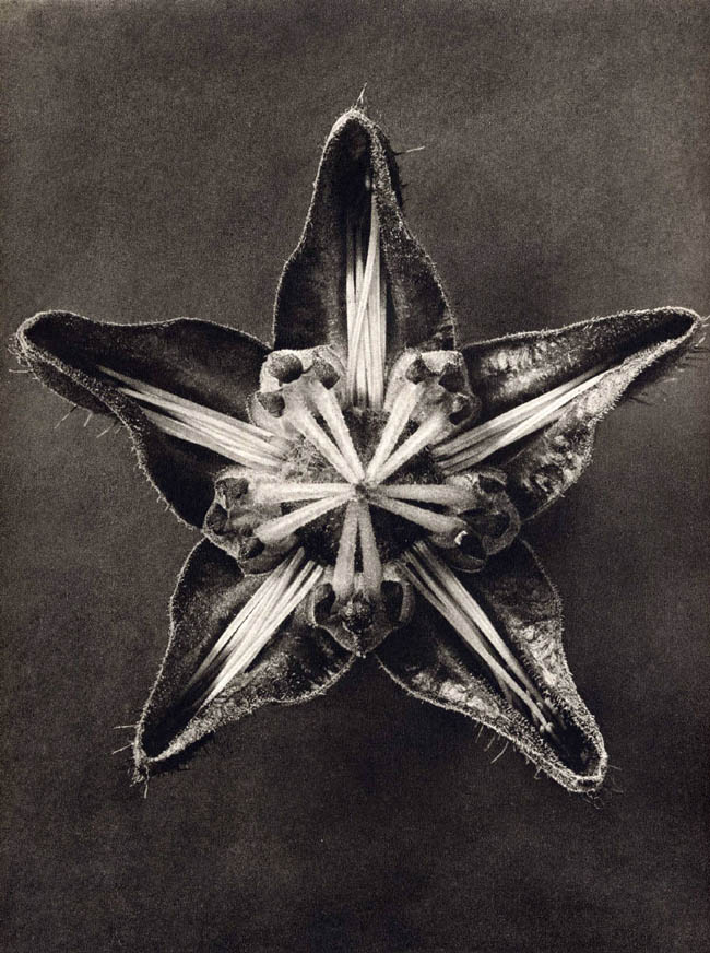
I leave here some of K Blossfeldt work… An Inspiration for pattern design … Should we be able to capture part of this natural construction, mouvement and energy 🙂
Plant photographs capturing the sensual beauty of nature from Urformen der Kunst (Archetypes of Art) (1928) by Karl Blossfeldt (1865–1932).
Blossfeldt was known for his technical mastery of macro photography where he magnified the alien beauty of nature through his close-up portraits of plants, twigs, leaves, and seeds.
Although he was a lecturer at the School of the Royal Museum of Arts and Crafts, Blossfeldt was never formally trained as a photographer.
Blossfeldt used home made cameras and lenses to magnify his subjects up to 30 times their natural size. This resulted in sharp-focus realism, extreme clarity, and rigid compositions that look surprisingly avant-garde.
Those images come from raw pixel public (free to download under the CC0 license) domain images They have digitally enhanced these astonishing plant photographs in high-resolution printable quality.
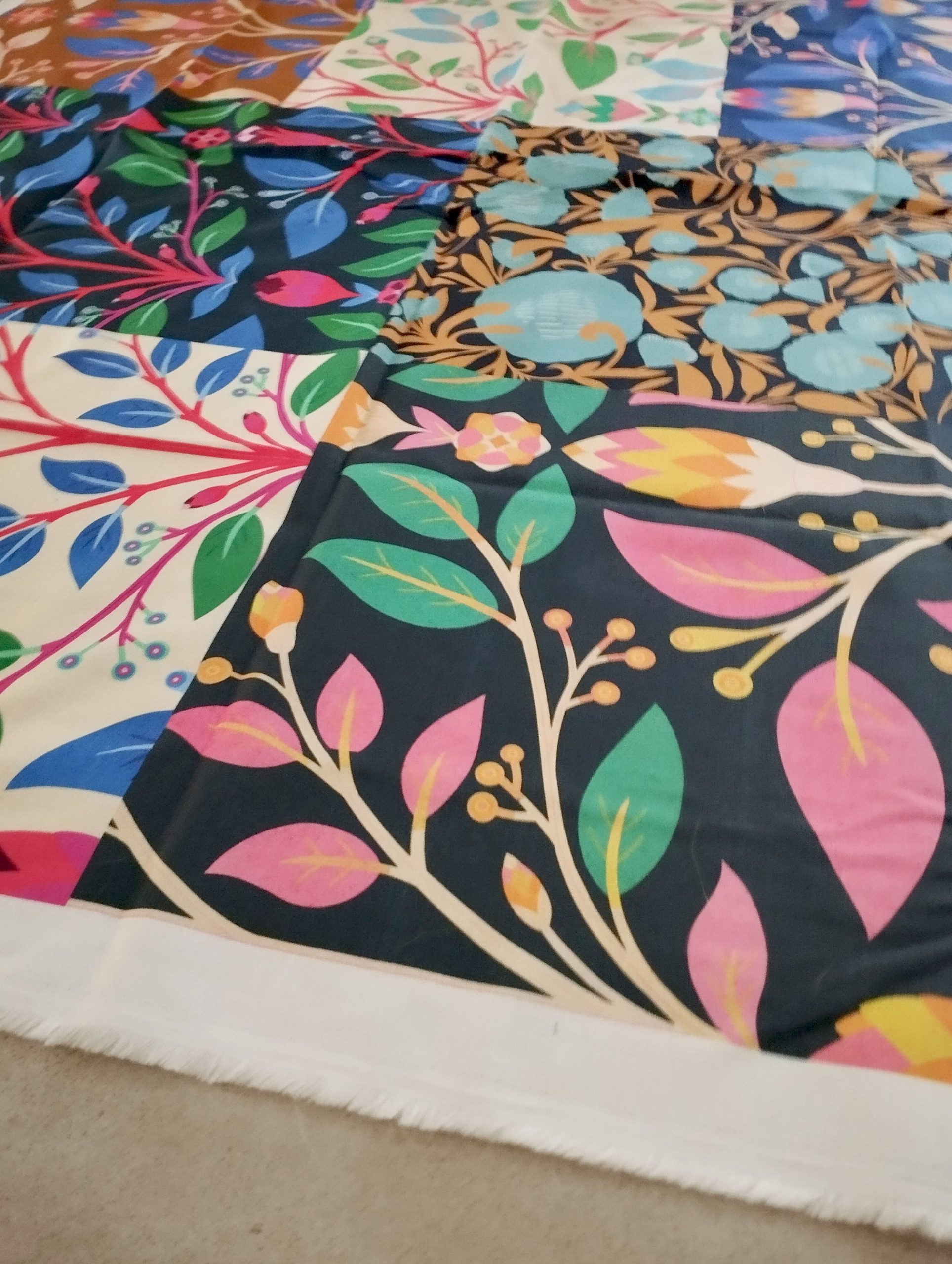
Sorry for the poor quality of the photos. I had them on my phone, and I forgot to mention it.
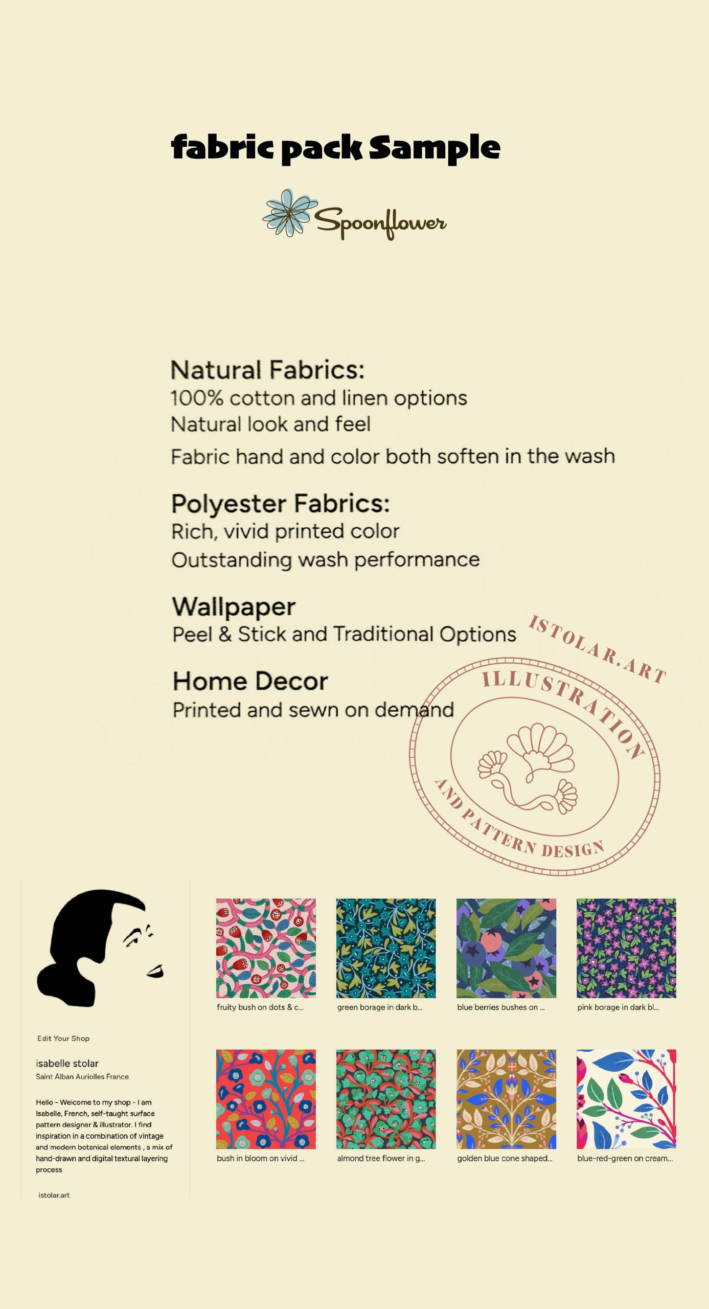
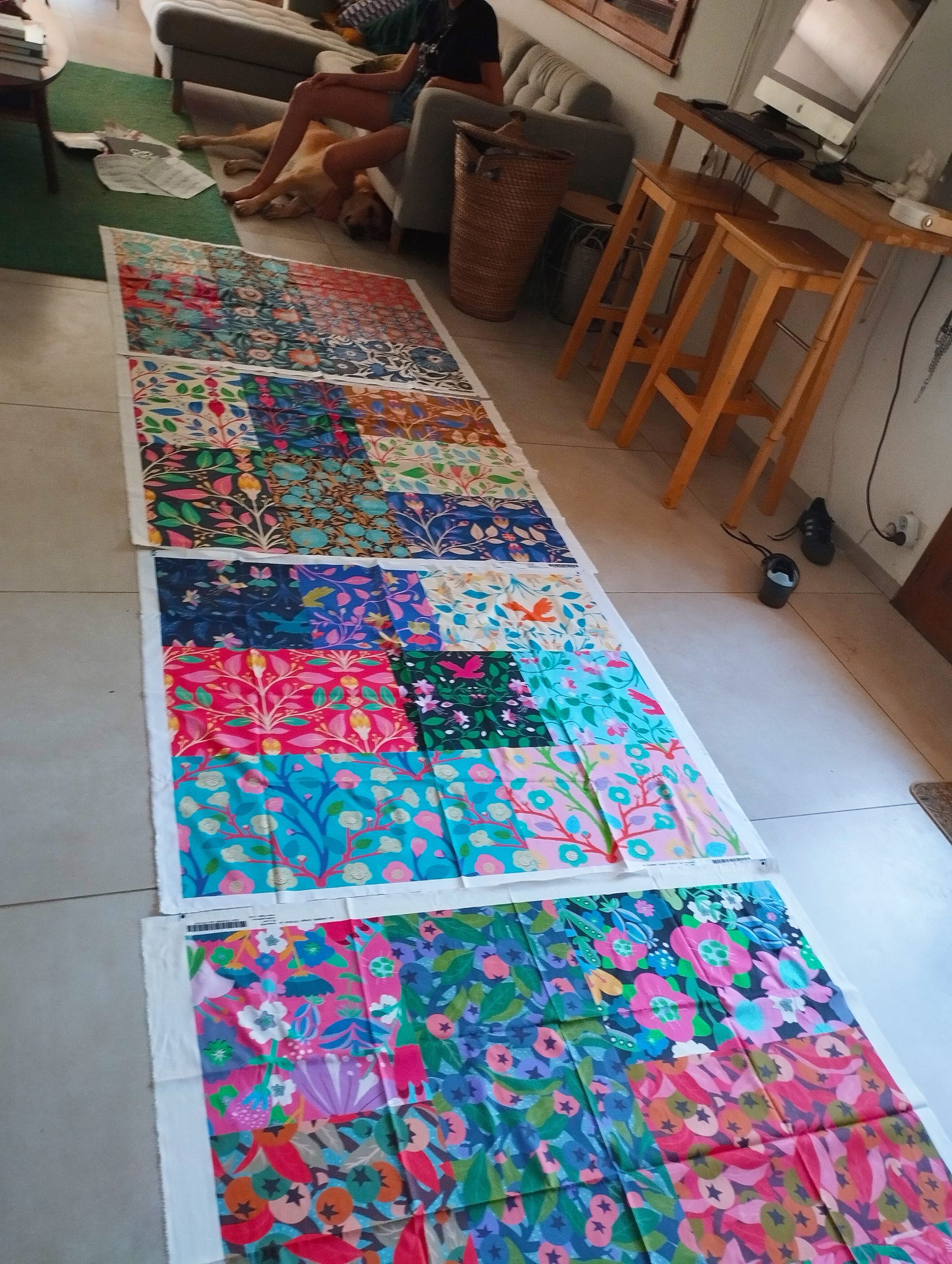
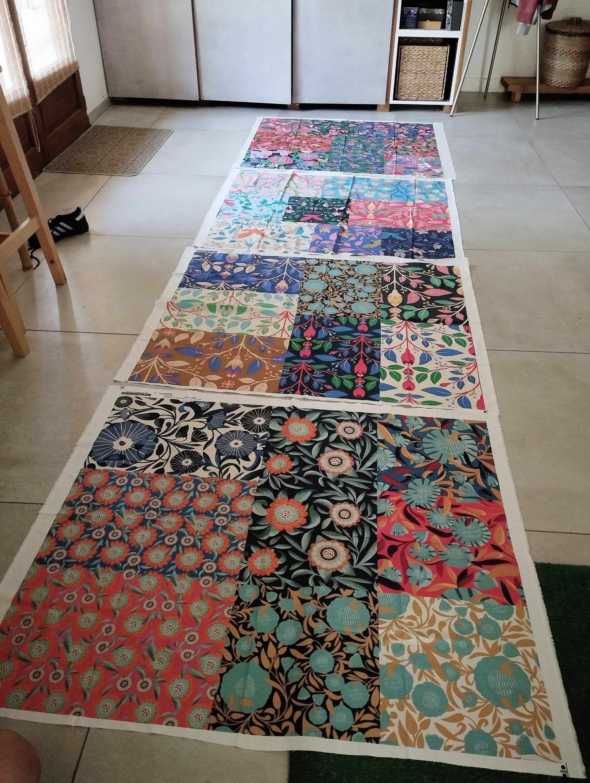
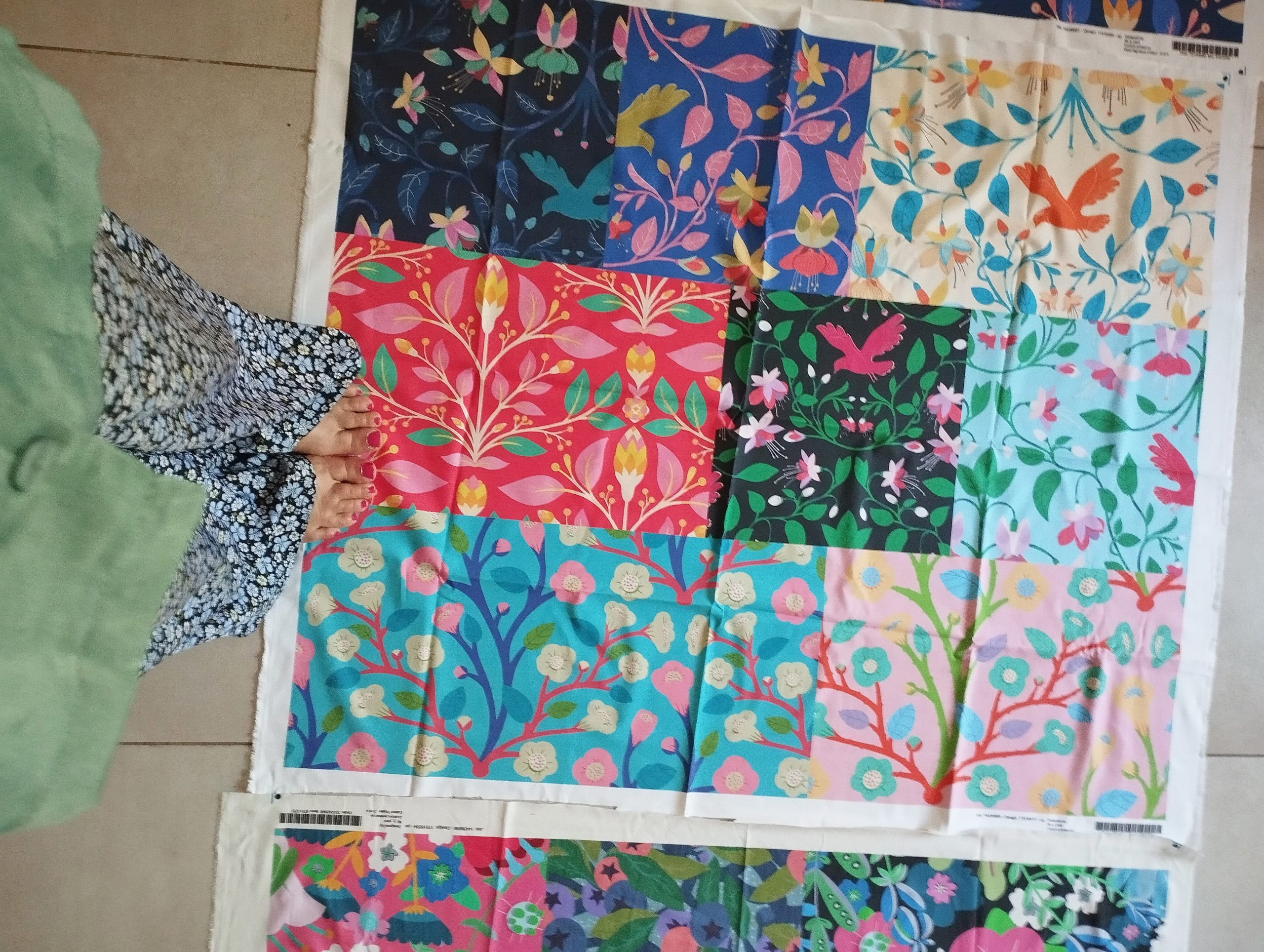
Last summer, I ordered different kinds of fabrics from my own Spoonflower shop. I wanted to check the quality of the print as well as the size of the large-format of my patterns design. In my Spoonflower shop, I usually upload three sizes for each design: Small, Medium, and Large (for wallpaper). It was difficult to get an idea of the proportion of the large design and the texture of the fabric.
Spoonflower allows us to select multiple designs we want to print and With the option “fill a yard” option, we can choose the fabric and organise the patterns as a patchwork. It can be for a quilt or any project but it’s also a great way to test various of our designs at once on one or two textile surfaces.
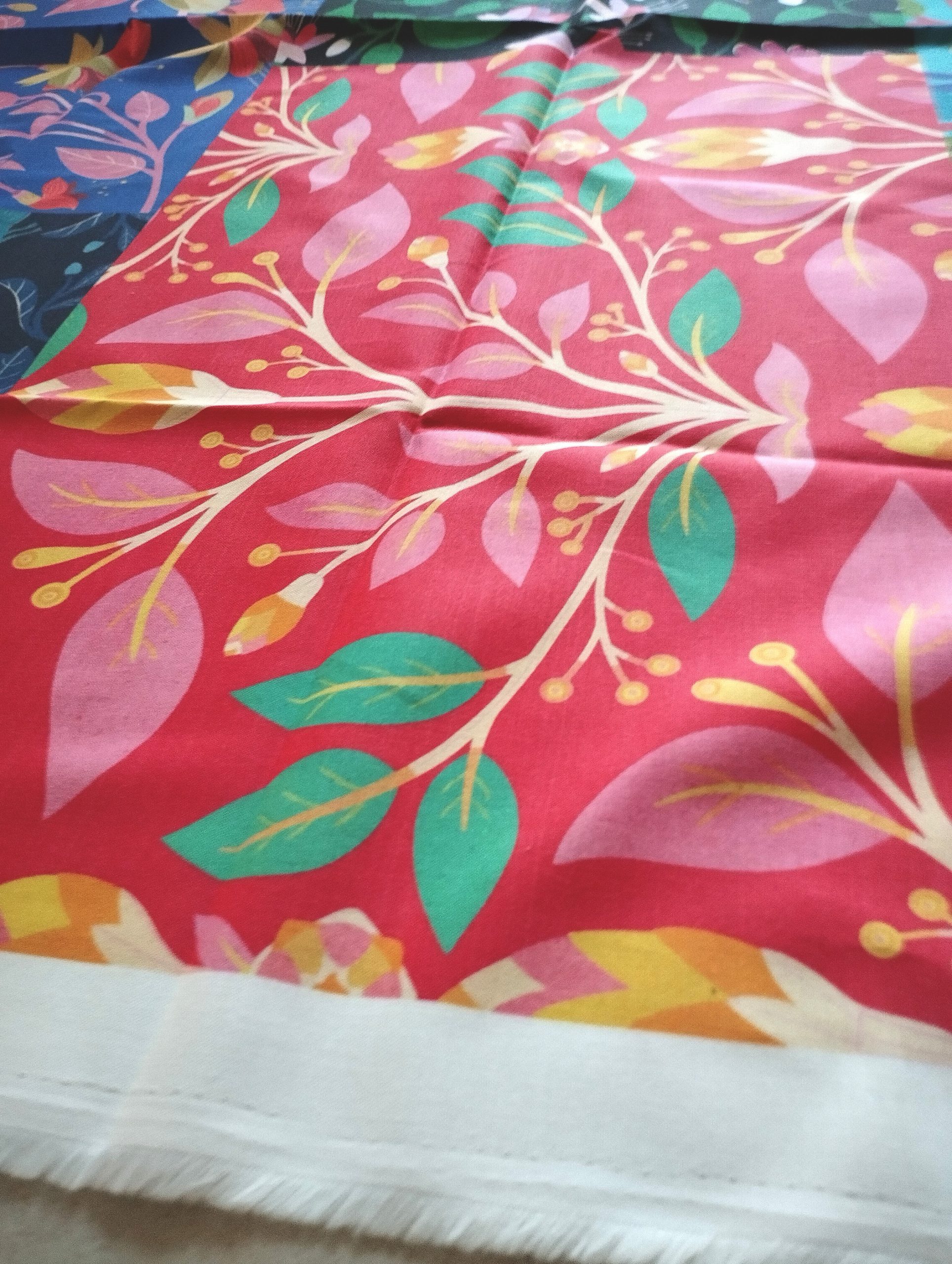
I was so pleased with the result! The prints are sharp, neat, and vibrant. I’ve tried other printing places and processes before, but none were as beautiful as those ones.
One of the fabric is really thick, a kind of Jute fabric, great strong home furnishing fabric… ideal for restoring and renovating upholstered furniture. It’s really nice . A total professional result !
I will post better quality photos soon …
Handy sample pack
I ordered a fabric sample box from #spoonflower. It helps to picture what could be done with the #patterndesign displayed in my spoonflower boutique. I was truly impressed by the pack. It goes from silky veil to thick beautiful furnishing fabric. I was so pleased by the range and the quality of those samples. 9m
Les mockups sont des outils merveilleux pour imaginer et, ou donner à imaginer ce que nos design de motifs pourraient rendre sur des surface.
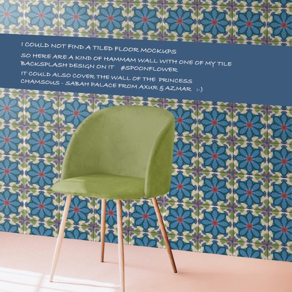
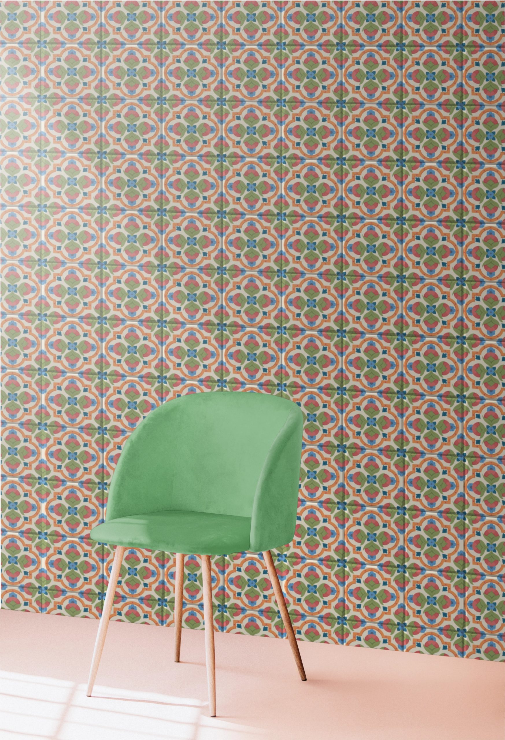
Je n’ai malheureusement pas trouvé (meme sur Rawpixel) de mock up de sol en carreau de ciment … qui pourrait mettre en valeur la collection de “backsplash” sur Spoonflower
Il faut que je prenne le temps d’apprendre à faire mes propre mockups …
… they where in a small format and my grand mother was sending loads of them all January long… some addressed to people from remote family that she barely knew others to the grocery guy or the across the road neighbours… a kind of happy formality. A gesture that required to make time and write nice formulas with her best goose feather handwriting style.
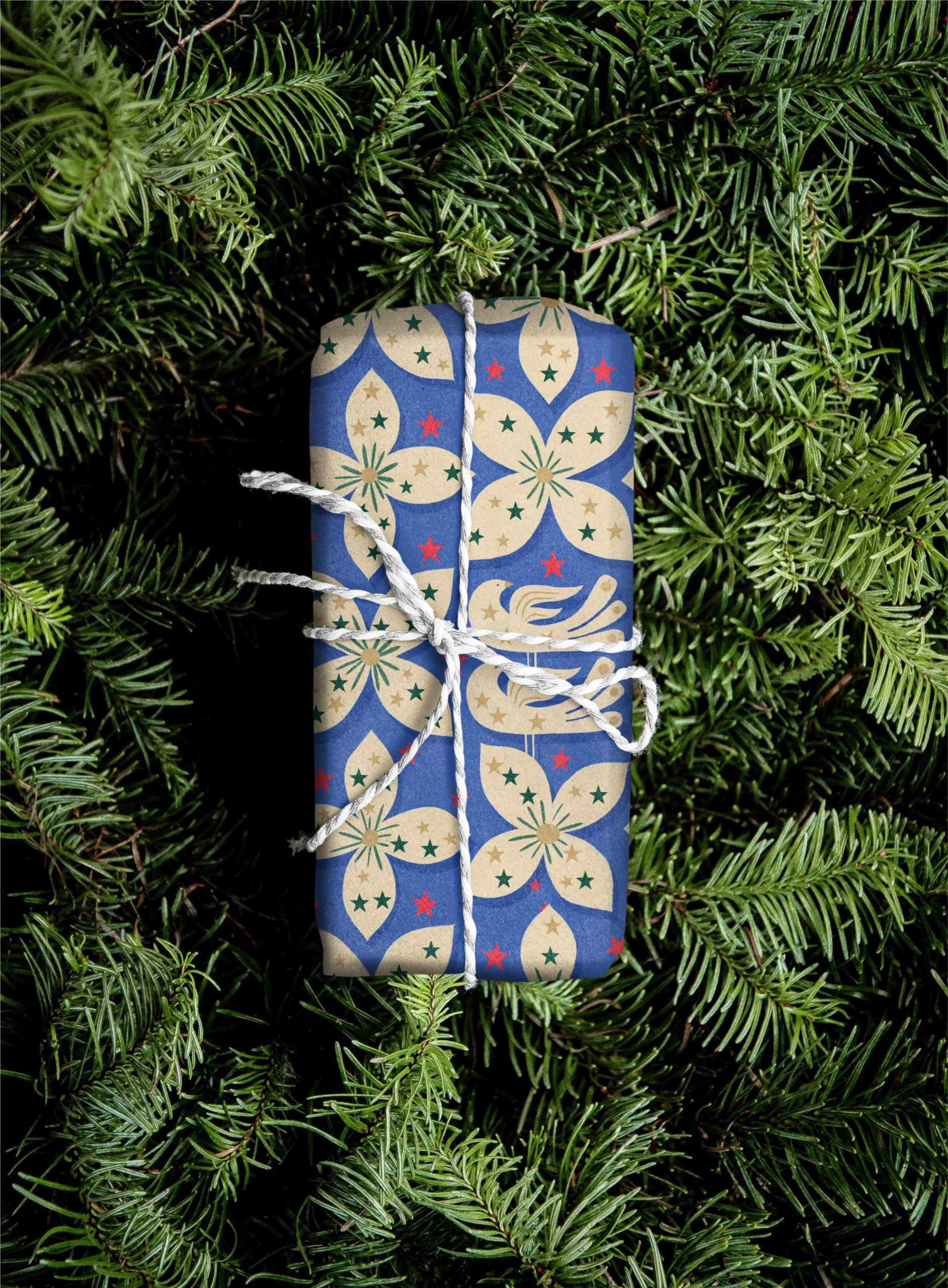
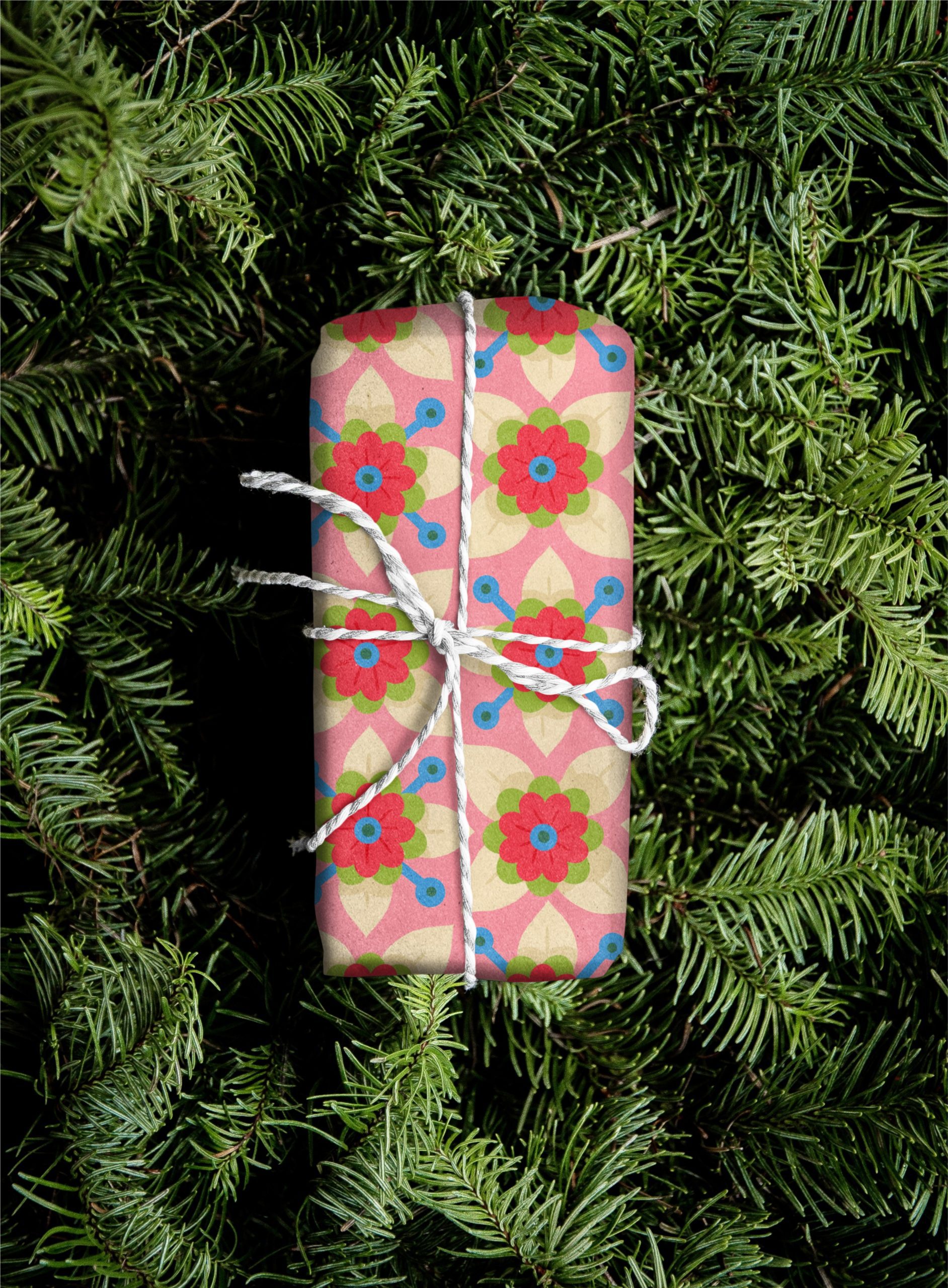
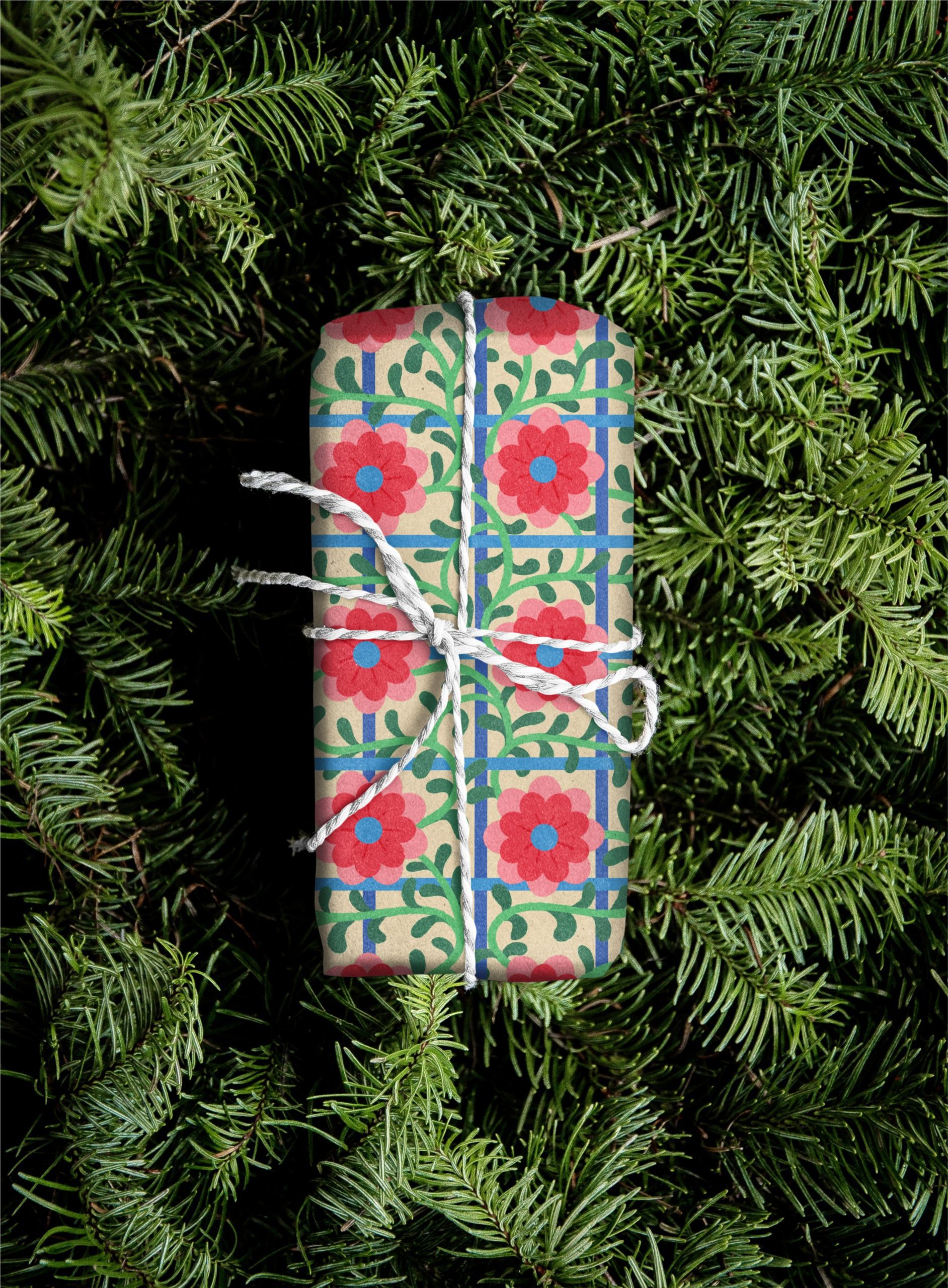
I made my Christmas patterns (for wapping paper) with this few procreate stamp brush i made just before
Creating a Custom Stamp Brush in procreate
Prepare Your Image: Start with a high-contrast image or design that you want to use as a stamp. You can use a drawing or import a photo and isolate the design by removing the background – Import the Image: Open the Actions menu (wrench icon). Go to the Add section and tap on Insert a Photo to bring in the image – Convert Image to a Brush: Once you’ve isolated the design, go to the Brush Studio by selecting the brush library and tapping the “+” icon to create a new brush. Under the Shape section, tap on Edit and import your design by choosing Import and selecting Photo or Import from File – Adjust the Brush Settings: You can adjust settings under Stroke Path, Taper, Shape, and Grain to fine-tune the look of your stamp brush. In the Shape section, you can also adjust the Scatter and Rotation to add variety to the stamp’s repetition – Save and Use: Once you’re happy with the settings, tap Done to save your brush, and it will appear in your brush library for use.
I soon will be be ready to present my patterns to fabric and interior decor industry. the truth is that i am a both scared and excited to jump in.
I first wanted to wait until I have various smalls coordinated collections to propose. So far, my patterns are individuals colors editable items (I hope they all have a family connection but there were not actually built as collections).
I cant wait to design some proper collections (coming soon)… How exciting!
Meanwhile, I try to make presentations such as these lampshades video to help people imagine how they could use my designs on their products. 🙂
Parfois , avec un peu de temps je partage ici les choses bien, les découvertes du moment.
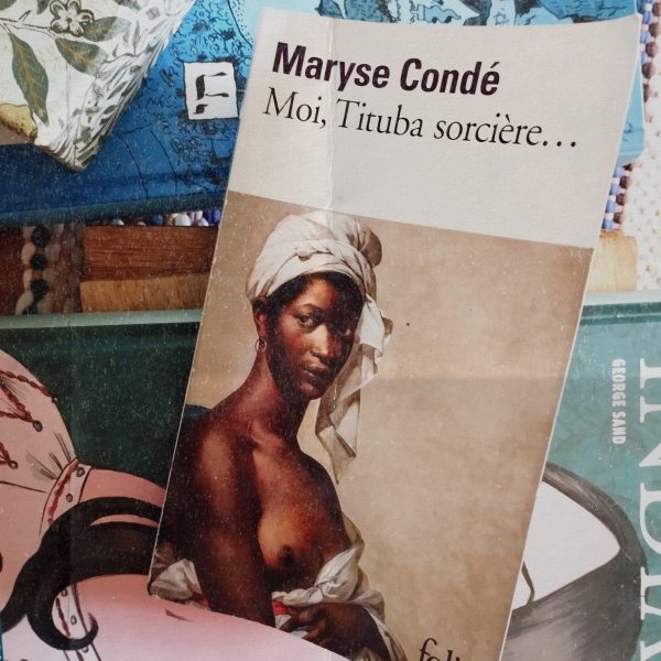
Mon impression générale
Grace à l’écriture de Maryse Condé, il y a eu une tension continue de lecteur, à cause de cette irritante et réaliste auto assignation d’une esclave à des espaces et des non prises de paroles que l’on comprend mais dont on attendrait aussi de la casse, des envies de briser du carcan.
Il y a pourtant en eux, les personnages j’entends, Tituba surtout, des flammèches de liberté puisqu’ils accèdent à des esprits qui sont à la fois surpuissants et humbles, des esprits presque moraux qui limitent et dosent leurs pouvoirs, qui laissent ‘le mal’ aux dominateurs, aux blancs, aux propriétaires, habitués aux tours de forces et de contraintes.
Ca peut même donner du dessins au detour d’une image mentale. qui sait?
Les expressions “Procès en sorcellerie”, “chasse aux sorcières” se concentrent dans le récit. Maryse condé en a fait autre chose.
Moi, Tituba sorcière (1986)
CONTEXTE: Les procès des sorcières de Salem sont une série de procès en sorcellerie célèbres de l’histoire coloniale de l’Amérique du Nord, situés entre février 1692 et mai 1693 dans plusieurs villages du Massachusetts proches de Salem, dans les Treize colonies, qui entraînèrent l’arrestation d’une centaine de personnes et l’exécution de quatorze femmes et de six hommes. C’est la chasse aux sorcières la plus importante de l’histoire de l’Amérique du Nord.
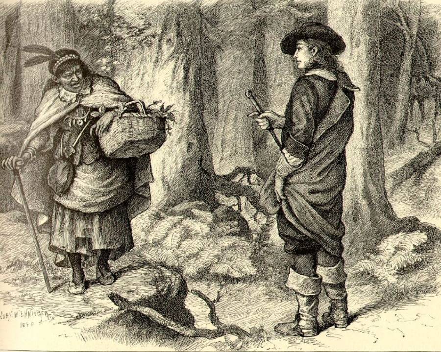
Accusée de sorcellerie, Tituba est marginalisée par rapport au groupe des esclaves. A la Barbade, elle est la seule ‘Noire’ libre, son maître l’ayant chassée. De plus, ses pouvoirs de guérisseuse sont redoutés et respectés. À Salem elle deviendra un bouc émissaire.
Le roman commence au XVIIe siècle, au départ à la Barbade et se poursuit dans l’atmosphère hystérique du village puritain de Salem (celui du procès des sorcières de Salem) près de Boston sorte de microcosme d’angoisse puritaine.
Le pasteur puritain Samuel Parris (personnage historique, père de Betty Parris et l’oncle d’Abigail Williams, deux des jeunes filles possédées) détient deux esclaves, dont l’une, nommée Tituba, qui joue un grand rôle dans l’affaire des sorcières.
Les trois premières femmes accusées sont Sarah Good, Sarah Osborne et Tituba. (toutes personnages du roman)
Tituba a choisie d avouer ce dont elle etait accusée. Elle fut est arrêtée, oubliée dans sa prison.
Le projet de Maryse Condé est de redonner une voix au personnage historique réel de Tituba sur qui il n’y a presque aucune information. Après Amnistie générale Tituba sortie de prison est ramenée par l’auteur dans son pays natal, la Barbade, au temps des Marrons et des premières révoltes d’esclaves, elle en fait ainsi une fiction historique. Grâce à Maryse condé Tituba retrouve une identité individuelle collective.
Au sujet des hallucinations:
L’hypothèse D’hallucinations dues à l’ergot du seigle a également été avancée théorie qui permet de réfuter la thèse d’une folie collective pourtant à considérer. Les mécanisme socio psychologique dans la propagation de haine n’ en reste pas moins un modèle du genre
La piété régnant au sein du monde des puritains, il est indéniable que les croyances religieuses ont eu leur part de causalité dans cette affaire. Par exemple, près de 85 % des accusés lors du procès étaient des femmes, ce qui était, à l’époque, justifié par le fait que Dieu voyait les hommes et les femmes égaux mais pas Satan. Les auteurs de l’époque jugeaient souvent les femmes comme «enfants du démon», cette pensée était vraiment ancrée dans les mœurs de l’époque. Cette peur venait déjà de l’Europe et certains comptes rendus de procès de sorcières datant du XVIIe siècle Cet épisode a été très largement utilisé, dans la littérature populaire et dans la rhétorique politique américaine, pour mettre en garde contre les dangers de l’isolationnisme, de l’extrémisme religieux, des fausses accusations ou des erreurs de procédure judiciaire.
De nombreux historiens estiment que ces procès ont eu une influence profonde et durable sur l’histoire des États-Unis.