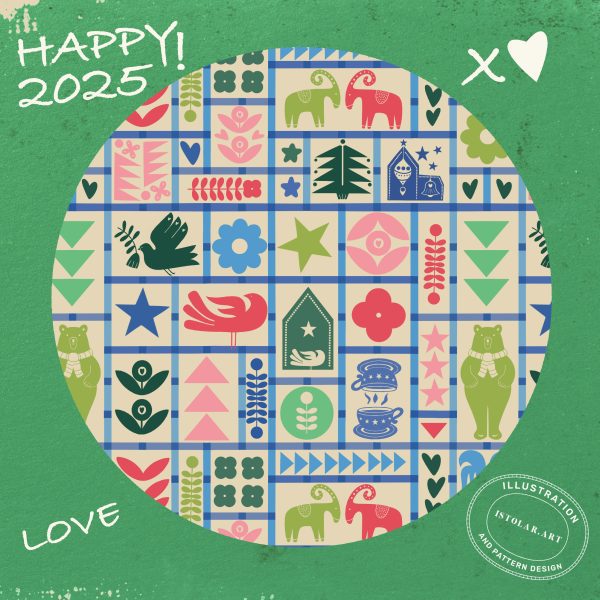
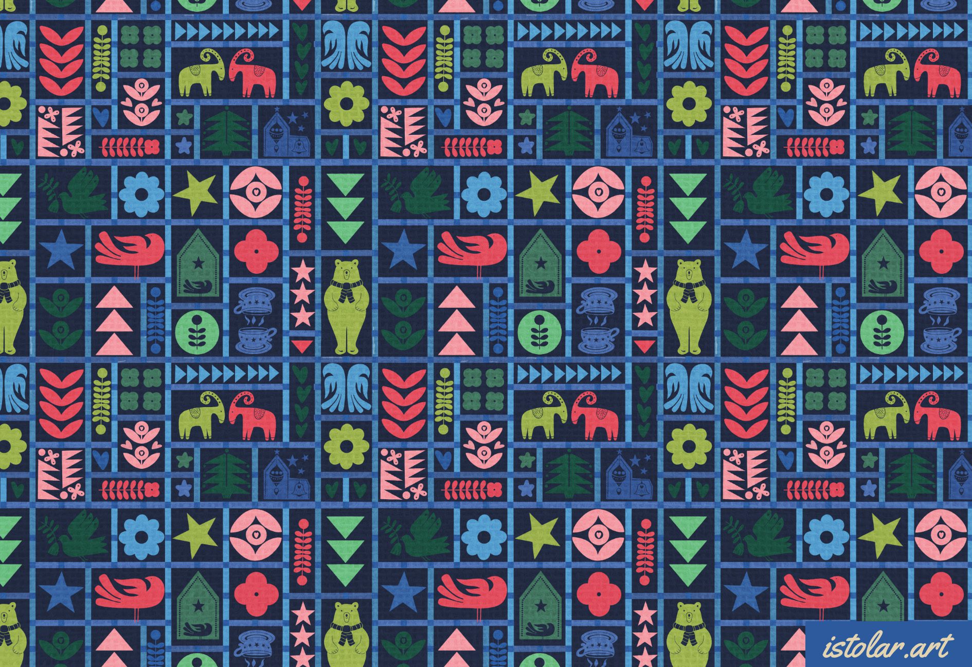
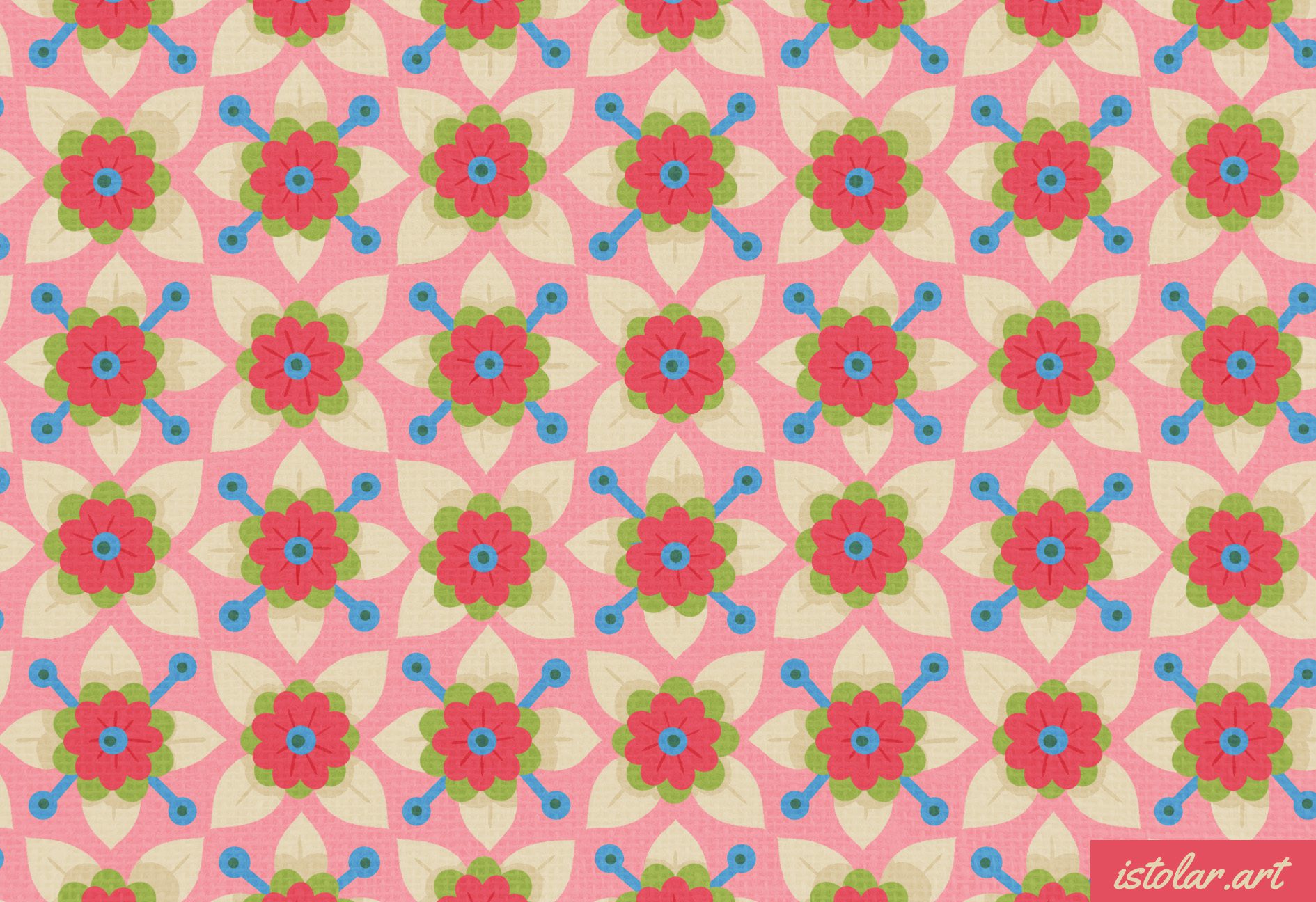
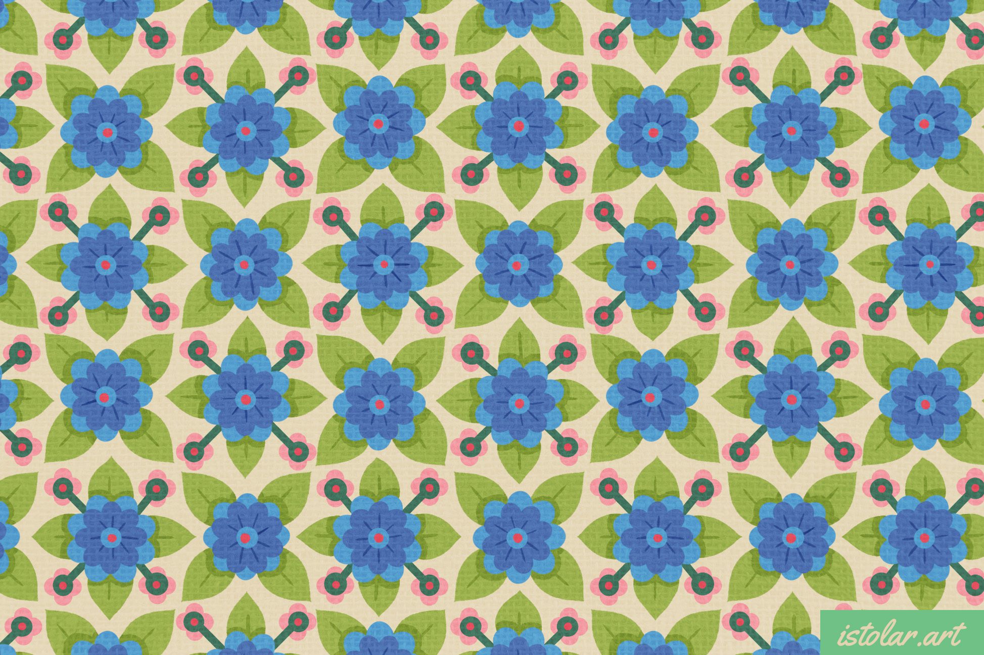
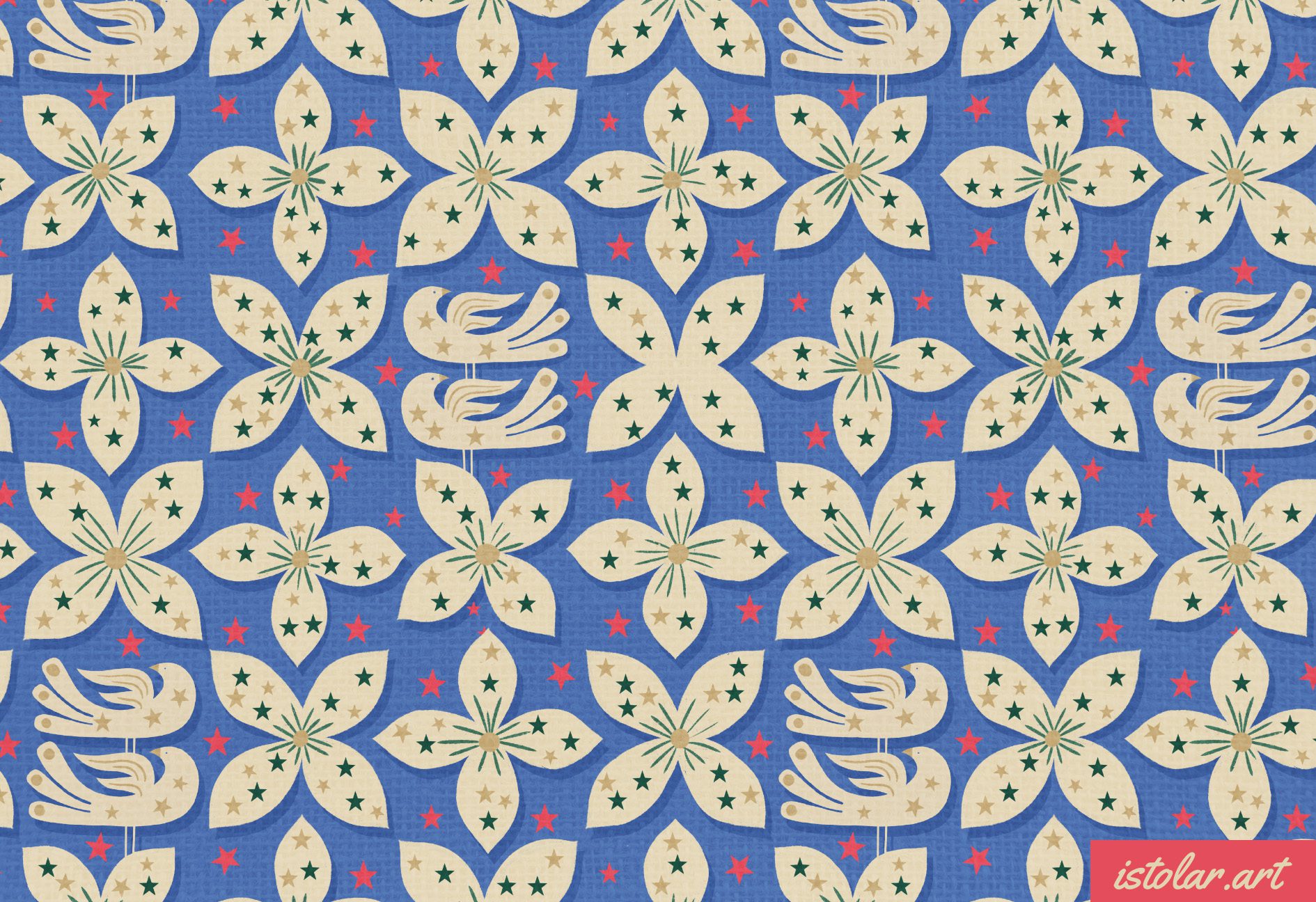
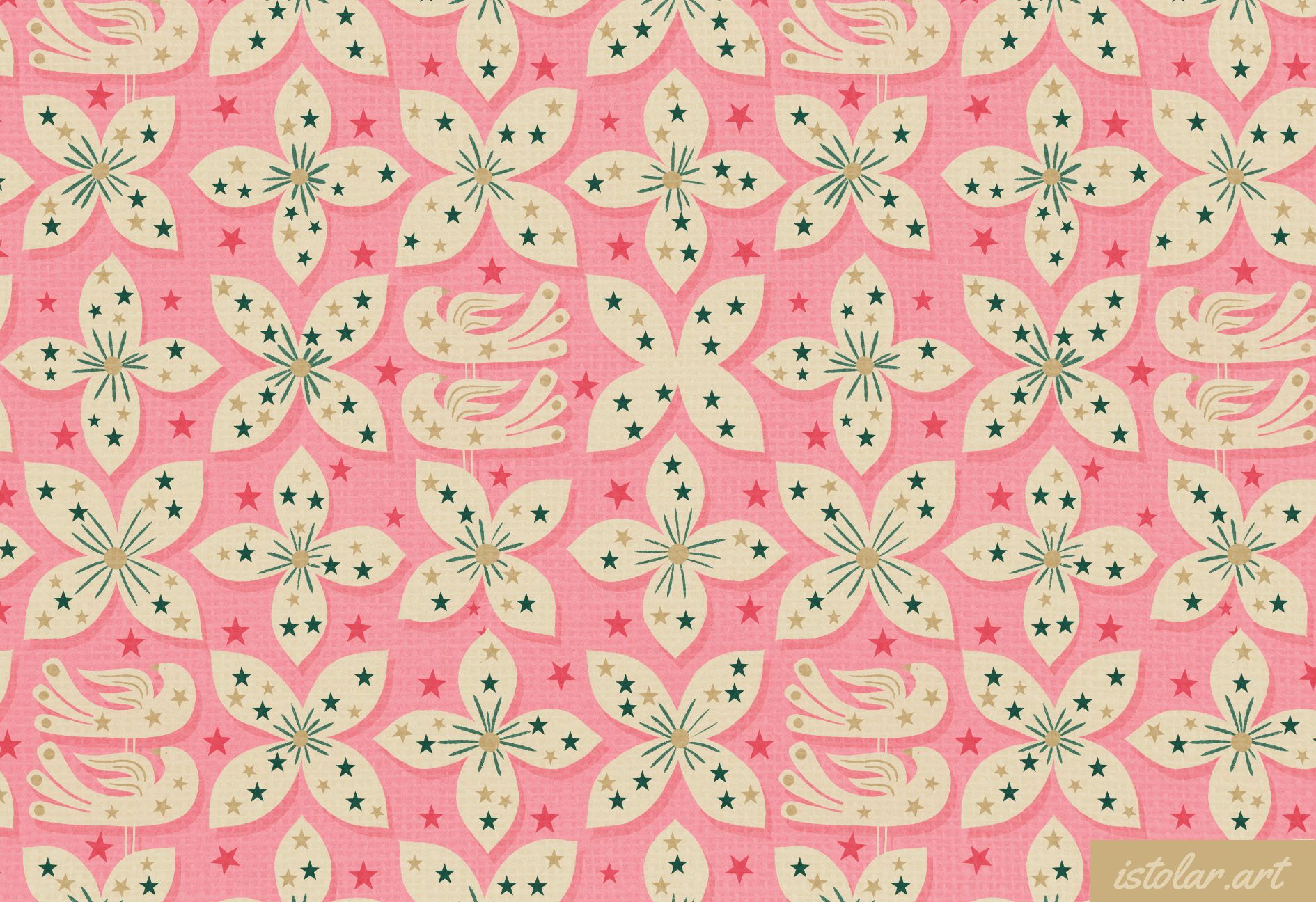
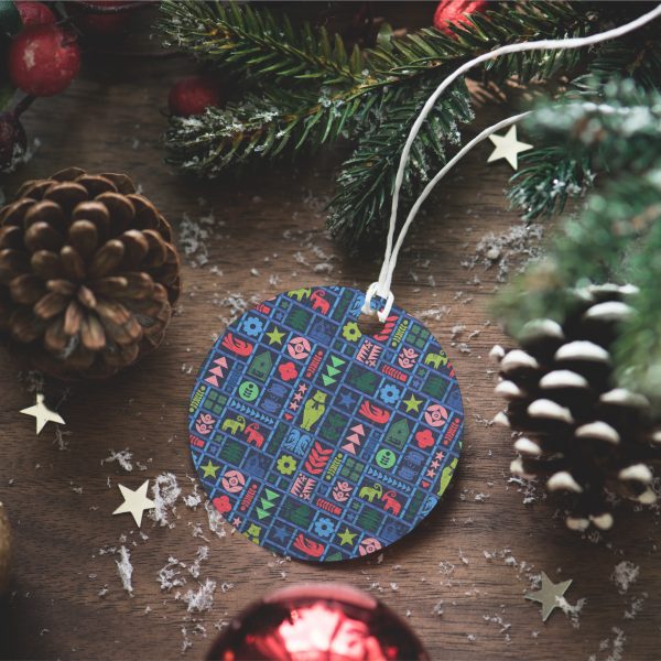
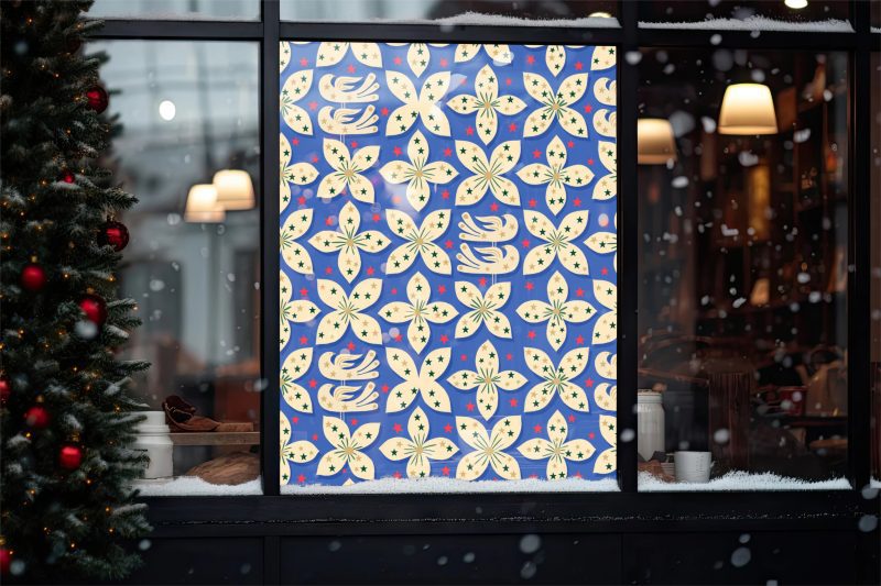
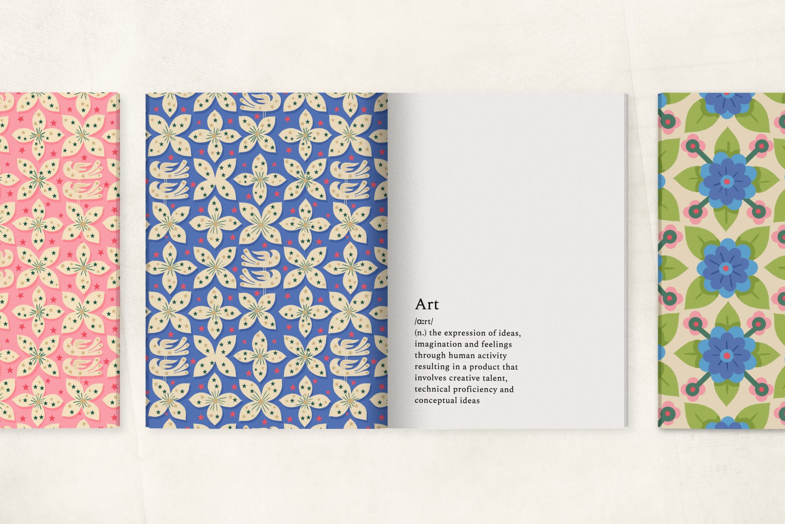
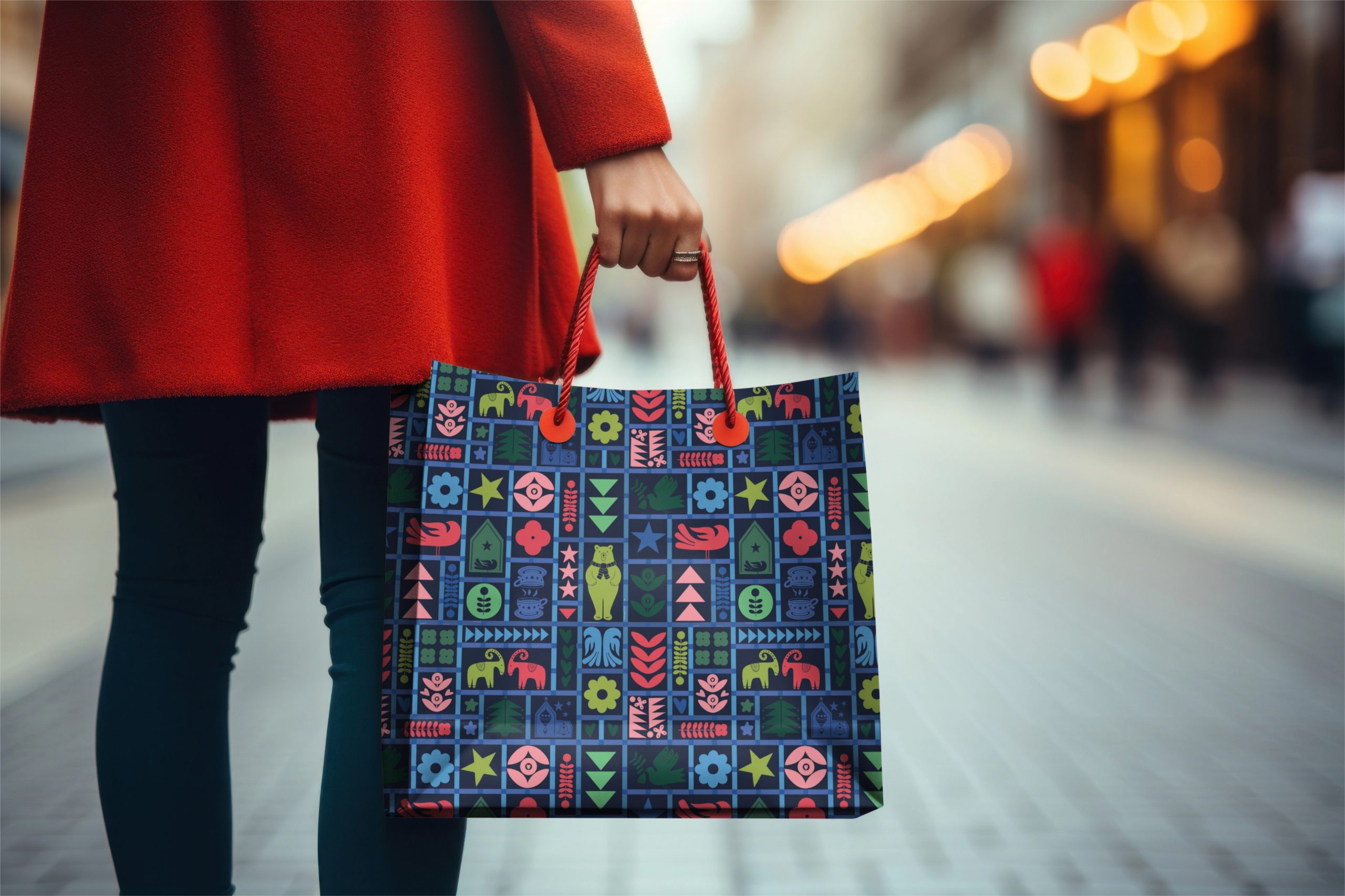
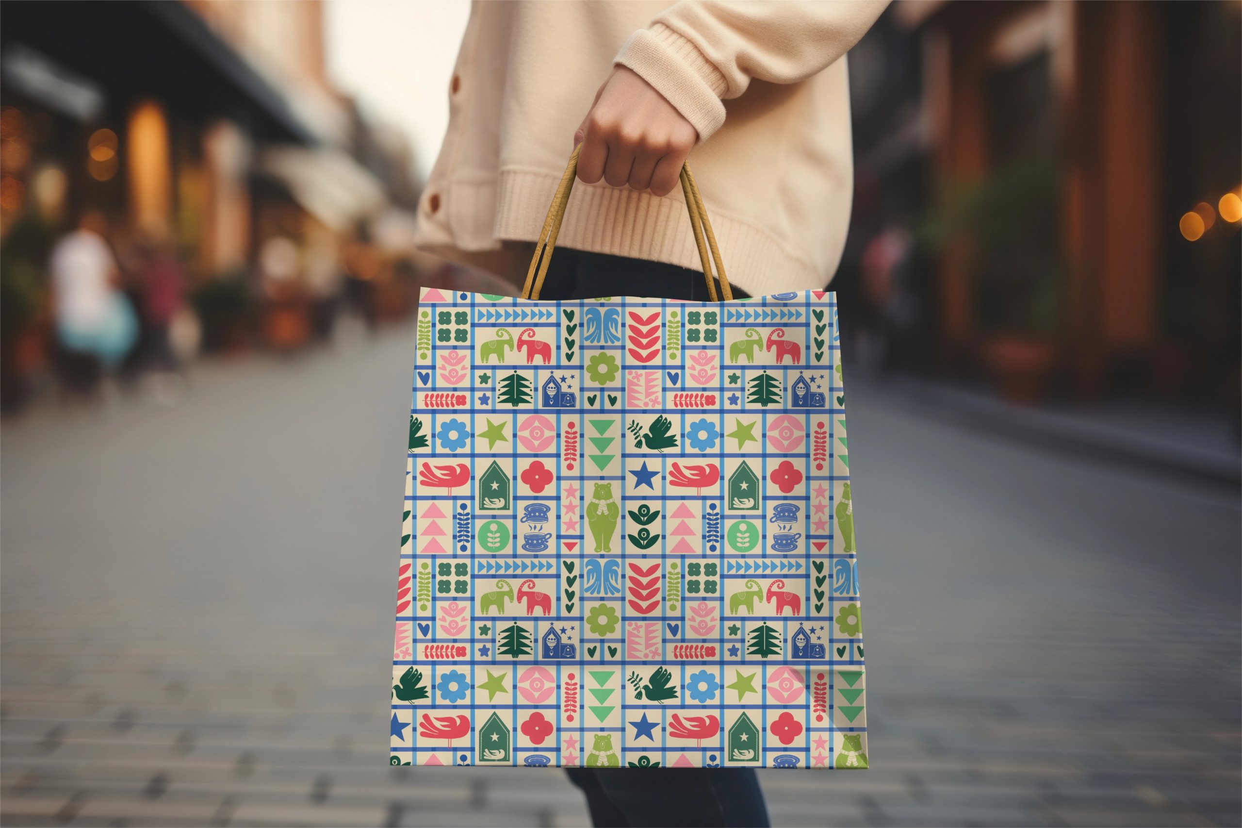
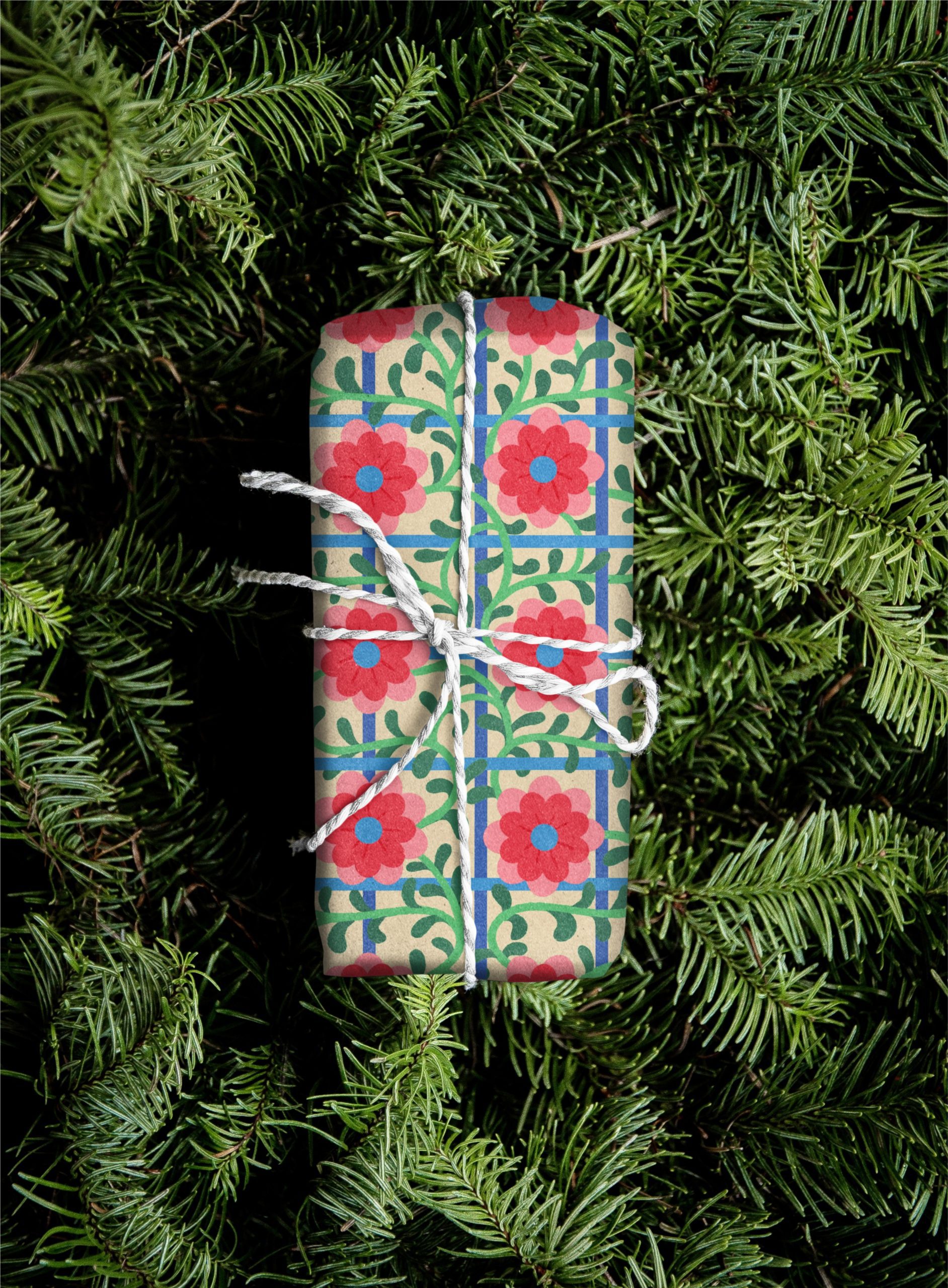
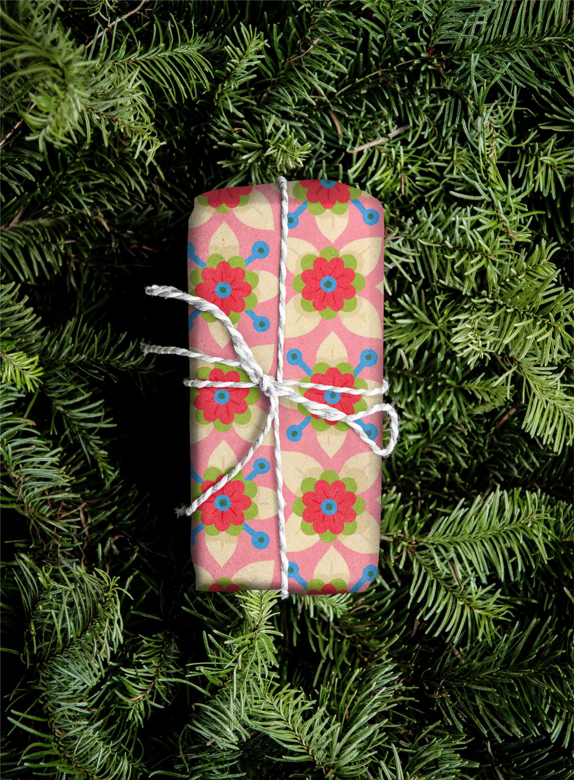
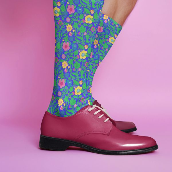
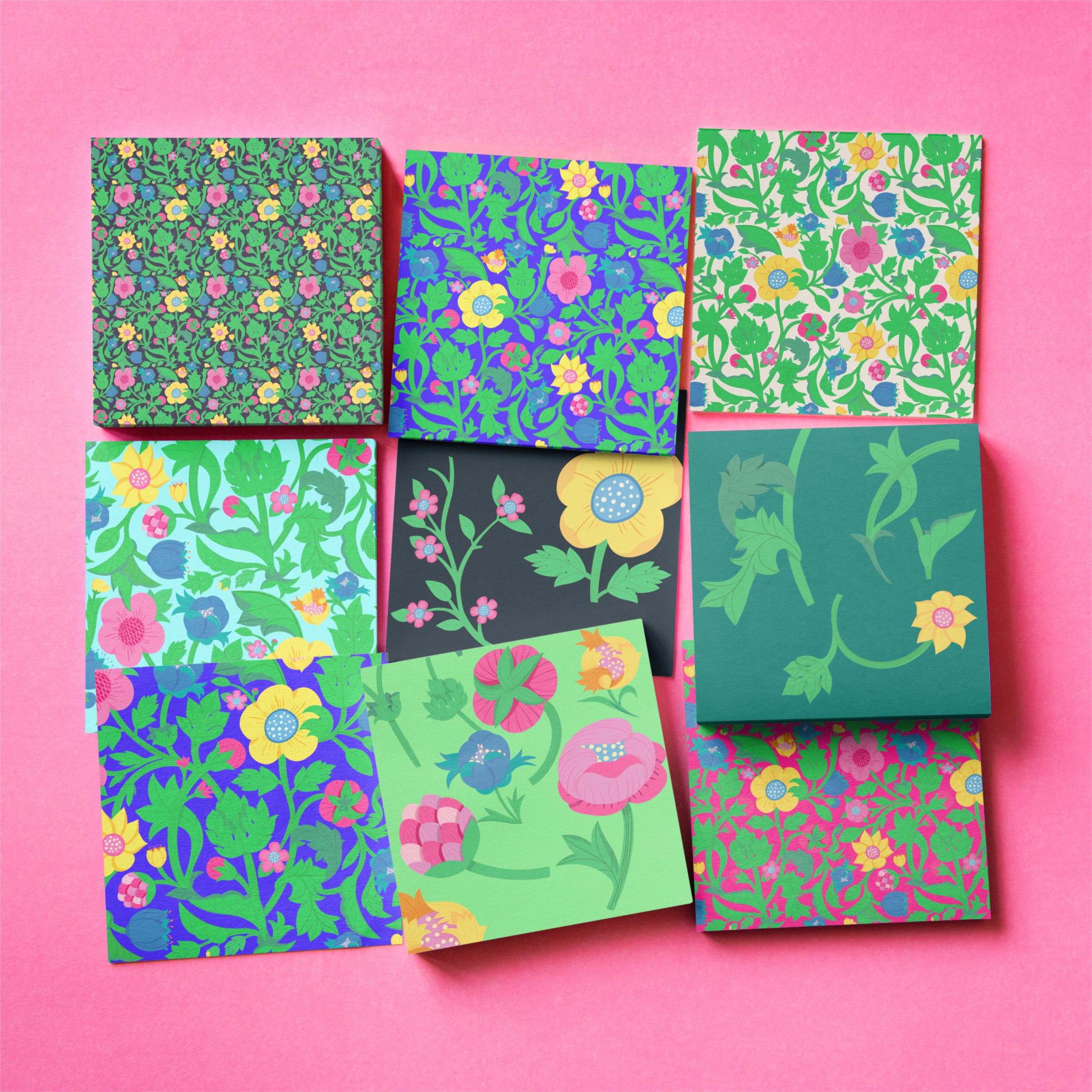
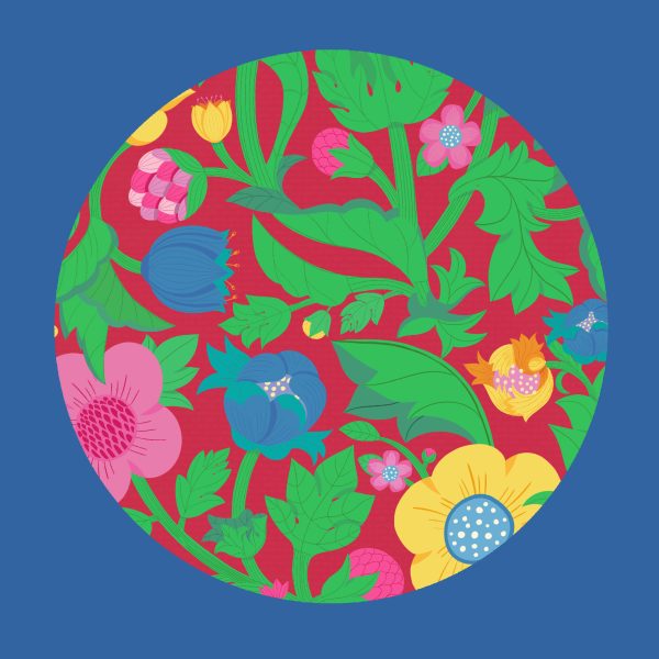
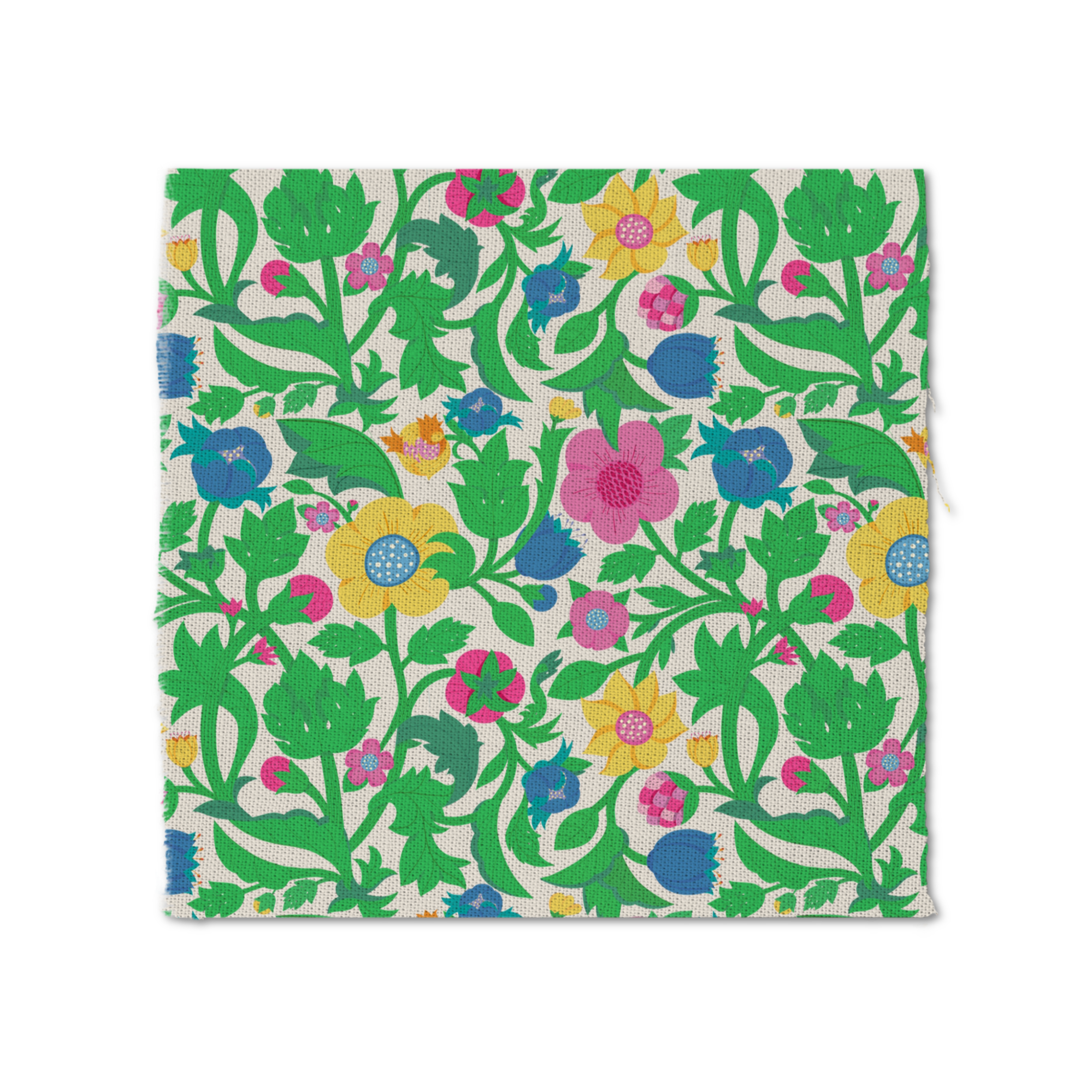
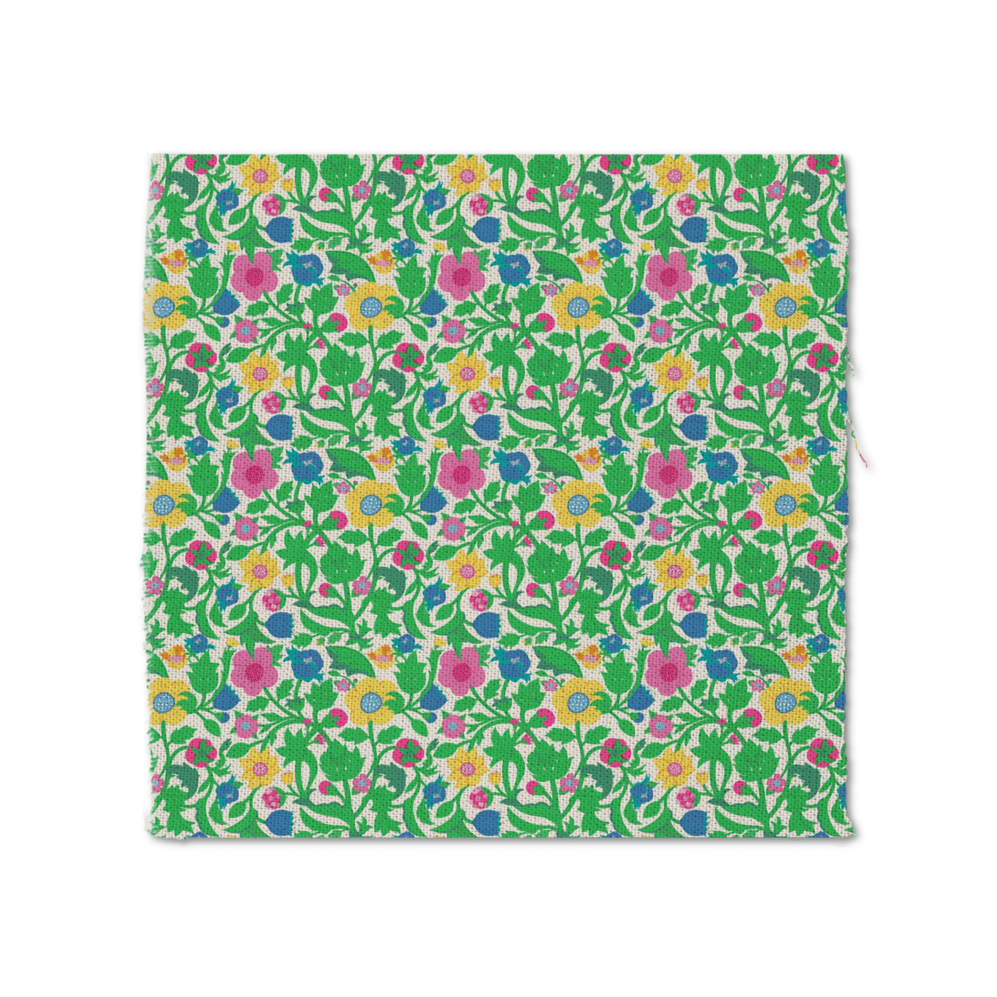
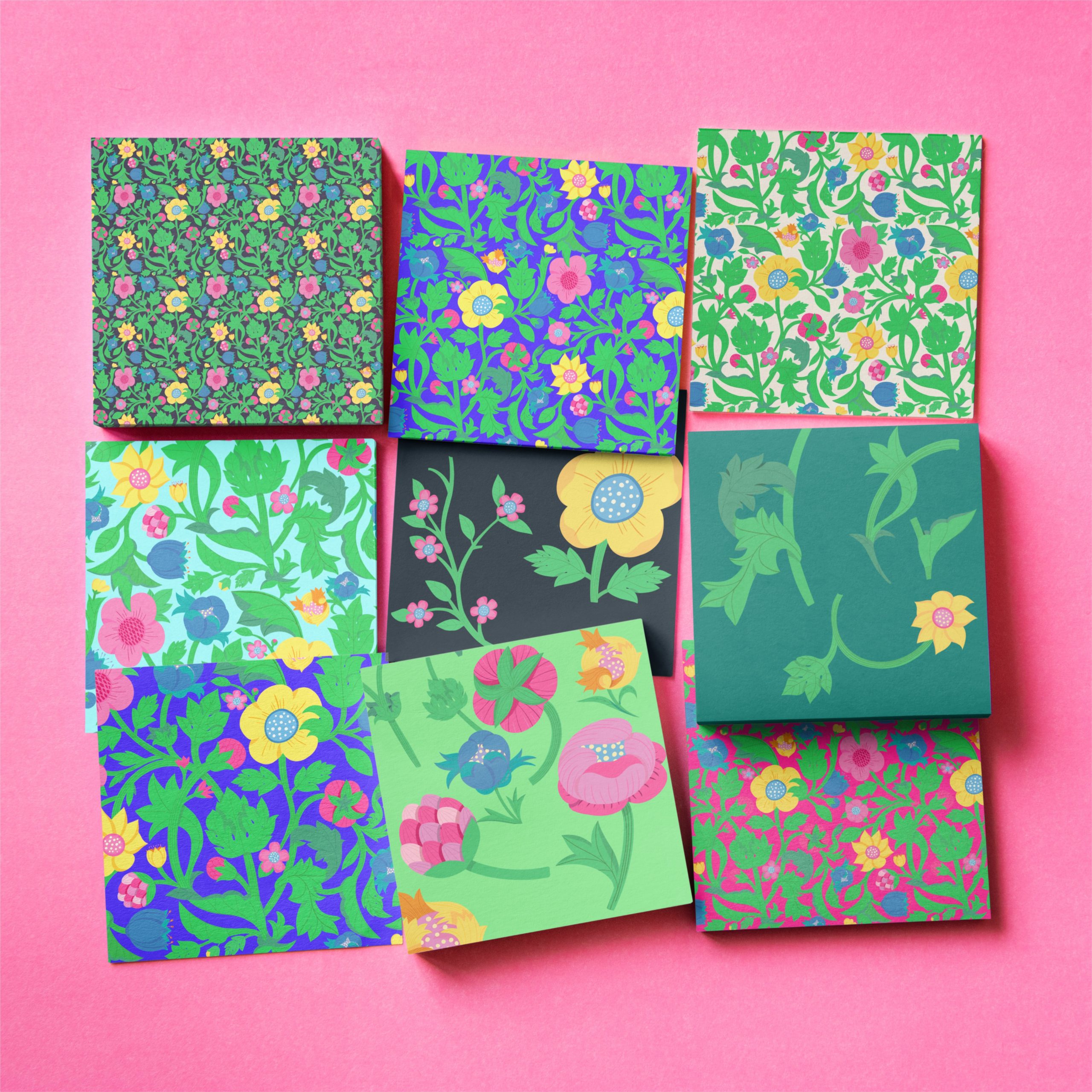
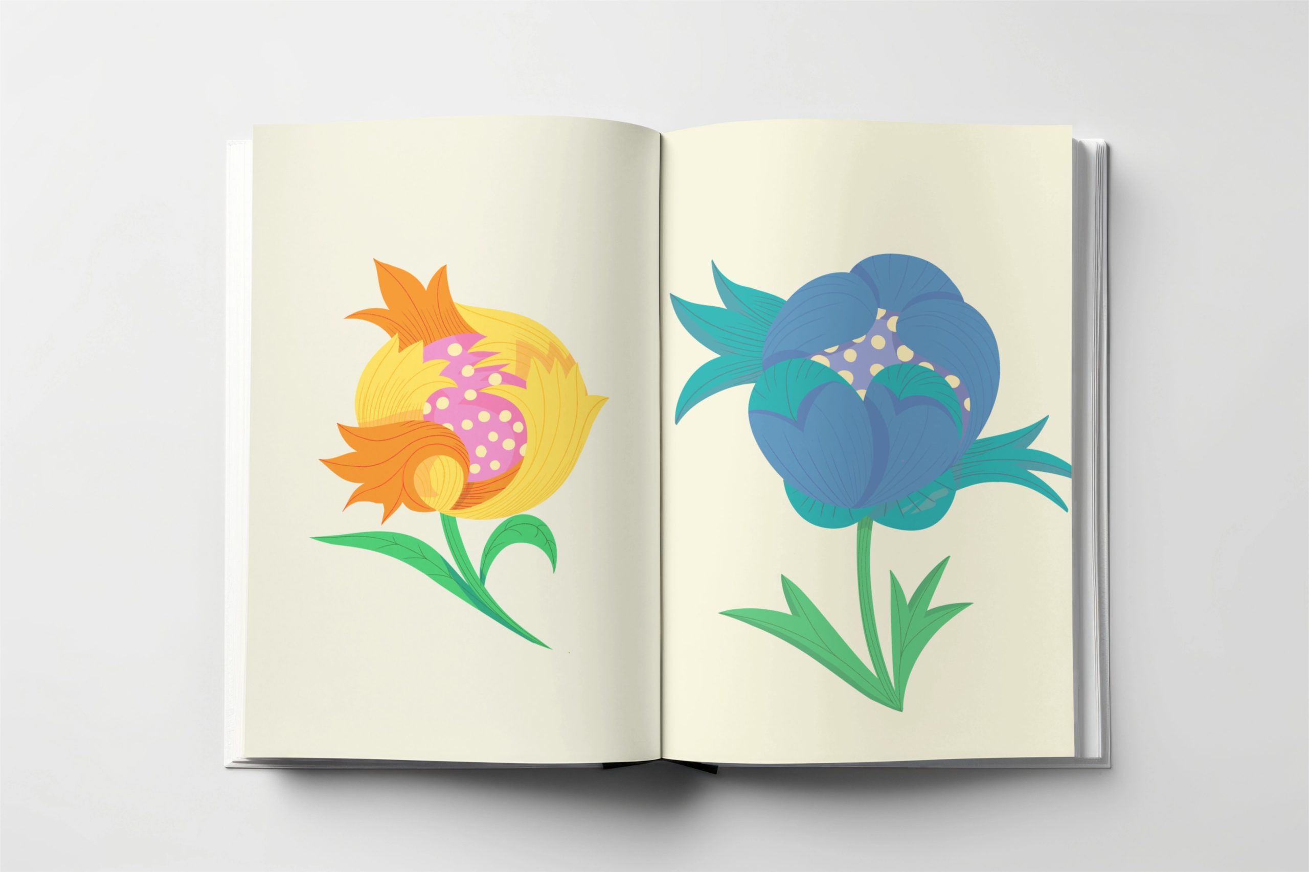
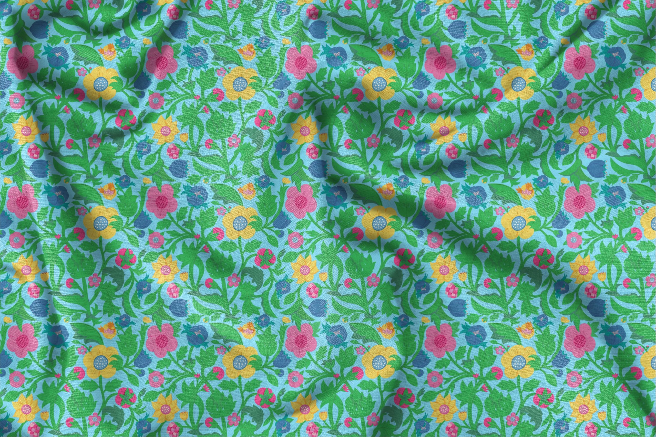
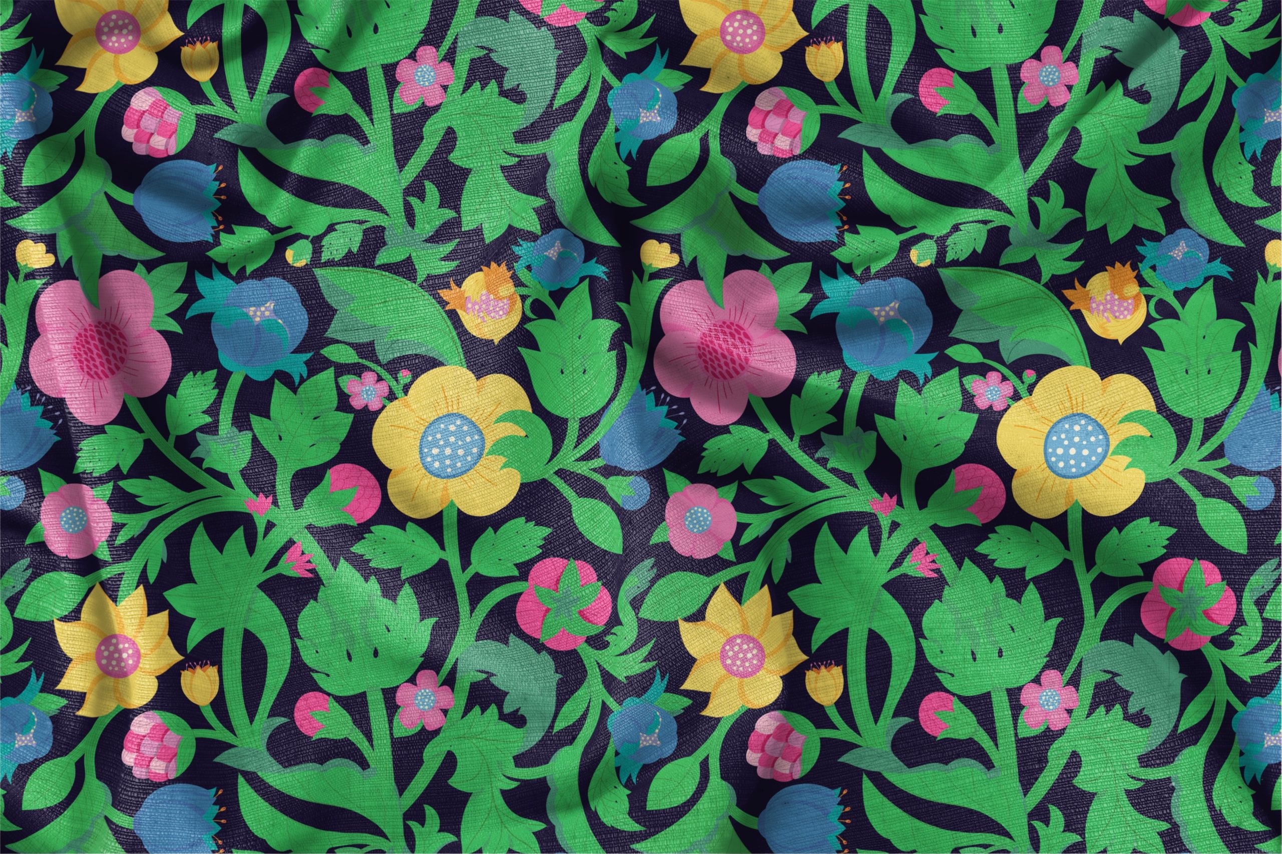
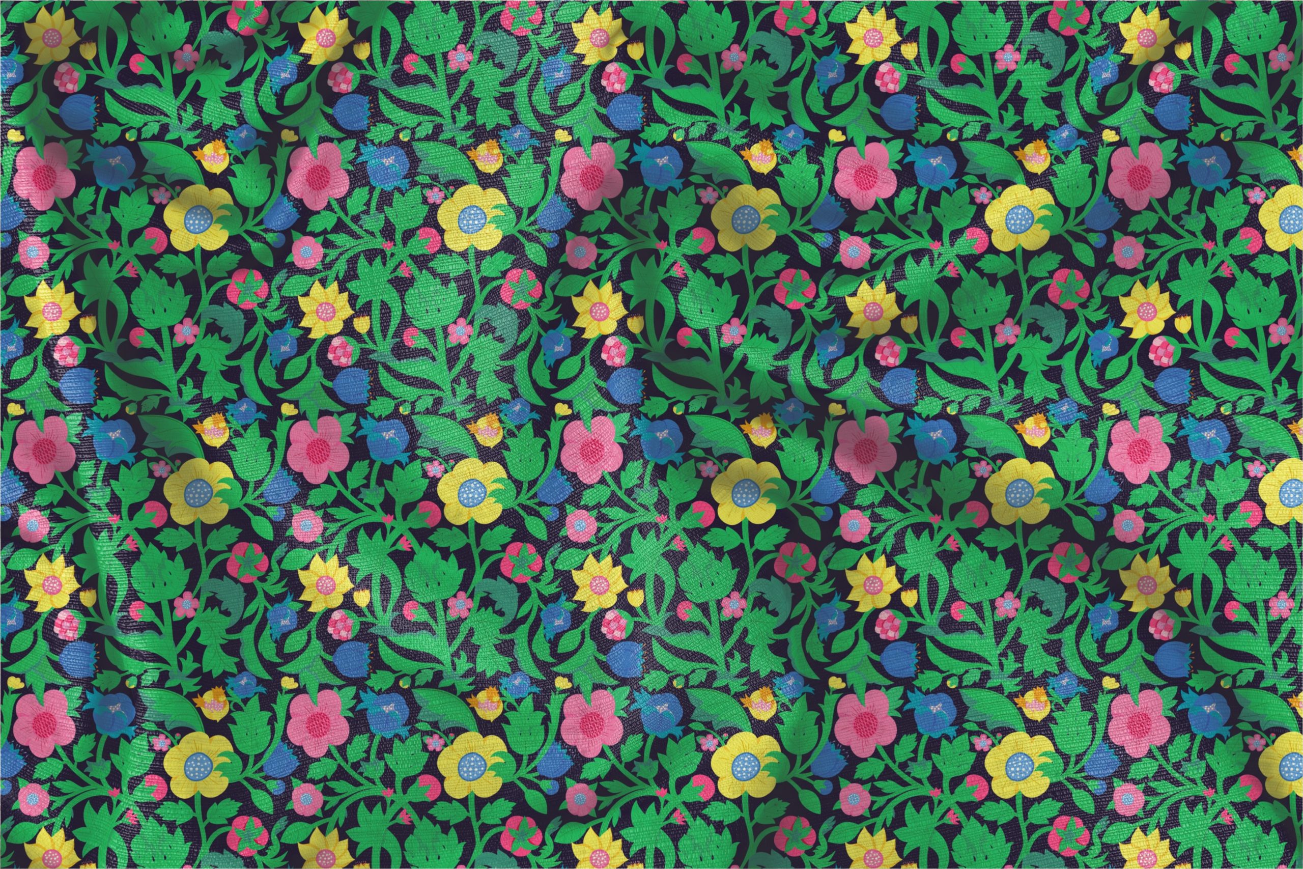
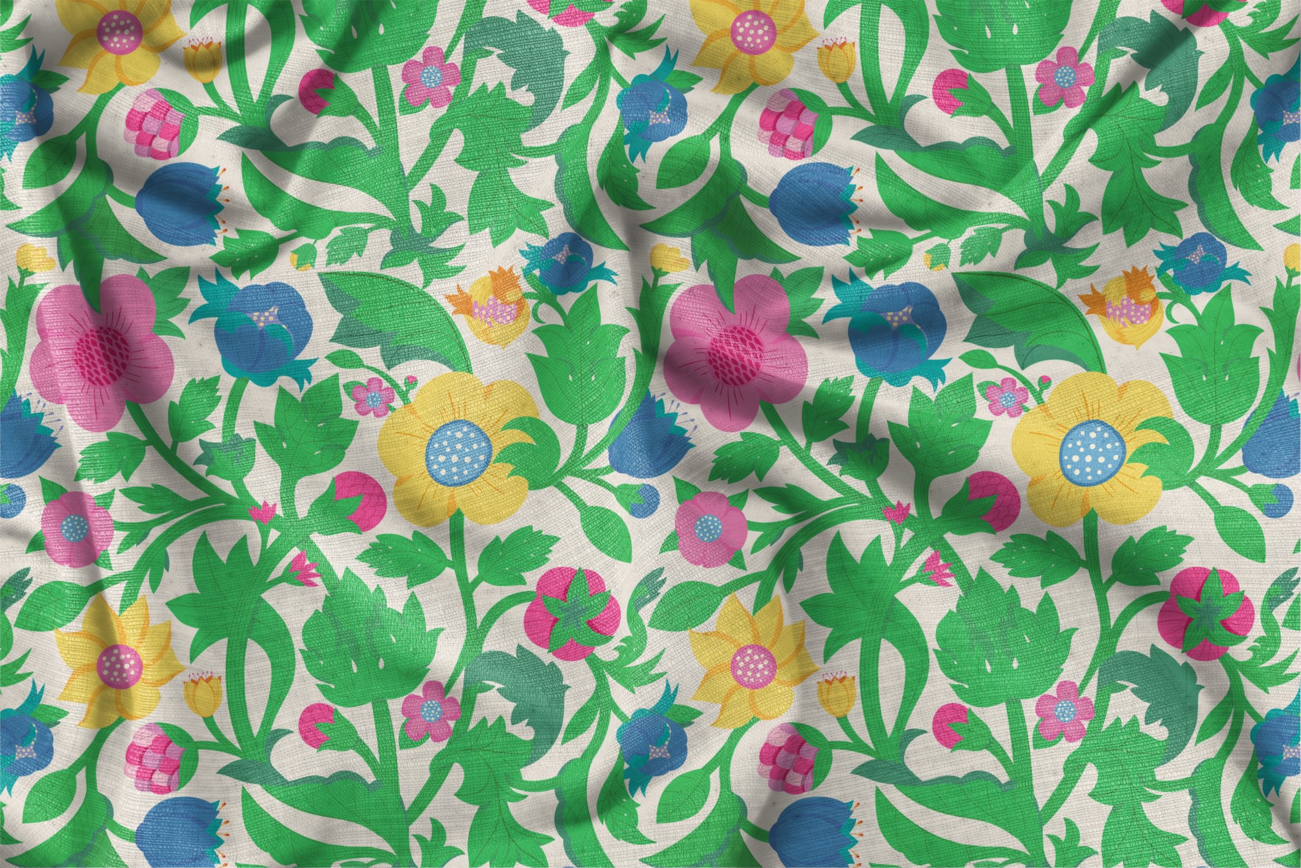
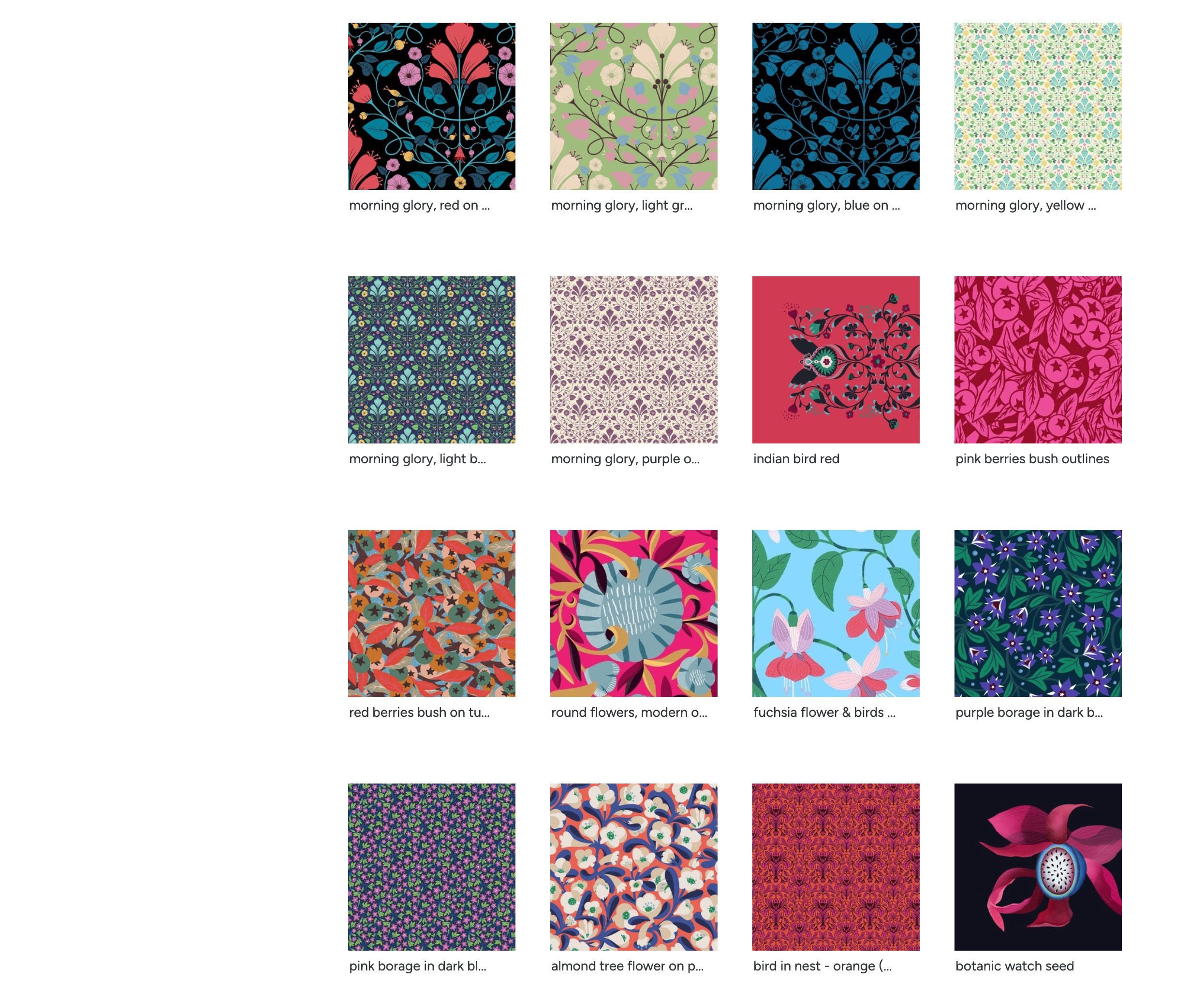
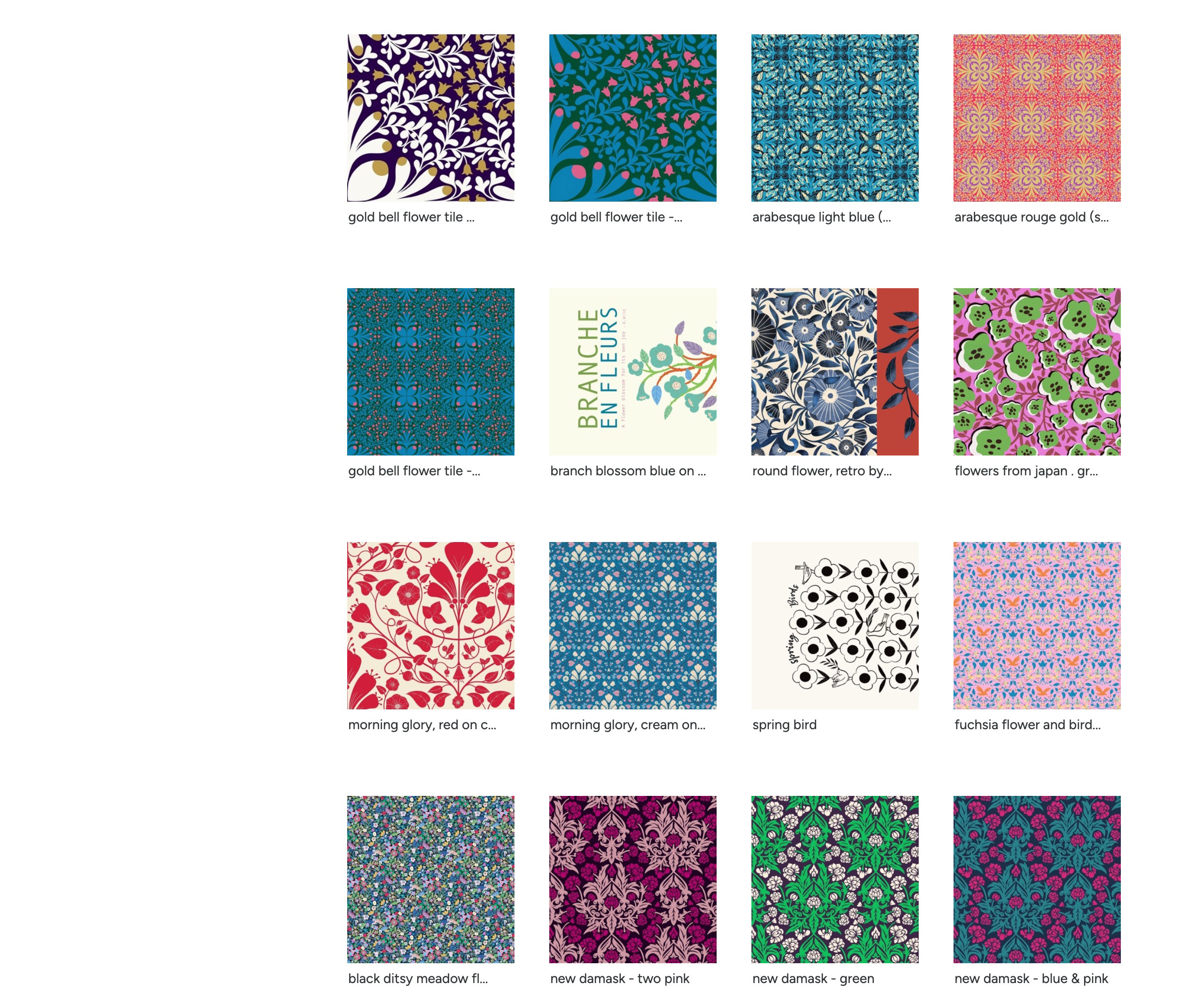
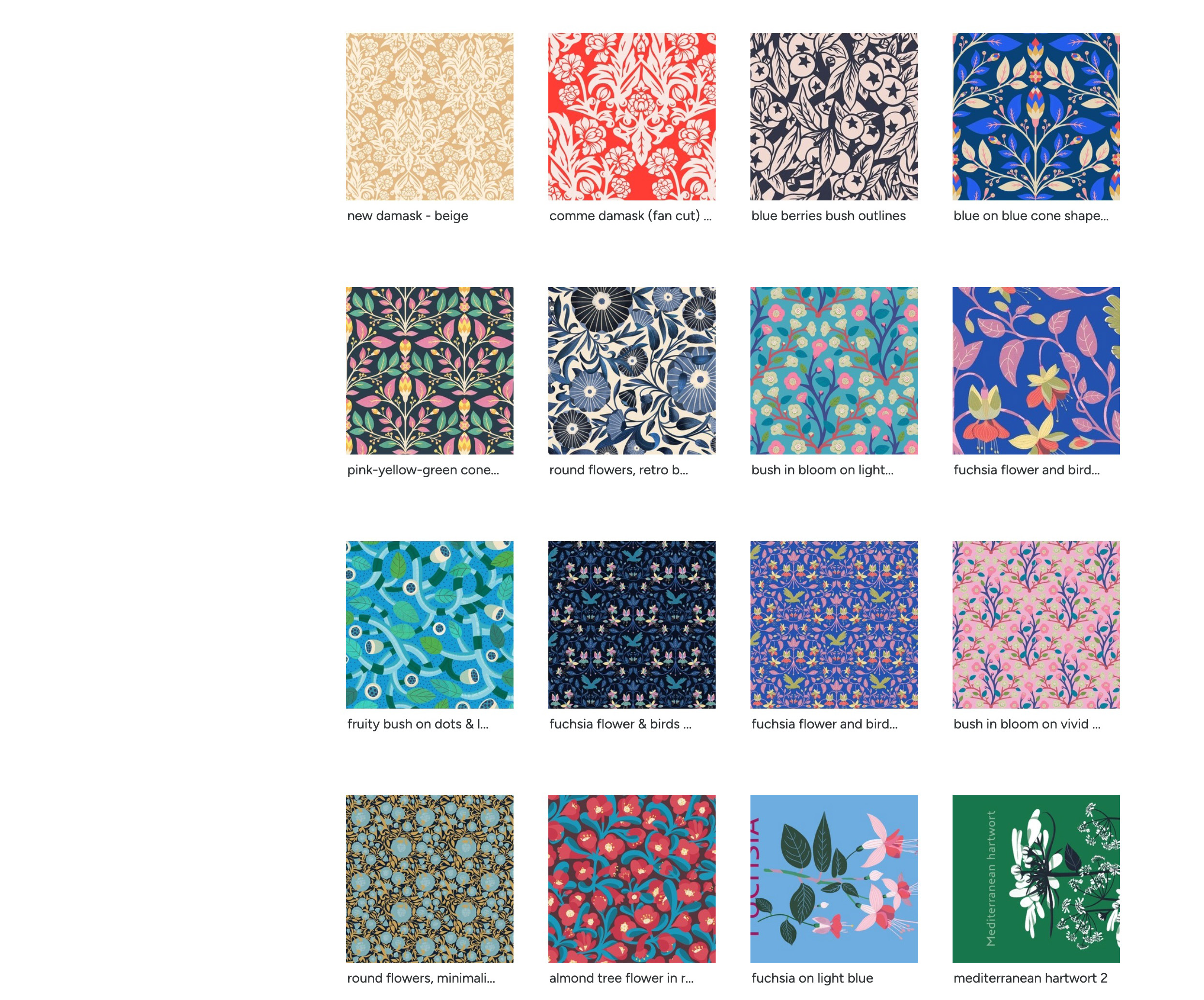
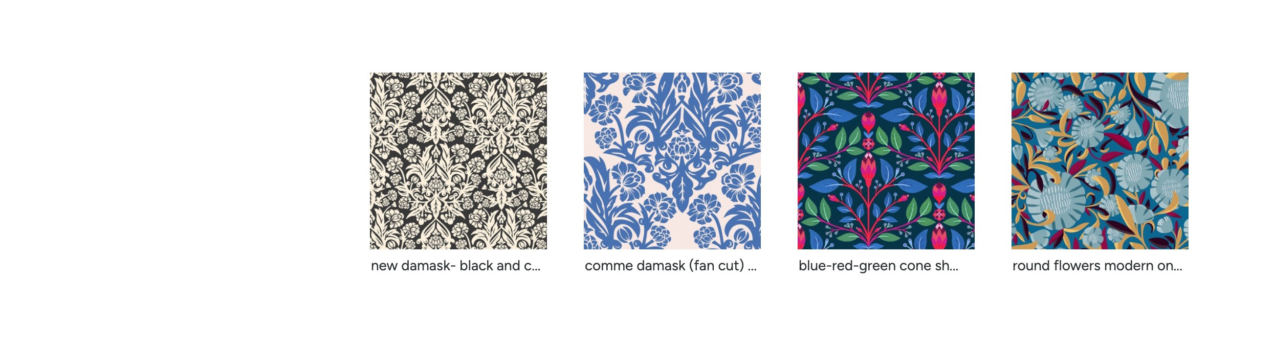
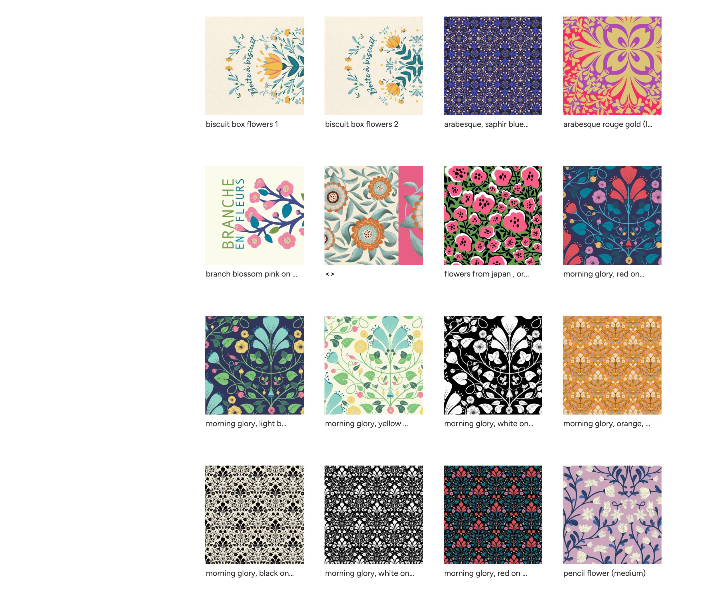
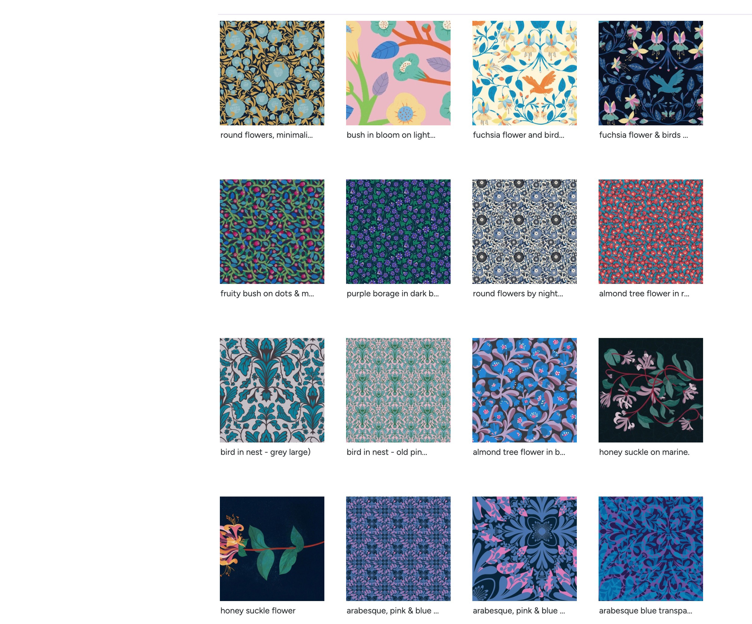
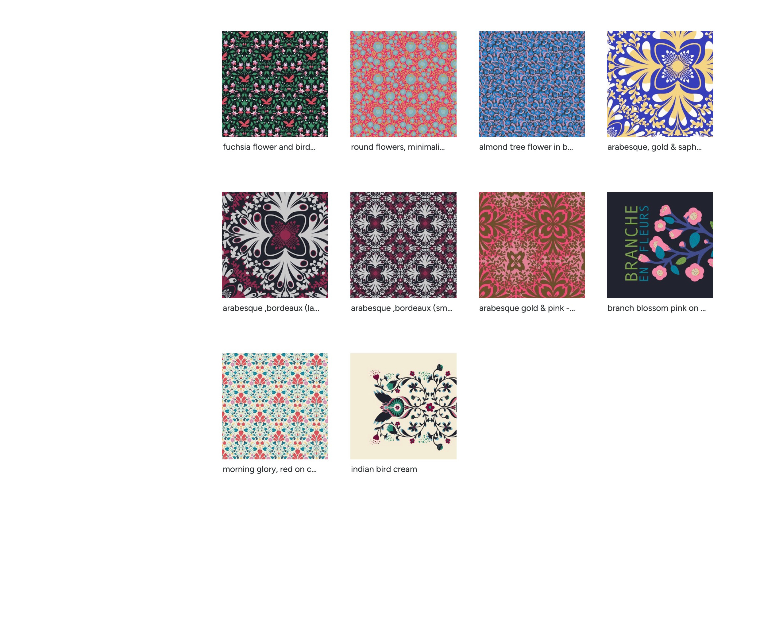
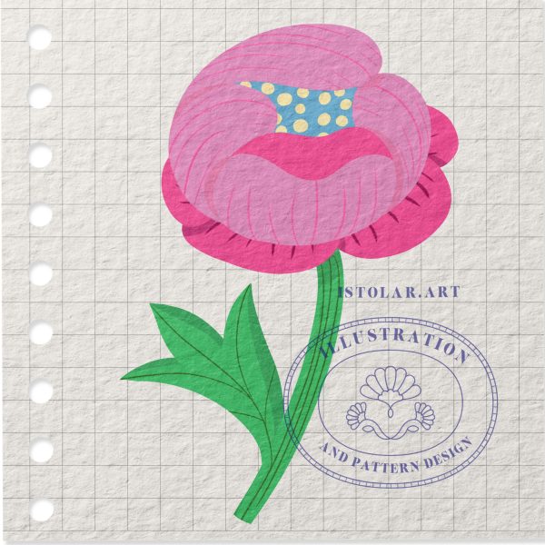
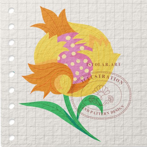
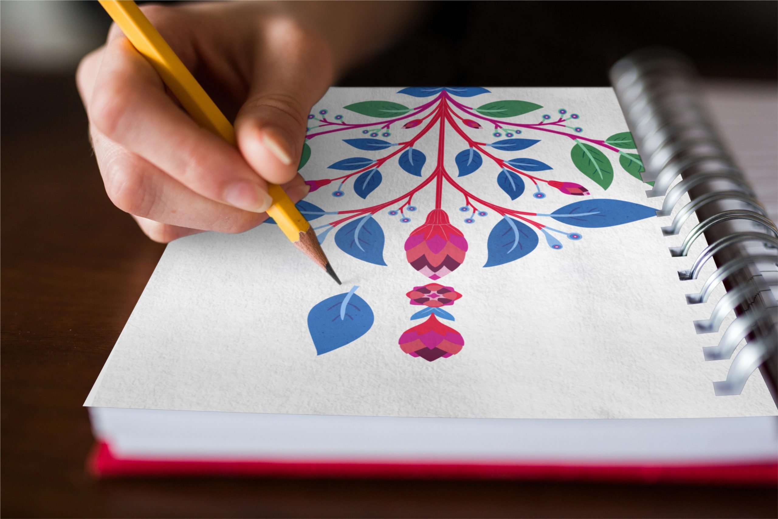
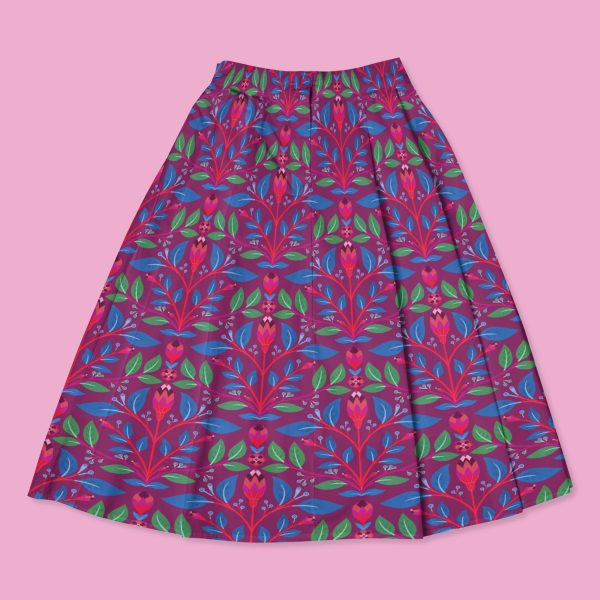
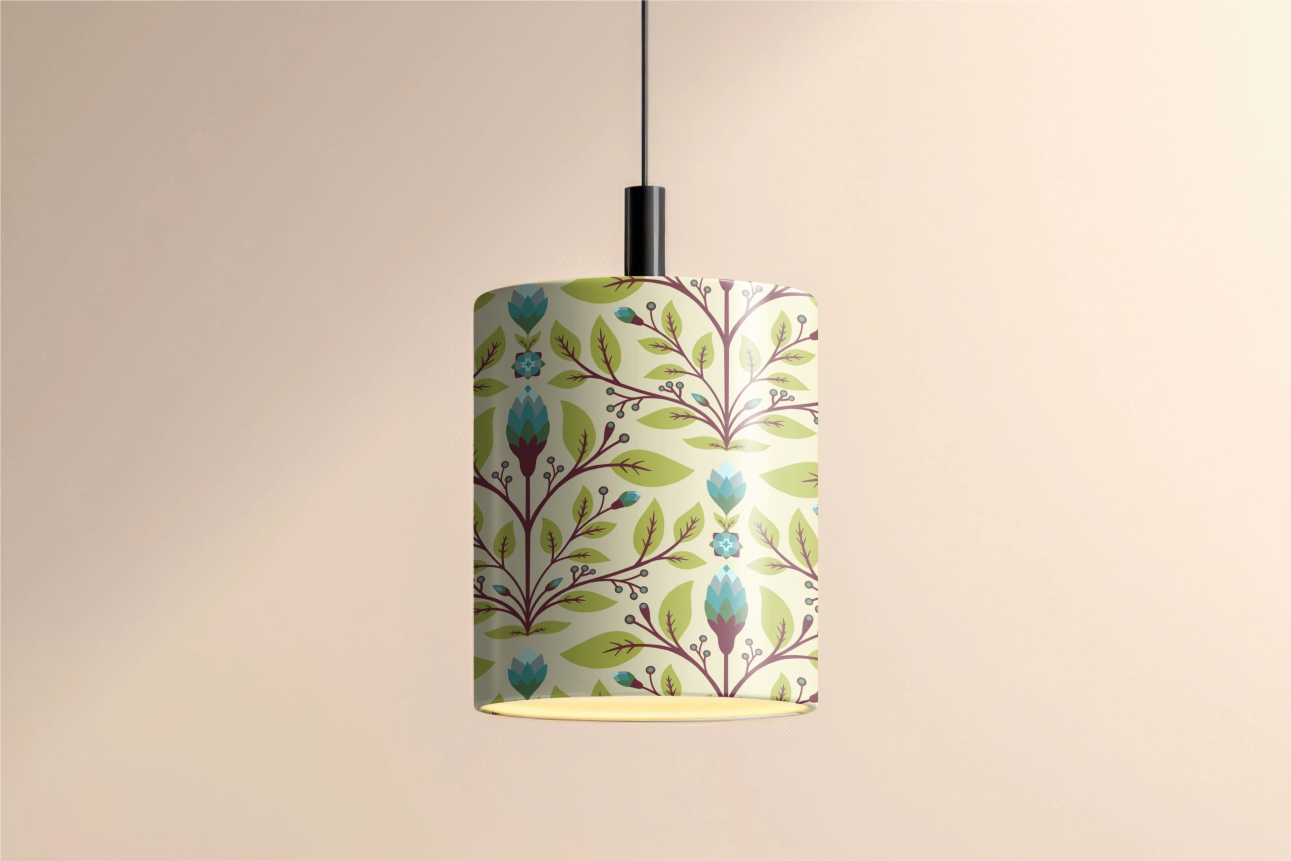
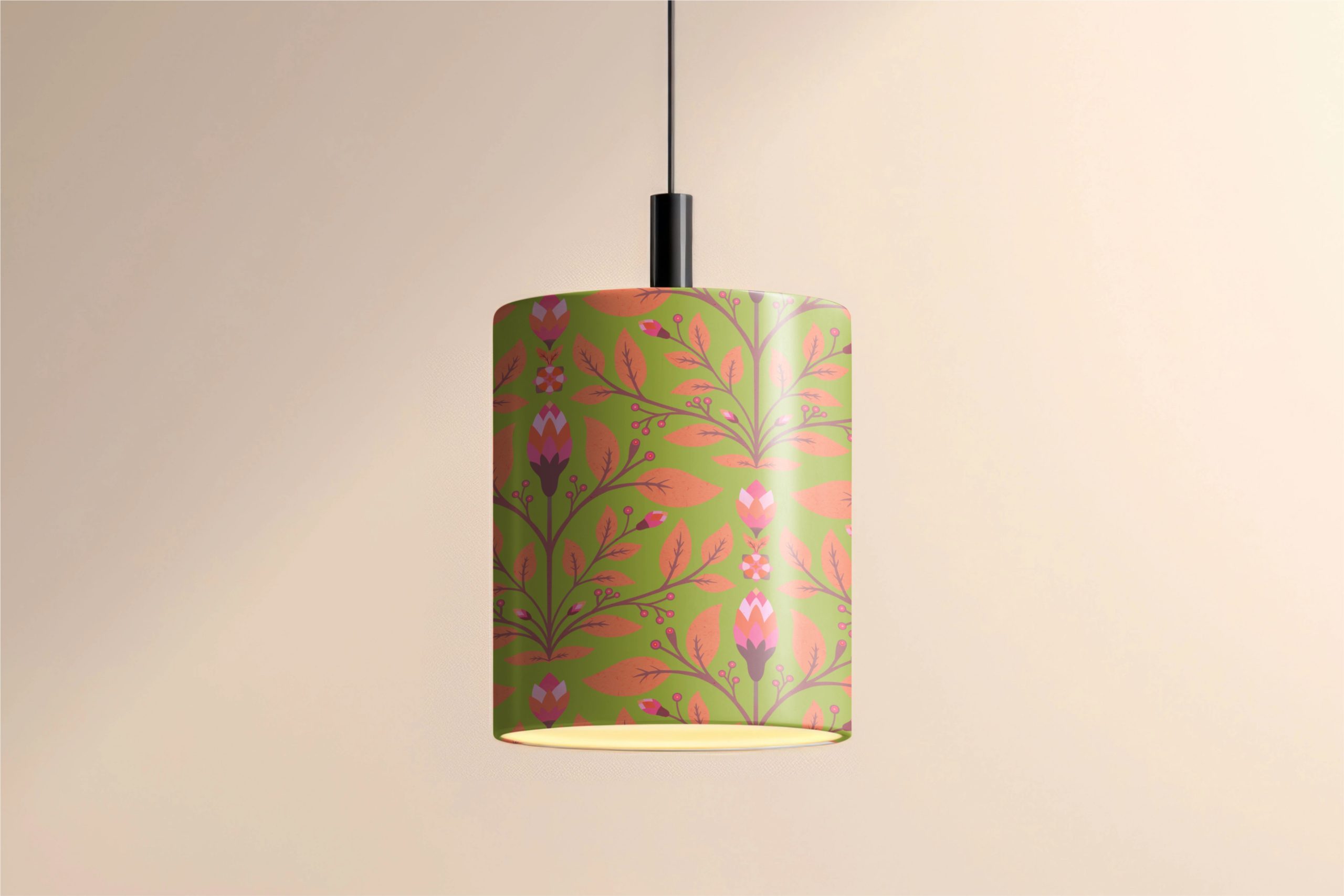
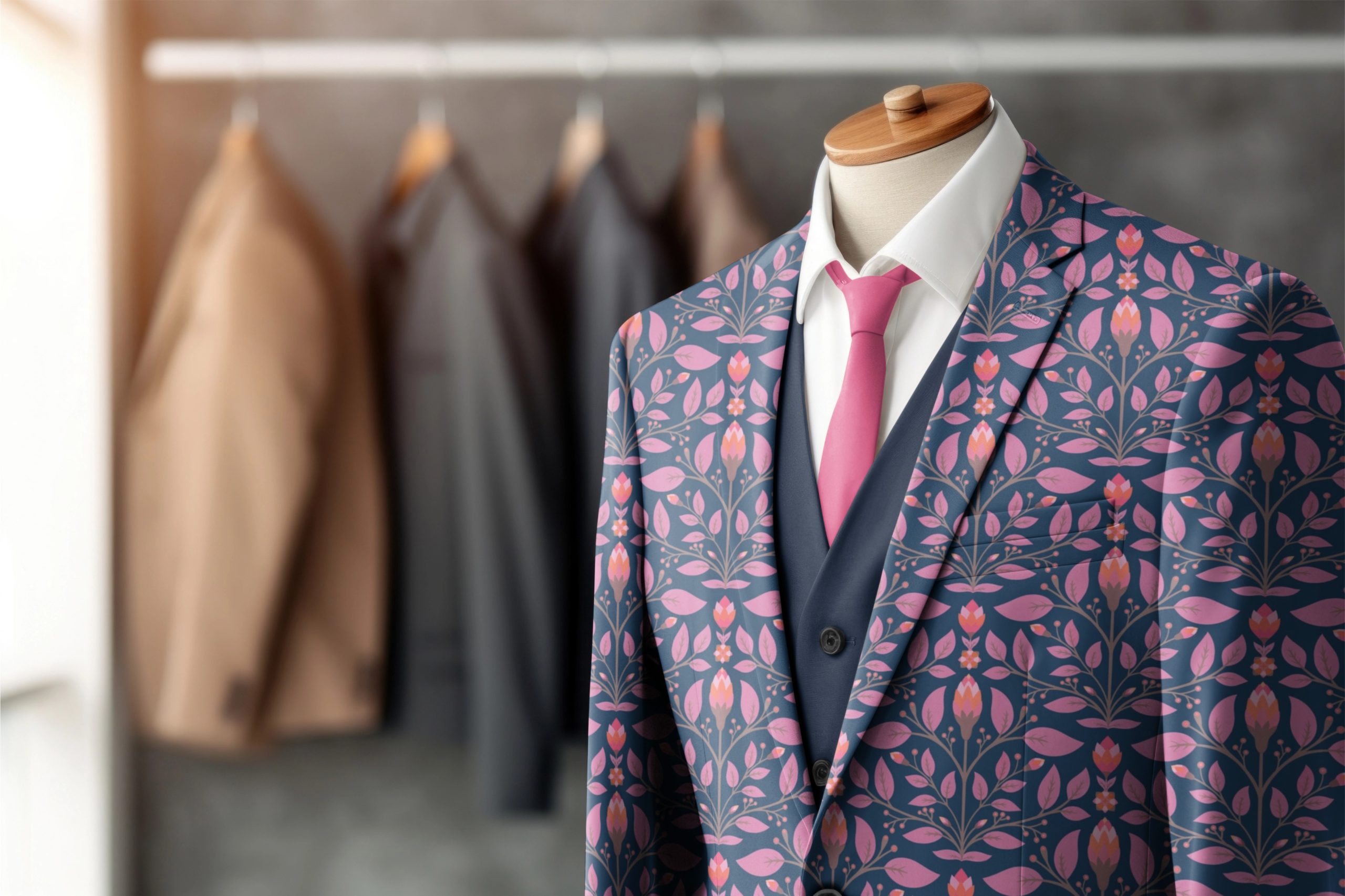
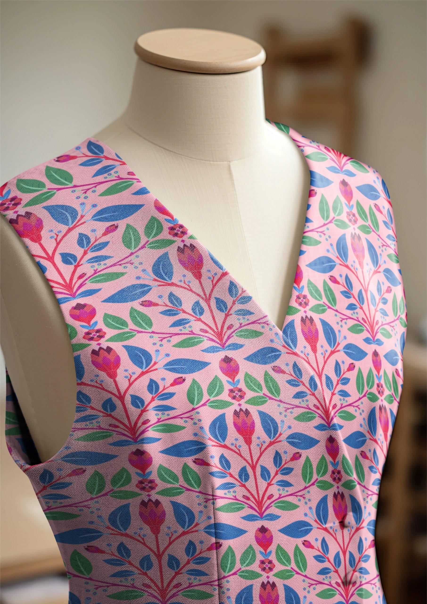
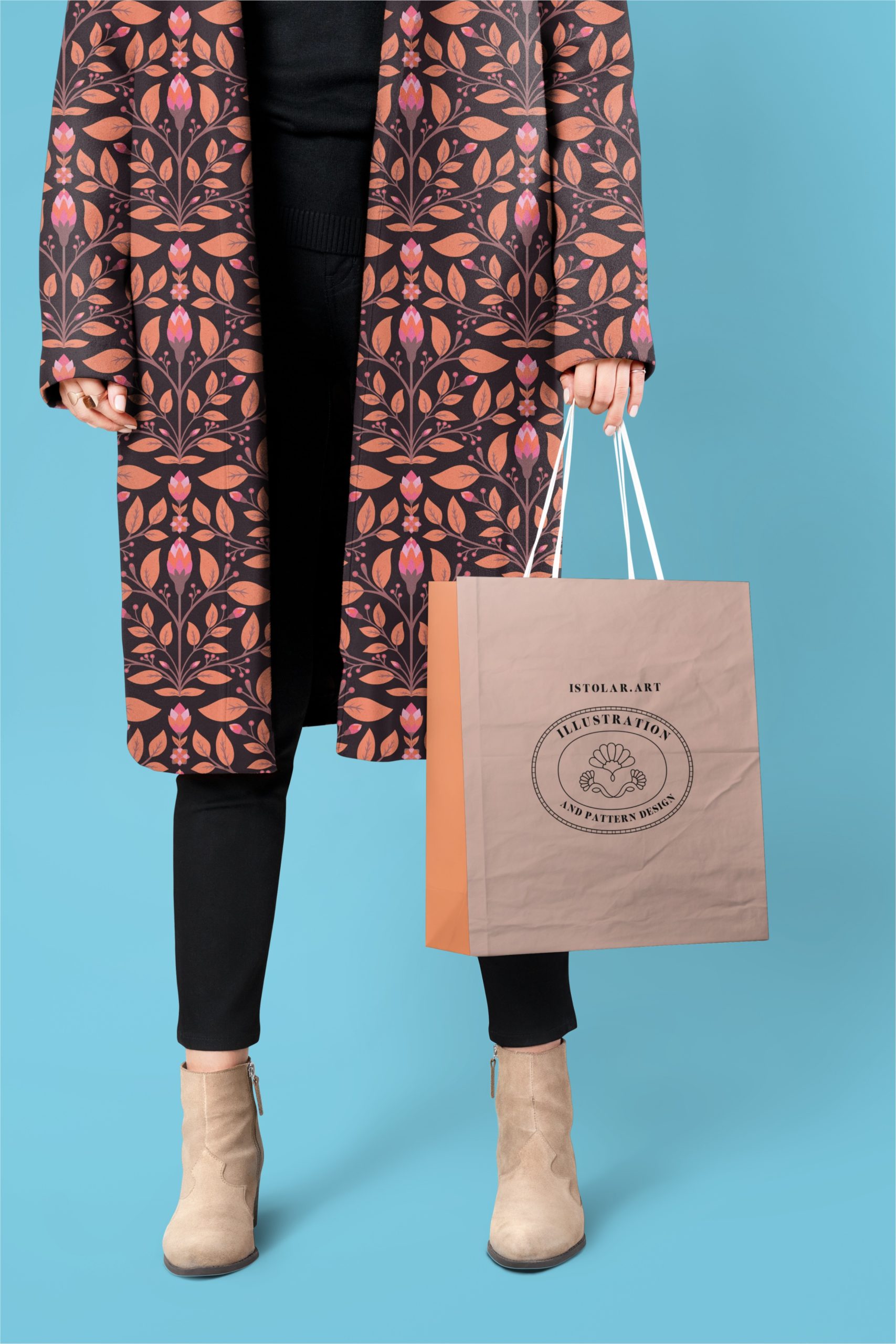
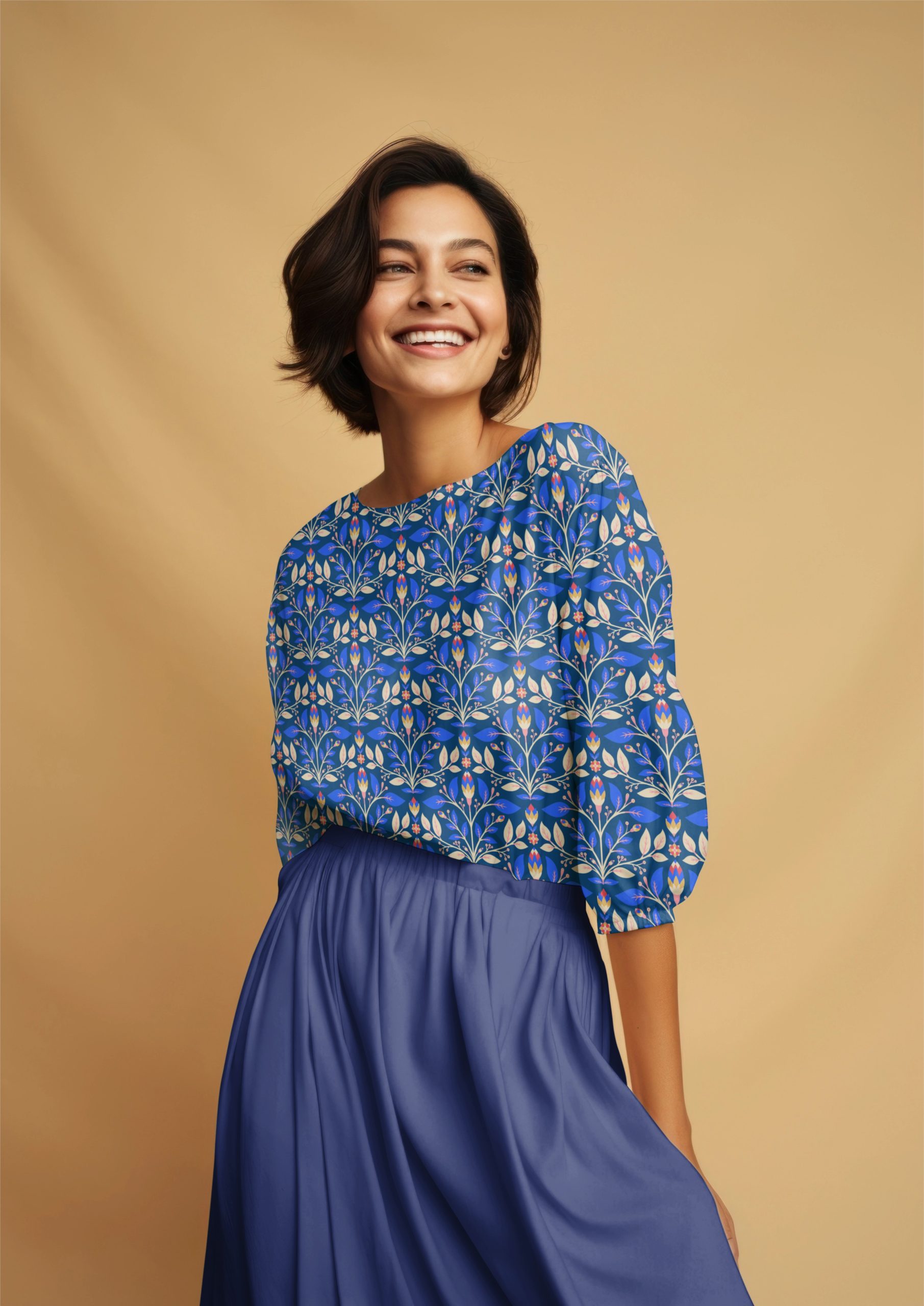
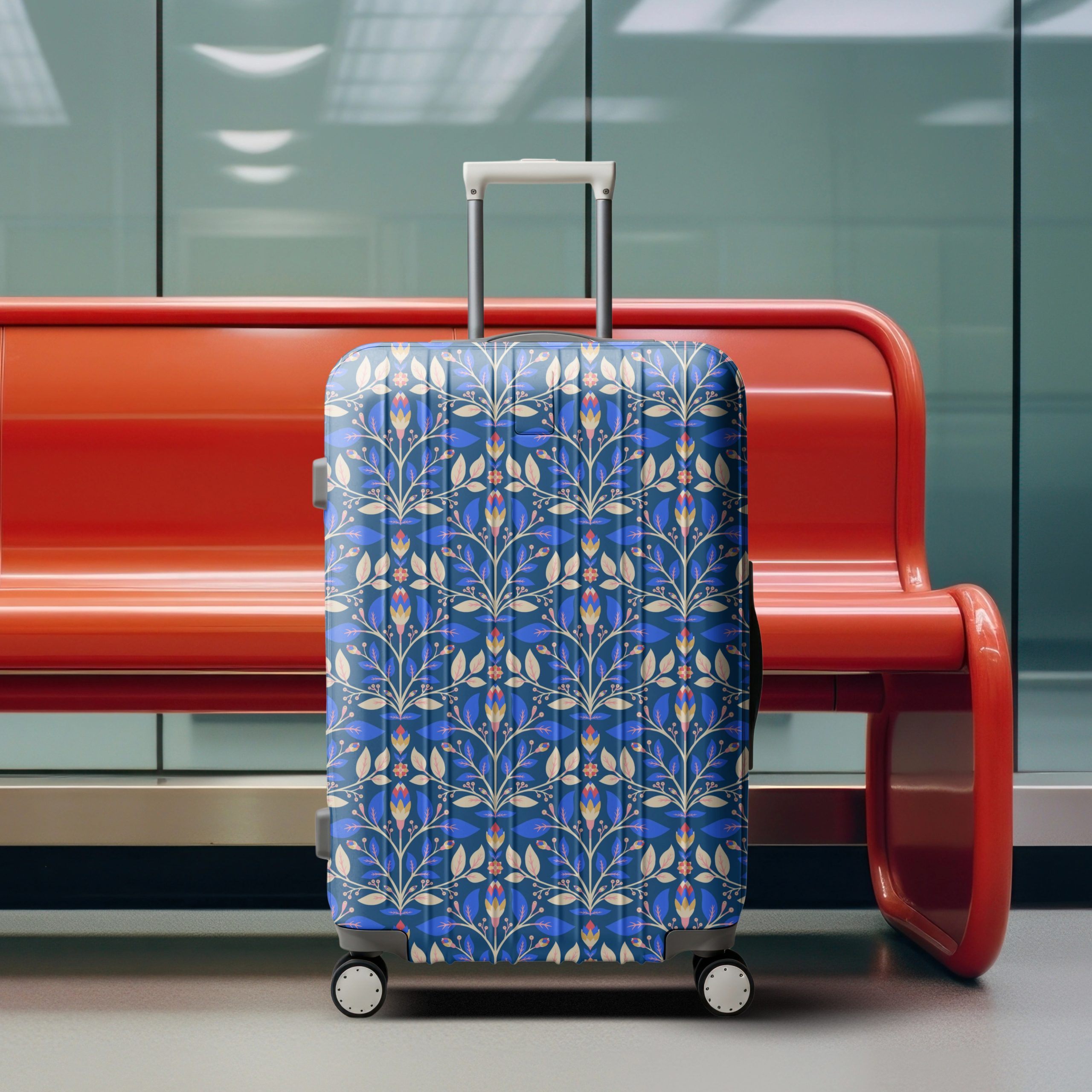
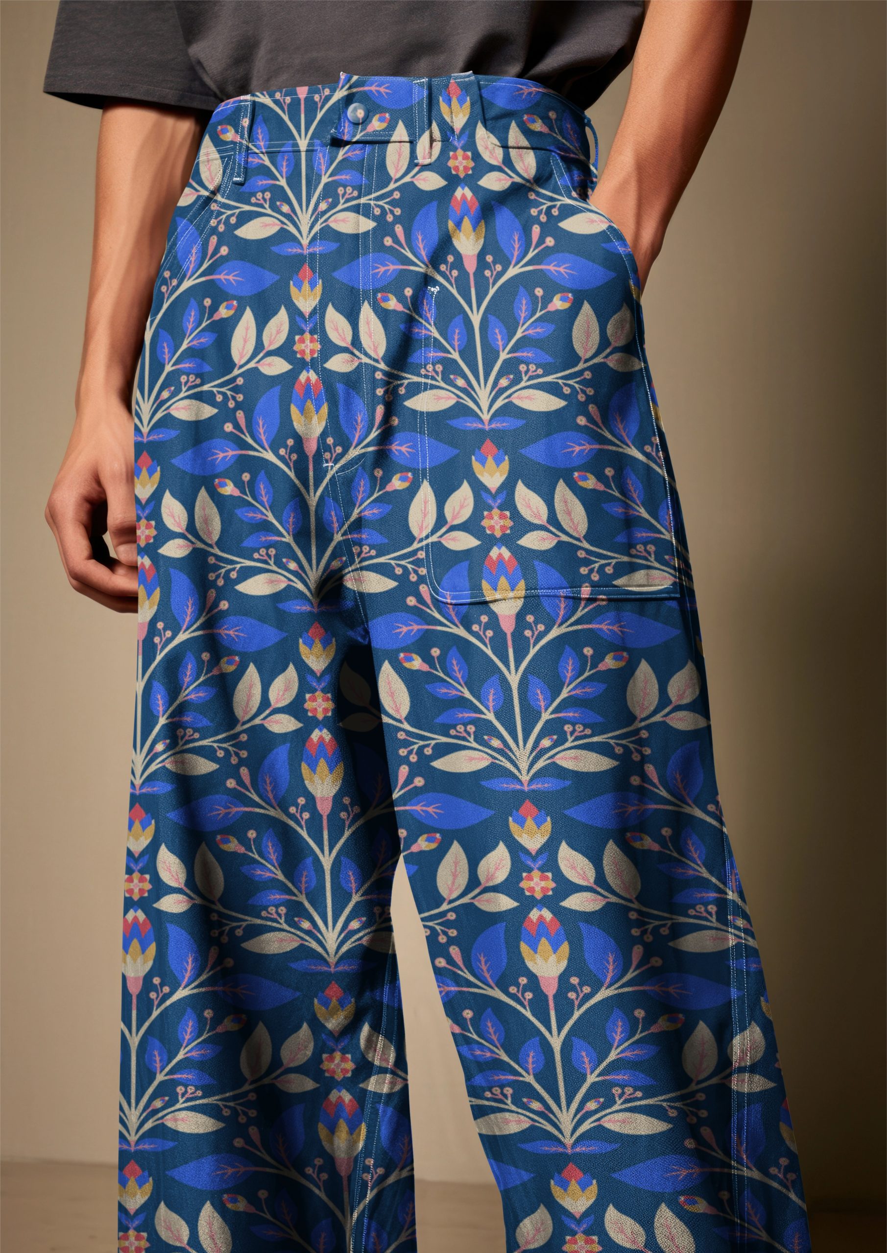
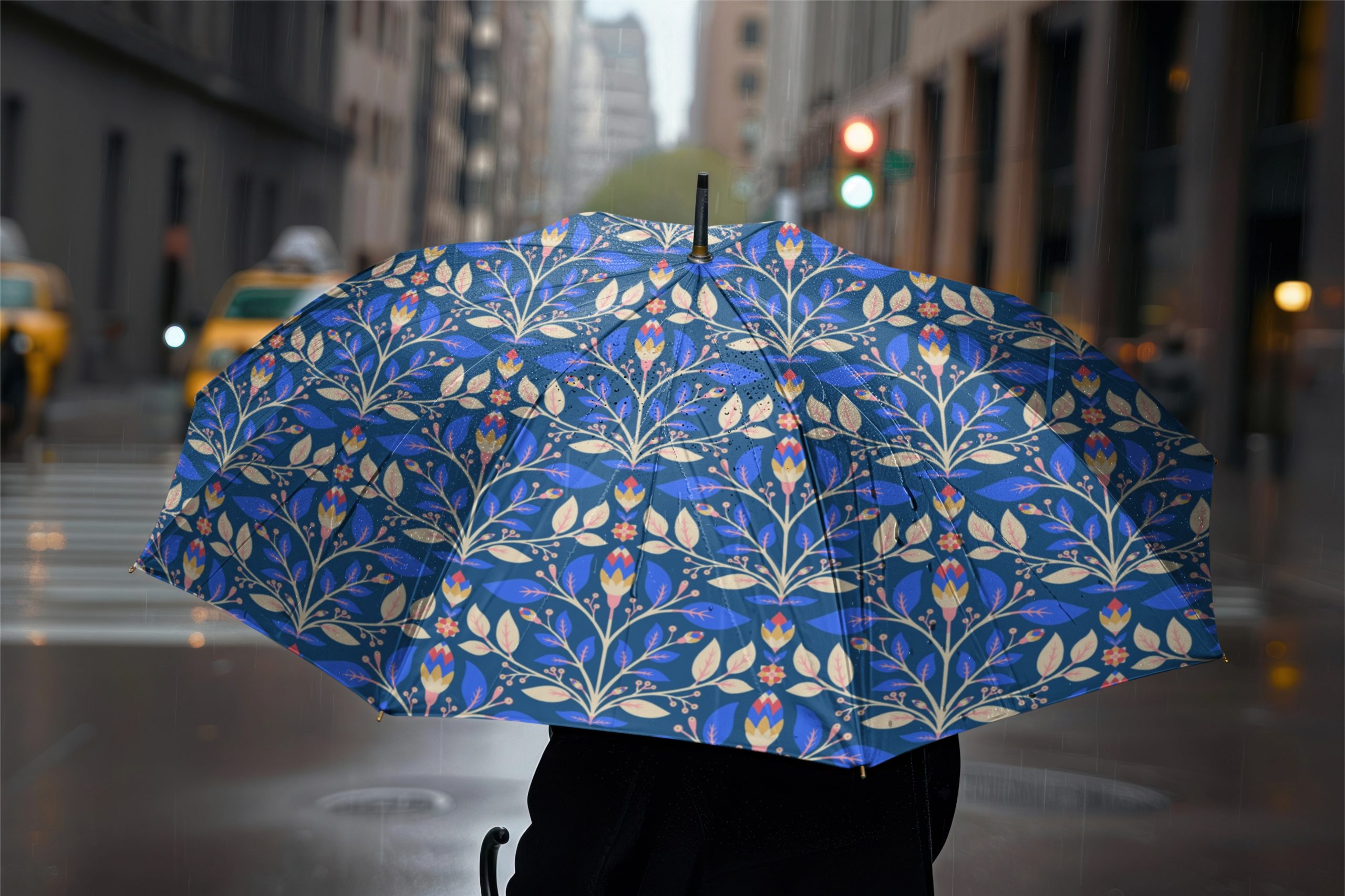
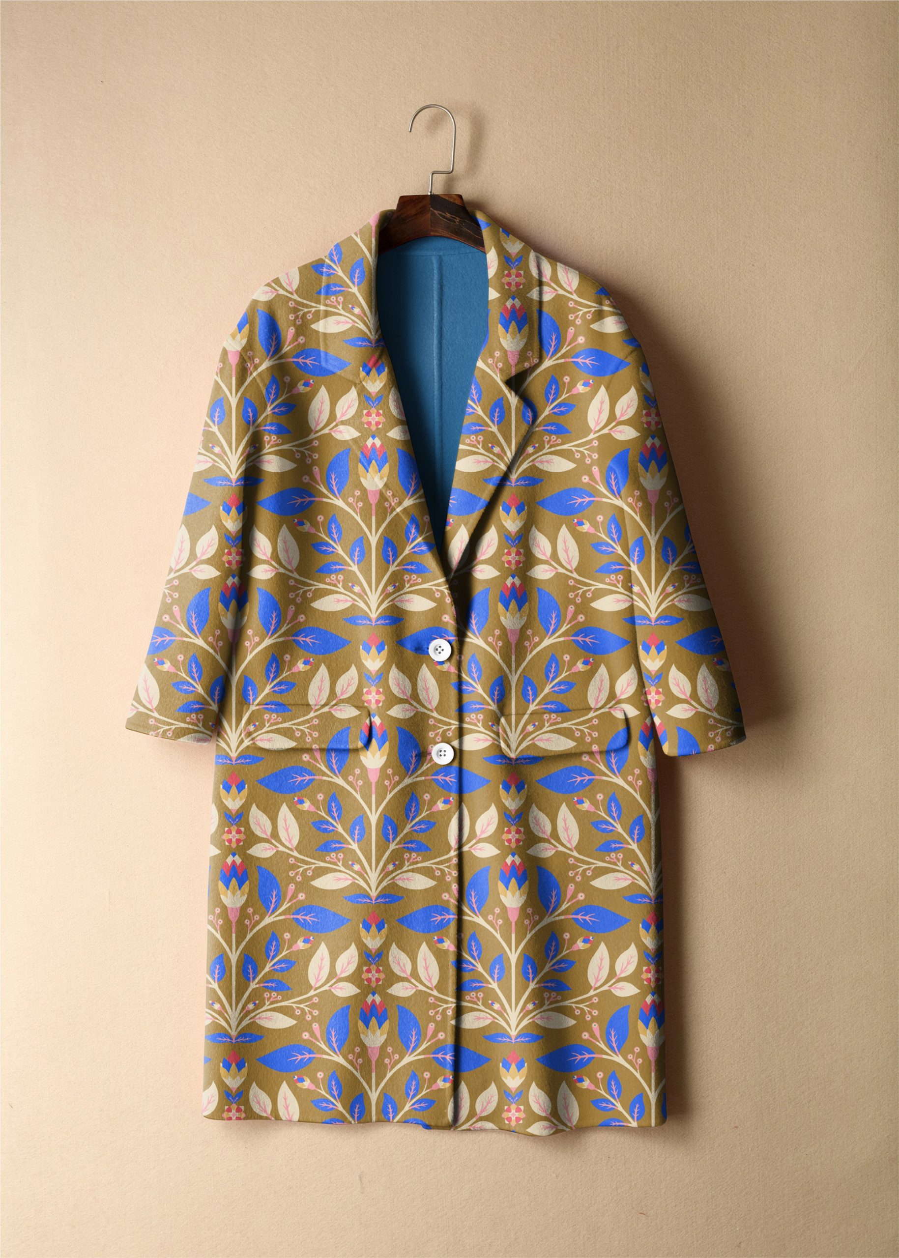
I created stamps (as a procreate brush) and used them to build a minimalist kind of scandinavian vibe (as i imagine it) patterns. using stamps & Simple paper cut shapes … with a simple repeat it create the magic as well as sophisticated ones.
It was quite relaxing to work with that material over the Christmas vacation, to focuses on simplicity, functionality with a connection to nature, a distinctive emphasis on clean lines, minimalism, and lightness… stylise rather than overly detail elements.
Usually I indulge myself onto the interacted Morris realm. it was different 🙂
I soon will be be ready to present my patterns to fabric and interior decor industry. the truth is that i am a both scared and excited to jump in.
I first wanted to wait until I have various smalls coordinated collections to propose. So far, my patterns are individuals colors editable items (I hope they all have a family connection but there were not actually built as collections).
I cant wait to design some proper collections (coming soon)… How exciting!
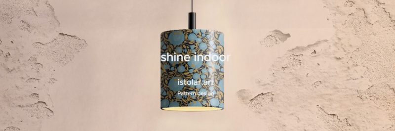
Meanwhile, I try to make presentations such as these lampshades video to help people imagine how they could use my designs on their products. 🙂
“No pattern should be without some sort of meaning”- William Morris
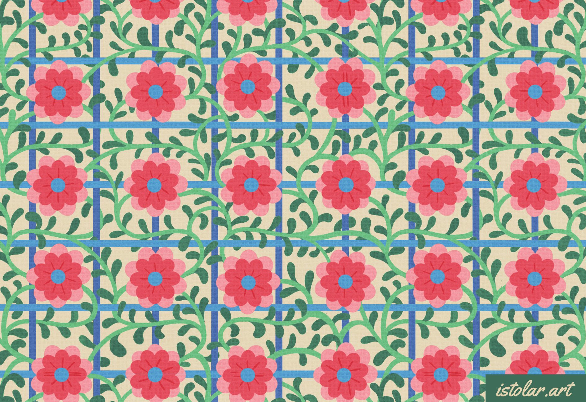
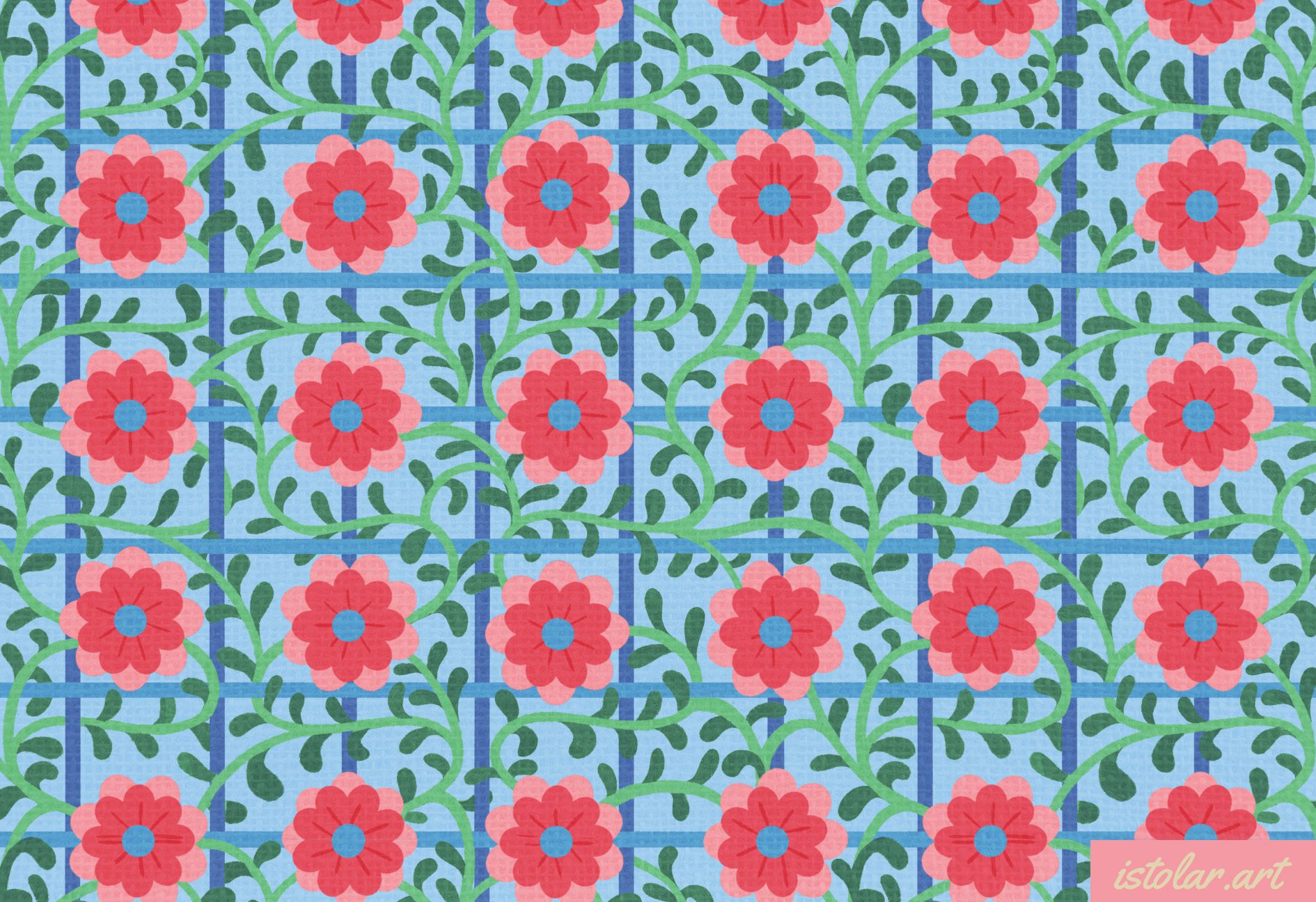
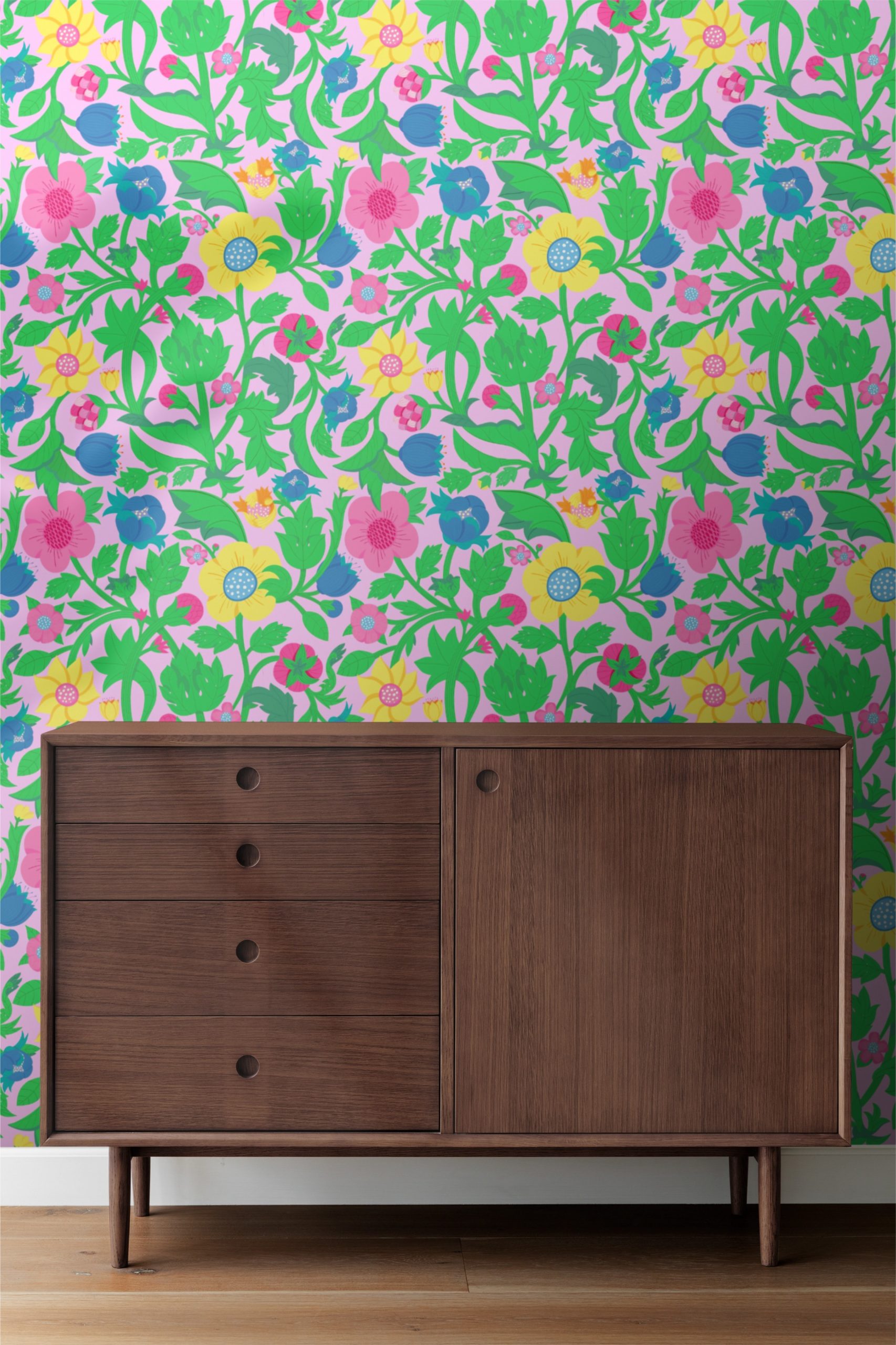
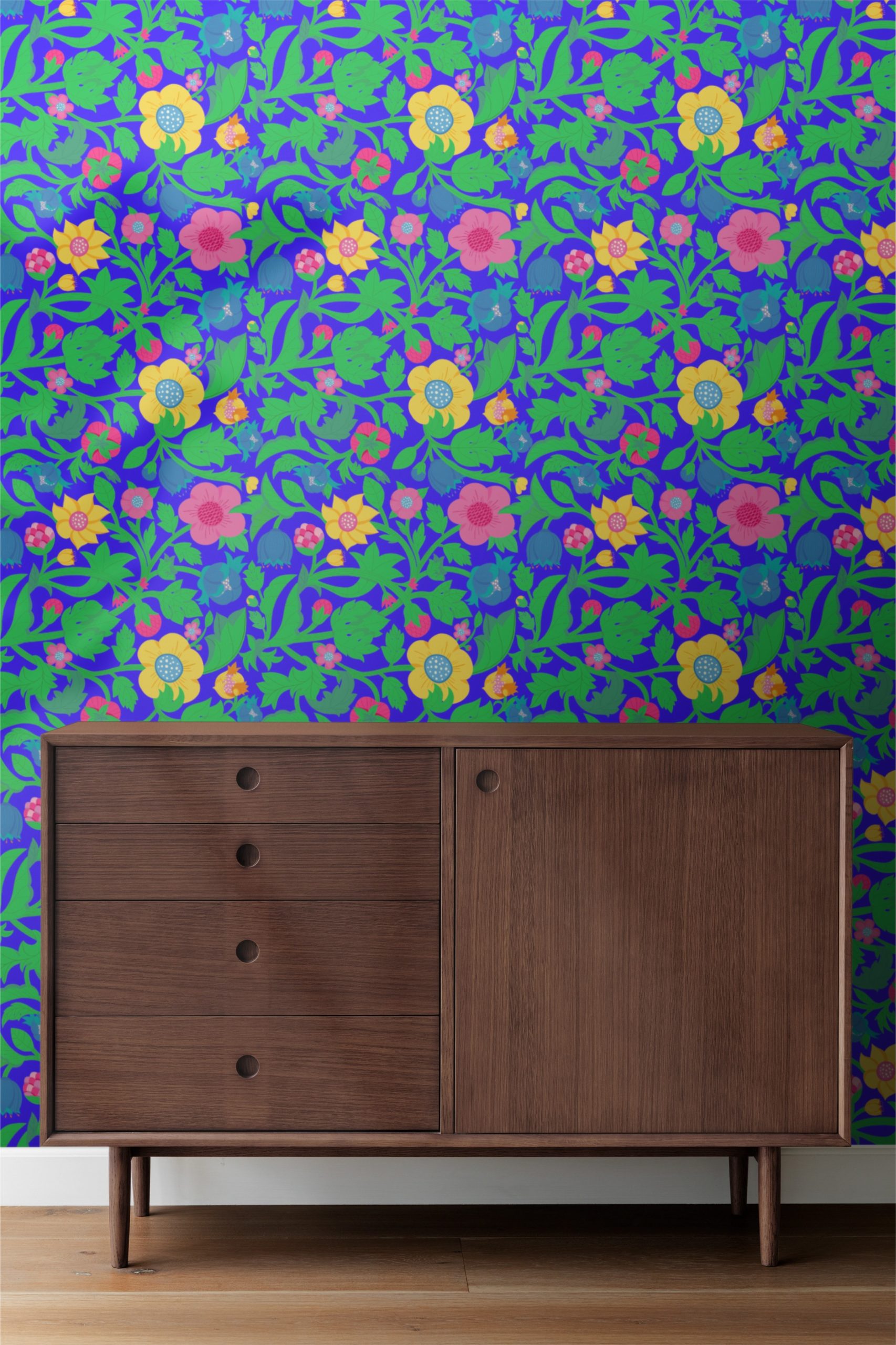
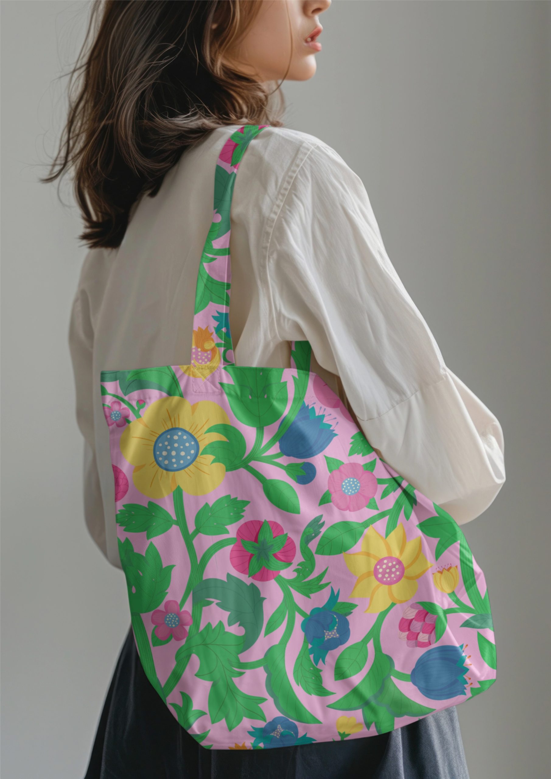
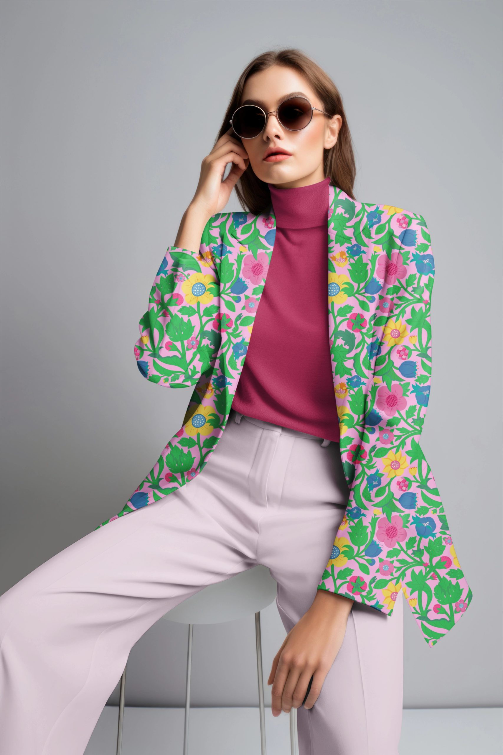
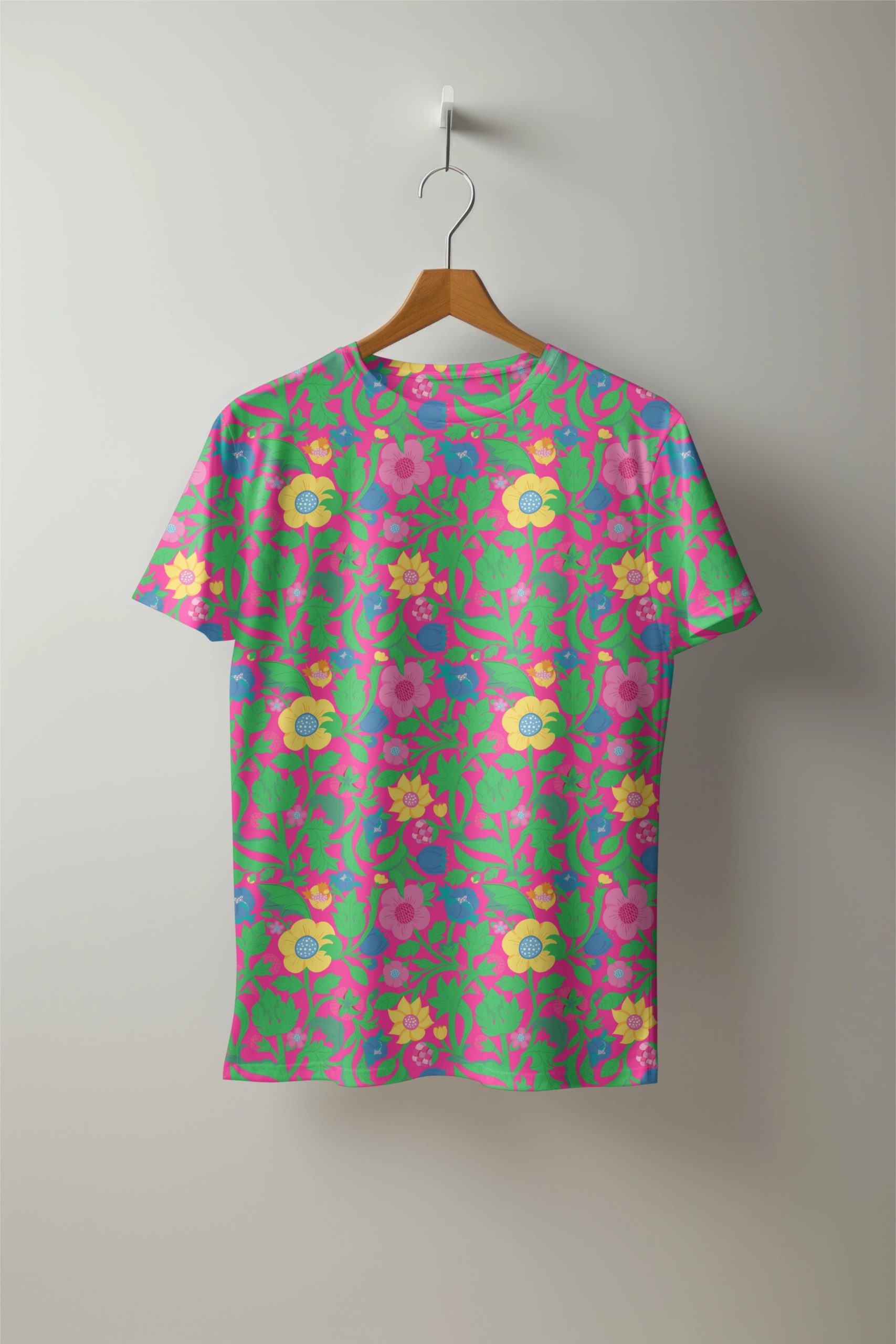
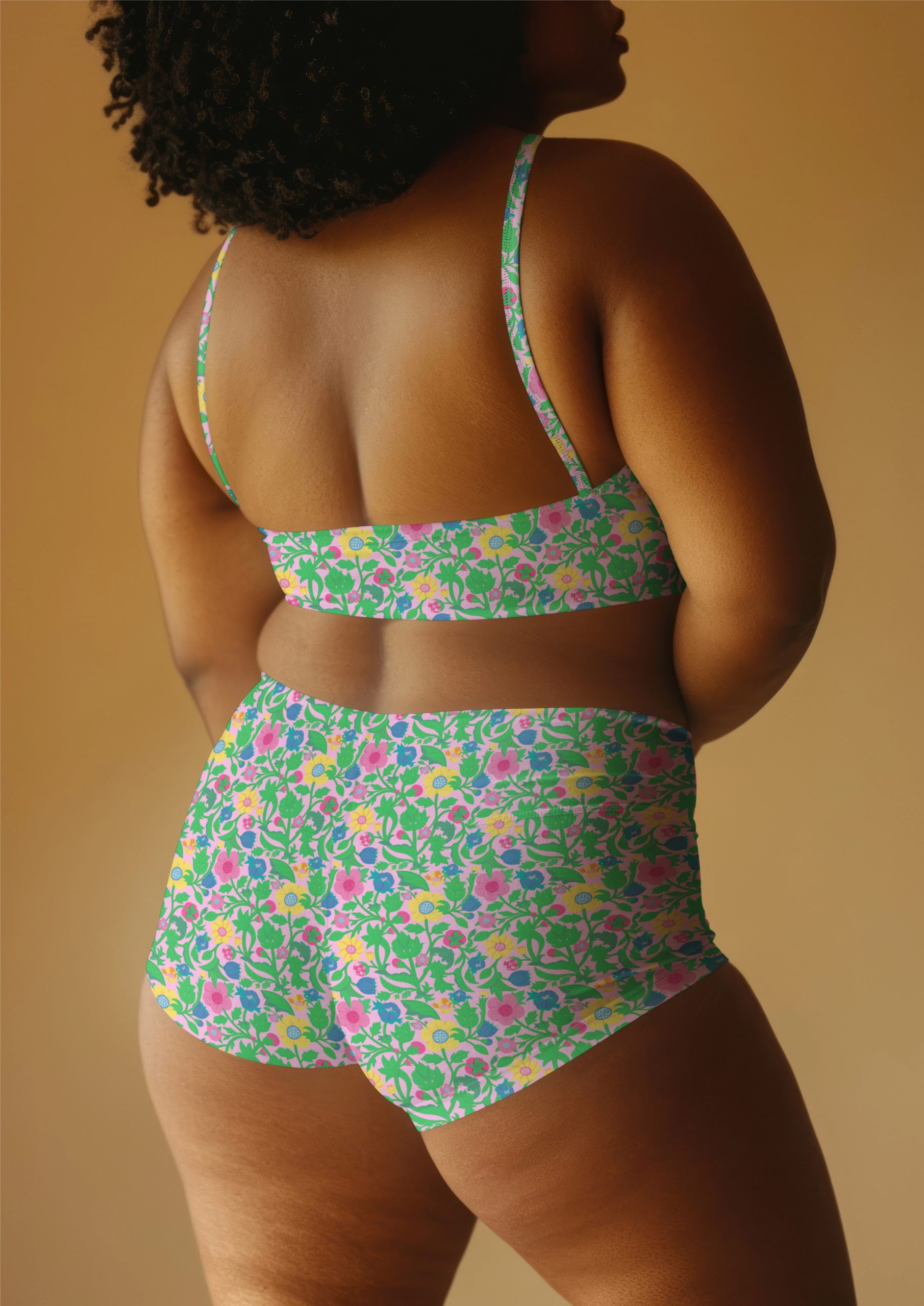
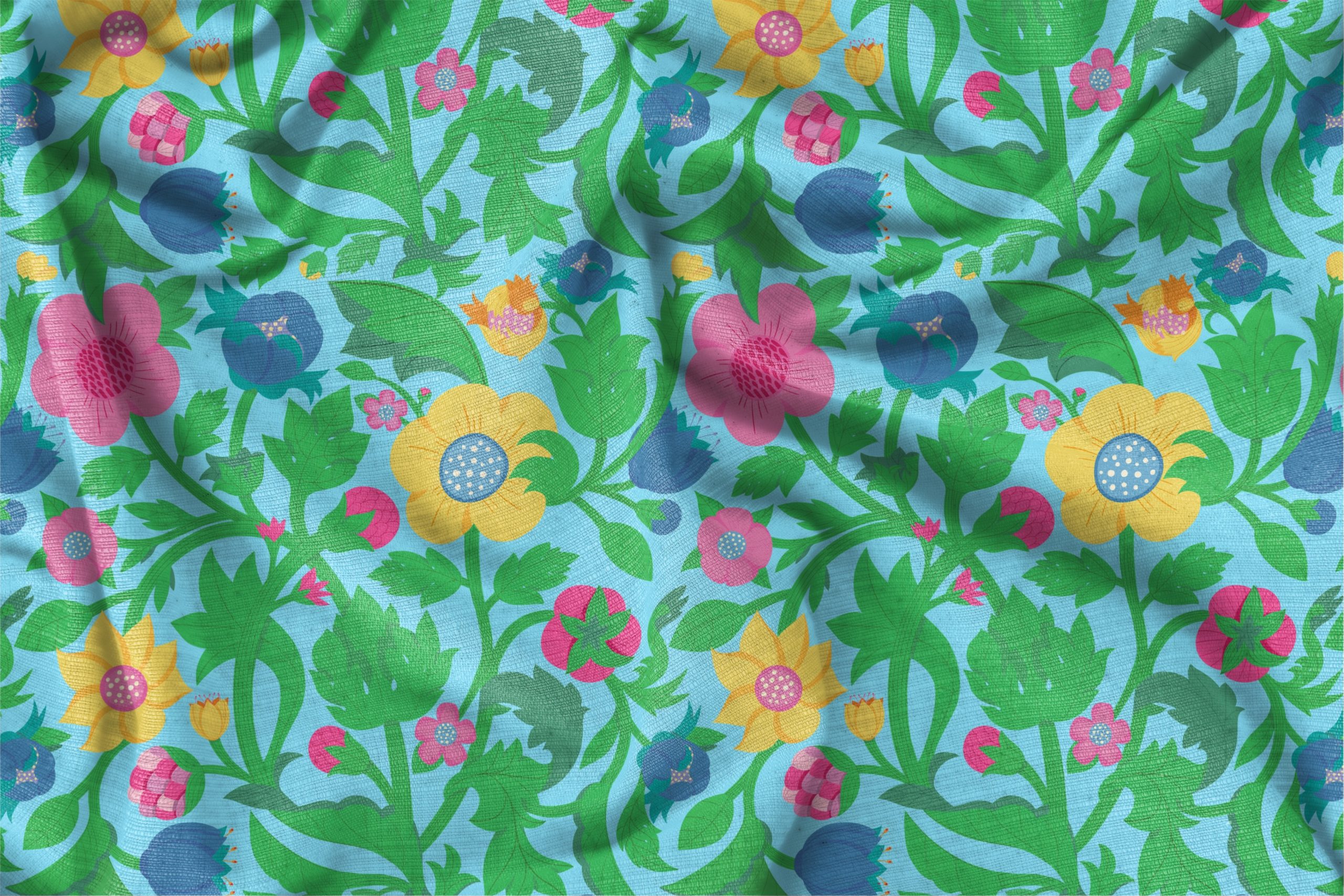
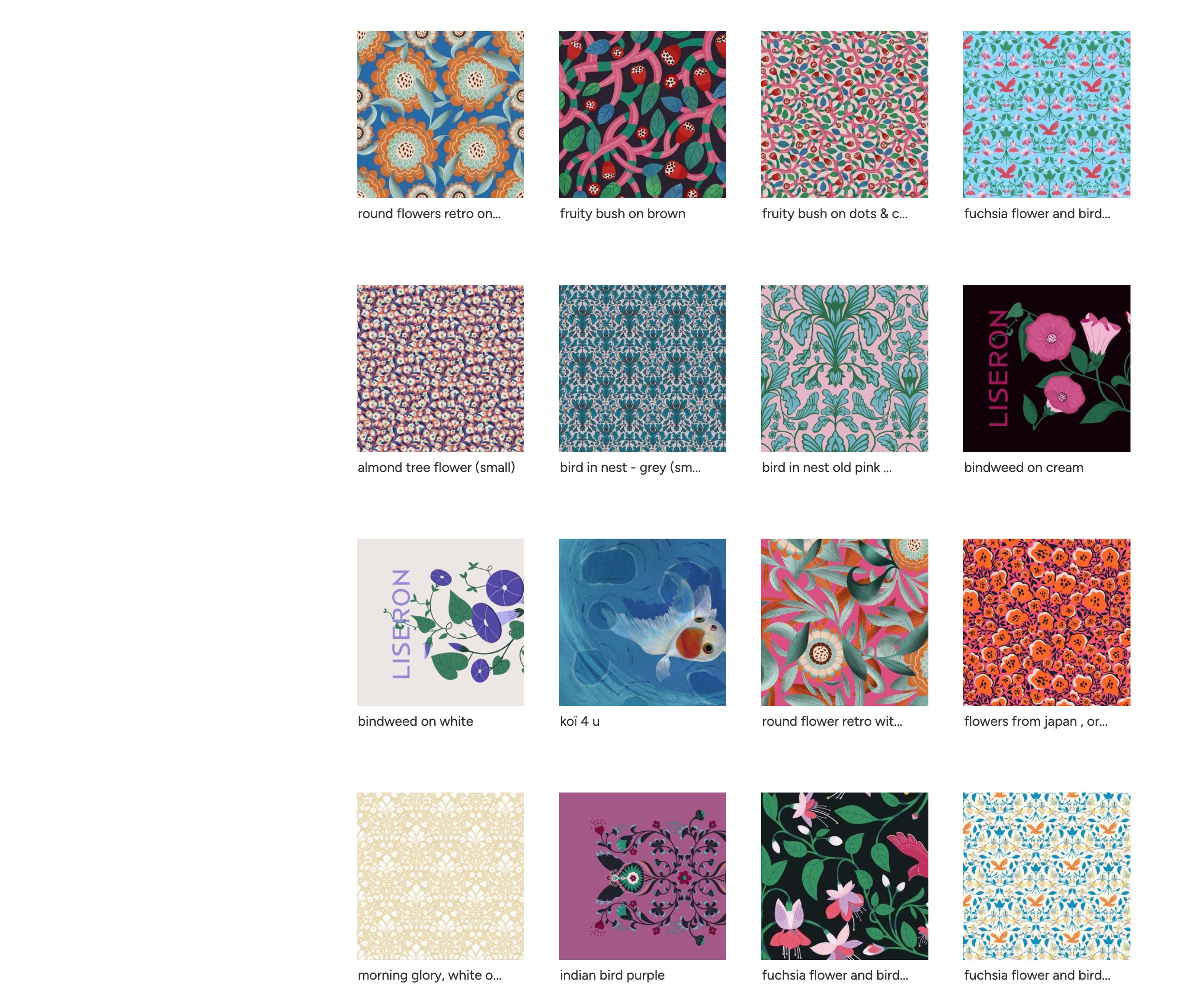
Immerse your space in an exuberant Garden of Eden with this dense, folkloric botanical pattern
He designs weaves together a tapestry of sunny yellows, punchy pinks, and deep blue blossoms in a seamless, all-over repeat.
Perfectly suited for transformative wallpaper installations or statement upholstery, this pattern offers a rhythmic, continuous flow that brings organic warmth and graphic clarity to any professional interior or textile project.
Set against a refreshing sky-blue ground, the palette is a vibrant mix of lime and emerald greens, punchy pinks, sunny yellows, and cornflower blues. This high-contrast scheme gives the pattern a cheerful, energetic, and garden-fresh mood.
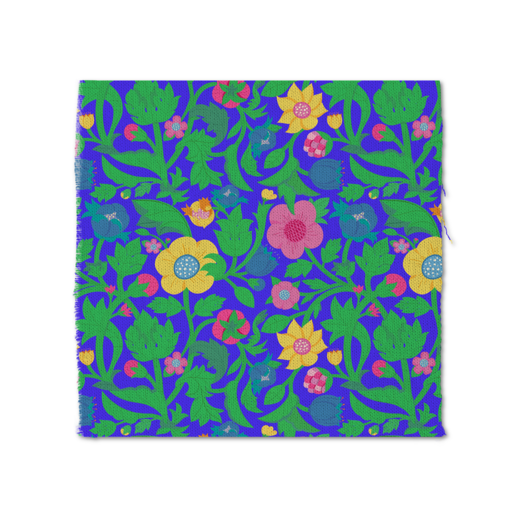
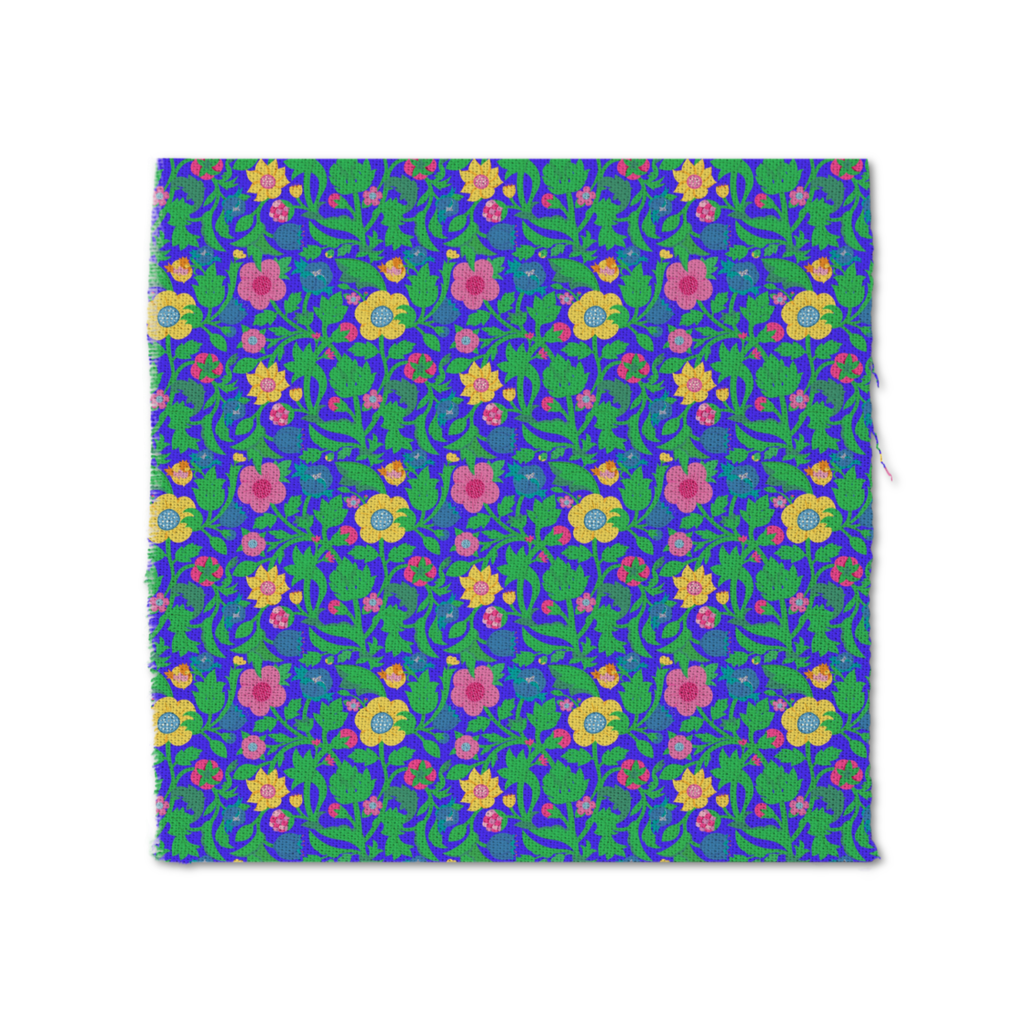
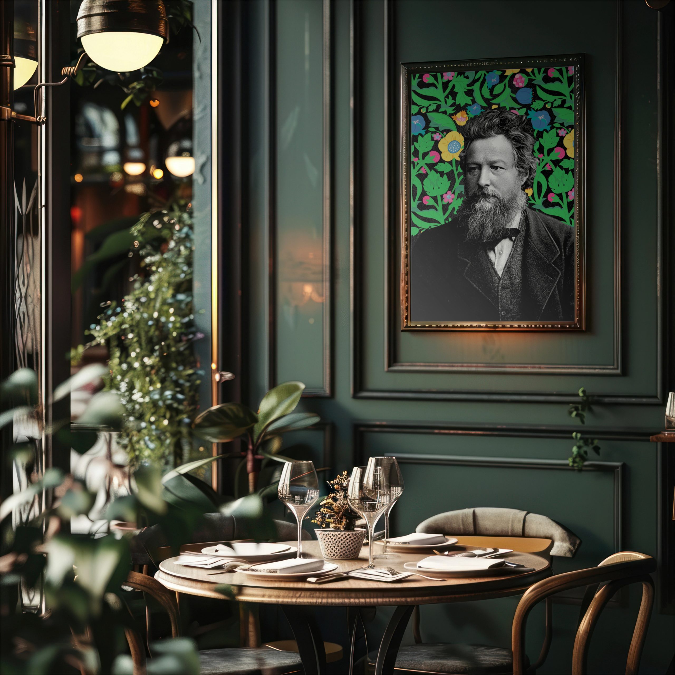
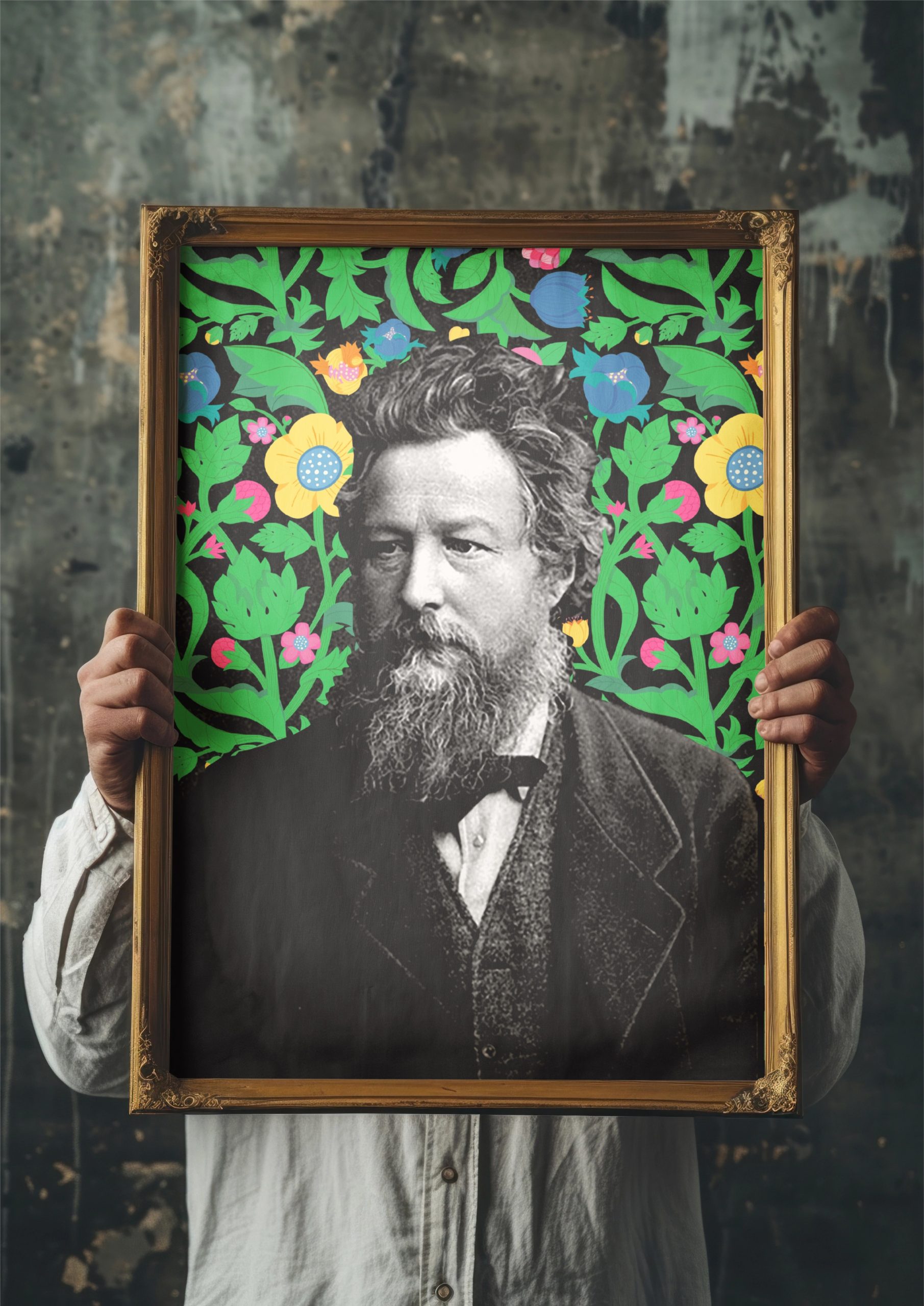
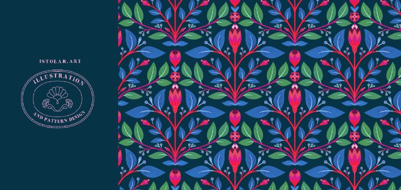
Set against an inky midnight ground, this dense botanical repeat blooms into a fully immersive decorative field
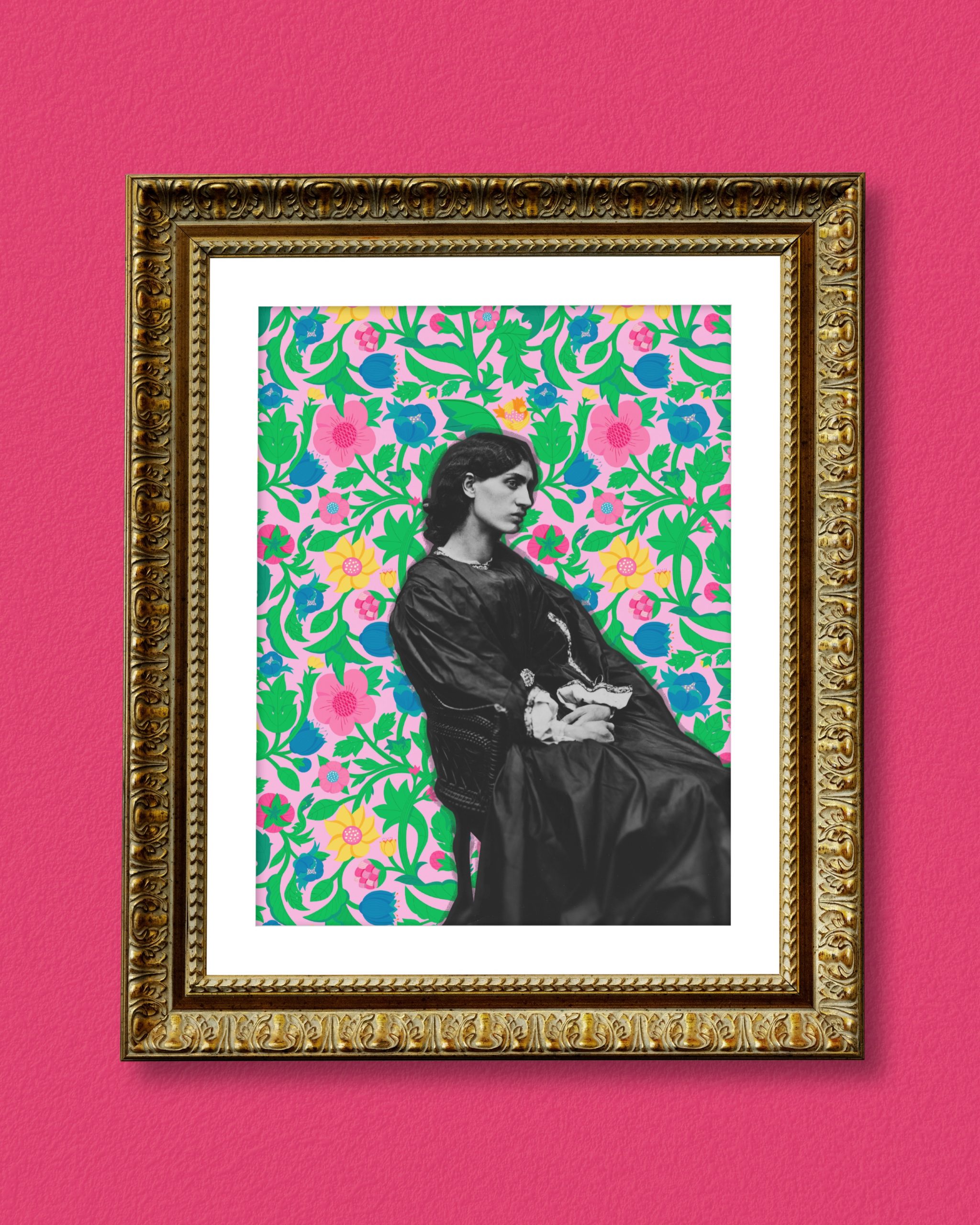
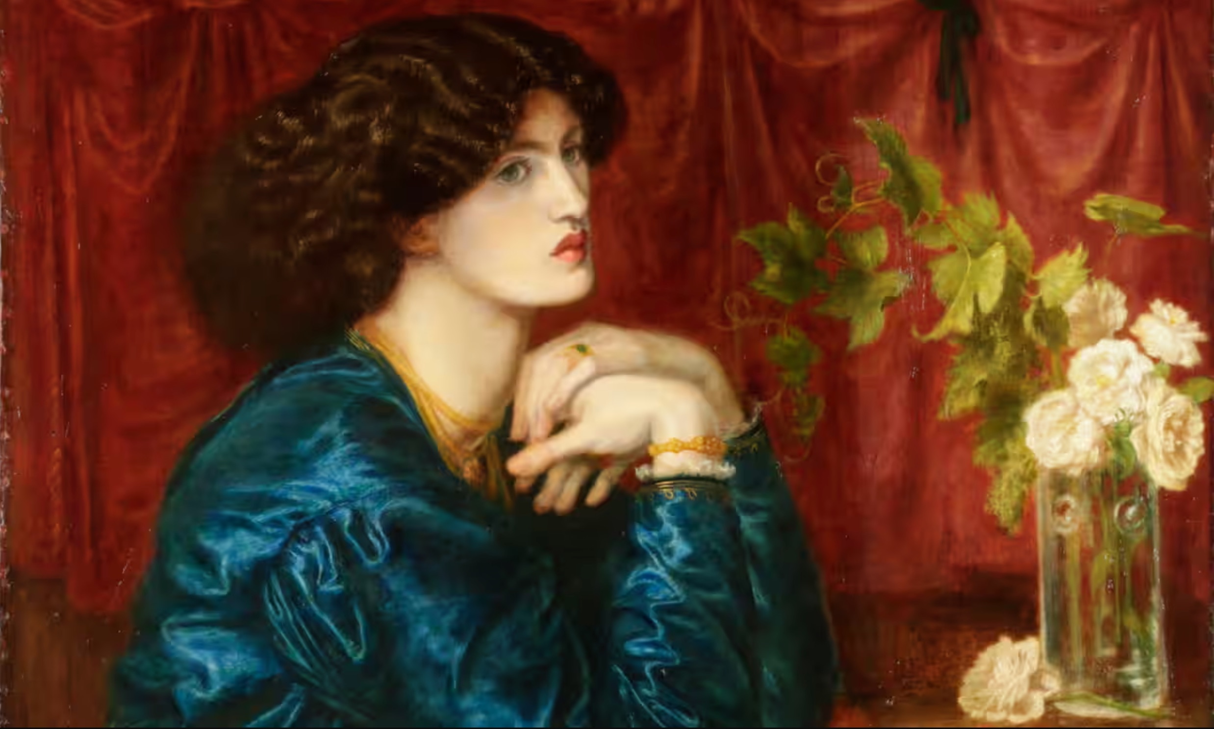
Jane Morris (The Blue Silk Dress) – a painting by Dante Gabriel Rossetti of his lover. Illustration: Dante Gabriel Rossetti
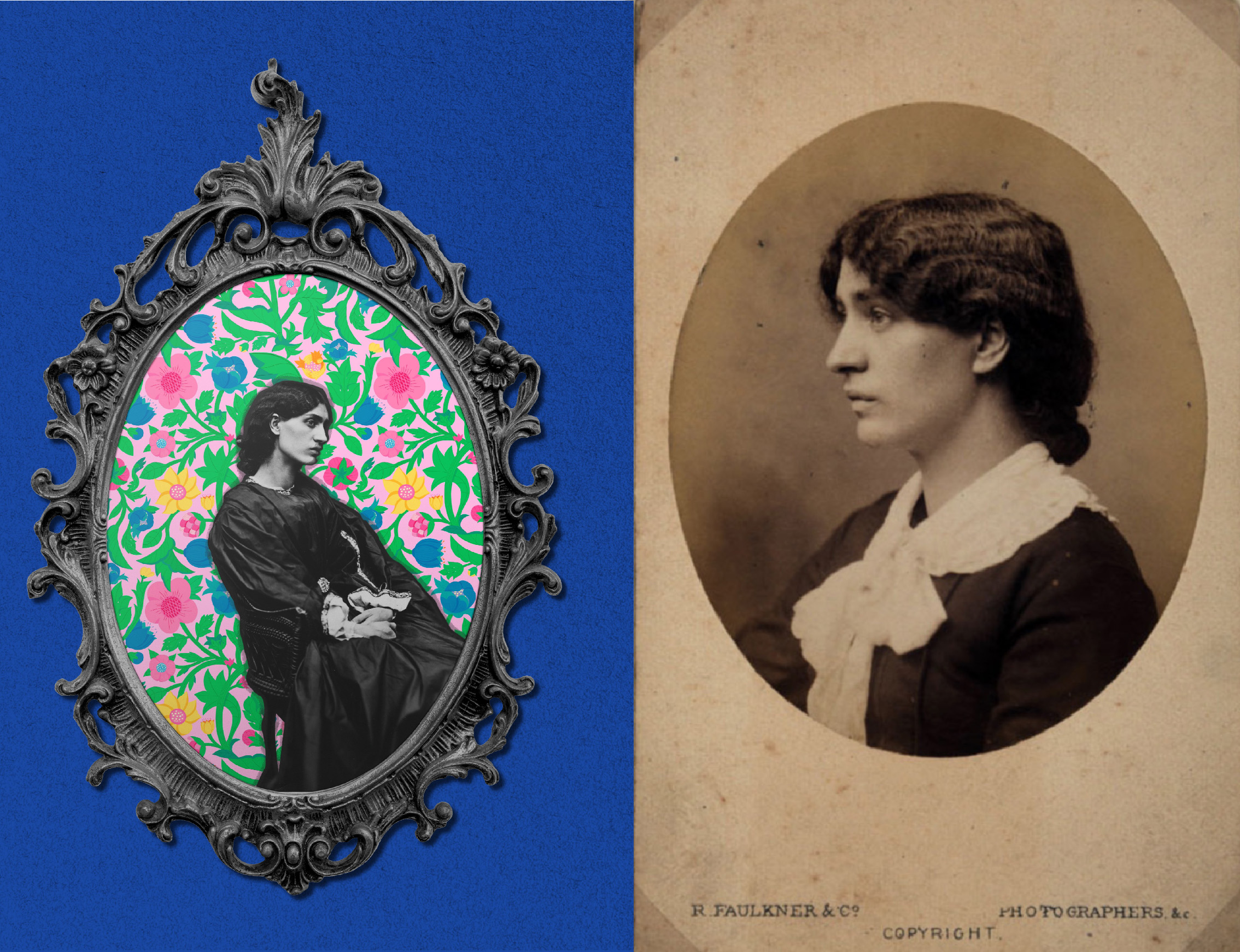
Jane Morris, pre-Raphaelite face of the Morris company brand, was essential to the creation and success of her husband’s decorative arts firm, Morris & Co
” One of the first decorations that William Morris made was a daisy-patterned wall hanging for Red House, which has since cemented his reputation as a design pioneer. “Jane later tells her daughter May, in a letter, that she chose the fabrics for that. And she and Morris sat down together, worked out what pattern was possible and then they stitched it together ” the guardian
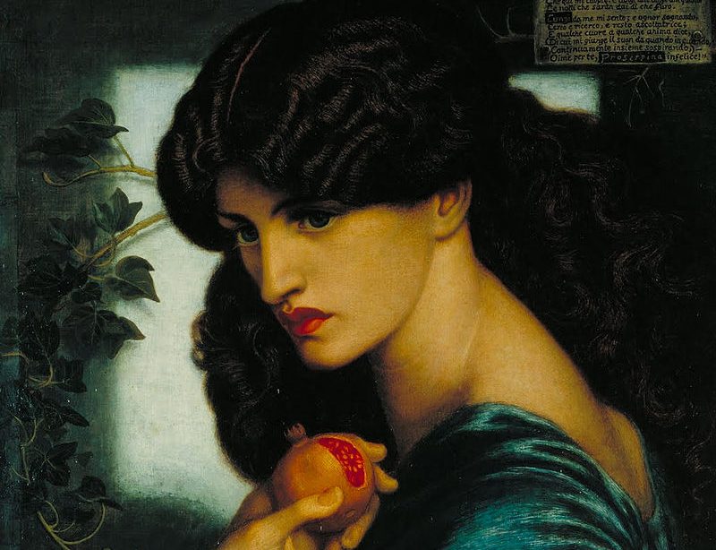
Jane became Rossetti’s model and muse, featuring in hundreds of his pictures, defining the Pre-Raphaelite ‘look’. He challenged Victorian conceptions of ideal femininity by formulating an unconventional, ‘aesthetic’ type of beauty characterized by a:
-columnar neck – thick waves of hair – well-defined brows – large expressive eyes- sensuous and long finger – massive limbs and large throat – exaggerated lips and eyes counterbalanced by a sense of remoteness
Did Jane Morris’s and Dante Gabriel Rossetti’s affair have an influence on the Arts and Crafts Movement?
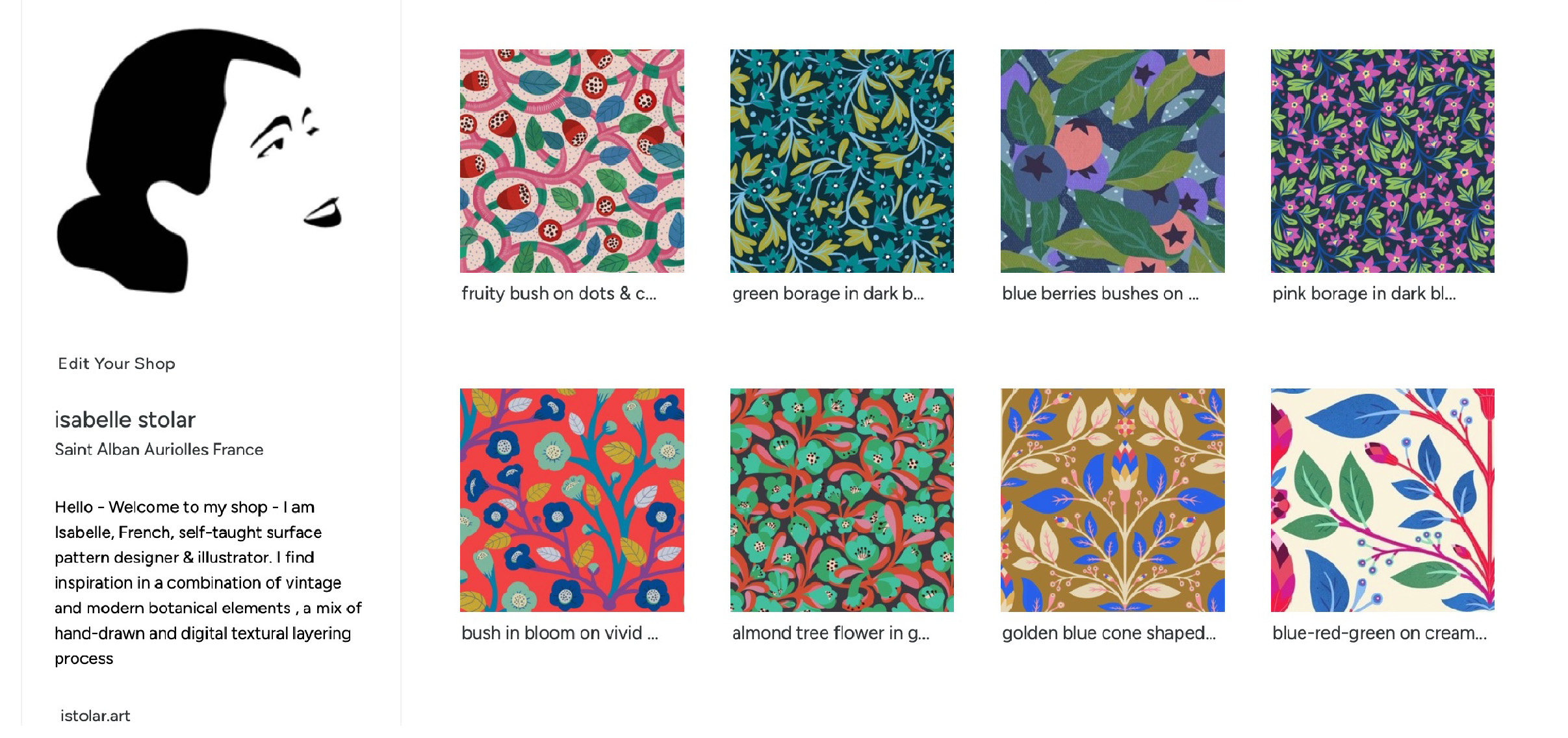
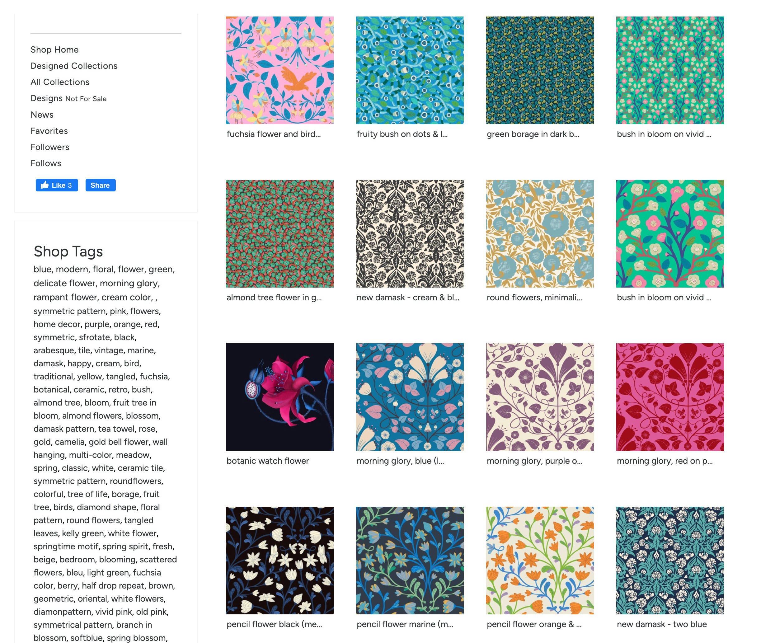
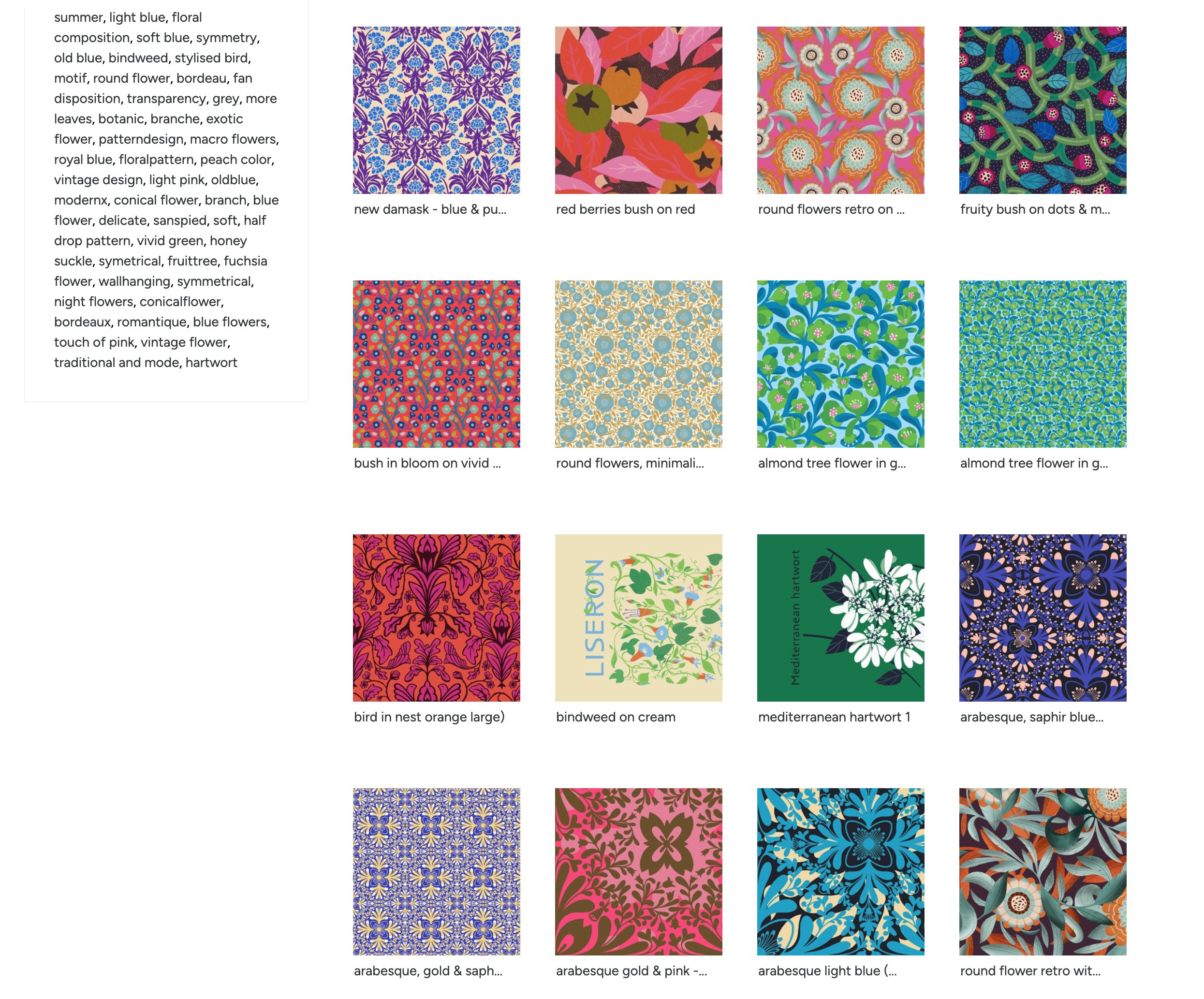
This summer I put together this spoon flower boutique.
I am very pleased because I ordered samples. The fabric range is large and beautiful and the prints iS of very high quality, I will show you on this blog soon 🙂
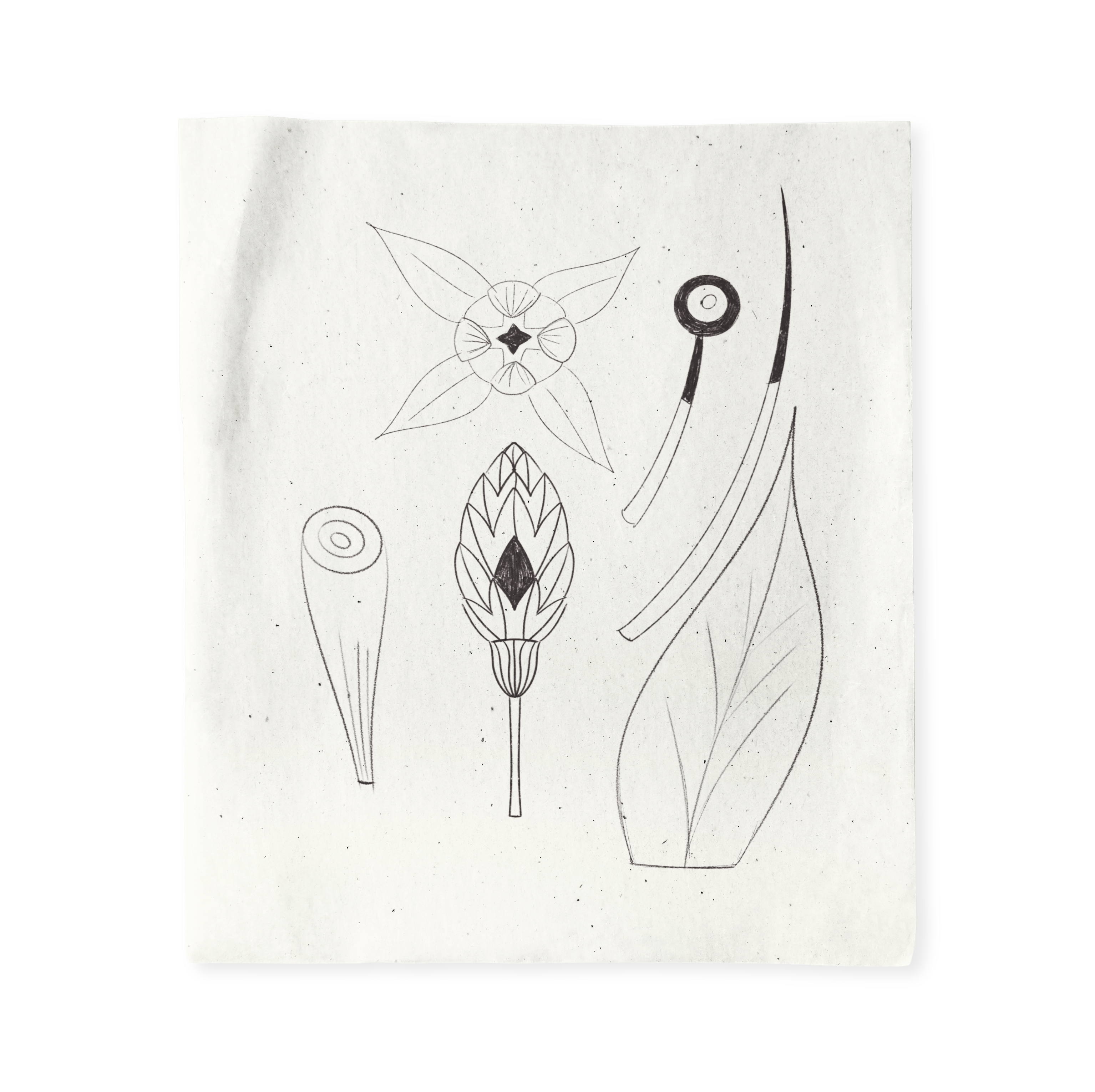
Cone-shaped flowers blooms that narrow evenly from the bottom to the apex of the flower to form a cone-shaped appearance .Many perennials develop cone-shaped blossoms during the spring and summer months. Typically, these flowers die out in the winter months and then come back to life in spring.
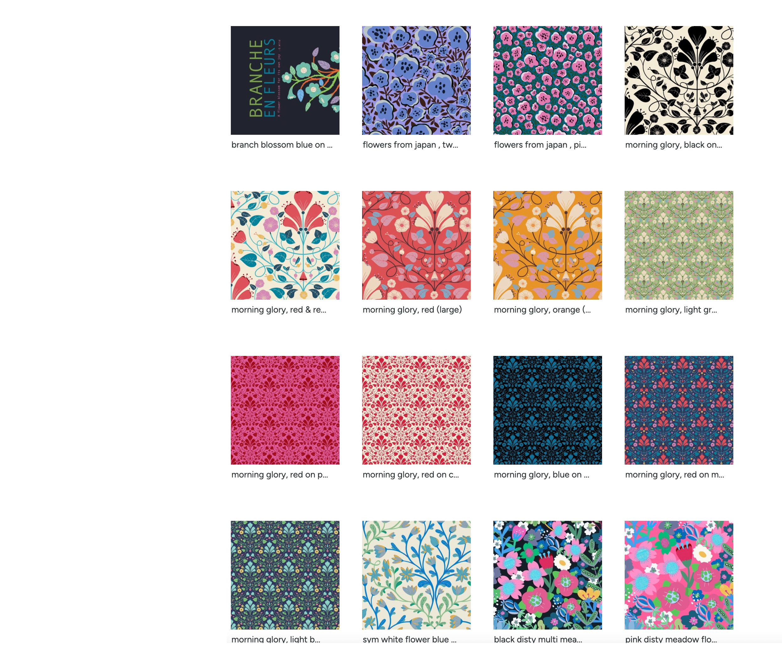
Embrace this intricately layered folk botanical pattern and elevate your space with this intricate botanical trellis, showcasing a rhythmic arrangement of stylized cone flowers and interlocking diamond motifs. Influenced by traditional folk art but rendered with sharp, graphic clarity,
The mirrored symmetry and dense composition provide a sense of refined abundance, making it an ideal choice for transforming a room through statement wallpaper or creating standout home decor pieces like upholstered chairs and heavy drapery. Harmonizing traditional decorative arts with a bold, modern palette, this design brings a timeless yet energetic rhythm to any interior surface.

 isa
isa