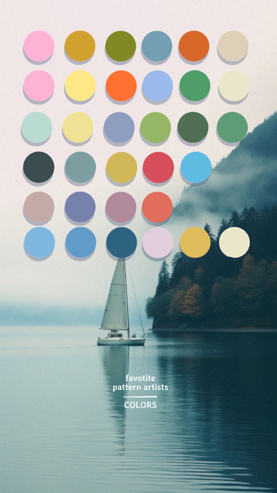
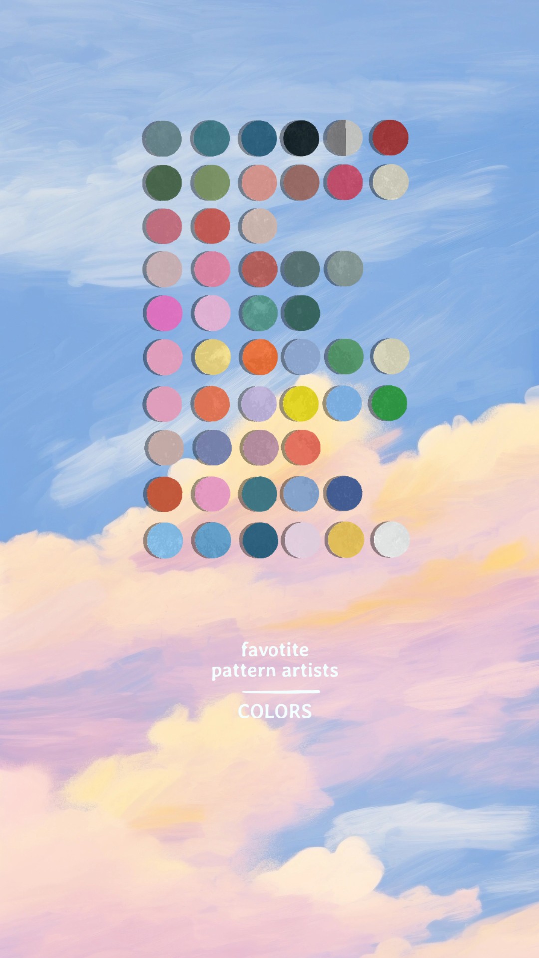
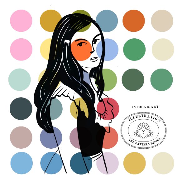
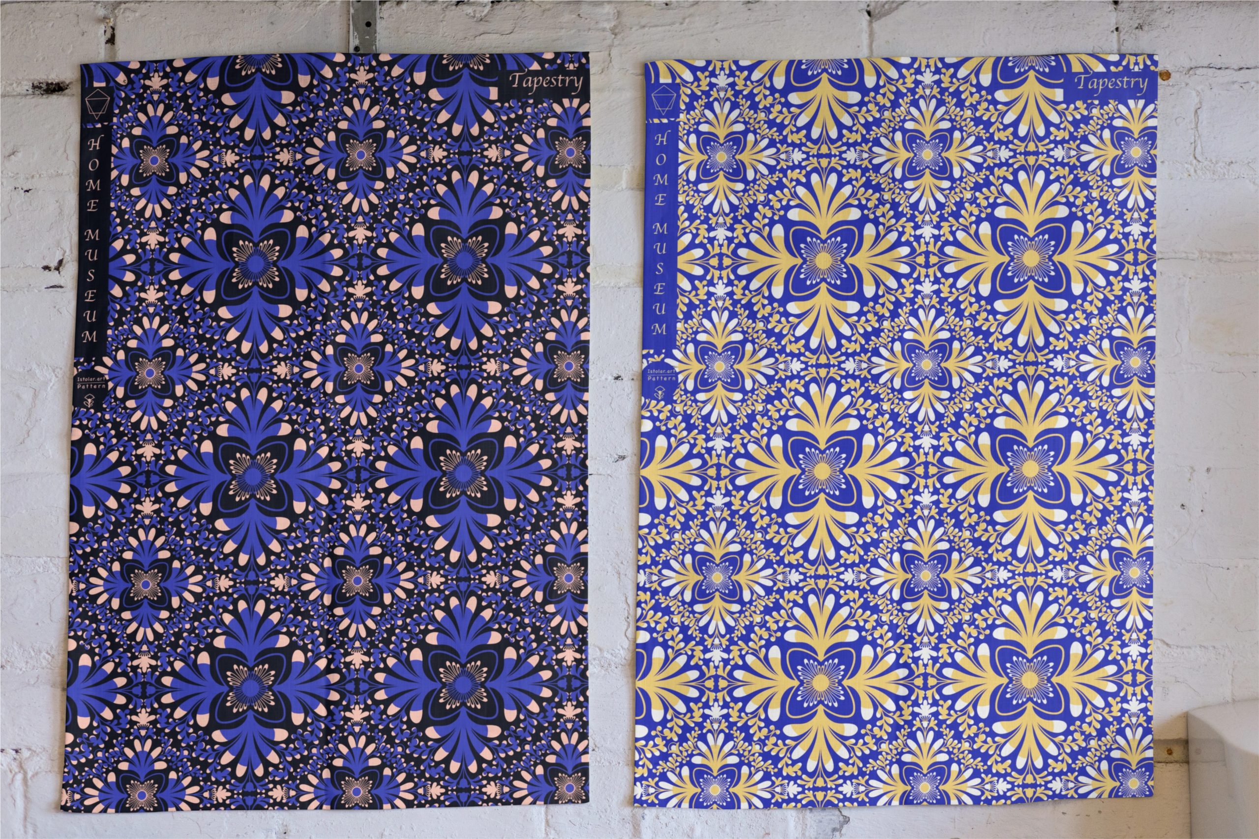
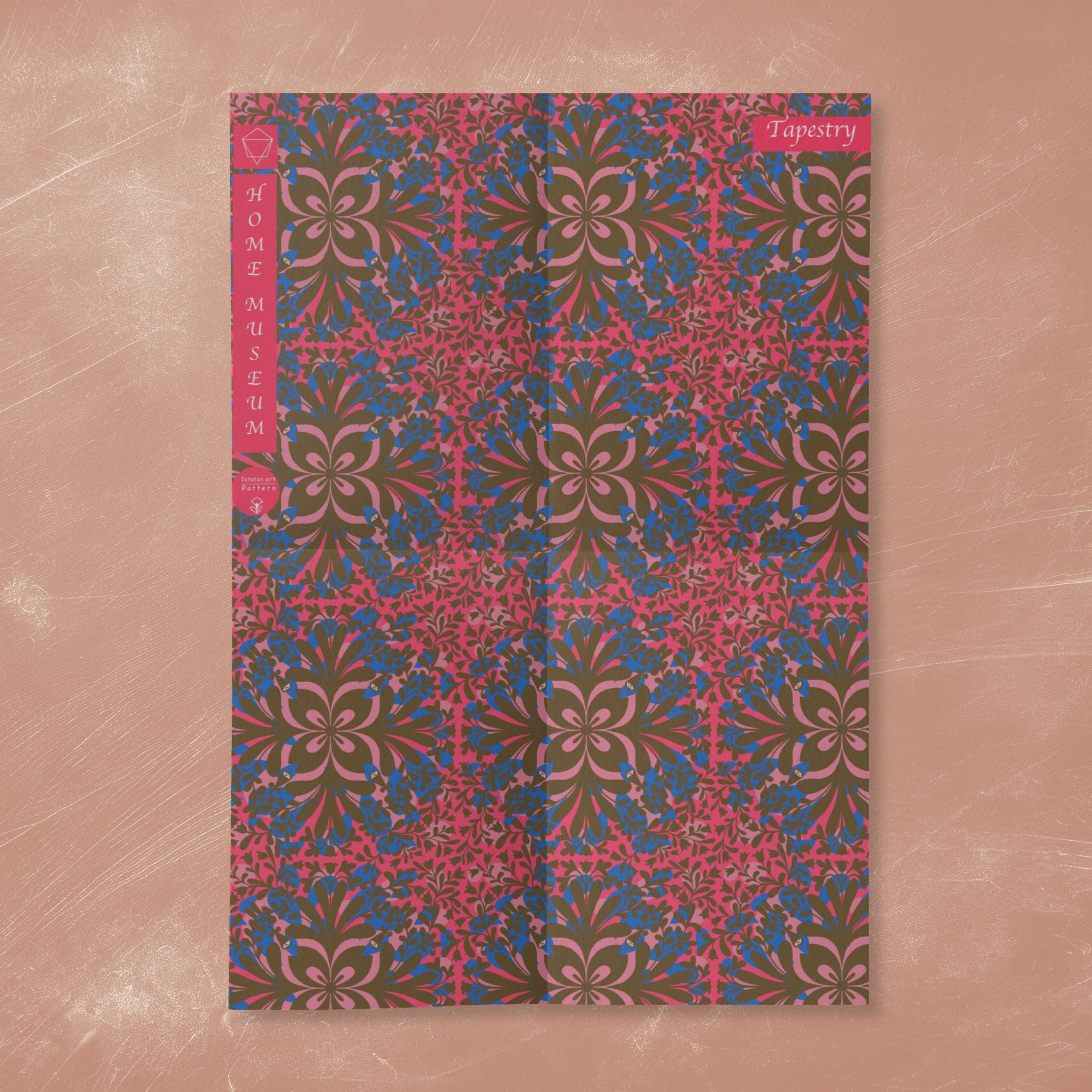
Before designing new pattern tiles, I took this habit of making time for exploring color sets I might not have chosen if relying only on my taste or intuition. So I had a look at my favorite pattern designer palettes.
it is good exercice for self challenging our mental color scheme.
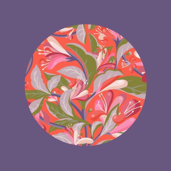
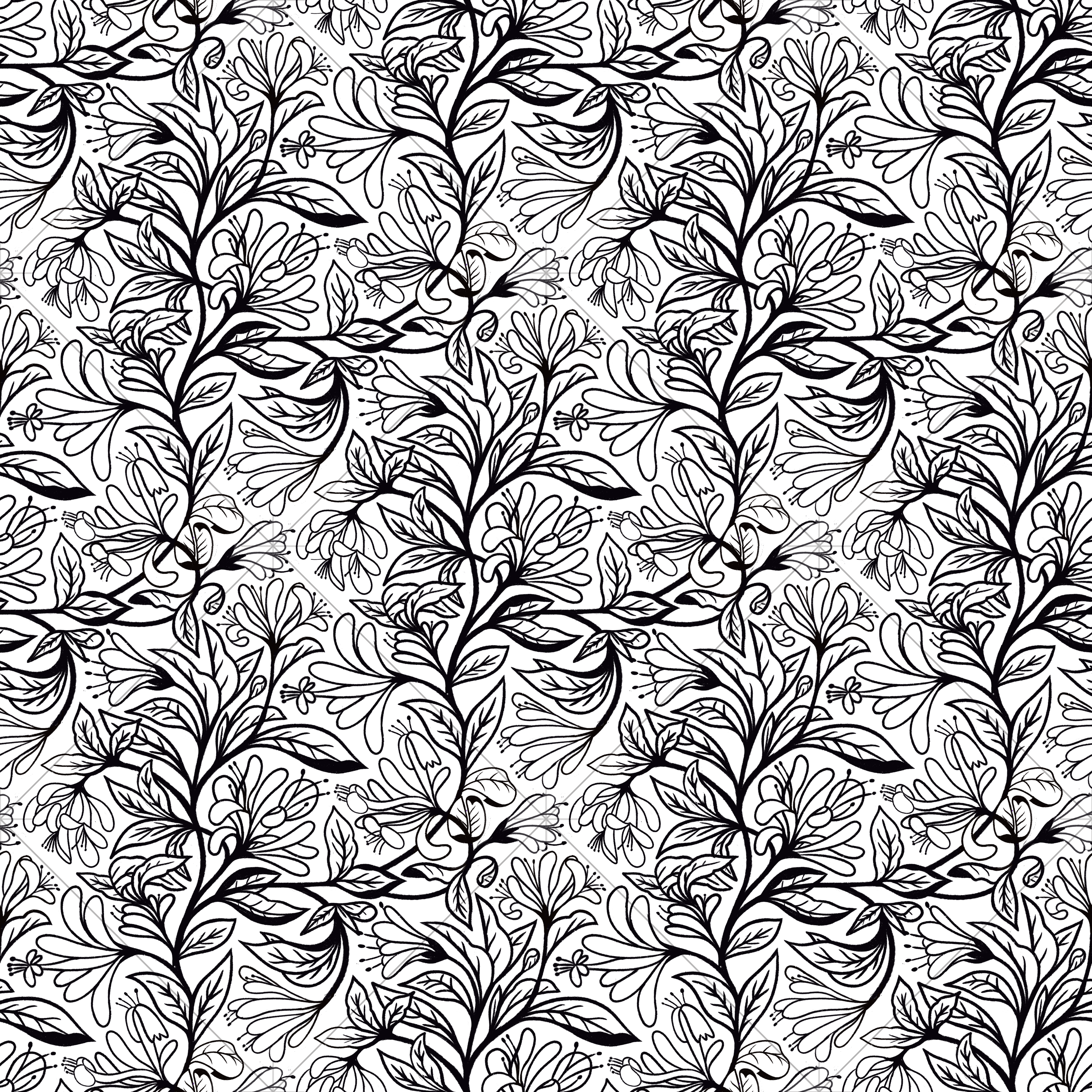
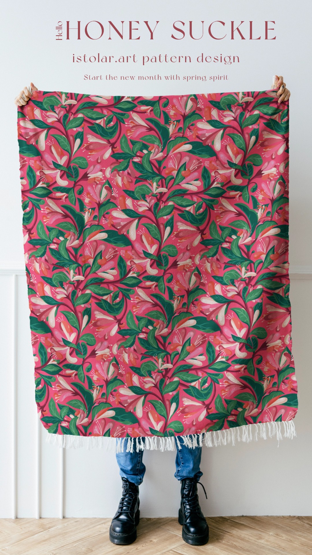
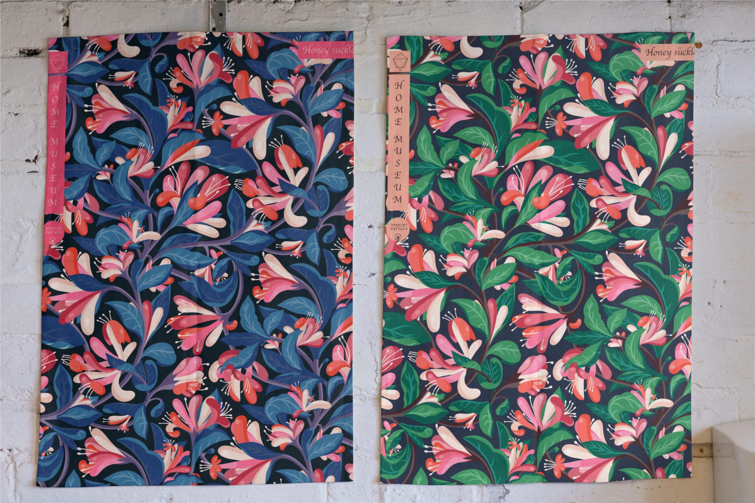
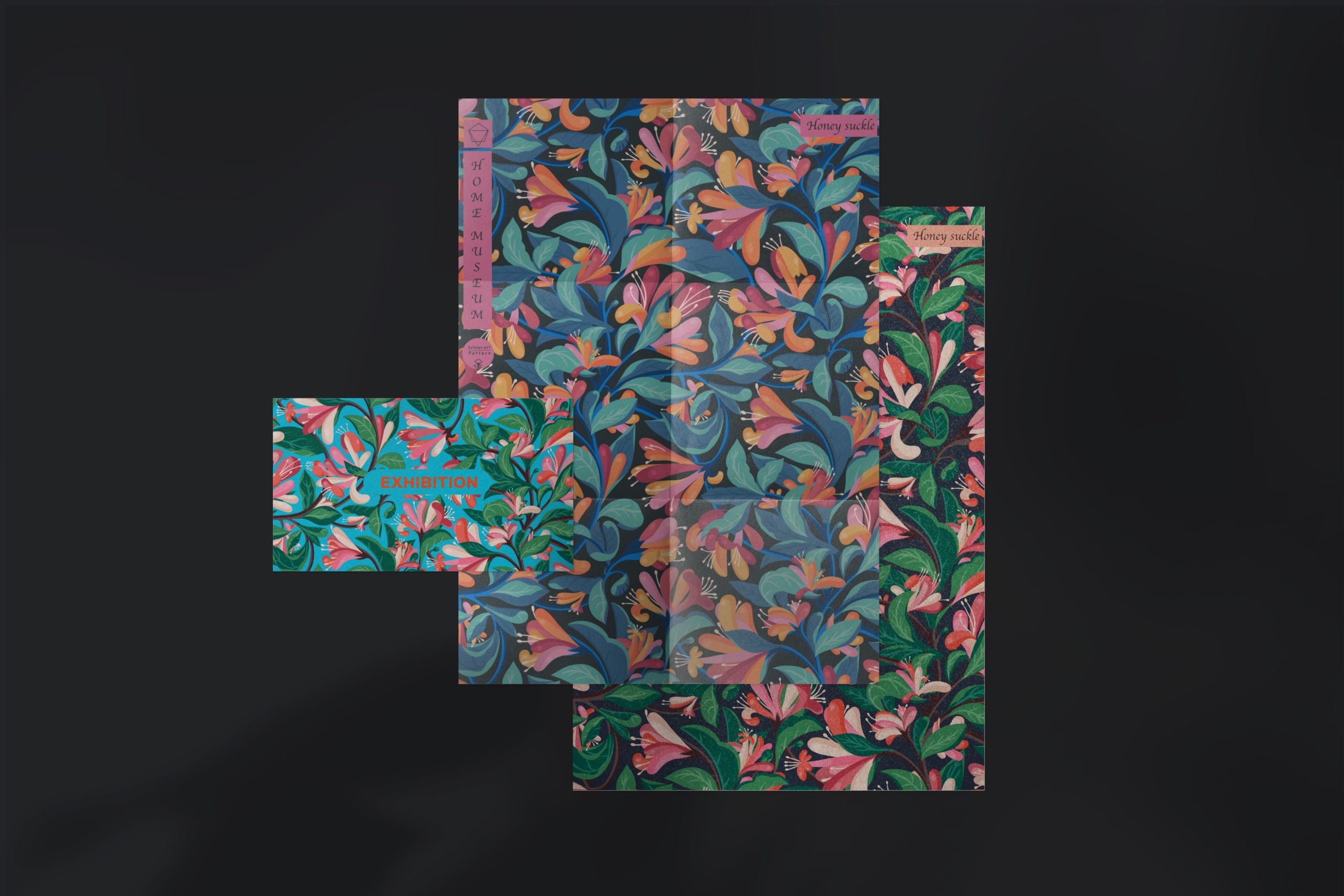
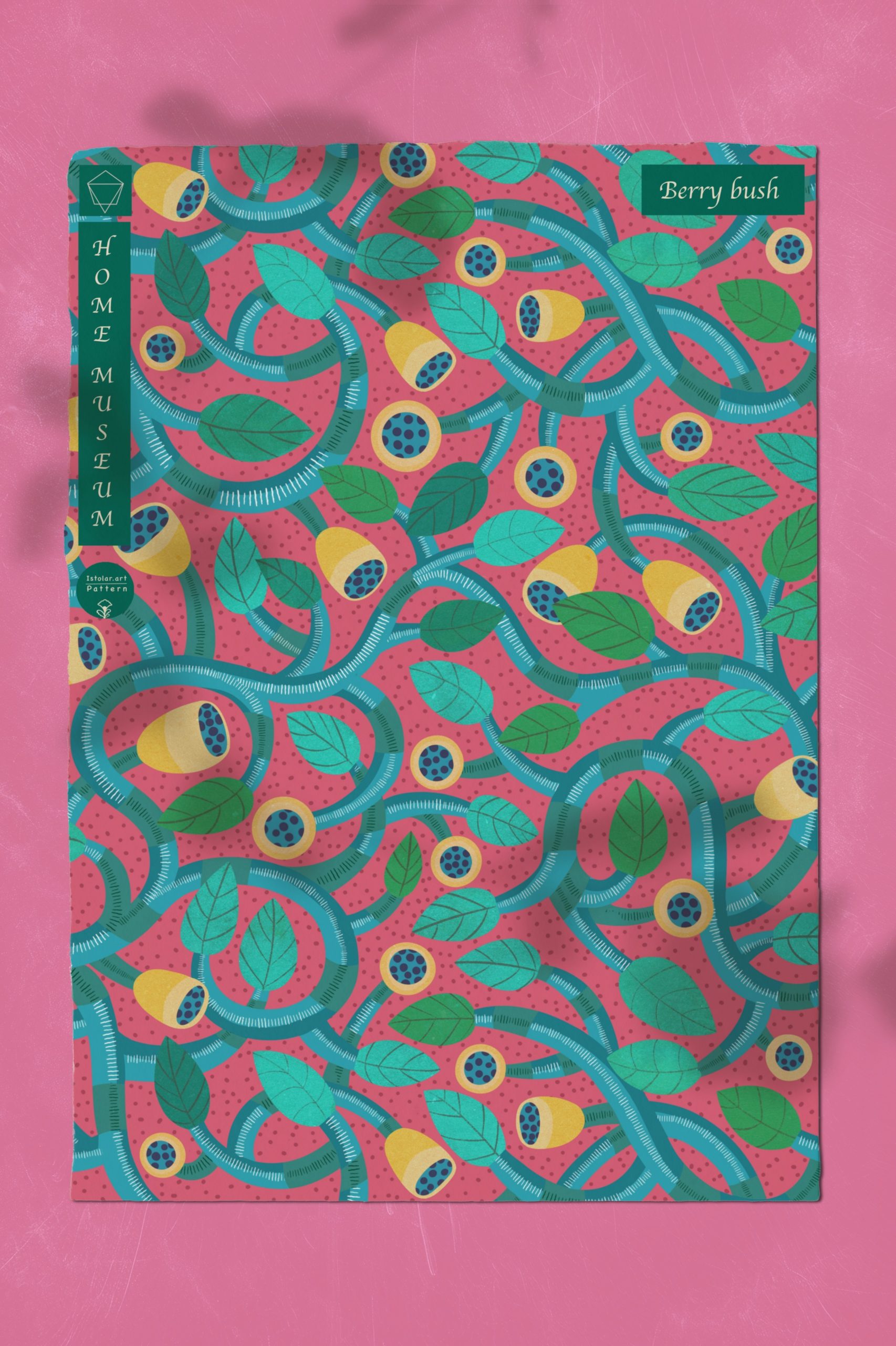
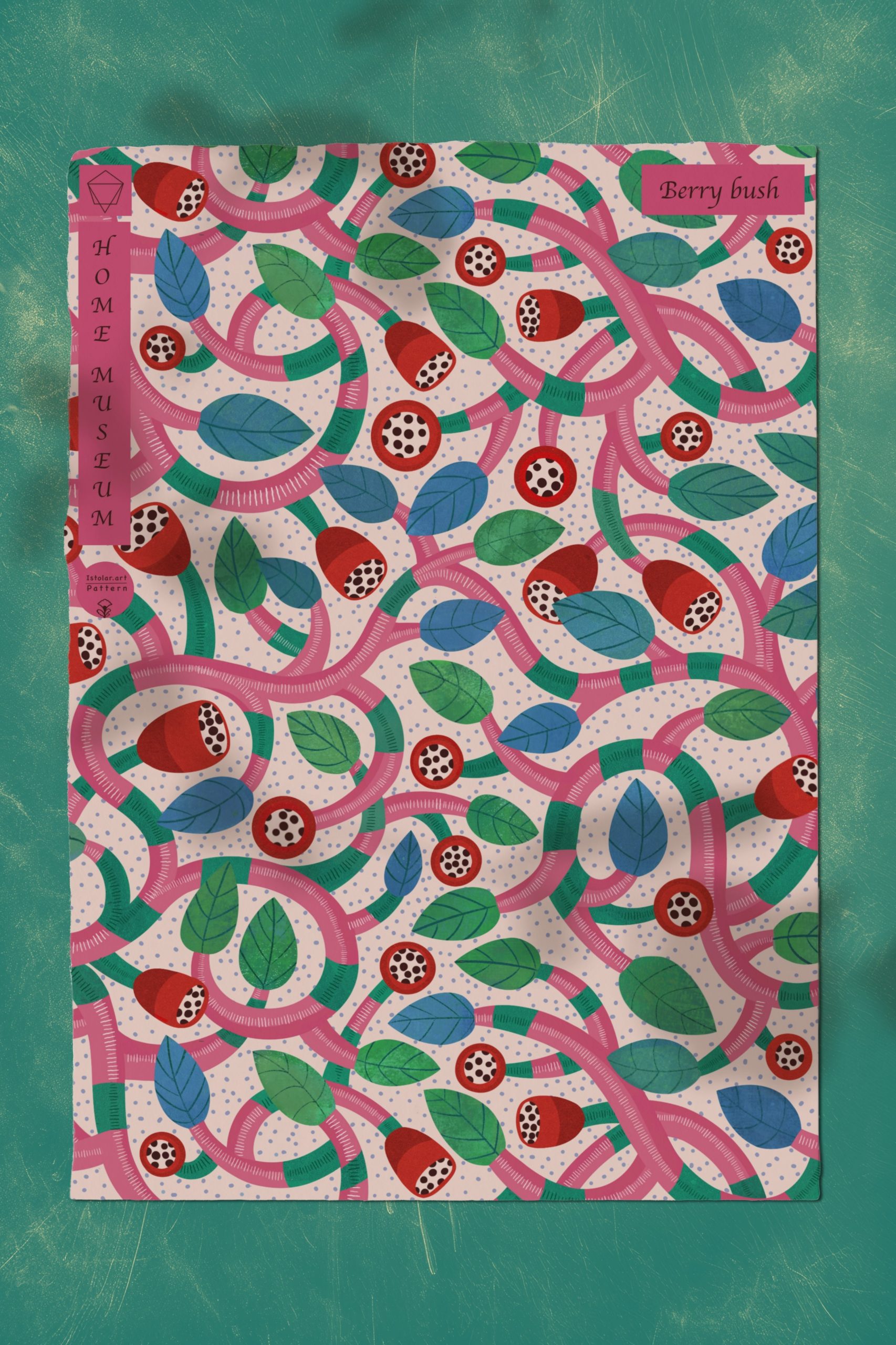
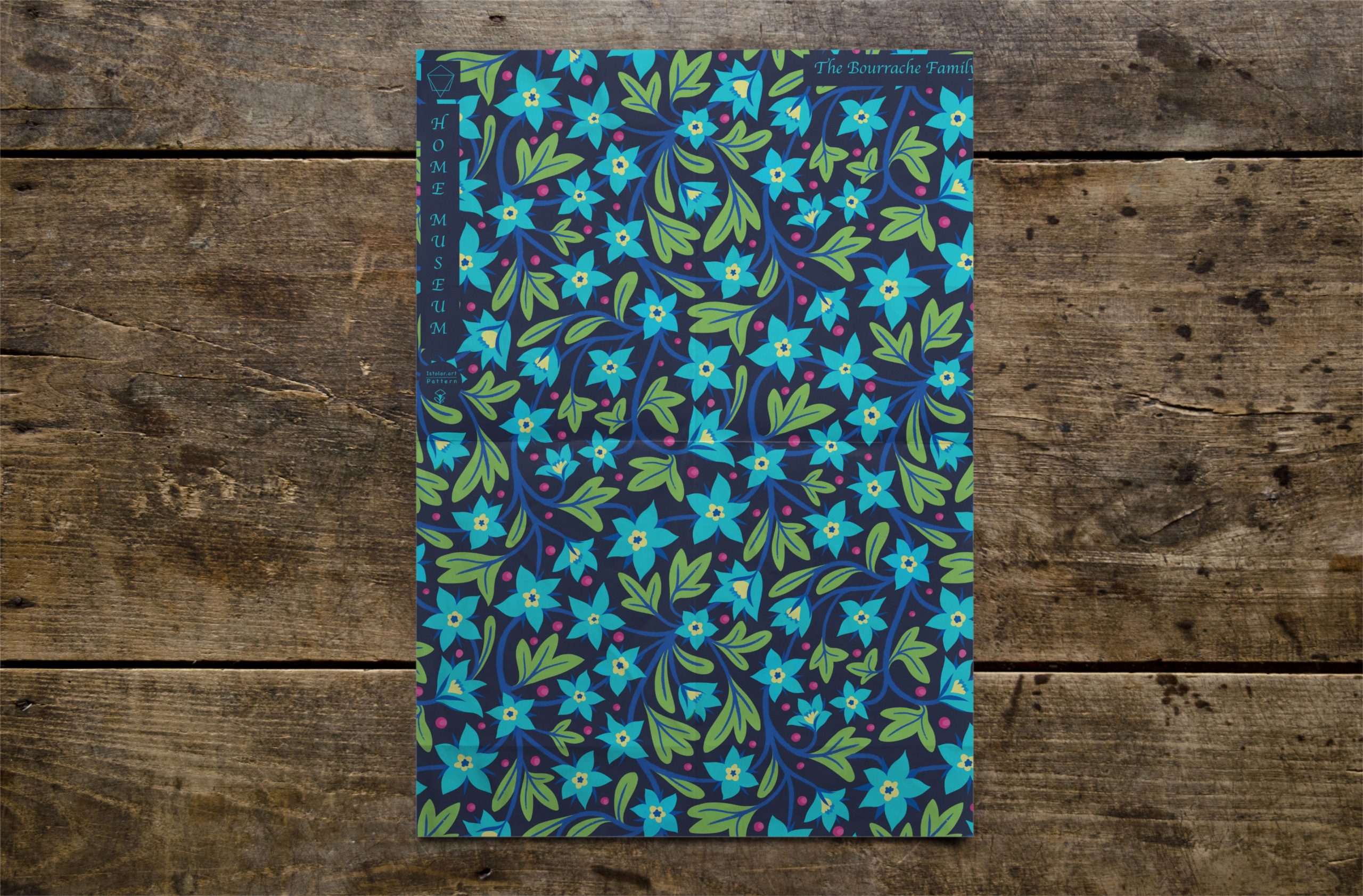
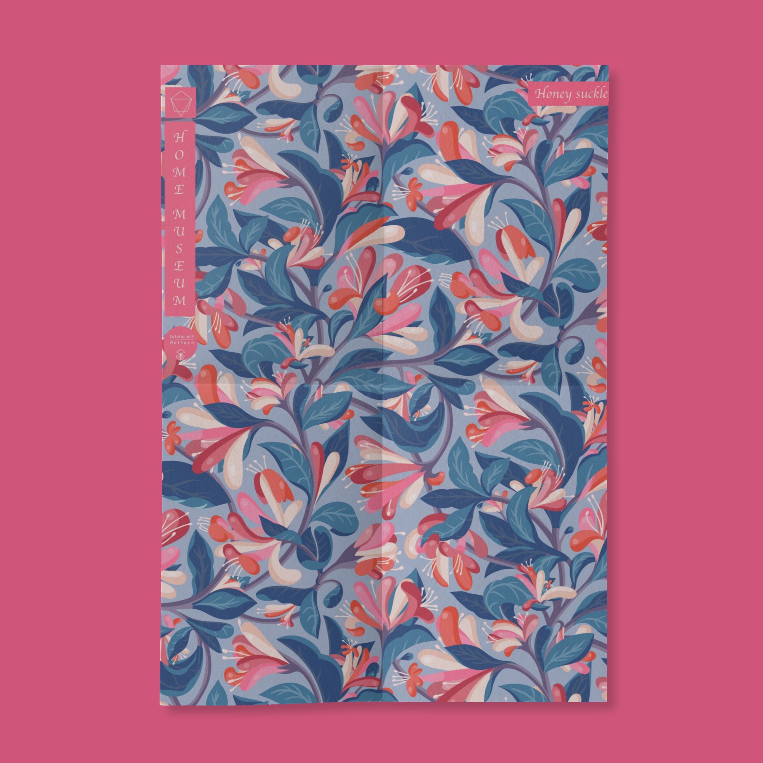
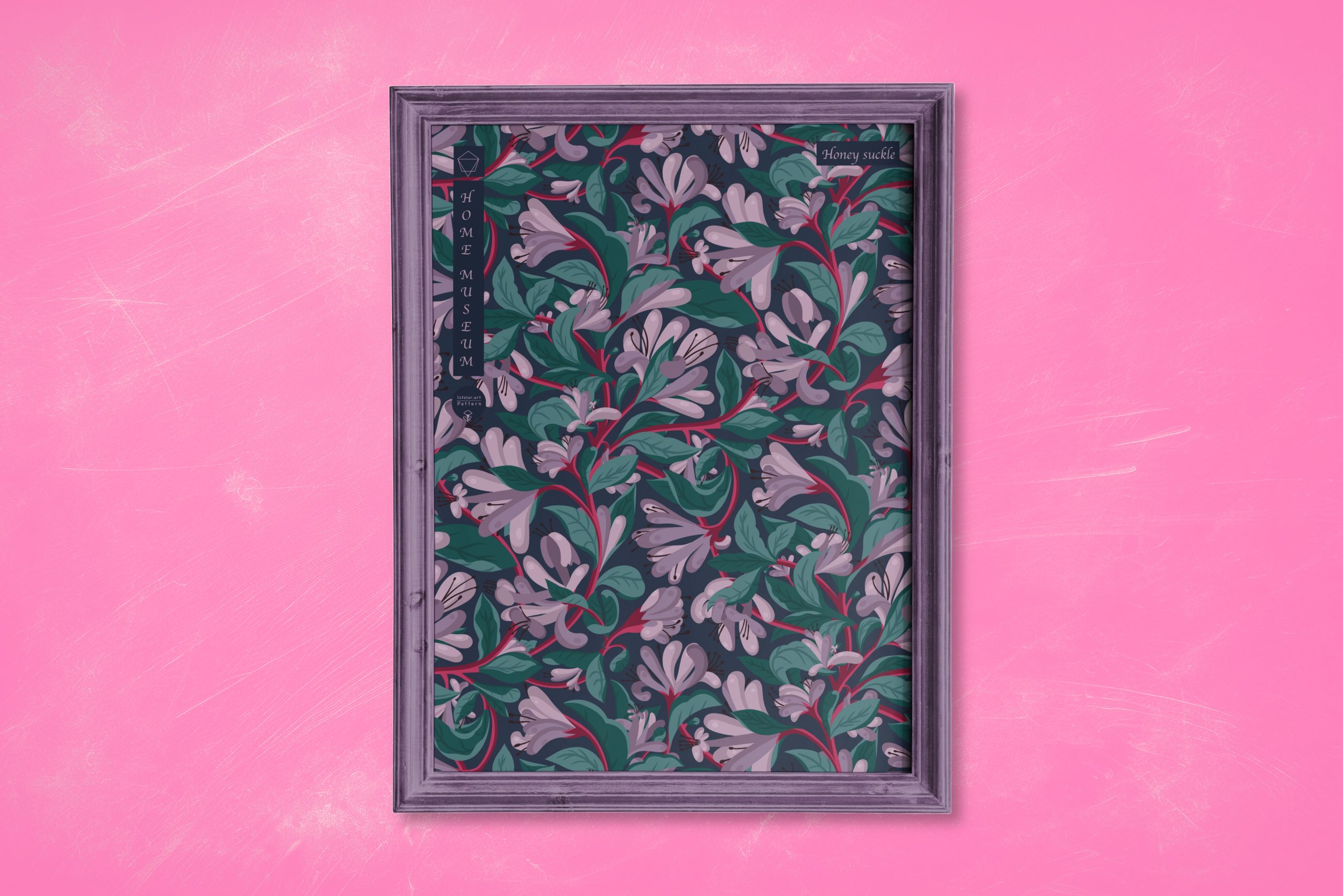
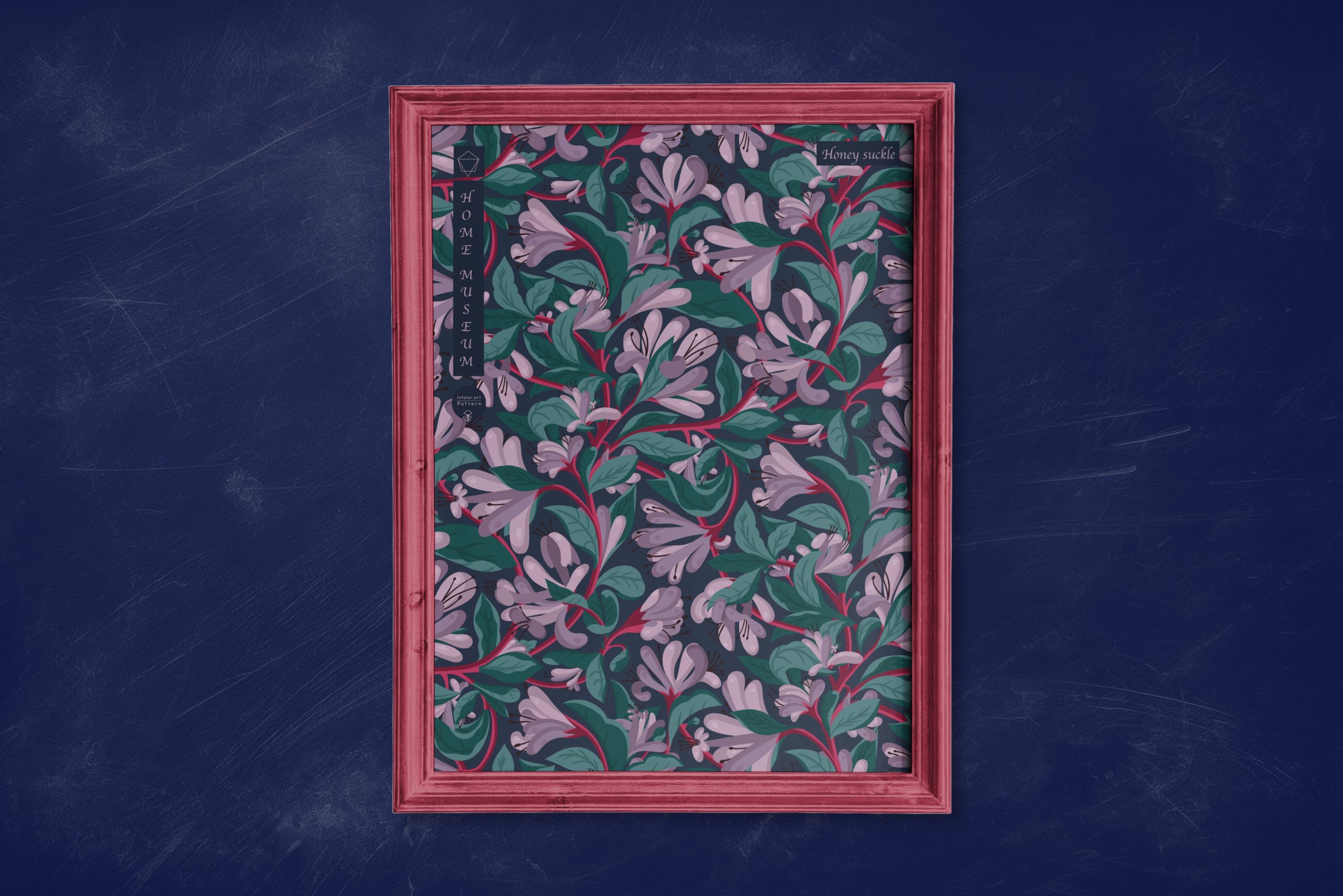
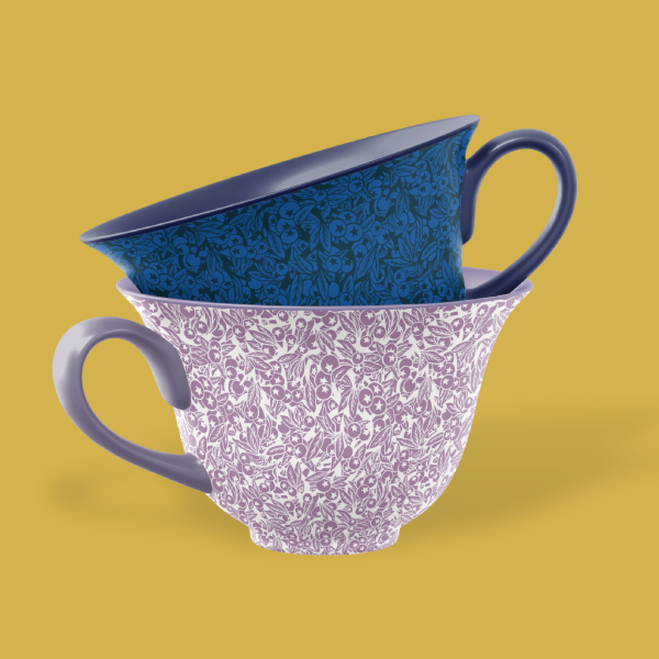
Honeysuckle is a fascinating subject for graphic design and art in general, providing endless possibilities for creating visually engaging and meaningful works.
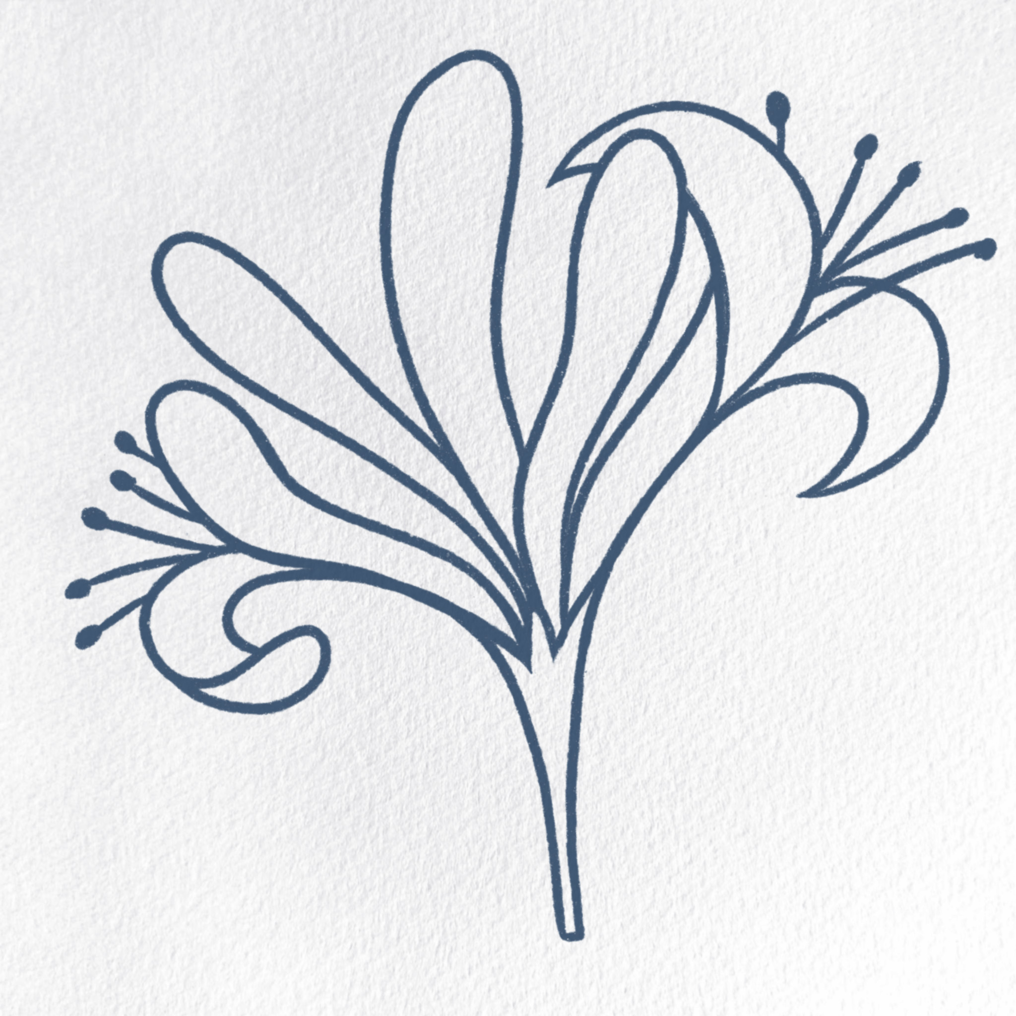
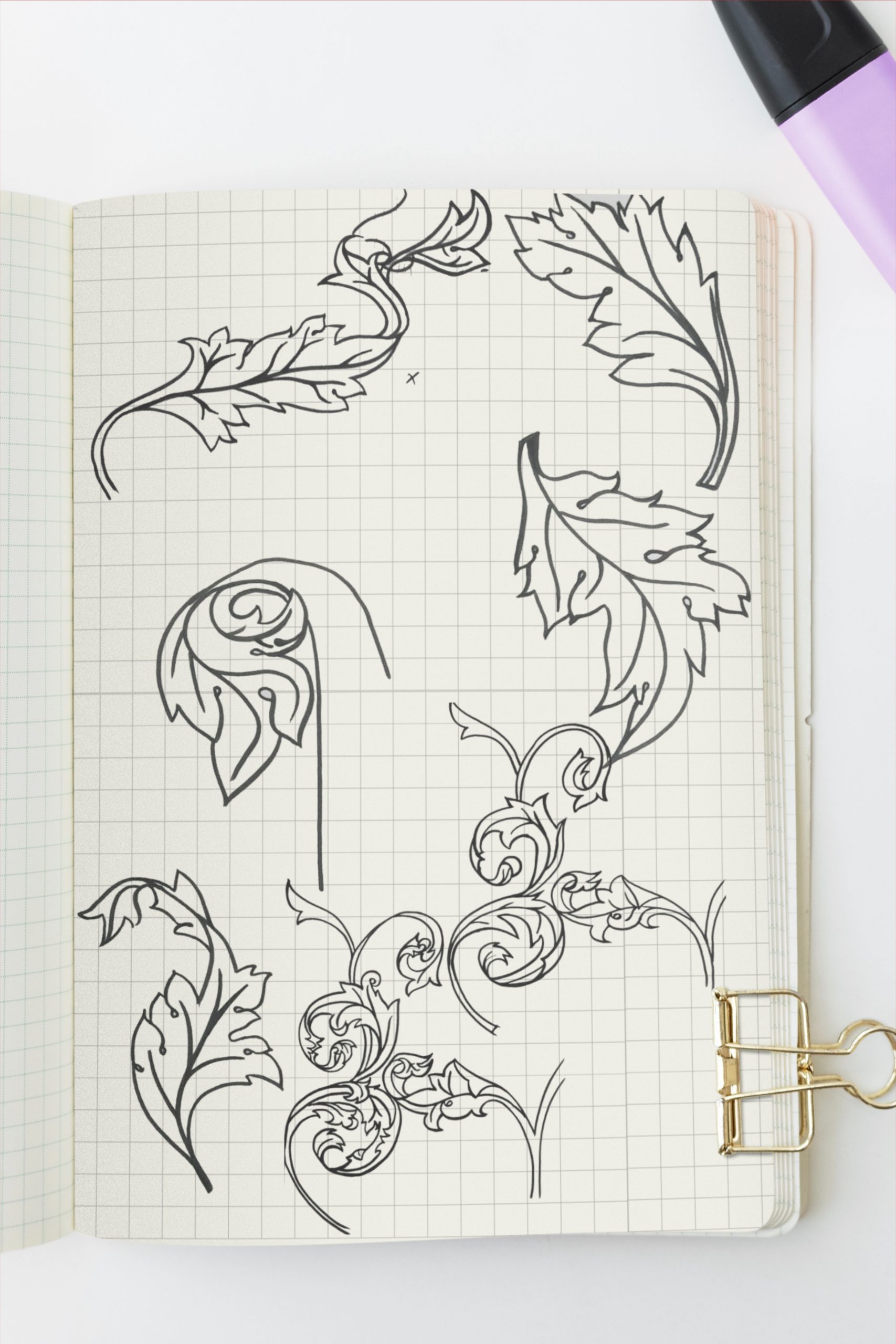
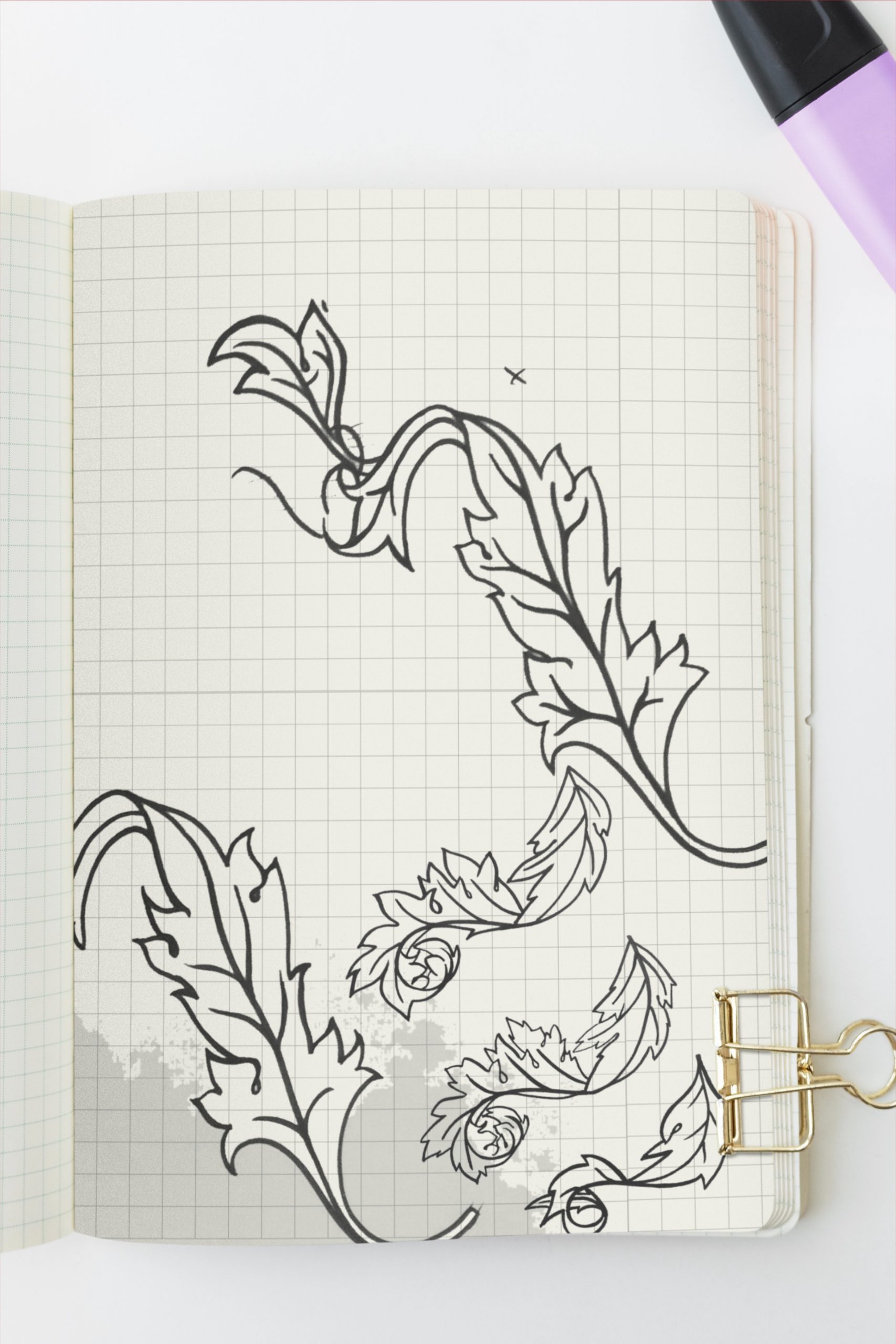
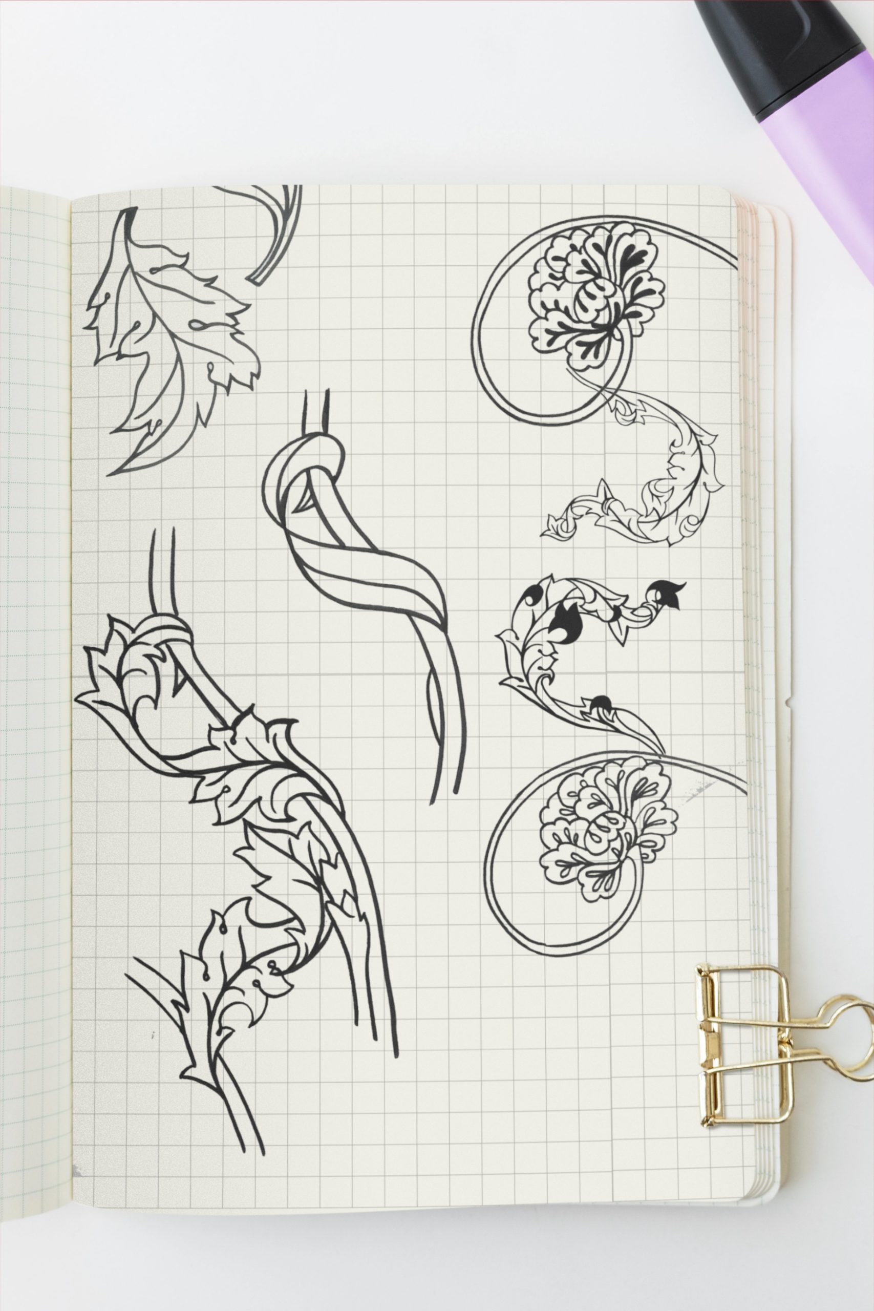
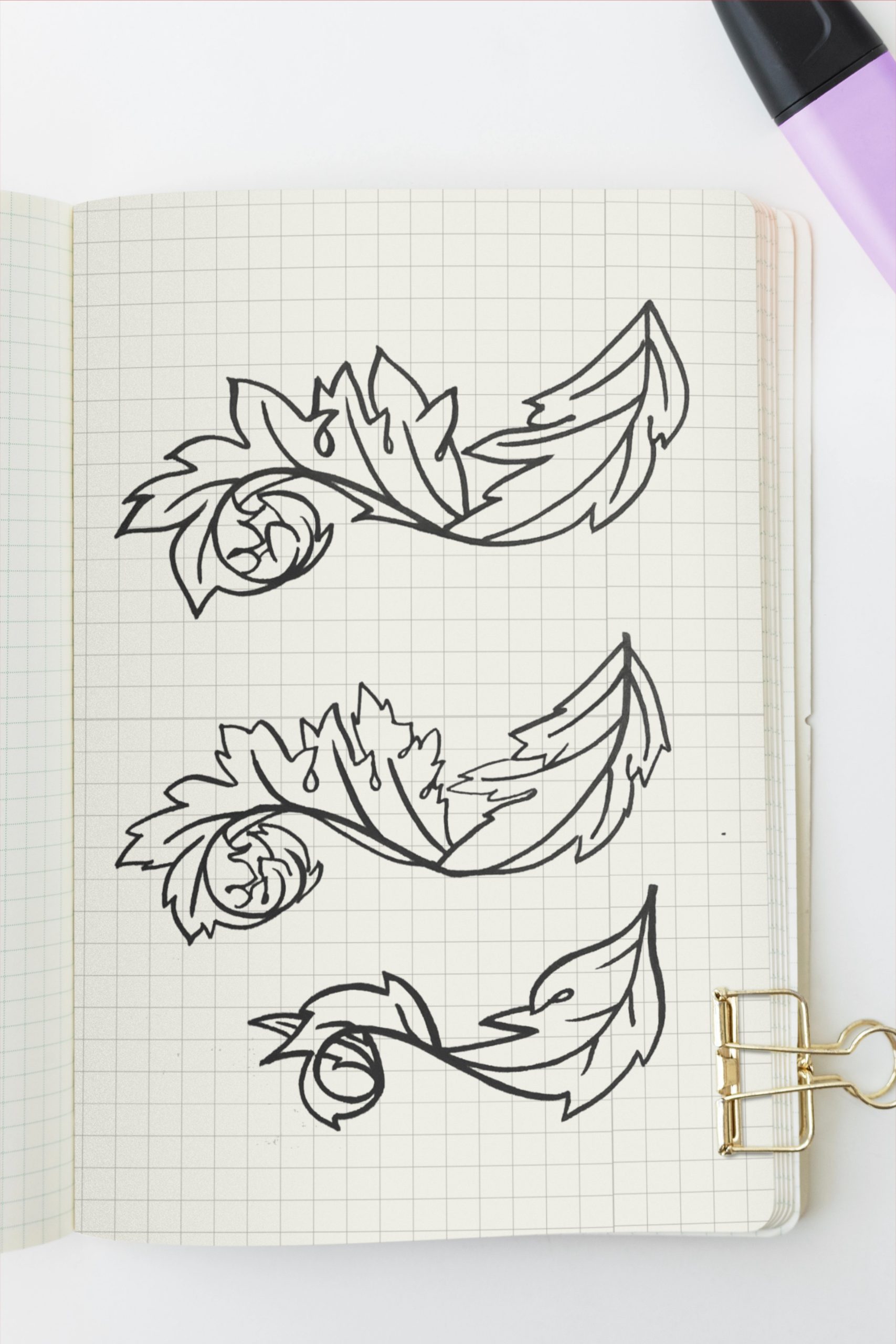
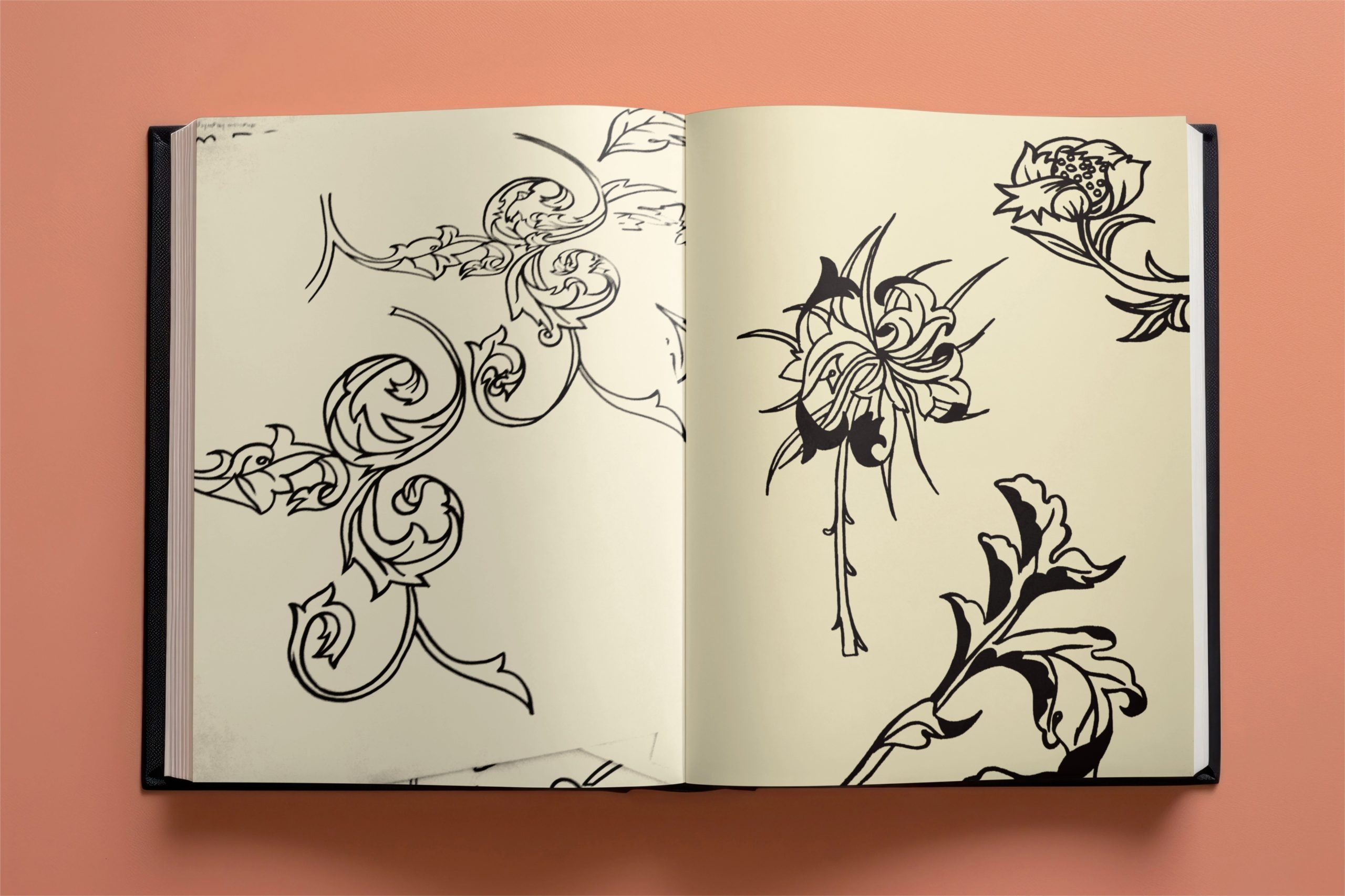
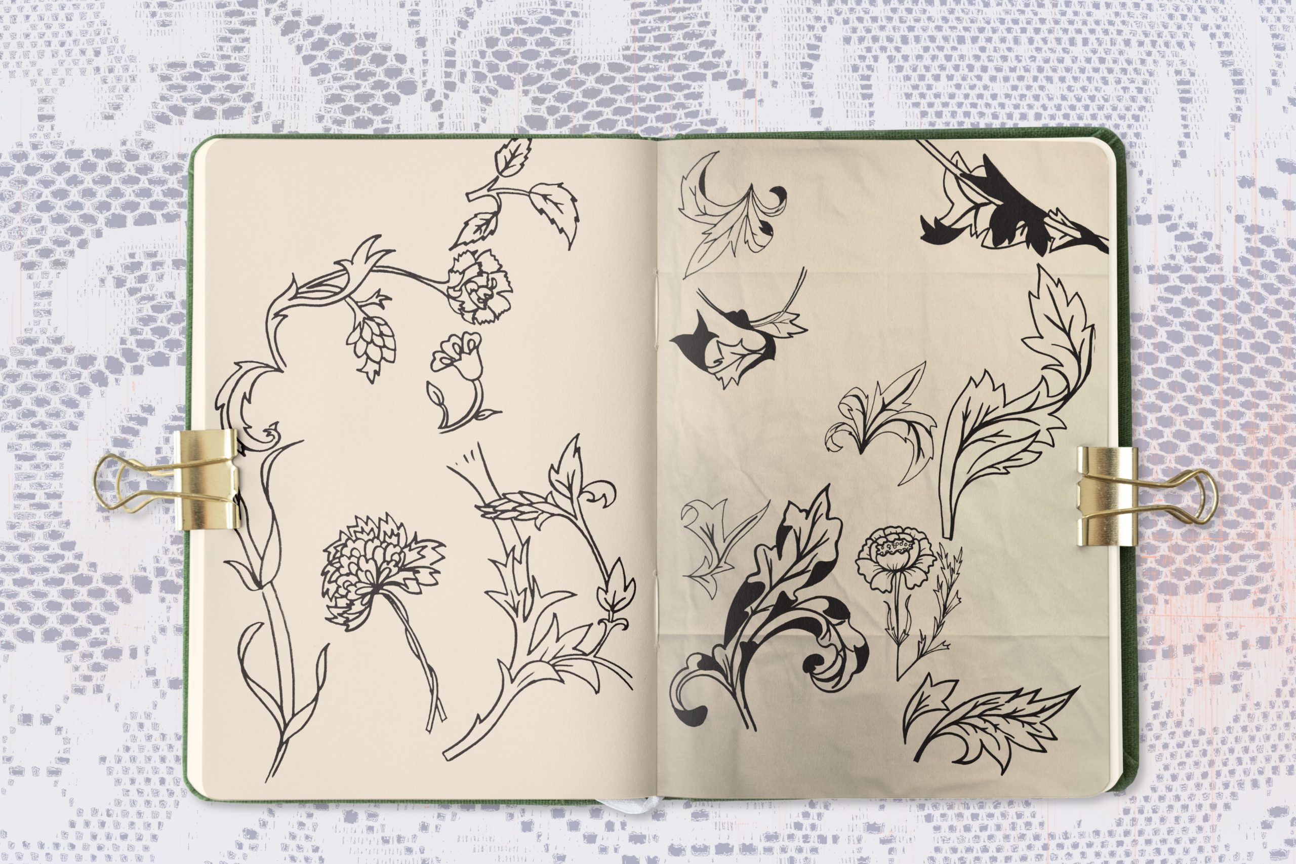
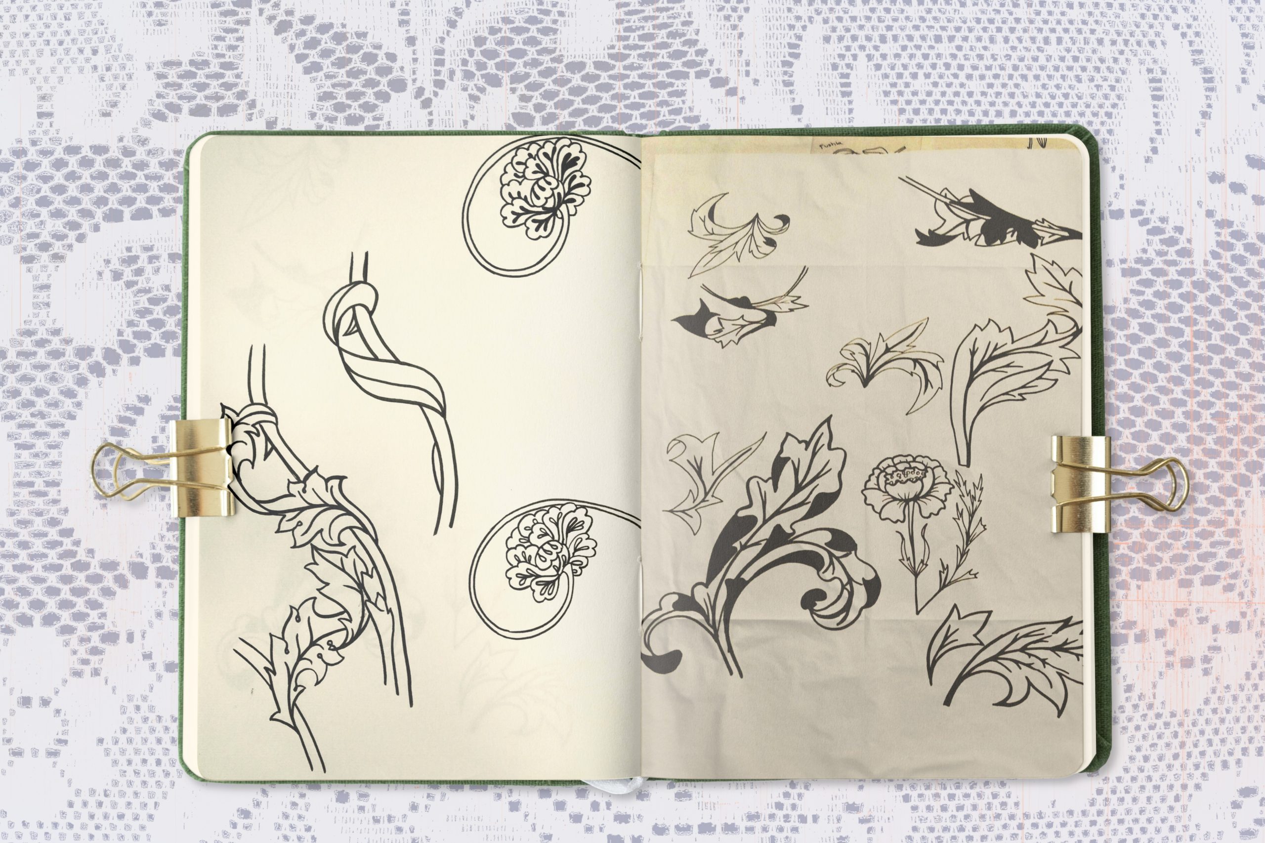
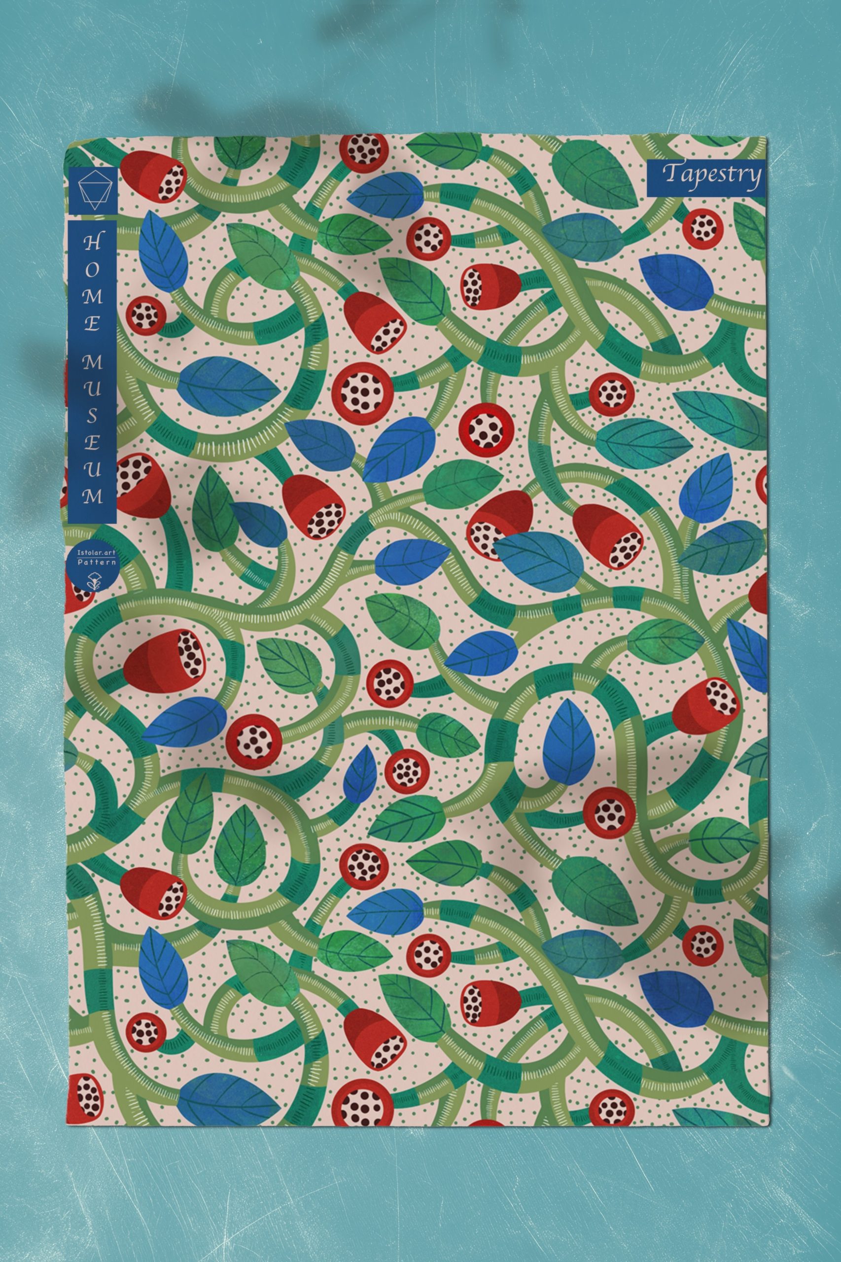
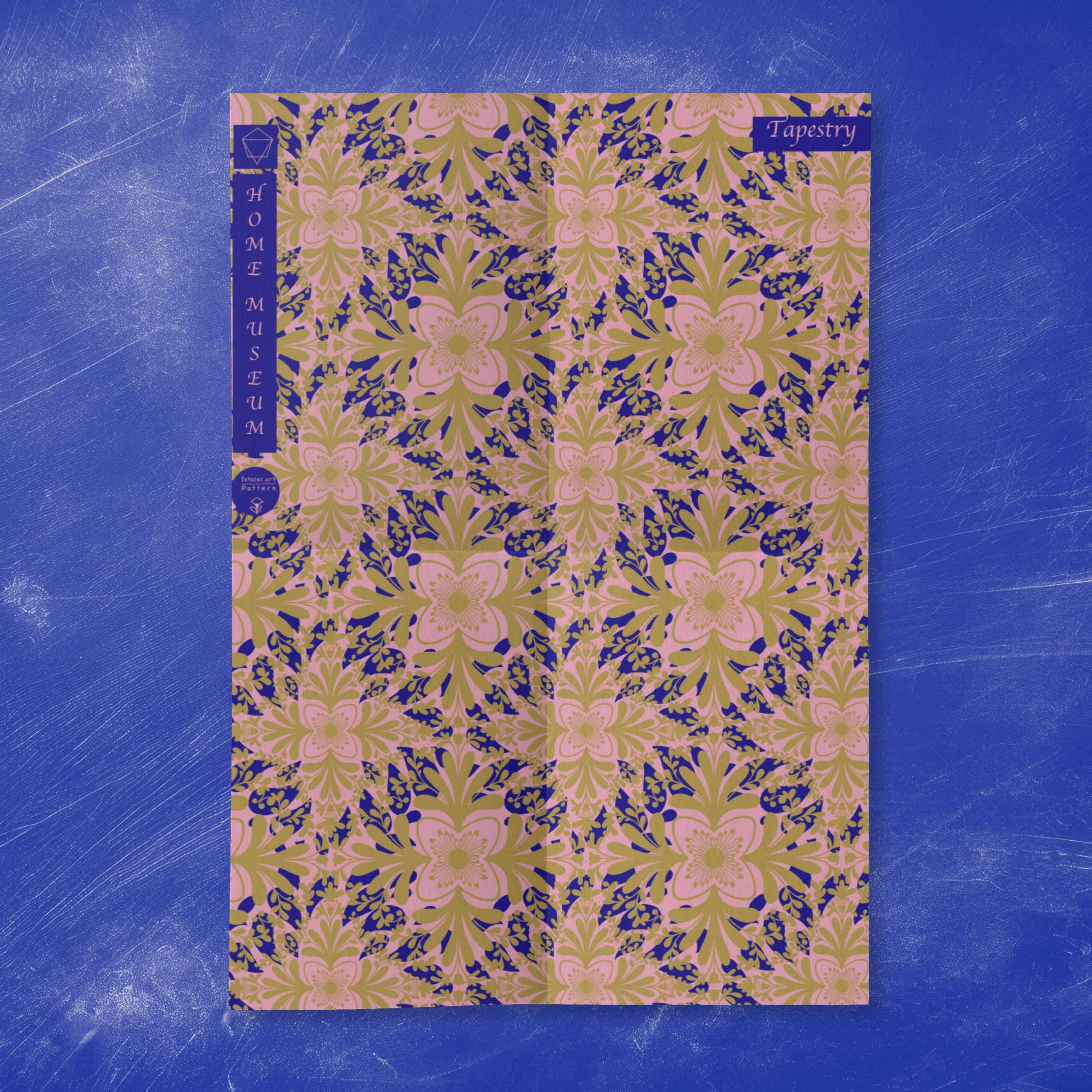
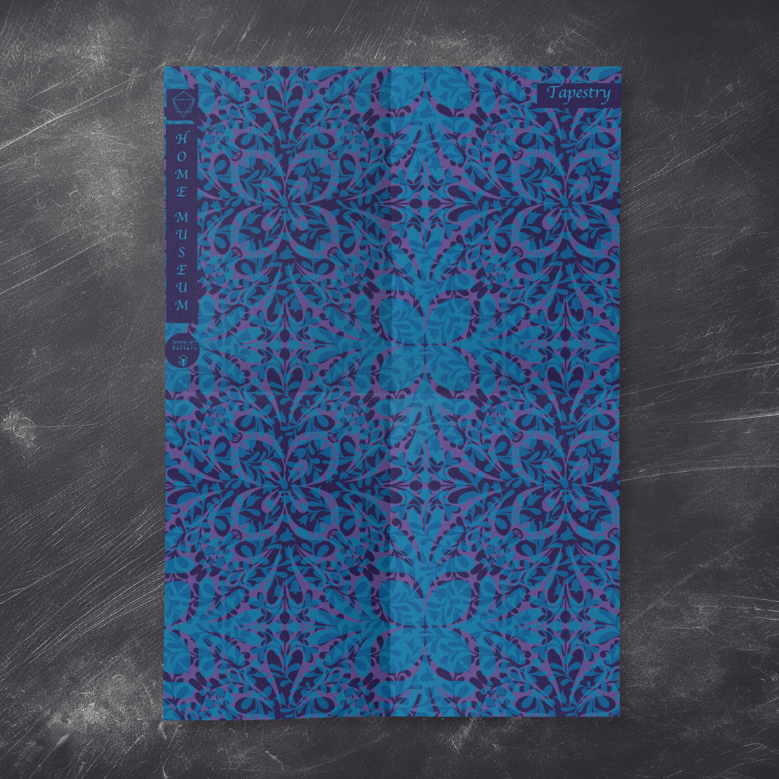
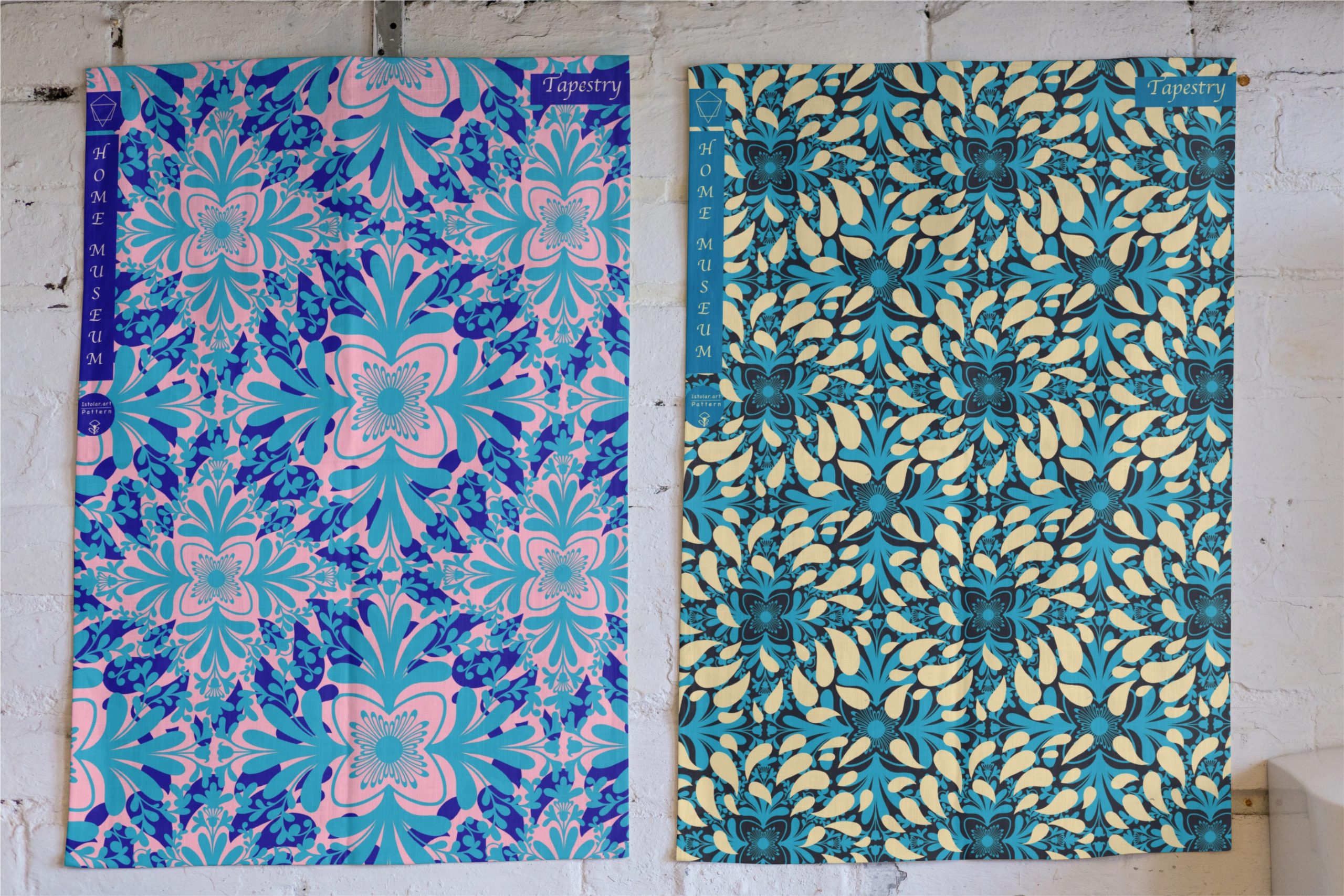
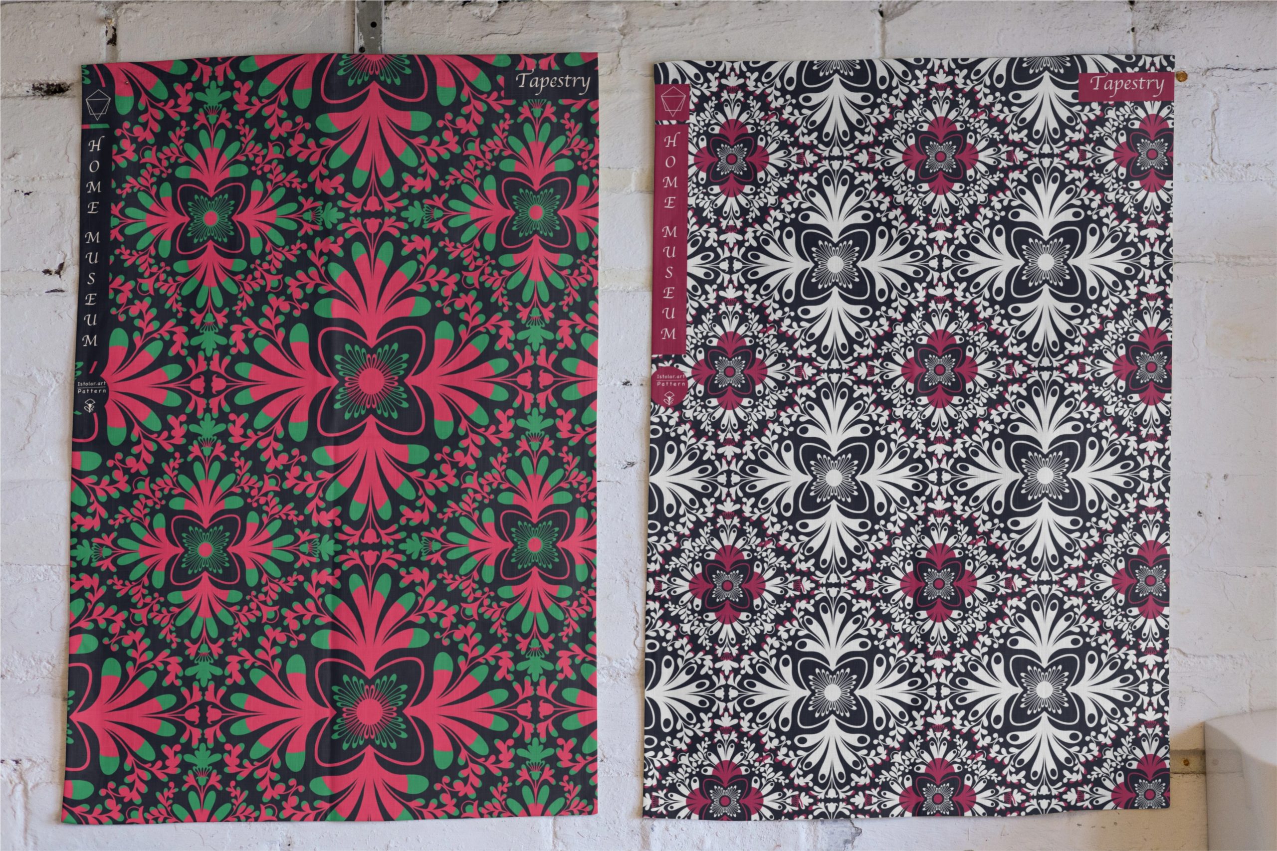
Honeysuckle plants are climbers and often have long, entwining vines that create complex and dynamic shapes. These twisting and turning vines can form intricate patterns that are visually captivating.The way the vines wrap around structures or other plants can create interesting visual compositions and a sense of movement.
The leaves of honeysuckle are typically arranged in opposite pairs along the stems. This regular pattern can create a pleasing and harmonious visual rhythm.The leaves themselves are often simple and oval-shaped, providing a contrasting backdrop to the more complex flowers and vines.
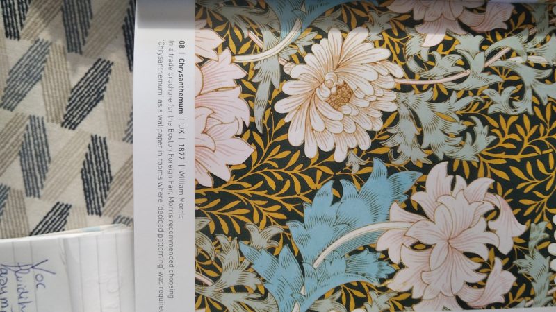
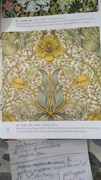
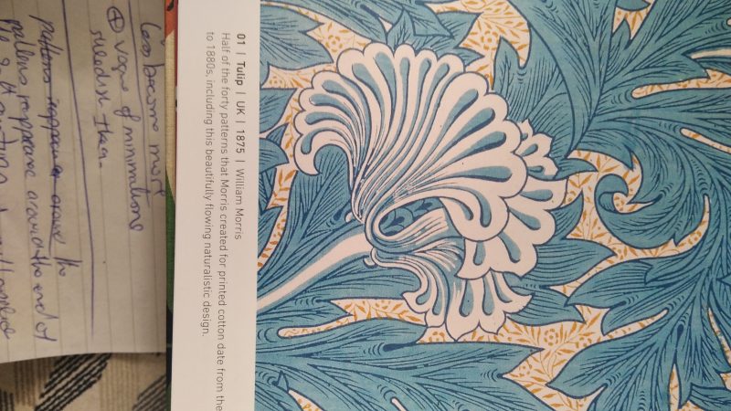
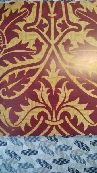
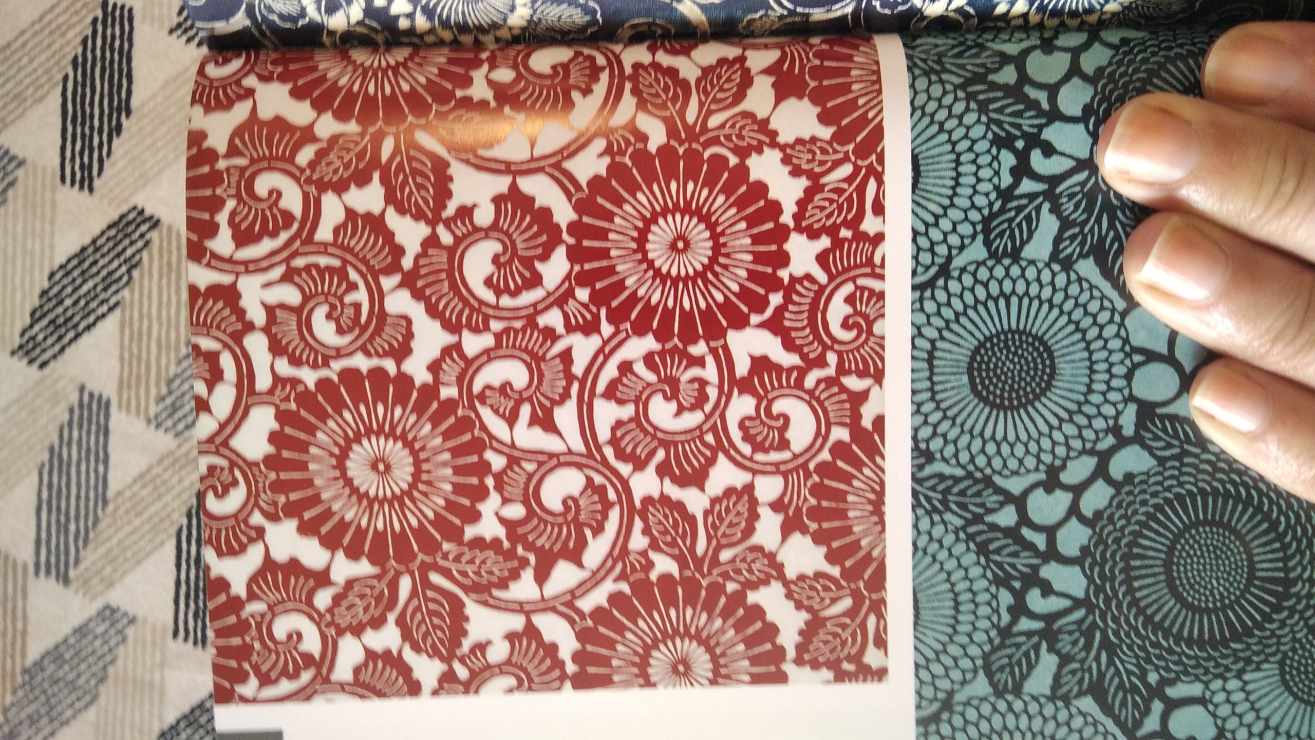
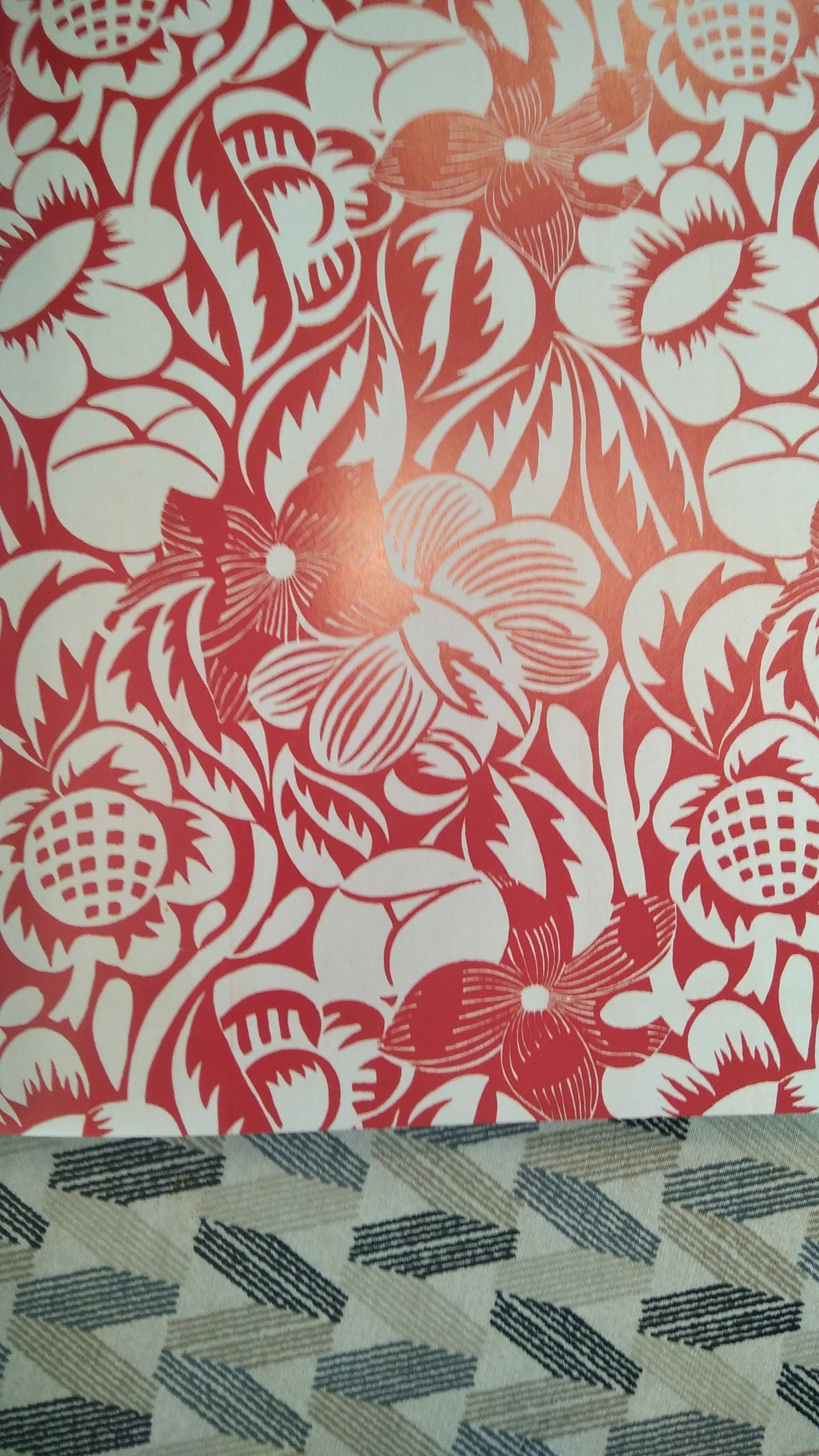
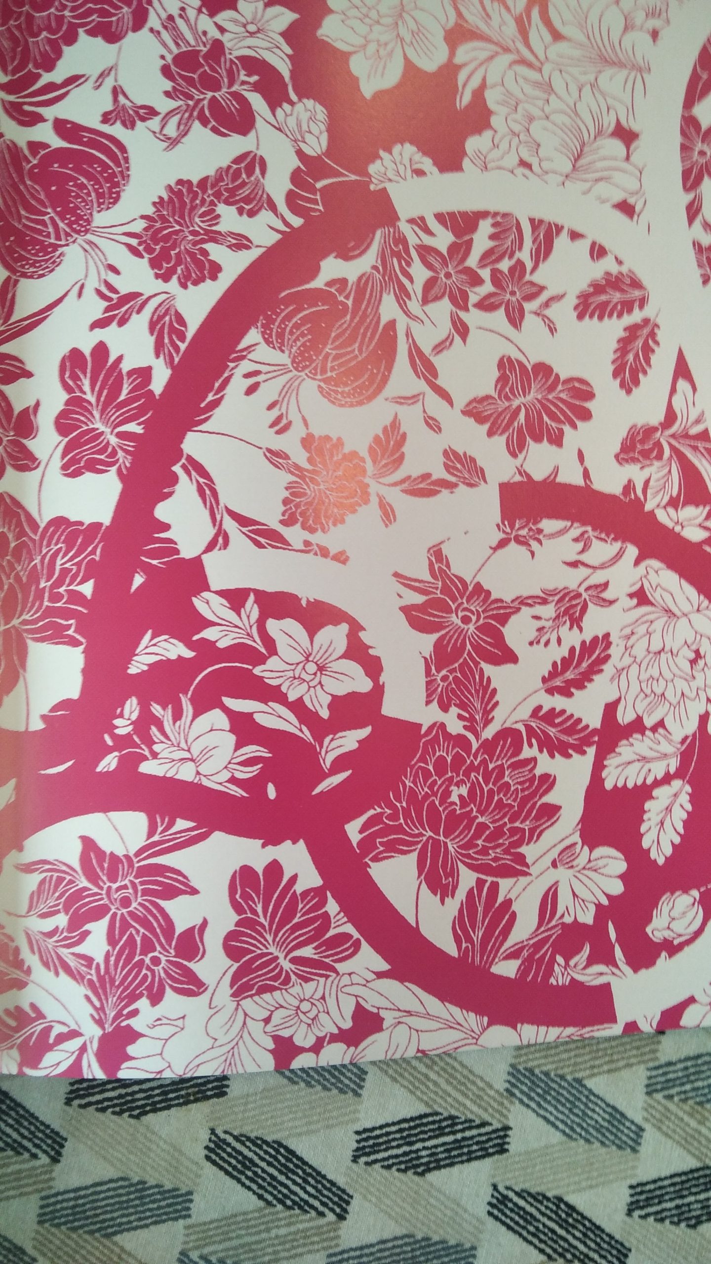
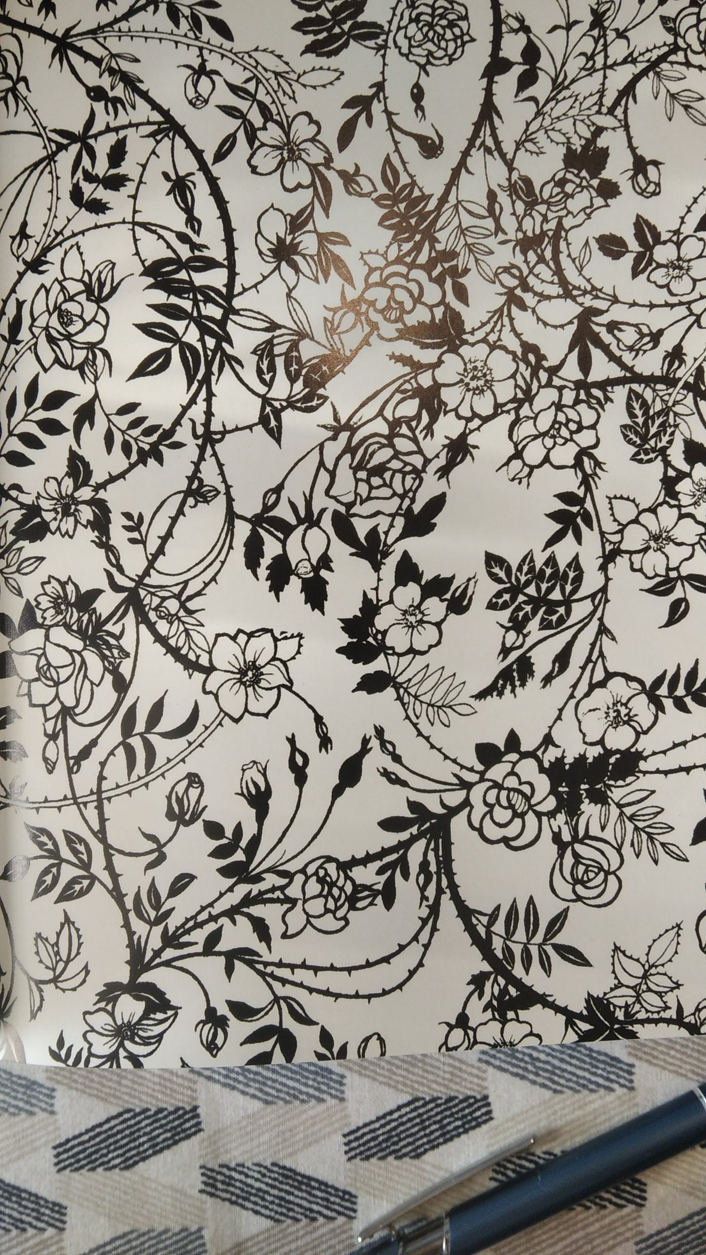
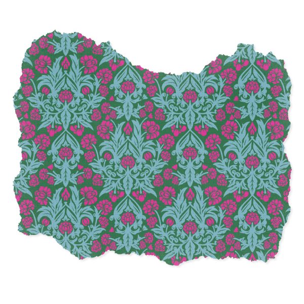
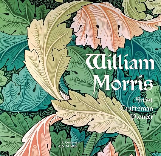
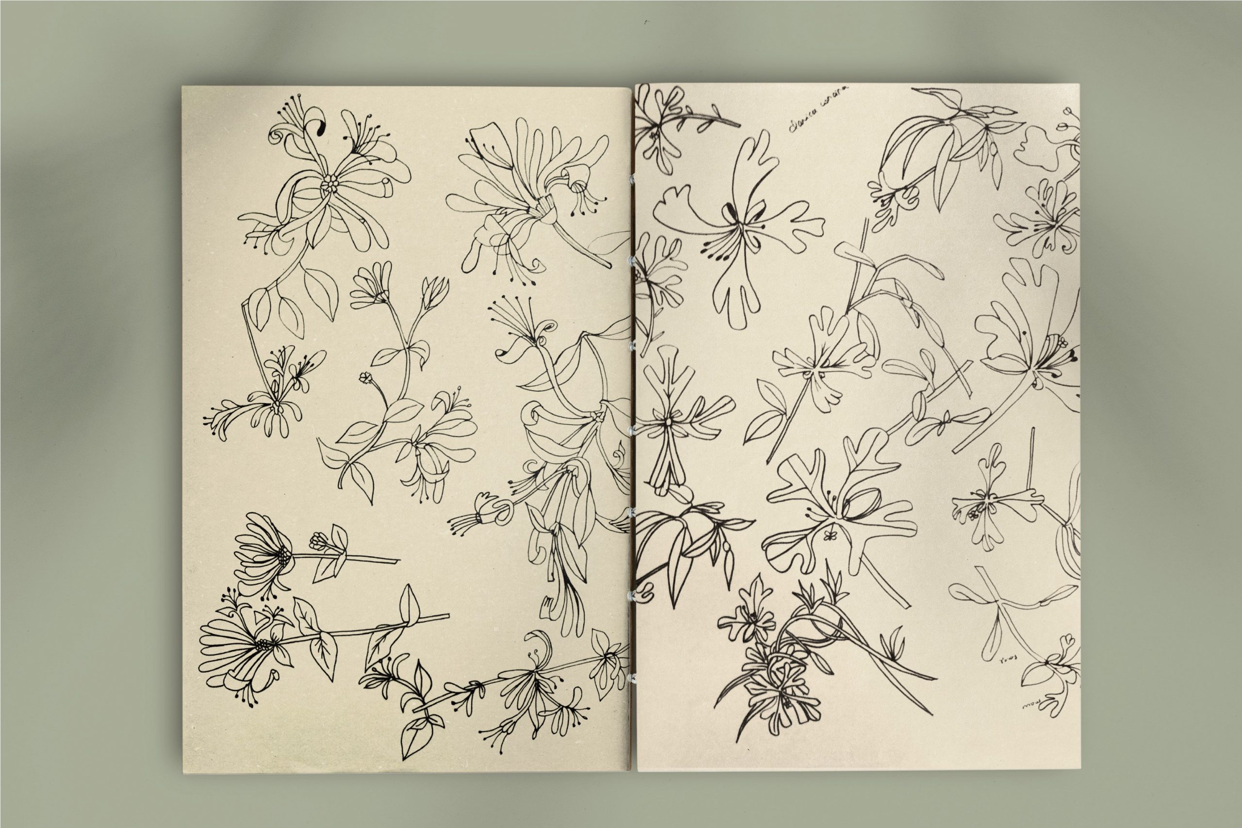
A force parcourir les livres de patterns tels que : William Morris , artist craftsman Pioneer , j avais plein de chèvrefeuilles parmi mes images mentales. Il fallait que ça sorte en motif. Voila!
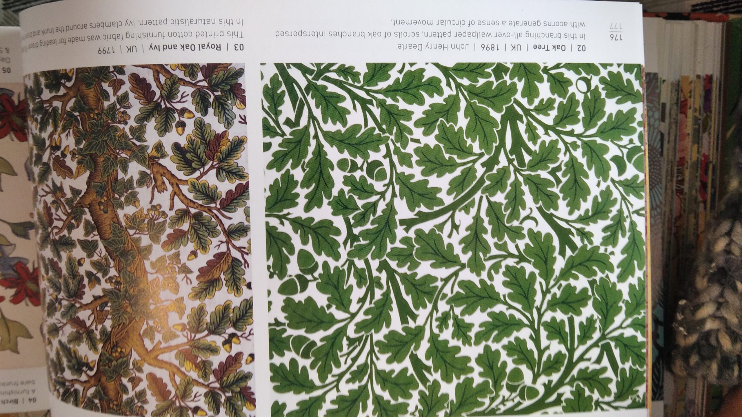
Aucun intérêt à le faire mais c’ est un excellent bouquin, un bon équilibre entre contexte géographico-historique et collections des patterns des plus illustres aux moins familiers. On se rend aussi compte que dans la firme Morris, Marshall, Faulkner & Co, la company est importante à découvrir … J’en parlerai un de ces jours…
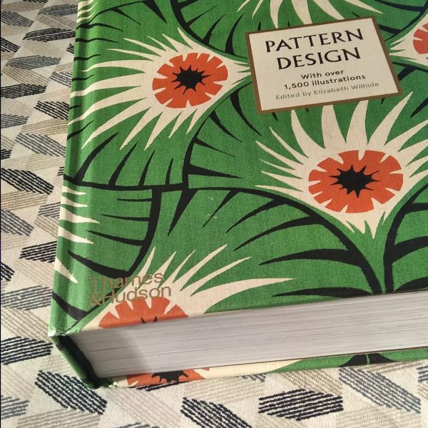
Le genre de bouquin vers lequel on revient très souvent: un livre de table de salon ou de table de chevet. II passe peu de temps sur des étagères
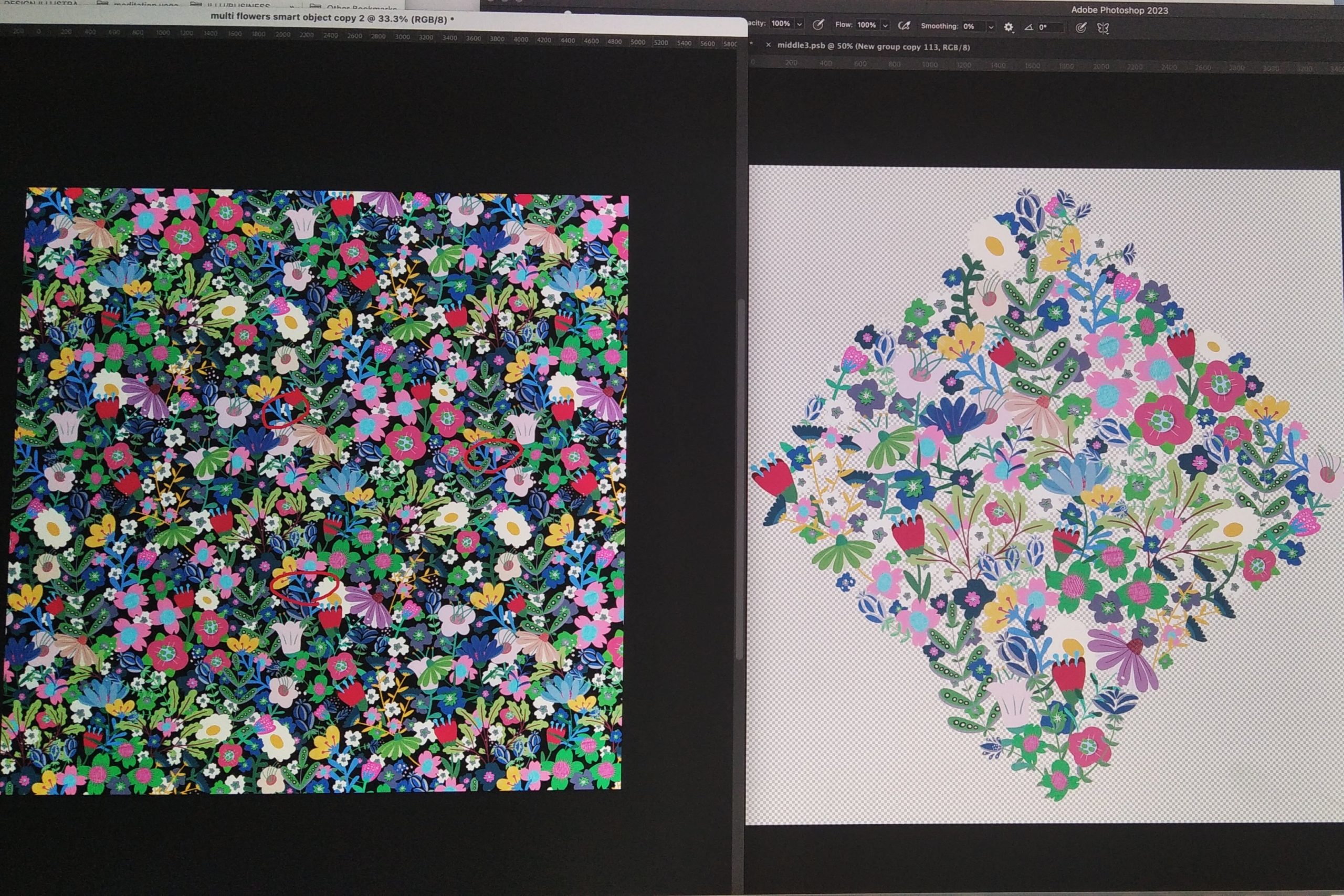
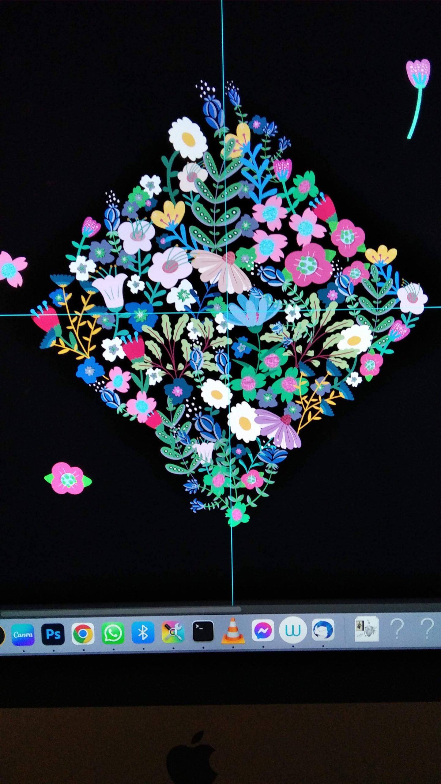
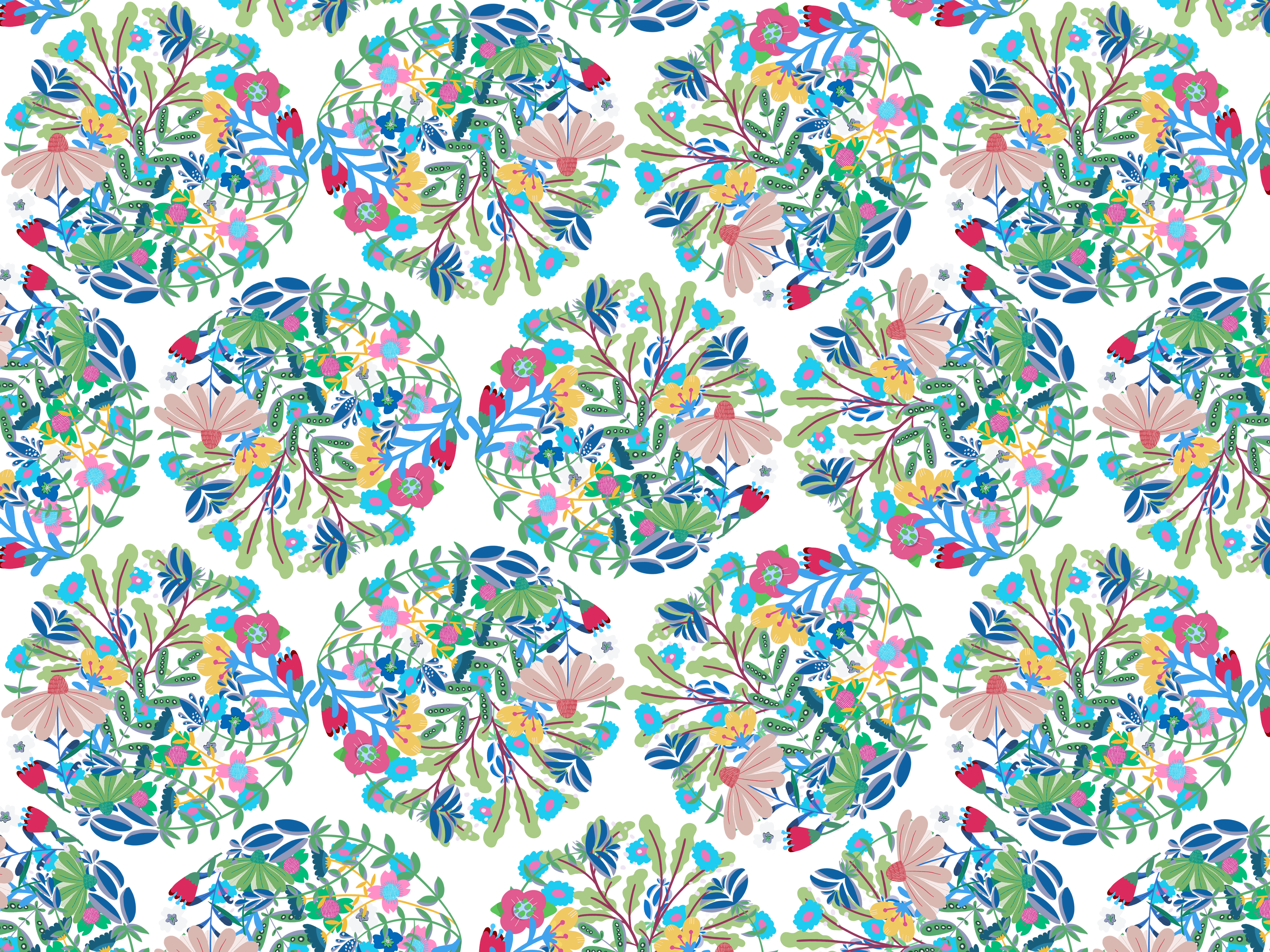
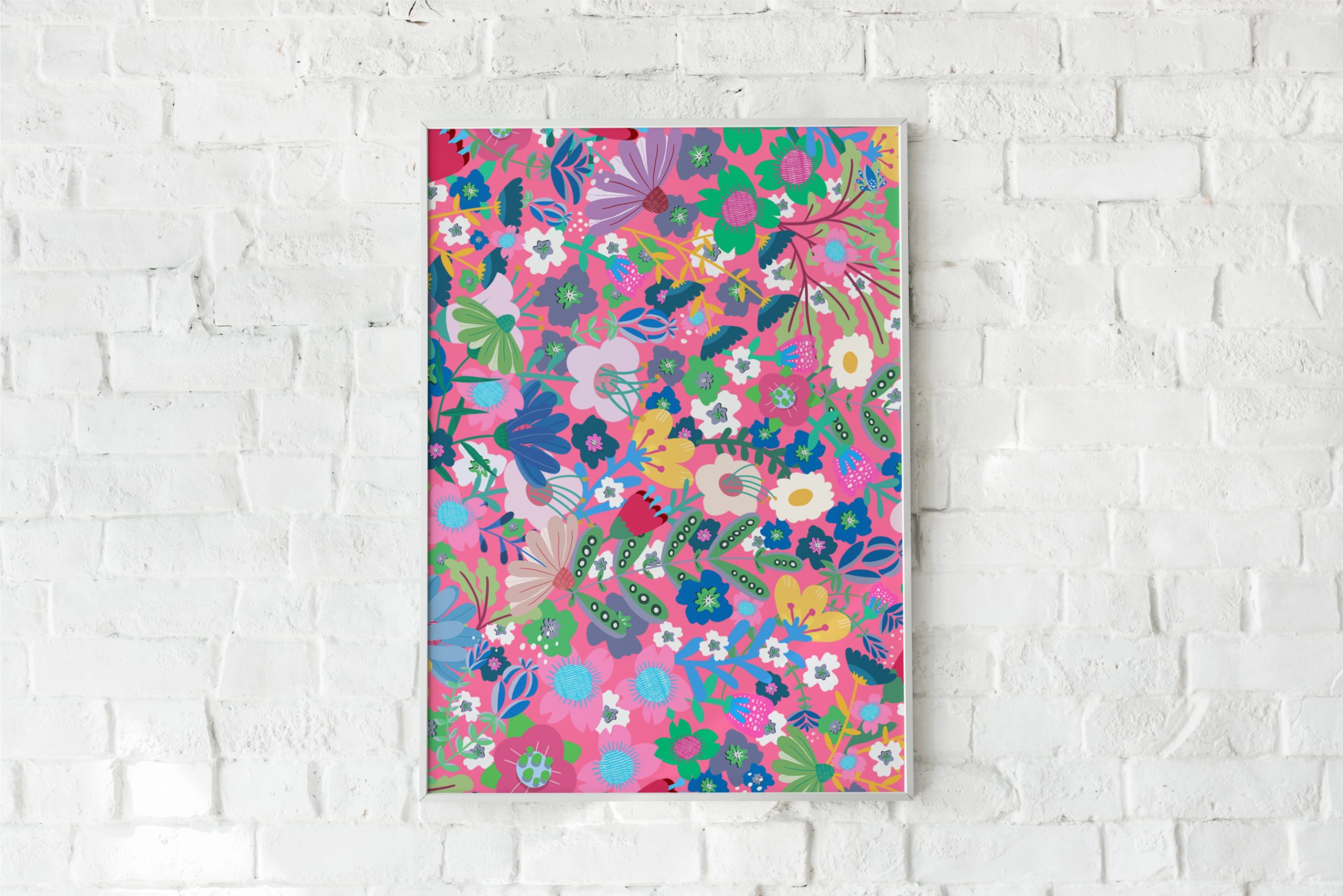
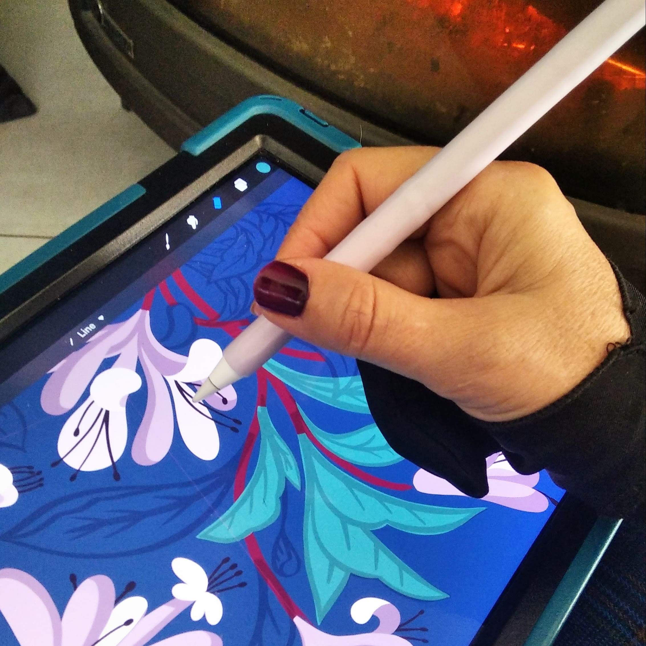
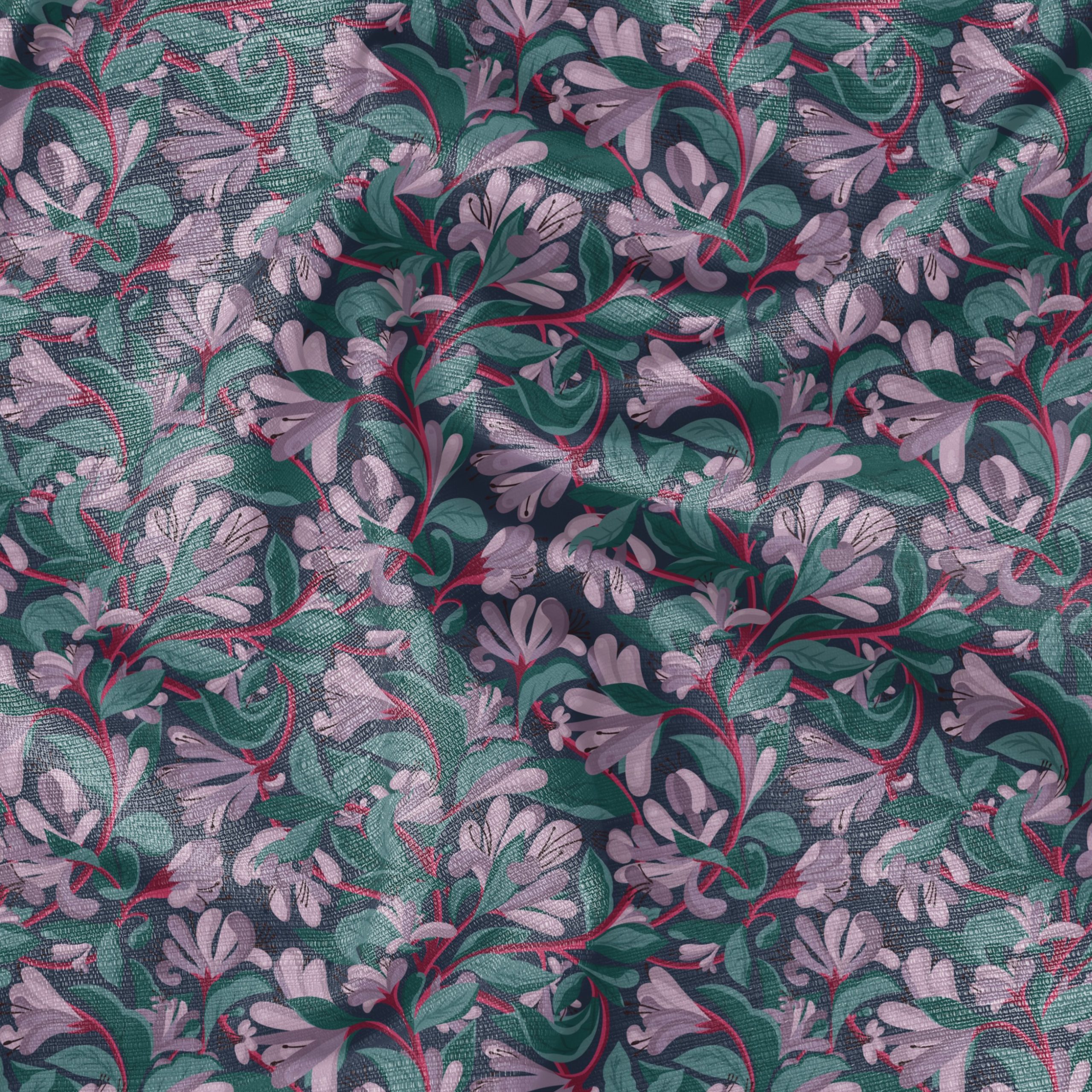
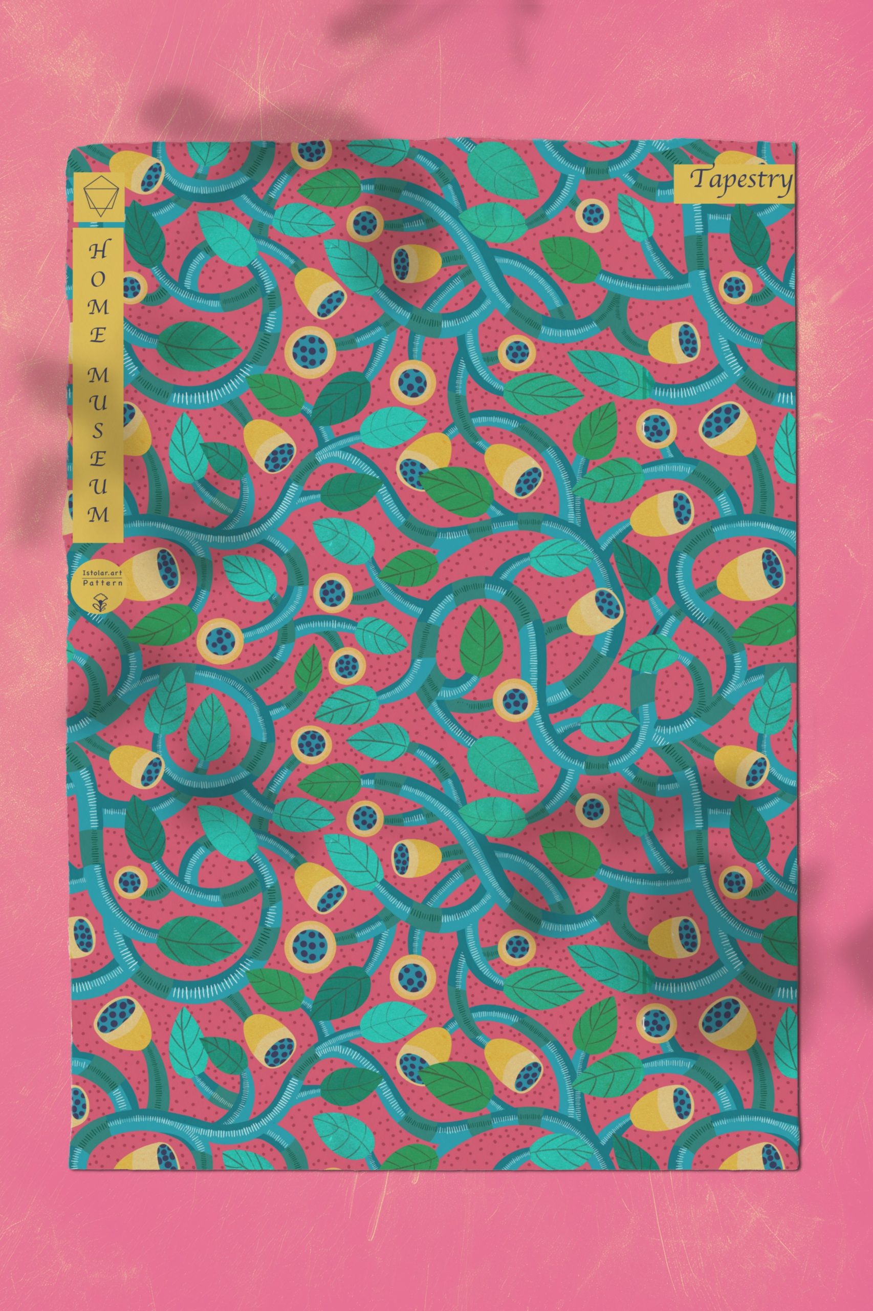
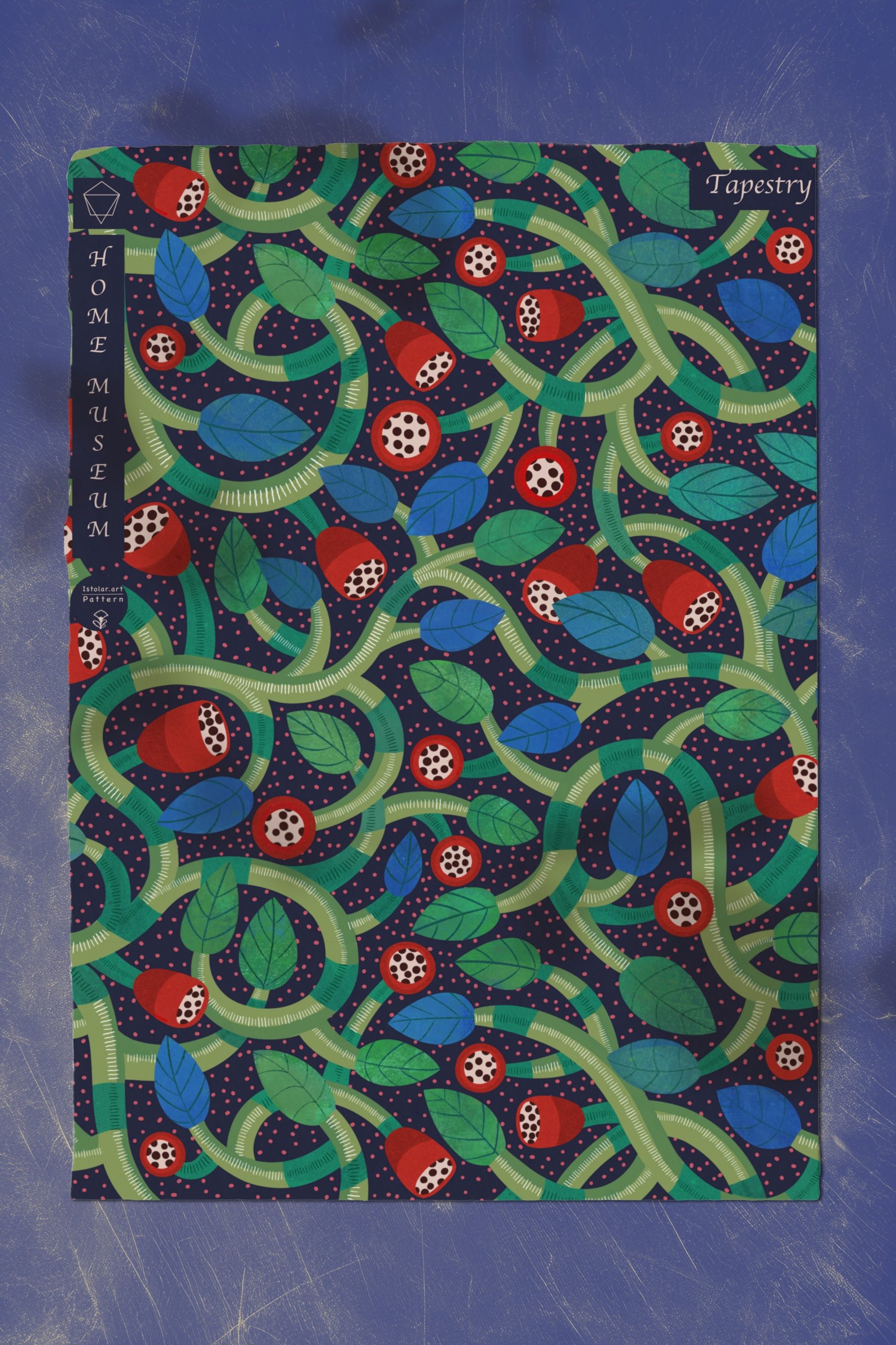
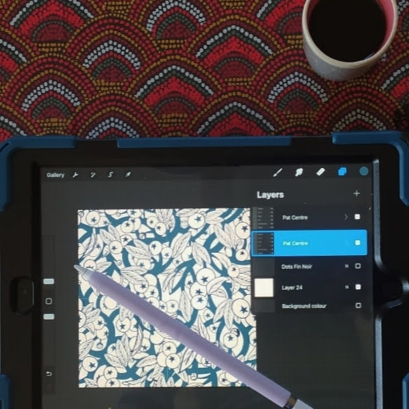
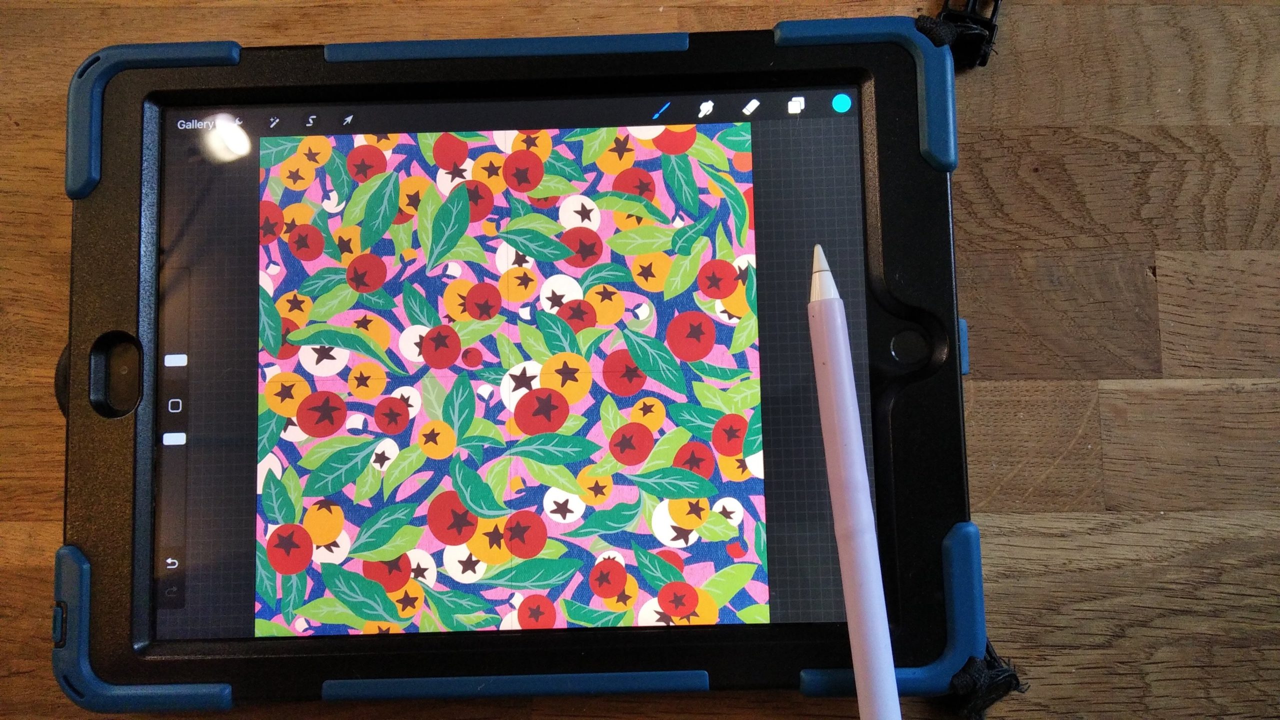
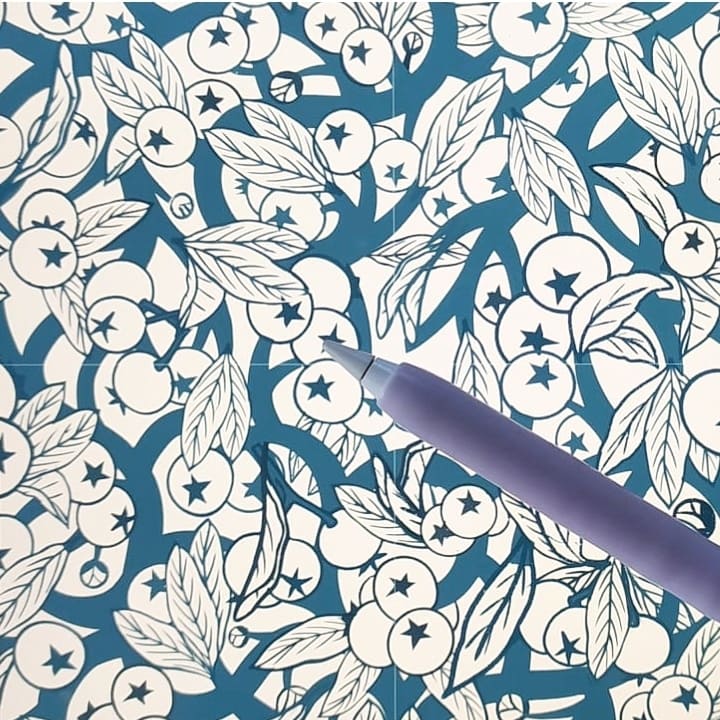
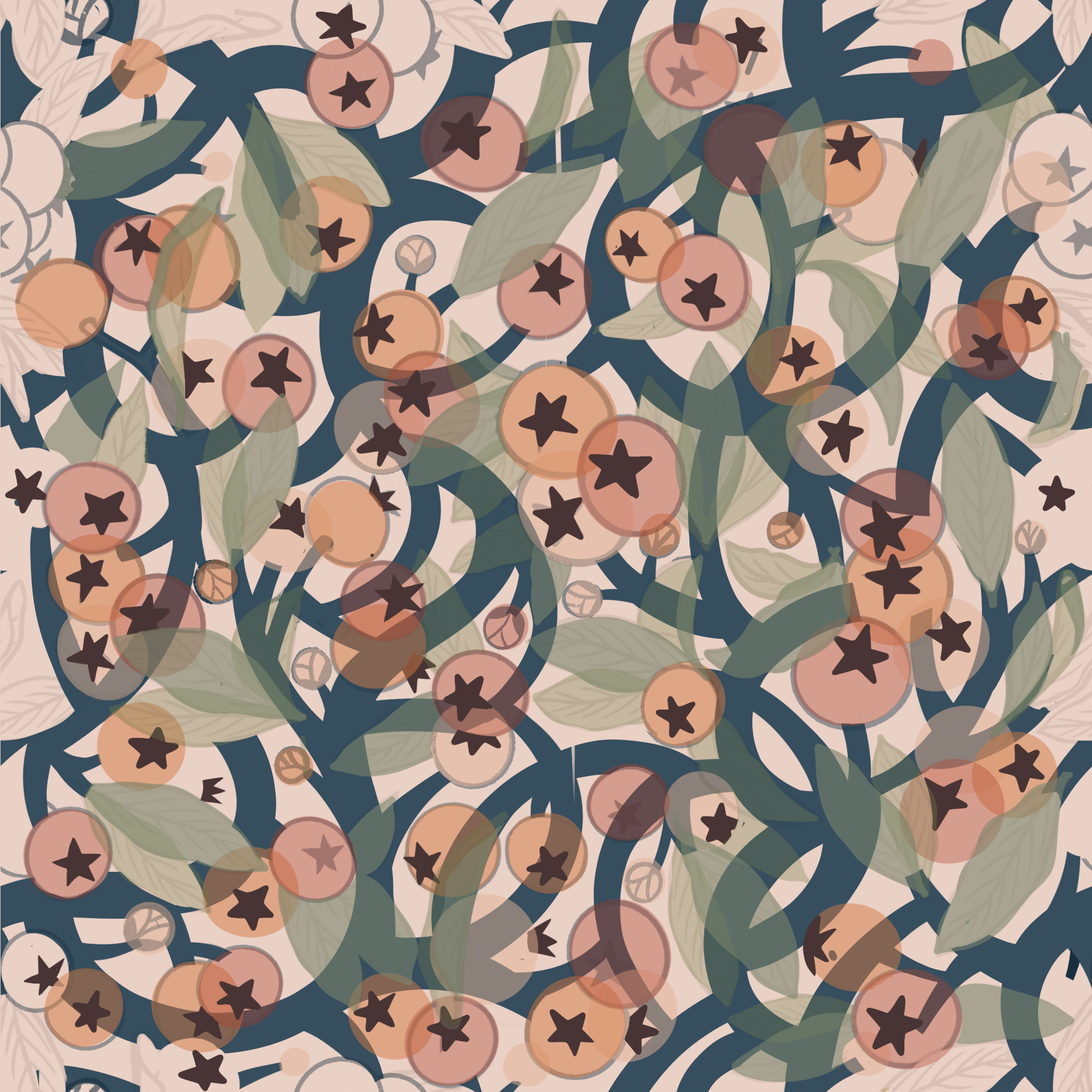
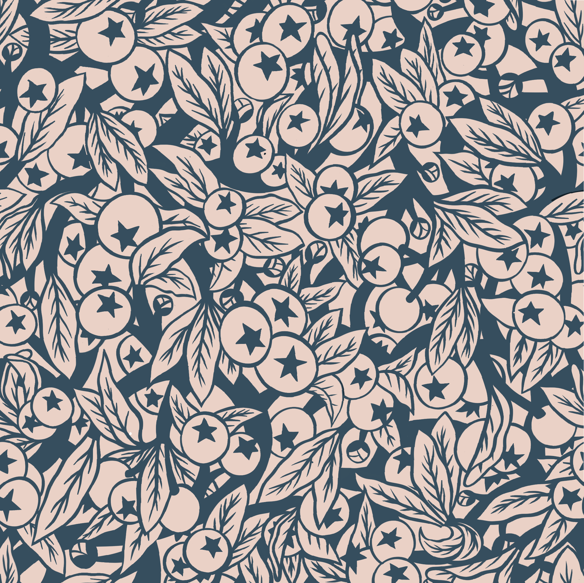
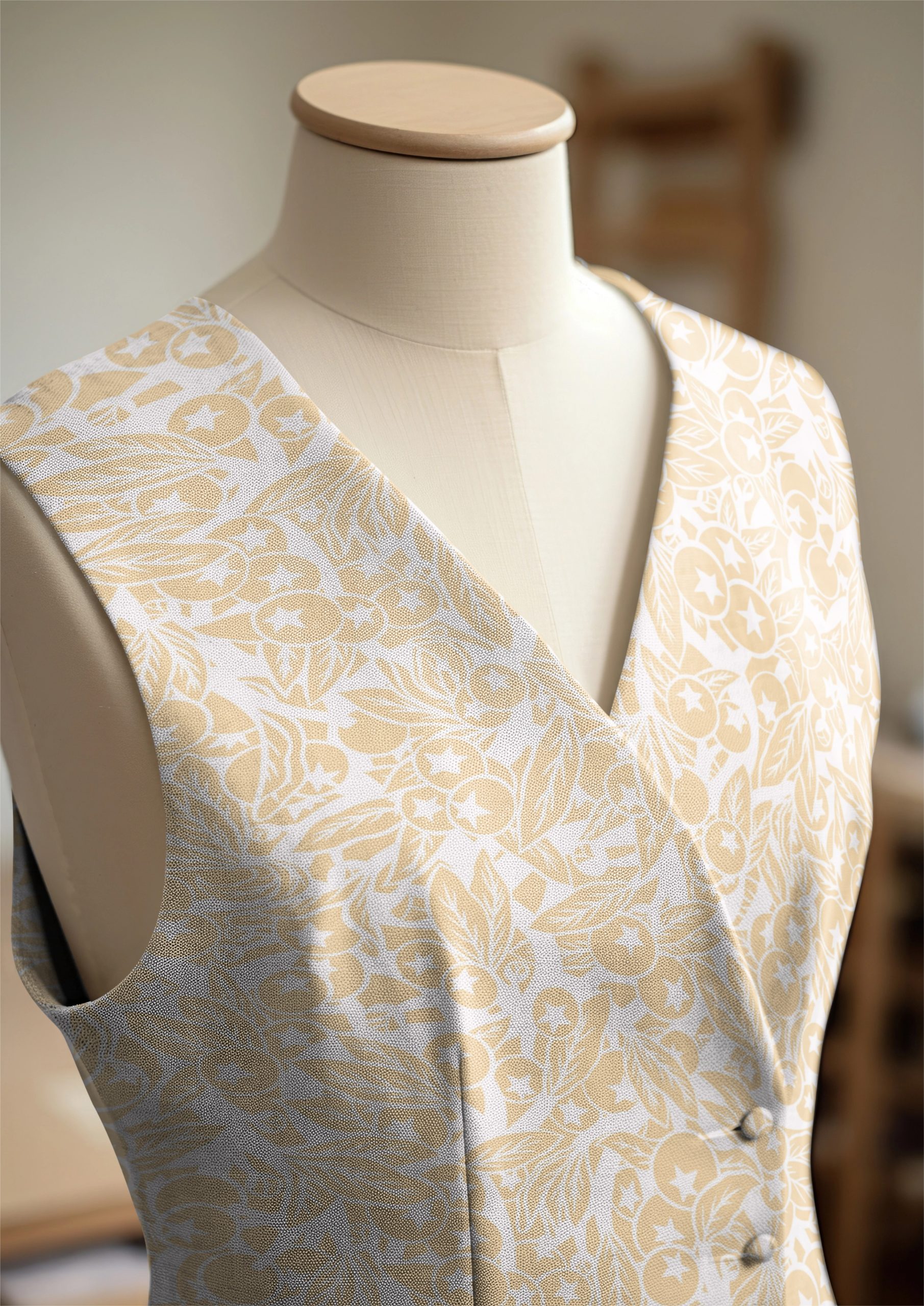
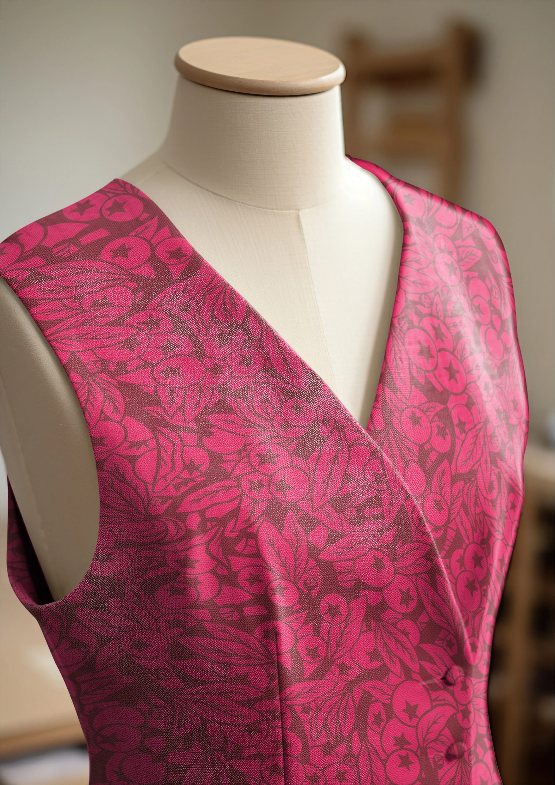
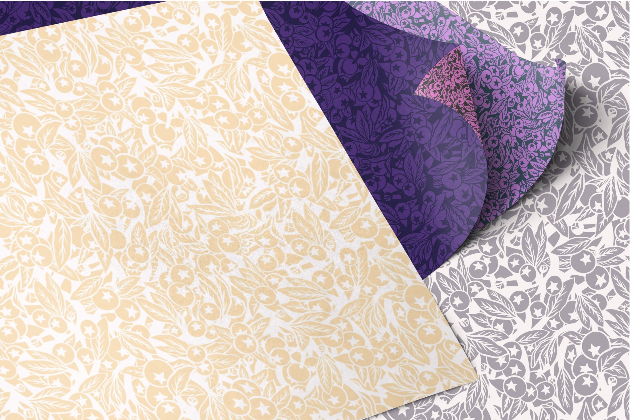
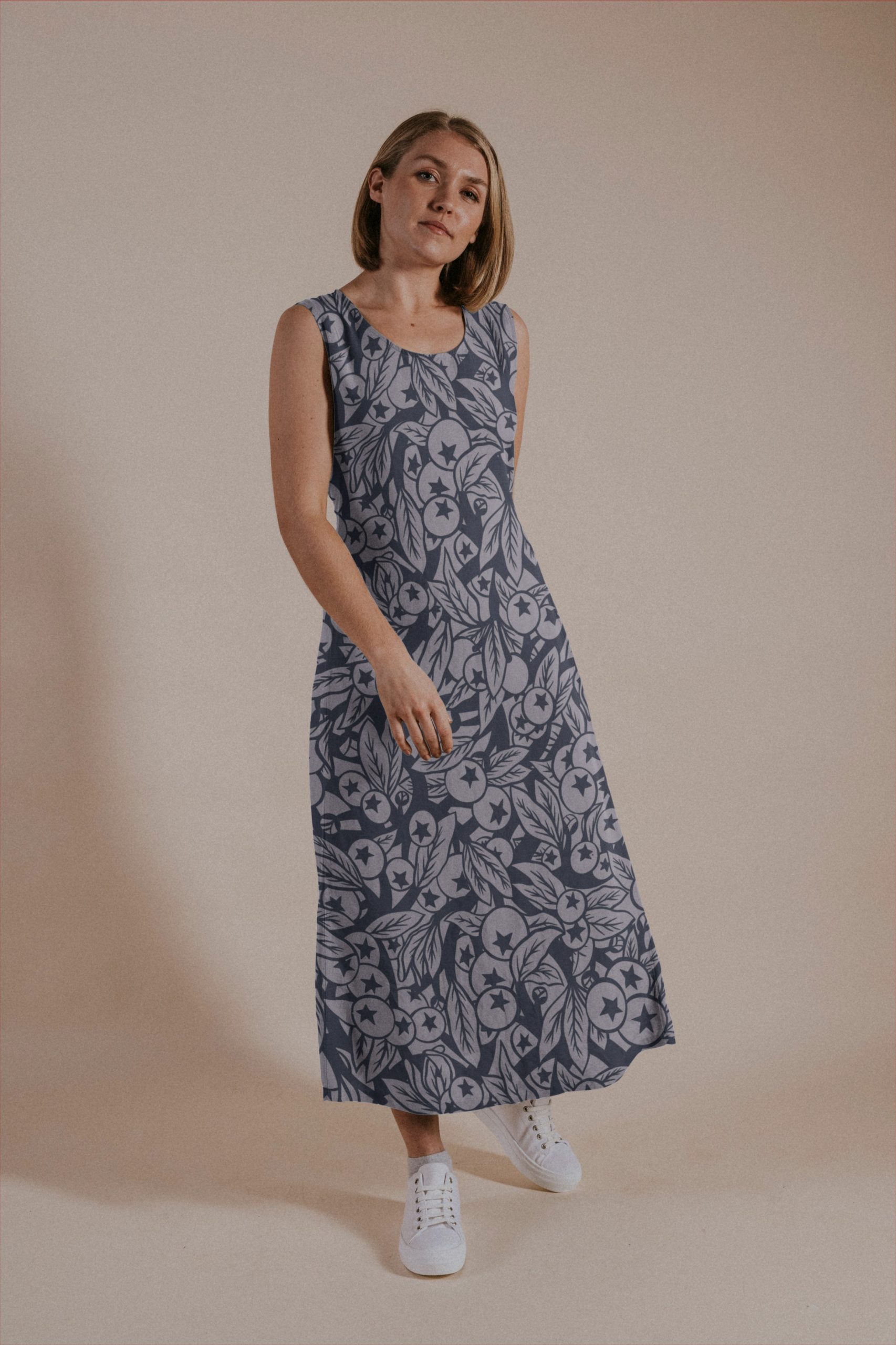
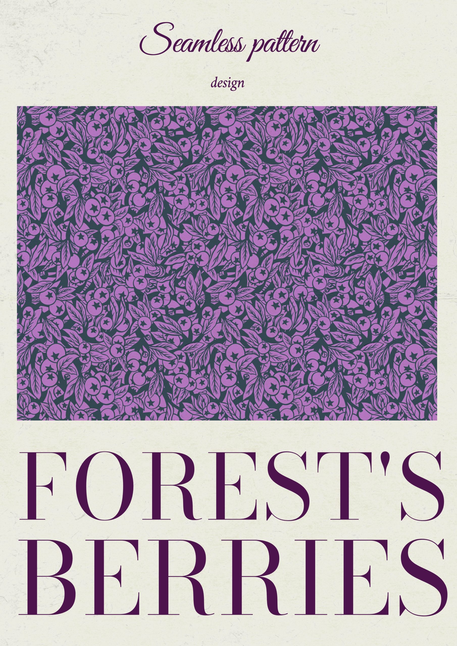
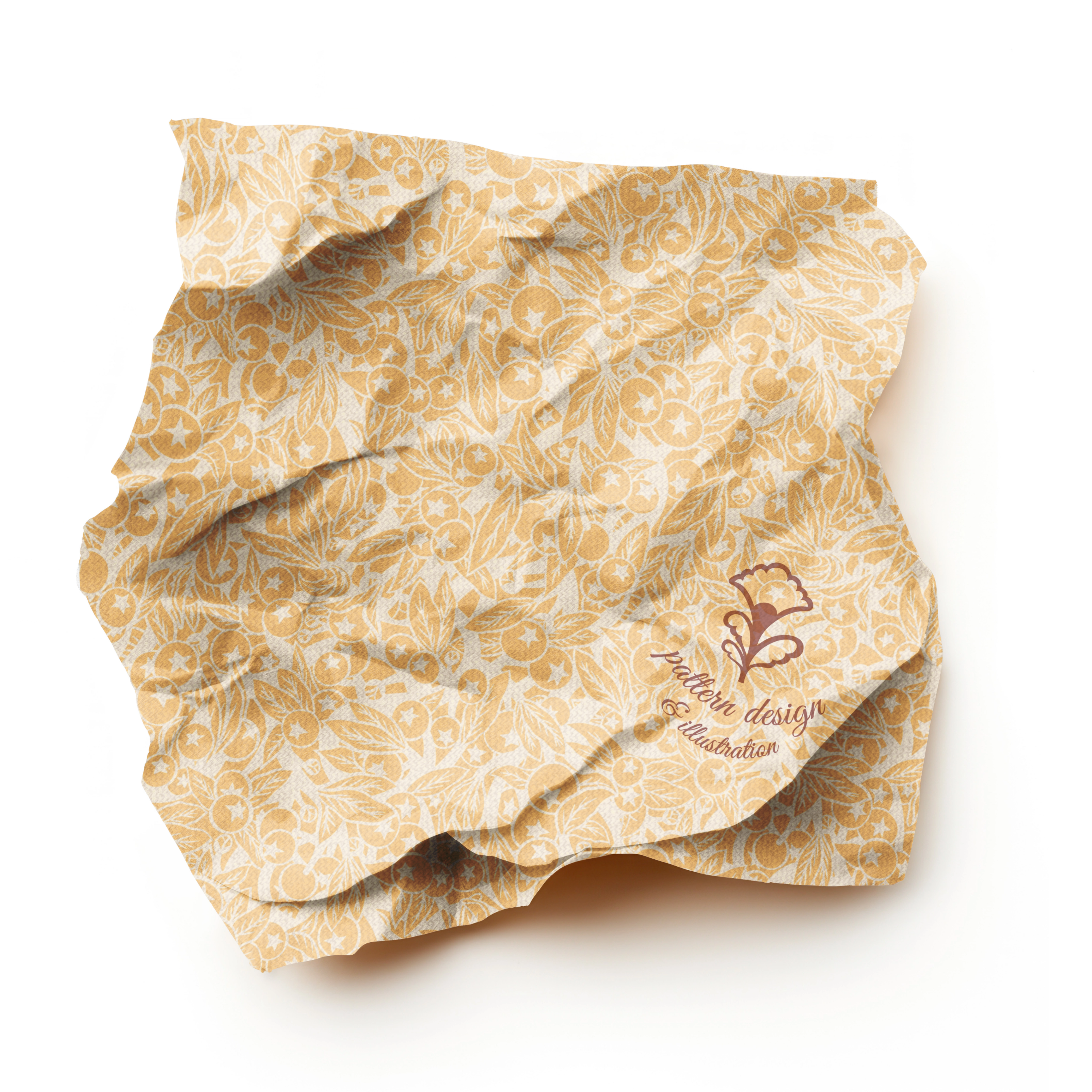
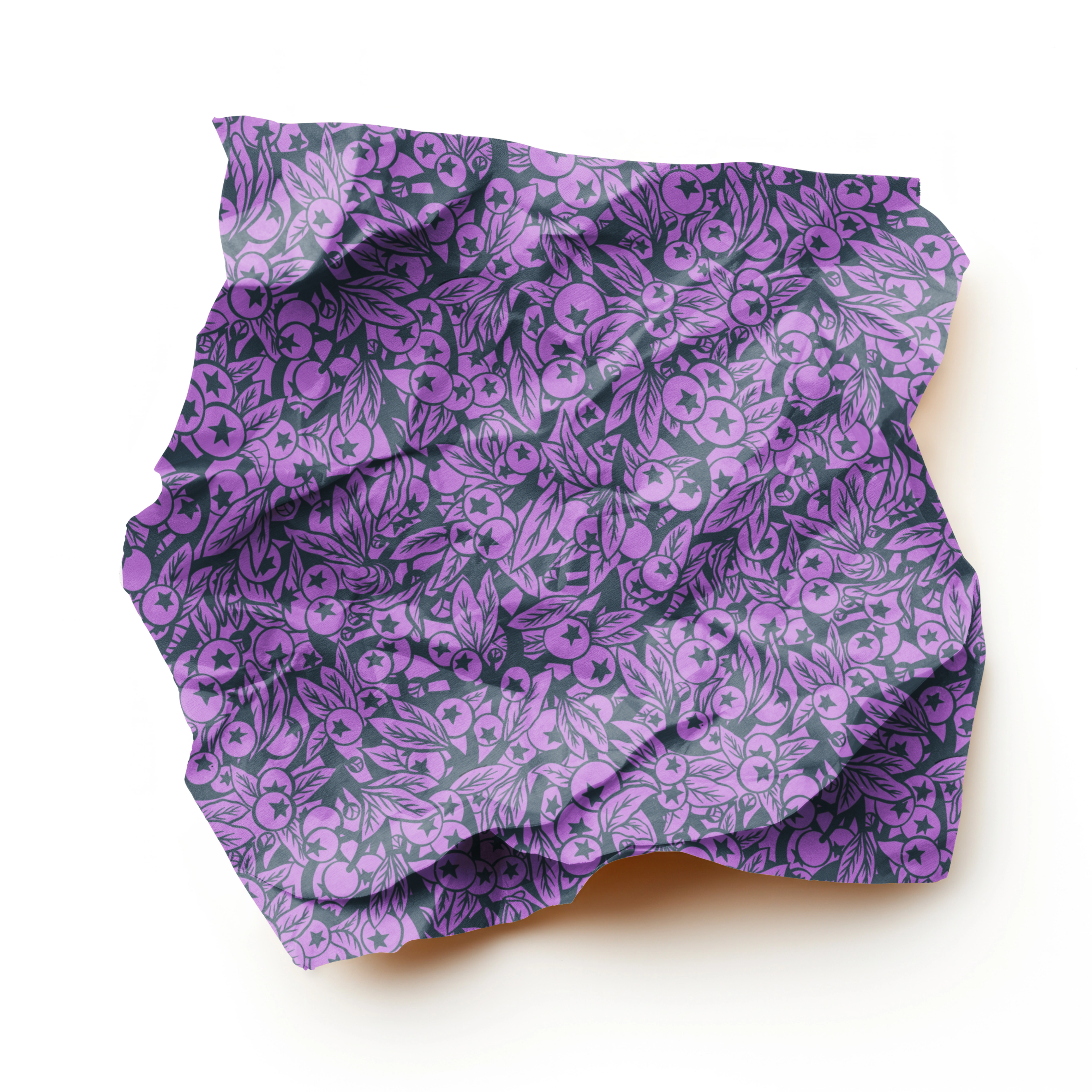
At the very begining I transformed a “tree of life” tile design non repeat pattern) into a full drop repeat pattern
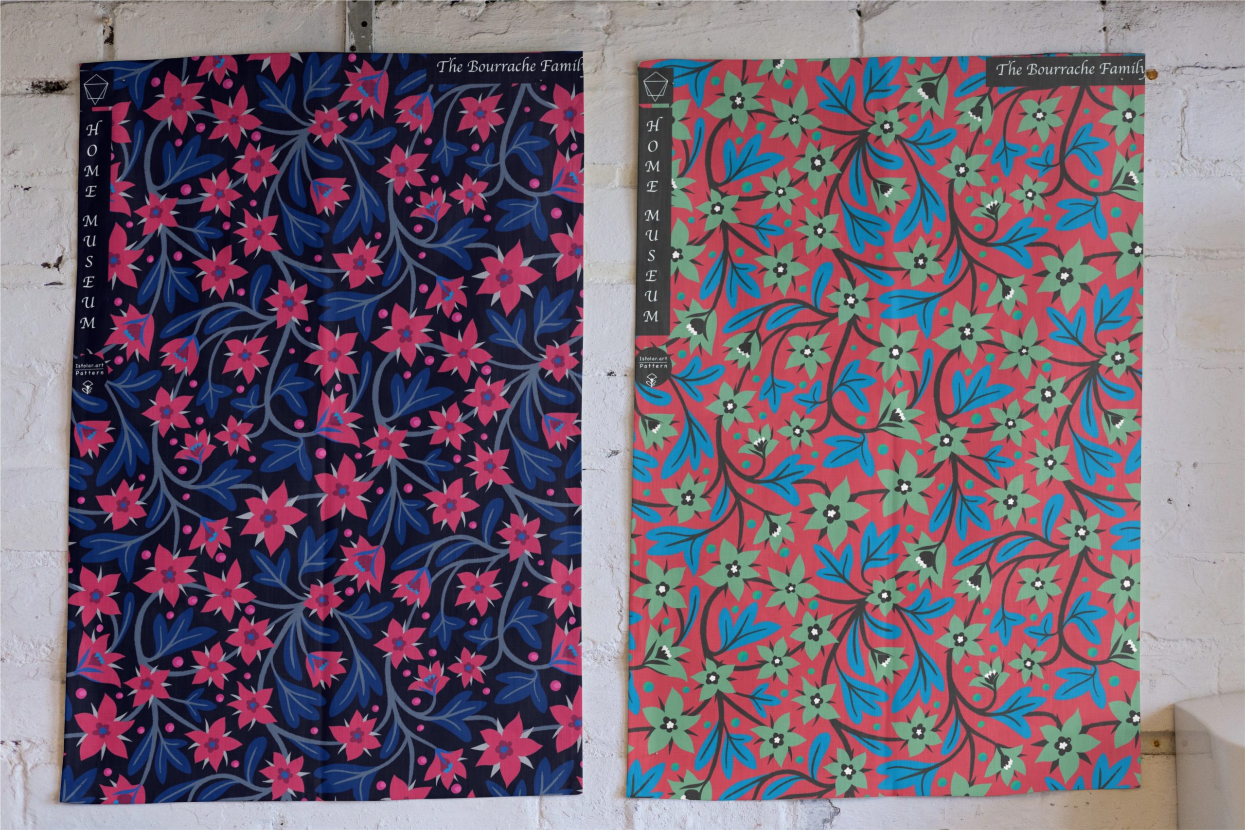
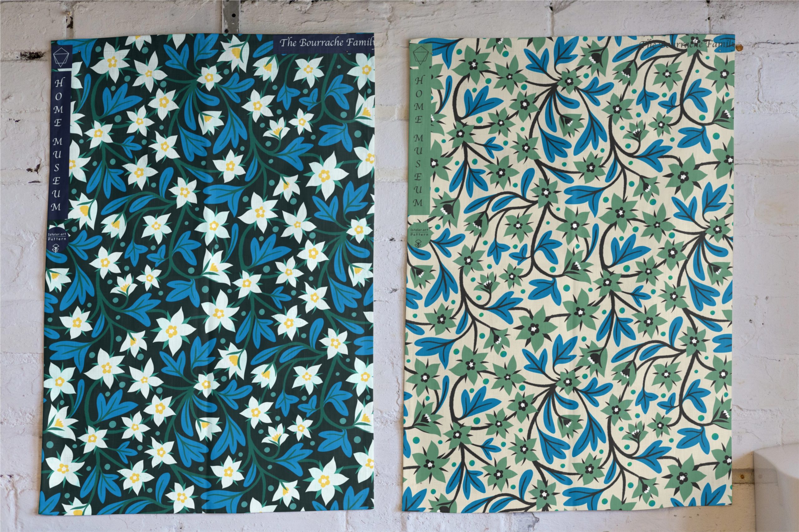
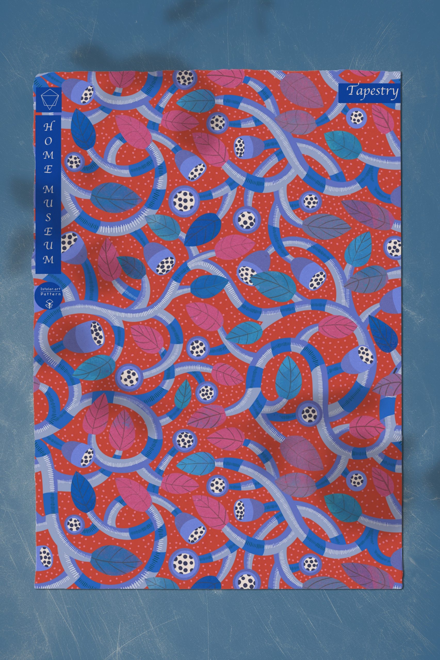
Then I intended to use the same pattern swatch structure to create an other pattern design. I wanted to create one more bushy motif with branches rather than thin flowers. I thought it would be a way to make an other pattern following the same tracks of a previous one. As a matter of fact I encountered lots of unexpected difficulties on the way: It was not that easy to make it even with the imbricated leaves and fruits. I might as well have started it from scratch. Eventually it worked out so all is well ! 🙂 .
I guess i learned a lesson : the structure of the repeat is one thing but the style of the flowers and leave make the identity and fluidity of the pattern even more strongly. It was not a short cut at all
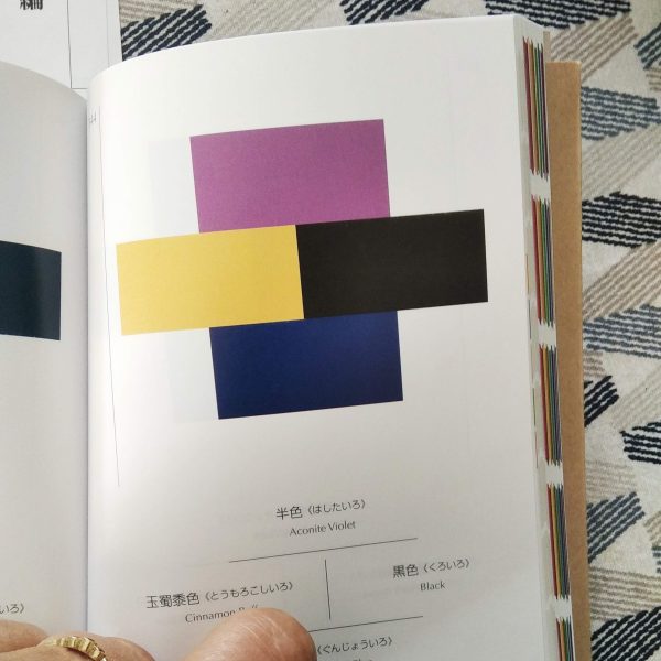
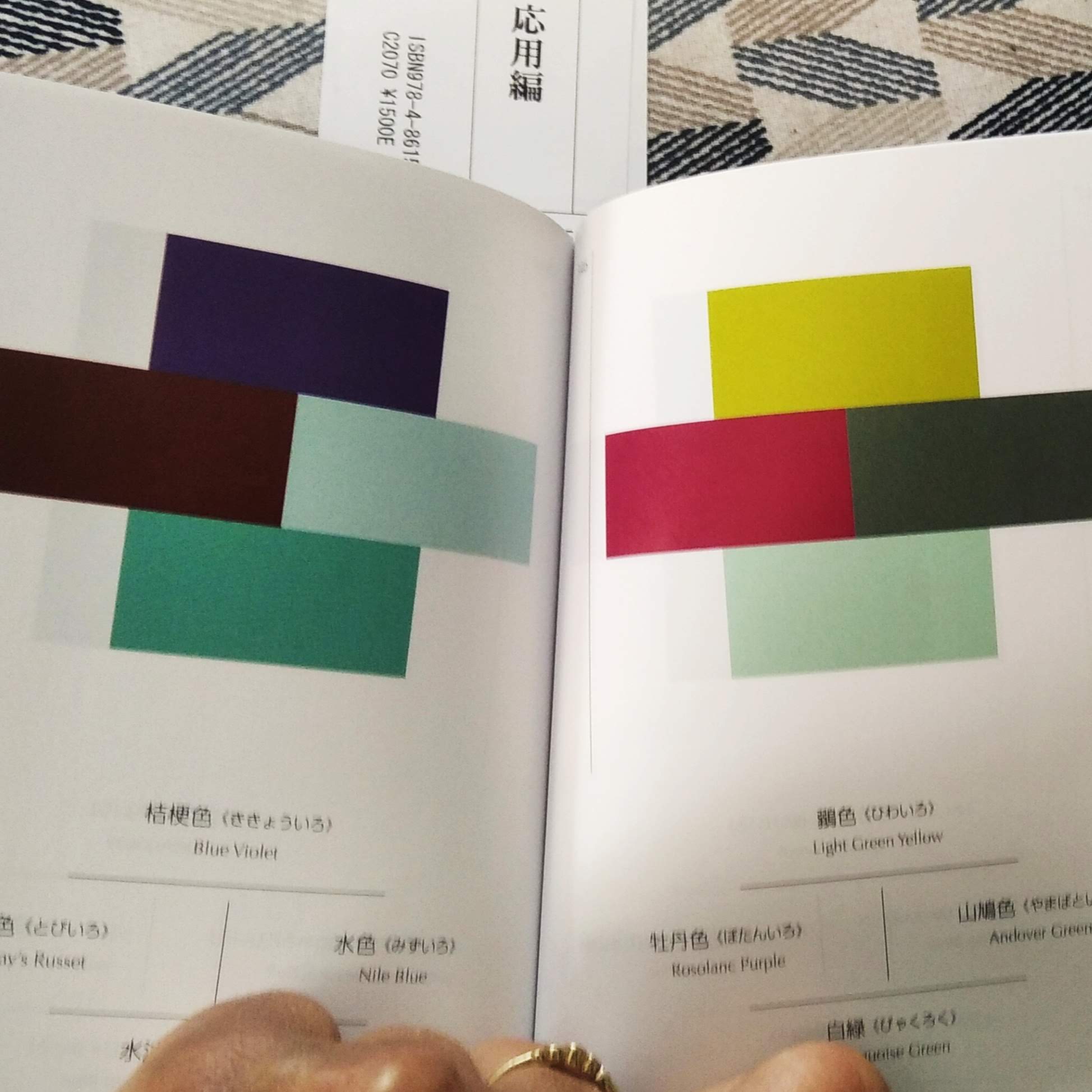
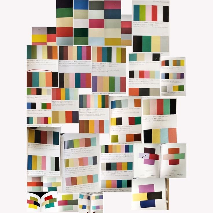
Dans la bibliothèque du MAD, j ai “trouvé” ces deux petits livres bijoux.
Le format, le papier, la présentation des combinaisons de couleurs tout est juste parfait
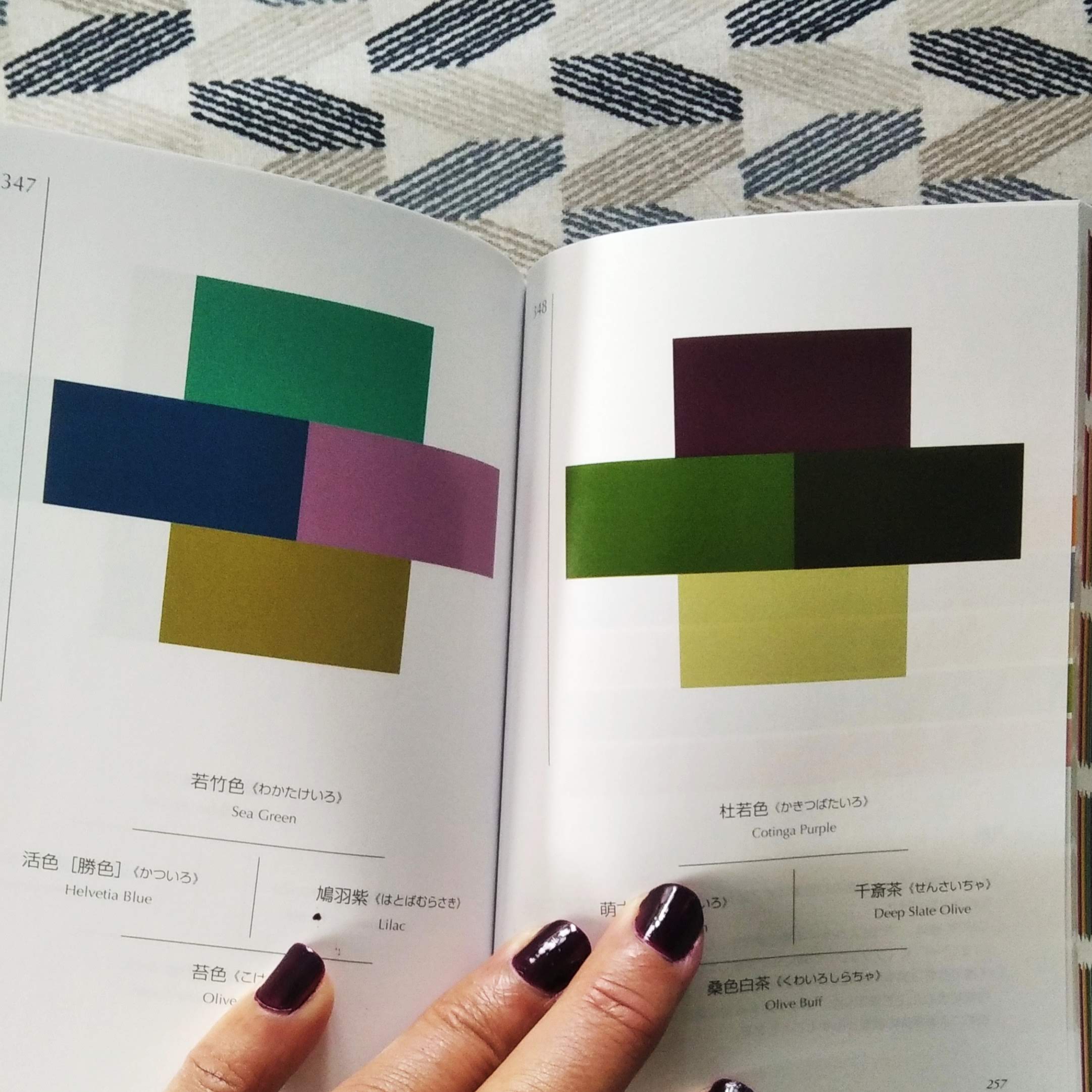
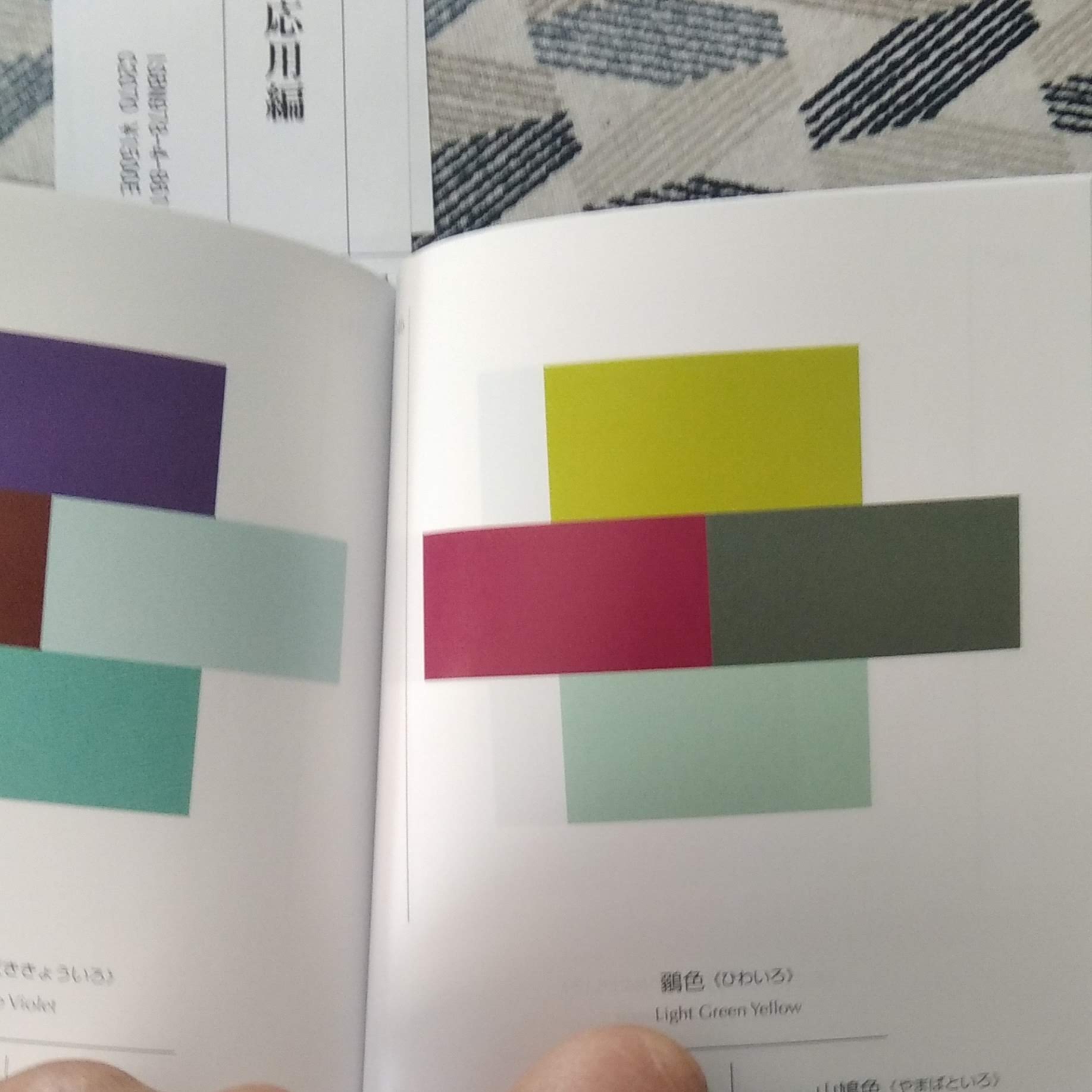
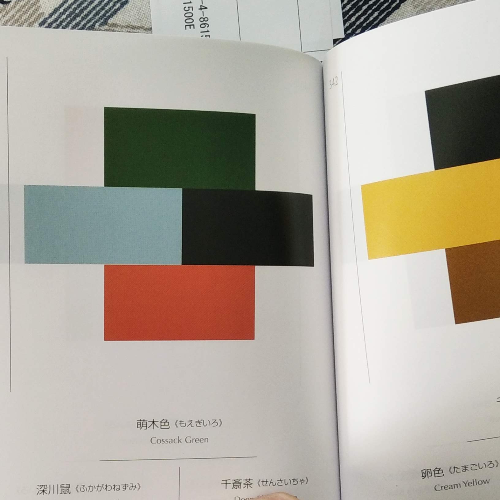
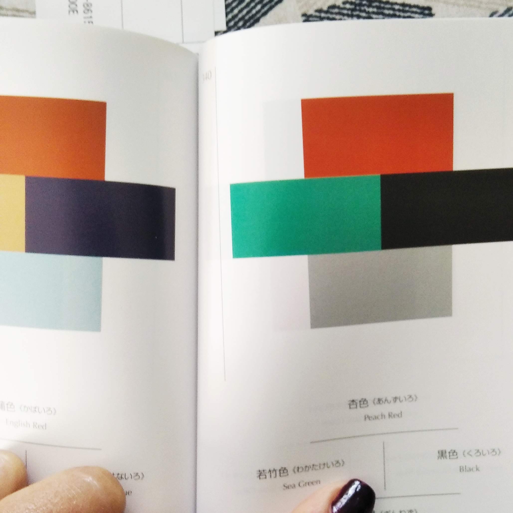
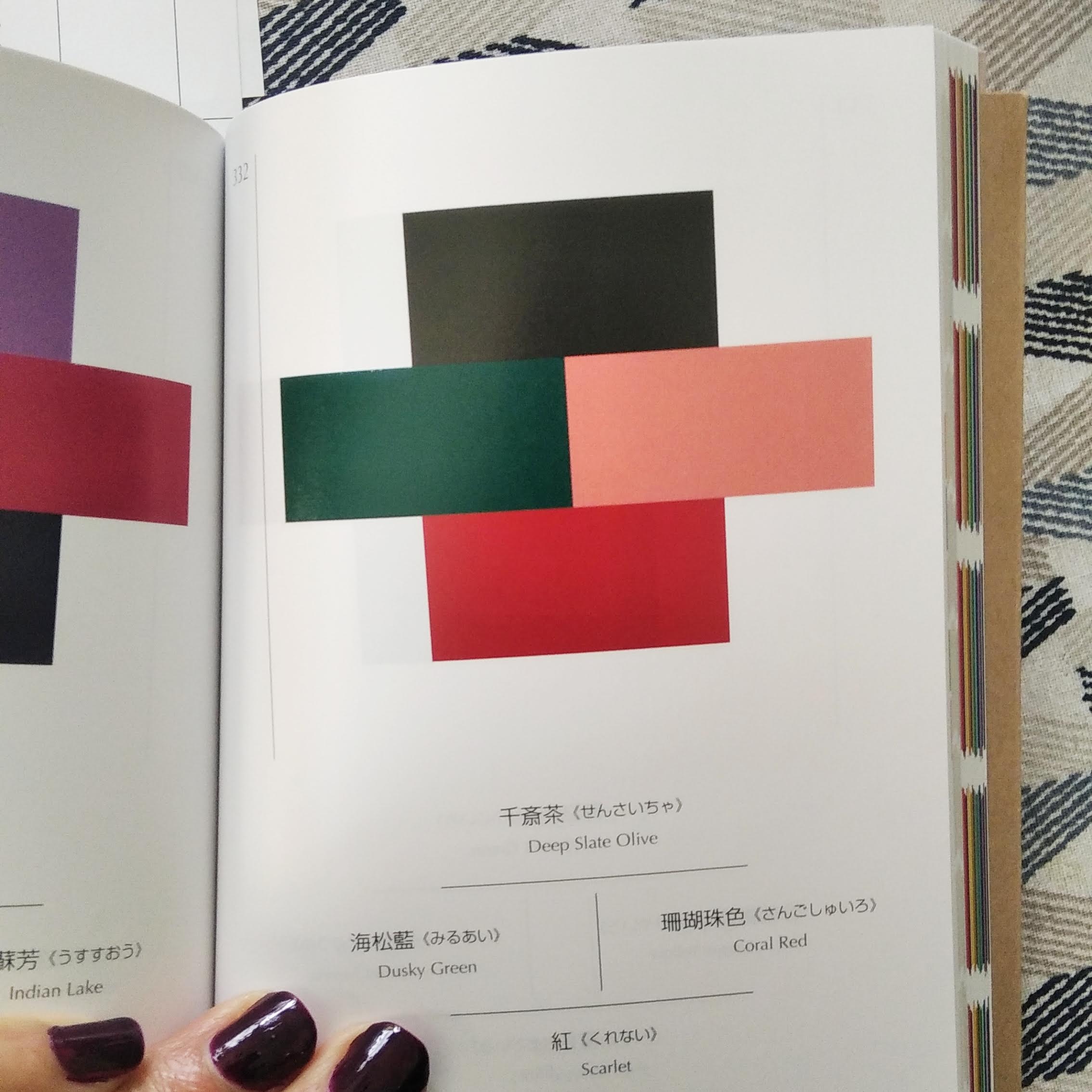
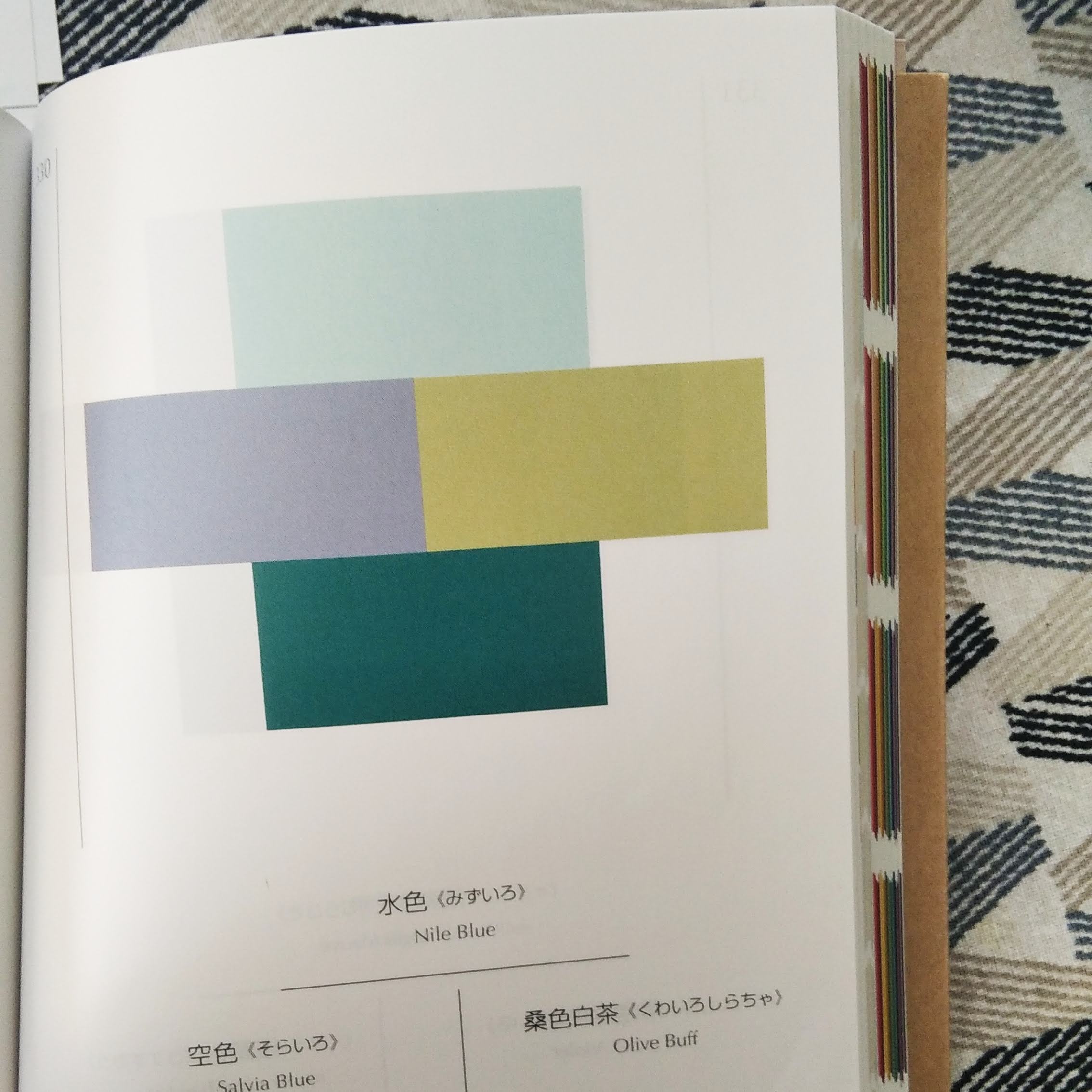
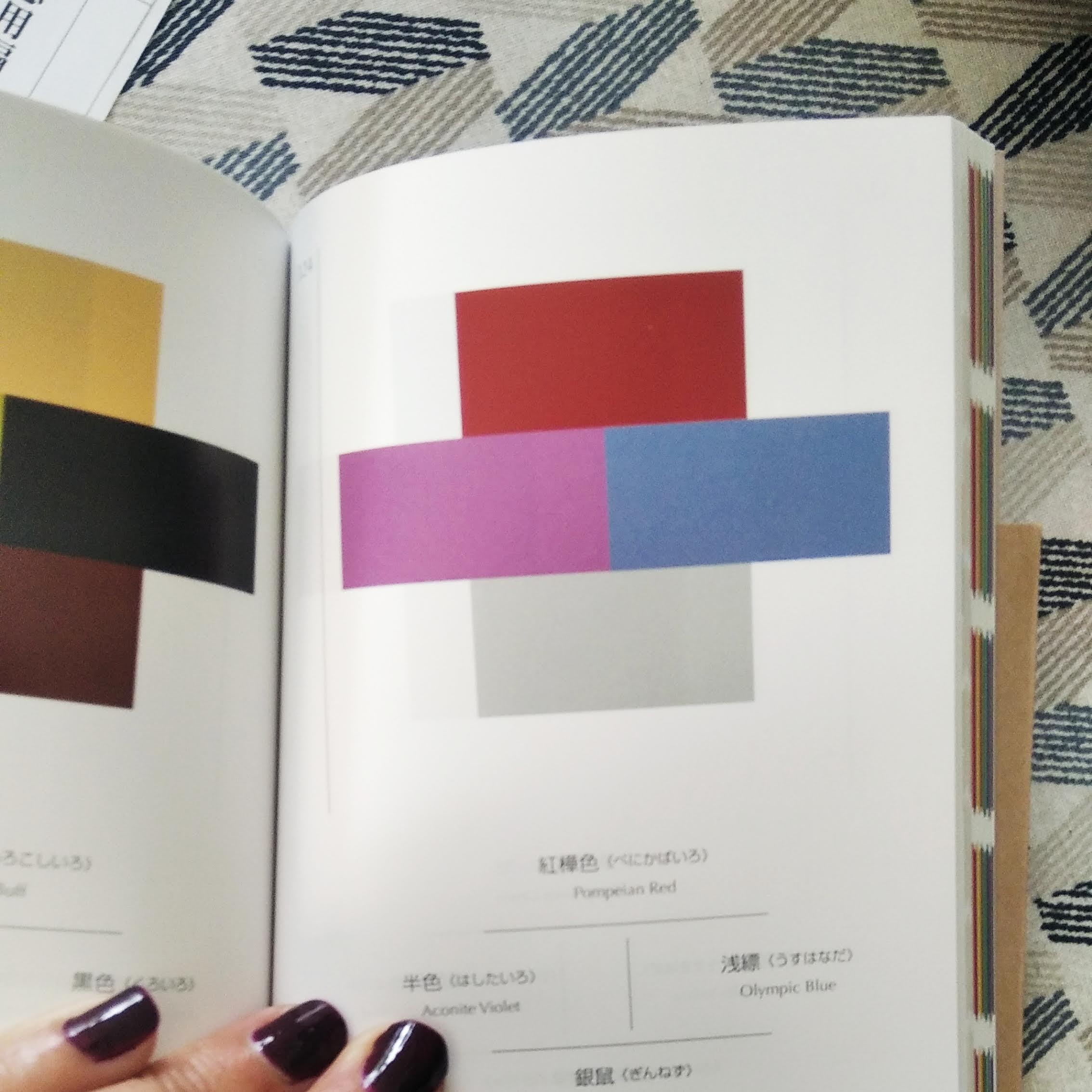
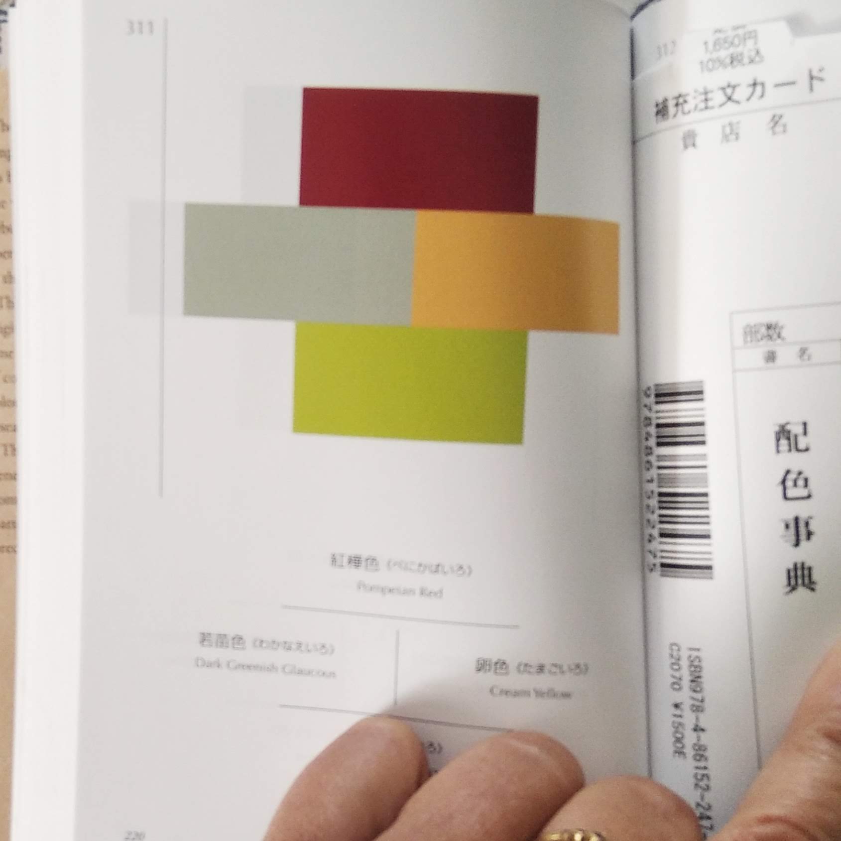
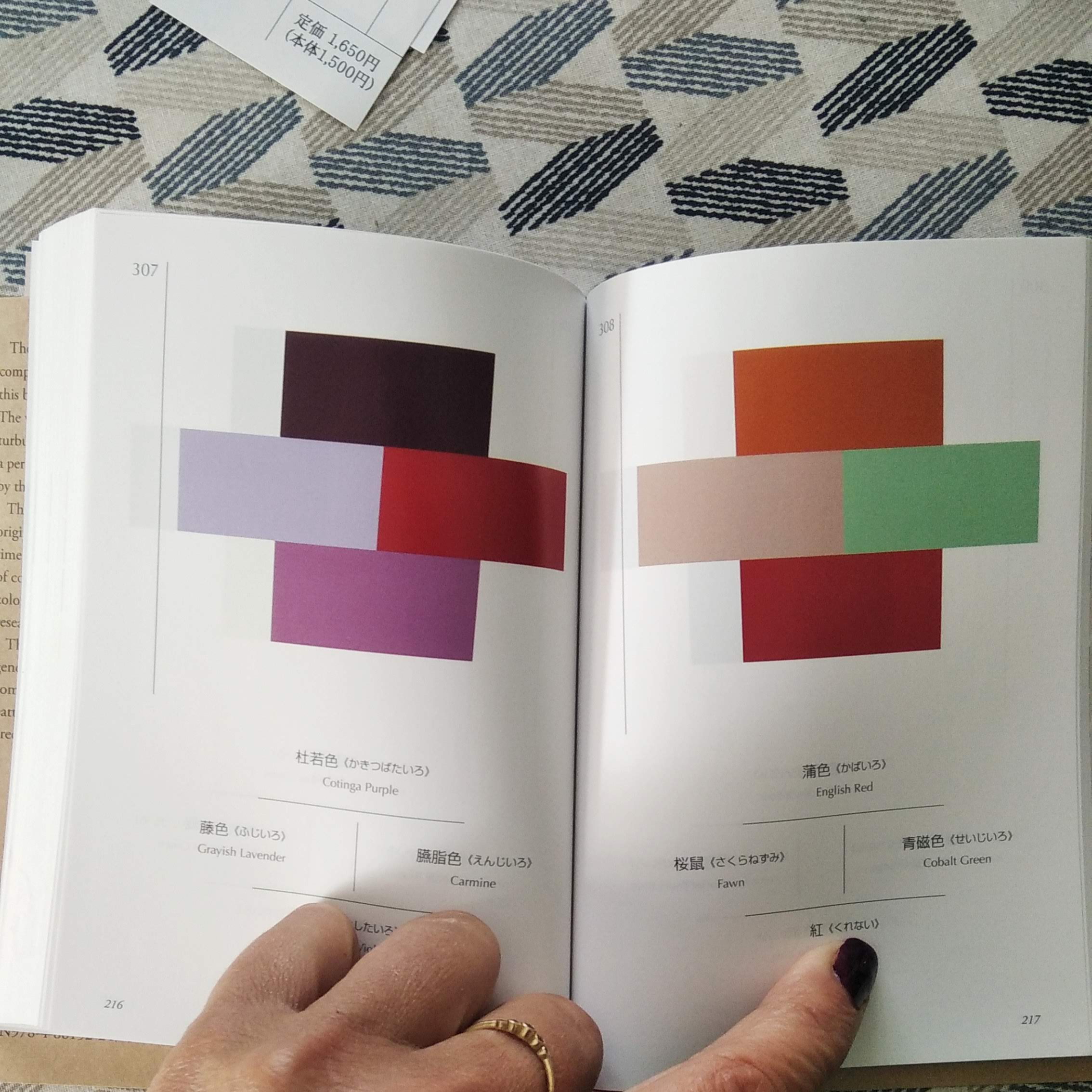
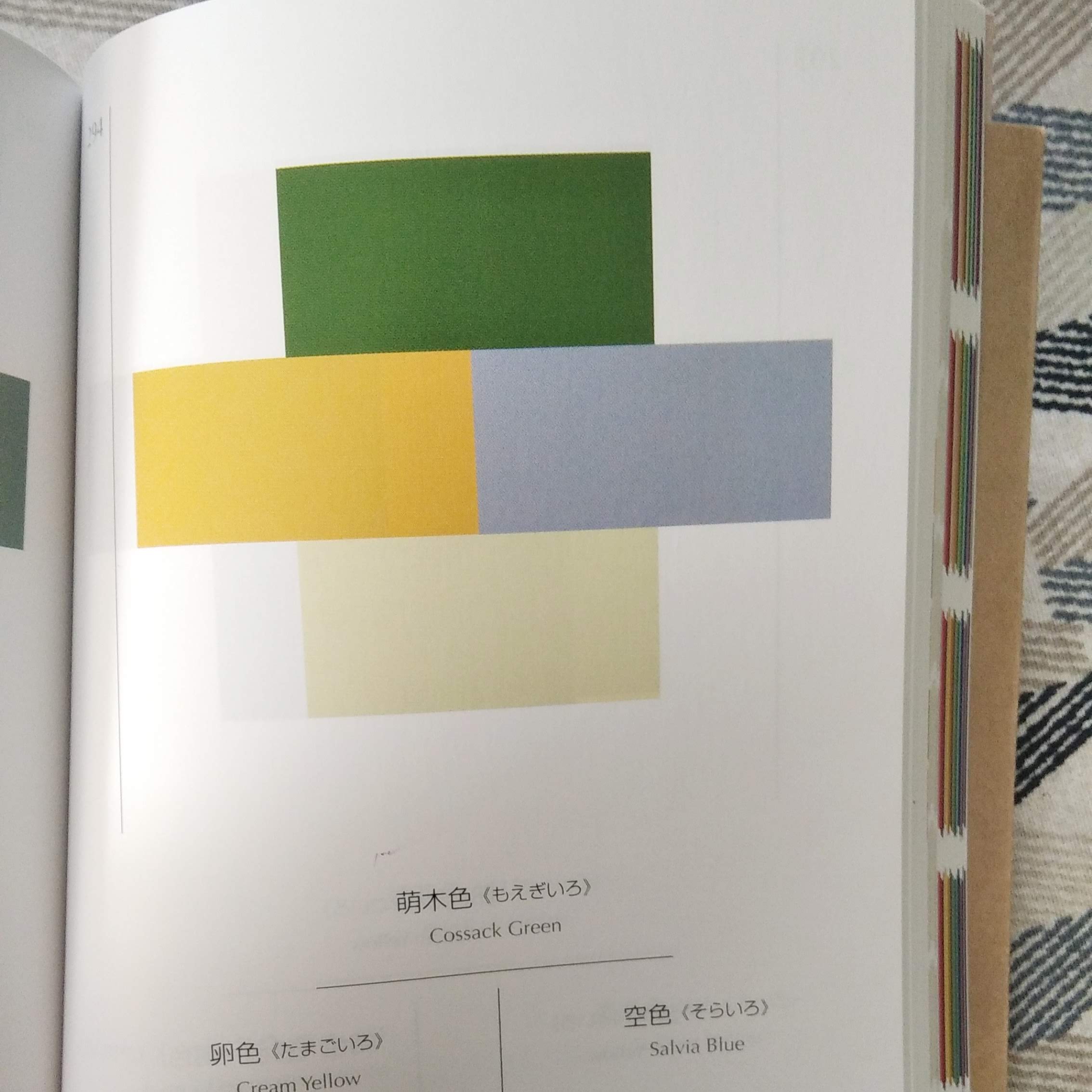
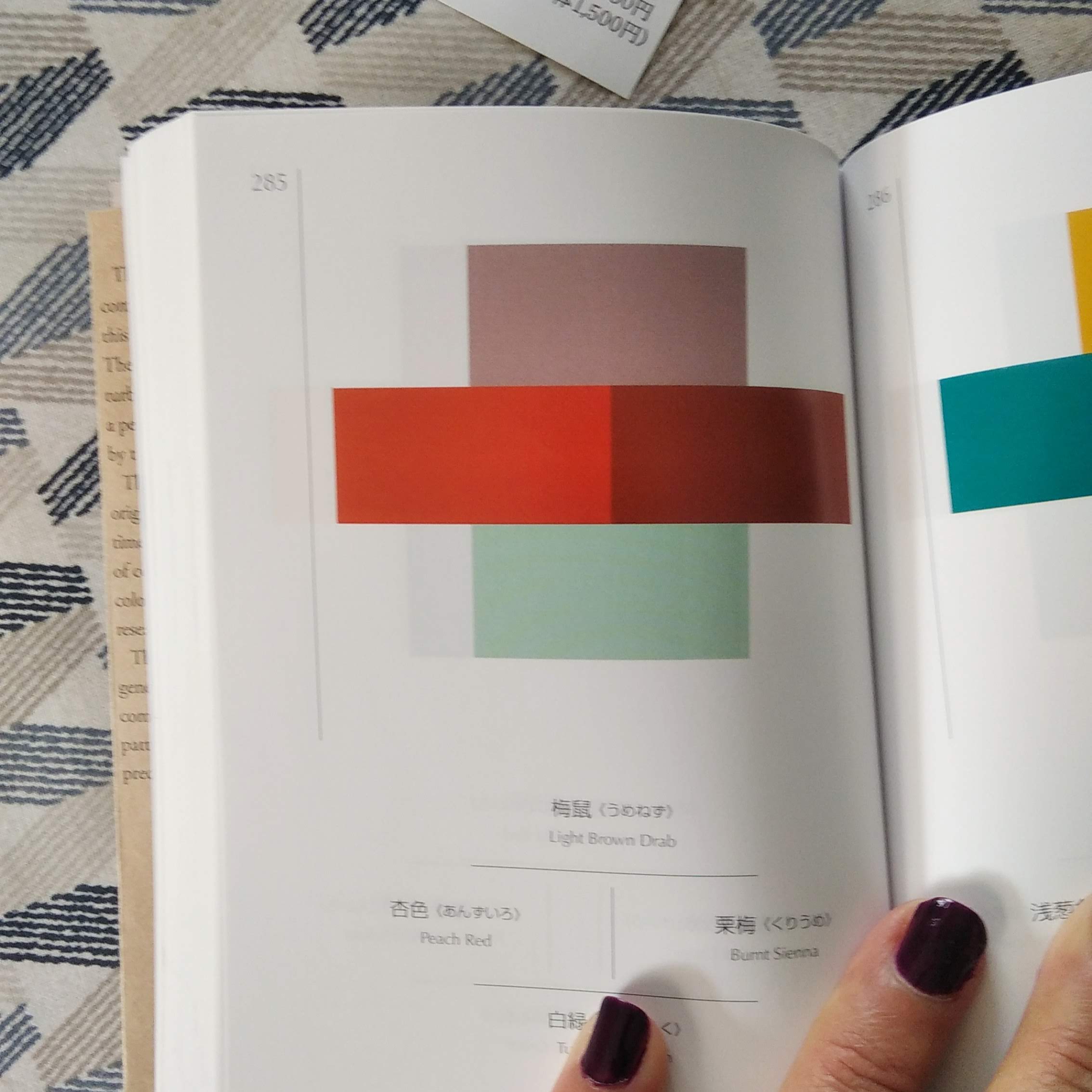
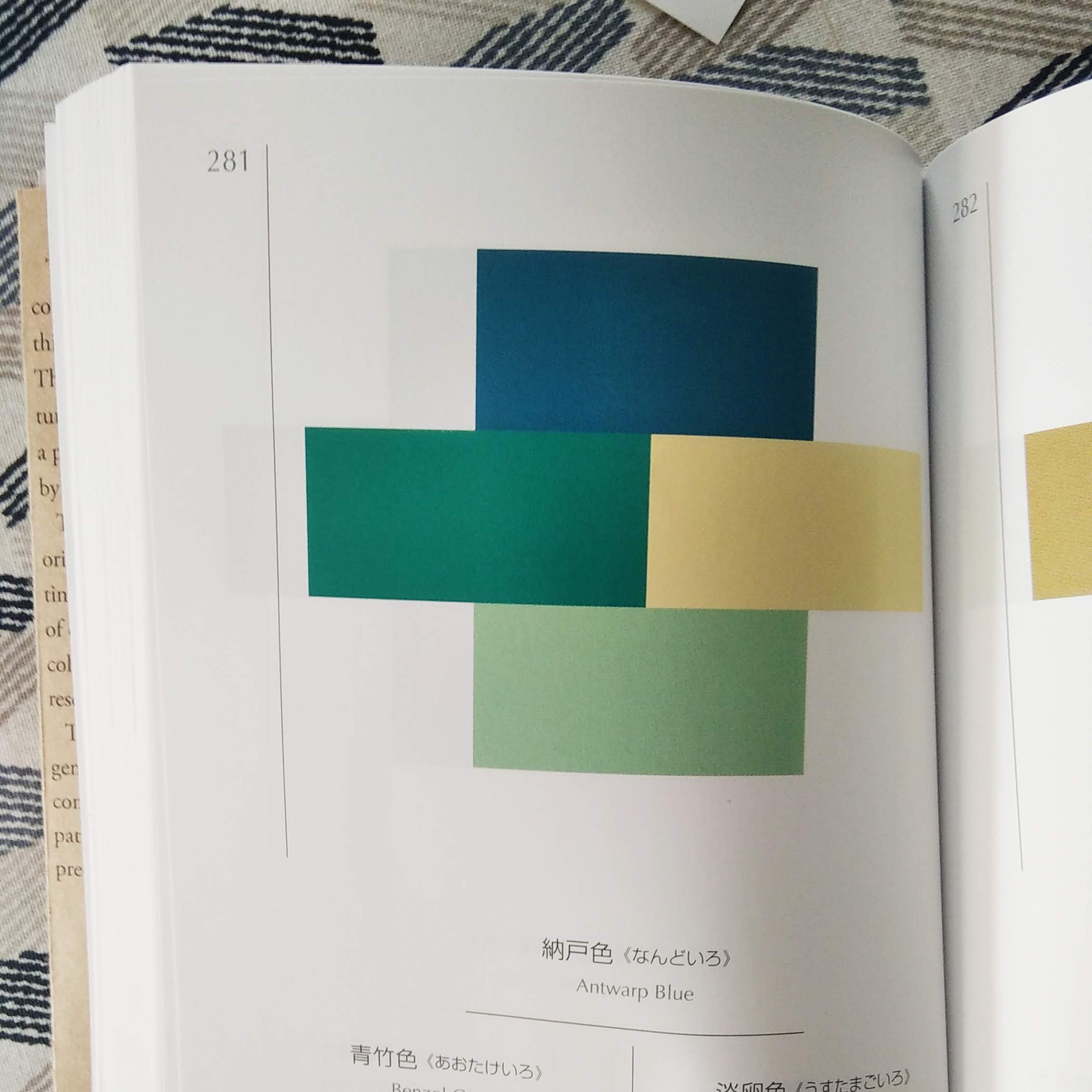
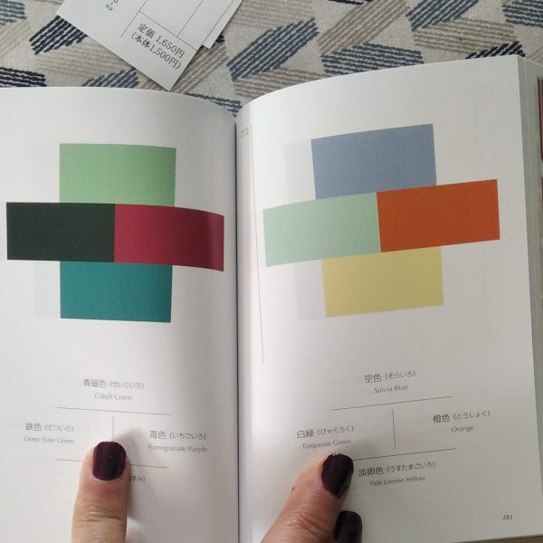
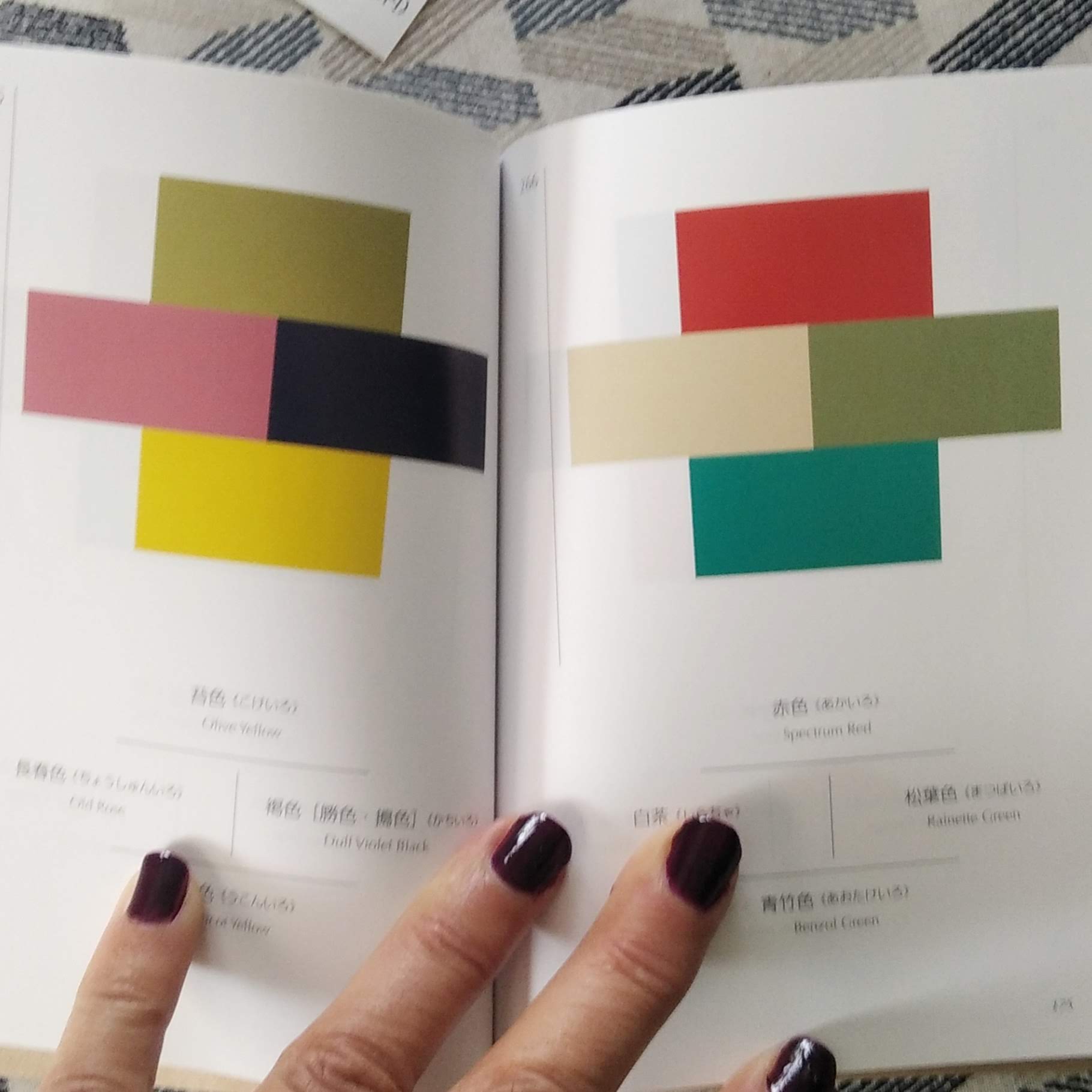
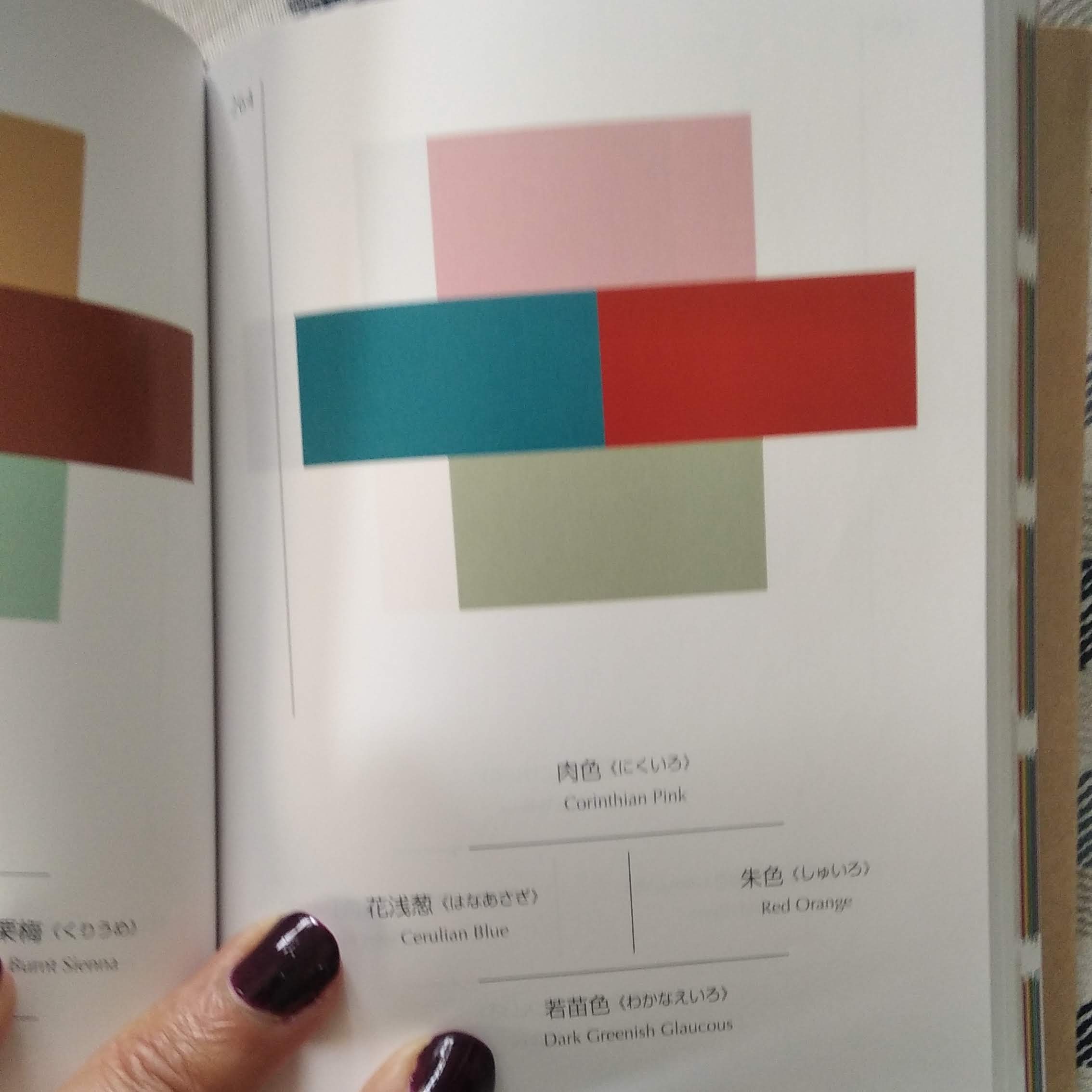
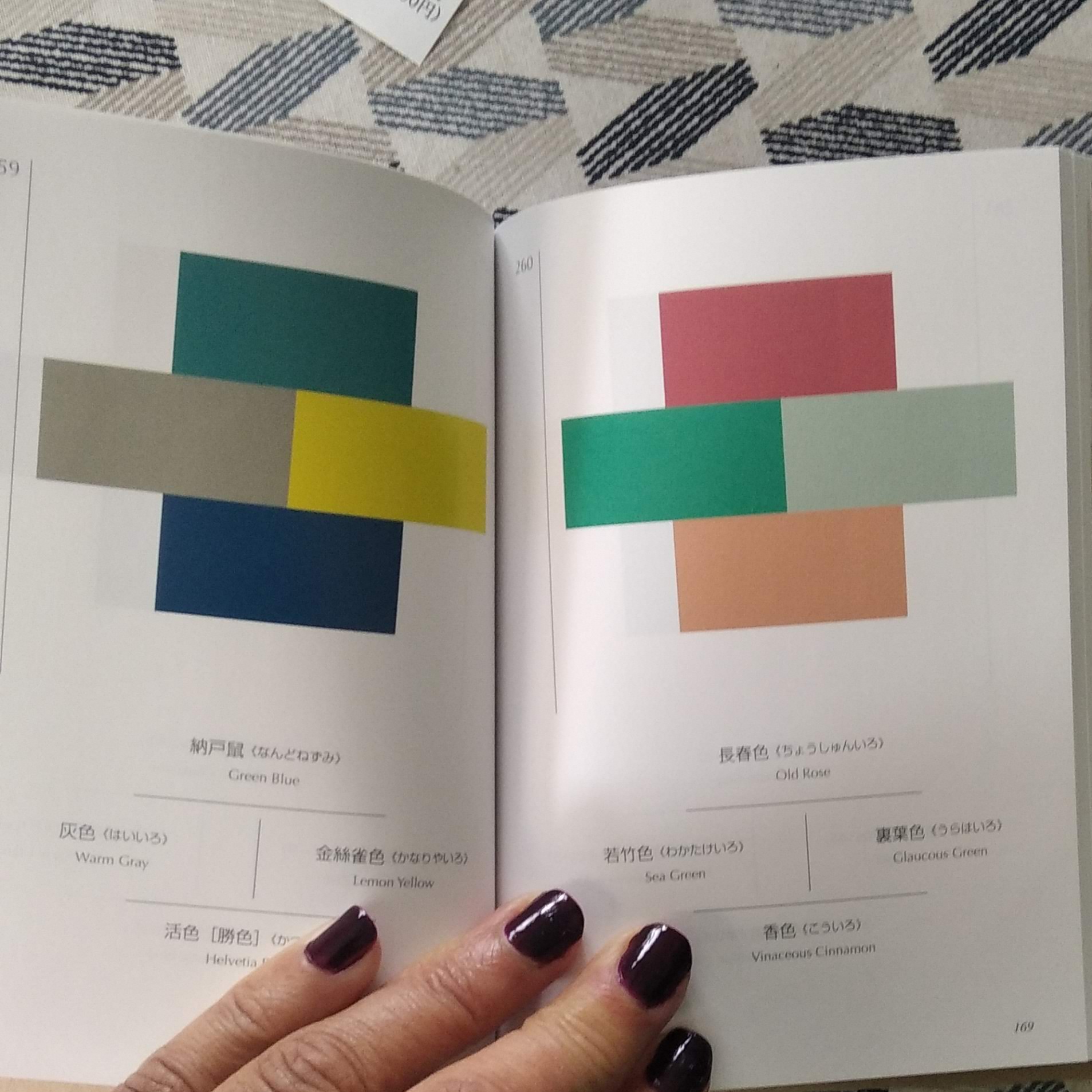
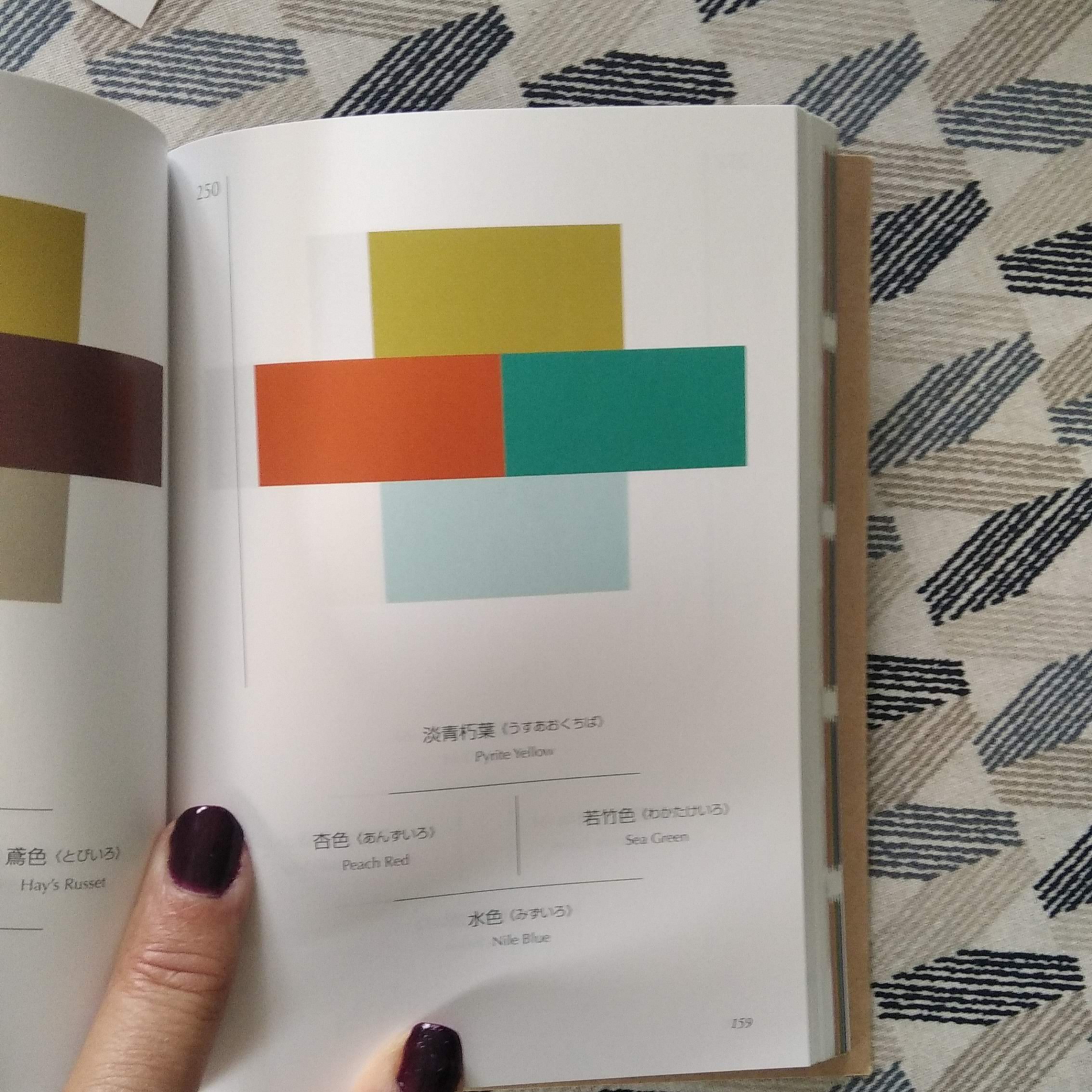
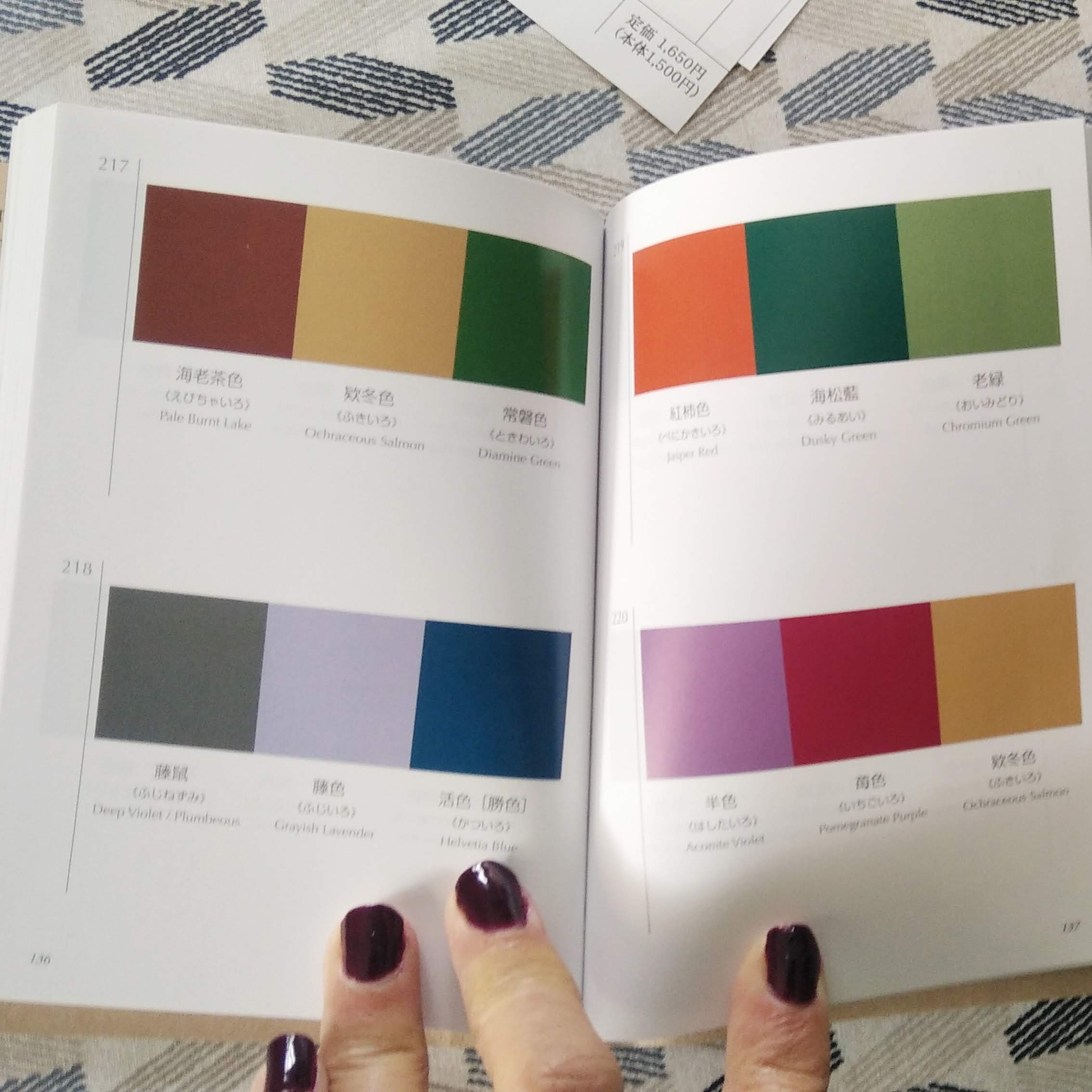
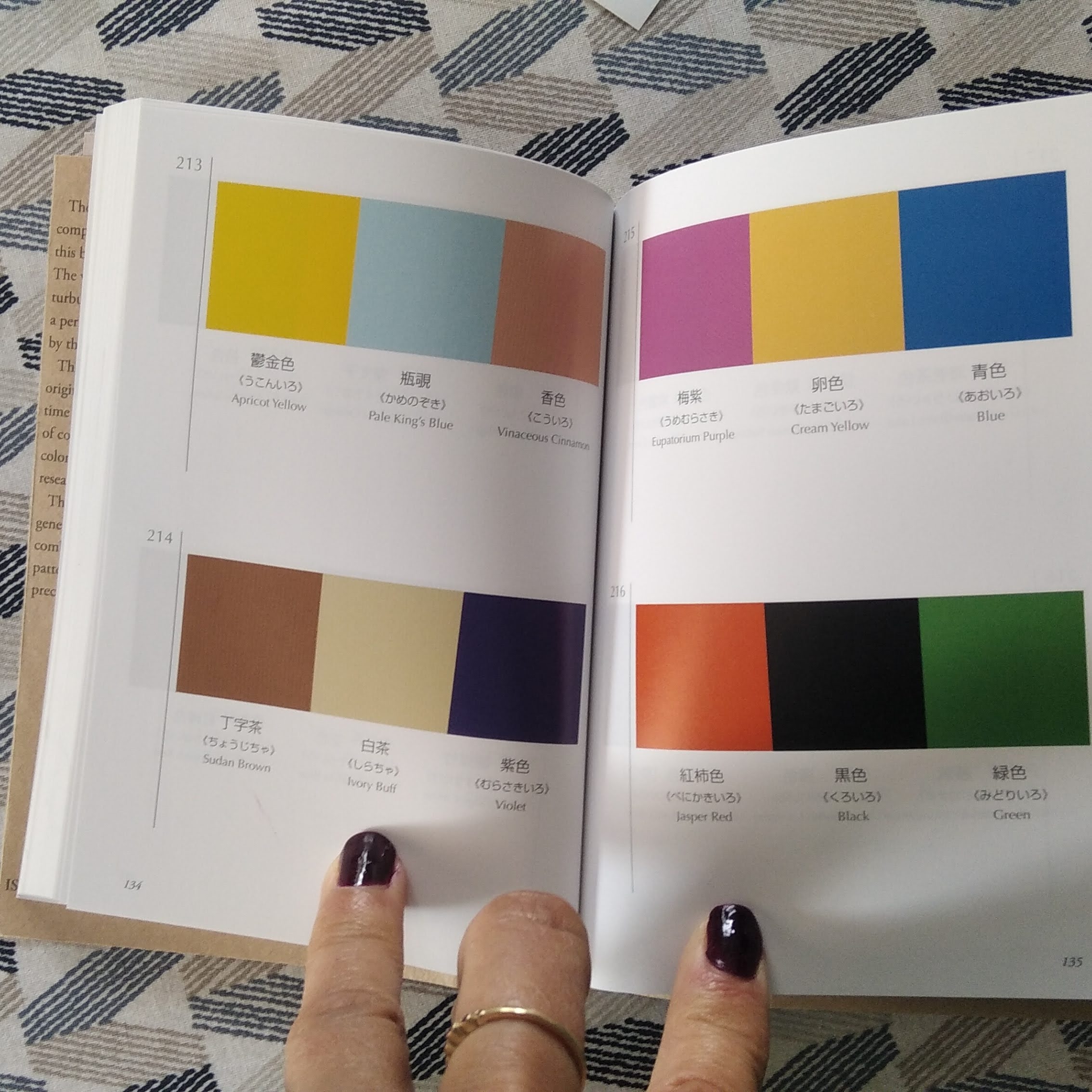
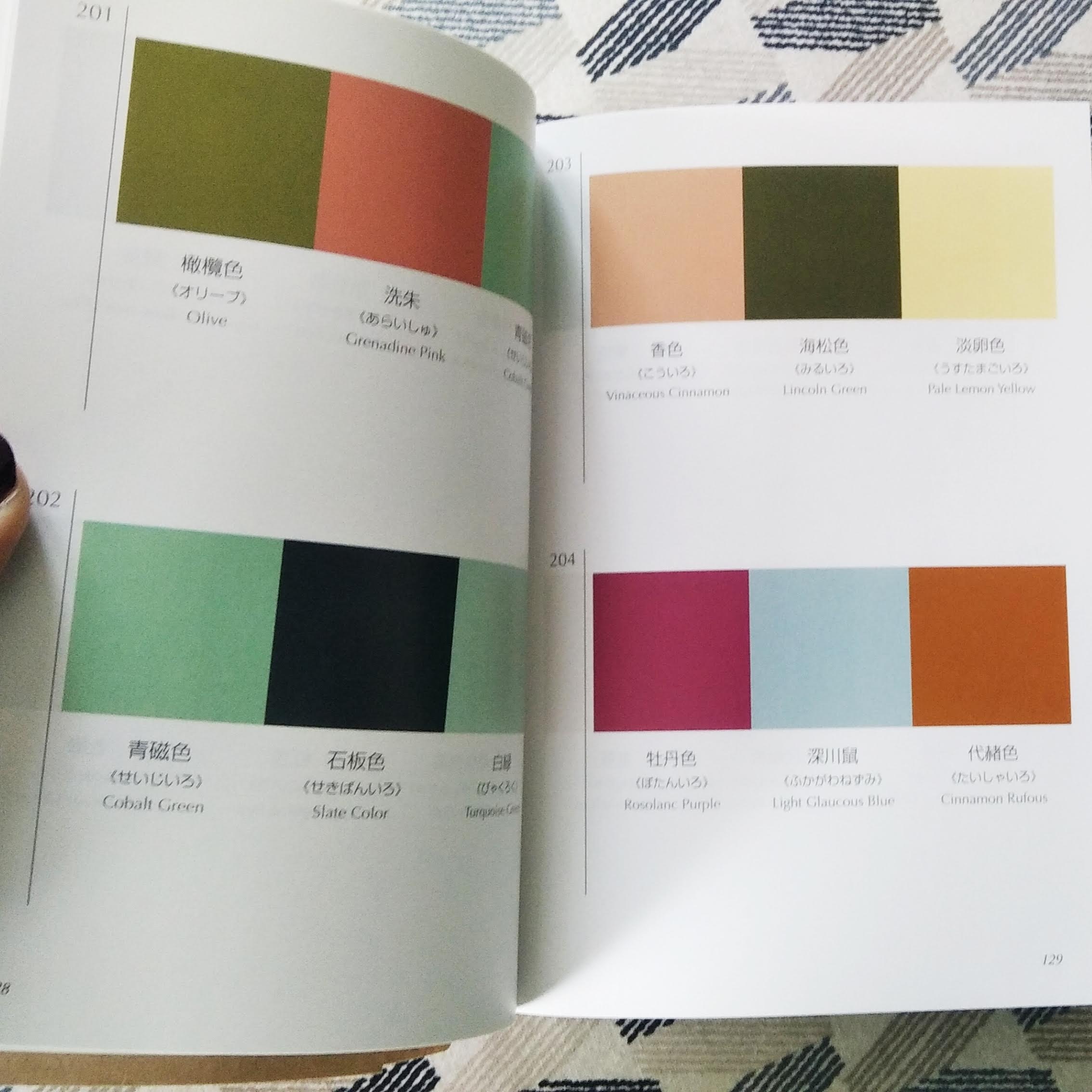
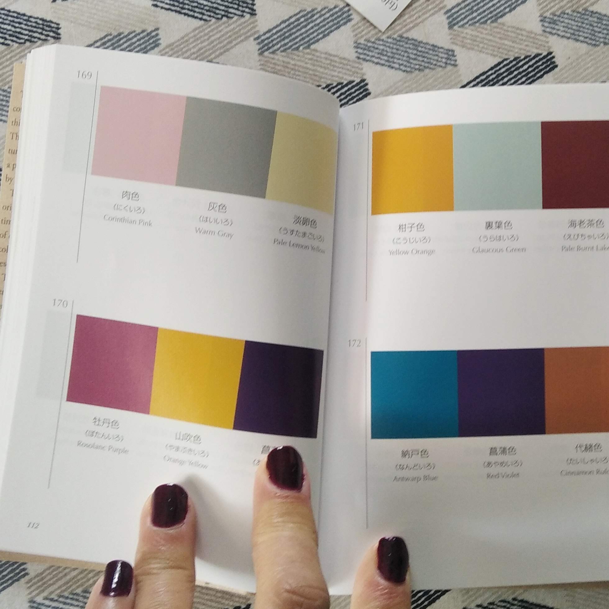
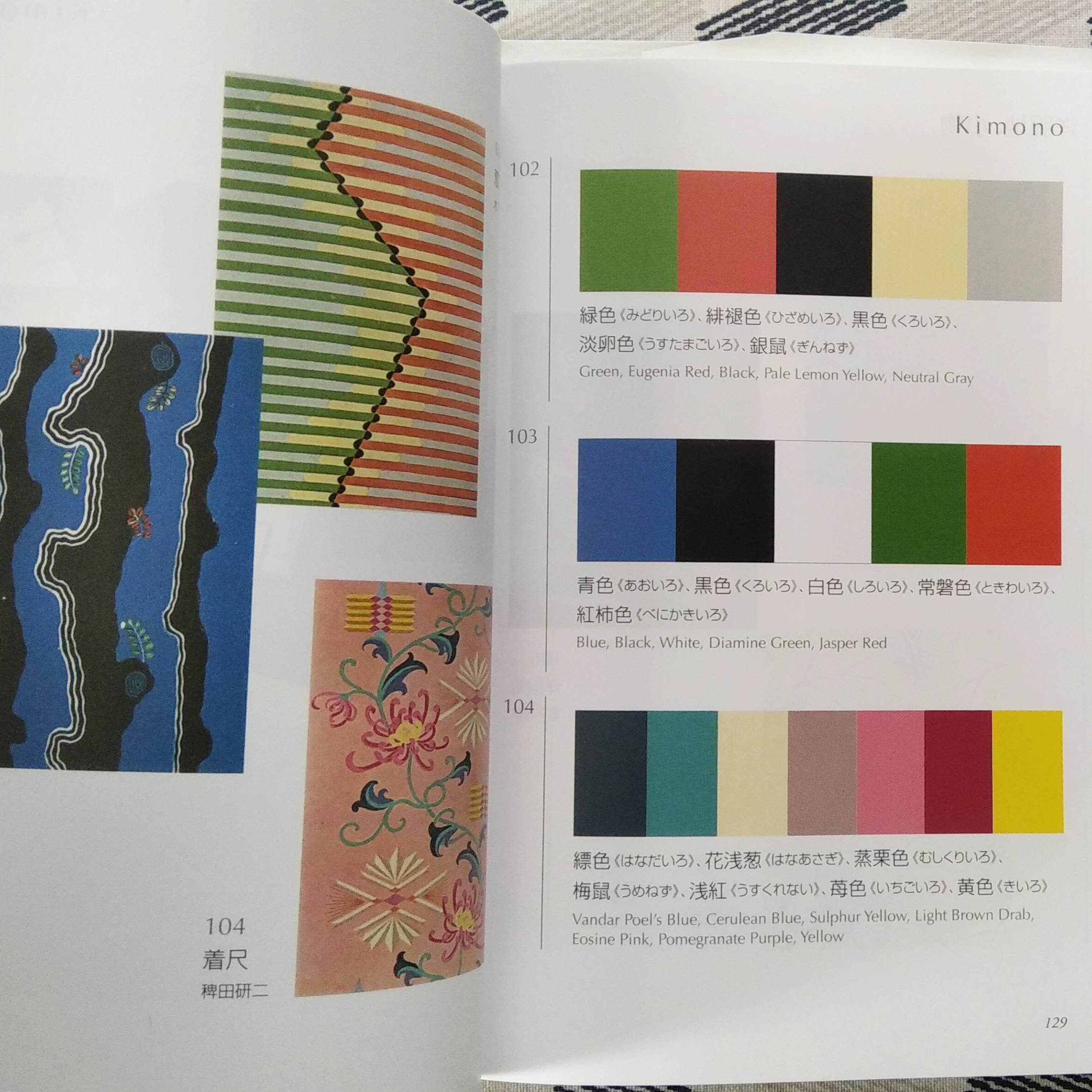
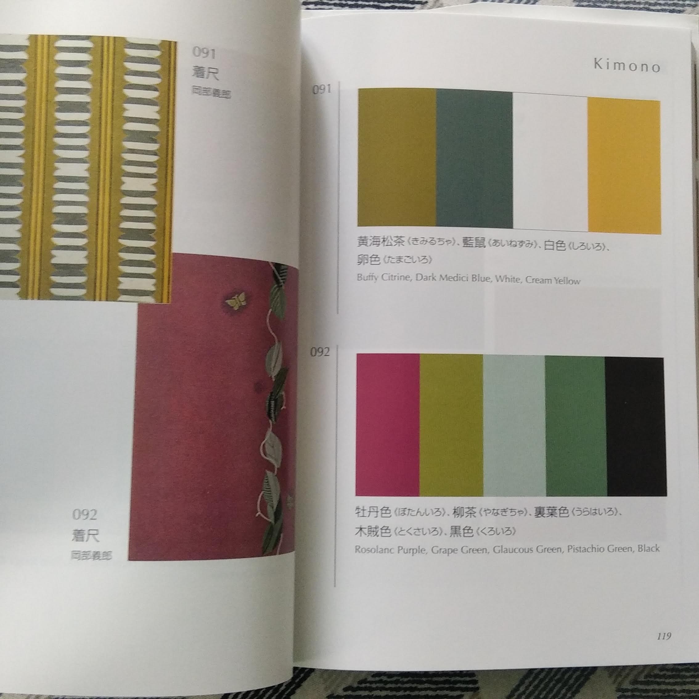
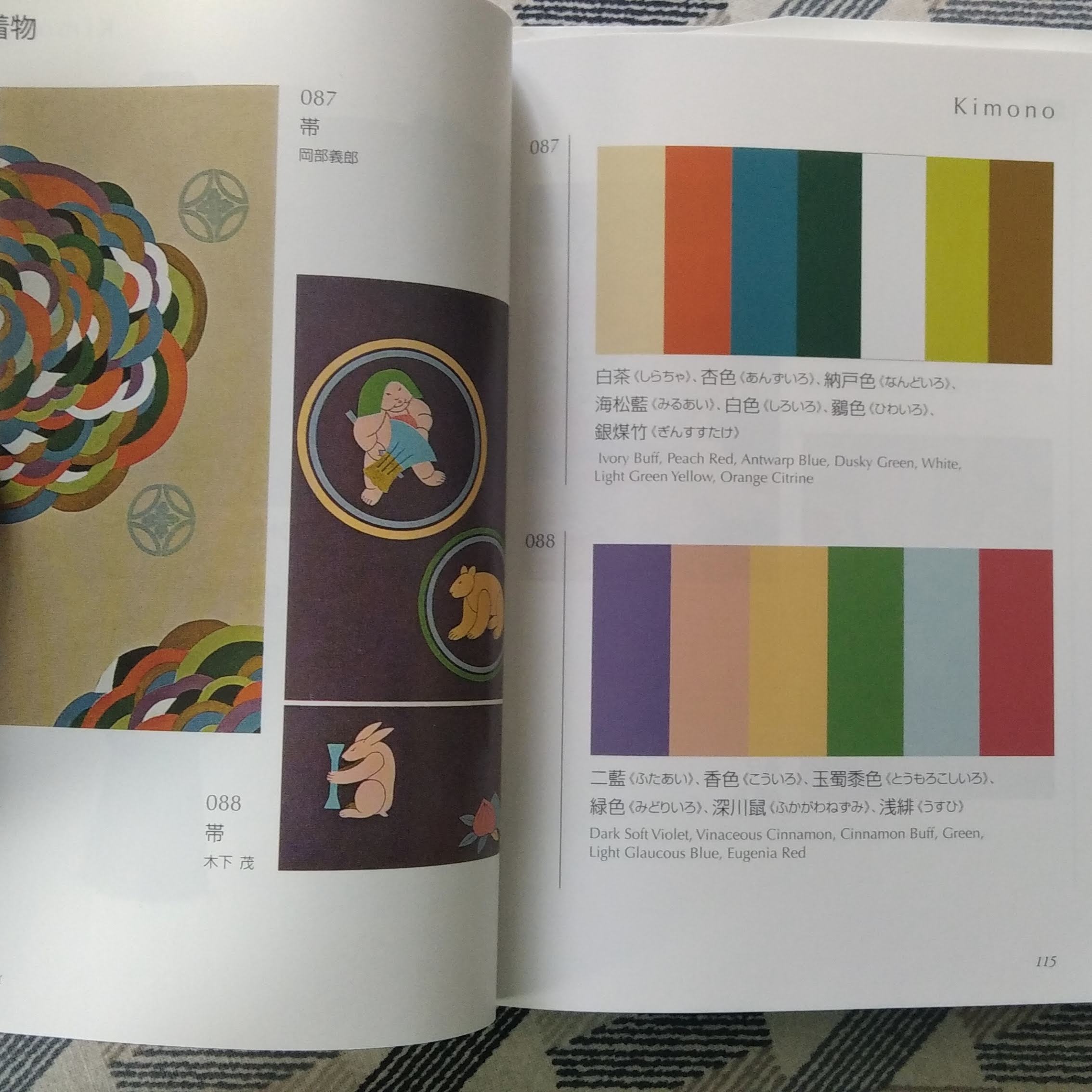
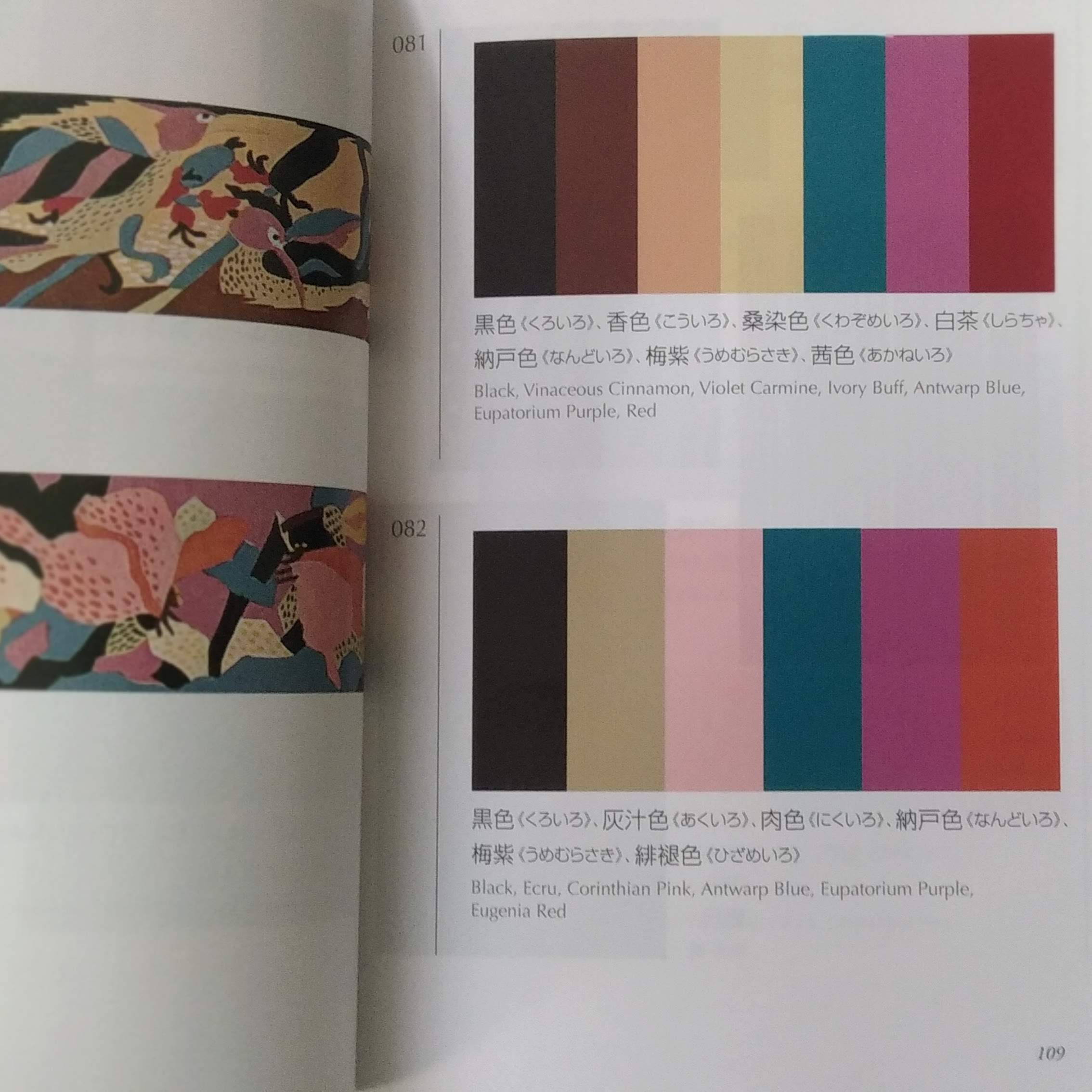
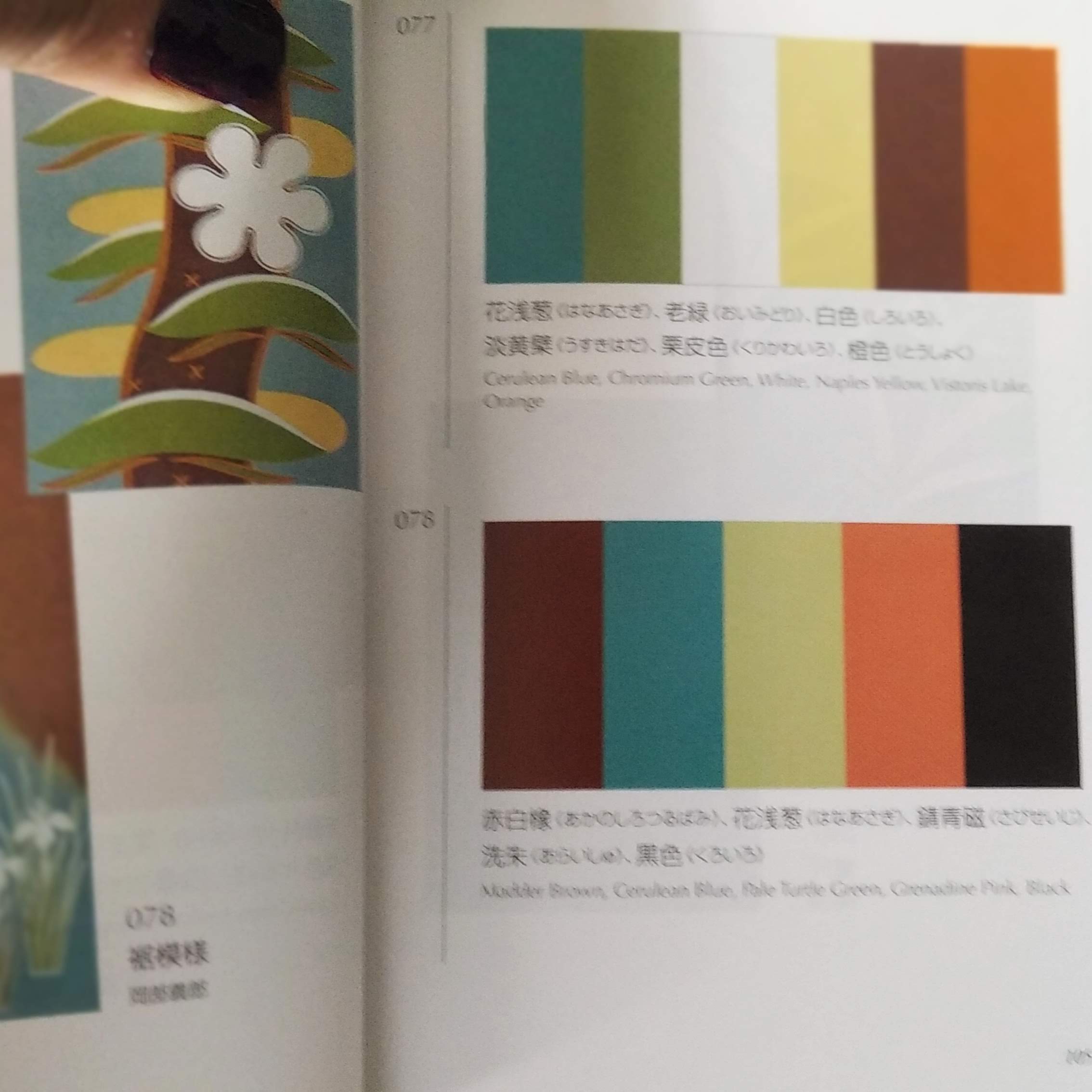
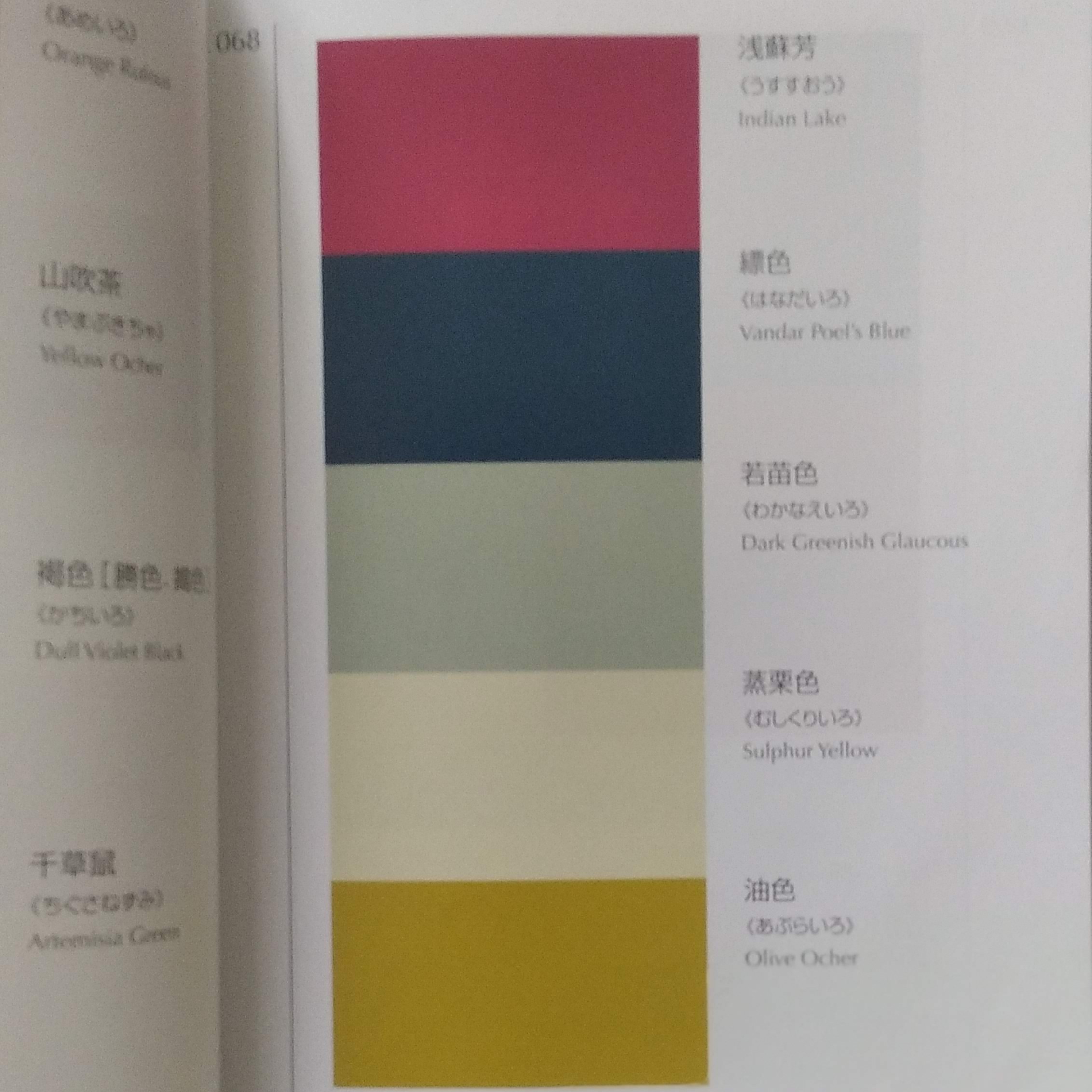
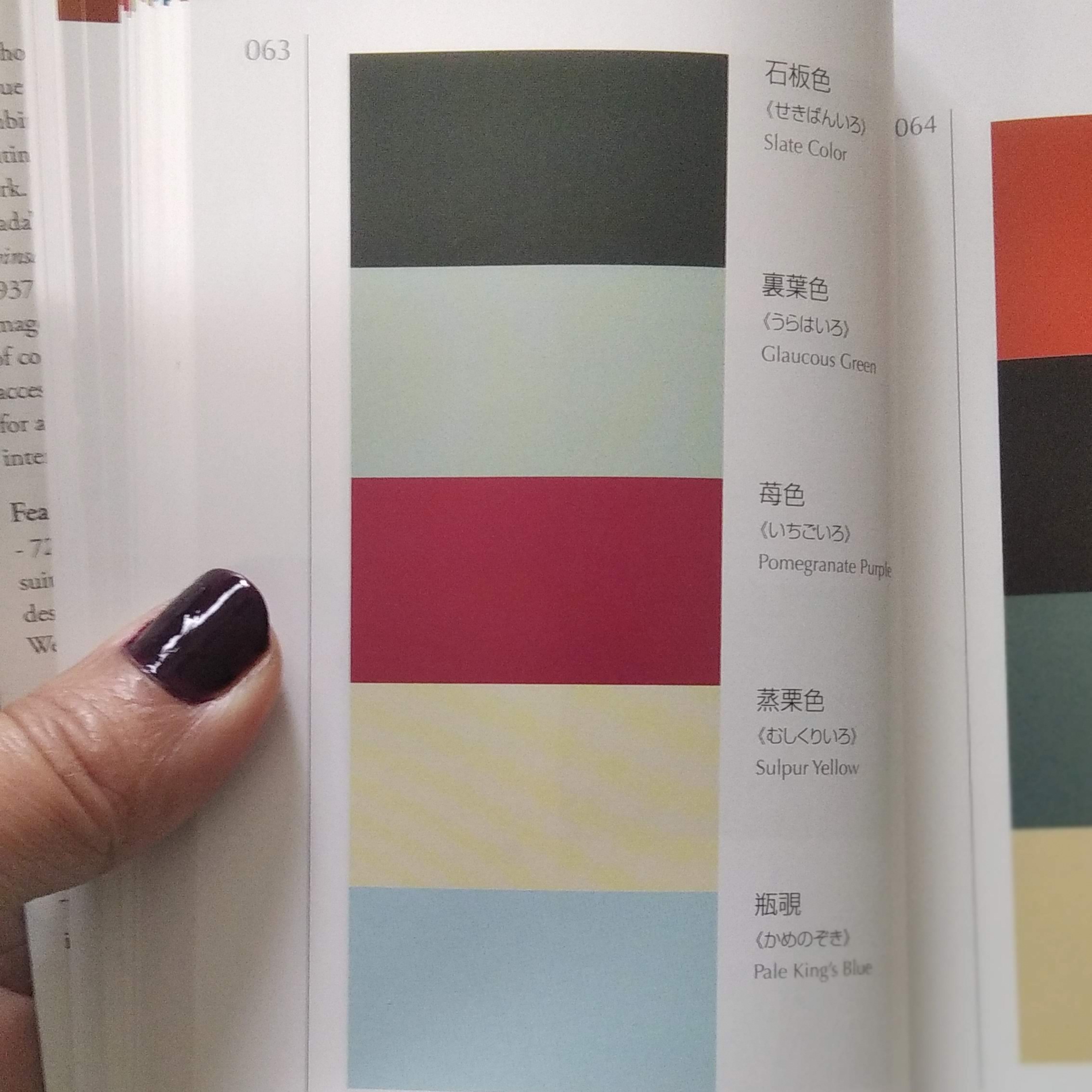
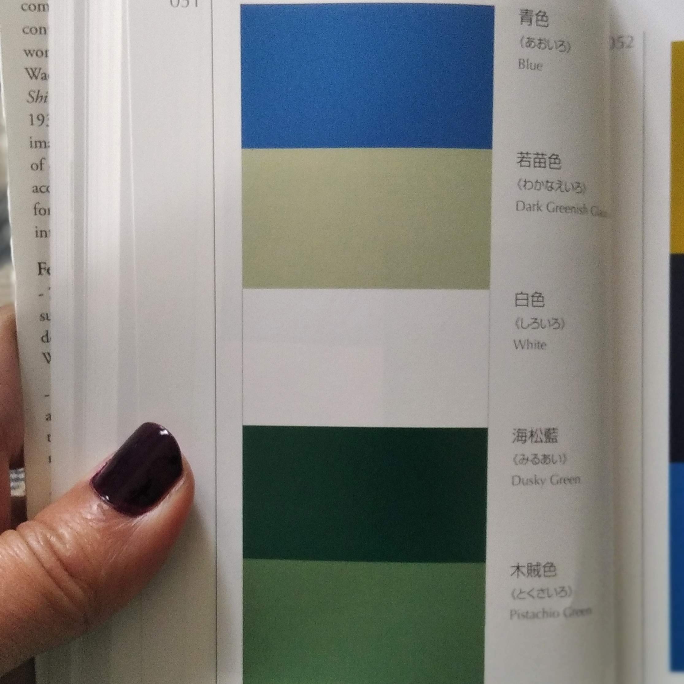
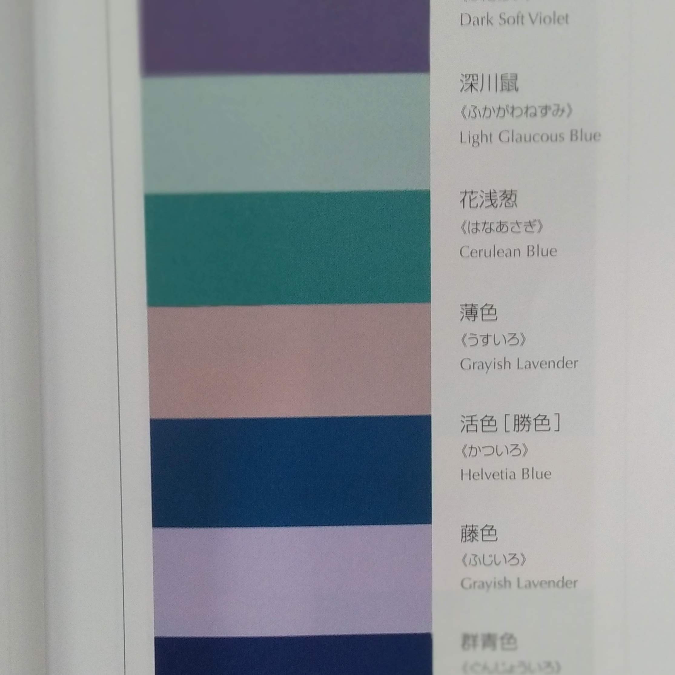
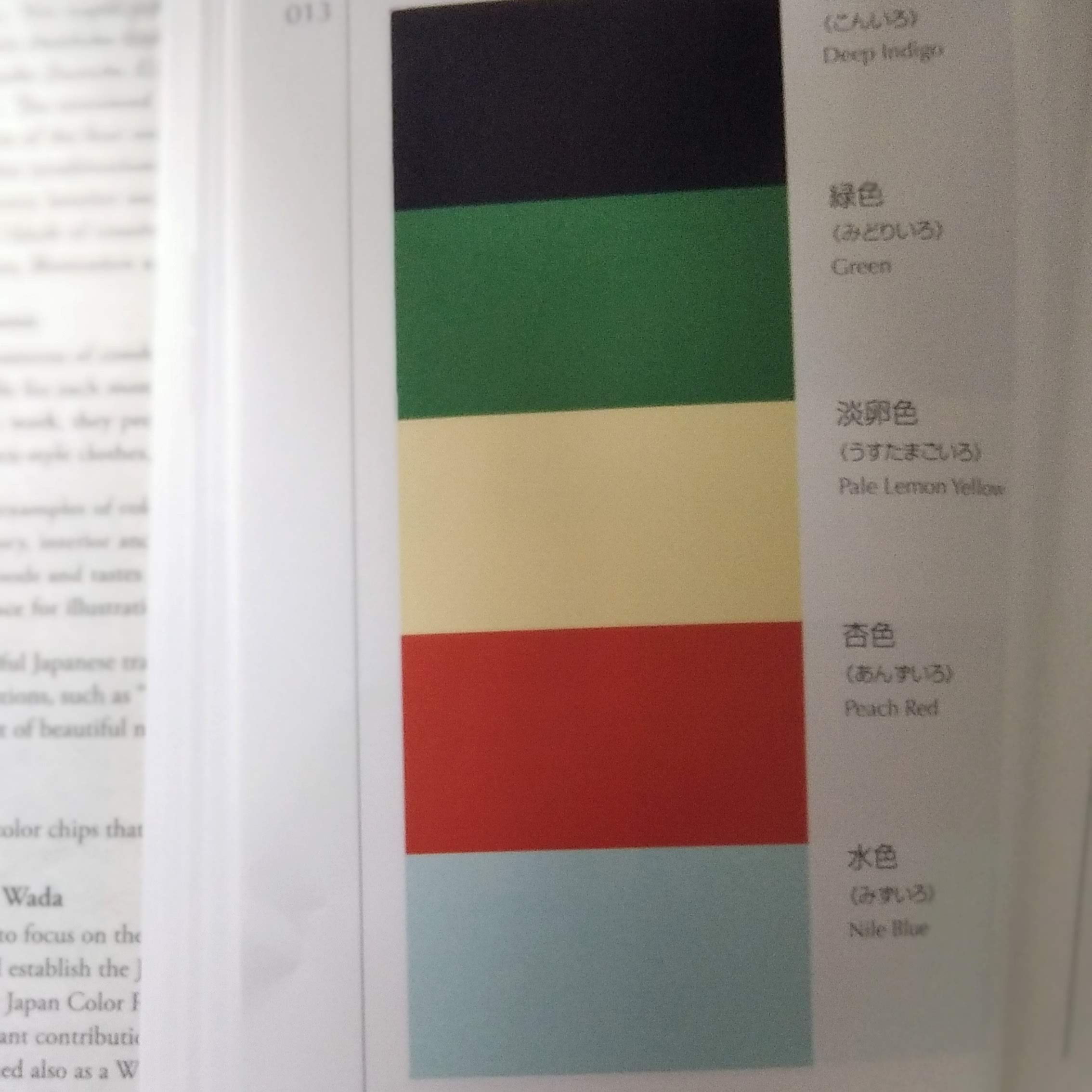
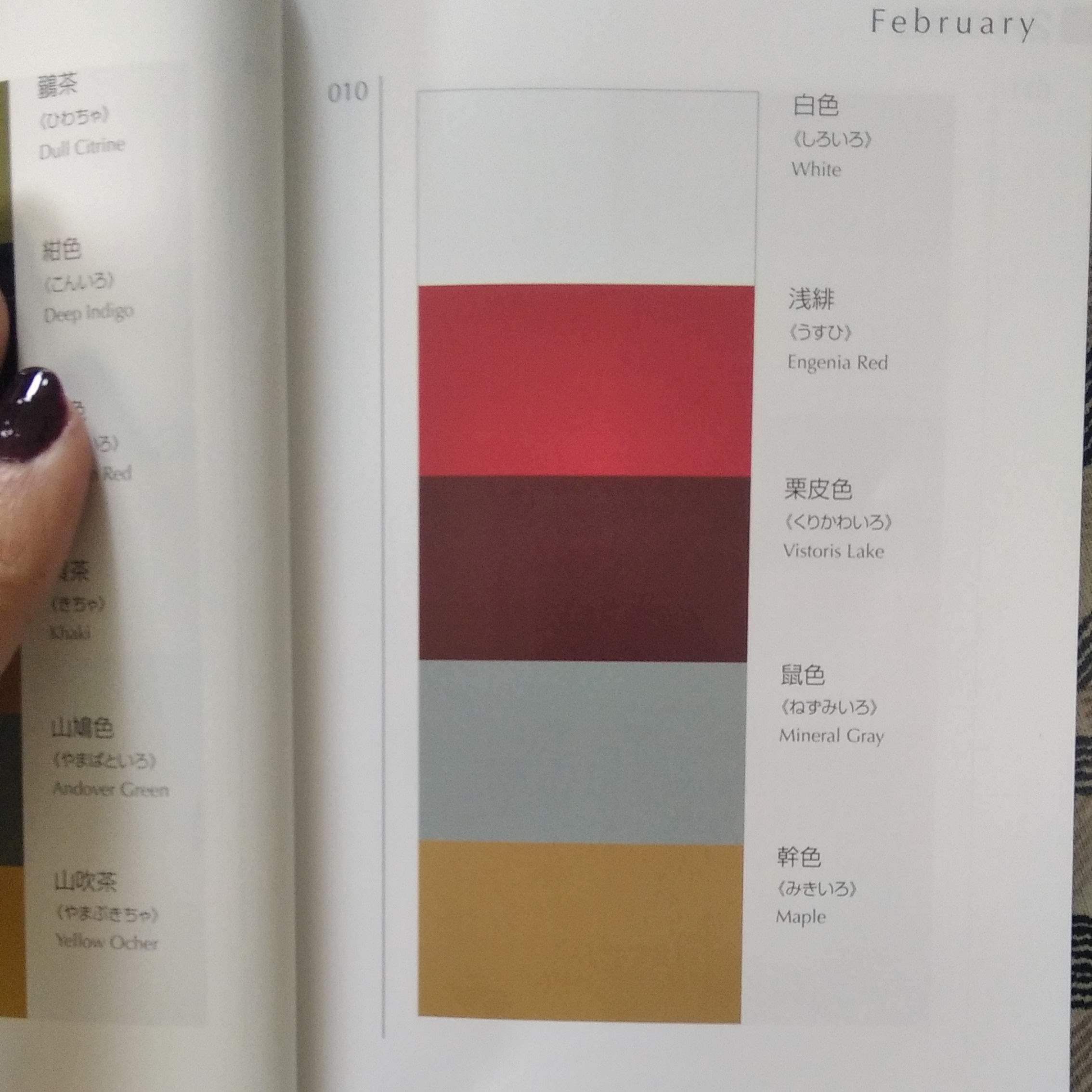
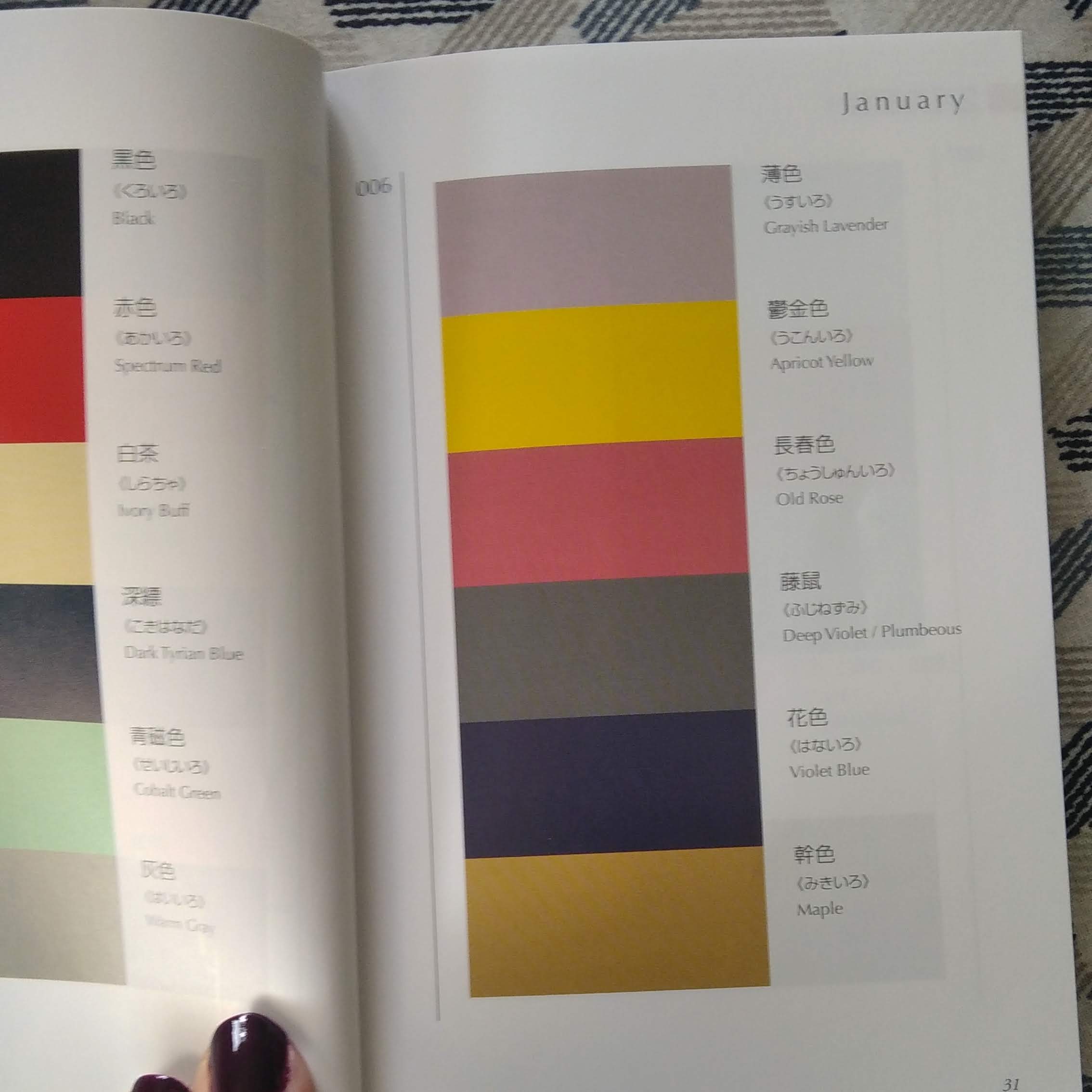
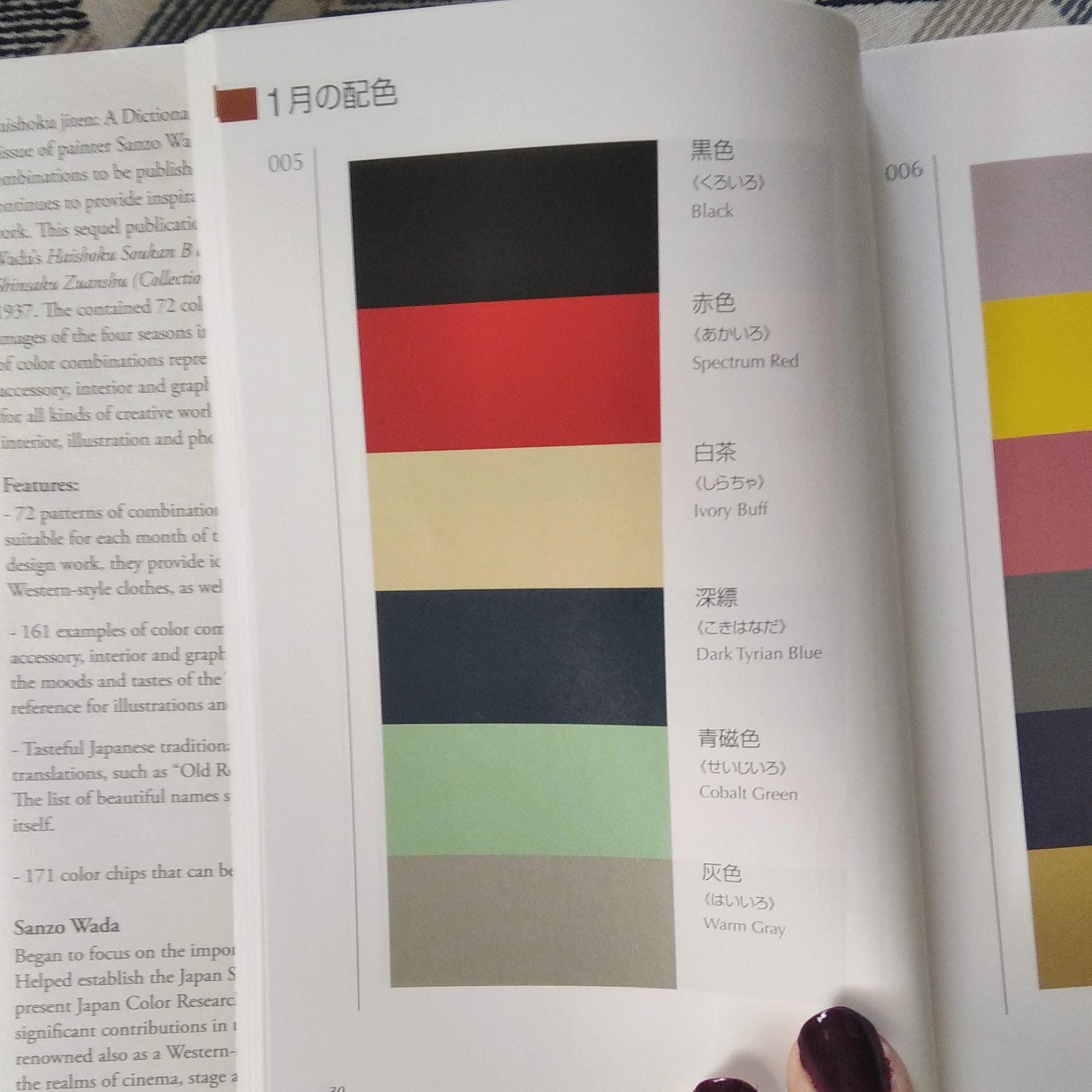
Adaptés de volumes publiés initialement entre 1933 et 1937, ces dictionnaires de combinaisons de couleurs ont été mis au point à l’époque par le peintre japonais SANZO Wada [1883-1967], lequel contribua notamment à créer la Japan Standard Color Association (devenue Color Research Institute).
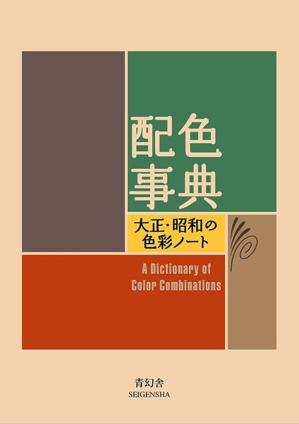
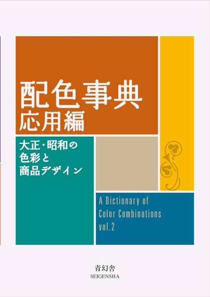
“DICTIONARY OF COLOR COMBINATIONS” vol. 1 et 2
Le premier volume présente 348 associations de couleurs différentes, comme autant de propositions et de réflexions sur les possibilités offertes. Divisé en 3 sections qui réparties selon le nombre de couleurs associées – 2 puis 3 et enfin 4 – le livre dispose en dernière partie d’un index colorimétrique qui permette de l’utiliser comme un véritable outil. Ainsi l’on peut se laisser aller à feuilleter les pages en guise d’inspiration, ou bien décider de repérer et travailler à partir d’une couleur précise dont on consultera ensuite les différentes planches où elle figure.
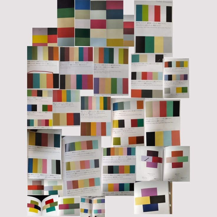
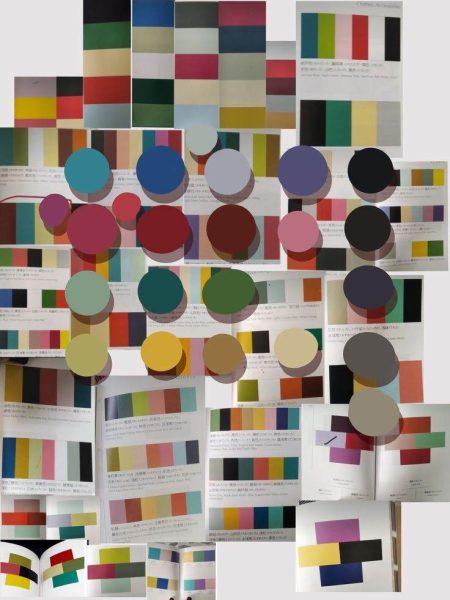
Le deuxième volume reprend la même formule mais en multipliant encore davantage les combinaisons (jusqu’à 7 couleurs associées ensemble), et en divisant l’ouvrage par domaines de travail : kimono, accessoires, tapis, book design, poterie etc.