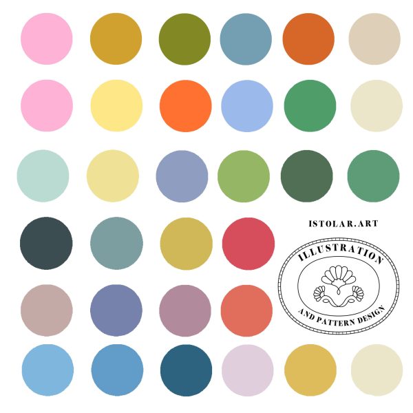
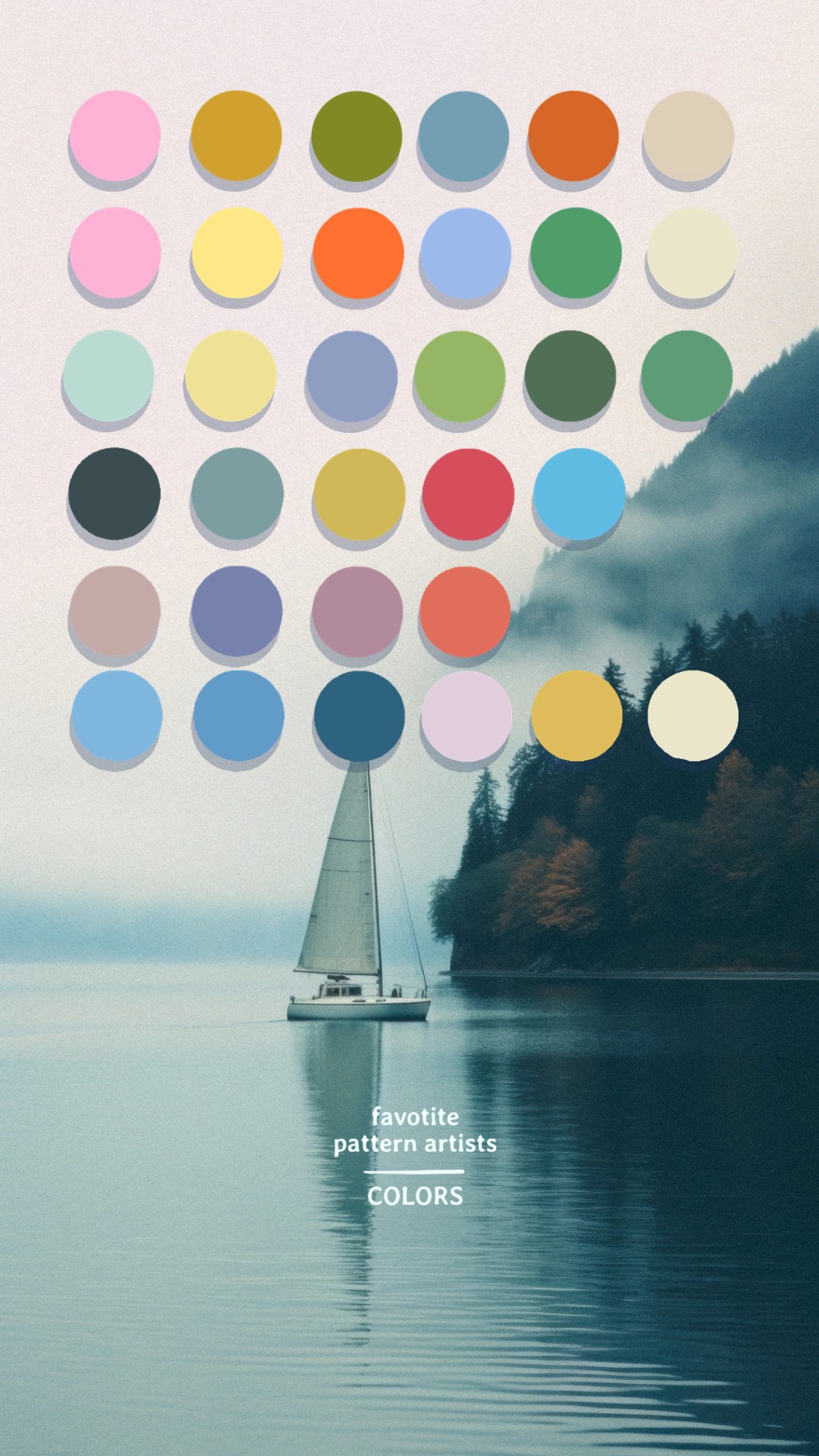
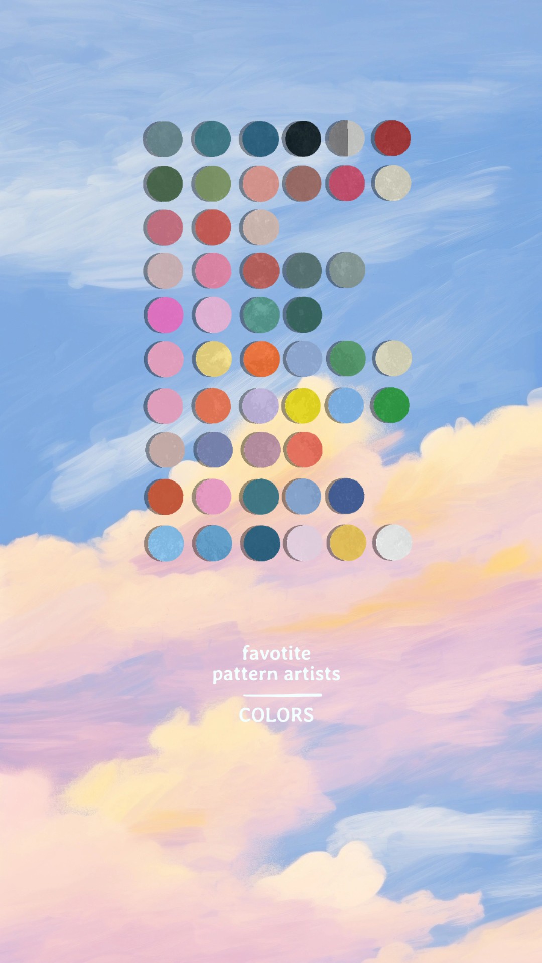
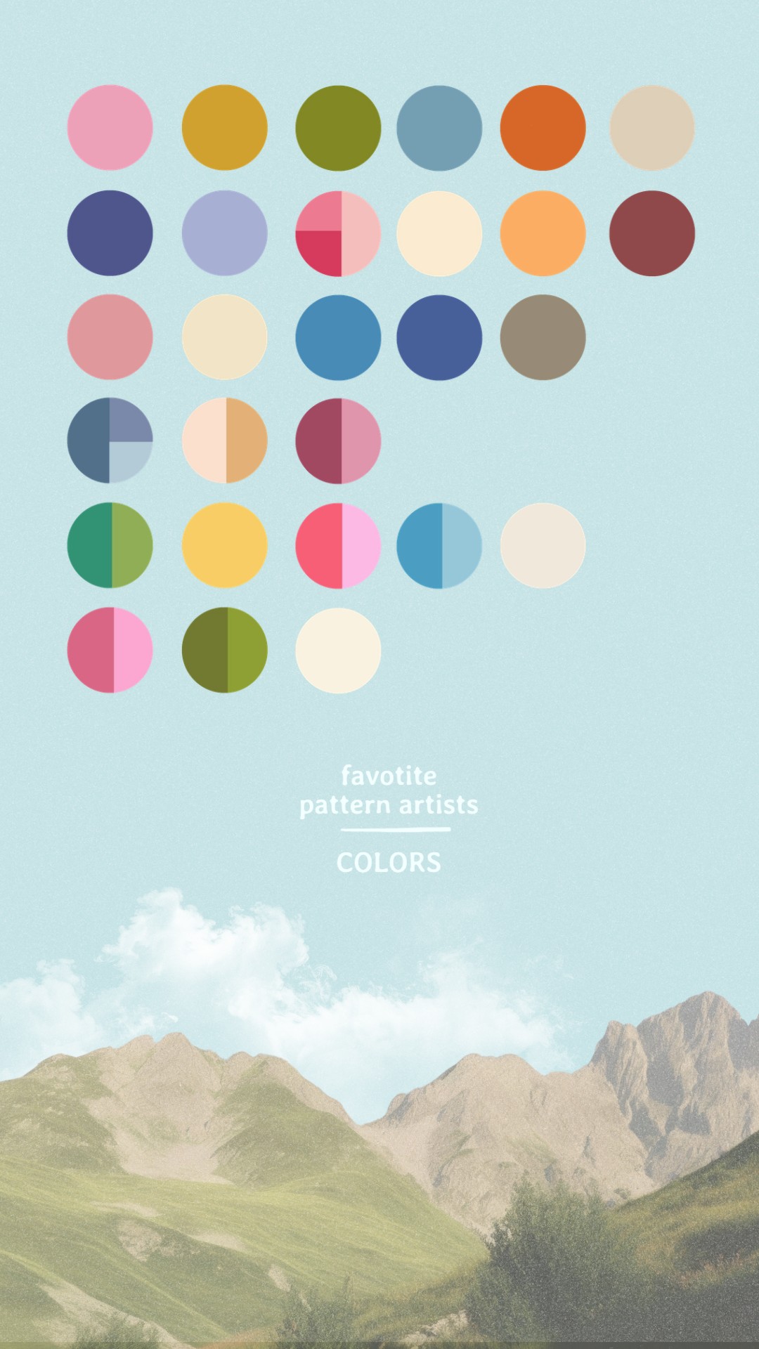
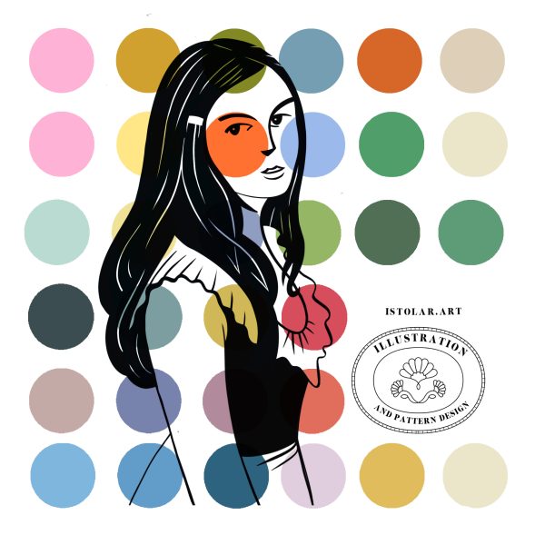
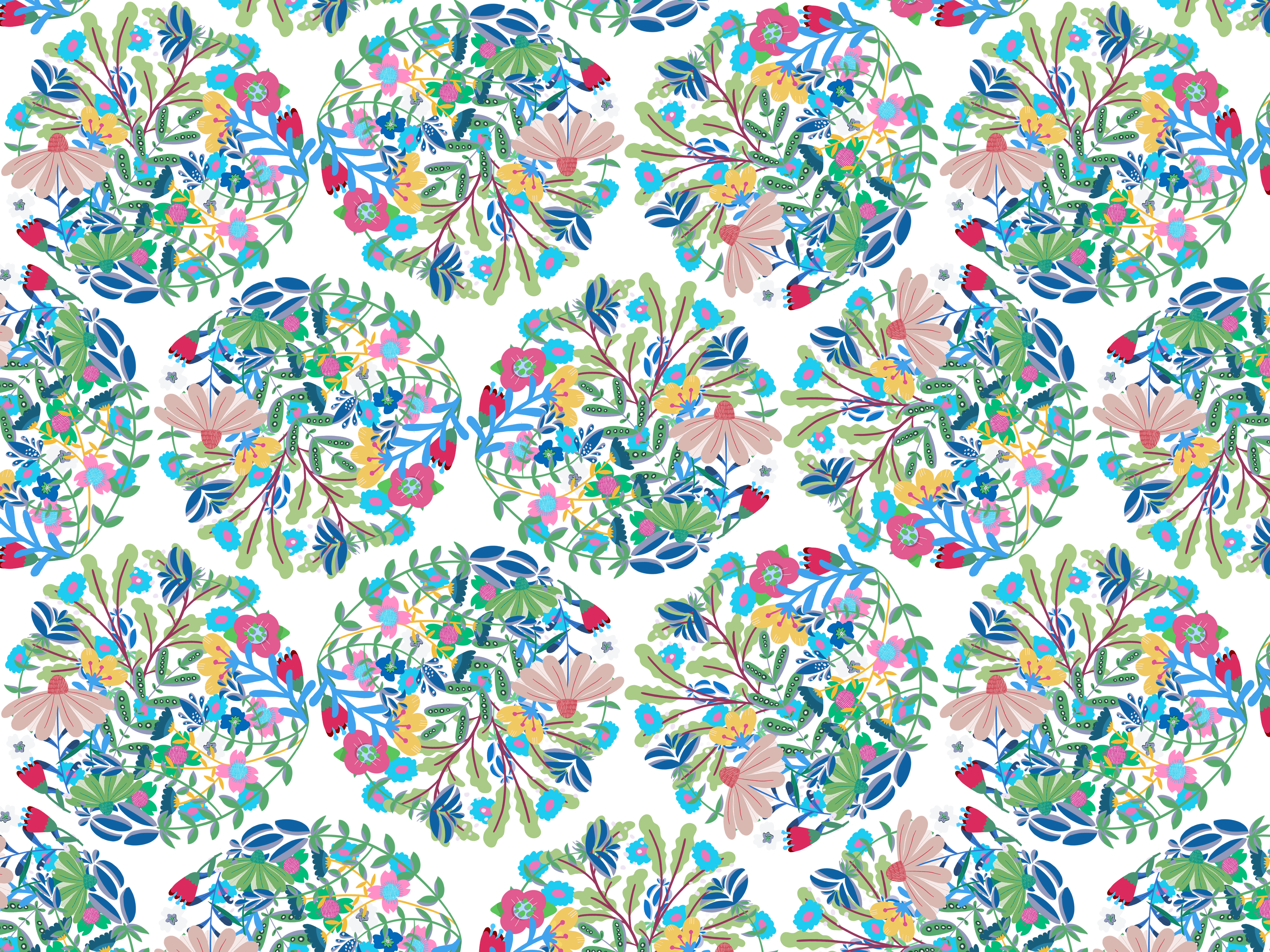
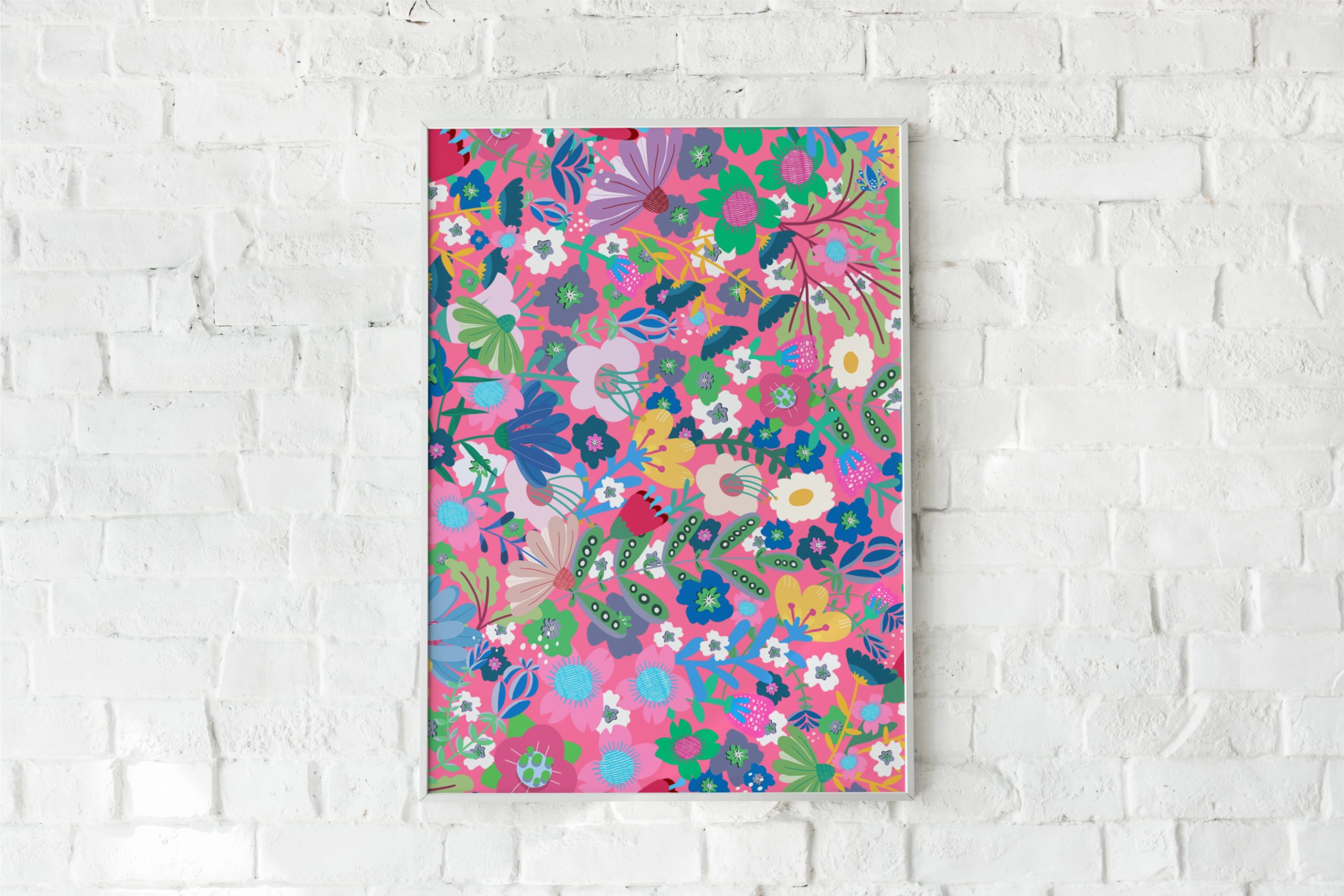
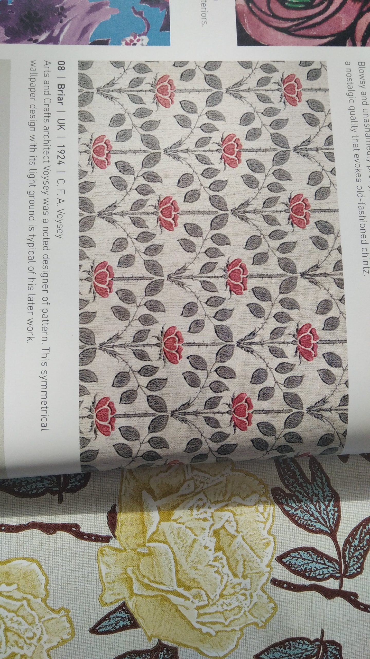
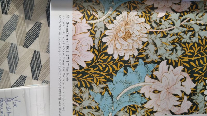
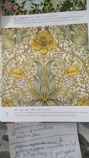
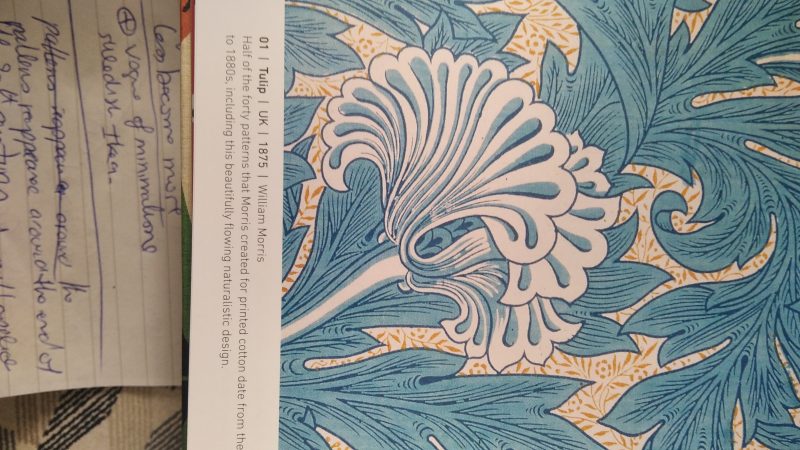
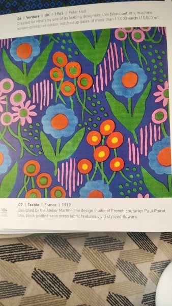
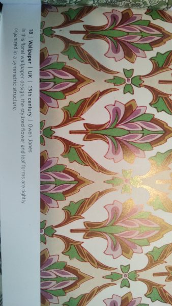
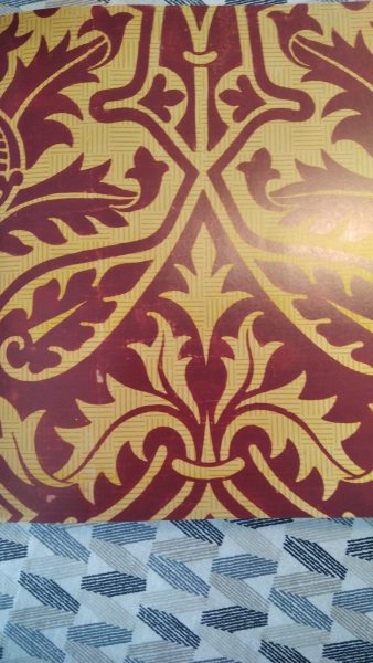
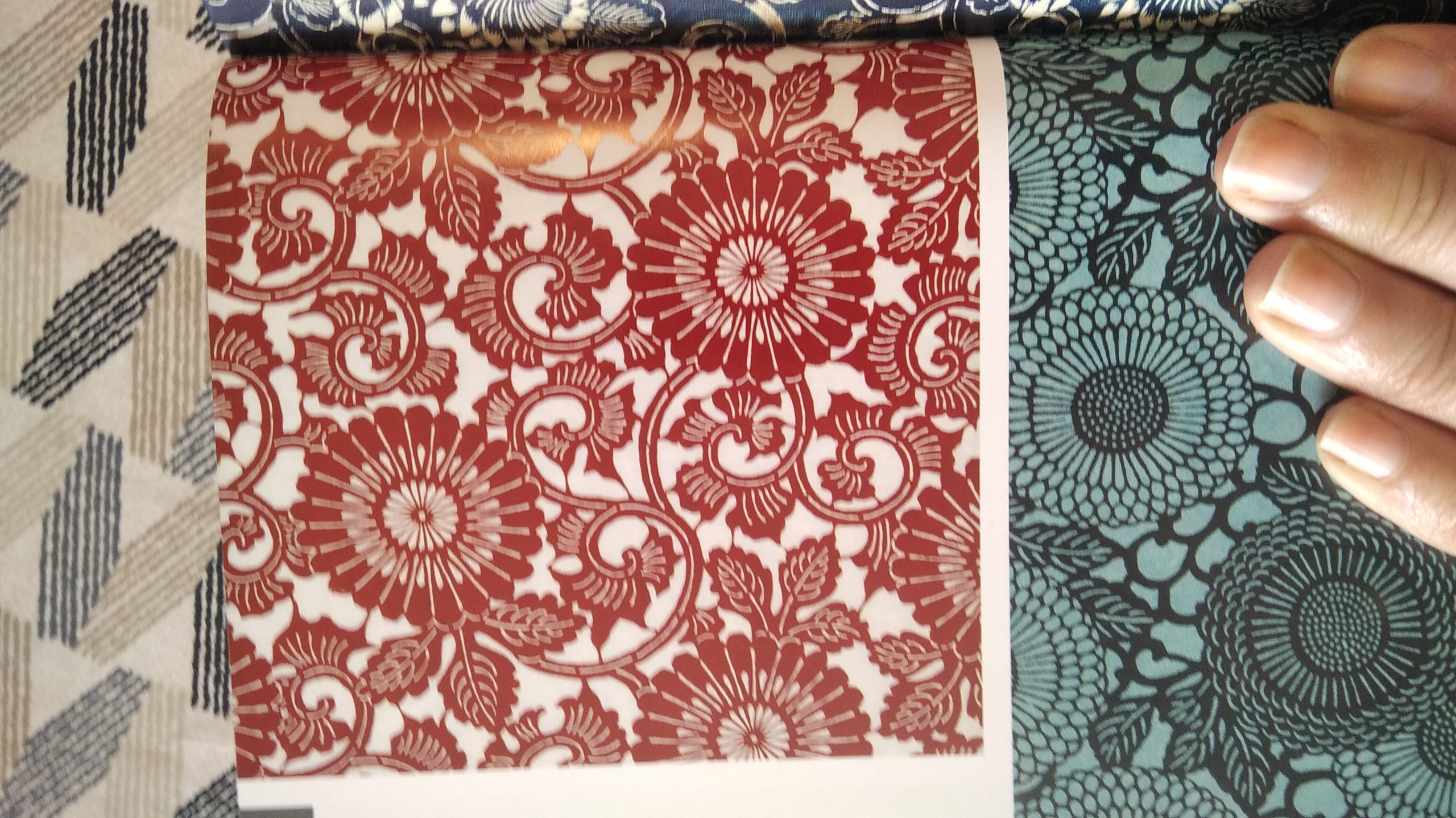
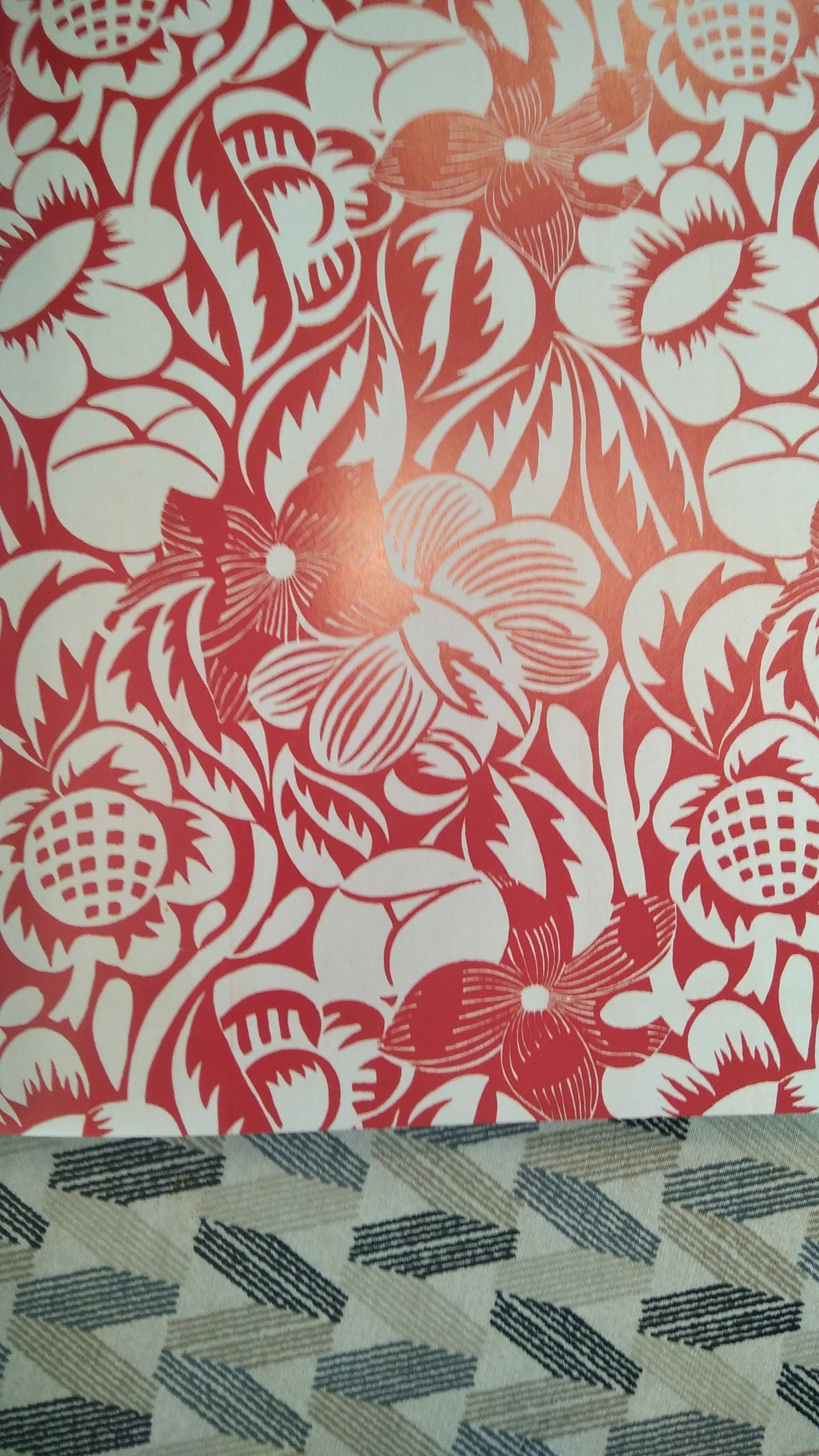
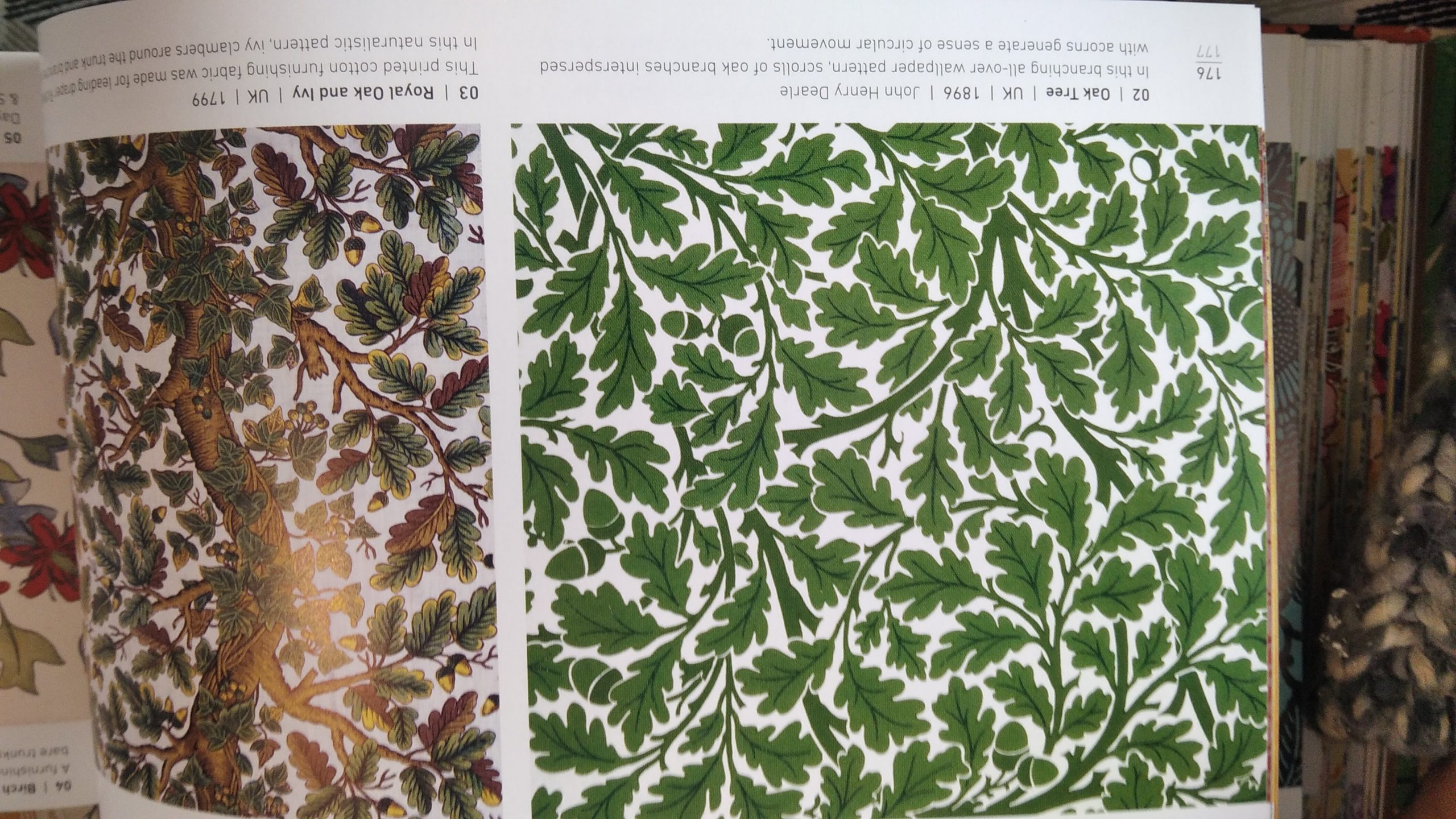
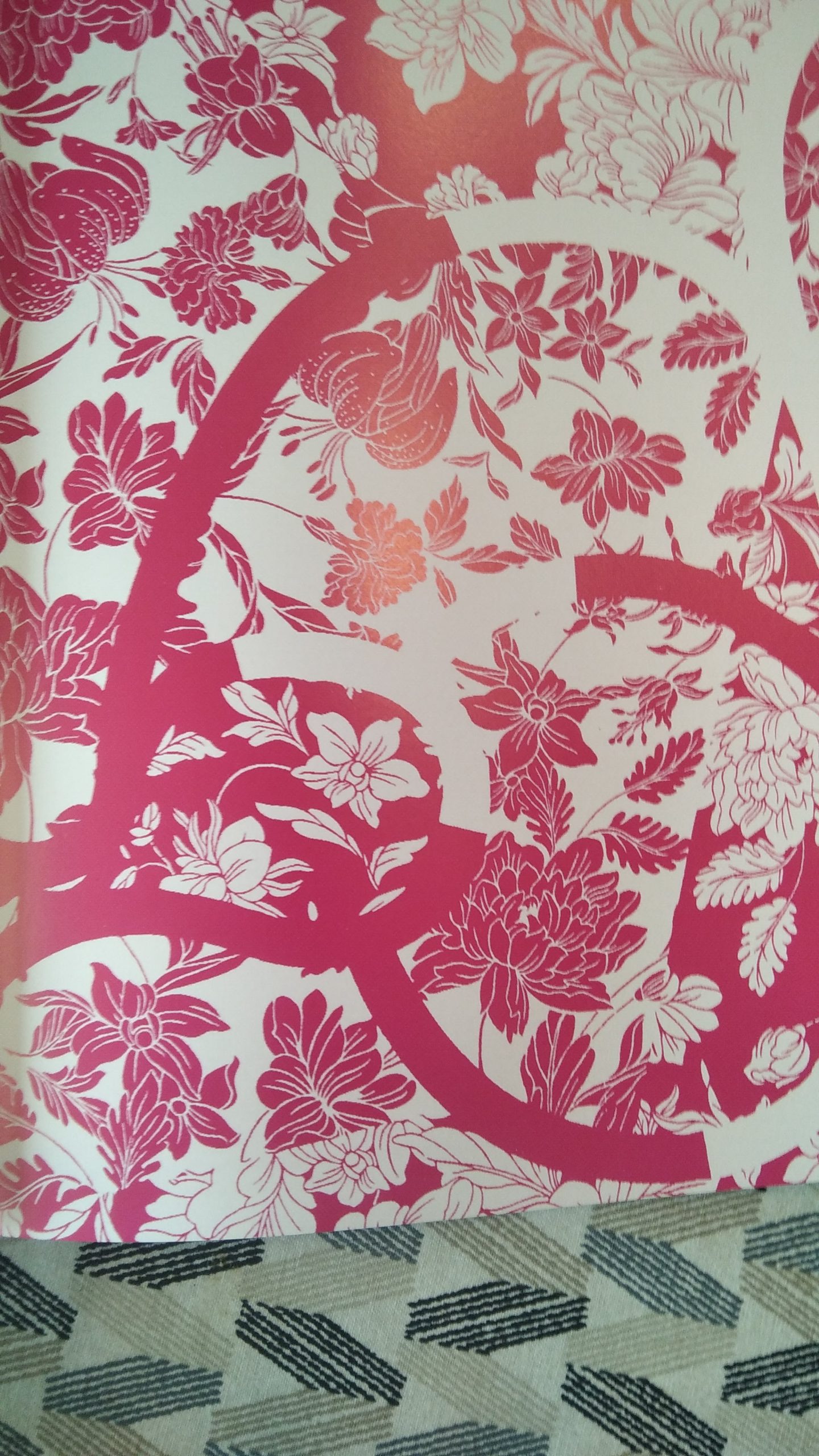
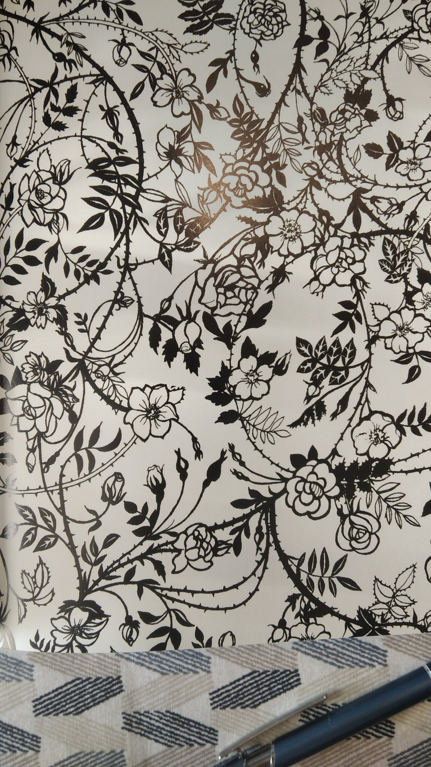
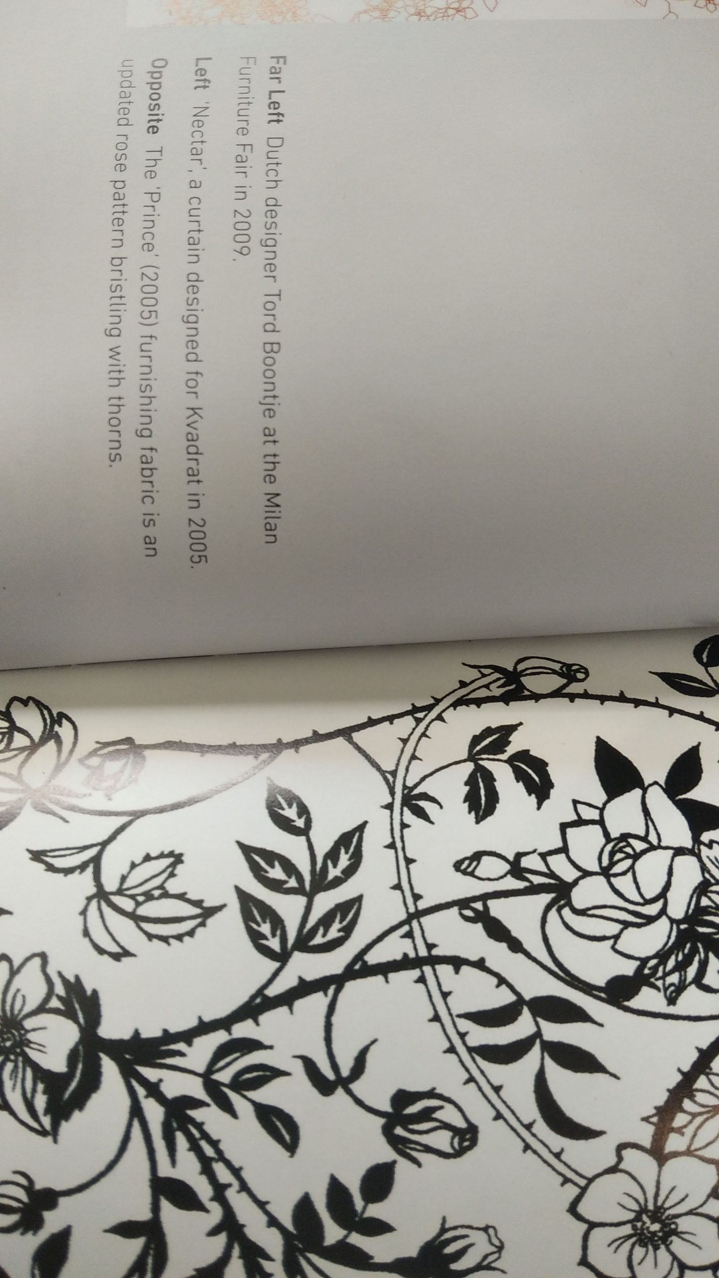
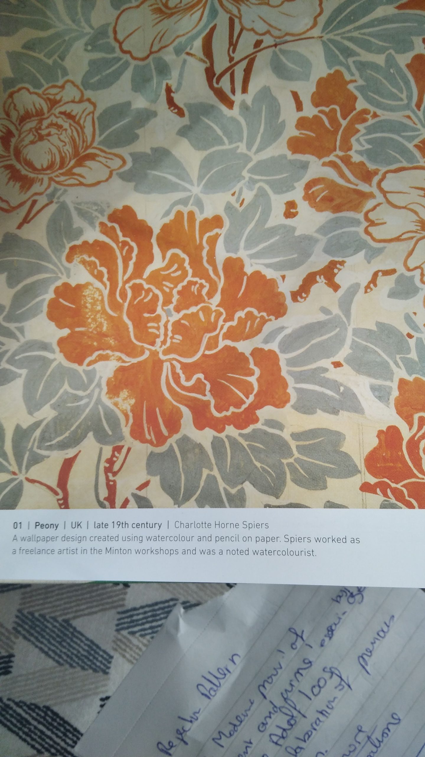
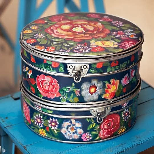
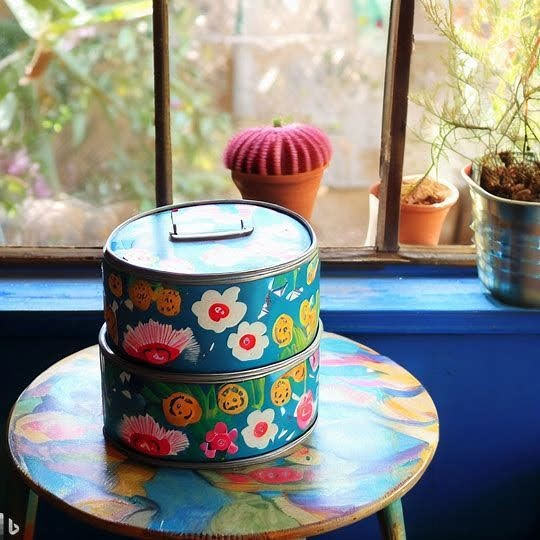
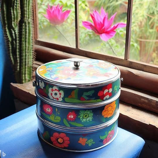
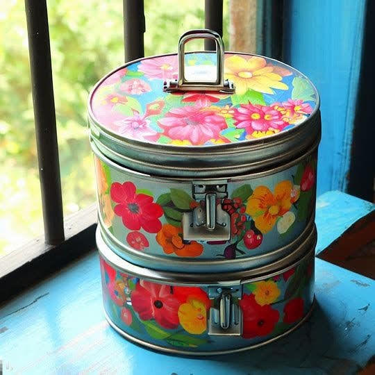
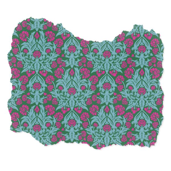
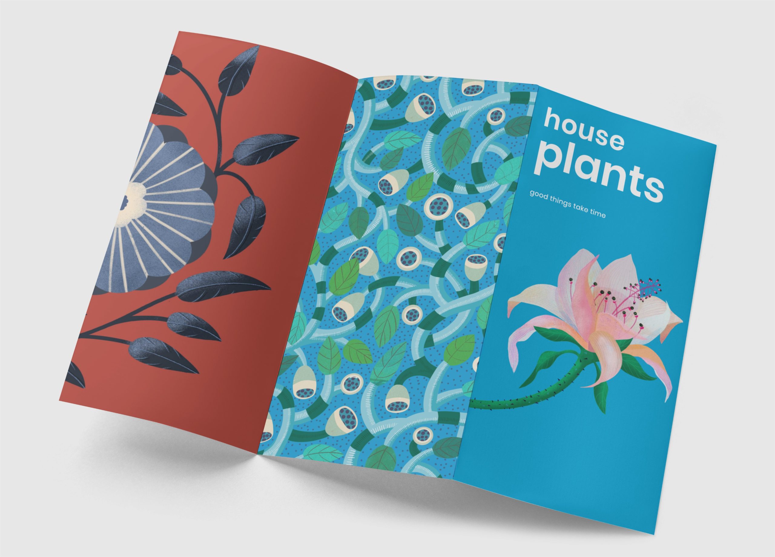
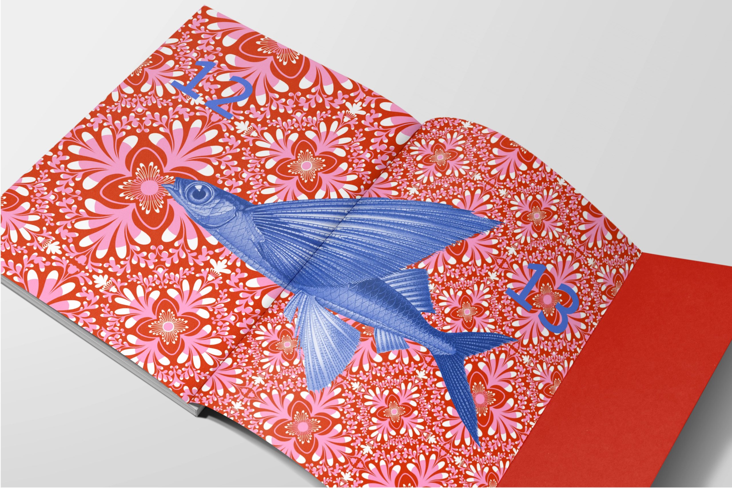
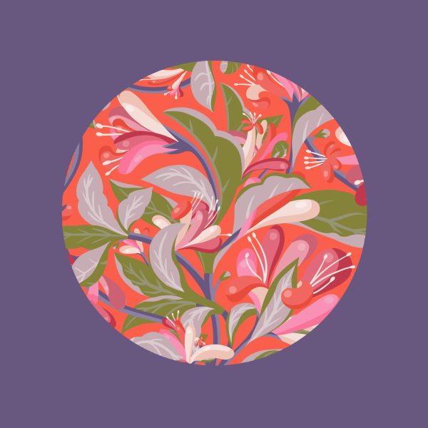
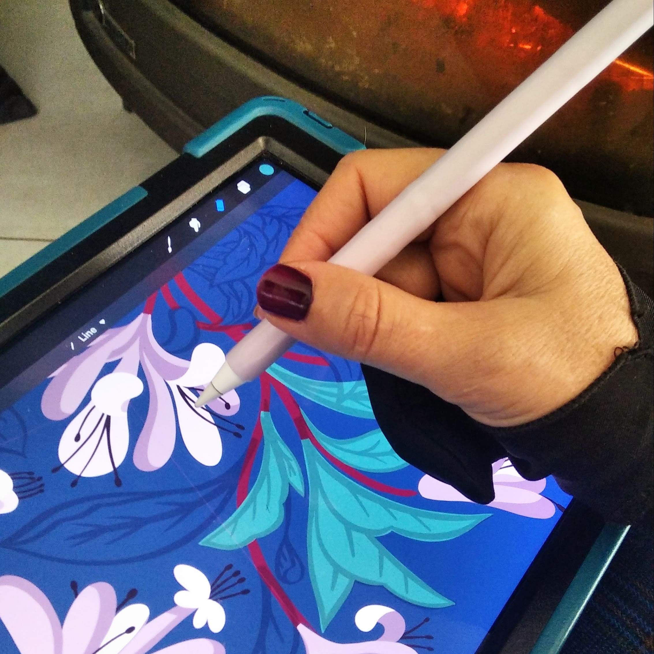
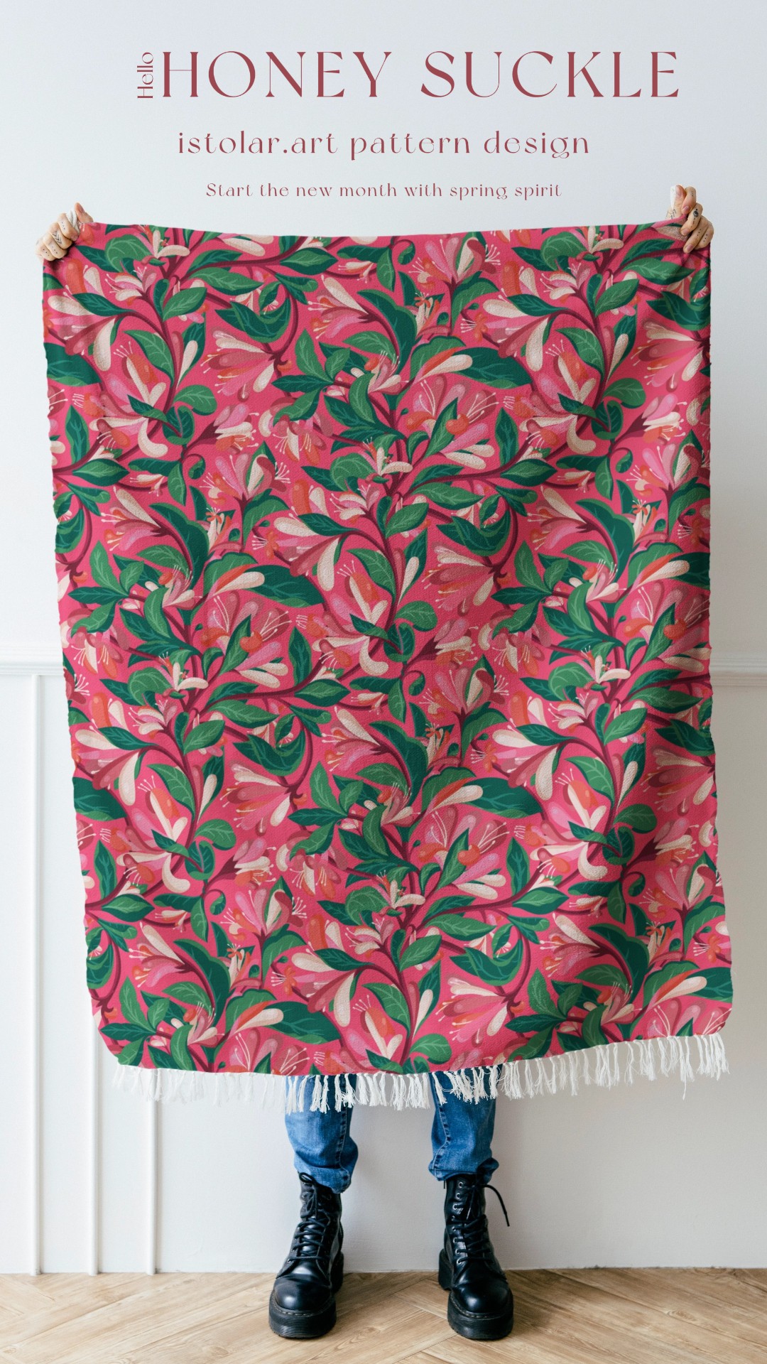
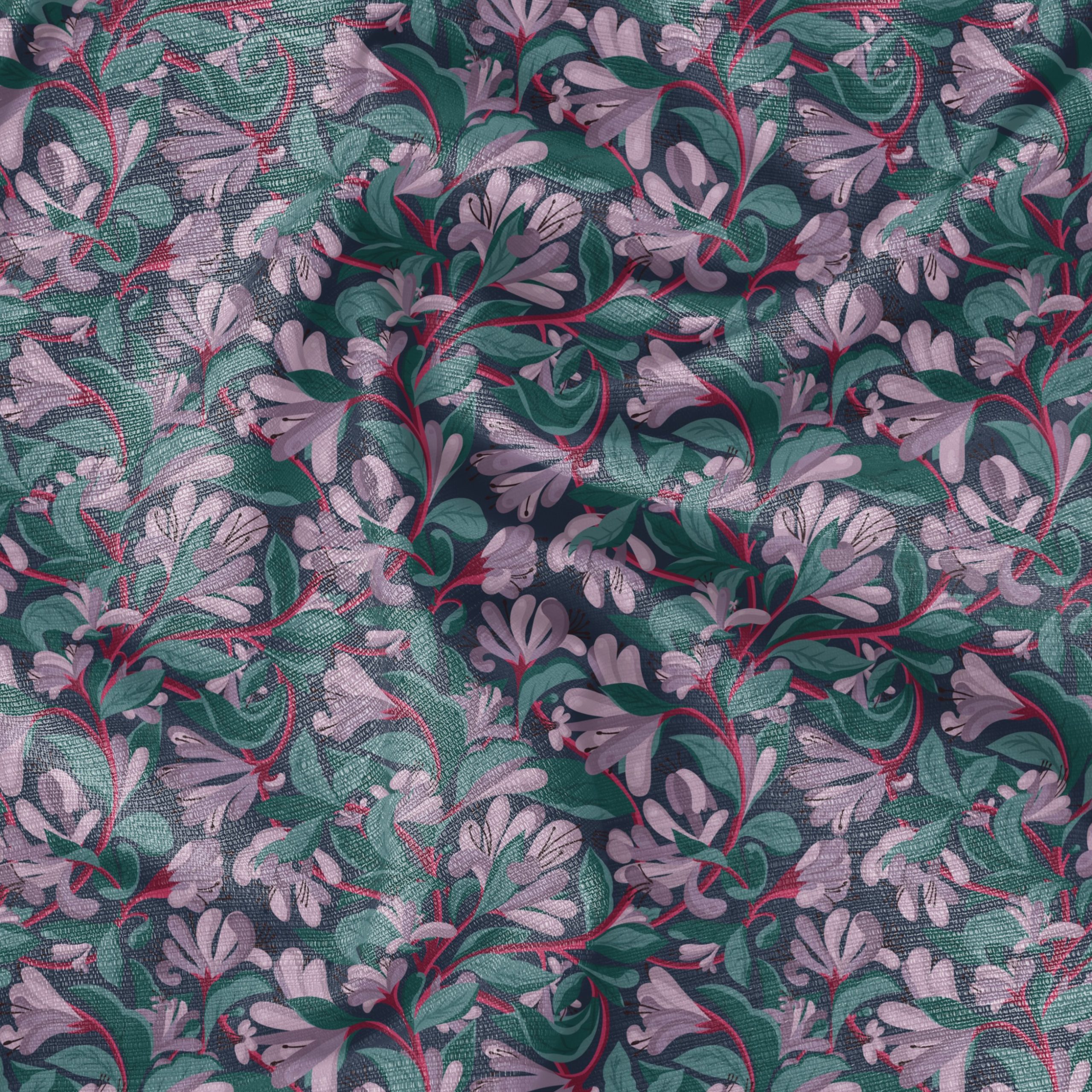
Before designing new pattern tiles, I took this habit of making time for exploring color sets I might not have chosen if relying only on my taste or intuition. So I had a look at my favorite pattern designer palettes.
it is good exercice for self challenging our mental color scheme.
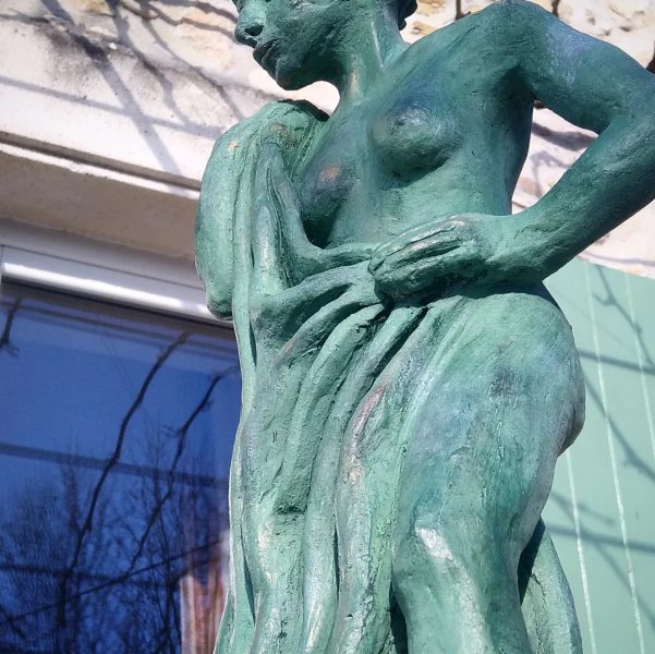
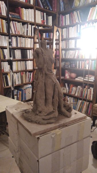
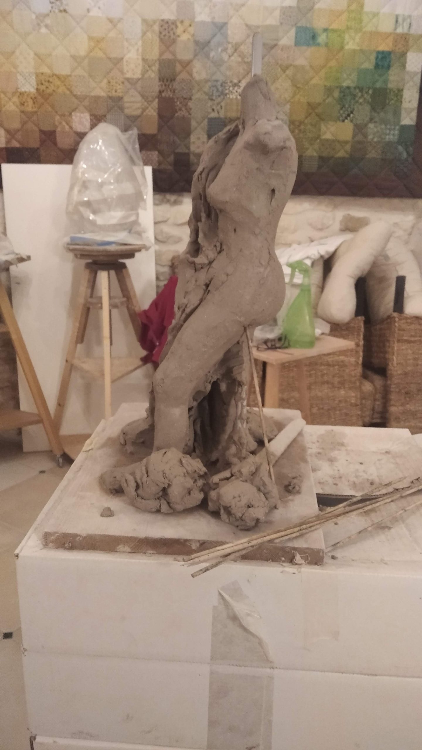
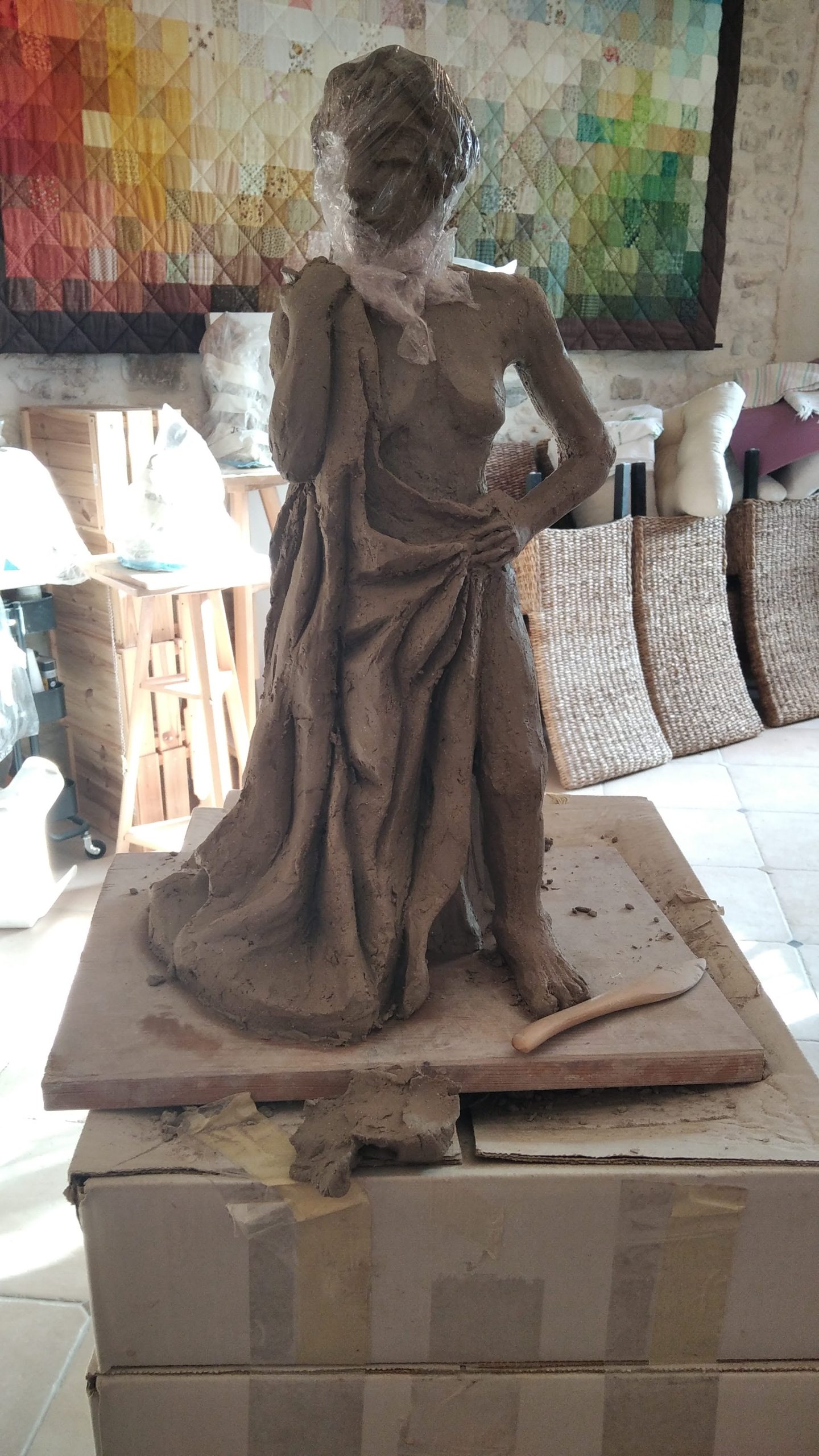
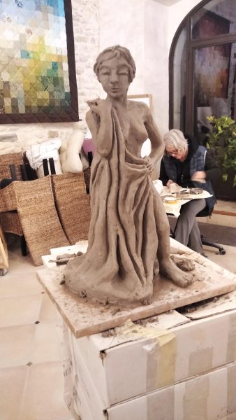
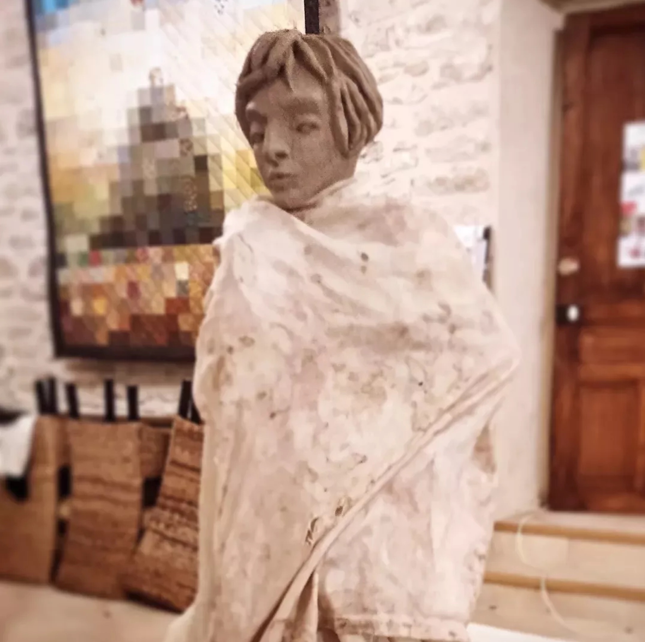
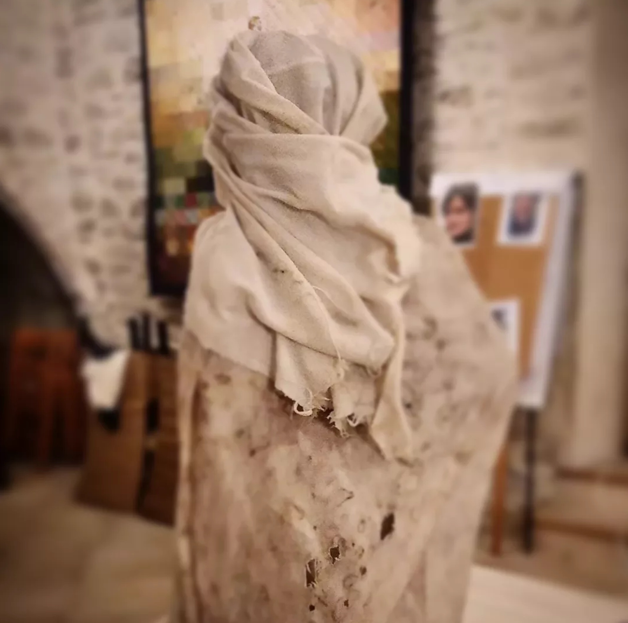
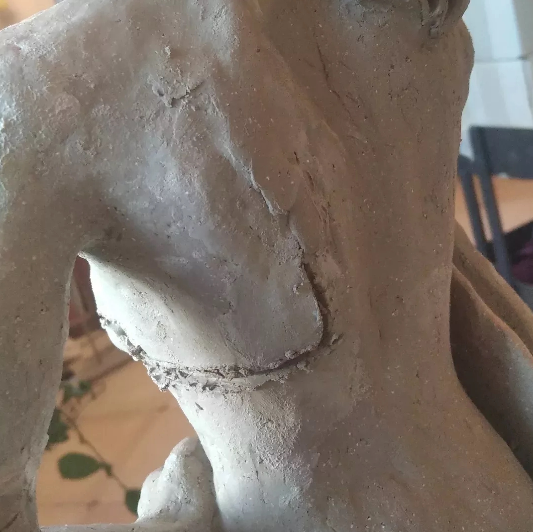
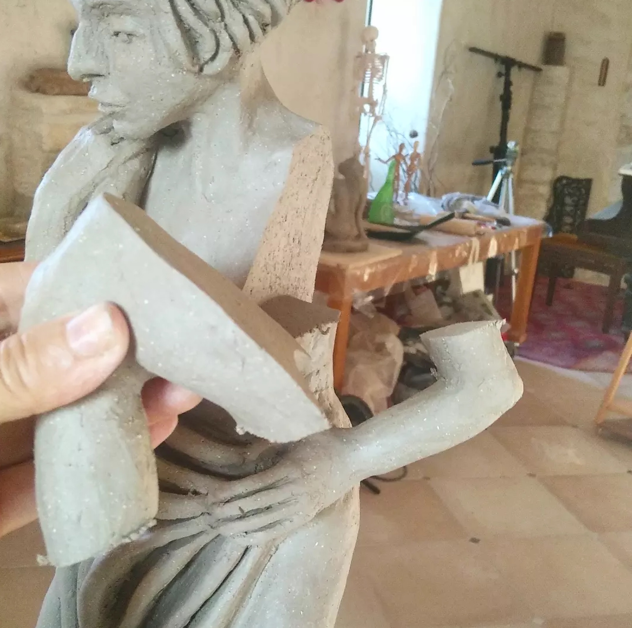
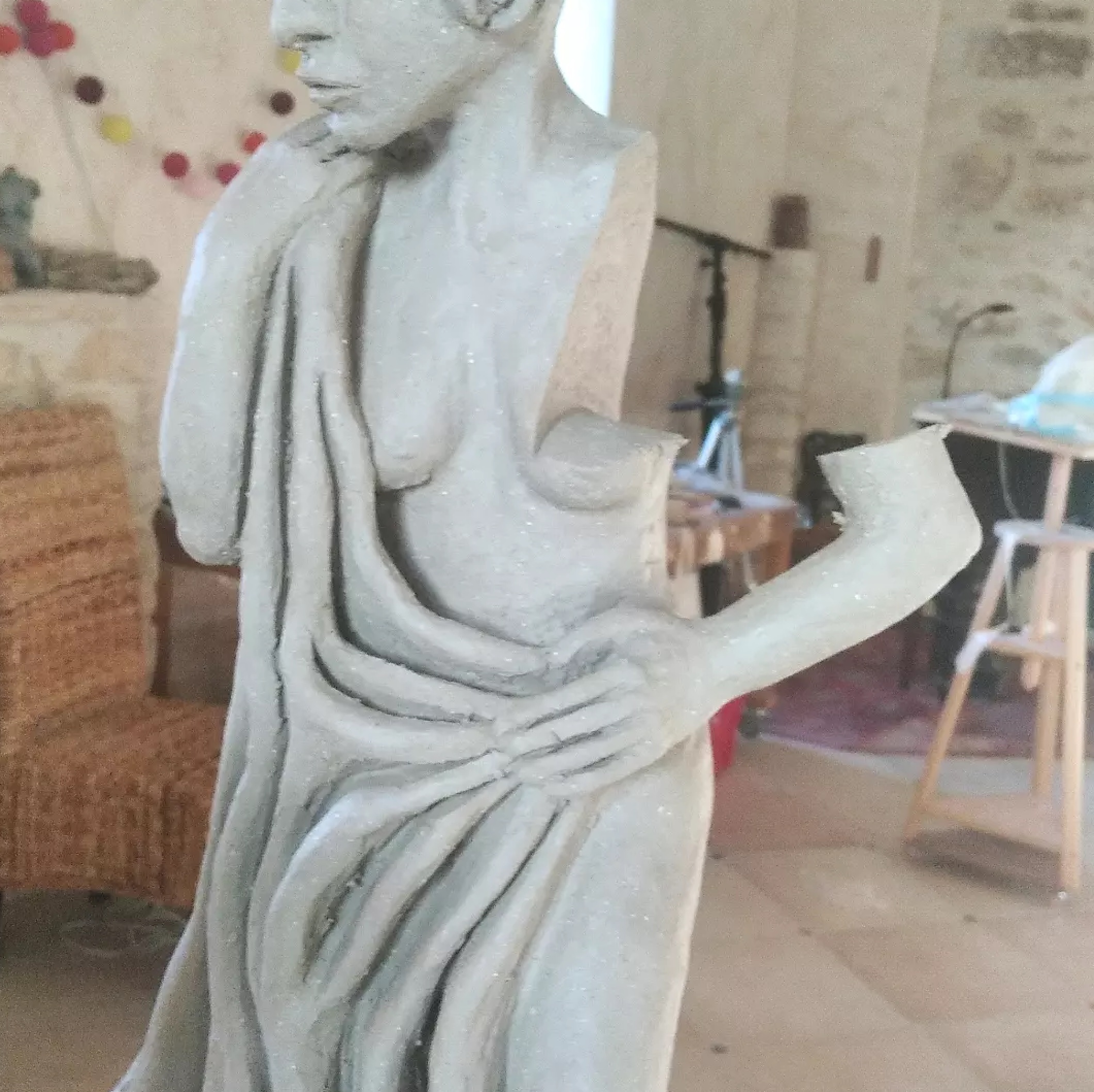
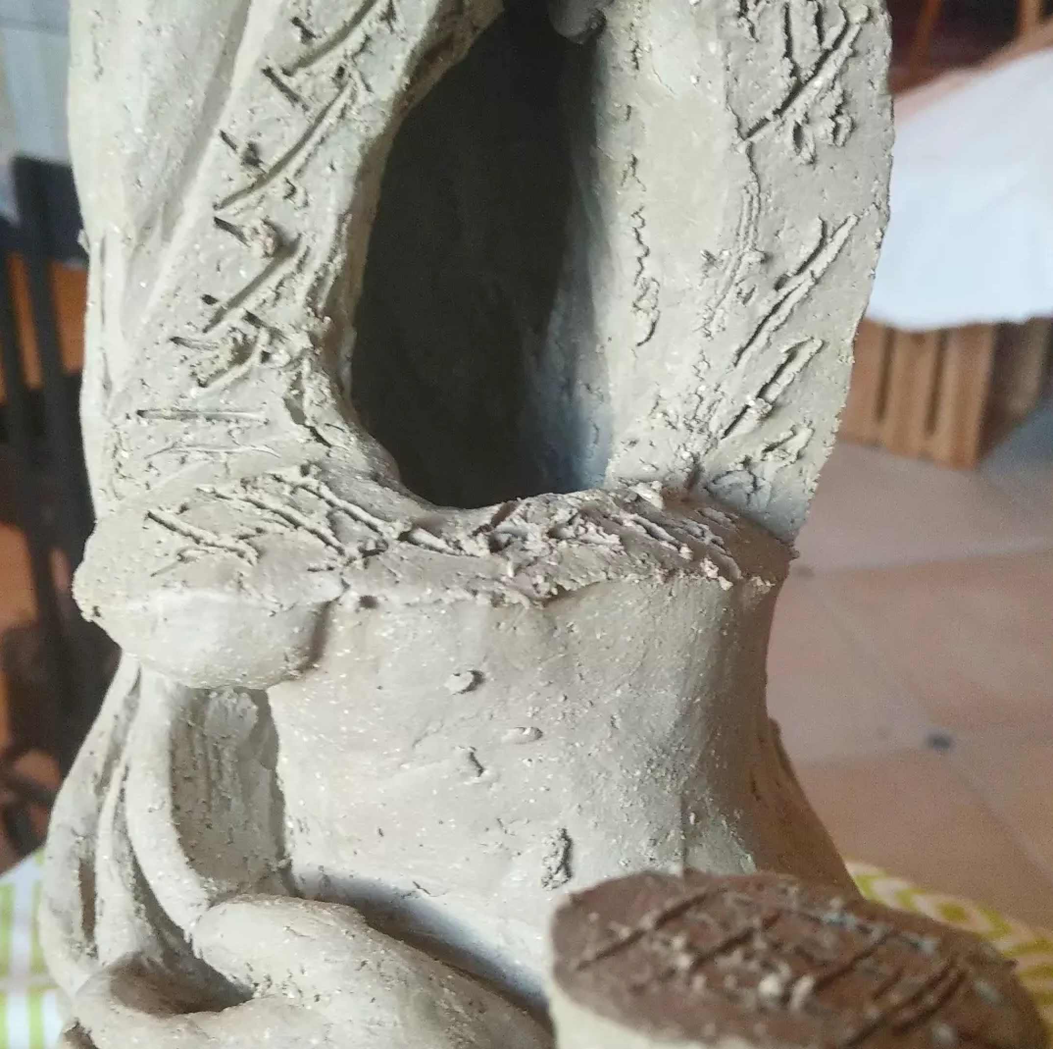
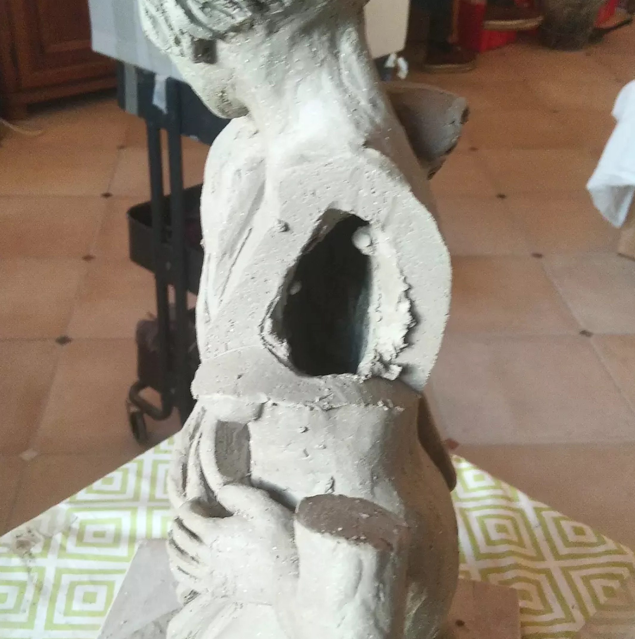
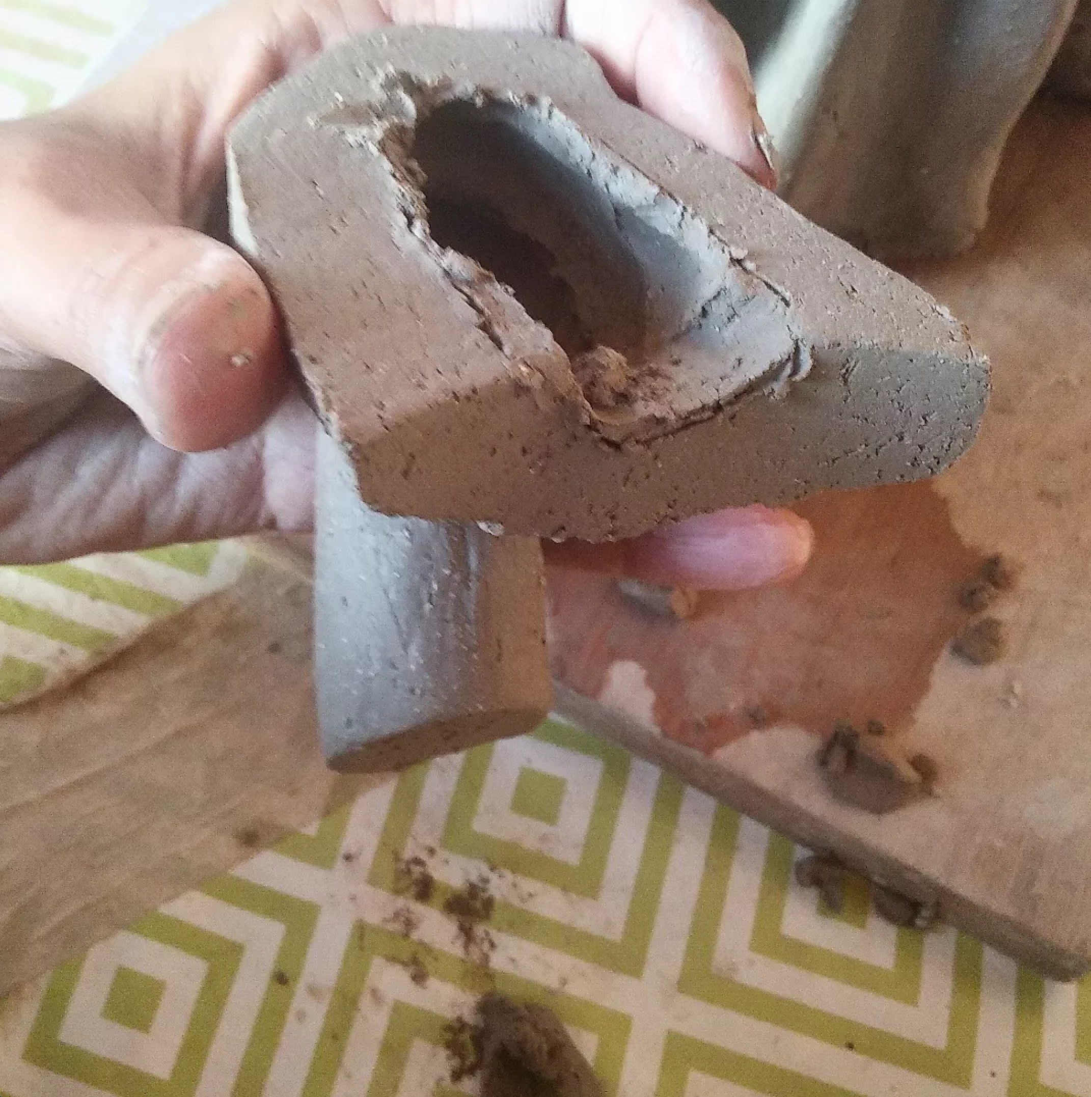
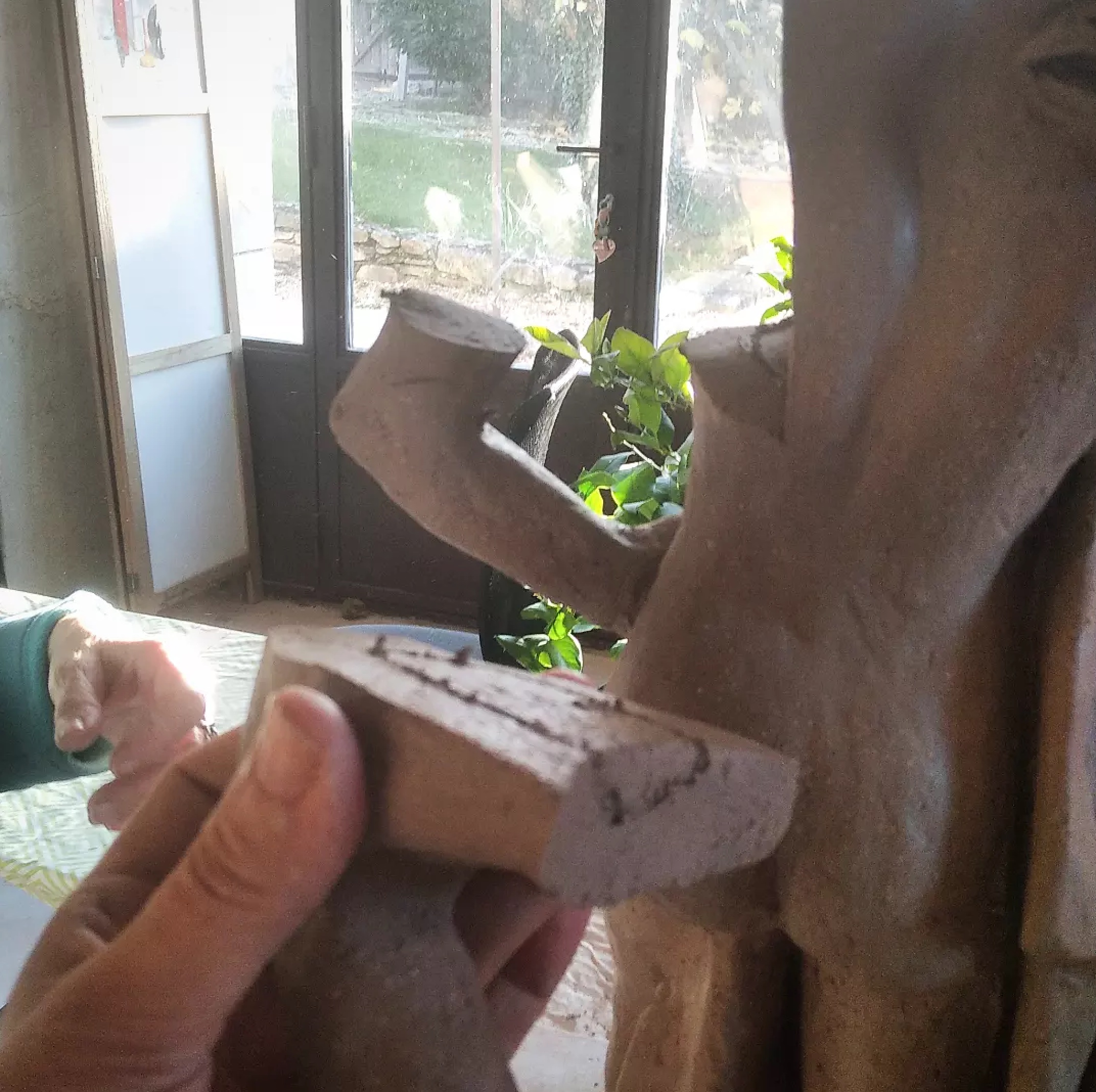
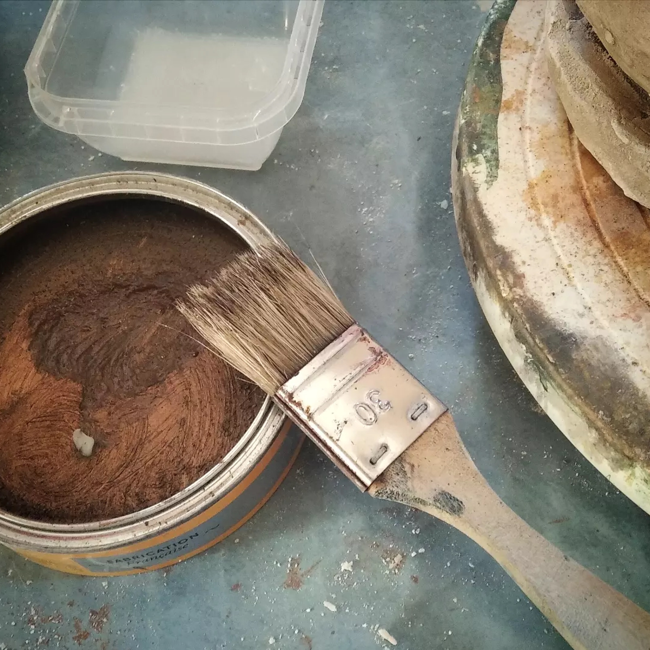
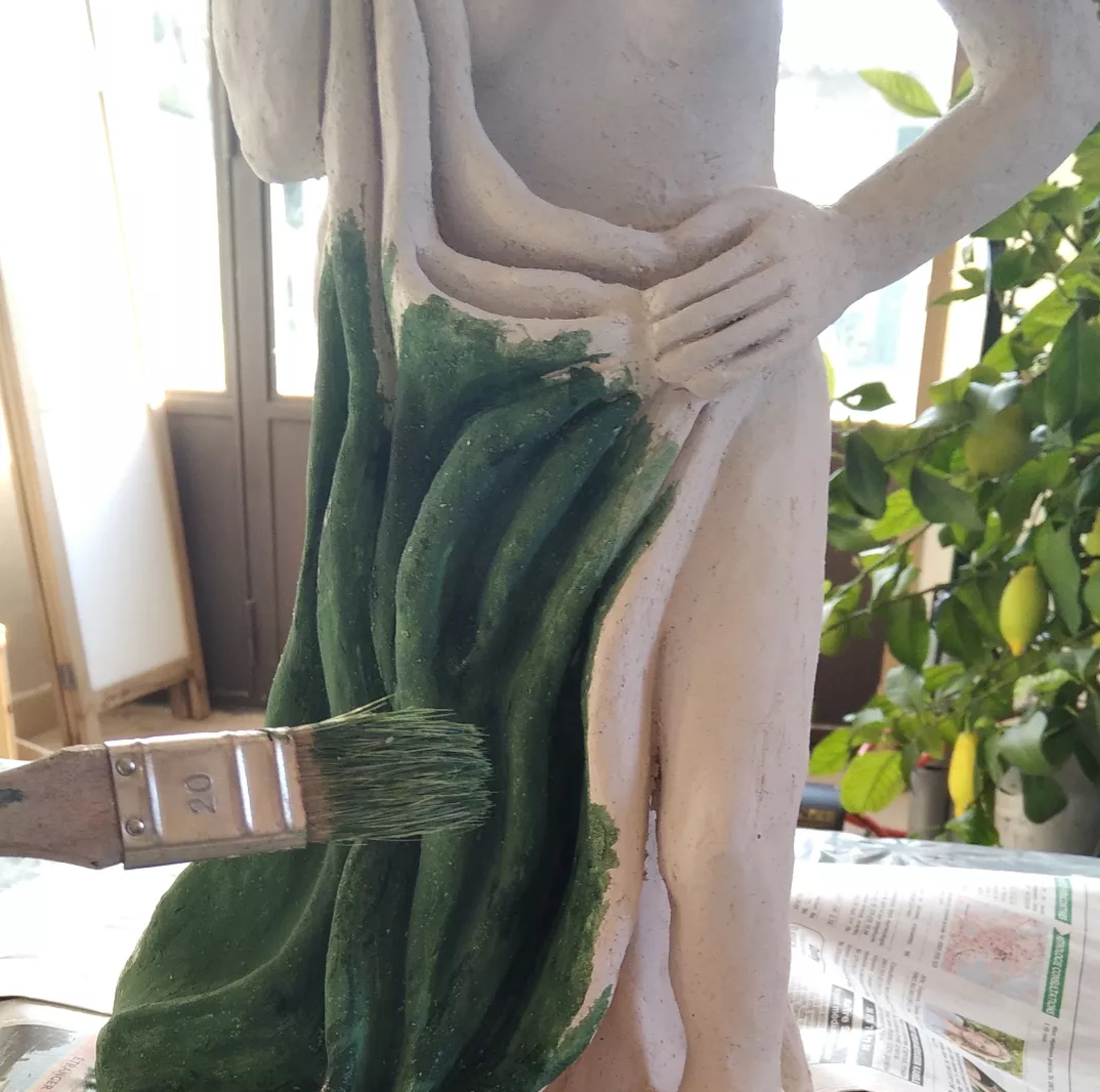
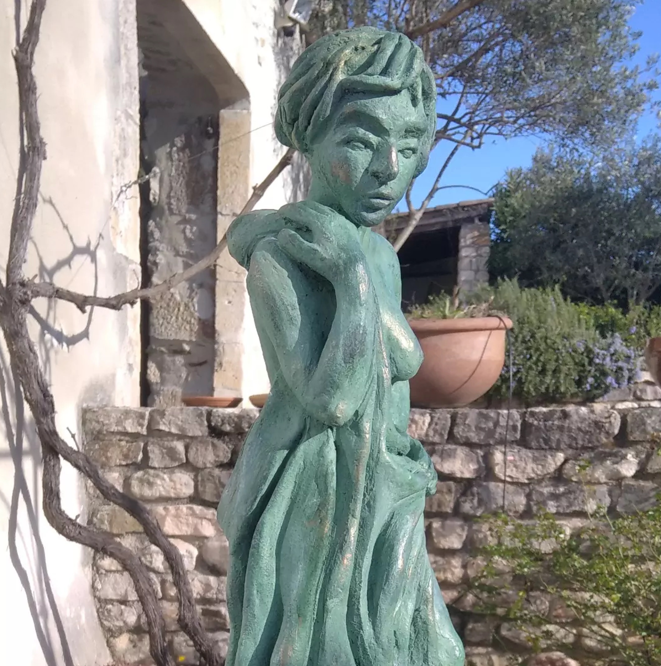
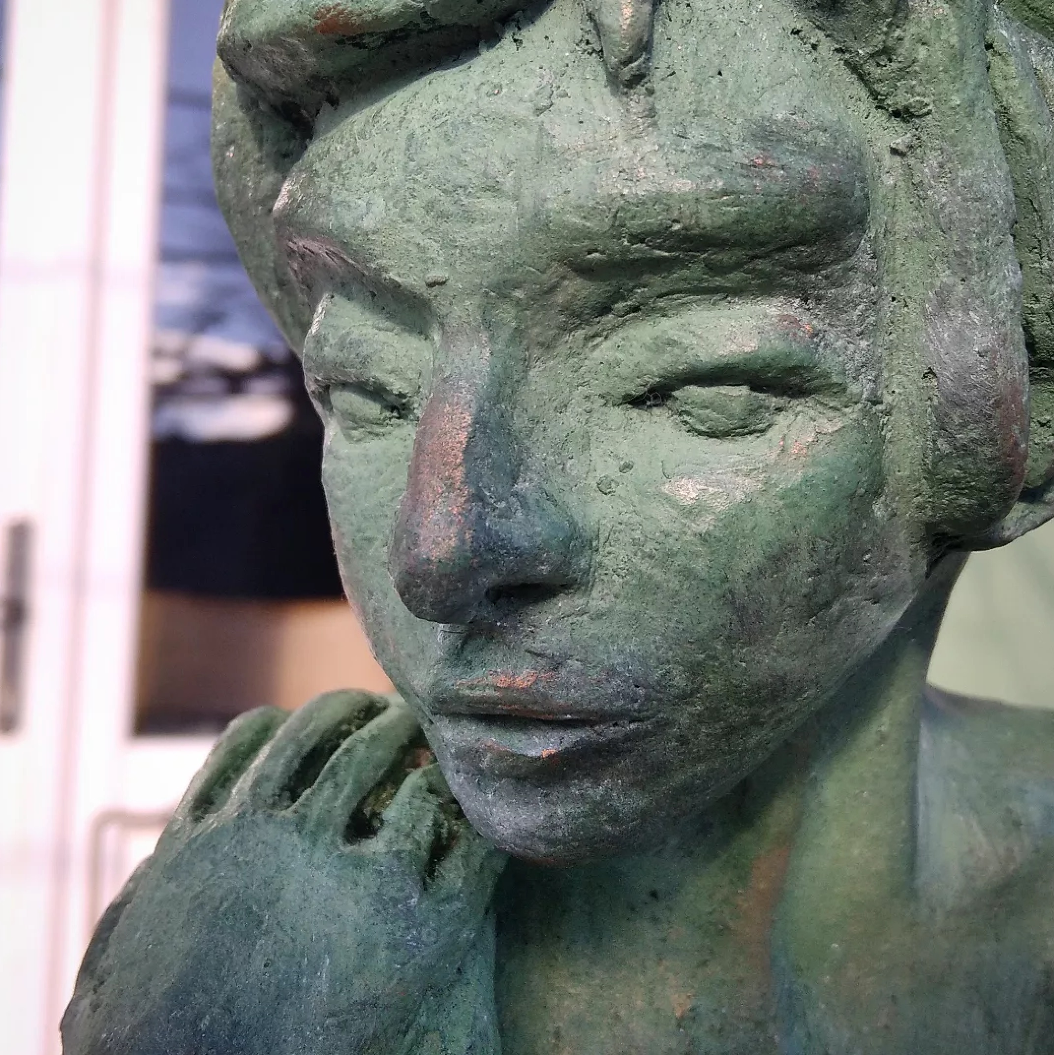
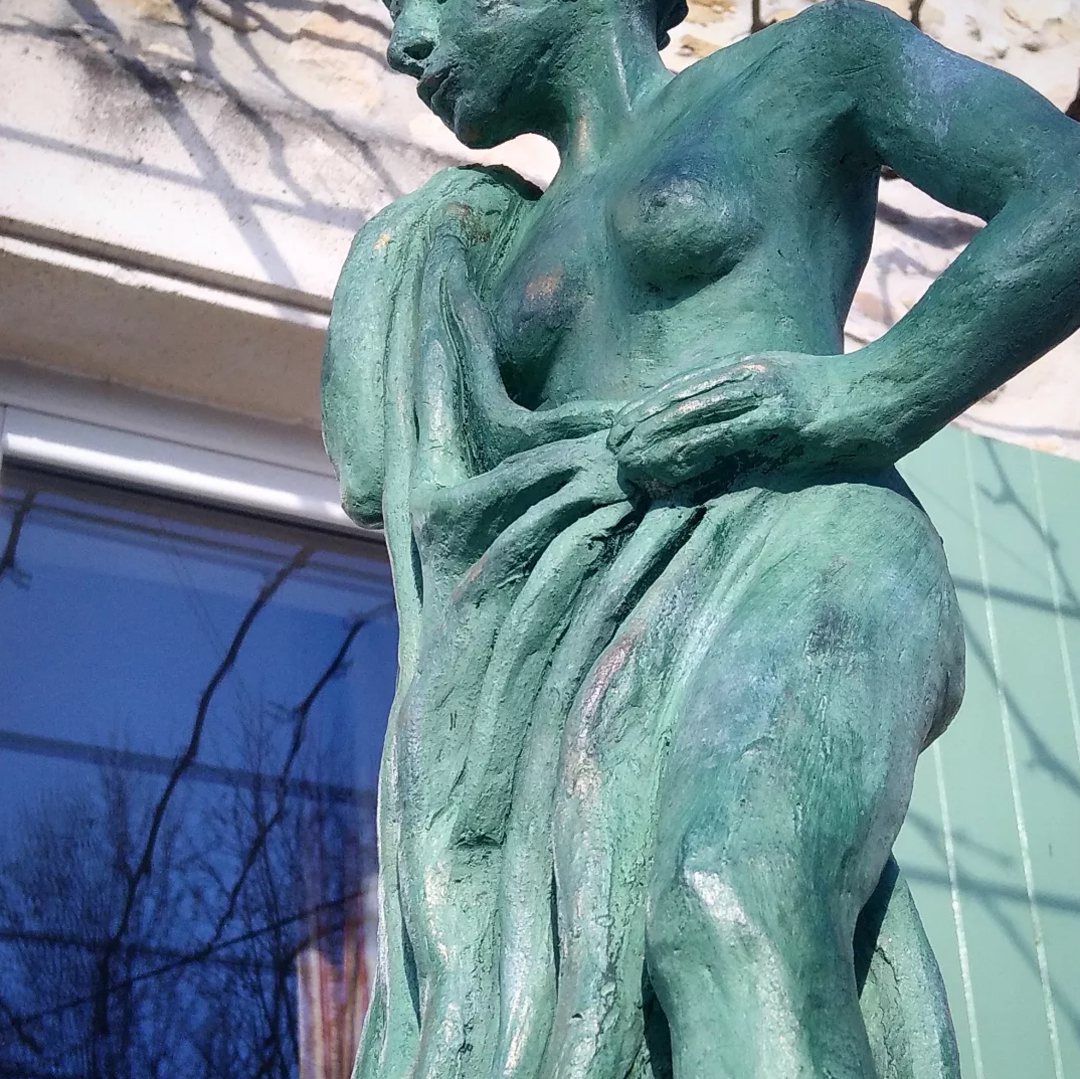
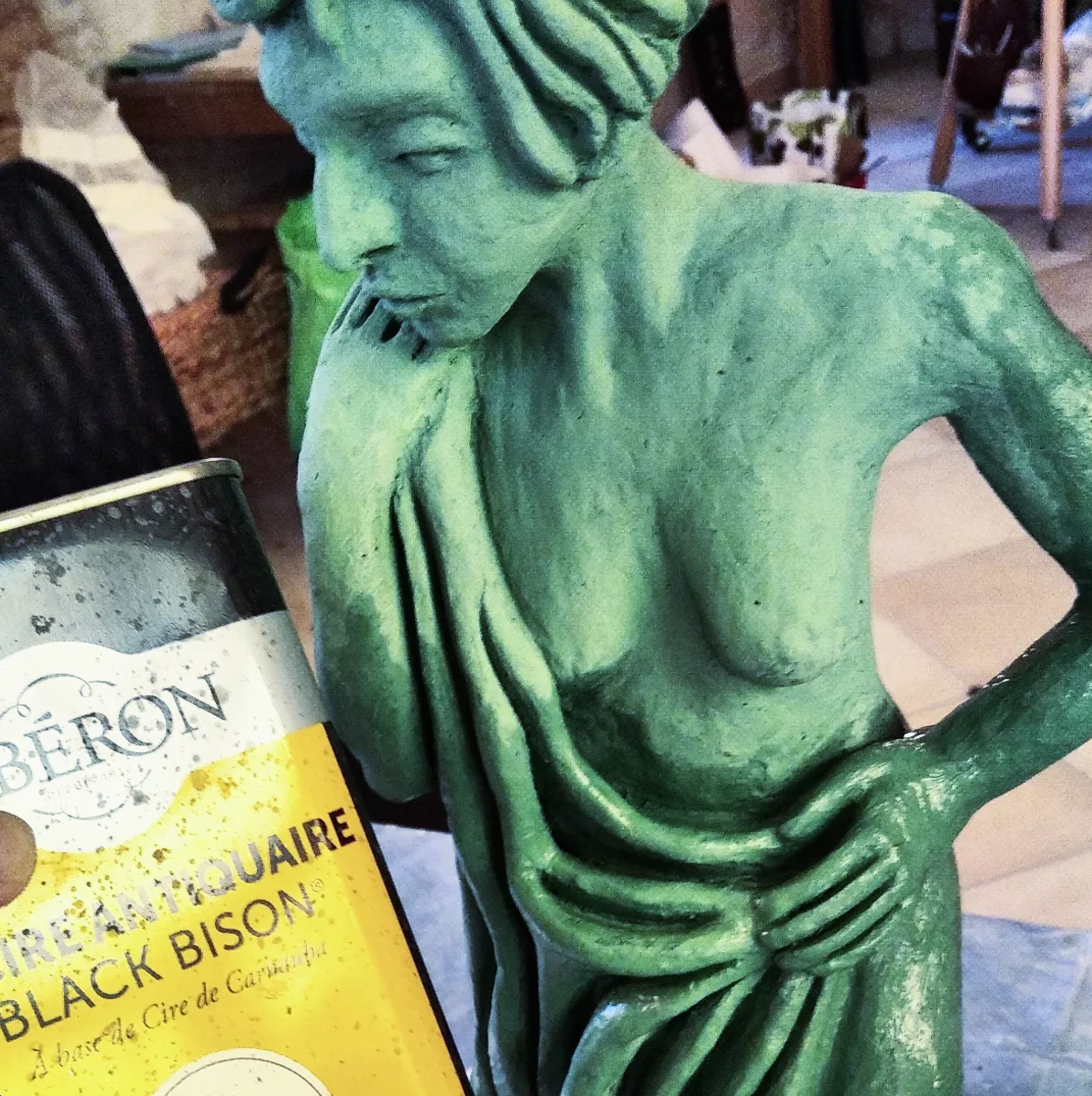
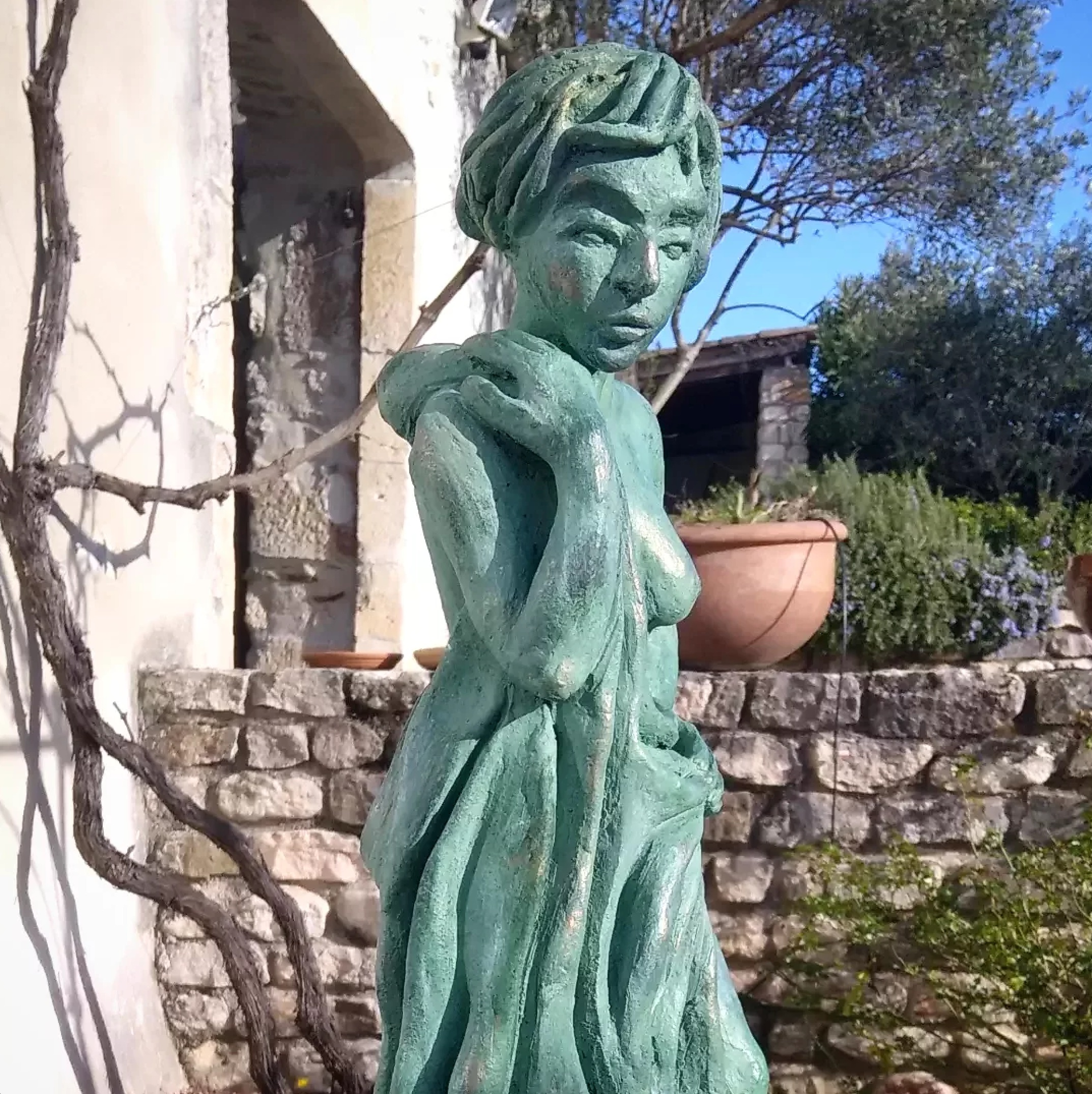
This year I joined a sculpture/modelage groupe. I had the chance, through a friend, to meet a local group of creative women who have been practicing sculpture for a few years already.
https://www.instagram.com/yhtac68/ share her experience through practice. She has a wonderful workshop place. Although It is not a couse but rather a place to practice together As a new comer in this field I am learning a lot.
I am a mix media digital creative personI spending hours facing a screen , I thought it would be nice, for a change, to work 3D, play with argile material. A kind of recreational art exploitation.
Est ce qu’on est encore capable de digérer toutes les images, toutes les données qui nous entourent?
Est- il possible de ne pas se perdre dans le processus des images générées par AI?
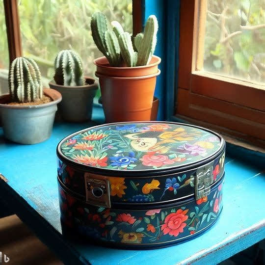
Ma première réaction face à l’afflux d’images générées par l’IA fut de rejeter en bloc l’aspect esthétique lisse et fumé (j ‘y voyais à priori un manque de grain ou de pixels :-). Puis, voyant quelques illustrateurs et artistes que j’apprécie beaucoup s’y essayer et par le même mouvement se construire une opinion sur l’ expérience et le rendu des images, je m’ y suis essayé, en menant une petite exploration sous forme de hobby.
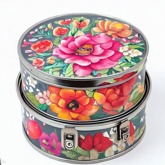
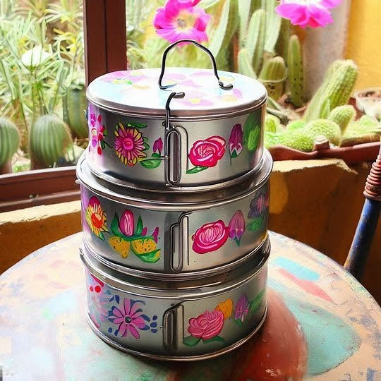
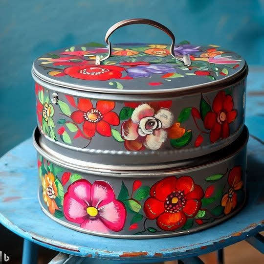
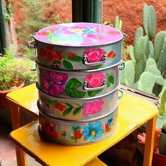
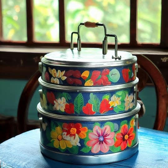
J’utilise DALL.E, via Bing Image Creator, le créateur d’images AI gratuit proposé par Microsoft. DALL-E 3 est entraînée pour générer des images à partir de descriptions textuelles. Le système peut placer les mots fournis dans un ensemble d’intégration texte-image, ce qui permet de concevoir des images, des plus simples aux plus extrêmes. Pour ce faire, il suffit de saisir une ligne de commande appelée prompt, en langage naturel.
Un prompt désigne ainsi instruction, que l’on envoie à un algorithme d’intelligence artificielle (IA) spécialisée dans la génération ’l’image.
Où est le sens de l’image?
Sans se lancer dans de grands débats philosophiques. L’IA pose des questions éthique et de propriété intellectuelle.
Si une image générée par un programme semble belle, pourquoi ne pas la considérer comme de l’art, hors tout contexte ?
Peut-être parce que cette image ne naît pas d’une idée ou d’une vision née dans l’ esprit et la culture d’un artiste ? elle ne constitue pas une réponse à des questionnement spécifiques passant par un processus d’expérimentation de différentes techniques
A prompte égal, l’image n’est pas transformée par la singularité et l’ humanité de l’artiste. Elle ne donne pas de vision singulière, elle n’a pas naturellement de personnalité, de culture, de style, de technique acquise au cours d’ une vie, d’une formation supérieure spécifique.
La part des databases?
l’IA passe directement de la database à la réalisation de l’ image ( art?)
Le bot ne dispose pas de quelque chose qui ressemblerait à l’expérience humaine . Il ne distingue pas la l’usage ou la fonction des choses ou des êtres vivants d’où les monstruosités occasionnelles, les yeux mal placés, les ciseaux inutilisables, les pieds de chaises ondulés ou disloqués…
Si elle est nourrie au préalable du travail humain, elle imite tel ou tel style, en l’occurrence plus ou moins bien, or, l’inspiration, ce n’est pas copier, ni imiter et encore moins plagier.
Il y a une forme d’instabilité de l’ IA par rapport à l’artiste qui peut créer plusieurs fois la même image. L’ IA évoluant constamment en analysant les données à un haut niveau d’abstraction, et chaque mise à niveau de l’ outil change les choses. Un prompt ne donne pas deux fois la même image sur l’ instant même et à plus forte raison dans le temps.
Est-ce que c’est toujours mon art?
Les compagnies d’intelligence artificielle arguent souvent que les logiciels “apprennent”. or en réalité ils utilisent les datas des bases de données d’œuvres existantes et ces œuvres ne sont pas nécessairement libres de droits.
Quid des droits d’auteur?
Qui a la propriété intellectuelle d’une image synthétisée par l’ IA dont le prompt est commandé par “ dans le style de“ ?
Vincent Mahé, illustrateur freelance, plante la situation suivante et s’interroge:
“imaginons un artiste IA qui rédige un prompt en demandant à Dall-E d’illustrer un article de presse dans le style de tel artiste et qui, ensuite, vend l’image au journal comme sienne. C’est problématique … si le prompt ne mentionne aucun nom mais décrit simplement un style, mais qu’ensuite un artiste se reconnaît comme plagié, que faire ? La ligne est très fine et ça ressemble à un enfer juridique… Le plagiat est parfois assez difficile à prouver légalement entre humains, alors avec Midjourney…»
L’IA change-t-elle la perception /définition de l’art et de l artiste?
Certains considèrent que l’intelligence artificielle doit nous amener à redéfinir complètement la perception que nous avons de l’Art. Par son biais, la création serait finalement réduite au seul concept d’imagination, l’ordinateur nous permettant de supprimer la phase de création pure. En se basant sur ce principe, la valeur de l’œuvre ne reposerait donc plus sur la virtuosité stylistique et technique de l’exécution, mais bien sur la seule créativité de l’artiste. De nombreuses tâches autrefois dévolues aux illustrateurs deviendraient accessibles à des personnes ne disposant pas forcément de compétences en dessin mais qui, en revanche, ont appris à maîtriser l’art du « prompt », c’est-à-dire la capacité à produire des instructions envoyées à la machine pour lui permettre de créer une image de toutes pièces.
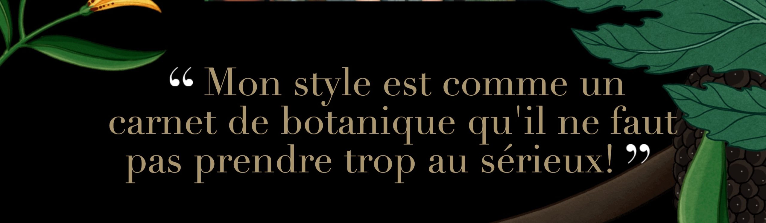
Je reprends ici l’ approche de Vincent Mahé que je trouve pertinente et utile. Il ne voit pas le métier d’illustrateur disparaître. Les illustrateurs viserait “une hybridation créative à différents degrés »
Ils pourraient devenir des “bricoleurs”,“petits génies du prompt IA qui réussieraient à intégrer Mid Journey dans leur processus créatif.
A côté il resterait:
– d’une part Les artisans, ceux qu’on viendra chercher pour le côté organique de leur art, estampillé, fait par un humain.
– d’autre part ceux qui produisaient un art que la machine reproduit à la perfection, à destination de consommateurs d’images peu regardant sur le créateur, IA ou humain”, qu’il nomme “les perdants”
Spécificité de la l’artiste et le prompt comme création
Les systèmes ne peuvent pas juger de ce qui nous touche ou ce qui nous laisse froid, ils ne peuvent pas non plus comparer et dire ça me satisfait pour le moment ou “je ne suis pas encore satisfait de ça” ou “à retravailler”. Le résultat est dépendant de nos directives
C’est un fait, L’IA est là. Elle crée selon les prompts, des images incroyables en quelques secondes. La création de ces images prendrait en moyenne des jours, voire des mois, à un être humain.
Entre l’engagement humain et l’automatisation de l’IA peut proposer des idées créatives perspicaces
La plupart des illustrateurs n’envisageait pas l’IA comme un générateur d’images prêtes à être utilisées telles quelles, mais bien comme une simple source d’inspiration.
Plus qu’une menace, les professionnels créatifs peuvent voir IA davantage comme un outil complémentaire et inspirationnel, découvreur de perspectives.
Ces images ne vont pas remplacer leurs créations personnels sur papier et tablettes
D’un côté, ils craignent logiquement des pertes d’emploi, de l’autre, de l’autre ils constatent que l’ IA peut aussi simplifier le travail au moment de la conception, ce qui laisse plus de temps ensuite pour embellir ce qu’a déjà produit l’intelligence artificielle. soit lA vue comme un accélérateur de processus préliminaire de création
Certains illustrateurs l’utilisent d’ailleurs déjà à cette fin, s’appuyant sur ce puissant algorithme pour chercher des idées et explorer de nouvelles pistes créatives.
Le prompt en lui même
A partir de là, on se concentre sur le prompt . L’ artiste devient concepteur et créateur de du prompte qui génère l’ image
Pour faire un bon prompt. Il nous faut faire preuve d’imagination et fournir un maximum de matière à l’intelligence artificielle. Plus la description sera précise et détaillée, meilleur sera le résultat. Il faut ajouter des mots-clés dans le texte pour que l’algorithme ait à disposition tout ce qui nous intéresse.
Il y a des possibilités d’obtenir des rendus spectaculaires, en donnant , par exemple, des instructions sur l’éclairage, le style, l’angle de vue. En ajustant la couleur ou l’ambiance. En jouant sur le zoom ou la composition..
« Il n’est pas facile de savoir si les images que vous avez codées, générées par l IA sont les vôtres.Il y a toujours un peu de soi même dans le prompt et en tant que tel, je comprends que les rédacteurs qui ne veulent pas partager leurs prompt” DD
“it isn’t easy to know if the images you coded and the AI rendered are yours.
There’s always a bit of yourself in the prompt, and as such I understand prompters who don’t want to share their prompts”
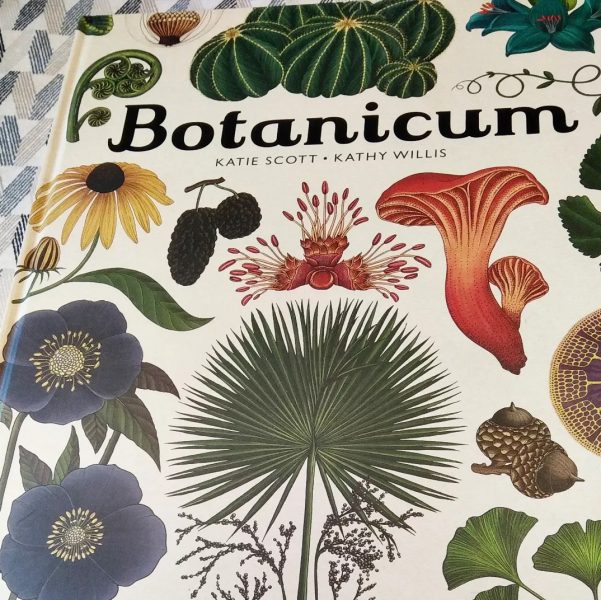
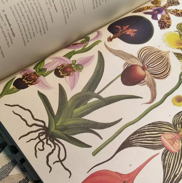
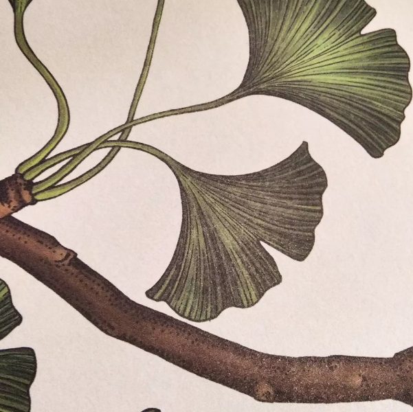
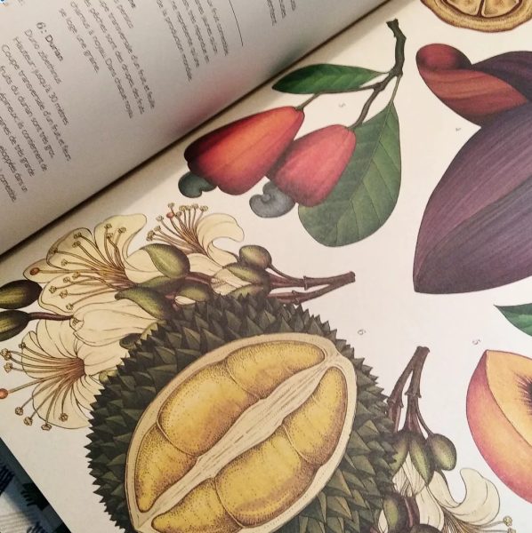
J’aime tellement les illustrations de Katie Scott !
Elles sont très connues. Vous les avez au moins croisées. Magnifique travail de precision et d’harmonie, texturé juste comme il faut. Son univers est une sorte de cabinet de curiosités botanique. Herbier géant ordonné et sauvage à la fois.
“Autodidacte, Katie n’a jamais étudié la botanique. Ses premiers dessins botaniques étaient des plantes nées de son imagination qu’elle traduisait sur papier. Cela lui a permis d’asseoir son style, ce qui l’a ensuite amenée à travailler aux côtés de botanistes sur des illustrations plus précises”
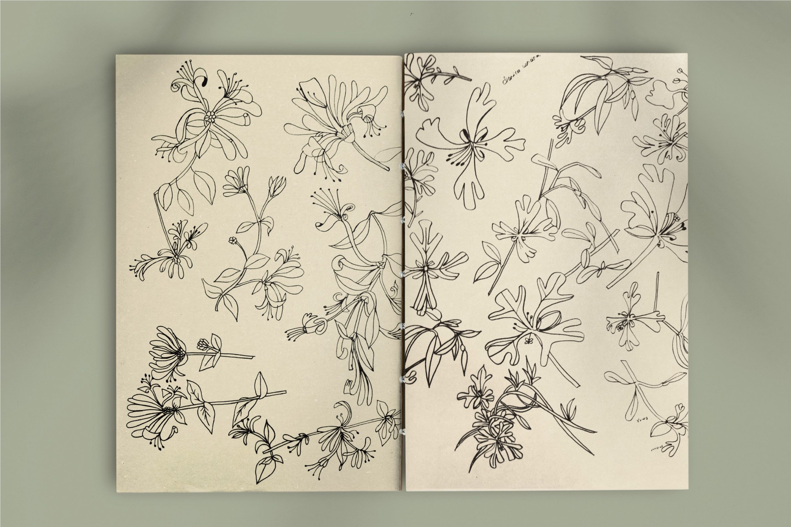
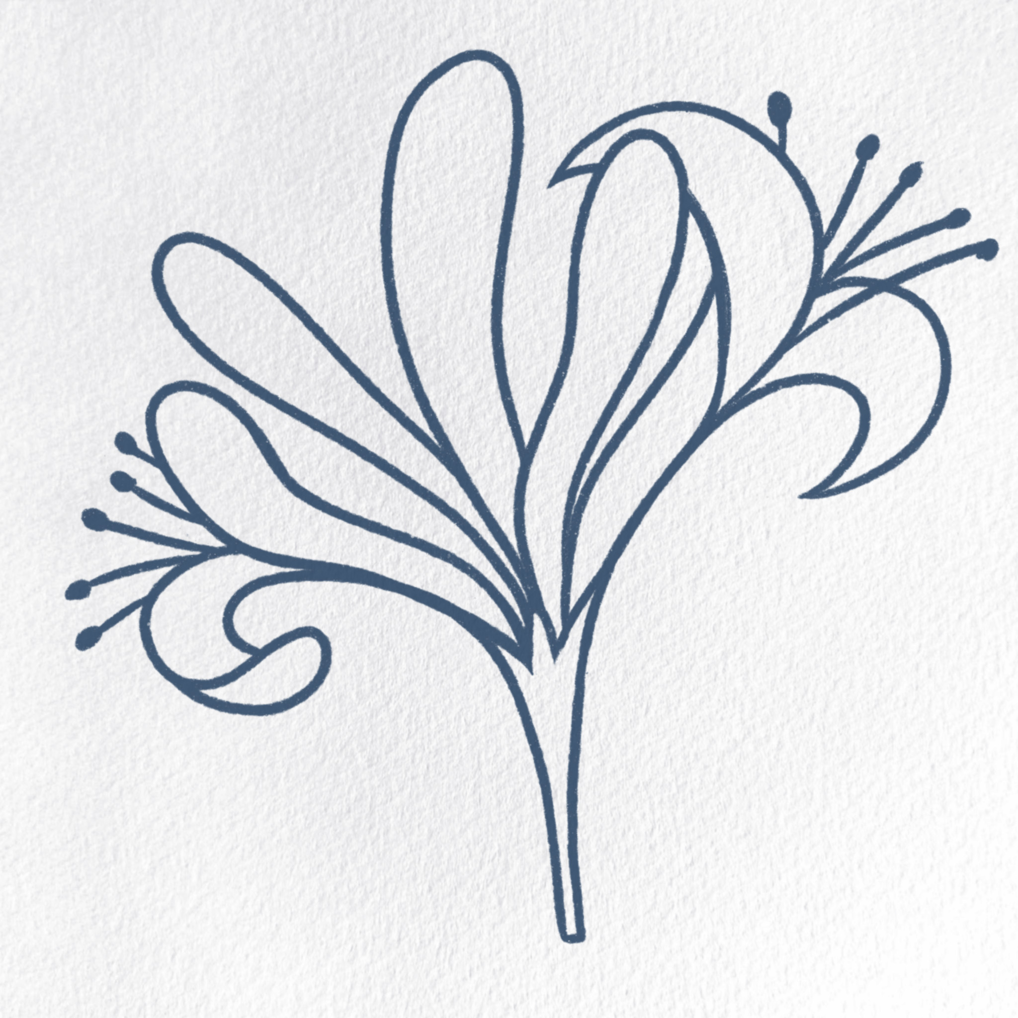
Honeysuckle is a fascinating subject for graphic design and art in general, providing endless possibilities for creating visually engaging and meaningful works.
Honeysuckle plants are climbers and often have long, entwining vines that create complex and dynamic shapes. These twisting and turning vines can form intricate patterns that are visually captivating.The way the vines wrap around structures or other plants can create interesting visual compositions and a sense of movement.
The leaves of honeysuckle are typically arranged in opposite pairs along the stems. This regular pattern can create a pleasing and harmonious visual rhythm.The leaves themselves are often simple and oval-shaped, providing a contrasting backdrop to the more complex flowers and vines.
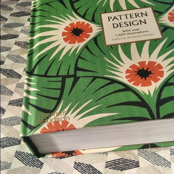
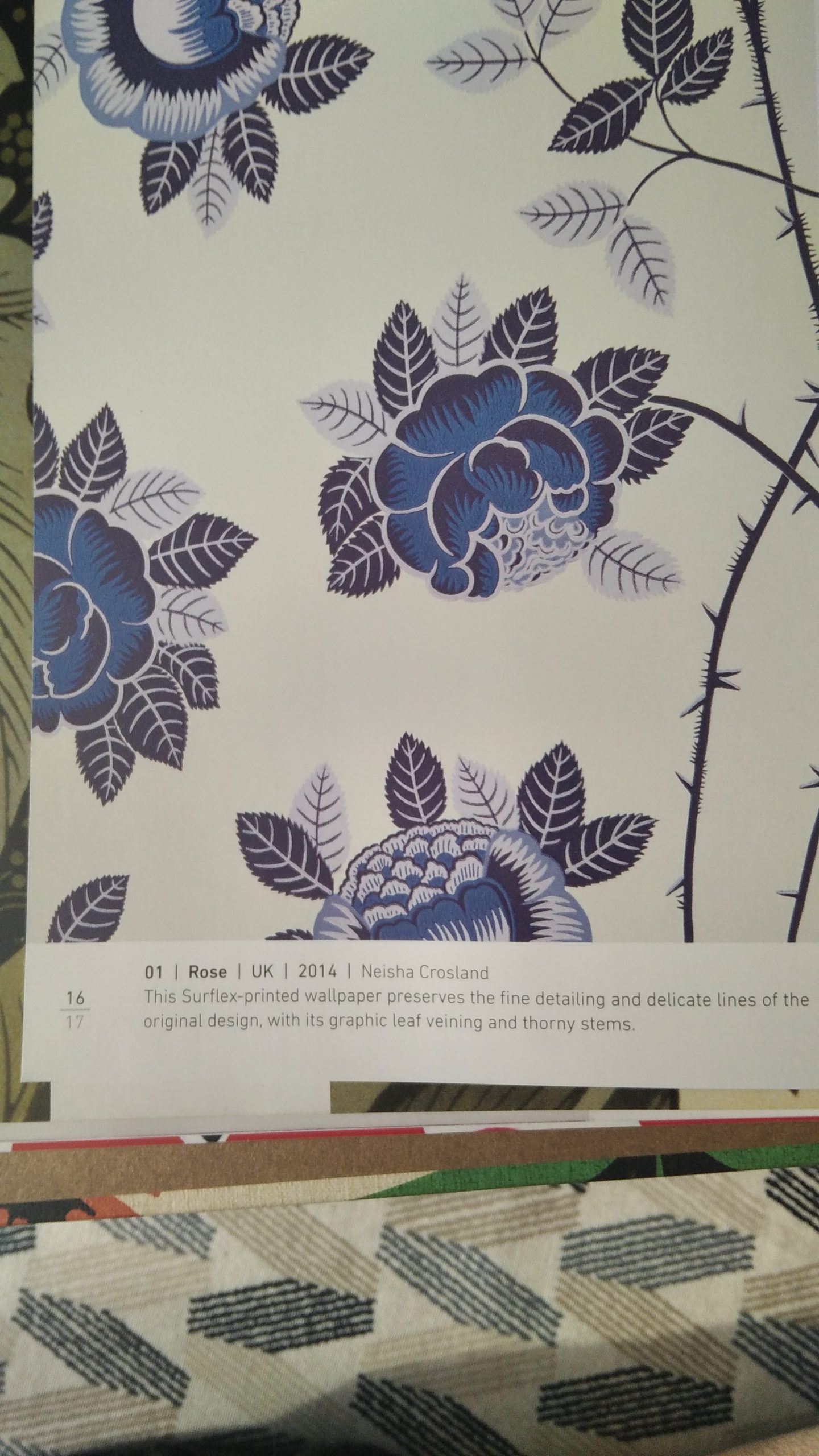
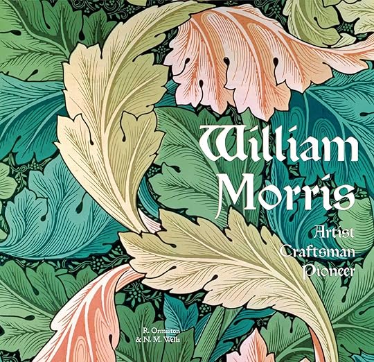
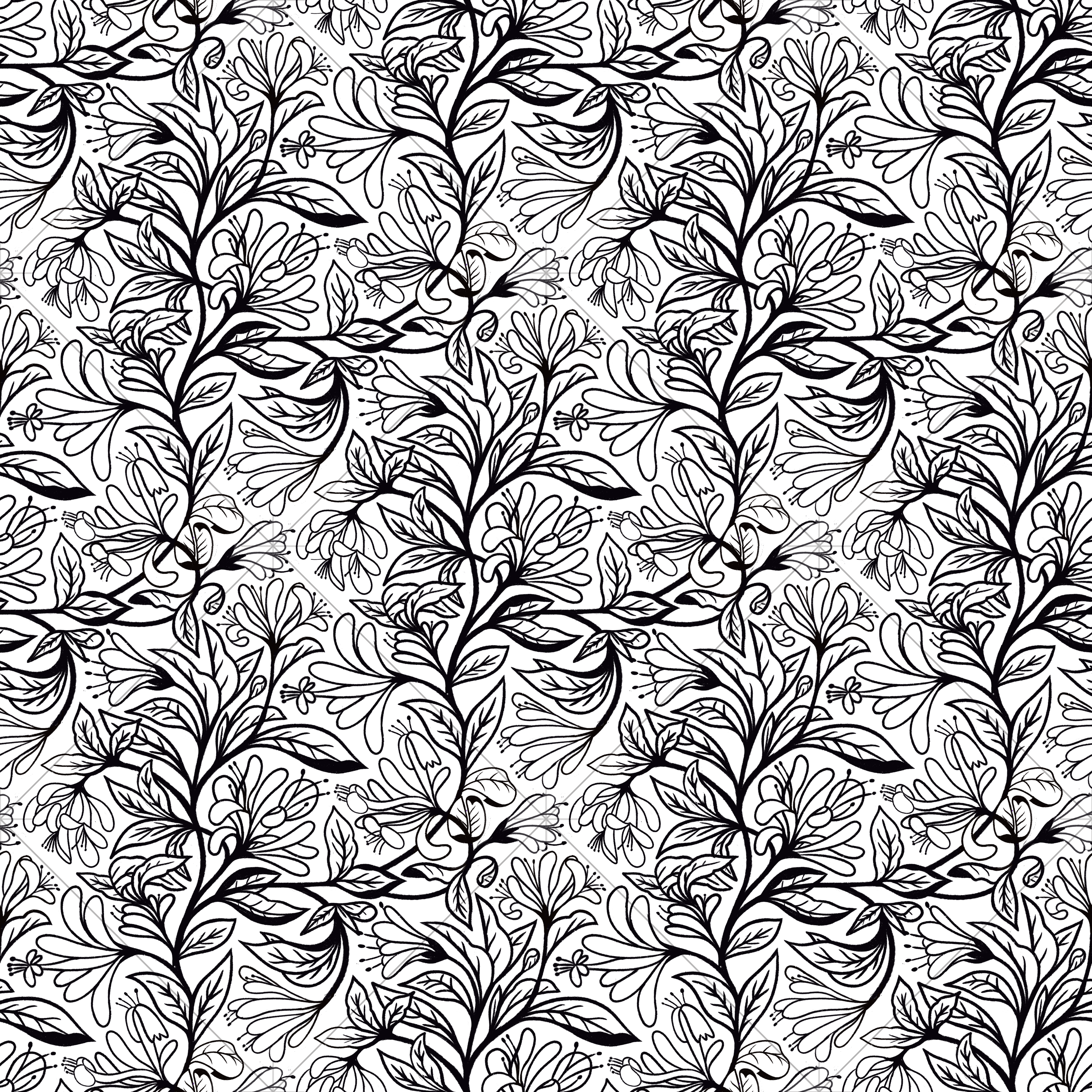
A force parcourir les livres de patterns tels que : William Morris , artist craftsman Pioneer , j avais plein de chèvrefeuilles parmi mes images mentales. Il fallait que ça sorte en motif. Voila!
Aucun intérêt à le faire mais c’ est un excellent bouquin, un bon équilibre entre contexte géographico-historique et collections des patterns des plus illustres aux moins familiers. On se rend aussi compte que dans la firme Morris, Marshall, Faulkner & Co, la company est importante à découvrir … J’en parlerai un de ces jours…
Le genre de bouquin vers lequel on revient très souvent: un livre de table de salon ou de table de chevet. II passe peu de temps sur des étagères
 isa
isa