 isa
isa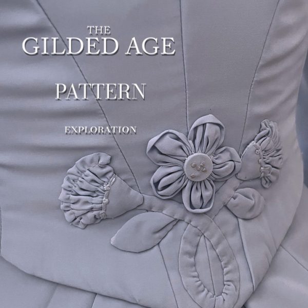
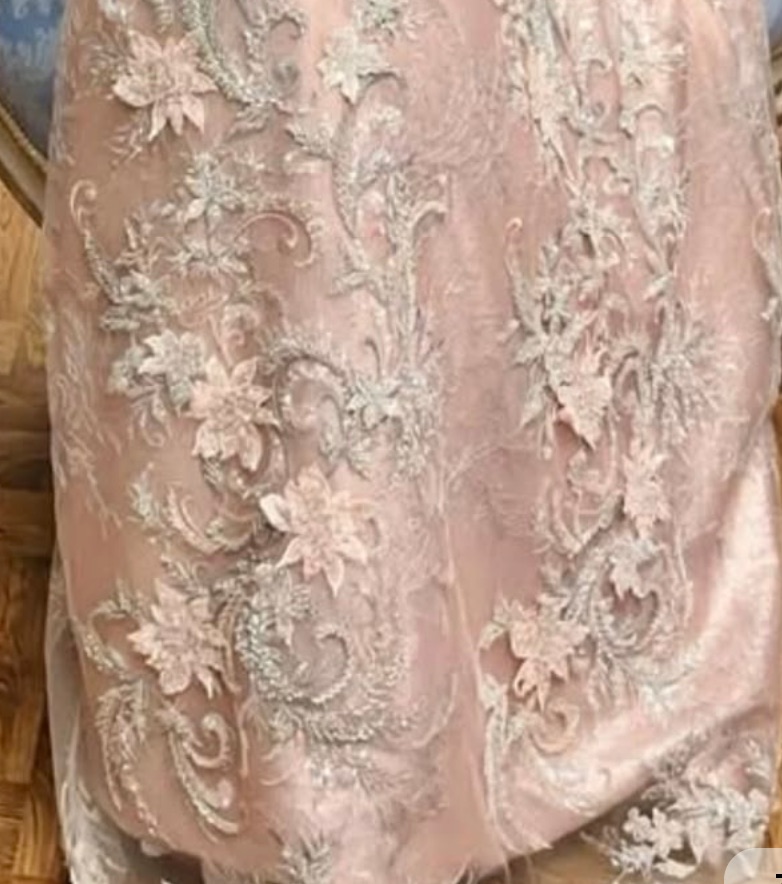
FR: J’ai vula série”the gilded age”. Des motif botaniques raffinés d’inspiration victorienne, associant des feuillages sinueux, des fleurs stylisées et un ornement évoquant le damas, dans un élégant motif en répétition continue.
***
ENGL: I saw the “gilded age” serie. Refined botanical motifs inspired by the Victorian era, combining sinuous foliage, stylized flowers, and damask-inspired ornamentation in an elegant seamless repeat.
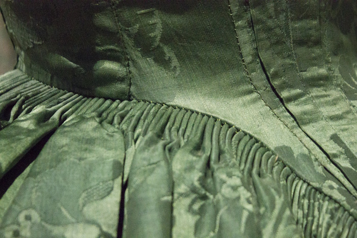
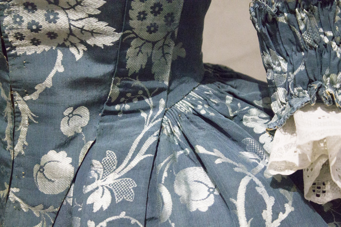
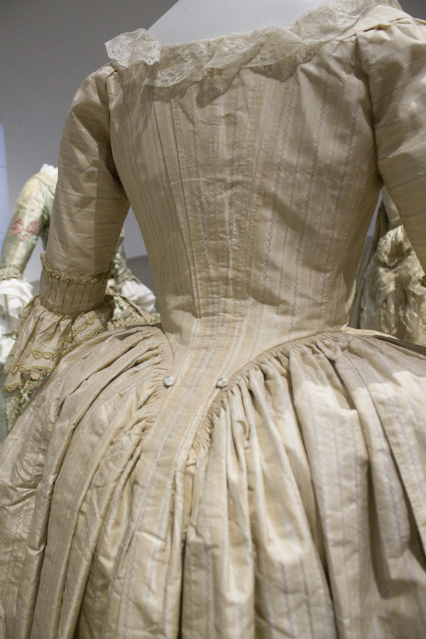
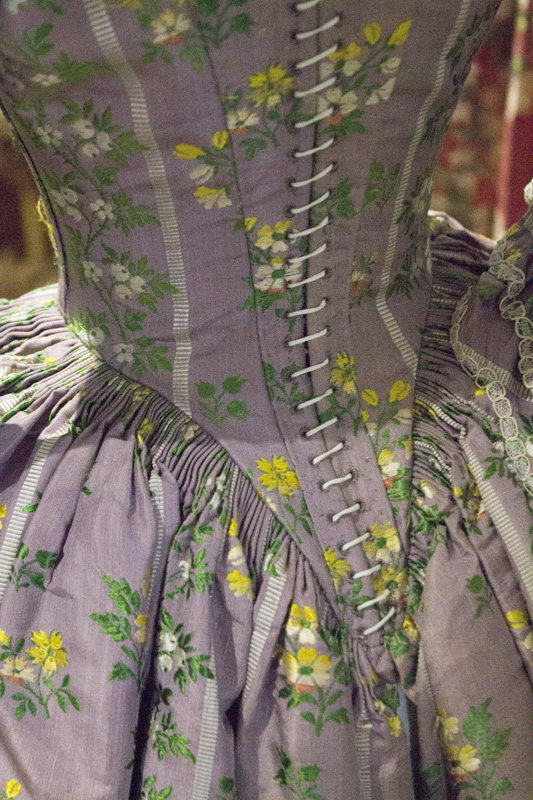
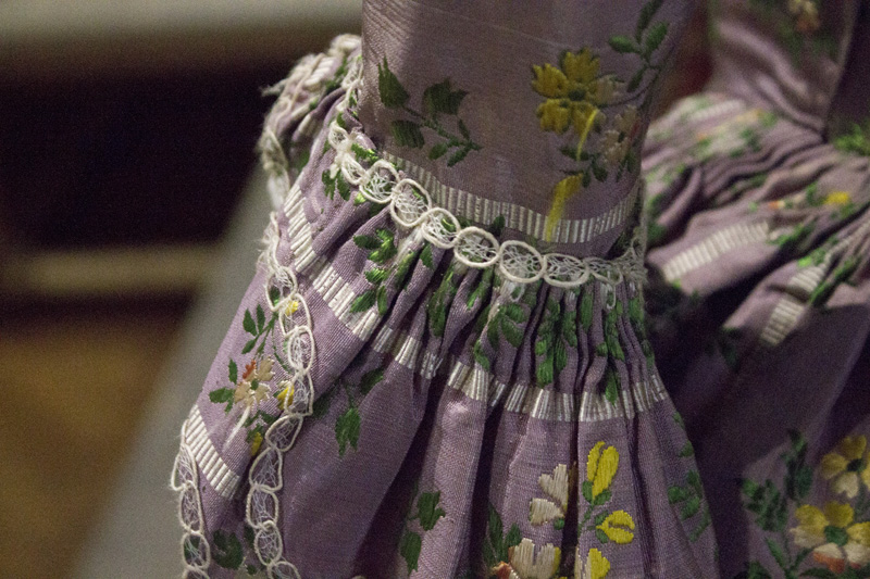
illustration de circonstance ( not from “the gilded age”)
image from atelier nostalgia
juste pour la beauté
FR: Quoi qu’ il en soit on fera une distinction entre « Gilded Age » historique et « The Gilded Age » série HBO. Pour le moment je suis sous le charme esthétique du “the gilded age” de la série. J’aime ce vocabulaire historique réinterprété avec une opulence théâtrale et une sensibilité chromatique plus contemporaine. La série re-visite l’époque plutôt qu’elle ne la reproduit de manière strictement documentaire. La costumière explique, d’ailleurs elle-même, avoir pris des libertés créatives pour produire des costumes plus spectaculaires à l’écran.
J’ai regroupé quelques uns des magnifiques motifs de la série
ENGL: In any case, we should distinguish between the historical Gilded Age and The Gilded Age, the HBO series. For now, I’m completely captivated by the series’ aesthetic interpretation of the Gilded Age. I love this historical vocabulary reinterpreted through theatrical opulence and a more contemporary color sensibility. The series interprets the period rather than reproducing it in a strictly documentary way. The costume designer herself has explained that she took creative liberties in order to create costumes that would appear more spectacular on screen.
I’ve gathered together some of the beautiful patterns and motifs featured in the series.
FR: Les robes, papiers peints, rideaux, tapis, tissus d’ameublement et décors intérieurs dialoguent constamment!
En arrière plan, des rideaux damassés. Au moyen plan des fauteuils à motif floraux et tapis à motifs parfois géométriques. Au premier plan, des robes florales..creant une impression de maximalisme controlé.
Partout, il a des motifs somptueux, tactiles et décoratifs, avec une prédilection pour les velours dense, profond, absorbant la lumière, des soies et satin brillants, fluides, parfois irisés, des taffetas plus rigides, avec beaucoup de tenue et de volume, des brocarts et jacquards en motifs intégrés dans le tissage plutôt qu’imprimés, les damas floraux ou arabesques souvent ton sur ton, des dentelles et tulles utilisés en géniales superpositions, des tissus moirés, donnant un effet ondulant … bref des design floraux a l infini!
La costumière Kasia Walicka-Maimone explique notamment avoir fait fabriquer certains velours pour obtenir deux dimensions de couleurs, et avoir utilisé des taffetas irisés dont la couleur change avec la lumière below the line
Dans The Gilded Age, le décor fonctionne beaucoup par stratification: des grands motifs, des motifs secondaires, des textures, galons, frange, surface unie
***
The dresses, wallpapers, curtains, carpets, upholstery fabrics, and interior settings are in constant dialogue with one another.
In the background, damask curtains. In the middle ground, floral-patterned armchairs and carpets featuring sometimes geometric motifs. In the foreground, floral dresses — creating an impression of controlled maximalism.
Everywhere, there are sumptuous, tactile, and highly decorative textiles, with a particular predilection for dense, deep velvets that absorb the light; glossy, fluid silks and satins, sometimes with an iridescent quality; more structured taffetas with plenty of body and volume; brocades and jacquards, where the patterns are woven into the fabric rather than printed; floral or arabesque damasks, often in tonal combinations; lace and tulle used in beautiful layers; and moiré fabrics, creating a rippling, shifting effect… In short, an endless array of floral designs!
The costume designer, Kasia Walicka-Maimone, explains that she had some of the velvets specially made to achieve a two-dimensional color effect, and also used iridescent taffetas whose colors shift with the light.
In The Gilded Age, the interiors rely heavily on layering: large-scale patterns, secondary motifs, textures, trims, fringe, and areas of solid color.
Comme Bridgerton ?
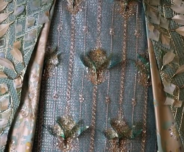
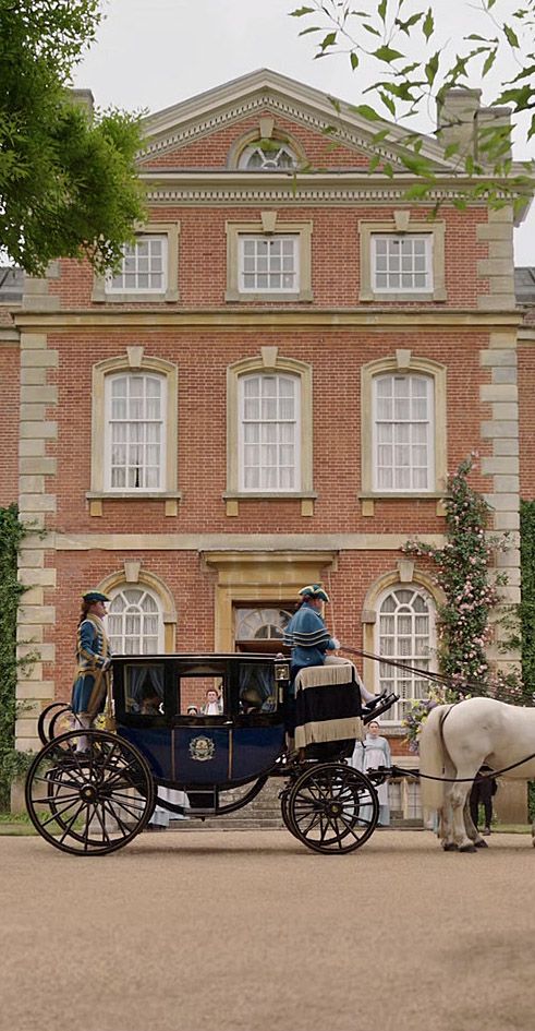
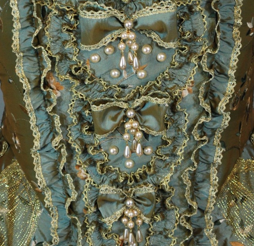
FR: Esthétiquement, on pense assez vite à comparer The gilded age à l’univers de Bridgerton … pourtant malgré la part d’interprétation des décors, dans “the gilded age”, on pressent moins d’anachronismes des couleurs … disons … de bonbonnières ou plus exactement cette palette « pastel sophistiquée »car il ne s’agit pas simplement de « couleurs pastel », la palette possède souvent une base légèrement grisée ou blanchie, ce qui lui donne cette impression de douceur et de raffinement (bleu poudré bleu gris vert sauge vert amande rose poudré rose blush lavande lilas jaune beurre crème, vieux rose). A noter que dans cette palette, le blanc est extrêmement important (ivoire, crème, blanc cassé, champagne). Ces neutres servent de respiration entre les couleurs.
bref une palette a la fois historiquement encrée et volontairement idealisée. D’autant que dans le cas de bridgerton chaque famille possède son propre « branding » chromatique dont la série utilise beaucoup cette opposition: Bridgerton (bleus, verts, blancs, argentés) et Featherington (jaunes, oranges, roses, verts chauds)
Le code couleur de Bridgerton est presque aussi important que les motifs : il participe directement à la construction des personnages, des familles et de l’atmosphère. Il est surtout beaucoup plus pastel, lumineux et poudré que celui de The Gilded Age.
Les deux séries puisent dans un vocabulaire historique très ornemental, mais elles le traitent de manière assez différente. Gilded Age est plus riche, dense, structuré et textile. Bridgerton est plus léger, romantique, floral et fantaisiste.
Dans Gilded Age, le motif semble souvent construit comme une architecture décorative. il a une certaine gravité. Il donne l’impression d’avoir été tissé, brodé ou imprimé sur un textile ancien. Il est a la fois ornamental, dense, superposé et structuré. Il remplit tout l’espace.
les couleurs dominantes somt les bordeaux, vert profond, bleu, or. La palette est faite de tons riches de “jewel tones” et terre. les valeurs sont moyenne à sombre. Les neutres sont des beige, brun, crème, bois sombre … on a une impression d opuplence
Dans Bridgerton, au contraire, le motif romantique aéré et délicat paraît davantage illustratif et narratif. Il laisse davantage respirer le fond. On retrouve beaucoup de fleurs isolées , de bouquets, de petites branches, d’oiseaux, de papillons, de paysages ou scènes de jardin, de motifs inspirés des chinoiseries. Le motif peut donner l’impression d’un jardin qui aurait été peint sur le tissu ou le papier peint.
La palette est, nous l’avons vu, pastelle poudrée, de valeurs claires et saturation moyenne avec des temperatures plutot froides aux quelques accents chauds. Les couleurs dominantes somt le bleu, rose et vert.
***
ENGL: Aesthetically, it is quite natural to draw a comparison between The Gilded Age and the world of Bridgerton. Yet, despite the degree of creative interpretation in the sets of The Gilded Age, we sense far fewer color anachronisms — or, to put it another way, far less of that confectionery-like quality found in Bridgerton’s sophisticated pastel palette.
It is important to note that this is not simply a matter of “pastel colors.” The palette often has a slightly greyed or whitened base, which gives it that characteristic sense of softness and refinement: powder blue, blue-grey, sage green, almond green, dusty pink, blush pink, lavender, lilac, butter yellow, cream, and old rose.
White is also extremely important within this palette — ivory, cream, off-white, champagne. These neutrals provide breathing space between the colors.
In short, it is a palette that is both historically grounded and deliberately idealized. In Bridgerton, each family even has its own chromatic “branding,” and the series makes extensive use of this opposition: the Bridgertons are associated with blues, greens, whites, and silvery tones, while the Featheringtons are associated with yellows, oranges, pinks, and warmer greens.
The color coding in Bridgerton is almost as important as the patterns themselves: it directly contributes to the construction of the characters, the families, and the overall atmosphere. Above all, it is much more pastel, luminous, and powdery than the palette of The Gilded Age.
Both series draw from a highly ornamental historical vocabulary, but they treat it in quite different ways. The Gilded Age is richer, denser, more structured, and more textile-driven, while Bridgerton is lighter, more romantic, floral, and whimsical.
In The Gilded Age, the pattern often seems to be constructed like decorative architecture. It has a certain gravity. It gives the impression of having been woven, embroidered, or printed onto an antique textile. It is simultaneously ornamental, dense, layered, and structured. It fills the entire space.
The dominant colors are burgundy, deep green, blue, and gold. The palette is built around rich jewel tones and earthy hues, with medium to dark values. The neutrals include beige, brown, cream, and dark wood tones. The overall impression is one of opulence.
In Bridgerton, by contrast, the romantic, airy, and delicate pattern feels more illustrative and narrative. It allows the background to breathe. We see many isolated flowers, bouquets, delicate branches, birds, butterflies, landscapes or garden scenes, as well as chinoiserie-inspired motifs. The pattern can give the impression of a garden painted directly onto fabric or wallpaper.
As we have seen, the palette is soft and powdery, with light values and medium saturation, generally leaning toward cooler temperatures with a few warm accents. The dominant colors are blue, pink, and green.
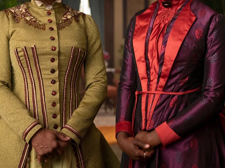
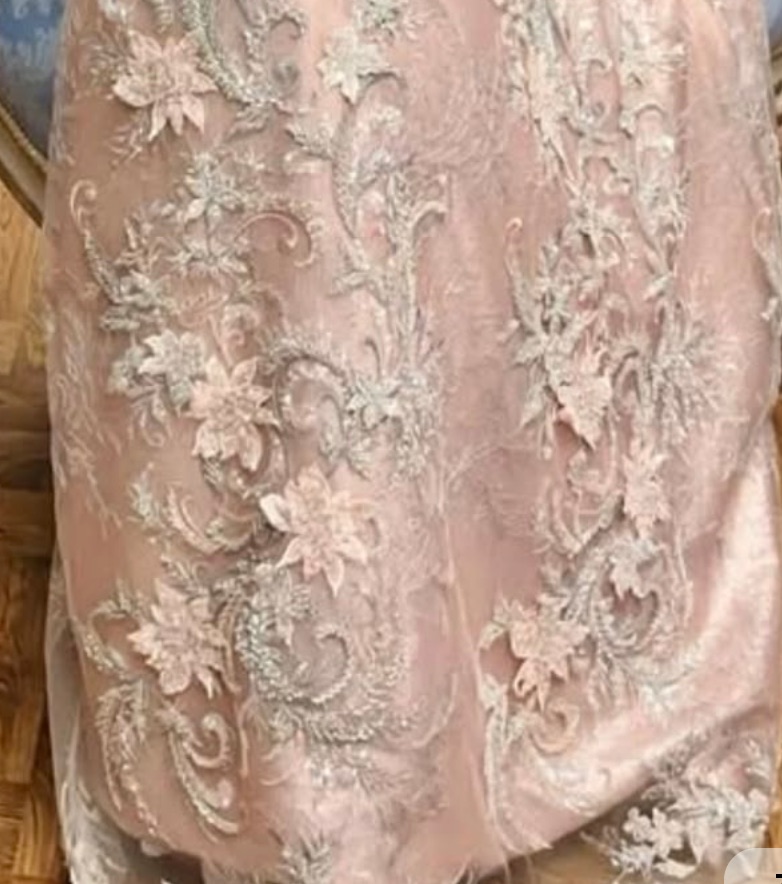
FR: Les deux univers sont infiniment inspirant pour “une faiseuse de motifs”.
- De Gilded age on pourrait garder la richesse des damas, les rinceaux*, la densité.
- De Bridgerton on pourrait garder la délicatesse florale, les jardins , les oiseaux et papillons, la chinoiserie, la légèreté narrative.
* motif ornemental en forme de branche végétale qui s’enroule en spirale ou en volute, le plus souvent garni de feuilles, de fleurs ou de fruits.
***
ENGL: Both worlds are endlessly inspiring for a pattern designer.
- From The Gilded Age, we could retain the richness of damasks, the scrolling foliage, and the density.
- From Bridgerton, we could retain the floral delicacy, the gardens, the birds and butterflies, the chinoiserie, and the narrative lightness.
* A decorative botanical motif in the form of a branch that curls into a spiral or scroll, usually adorned with leaves, flowers, or fruit.