 isa
isa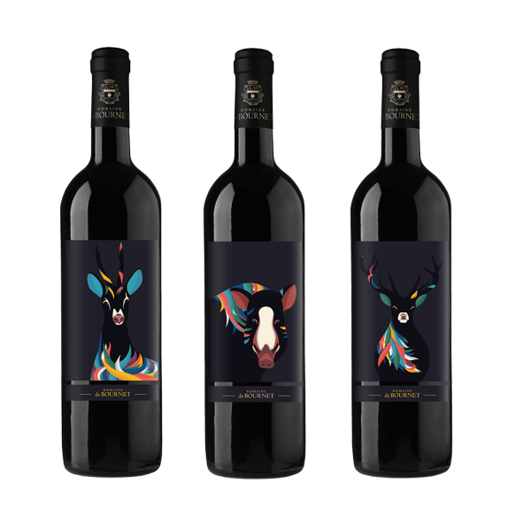
FR / Avant de passer à l’impression définitive, il est vraiment utile et souvent assez encourageant de tester le motif sur des mockups.
ENG / Before going to the actual print, it is really helpful and often quite encouraging to test the design on mock-ups.
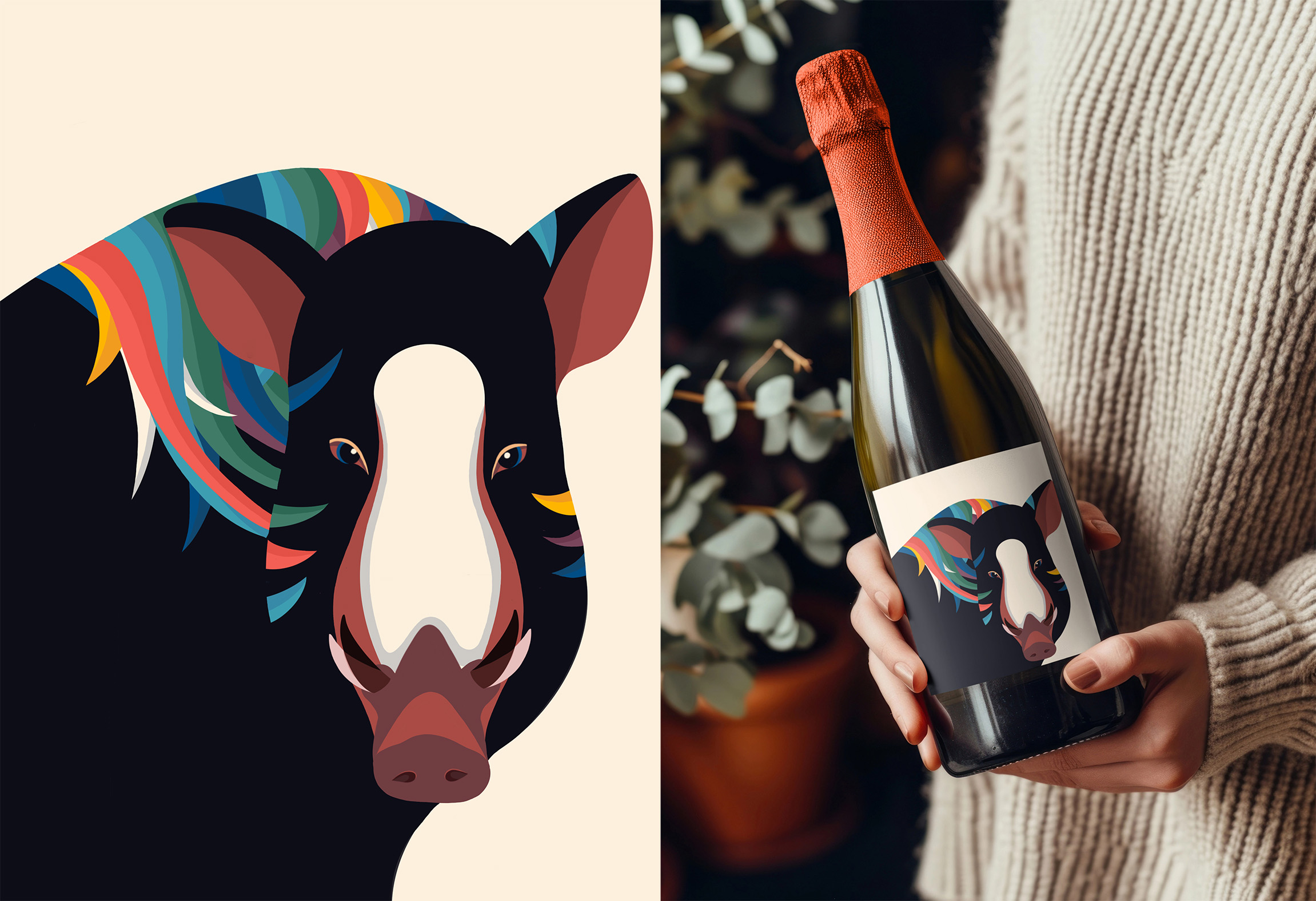
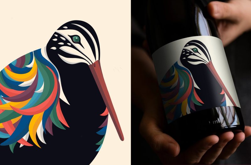
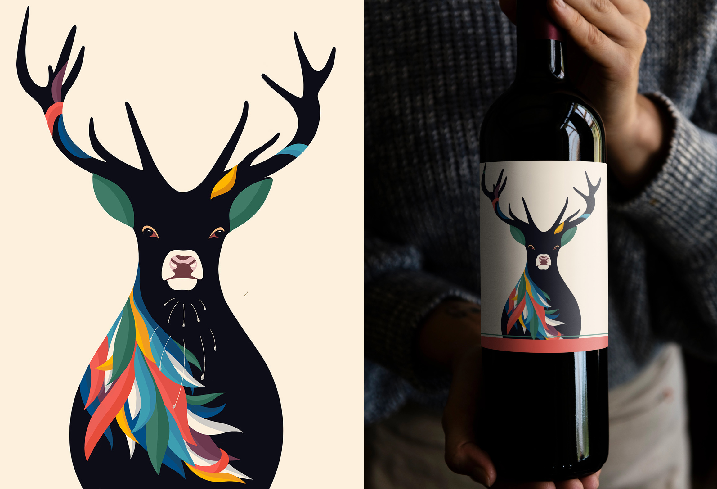
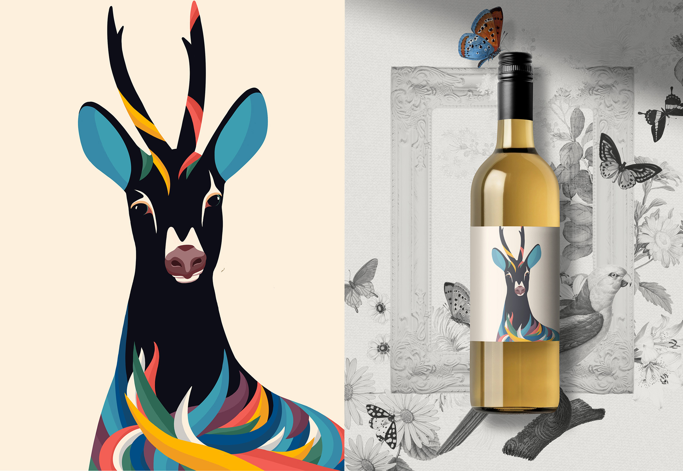
Mock up from rawpixel
FR
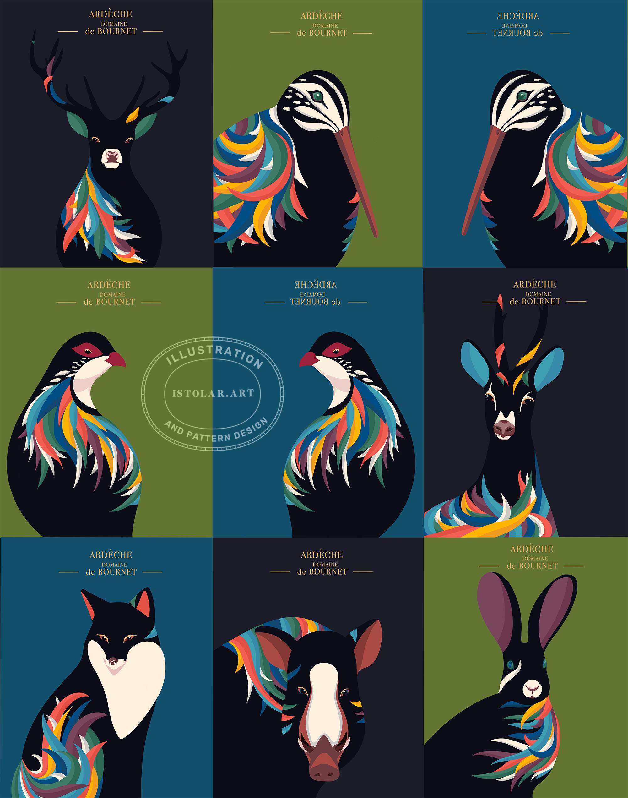
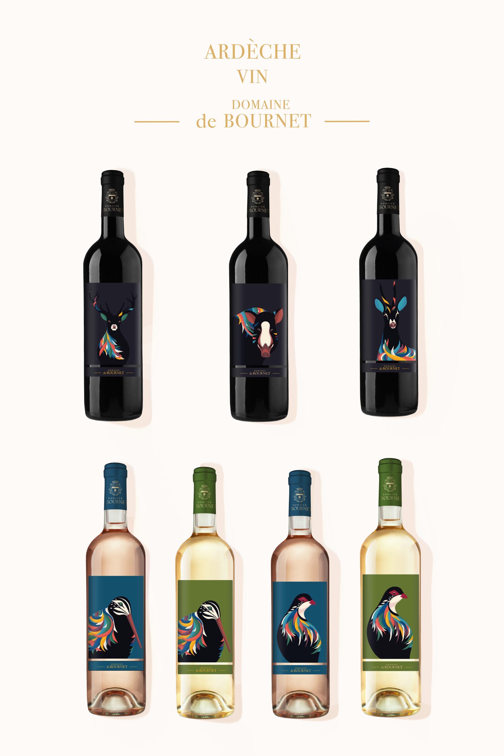
Au départ, le fond de l’étiquette devait être crème, mais il est finalement devenu noir (il y a une toute petite histoire de confusion derrière ça! ensuite Le vigneron, le propriétaire du domaine, a aussi testé le motif avec des fonds verts et bleus. La premiere versio se declinait donc en noir, vers et bleu
ANGL
At first, the background of the label was supposed to be cream, but it eventually turned black (there is a story behind that!. Then the owner of the vineyard, also tested the design with green and blue backgrounds. The first version ended up being: green, blue and black.
La première version a finalement donné ceci : vert, bleu et noir.
LA MINIE HISTOIRE DU FOND NOIR
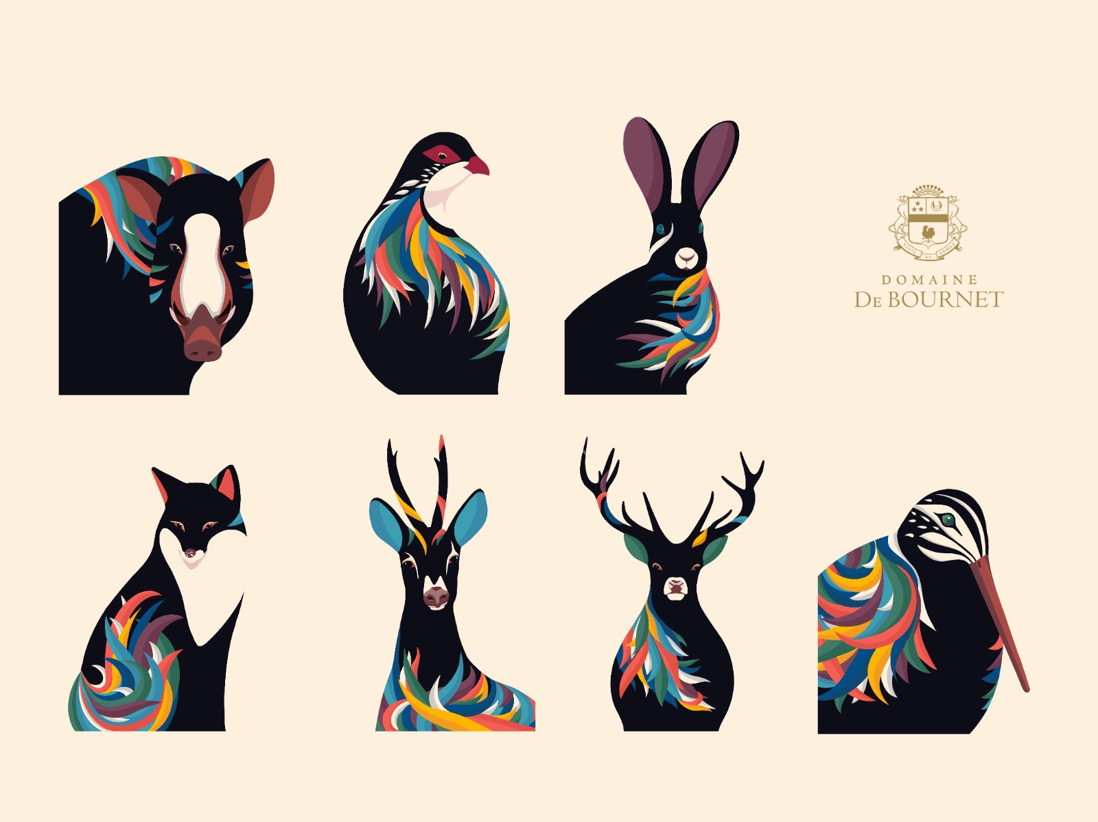
FR/ J’ai terminé l’étiquette et envoyé une version PNG, sur un fond creme, au propriétaire du domaine. Je ne me souviens plus avec quel logiciel il l’a ouverte, mais, d’une manière ou d’une autre, le fond crème est apparu en noir. J’ai ensuite reçu un message de sa part me disant qu’il trouvait finalement que le fond noir était une très bonne idée, que cela donnait quelque chose de vraiment élégant, raffiné et chic.
Au début, je dois dire que je n’ai pas vraiment compris ce qui s’était passé! Mais finalement, nous avons décidé de partir sur cette idée. Pour la première version de la collection, nous avons donc conservé le fond noir pour le sanglier, le cerf et le chevreuil, tandis que le vert et le bleu ont été utilisés pour les autres étiquettes.
J’étais plutôt contente de cette idée, mais j’avais aussi conscience d’un problème technique: j’avais à l’origine dessiné les contours des animaux (flammes comprises) en pensant à un fond clair. Ils n’avaient pas été conçus pour fonctionner sur du noir. À ce stade, revenir en arrière et tout redessiner n’était pas vraiment une option raisonnable. Cela aurait représenté des heures de travail supplémentaires.
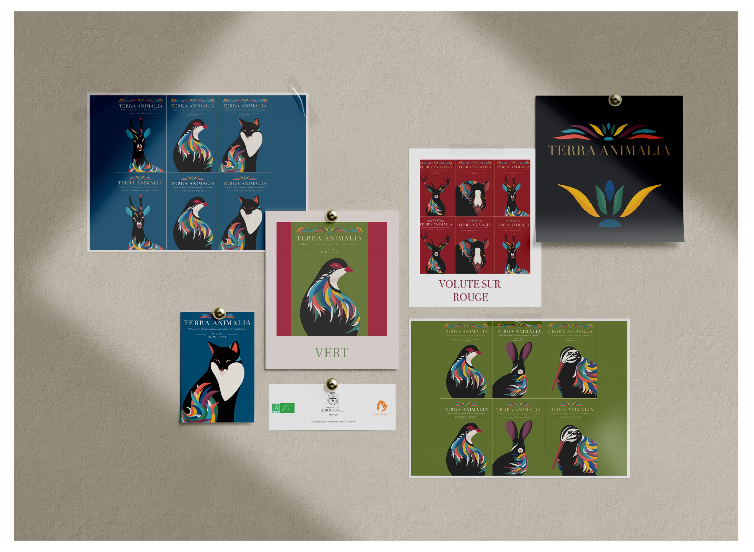
Dans la version modifiée, qui n’a pas encore été publiée, le design a encore évolué: nous avons ajouté un nouveau titre ainsi qu’une volute qui reprend les couleurs des flammes. À la demande du client, nous avons également fait évoluer le noir vers un rouge profond et riche.
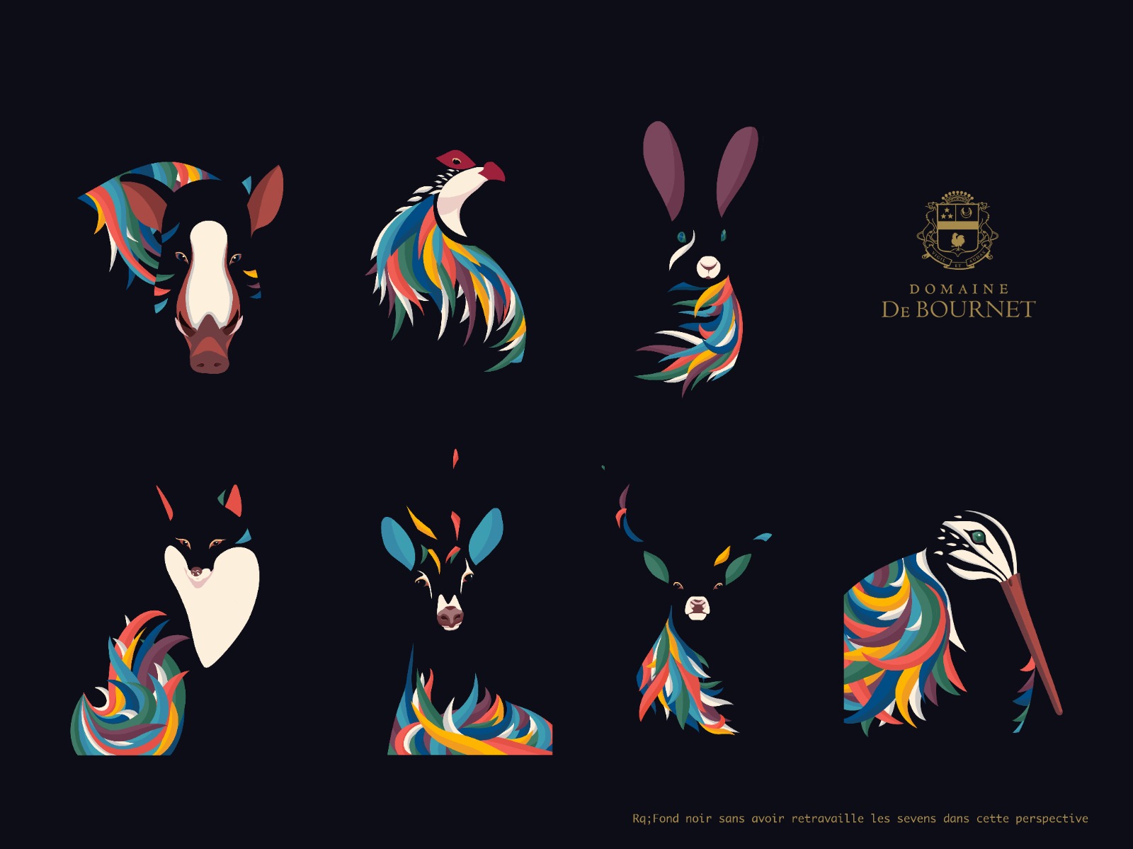
THE LITTLE STORY BEHIND THE BLACK BACKGROUND
ENG / I finished the label and sent a png version on a cream background to the client. I don’t remember which software he opened it in, but somehow the cream background appeared black. I then received a message from him saying that he thought the black background was a great idea, that it looked really elegant, refined and chic.
At first, I honestly didn’t understand what had happened! But in the end, we decided to go with it. For the first version of the collection, we kept the black background for the wild boar, the deer and the roe deer, while green and blue were used for the other labels of the mini collection.
I was quite happy with the idea, but I was also aware of one technical problem: I had originally drawn the animal outlines (including the flames) with a light background in mind. They hadn’t been designed to work on black. At that stage, going back and redrawing everything wasn’t really a sensible option. It would have meant many more hours of work.
In the amended version, which hasn’t been published yet, the design has evolved further: we added a new title and a volute echoing the colours of the flames. At the client’s request, we also shifted the black towards a rich red.
LAPREMIERE VERSION / FOND NOIR POUR LE VIN ROUGE SERA MISE A JOUR AVEC
FIRST VERSION / BLACK BACKGROUBD FOR RED WINE WILL BE UPGRADED WITH
- Le titre terra animalia + volute et un riche fond rouge pour le vin rouge
- The “Terra animalia” title + scroll and a Rich Red repacing the black background
MISE A JOUR EN COURS …
PENDING UPGRADE …